
Goals
This design pertains to the Advanced Views Interace. There are two main goals of this design:
1) make “Save” button easier to find
2) make it easier to distinguish between configurable and preview sections of interface
Both in the usability studies done at BADCamp and the Google studies, users had trouble locating the save button on the Views interface. Some examples:
http://www.youtube.com/watch?feature=player_detailpage&v=LSzaswGl-BU#t=2...
http://www.youtube.com/watch?feature=player_popout&v=BOgL2O-2ANk#t=3351s
Other issues:
- The save button will appear off screen if the preview becomes too wide
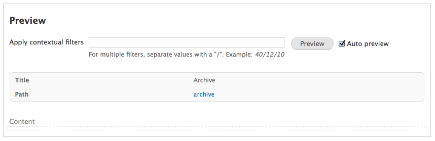
- Users think they can edit everything in the preview and don’t understand how it relates to the configurable section. The interface should be strictly divided between “configure” and “preview”.
- User doesn't understand when preview was updated
Proposed solution:
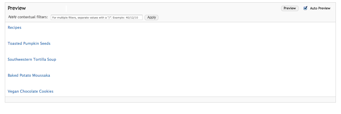
- The interface has 2 sections in the visual hierarchy: “Configure” and “Preview”. This will establish a pattern of “edit here”, “see results there”. Currently the user can edit options in the Preview section, which conflates these two functions. Until users can truly create Views with a WYSIWYG editor, “edit” and “see” should remain separate. For this reason, the editable quick menus in preview have been removed.
- Users are comfortable scrolling down in the Views interface to see a preview of their changes. The save button is placed in the bottom left of the Configure section to accommodate this workflow.
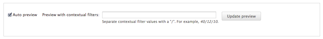
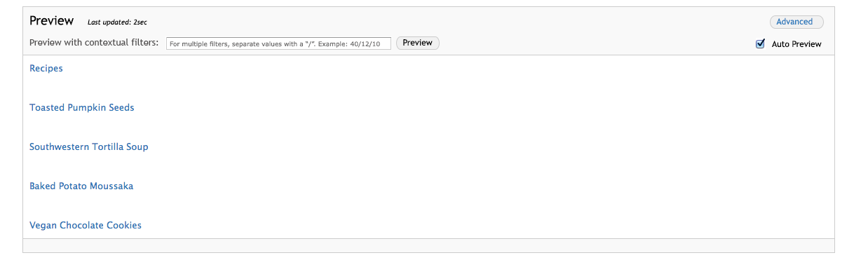
- Contextual filters and the checkbox for auto preview are moved under an Advanced button in the Preview section. This will prevent new users from getting confused by them.
- There are some copy changes to better communicate the interface (see screens).
- Added "last updated" message by preview to reinforce to user it reflects their latest changes
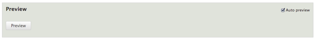
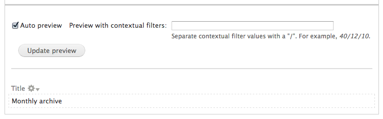
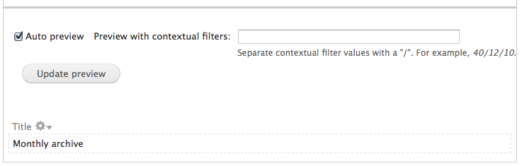
Interface mockups
New interface with save button and 2 sections
After clicking the "advanced" button on the preview section
Placeholder text in field reads: "For multiple filters, separate values with a "/". Example: 89/9/7"

Unsaved changes warning appears directly above configure section.

| Comment | File | Size | Author |
|---|---|---|---|
| #51 | interdiff-51-48.txt | 469 bytes | idebr |
| #51 | 1831894-views_ui_preview-51.patch | 3.31 KB | idebr |
| #51 | 1831894-51-after.png | 196.51 KB | idebr |
| #51 | 1831894-51-after-rtl.png | 200.61 KB | idebr |
| #44 | 1831894-before.png | 197.12 KB | idebr |


Comments
Comment #0.0
technicka CreditAttribution: technicka commentedadding in images inline
Comment #0.1
technicka CreditAttribution: technicka commentedgot rid of big images
Comment #1
Bojhan CreditAttribution: Bojhan commentedTo append to this, we found this in two studies and it severely interrupted the process to the point that people exited the screen without actually saving and with that having the feeling it didn't work, and creating a new one.
I definitely think this is a major, it occurred in two studies and had a severe impact on the workflow. It is also a bug because it stopped people in their tracks, I am not sure if there was no guidance if people would have understood how to resolve this.
I helped technika in formulating this issue, this proposal outlines a idea on how to solve this. We think this is likely the direction it needs to take, to really create a noticeable save button and changing the layout is part of this as it requires a more holistic change.
Comment #2
technicka CreditAttribution: technicka commentedcropped versions of original screenshots to show focus
Comment #2.0
technicka CreditAttribution: technicka commentedcopy
Comment #2.1
technicka CreditAttribution: technicka commentedadded back images
Comment #2.2
technicka CreditAttribution: technicka commentedadded explanation for advanced
Comment #3
Bojhan CreditAttribution: Bojhan commentedAlright, so I have spend a bit talking this through with @dawhner and @damiankliop.
They mentioned that it will be hard to hide all of this functionality under "Advanced" as its a common thing to use if you have contextual filters and disabling/enabling preview is something you then do often.
I suggested the following:
Another thing for consideration is unchecking "Auto-preview" when you filled out a contextual filter value, since it won't auto update?
Comment #4
Bojhan CreditAttribution: Bojhan commentedThis could use some code! :) ?
Comment #5
dawehnerMaybe i should have better stopped at the first contact with css, maybe this is still helpful for someone else :)
Comment #6
dead_armPostponing on #1840896: Views UI CSS Cleanup which is almost, because it updates some of the preview styling. Once that is in I would be happy to work on the CSS portion dawehner!
Comment #7
tim.plunkettThis issue has two parts:
The second one is blocked by #1840896: Views UI CSS Cleanup, but the first is separate, and unblocked.
It could be moved to a separate issue.
Comment #8
dead_armComment #9
dead_armSelf-assigning to finish up.
Comment #10
dead_armChanges from #5 with CSS clean up.
Chrome preview
Firefox preview
Comment #12
dead_armFor good measure adding before-patch screenshots.
Chrome preview before
Firefox preview before
Comment #13
dead_armI'll update the patch to fix the test failures.
Comment #14
dead_armUpdated the tests to be able to find and click the preview button.
Comment #15
dawehnerCan't review the css side of it, but especially the missing flickering is great!
From the PHP side it looks RTBC beside that single point here
This seems to duplicate just existing code.
Comment #16
Bojhan CreditAttribution: Bojhan commentedThis still needs the box like styling, the header of view config has.
Comment #17
jessebeach CreditAttribution: jessebeach commentedxjm, tim.plunkett, dwehner, jessebeach and dmistry discussed and concluded that the Save button will be placed in the bottom left, following the standard Drupal pattern. The save button in the top right will be removed.
Comment #18
tim.plunkettIn addition, the Save button will be persistent. Currently it is only visible if the view has been modified.
Comment #19
Bojhan CreditAttribution: Bojhan commentedI am +1 to this, keep in mind though that the "distinguish" part isn't solved by this.
Comment #20
Bojhan CreditAttribution: Bojhan commentedtagging
Comment #21
damiankloip CreditAttribution: damiankloip commentedRerolled. dead_arm - goodluck.
Comment #23
klonoshuh?
Comment #24
tim.plunkettwhat?
Comment #25
klonos#22 says the patch failed testing while the patch in #21 is green. ???
Comment #26
tim.plunkettI retested it from qa.d.o
Comment #27
dead_armPatch attached includes styling (#16 and #19) on the preview section in order to address the visual differentiation portion of this task.
Currently:
With patch applied:
Comment #28
dead_armCreated a new issue, #2003440: Change the location of the save button, for the save button portion of this task, as #7 recommended it previously and the patches thus far have addressed the distinguishing areas portion only.
Comment #29
dead_armAdd #27 to queue for testing.
Comment #31
dead_arm#29: 1831894-27.patch queued for re-testing.
Comment #33
dead_arm#29: 1831894-27.patch queued for re-testing.
Comment #35
dead_armRe-rolled patch.
Comment #36
dead_armPostponing on #1983164: Entity Forms in ajax requests don't find the route until Preview is working again, as we need all of the elements present in order to apply new styling correctly.
Comment #37
dead_armPreview is working, so the changes can be tested. The patch needed to be re-rolled. I got some of the styling further along, but the form markup isn't ideal to make all the changes requested, namely aligning the preview button with the field and having both of those be part of the preview header.
Currently:
With patch:
Comment #38
Bojhan CreditAttribution: Bojhan commentedThis doesn't install on simplytest.me
It really looks good though, can we get a reroll?
Comment #39
dawehnerRerolled.
Comment #40
Bojhan CreditAttribution: Bojhan commented@dawehner Did you check it? There are some wierd things happening.
Comment #40.0
Bojhan CreditAttribution: Bojhan commentedrelocate text
Comment #41
Bojhan CreditAttribution: Bojhan commentedOk, needs a little bit of work
Comment #42
dawehnerHei, everyone should be able to work on it :)
Comment #43
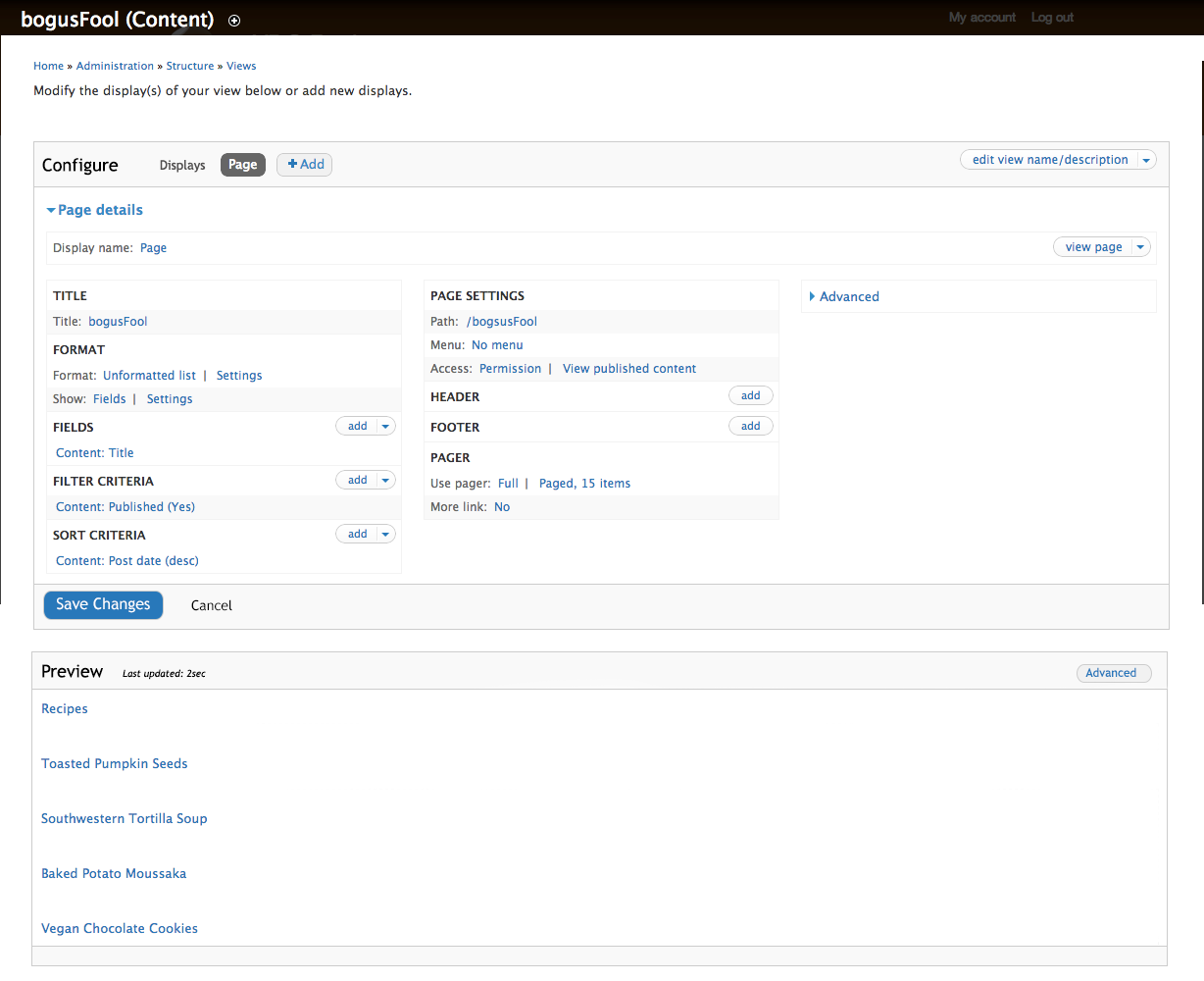
idebr CreditAttribution: idebr commentedRerolled patch attached. Can confirm it does not look good.
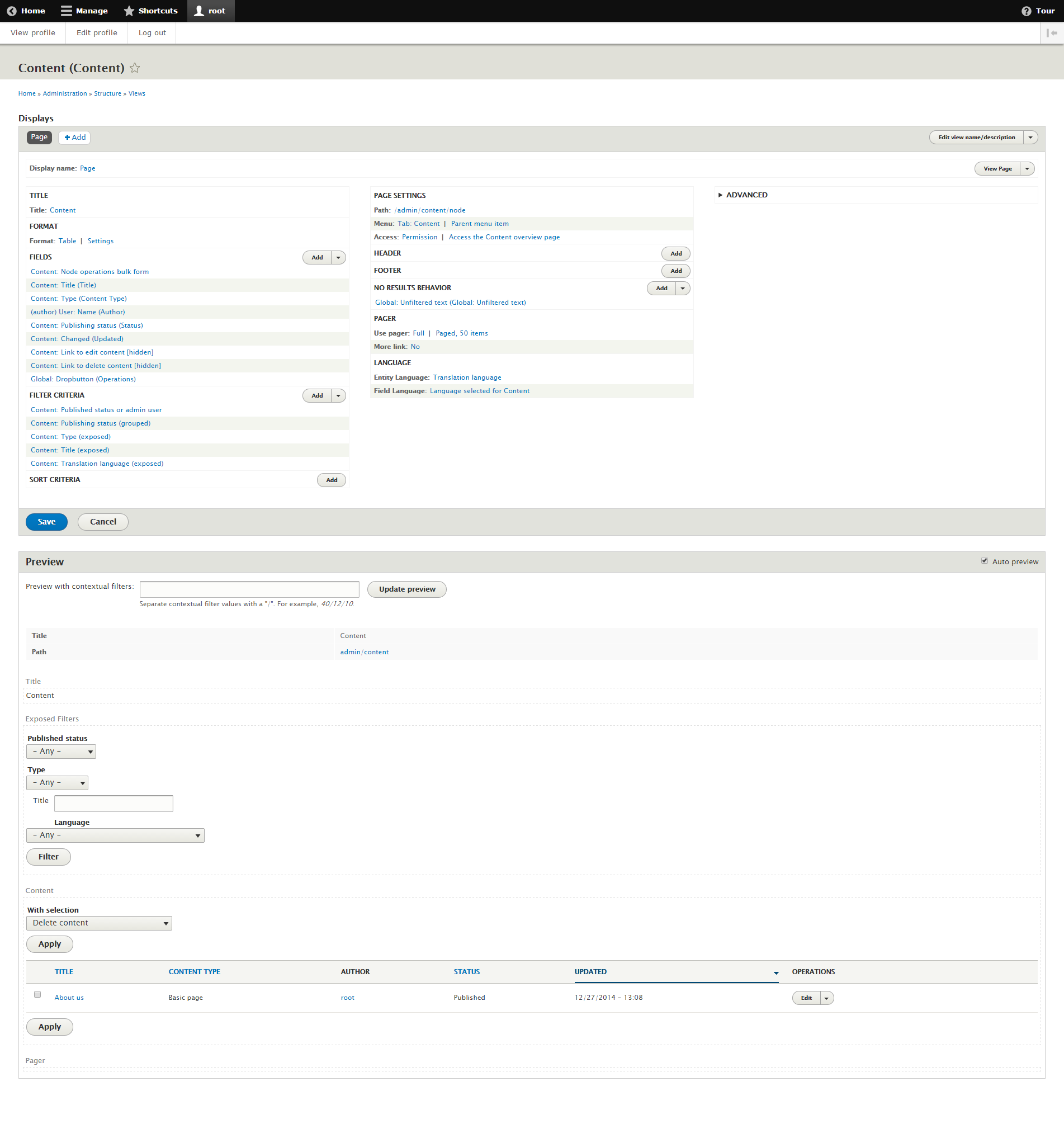
Comment #44
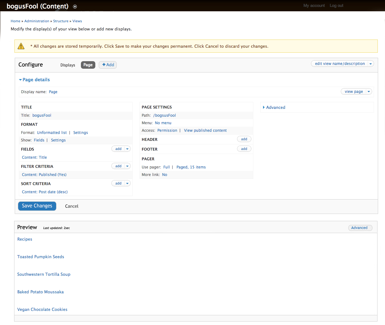
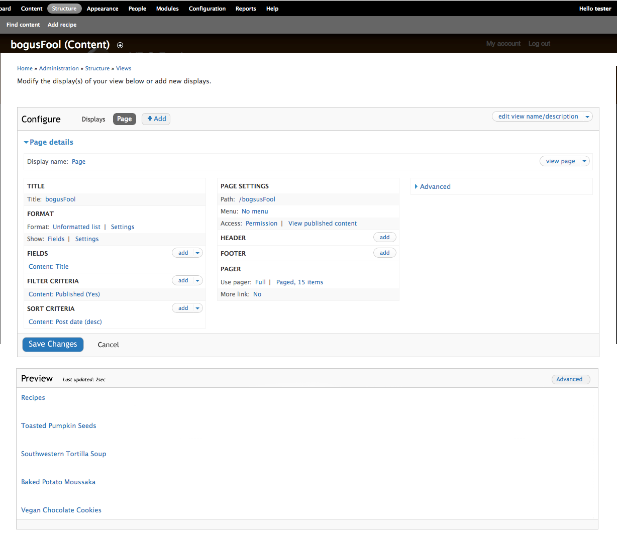
idebr CreditAttribution: idebr commentedIt appears the Views UI had some updates since the last patch:
Screenshot before:

Screenshot after:

Comment #45
dawehnerThese screenshots look alright for me.
@Bojhan @yoroy
Is it okay to not tackle the argument part for now but just care about the save button area?
Comment #46
Bojhan CreditAttribution: Bojhan commentedSure, we can go ahead and remove that silly text too "Click on an item... blababa"
Comment #47
dawehner+1
Comment #48
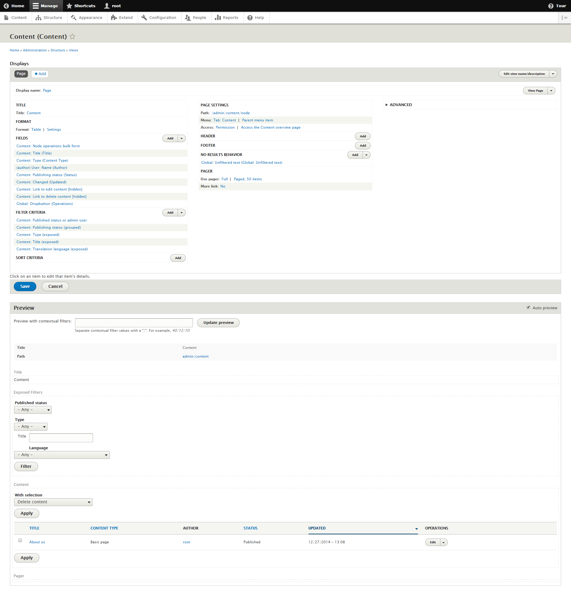
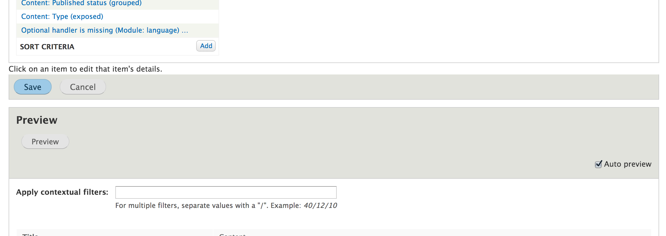
idebr CreditAttribution: idebr commentedI have updated the Views edit form to remove the silly text. As mentioned in my previous comment, there is a separate issue for the exposed filter styling in the View preview: #2396465: Views UI: Exposed Filter css is not applied
Screenshot after:

Comment #49
dawehnerLooks fine for me.
Comment #50
jibranCan we have a RTL screenshot?
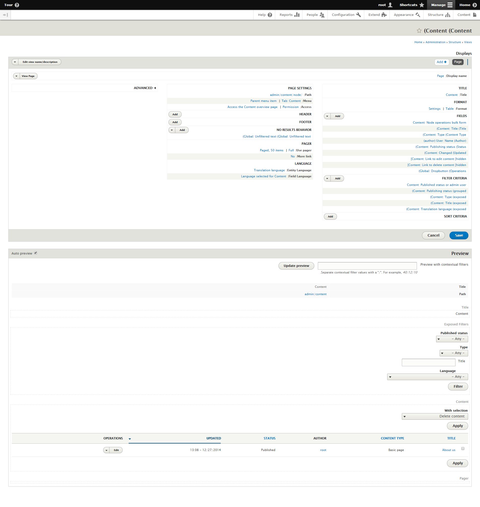
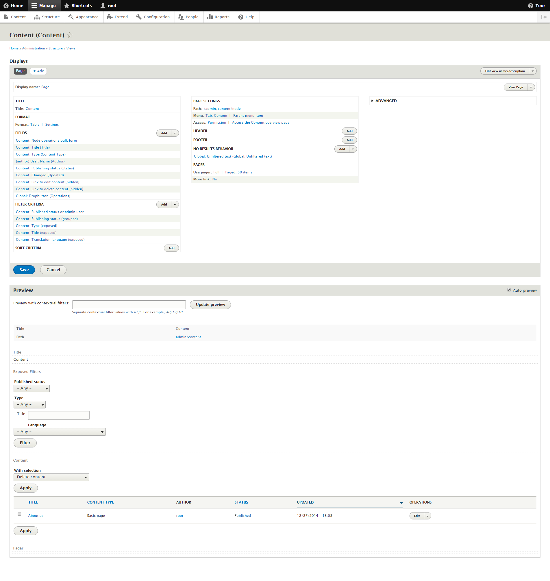
Comment #51
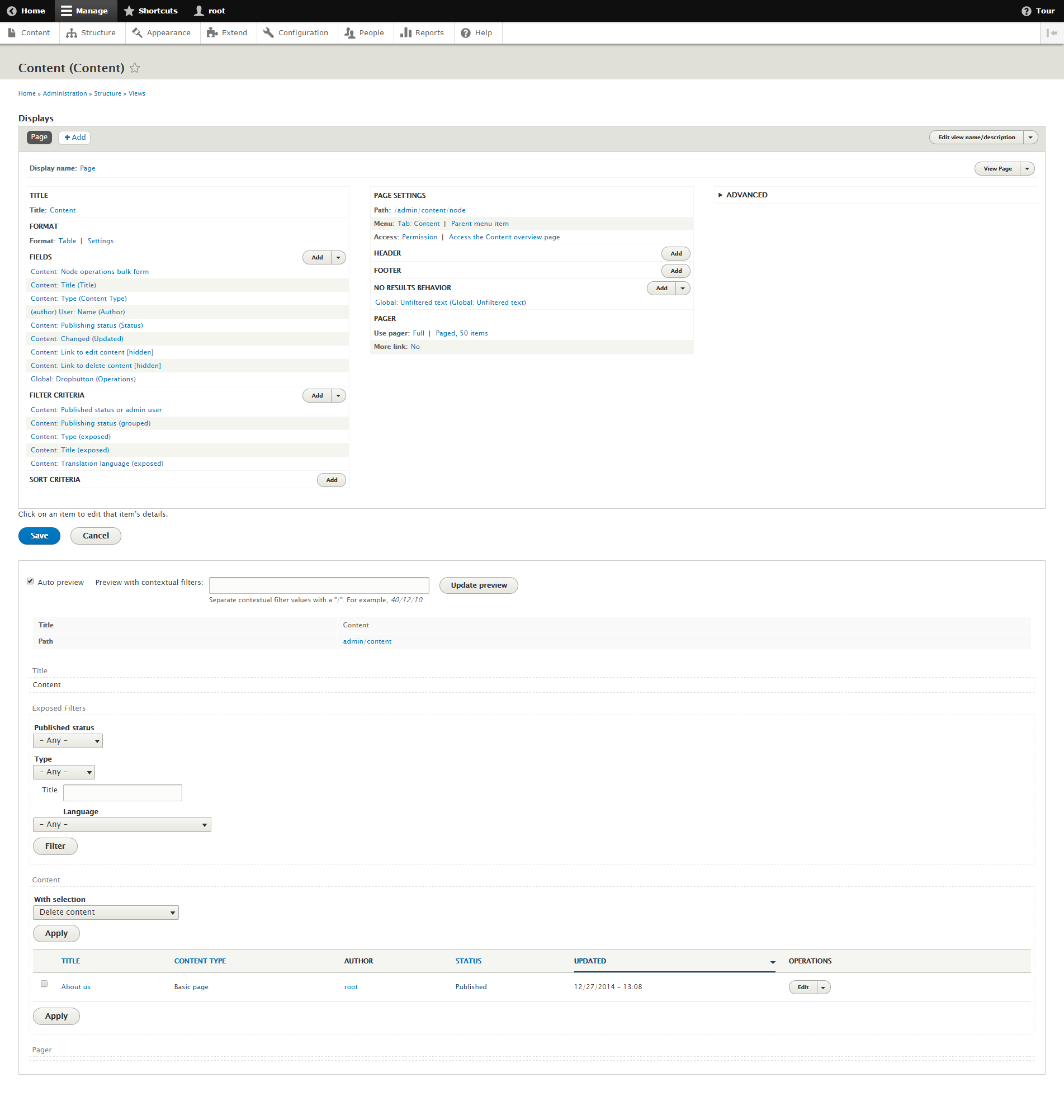
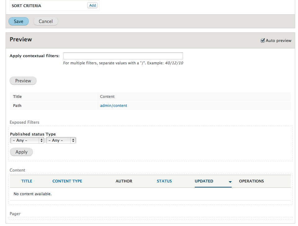
idebr CreditAttribution: idebr commentedThanks jibran for reminding me to add RTL css :)
Screenshot after (LTR):

Screenshot after (RTL):

Comment #52
dawehnerStill looks fine :)
Comment #53
alexpottThis issue addresses a major bug and is a prioritised change (usability) as per https://www.drupal.org/core/beta-changes. Committed ab94733 and pushed to 8.0.x. Thanks!
Comment #55
Bojhan CreditAttribution: Bojhan commentedWhooo!
Comment #57
Gábor HojtsyThanks, removing from UX sprint now.