
Problem/Motivation
When the comments are large, the comment boxes form long columns in narrow screens.
The space utilization and Alignment of comments in narrow screens needs review.
Admin URL: node/%
Proposed resolution
Remaining tasks
Verify that @Cottser's review was addressed.
User interface changes
See #55 for screenshots in LTR and RTL on several viewports.
| Comment | File | Size | Author |
|---|---|---|---|
| #81 | 1902862--after--patch--pic.png | 34.89 KB | vikashsoni |
| #81 | 1902862--before--aptch--pic.png | 66.96 KB | vikashsoni |
| #53 | alignment_of_comments-1902862-53.patch | 1.41 KB | yogeshmpawar |


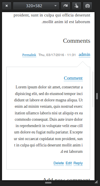
Comments
Comment #1
rcaracaus CreditAttribution: rcaracaus commentedRemoving the left arrow and clearing the comments to force the submitted information below the comment seems like a logical solution?
Comment #2
hansrossel CreditAttribution: hansrossel commentedCannot fix this right now because something has changed in the comment wrapper template that puts the comment text outside the comment box.
Comment #3
oresh CreditAttribution: oresh commentedYes, also noticed that. I couldnt find an issue for the comments changes, if you find please provide a link.
I also have a problem with posting comment - it doesnt work until i remove display none from comment body.
Are there any changes in comments designs?
Comment #4
DeeLay CreditAttribution: DeeLay commentedThis is the issue for the comment body appearing outside the bubble:
http://drupal.org/node/1965650
Comment #5
BrightBoldSeems like this needs to be postponed until #1965650: Comment rendering broken: comment body rendered outside of the bubble is resolved.
Comment #6
DeeLay CreditAttribution: DeeLay commentedCreated a patch based on the suggestion from rcaracaus in #1, however I don't think it looks quite right, might need to still have the arrow there but pointing up. I'll have a look to see if it is possible to do that with css transform
Comment #6.0
DeeLay CreditAttribution: DeeLay commentedis not an admin page so should not be part of the meta issue
Comment #7
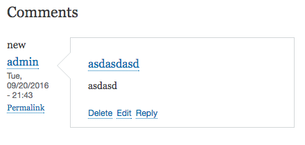
yoroy CreditAttribution: yoroy at Roy Scholten commentedThis is still the case. Would be nice to see a design where the name, date and permalink would show above with the pointy bit of the comment moved to the top of the comment.
Comment #8
kostyashupenkoComment #9
andypostComment #10
kostyashupenkoComment #11
kostyashupenkoComment #12
kostyashupenkoWhat about this design? What do you think? No global changes actually, but anyway, maybe you want to see here another changes as well?
Patch here (to reproduce it)
Comment #13
kostyashupenkoComment #14
yoroy CreditAttribution: yoroy at Roy Scholten commentedYes, like that. Thank you @kostyashupenko. Looking at it I wonder if we could put author, date and permalink on a single line for this layout. Saves some space and puts the arrow right under the author name.
Comment #15
kostyashupenko@yoroy, yep, sure. Working on it
Comment #16
kostyashupenko@yoroy, btw. You mean that arrow should be centered under username? I mean if you have toolongusername and arrow should be exactly centered? Or to allign this arrow under username "admin"
Comment #17
yoroy CreditAttribution: yoroy at Roy Scholten commentedNo, there's no need to center that, current position looks fine to me.
Comment #18
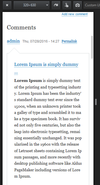
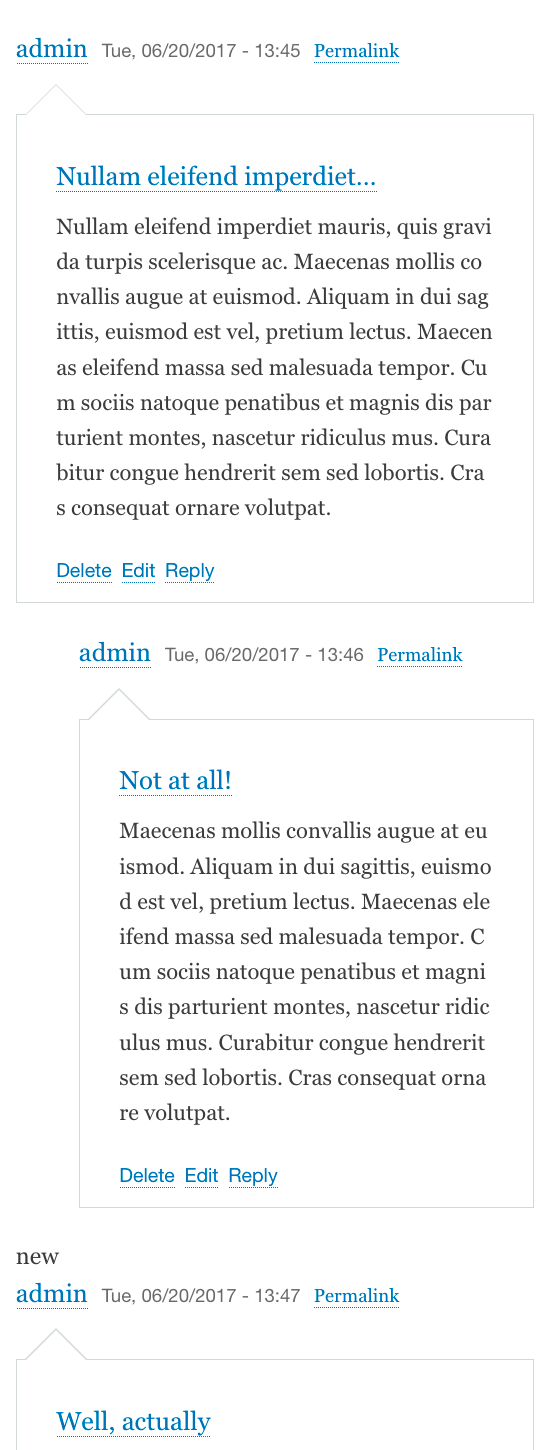
kostyashupenko@yoroy, i've added styles for 1 line and added also styles for rtl. Look on screens
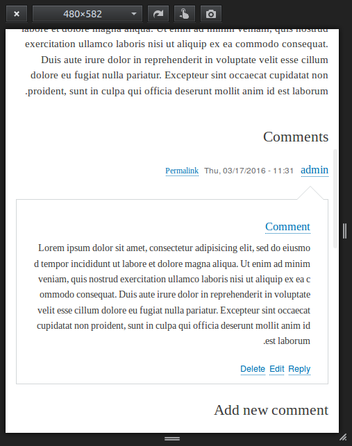
LTR and RTL for 480px:
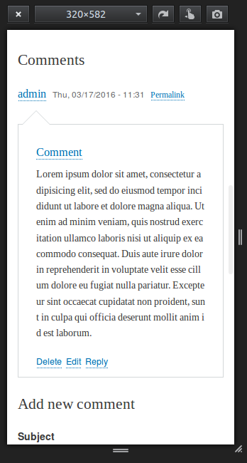
LTR and RTL for 320px:
Comment #19
kostyashupenkoComment #20
emma.mariaComment #21
yoroy CreditAttribution: yoroy at Roy Scholten commentedComment #22
yoroy CreditAttribution: yoroy at Roy Scholten commentedMaybe somebody could do the manual testing at devdays Milan? would be nice to get this in.
Comment #23
Gábor HojtsyThis has not been worked on for the past month, so untagging from sprint.
Comment #24
chetan2111 CreditAttribution: chetan2111 at Srijan | A Material+ Company commentedHi,
Tested the comment section alignment and spacing and it is working as expected the changes are correct on above mention sizes but the issue exist on above 480 size devices like ipad.
Comment #25
kostyashupenkoSo.... ?
Comment #26
andypostI think that ready
Comment #27
xjmComment #28
xjmComment #29
xjmAs a design improvement this is probably beta deadline.
Comment #30
star-szrEither I missed it or there aren't before/after screenshots, those would be very helpful here :)
Thanks everyone who's worked on this so far. From the screenshots I'm seeing it looks promising, I think some code details need to be addressed though.
Bartik already has a max-width 460px/min-width 461px breakpoint used in a few places, any reason to not use that breakpoint here? If it's not too large there's also an existing max-width 559px/min-width 560px breakpoint used in a few places.
I think these need LTR comments (see below for reference link) and there seems to be some inconsistency/redundancy here. Why does RTL redeclare the exact same
border-leftvalue?Why do both the LTR and RTL selectors declare a value for top? Shouldn't the LTR suffice?
I believe these need
/* LTR */comments per https://www.drupal.org/node/1887862#rtl.One is ::before, the other is :after. I can't find a standard on this for Drupal in/around https://www.drupal.org/node/1887862 but most of core uses a single colon. We should at the very least be consistent within the code we are adding.
Comment #32
bandanasharma CreditAttribution: bandanasharma as a volunteer and at gai Technologies Pvt Ltd for gai Technologies Pvt Ltd commentedAdded patch and interdiff file. I have made changes according to #30 points.
Comment #33
bandanasharma CreditAttribution: bandanasharma as a volunteer and at gai Technologies Pvt Ltd for gai Technologies Pvt Ltd commentedComment #34
Chernous_dn CreditAttribution: Chernous_dn at FFW for FFW commentedHi @bandanasharma test different resolutions, looks good. Attach screenshots.
Comment #36
Chernous_dn CreditAttribution: Chernous_dn at FFW for FFW commentedComment #37
Chernous_dn CreditAttribution: Chernous_dn at FFW for FFW commentedComment #38
webchickAssigning to @Cottser to verify that his feedback has been addressed. For example, I didn't see any changed lines in the interdiff around that 480px line.
Otherwise though, looks like a great patch and a lovely improvement! Thanks for all the detailed screenshots, @Chernous_dn!
Also, since I have it up anyway, here's a "before" screenshot. Adding to the issue summary.
Comment #39
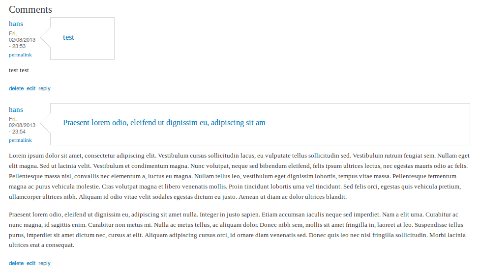
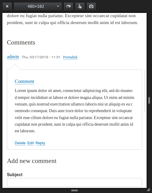
webchickMeh. That screenshot was pretty crappy. Basically. "before" the "admin / permalink" stuff is to the left, which reduces the available width of narrow screens by about 30%. "After," that stuff moves to the top on narrow screens (but keeps the current design in wide screens), so you have more screen real estate for comment content.
Comment #40
star-szrSorry for the delayed review (and thanks @webchick for taking a look!). This is looking much better, just a few things left.
These blank lines should be left in.
It would still be nice IMO to change this to one of the breakpoints I suggested in #30.1. I think having fewer overall breakpoints results in a more predictable and consistent frontend and this particular case probably doesn't merit its own breakpoint.
Nice, overall the LTR/RTL stuff is looking more consistent.
I could be wrong, but I don't think these lines are needed in the LTR case. The initial value of right is auto (https://developer.mozilla.org/en-US/docs/Web/CSS/right) and if there is no border-right, specifying a border color isn't necessary.
Comment #41
bandanasharma CreditAttribution: bandanasharma as a volunteer and at gai Technologies Pvt Ltd for gai Technologies Pvt Ltd commentedI have make changes according to #40 comments and added the patch.
Comment #43
bandanasharma CreditAttribution: bandanasharma as a volunteer and at gai Technologies Pvt Ltd for gai Technologies Pvt Ltd commentedReroll the patch again.
Comment #44
bandanasharma CreditAttribution: bandanasharma as a volunteer and at gai Technologies Pvt Ltd for gai Technologies Pvt Ltd commentedComment #46
bandanasharma CreditAttribution: bandanasharma as a volunteer and at gai Technologies Pvt Ltd for gai Technologies Pvt Ltd commentedComment #48
yogeshmpawarRerolled the patch against 8.3.x because #46 failed to apply .
Comment #49
bandanasharma CreditAttribution: bandanasharma as a volunteer and at gai Technologies Pvt Ltd for gai Technologies Pvt Ltd commented#48 patch is apply success fully, after applying patch in the comment.css file add same css within this @media all and (max-width: 460px). We have only need to replace the breakpoint and remove comment from the file. I have attached after and before screen shot.
Comment #50
bandanasharma CreditAttribution: bandanasharma as a volunteer and at gai Technologies Pvt Ltd for gai Technologies Pvt Ltd commentedagain added the patch with these changes.
Comment #51
bandanasharma CreditAttribution: bandanasharma as a volunteer and at gai Technologies Pvt Ltd for gai Technologies Pvt Ltd commentedComment #53
yogeshmpawarRerolled the patch against 8.3.x because #50 failed to apply.
Comment #55
surbhiG CreditAttribution: surbhiG commentedReview the latest patch #53 and this issue seems fixed now and refer the attached screenshot for the same. So moving it to RTBC.
Comment #56
xjmGreat work on the screenshots @surbhi90!
Updating the summary to link that comment, and also updating the file list to show the latest patch.
Comment #57
xjmSince a good bit of CSS is needed for this fix, it would be good to either get a frontend framework manager's review or a Bartik subsystem maintainer review. I couldn't decide which to do, so I tagged it for subsystem maintainer review but also left it RTBC and tentatively assigned to Cottser in case he has a chance to review it. (If not we can unassign for a different CSS review.)
Nice work on this, everyone!
Comment #58
star-szrSorry for the very delayed response, I've been trying to get to this issue. I'm going to unassign but keep this issue on my list to review, to give others the opportunity to review or provide feedback.
Comment #59
xjmAlright, let's see if we can get a Bartik or CSS maintainer review then. Thanks @Cottser!
Comment #60
emma.mariaI'm taking a look at this at MidCamp and easing myself back into the issue again :-)
I can take a look at the CSS plus I'm going to do some manual testing on my phone to see how it feels.
Great work so far everyone :-)
Comment #61
yogeshmpawarAny Update on this issue ?
Comment #62
joginderpc CreditAttribution: joginderpc at Srijan | A Material+ Company commented@emma.maria what about the test status you had done or not? Please update this issue so far it will move to next core installation.
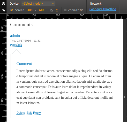
As i had tested it manually the arrows are working fine on mobile. Screen shot attached bellow.
Comment #63
joginderpc CreditAttribution: joginderpc at Srijan | A Material+ Company commentedComment #64
joginderpc CreditAttribution: joginderpc at Srijan | A Material+ Company commentedComment #65
yoroy CreditAttribution: yoroy at Roy Scholten commentedStill happy with this design.
One question about the "new" marker: is it semantically ok that this is *not* inside the footer element that contains the username, date, permalink? Honest question, I have no opinion :)
Comment #66
jibranI think 'Needs design review' tag can be removed after #65.
Comment #67
lauriiiI'm sorry, I have one more point about the code which is quite a minor problem but should be still addressed. This will also give @emma.maria some more time if she wants to follow-up on #60 :)
Is there a particular reason why article element has been used on the selector? Also it would be great for clarity if this would be placed as a first selector for comments.
Comment #68
brahmjeet789 CreditAttribution: brahmjeet789 as a volunteer and at gai Technologies Pvt Ltd commented@laurii patch 53 is working fine for me and i reduce the above space from the comments for smaller screen. regarding why use article as display: block beacuse comments are in article tag .
Comment #69
brahmjeet789 CreditAttribution: brahmjeet789 as a volunteer and at gai Technologies Pvt Ltd commentedComment #72
brahmjeet789 CreditAttribution: brahmjeet789 as a volunteer and at gai Technologies Pvt Ltd commentedAny update on this issue.
Comment #74
Manjit.Singh@Laurii: I haven't see any trouble to access comments on narrow screen.
Or do we have any plans to change the designs ?
Comment #79
djsagar CreditAttribution: djsagar at OpenSense Labs commentedPlease work for 9.2.x-dev.
Thanks!
Comment #81
vikashsoni CreditAttribution: vikashsoni as a volunteer and at Zyxware Technologies commentedPatch #18 applied successfully and looks good for me
After patch layout is looking good
Thanks for the patch
for ref sharing screenshot...
Comment #85
pameeela CreditAttribution: pameeela commentedMoving to contrib since Bartik was removed from core in D10.