
Problem
In reviewing #1849754: Fix add & remove shortcuts hover text alignment I realised the colour contrast for the add & remove shortcut links on the overlay are not WCAG compliant (#0074BD on #000000).
You can confirm this on any colour contrast checker e.g. http://snook.ca/technical/colour_contrast/colour.html
Results
Are colours compliant? NO
Contrast Ratio 3.51
WCAG 2 AA Compliant NO
WCAG 2 AA Compliant (18pt+) YES
WCAG 2 AAA Compliant NO
WCAG 2 AAA Compliant (18pt+) NO
The minimum requirement for AA is 4.5:1. (http://www.w3.org/WAI/WCAG20/quickref/#qr-visual-audio-contrast-contrast)
Proposed resolution
Change the link colour to increase contrast 4.5:1, possibly by styling this link differently in the overlay, because the background is white in the non-overlay screen (the contrast is currently sufficient for AA on a white background).
User interface changes
TBC
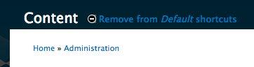
Screenshot of current colours:
| Comment | File | Size | Author |
|---|---|---|---|
| #30 | Screen Shot 2013-04-05 at 1.16.34 PM.png | 53.22 KB | tkoleary |
| #27 | Screen Shot 2013-04-05 at 12.42.17 PM.png | 28.16 KB | pameeela |
| #27 | Screen Shot 2013-04-05 at 12.42.32 PM.png | 24.04 KB | pameeela |
| #26 | Screen Shot 2013-04-04 at 4.20.03 PM.png | 55.29 KB | mgifford |
| #26 | Screen Shot 2013-04-04 at 4.21.07 PM.png | 26.79 KB | mgifford |


Comments
Comment #1
mgiffordJust confirmed with http://webaim.org/resources/contrastchecker/
So do you think we need to go as light as #009bfb?
Comment #2
pameeela CreditAttribution: pameeela commentedIn Drupal 7 it is white on a grey background, both in the overlay and in the full page. I'm not sure why that was changed, it seems to work well as it is one style that can be used for both.
Comment #3
mgiffordIn D7 Seven, it looks good:
#5f605b / #fff
Contrast Ratio: 6.3:1
Can you roll a patch for the change?
Comment #4
echoz CreditAttribution: echoz commentedNote the issue is when the overlay is enabled, otherwise it's the grey background, so be sure to target the overlay with the patch.
Comment #5
pameeela CreditAttribution: pameeela commented@echoz, I'm seeing the blue even with overlay disabled although there is a trace of the grey background. This may be a regression from #1849754: Fix add & remove shortcuts hover text alignment.
Just to clarify, what is the intended style? Matching D7, with white on grey regardless of where?
Screenshot attached with overlay disabled (fresh copy of D8).
Comment #5.0
pameeela CreditAttribution: pameeela commentedUpdates issue link
Comment #6
echoz CreditAttribution: echoz commentedOh, I see what you mean, and your reasoning for same styling makes sense, although I think it would look better matching the h1 page title in each case, white or black. I gave up trying to track down the intended style, I believe you could invent what you like and see how others like it.
I don't know how Seven got away with the non AA compliant contrast of #0074bd link color on #e0e0d8 background either, but that's another issue.
Comment #7
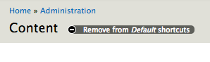
pameeela CreditAttribution: pameeela commentedPatch restores D7-ish styling, with white links on grey background. Also increased the text size and line height. First ever attempt at a patch so expecting that it needs work! Tested in Chrome, FF, Safari and IE10 (don't have 9 available) and seems to look OK.
Screenshots-
Comment #8
mgiffordThis looks good to me. Great job @pameela!
Comment #9
catchThis is too much theming for a module CSS file. It should go in Seven if anywhere. Additionally the div selector is uneccessary, not sure why it needs font size (and in pixels), padding, float declarations - why not just a different colour?
Comment #10
pameeela CreditAttribution: pameeela commentedRe-done, added the new CSS to Seven, and removed a bunch of unnecessary CSS as noted by @catch. Looks the same!
Comment #11
mgifford@catch the output looks good in simplytest.me. Want to review the CSS? Thanks for catching that!
Comment #12
larowlanThere is some matching css in the RTL file too (see http://drupalcode.org/project/drupal.git/blob/refs/heads/8.x:/core/theme...)
The float declaration can go from there and the padding will need updating too.
Comment #13
mgifford@pameeela do you want to reroll the patch with a modified core/themes/seven/style-rtl.css file that modifies
div.add-or-remove-shortcuts?Should be easy to do/test. Thanks @larowlan.
Comment #14
echoz CreditAttribution: echoz commentedMore code review on #10 patch:
- The last 4 property: value; lines don't need a /* LTR */ comment as they have no left/right specific values.
- padding: 0 6px 0 6px; can be shortened to padding: 0 6px;
Comment #15
pameeela CreditAttribution: pameeela commentedOK, once again. No changes to LTR css since the last patch, except removing comments. Have tested using RTL in English, screenshot attached, but assuming others should try as well.
Comment #16
echoz CreditAttribution: echoz commentedseven/style-rtl.css just needs the declaration removed (done correctly), but none of the next added declaration needed, as it gets that all correctly from seven/style.css, there is no left / right specific values.
padding: 0 6px; means top + bottom are 0, and left + right are 6px, so does not get a /* LTR */ comment.
I did not test the patch, this is only another code review.
Comment #17
pameeela CreditAttribution: pameeela commentedRighto, thanks for the help - this is my first go with RTL and it's surprisingly difficult to get your head around! Screenshot above still applies, haven't changed any styles here.
Comment #18
echoz CreditAttribution: echoz commentedGreat. Sorry I didn't mention this before, but the 3 blank lines need the whitespace removed. It's convenient to configure your text editor to automatically do that. Someone else please actually apply the patch for rtbc. Thanks for sticking with this pameeela!
Comment #19
pameeela CreditAttribution: pameeela commentedThanks echoz, there aren't any blank lines in my files (except where they should be), where are you seeing them?
Comment #20
echoz CreditAttribution: echoz commentedThe 3 blank lines in the patch begin with a *space*, they are not empty. Just place your cursor there and you'll see it, then hit delete.
Comment #21
larowlanI can't see any whitespace issues in the latest patch. Am I missing something?
Comment #22
echoz CreditAttribution: echoz commentedUnless me and BBEdit are crazy, each one of the 3 blank lines begins with a 1 character whitespace. You can't "see" it until you place your cursor there. You can select it.
Comment #23
echoz CreditAttribution: echoz commentedAh, the whitespace is in the patch file, but not with a + so it does not add it to the patched files. You can disregard my whitespace rantings, although it's still a good idea to configure your text editor to strip trailing whitespace.
From CSS formatting guidelines, "There MUST NOT be any whitespace (spaces or tabs) at the end of lines. This means blank lines should also not contain any spaces or tabs."
Comment #24
mgiffordSo @echoz any reason not to mark this RTBC?
Comment #25
echoz CreditAttribution: echoz commentedI have no more objections for someone else to finish testing, nice work pameeela :-)
Comment #26
mgiffordPatch tested on the Mac with FF, Safari, Chrome & Opera. I guess we need IE testing though.
Comment #27
pameeela CreditAttribution: pameeela commentedIE screenshots attached.
Comment #28
larowlanThanks for the screenshots - I think this is back to RTBC
Comment #29
webchickOh, SO AWESOME to see this fixed! This has been drivin' me nuts. :)
Committed and pushed to 8.x. Thanks!
Comment #30
tkoleary CreditAttribution: tkoleary commentedOk, sorry to rain on the parade here because it looks like quite a bit of work has been done, but this is out of sync with the new Seven style guide:http://groups.drupal.org/node/283223.
Maybe from now on if an issue is taged with UX the first step in the process should be to check the style guide to see if there is a design. On the upside, at least we uncovered some cross-browser and accessibility issues we will know when implementing the new design :).
Comment #31
webchickYes, it is. But this fixes a bug, and the Seven styling isn't in core yet. :)
Comment #32.0
(not verified) CreditAttribution: commentedUpdates issue number with proper formatting.