 Support for Drupal 7 is ending on 5 January 2025—it’s time to migrate to Drupal 10! Learn about the many benefits of Drupal 10 and find migration tools in our resource center.
Problem/Motivation
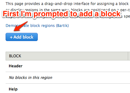
This issue is part of #1875252: [META] Make the block plugin UI shippable. One of the most confusing aspects of the "interim" blocks user interface is that the UI does a poor job of explaining the workflow to users when they want to place additional blocks in their themes. This is the workflow currently:
First screen
Second screen
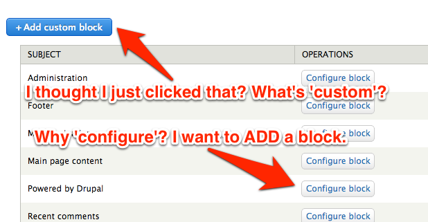
Two things are confusing:
- I clicked "Add block," and then I'm faced with two different kinds of block-adding tasks: placing a new instance of an existing block, or creating a new custom block and then additionally placing an instance of it.
- I am clicking the action "Add" and then being given the option to "configure" what look to be existing things, which doesn't make sense. In fact, there's also a bunch of configure buttons next to blocks on that first screen where I first selected "Add block"--it almost seems like I'm stuck in a loop.
Proposed resolution
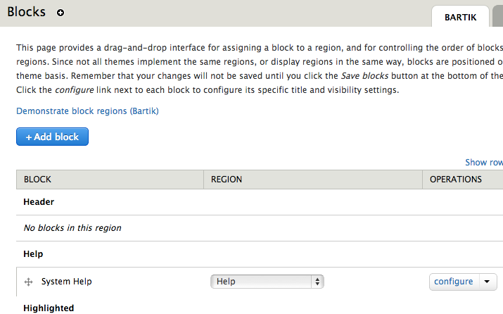
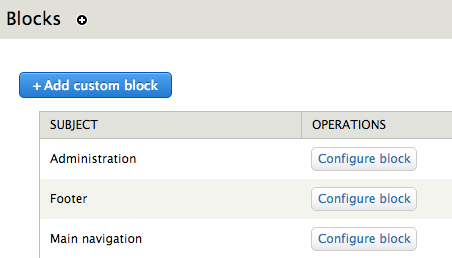
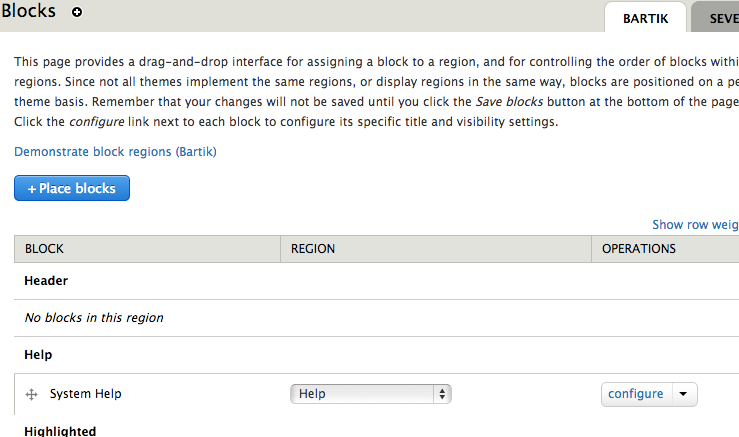
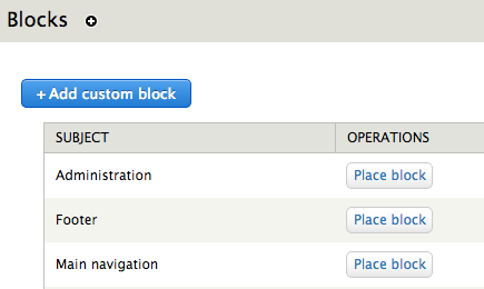
Change the button text to describe the ACTUAL action we're taking: placing blocks. Both Bojhan and Kevin O'Leary seem to agree this would be a better button label.
- The "Add block" button on
admin/structure/blockis re-labeled "Place blocks." - The "Configure block" buttons on
admin/structure/block/list/block_plugin_ui%3Aythemename/addare re-labeled "Place block."
Remaining tasks
- @klonos suggests removing the
+icon in #4. @xjm still feels it makes sense since we are placing an additional block (added onto the ones already listed). Decide.
User interface changes
Before patch: screen 1
Before patch: screen 2
After patch: screen 1
After patch: screen 2
Related Issues
| Comment | File | Size | Author |
|---|---|---|---|
| #6 | block-1950700-6.patch | 1.96 KB | xjm |
| #6 | interdiff-0.txt | 1.06 KB | xjm |
| place-block.patch | 918 bytes | xjm | |
| after_screen_2.png | 17.98 KB | xjm | |
| after_screen_1.png | 57.85 KB | xjm | |










Comments
Comment #1
xjmComment #3
klonos...coming from #1875780: "Configure block" button text in the Block Library is confusing that was just closed as a duplicate of this one here.
Comment #4
klonosThe "+" sign in from of the now renamed "Place blocks" button doesn't make sense in this new design. It should be removed.
Comment #5
xjmI think it still makes sense. It's also part of an existing pattern, not something special for this interface.
Comment #6
xjmI'll add the feedback from #4 to the summary. Attached updates the one test that relied on these link texts.
Comment #6.0
xjm.
Comment #7
klonosThanx ;)
Comment #8
YesCT CreditAttribution: YesCT commented#1956346: 'Configure block' dropbutton link should say 'Add block' or 'Place block' for block library listings marked a duplicate of this one.
Comment #9
xjm#6: block-1950700-6.patch queued for re-testing.
Comment #10
Bojhan CreditAttribution: Bojhan commentedI think this is a go, the only reservation I have is that we generally don't use action buttons to go to another listing page. This might end up confusing, but given that it is such a tiny change we can easily test it and adapt afterwards.
Comment #11
xjmRelated: #1956134: Provide helpful editing links on "admin/structure/block" for deriver blocks (menu, views, block content, etc.)
Comment #12
xjmSorry, xpost. Thanks @Bojhan.
Comment #13
webchickYeah, I agree that this is totally confusing right now. This helps push it along a little towards sanity.
Committed and pushed to 8.x. Thanks!
Comment #14.0
(not verified) CreditAttribution: commentedUpdated issue summary.