
Splitting of #1760658: Come up with a formatter for file fields
1. Testbot info on files in the table on issue node
Latest code output:

2. Testbot info on files in comments
Latest code output:

Latest mockup (for comparison):

- we show testbot info on a separate row
- we show it for all files
- later when there are more plugins/environments we'll think how to improve this layout with optionally hiding part of the info
| Comment | File | Size | Author |
|---|---|---|---|
| #21 | 1979574-21.patch | 775 bytes | jthorson |
| #17 | nodechanges-add_css_class_to_status_td.patch | 824 bytes | jthorson |
| #14 | nodechanges_no-jumplink-for-original-files.patch | 1.2 KB | jthorson |
| #13 | nodechanges_change-comment-title.patch | 481 bytes | jthorson |
| #10 | file_table.png | 38.26 KB | jthorson |


Comments
Comment #1
klonos...just a minor note on the mockup in the issue summary: the newly added files should go under the old/hidden in order to be in tandem with how new comments are added under old comments.
Comment #2
dww- The rowspan on the status field seems like a good thing to group the results with the file. This is easy to implement now. See #1760658-34: Come up with a formatter for file fields (patch | screenshot).
- Also at #1760658 there was talk of merging the D6 "Status" and "Results" columns into a single "test results" column with these choices: "Ignored, Queued, Running, Failed, Passed". There was also talk of "Failed to apply" as an important case to distinguish. Perhaps this could be a 4th column in the rows for every file, and this second line with result summaries only appears below files that have results. That also makes it easier to handle the "re-queued" case, since the "Test results" in the first row can say that, while the 2nd row continues to show the summaries from the last time the tests ran.
- I was also arguing that once we have the basic "Test results" column, I'm not sure everyone cares or needs to see this second row at all. I proposed a few solutions:
A)
Always visible in the (narrow) "Test results" column in the files table(s)(separate row is clearly better than this)B) Only in a mouse-over of some kind
C) In a hidden div that are revealed via a JS toggle (like "show table weights" via tabledrag)
D) Only on the separate page that "view details" links to - aka ignore it entirely in this UI
E) In the JSON representation of the issue node so dreditor can do something slick with it ;)
F) other?
We don't want to over-complicate this, so if we just have the 2nd row with the result summaries for every file with results, that's okay. But, I still think keeping this mostly hidden by default would be a win, since my guess is only a small minority of people actually care about any of these details.
Cheers,
-Derek
Comment #3
jthorson CreditAttribution: jthorson commentedBased on the output on my dev site, I'm really struggling with the rowspan; as it doesn't mesh well with table striping.
Compare
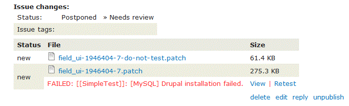
versus
The effect is worse within a long list of files ... the test results cell striping blends in with the cell below it, instead of the file it's associated with.
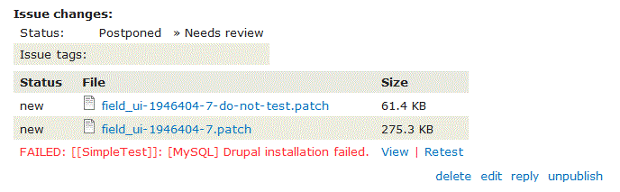
Comment #4
jthorson CreditAttribution: jthorson commentedA higher quality example ...
Comment #5
jthorson CreditAttribution: jthorson commentedInitial nodechanges integration pushed to PIFT: http://drupalcode.org/project/project_issue_file_test.git/commit/3cf898e...
Comment #6
jthorson CreditAttribution: jthorson commentedI've created an alpha release of PIFT which can be rolled over to git7staging ... once it's there, the comment view of files should 'just work'. The current implementation places an empty cell under 'new' to indent the status message under the filename, which just looked better aesthetically.
The display of test status in the file table at the top of the issue needs configuration, and leverages the existing 'extra columns' approach native to extended_file_field ... we can look at adjusting this to add rows instead either before or after launch.
I'd recommend adding a 'width: 100%' or similar to the file table in comments, to avoid variable-width tables based on length of file name or test summary ... the result is a little cleaner.
Comment #7
jthorson CreditAttribution: jthorson commentedI've pushed the initial 'display PIFT results as rows' fix to PIFT 7.x-2.x:
http://drupalcode.org/project/project_issue_file_test.git/commit/799afd7...
I'll attempt to merge this into bzr so that it appears on git7site after the next rebuild.
Comment #8
jthorson CreditAttribution: jthorson commentedExtended file field display seems to be working, as illustrated at http://pift-drupal_7.redesign.devdrupal.org/node/2012142. However, it looks like I'm missing about 95% of test results in the pift_data table after my last rebuild of that site ... will need to do some additional troubleshooting to discover why; and want to confirm whether the same issue is seen on git7site once the login troubles have been resolved.
Comment #9
jthorson CreditAttribution: jthorson commentedIssue in #8 opened as #2019941: After D7 migration, PIFT_DATA does not contain any test results for files originally attached to comments.
Once that's sorted, then the basic display functionality shouldn't require much more than some CSS tweaking. I'm guessing around 2hr for the discussion regarding what tweaks are required, and the associated tweaking/testing/fixing table striping/etc.
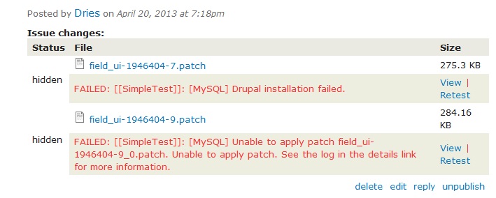
Comment #10
jthorson CreditAttribution: jthorson commentedCommitted to PIFT 7.x-2.x (commit link). Also includes fixed table striping and grouping by comment ID.
Some screenshots from my dev site:
File Table:

Nodechanges output:

Comment #10.0
jthorson CreditAttribution: jthorson commentedUpdated issue summary.
Comment #11
tvn CreditAttribution: tvn commentedI took a look at the git7site today. Some questions:
Can we remove [MySQL] and []: around SimpleTest? To have messages like:
If there is no comment id - can we show nothing instead of 'none' link?
I think file icons and background for even rows should be removed as well.
View link and author names in one column do not look good in the main files table on issue. Maybe we should try moving 'View' link somewhere e.g. put it right after the message:
PASSED: [SimpleTest] 56,774 pass(es) (view).
Table of file changes on comments - 'Status' column should have right border all the time. Currently on rows with no test results there is no right border.
Comment #12
drummThe brackets look like they come from the qa server, changing those is out of scope for this issue and not a priority. It is a good idea.
Agreed.
I think the background coloring is good. Here is an example with a lot of files: http://git7site.devdrupal.org/node/1978958
I could go either way on the file icons. They do switch for images: http://git7site.devdrupal.org/node/1741498
I'm okay either way. If we do change things, I'd consider making the "PASSED..." text the link, and having retest inline. There is a chance going that far could make the view link non-obvious, we'd want to keep the green/red coloring instead of making it blue.
Sure, as long as the change is easy.
Additionally, can we shorten the main table headers?
Comment #13
jthorson CreditAttribution: jthorson commentedThe "Comment" title change needs to go in nodechanges, which I don't currently have commit access to. I'll work on the rest.
Comment #14
jthorson CreditAttribution: jthorson commentedThe comment jumplinks come from nodechanges as well ... this patch removes the jumplinks for files attached to the original issue. (Does not include the previous patch, and not actually tested; but should work as long as we don't perform any 'empty' checks on the jumplink return value.)
Comment #15
drummCommitted #13 and #14.
That leaves:
Which can be seen at http://git7site.devdrupal.org/comment/7032118#comment-7032118.
And maybe reformatting the PASSED row.
Neither is a launch blocker, but might as well fix them up if easy to do.
Comment #16
jthorson CreditAttribution: jthorson commentedFile-related column titles have been shortened in the latest commit to extended_file_field ... I'll merge into bzr once I investigate the remaining items from 11 & 12 (I suspect I'll need to add some css classes to the table cells being output as well).
Comment #17
jthorson CreditAttribution: jthorson commentedCSS class needed to be added to nodechanges. Patch below. I've updated the PIFT css file to actually add the border on the 'status' lines.
PIFT has also been updated to show the "View | Retest" operations inline with the test information for both the extended file field table and the nodechanges results.
I think this should cover off #11 and #12.
Comment #18
jthorson CreditAttribution: jthorson commentedComment #19
drummAlmost there. I think the main table is good. The per-comment table is missing a rowspan on some 'new' cells, http://git7site.devdrupal.org/comment/7036498#comment-7036498.
Comment #20
jthorson CreditAttribution: jthorson commentedK ... I think the latest BZR merge of PIFT should take care of the missing rowspan.
Comment #21
jthorson CreditAttribution: jthorson commentedOoops! Stupid mistake in the nodechanges patch.
Comment #22
drummCommitted & merged. I think this is done now?
Comment #23
tvn CreditAttribution: tvn commentedLooks good enough!
Comment #24.0
(not verified) CreditAttribution: commentedUpdated issue summary.
Comment #25
apadernoI am removing issue tags used from one to four issues. I apologize for bumping the issue.