insert inline images using wysiwyg and ckeditor
The Picture module allows you to use picture groups created with inline image inserted in body field with WYSIWYG or CKEditor modules.
Configuration
Picture settings
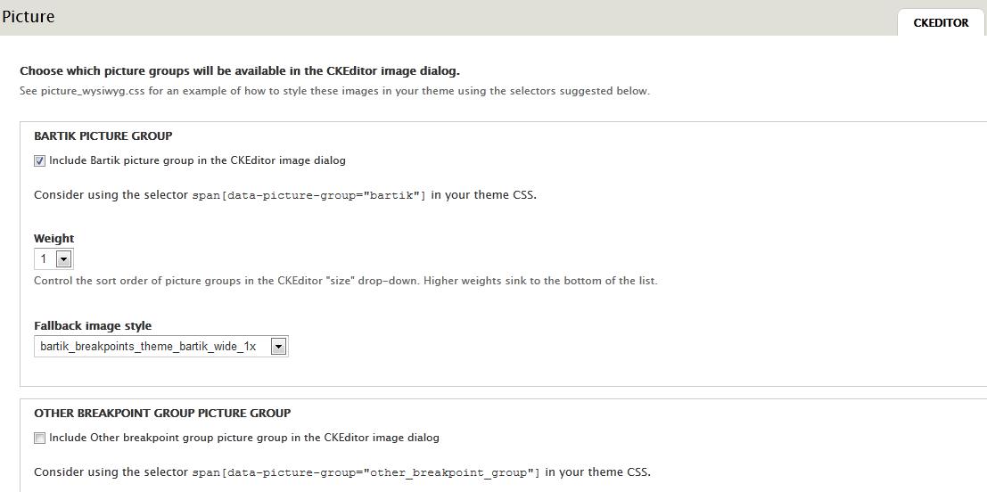
Navigate to Picture settings (admin/config/media/picture/ckeditor) and enable the picture groups which will be available in the ckeditor (the library) image dialog box.
You can set for each group his weight (in the select list) and the fallback image style
Filter Text format
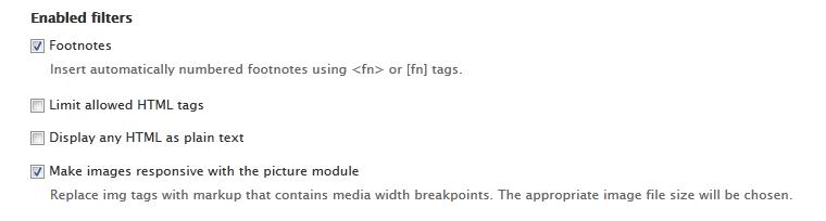
Navigate to the text format (admin/config/content/formats/full_html for the Full HTML Format) on which you want use picture module and enable the filter Make images responsive with the picture module.
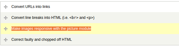
You have to move Make images responsive with the picture module below Convert line breaks into HTML (i.e. <br> and <p>) if it is enabled, otherwise you'll get empty lines above and the pictures won't be responsive.
Plugin WYSIWYG
Navigate to the WYSIWYG profiles (admin/config/content/wysiwyg/profile/full_html/edit) and enable the plugin Responsive images with the picture module.

And insert an image
You can now insert an image with the image dialog box (you can browse for images on the server only if you have IMCE installed).


Select the image alignment and choose the picture group you enable in the first step.
You can set the alt and title attributes.
Inline picture element styling
You can style a rendered inline picture element by using picture-specific attributes and their values. These two attributes are data-picture-group and data-picture-align.
The HTML generated by the Picture module is contained within a span tag:
<span data-picture-align="left" data-picture-group="bartik" data-alt="alt text here" data-picture="">
<!-- Picture module does its magic here -->
</span>
Styles can be applied to img tags within this span tag using attribute values for the data-picture-group and data-picture-align attributes.
An example is provided below:
/* Theme CSS */
/* Picture element styles */

span[data-picture-align="left"] img {
    margin-right: 20px;
    float: left;
}

span[data-picture-group="bartik"] img {
    max-width: 33%;
    height: auto;
}
These styles can be nested within @media queries, as well.
An example is provided below:
@media all and (min-width: 0em) {
    span[data-picture-group="bartik"] img {
        max-width: 100%;
        height: auto;
    }
}

@media all and (min-width: 20em) {
    span[data-picture-group="bartik"] img {
        max-width: 33%;
        height: auto;
    }
}
Custom css file for the WYSIWYG
The image inserted in the body field is displayed with original size in the node edit form. You can set a custom css in the WYSIWYG settings in order to better control the display of the picture in this form.

For example you can use some rules as
/* File editor.css */
/* Picture rules for node edit form */

img[data-picture-align="left"]  {
  margin-right: 20px;
  float: left;
}

img[data-picture-group="bartik"]  {
  max-width: 33%;
}
Help improve this page
You can:
- Log in, click Edit, and edit this page
- Log in, click Discuss, update the Page status value, and suggest an improvement
- Log in and create a Documentation issue with your suggestion
