
D.o procid experiment
This issue would be a good case study to evaluate procid #2154143: Evaluating Procid, a tool to help the drupal community improve the consensus building process for d.o issues
You do not have to use procid to work on this issue, but if you want to, your feedback would be very helpful.
----
Follow up for: #1399846: Make unused file 'cleanup' configurable
Problem/Motivation
The automatic file clean-up functionality in Drupal core is a destructive feature that automatically, and without warning, permanently removes file content that meets a specific criteria. That criteria is when the file usage for individual files reaches zero (0).
Since since is a rather unique, maybe even the only, behaviour of Drupal core it is important that users fully understand this concept so they can make an informed decision about its configuration.
The current implementation UI is not making this stand out and this there is chance/risk users will miss it. At least until they start to wonder why files are disappearing from their site.
Proposed resolution
Mockup proposal for new UI that also will improve the UX for users:
This will both separate the file clean-up configuration and make it stand out much better against the other configurations on this page.
The proposed options for the drop-down are:
- Disabled
- After 3 hours
- After 12 hours
- After 1 day
- After 1 week
- After 4 weeks
- After 3 months
Remaining tasks
- Finalize the texts
- Finalize the names of the drop-down options
- Create the d.o page for more detailed information
- Write the patch
User interface changes
See mockup above
API changes
None
| Comment | File | Size | Author |
|---|---|---|---|
| #10 | Orphaned Files UI v3.png | 47.92 KB | tsvenson |
| #9 | Orphaned Files UI v2.png | 49.76 KB | tsvenson |
| #9 | Orphaned Files UI Expanded.png | 73 KB | tsvenson |
| Orphaned Files UI.png | 49.13 KB | tsvenson |


Comments
Comment #1
tkoleary CreditAttribution: tkoleary commented@tsvenson
I like this. My only comment would be to have "Manage Orphaned files" collapsed on load.
Comment #2
tsvenson CreditAttribution: tsvenson commentedThanks @tkoleary, glad you liked it.
I actually designed it not collapsible on purpose. Since this configuration, when enabled, will permanently delete content it would be easy to miss if it was "hidden" on page load.
Comment #3
tkoleary CreditAttribution: tkoleary commented@tsvenson
Good point, but I think it could be even simpler and clearer:
Automatically delete orphaned files?
☑ off ☐ on
Files are "Orphaned" when they are not currently used in any content. Setting to "off" will retain orphaned files for future use.
Warning: Setting to "on" will delete orphaned files!
Then also remove the fieldset and "manage..." label.
Also I would change "Temporary directory" to "Temporary file location". And why does the download method have a radio button for one option?
Comment #4
tsvenson CreditAttribution: tsvenson commented@tkoleary:
With just on/off option you leave no room for sites that want to allow time for reusing orphaned files. That's what the options in the drop-down is there for, allowing between 3h to 3 months from the time a file becomes orphaned and when it will be deleted. Unless they are reused and thus not orphaned any longer.
The stuff above the "Manage orphaned files" box is part of the file-system config page. I just included them for illustration purposes. While I agree about the single radio button, you will need to file a separate issue for that. Using directory is OK there as it is a system path.
Comment #5
tsvenson CreditAttribution: tsvenson commentedActually, realizing after my last comment, that it needs to be explained in the text that current orphaned files that is reused, will no longer be marked as orphaned.
Need to mull over that a bit, expect a new mockup shortly. Unless someone else has a good suggestion in the meantime.
Comment #6
tkoleary CreditAttribution: tkoleary commented@tsvenson
I see. That makes sense. I think that we can attach all of that functionality to the "on" state though. So exactly what I suggested above but when the user checks "on", only then do they see the select list for configuring when things get deleted.
In the "off" state, nothing gets deleted ever.
Comment #7
tsvenson CreditAttribution: tsvenson commented@tkoleary
Ahh, now I get you. Okido, I will make a couple of mockups for that too, one for disabled and one for enabled. With some luck I get time to do that later tonight.
Comment #8
tkoleary CreditAttribution: tkoleary commented@tkoleary
Awesome! I'm glad were finally fixing this. It's going to really help Media in D8.
Comment #9
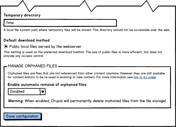
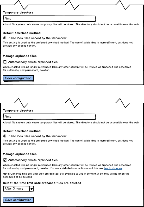
tsvenson CreditAttribution: tsvenson commentedHere are the new mockups I've been working on.
This one is an improved design over the original. I have made the text better. The Warning is also removed and replaced with an informative Note above the drop-down.
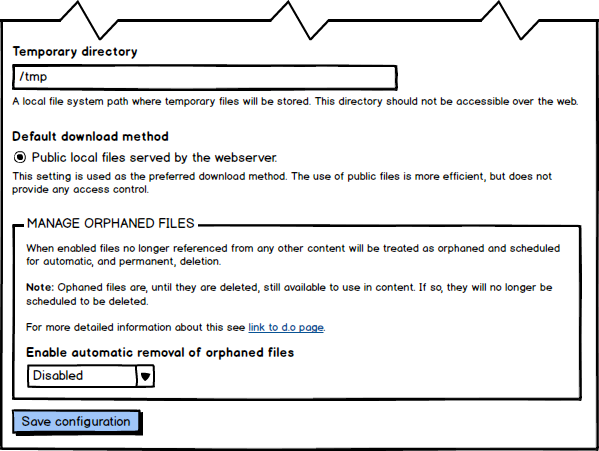
As per request by @tkoleary I also designed a version without the fieldgroup.
The top is showing when the feature is disabled and the bottom when enabled.
My personal opinion here is that without the fieldgroup frame this destructive setting isn't visible enough for users. It kinda risk being mixed mingled in with the other options on the page.
I believe it is important that there is a clear differentiation between this delete feature and the other settings here. They are of different nature and the fieldgroup helps visualize that for the users.
Comment #10
tsvenson CreditAttribution: tsvenson commented[Sorry for the spamming...]
It didn't look good having the link to the d.o page on a single line. It looked misplaced after the Note text so I moved it to the end of the first paragraph:
As bonus it saves some pixels in height and thus less need for unwanted scrolling ;)
Comment #11
tsvenson CreditAttribution: tsvenson commentedAdding "usability" tag to alert some people....
Comment #12
klonosThe sentence "When enabled files no longer referenced from any other content..." needs a comma like so: "When enabled, files no longer referenced from any other content...". Better yet, it could be "When this option is enabled, files no longer referenced from any other content..."
Comment #13
tsvenson CreditAttribution: tsvenson commented@klonos
Thanks for you feedback. Yes a comma, or improved text, is needed as you say. Have been struggling a bit to get that paragraph good.
Will test a few things and then make a new mockup.
Comment #14
tkoleary CreditAttribution: tkoleary commentedThe second two mockups in #8 look great to me
Comment #15
tsvenson CreditAttribution: tsvenson commented@tkoleary
I take it you referencing #9 and not #8?
If so, thanks for liking the design. Would be great if you could elaborate a bit on your view of the pro's and con's of the two design proposals.
@klonos
I have been mulling over the text and believe your second suggestion:
is the one to go with.
Would be great if others could chime in here. English isn't my native lingo so I would prefer feedback from others more qualified. Especially as this is a core change.
Comment #16
tsvenson CreditAttribution: tsvenson commented@tkoleary
Do you know if there is any UI design standard for Drupal when it comes to configuration options that reveal more options when enabled?
A fieldgroup is in itself indicating there will be more info/options when expanded, however the second mockup in #9 has no such info or visual clue for the user.
Great if you could point me to any more info about this if you know of any.
Comment #17
tkoleary CreditAttribution: tkoleary commentedA checkbox that expands a field exists for add revisions in node/add. That's similar if less complex.
Comment #19
tkoleary CreditAttribution: tkoleary commentedTagging Spark since we pushed for this
Comment #20
tsvenson CreditAttribution: tsvenson commented@tkoleary. I'll have a look at that.
Also, as per https://drupal.org/node/1399846#comment-7721311 I am working on a complete redesign, clean-up and simplifying, of the file system configuration page. Have just been swamped with other stuff last week or so. Hope to have that ready before the weekend.
However, as it expands the scope a bit I am thinking of first post the mockups in the g.d.o/usability group. Would be good to have a few more usability/UX people having a look at it I think.
Comment #20.0
tsvenson CreditAttribution: tsvenson commentedFixed typo in options list.
Comment #21
YesCT CreditAttribution: YesCT commentedComment #22
Dave Reid