
The UX team decided it would make more sense to have the block placement sidebar to the left of the block layout listing.
When the window is at small sizes, the block placements sidebar will continue to fall below the block layout.
| Comment | File | Size | Author |
|---|---|---|---|
| #13 | move_the_block-2078601-13.patch | 1.87 KB | alansaviolobo |
| #12 | drupal-move-the-block-placement-browser-to-left-of-table-and-collapse-it-2078601-11.patch | 1.93 KB | InternetDevels |


Comments
Comment #1
tim.plunkettThe first mistake I made in the original issue (#2058321: Move the 'place block' UI into the block listing) was to use "left" and "right". This issue highlights the stupidity of that decision :)
So the first thing I've done here is rename them "primary" and "secondary".
Locally I did this in several patches, and I've attached one rolled with format-patch to make it easy to see the discrete steps.
Comment #2
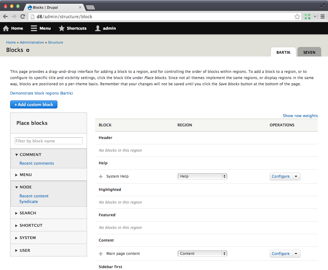
tim.plunkettScreenshot of it on the left.

Two things that pre-existed but are now more obvious:
The weird gap caused by "Show row weights"
There are three greys used: The two by the block placement details element (coming primarily from the node form, see https://drupal.org/node/2061863) and the one for the block layout listing header.
Comment #3
Bojhan CreditAttribution: Bojhan commentedI don't think this was a UX team decision at all, as far as I know mostly Kevin liked it this way. I am definitely not for doing this and I don't know if yoroy is. The case that was made is that the sidebar is for "secondary" content and can thus be overlooked. I think there are at least 3 points, on which this UI change could cause issues:
1) As we add more and more usefull stuff like facets in the sidebar. The strategy of "people might ignore it", becomes rather silly. Because people ignore it, because we don't put critical functionality there, once we do - people learn that its there. Its not like the Views UI, where you have a cockpit of elements - the sidebar is highly noticeable.
2) Grouping occurs when its put on the left. The vertical menu, conflicts with the sidebar making it look like a group of links (even though there is a visual divider, the spacing, items, etc. all look similar). Given that vertical listings that look similar are so close to each other, it will likely make it harder to scan down the list.
3) This also sets a precedent that people can just decide where they want their sidebar, on the left or right. If we do this it really needs a bunch of rules, because we don't want the UX to become so random, once contrib starts using this pattern.
Comment #4
tim.plunkettAfter working on #2079037: Use two columns for the place block form and studying the approach used in node form more, I realized that polluting the form with all of this knowledge of primary/secondary left/right is wrong.
With a template file, I can just target what we want to move, and leave the form structure as it was before #2058321: Move the 'place block' UI into the block listing went in.
As this changes all of the structure of the block listing (back to how it was), it blocks #2078951: Highlight the row of block that was just placed and #2079037: Use two columns for the place block form.
No visual changes are made here.
Comment #5
tim.plunkettBecause this doesn't have consensus, I've moved the form restructuring to #2079761: Use a template for the block listing page to simplify the form, and am demoting this back to a normal task.
Here are the changes, assuming that issue goes in as is.
Leaving at NW because it will fail otherwise.
Comment #6
tim.plunkettOkay, that went in.
Comment #7
tim.plunkettRerolled for recent commits. No changes. The screenshot in #2 is still accurate.
Comment #8
tim.plunkettUnassigning from myself, the patch still applies.
Comment #9
Bojhan CreditAttribution: Bojhan commentedNothing to review I think, it was reviewed in #3. And those comments need to be addressed.
Comment #10
benjy CreditAttribution: benjy commentedPatch no longer applies and it seems we need to have more of a discussion about this issue anyway so setting back to NW.
Personally I preferred it on the left however it's been growing on me over on the right, so i'm happy for someone else to decide where it ends up.
Comment #11
klonosComment #12
InternetDevels CreditAttribution: InternetDevels commentedMaybe something like this?
Comment #13
alansaviolobo CreditAttribution: alansaviolobo commentedreroll
Comment #14
webchickTagging. The lack of visibility of the right sidebar definitely came up in recent usability testing.
Comment #15
legolasboThis issue is currently being addressed in #2512456: Implement the new block layout design to emphasize the primary interaction of placing a block by moving the sidebar to a separate page. #2513528: Add a link to add a block in empty regions on the Block layout page. will add links to each region to make adding blocks to a specific region easier.
I think moving the sidebar to the left of the page is not the way to go given the efforts in the issues above and will therefor close the issue. Please reopen the issue if you think it is still relevant.
Comment #16
MattA CreditAttribution: MattA commented