
The colour contrast on this theme looks very nice for normally sighted viewers, but fails W3C accessibility guidelines: the contrast is insufficient.
| Comment | File | Size | Author |
|---|---|---|---|
| #9 | accessability-test.png | 263.11 KB | mheinke |
| #9 | accessability-2.patch | 1.91 KB | mheinke |


Comments
Comment #1
mheinke CreditAttribution: mheinke commentedcan you link to the standards, and can you provide patches or guidance?
thanks!
Comment #2
mgiffordThe handbook is good:
https://drupal.org/node/464500
I also put up some suggestions for D8 #2125621: Contrast between title/slogan and header is too low
Comment #3
mheinke CreditAttribution: mheinke commentedi may role in a seperate stylesheet and admin setting that allows you to use a "low contrast" version for accesibility.
Comment #4
mgiffordSome interesting examples about contrast switching here https://drupal.org/project/pagestyle
But generally it's a good idea to have your theme follow the contrast guidelines. It helps low vision folks, but also really helps folks who are trying to use their site on the back deck on a sunny day.
The use of mobile devices especially makes contrast a more important issue for everyone.
Comment #5
mheinke CreditAttribution: mheinke commentedI guess im still not quite understanding the issue.
this theme by default shows black text on a white background for body.
are you talking about the background and the wrapper which are both sort of the same grey?
here is a production site that im currently running that uses this theme (with minor adjustments to the color scheme) is that better? http://www.mainstreamenergy.com/
Comment #6
mgiffordI'm just chiming in with more info about color contrast and accessibility.
White on black should be just fine. Lots of variations.
But looking at that site with this plugin indicates there are definitely problems with color contrast:
https://addons.mozilla.org/en-us/firefox/addon/wcag-contrast-checker/
Comment #7
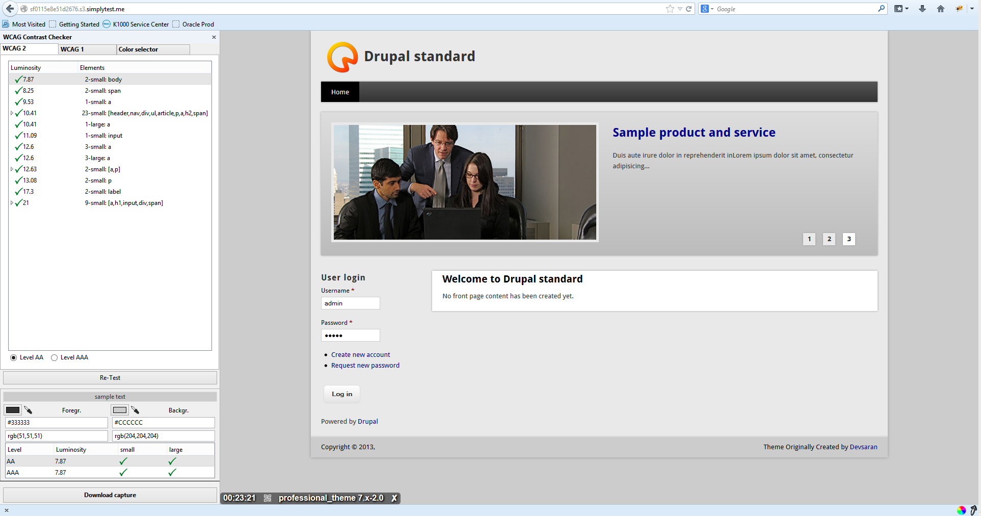
mheinke CreditAttribution: mheinke commentedthe text changes it suggests are all good. im going to put a patch in here which will take care of all of the WCAG2 (level AAA) issues with text.
Comment #8
mheinke CreditAttribution: mheinke commentedfirst attempt at a patch
Comment #9
mheinke CreditAttribution: mheinke commentedsecond attempt at a patch. fixes all of the text issues.
Comment #10
mheinke CreditAttribution: mheinke commentedComment #11
Leeteq CreditAttribution: Leeteq commentedComment #12
mheinke CreditAttribution: mheinke commented@leeteq,
thanks for changing the title of the issue
Comment #13
mheinke CreditAttribution: mheinke commentedthe latest release is much more accessible according to the widgt above. please test and confirm (version 2.01)
Comment #14
mgiffordI looked at it and the color contrast is great, thanks!
I'll add another issue though about the carousel.
Great job though, thanks!
Comment #15
mheinke CreditAttribution: mheinke commentedlook forward to the second issue!
thanks!
Comment #16
mgiffordI think that was #2157985: Slider controls require mouse to operate