
Follow-up from #1490402: Redesign tabs and the content header.
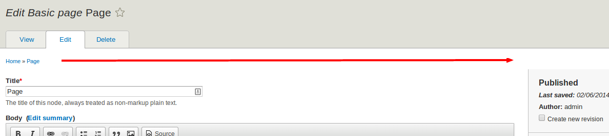
The placement of the breadcrumbs shifts the sidebar down so it is no longer flush with the top of the main content area.
| Comment | File | Size | Author |
|---|---|---|---|
| #20 | screenshot-sidebar-after.png | 75.29 KB | RainbowArray |
| #20 | screenshot-sidebar-before.png | 75.08 KB | RainbowArray |
| #19 | 2195675-breadcrumbs-push-sidebar-19.patch | 1.93 KB | philipz |
| #15 | 2195675-breadcrumbs-push-sidebar-down-before-after.png | 79.43 KB | philipz |
| #10 | sidebar-border-top-2195675-10.patch | 352 bytes | RainbowArray |


Comments
Comment #1
LewisNymanI'm sure there are way to get around this in CSS. Silly question first: Do we need breadcrumbs on these pages? We already have navigation to the homepage and back to the node itself in the toolbar and tabs.
Comment #2
amateescu CreditAttribution: amateescu commentedThe toolbar navigation to the homepage doesn't work in all cases. See #2154911: Lost the Home button when on Admin pages (especially comment #2).
Comment #3
philipz CreditAttribution: philipz commentedThis seemed an easy fix at first but it might not be so. Moreover it might need some unnecessary css "hacks" to force it look good.
I think that it would be best to just add a border on top of sidebar and let the breadcrumb push it down as it does now.
While at it I would throw out the equal height of sidebar. I'm not sure why this was decided so and maybe for a good reason but I don't understand why was it so important to make it equal height at cost of css hack.
Comment #4
LewisNymanI don't know the design of the content creation screen is a implementation PITA but it does look better when the sidebar takes up the entire height. The spacing problem also occurs when you have messages appear on the page. I'm not sure there's any way to do this nicely but at this stage I'd rather do something dirty like a negative margin than change the design.
Comment #5
longwaveIf there are secondary tabs on the content edit page, they will also push the sidebar down.
Comment #6
RainbowArrayThe reason this is happening is because of the way the HTML is structured: it's structured sensibly, but makes it difficult to fix this problem.
Within div#page, we have three sub-elements:
The entirety of the page creation form is within main#content, nested a couple levels down in div.region then dev#block-seven-content and finally div.content.
Inside of div.content is the form element that's used for page creation. The form has a nested div, which seems rather useless, and then div.layout-node-form nested inside of that with the following:
layout-region-node-main and layout-region-node-footer are floated to the left at larger viewports, which leaves layout-region-node-secondary on the side. layout-region-node-secondary stretches the entire height through large negative margins and and large paddings.
The point is that layout-region-node-secondary can have an equal height design, but the equal height it's match is layout-region-node-main plus layout-region-node-footer. It can fill the entire height div.layout-node-form, but that's it.
Since all of this is nested within main#content and nav.breadcrumb and div.tabs-secondary come before that, layout-region-node-secondary will never stretch to the top of div#page that contains the breadcrumbs and secondary tabs.
There might be some rather crazy ways to try to get the top of the sidebar to match up with the top of div#page.
You could set the sidebar to use absolute positioning, but if you do that, equal heights columns are straight out.
You could set absolute positioning on the breadcrumbs and secondary tabs, but that's going to get really awkward because you don't know how long those lines might be, and thus you can't know how far to push down the rest of the content.
If you nested breadcrumbs and secondary tabs inside of layout-region-node-main, then you'd be good to go.
Honestly that's the best way to probably achieve that design. Since every Seven page wouldn't have this HTML structure and a sidebar issue, then you'd probably need an override of page.html.twig for the kind of pages that would have this type of layout.
That might be awkward and annoying, but realistically, those are your options.
The alternative is to change the design and put borders on the top of the sidebar. That might look awkward too.
Custom page.html.twig is probably the way to go.
Comment #7
RainbowArrayI took a look at the design of these admin pages again. There already is a bottom border on the secondary options sidebar. The easiest solution here is to just put a top border on it as well. If you want the the height of the sidebar to match the height of the main content options and submit blocks that's fine. The CSS would be simpler without that requirement, but it's ok if it's in there.
I don't know, that just seems like the easiest way to go. Everything else is a giant pain.
Comment #8
larowlanNew Region For Seven? Then Move Breadcrumb Block Out Of Content region
Comment #9
philipz CreditAttribution: philipz commentedThe sidebar in node add/edit page is not really a region. It is all a form in content region. Therefore creating new region for breadcrumb will not solve the problem in this case.
Comment #10
RainbowArrayHere is a patch to add a top border to the node edit sidebar. Not the same as before, no, but it is a fairly simple way to solve the problem.
Other options that could be looked at would be pseudo-elements with the breadcrumbs and secondary tabs or changing the position of the breadcrumbs and the tabs to inside the form on the node edit page.
I'm not sure it's worth doing that just to have the sidebar stretch to the top, particularly since it doesn't stretch to the bottom of the page either.
Comment #11
larowlanFWIW I still think the answer is a new breadcrumbs region, instead of in content region in seven
Comment #12
RainbowArray@larowlan:
A breadcrumb region won't solve this because of the structure of the HTML. You would need the breadcrumbs and tabs to be nested within layout-region-node-main, which is a div inside of a form. So it makes sense for these content editing forms, but not for the rest of seven in general. If you wanted a breadcrumbs-tabs region, you'd need a separate template for these content editing forms so that you could shift the location of the region on those templates.
That's possible, in theory, I just don't know that that level of complication is necessary, when a top border works ok, even if that isn't the original design.
Comment #13
philipz CreditAttribution: philipz commentedThis patch applies cleanly and is simple enough at least for a temporary fix. I'll risk and change it's status here.
Comment #14
tim.plunkettIs that a real fix? We need a screenshot of what it looks like.
Comment #15
philipz CreditAttribution: philipz commentedHere's the screenshot. Fixing it any other way (than moving breadcrumb back to top) would be very hard and could cause more problems.
EDIT: sorry for the tooltip on before screenshot but it's not covering anything important :)
Comment #16
tim.plunkettAh. So this is the same problem I had on admin/structure/block, where the comps had the sidebar flush with the top as node/add used to.
Adding the top border was the same fix.
However, the sidebar was not completely flush right, and so has a border on all 4 sides.
Comment #17
philipz CreditAttribution: philipz commentedThe block layout page sidebar looks a lot better than node add/edit - with the sidebar not flush to the right completely and with border on all 4 sides.
We could make node add/edit form sidebar look the same. Then we would have this issue fixed and everything looking consistent at the same time.
Oh and while at it let's remove the faux equal heights from the node add/edit sidebar as well - the blocks page is not using it :)
Comment #18
tim.plunkett+1
Comment #19
philipz CreditAttribution: philipz commentedHere it is. This patch is only removing styles.
I still have to apply #16 from #2056173: Regression: Two-column layout is broken by vertical toolbar to see two columns correctly.
Comment #20
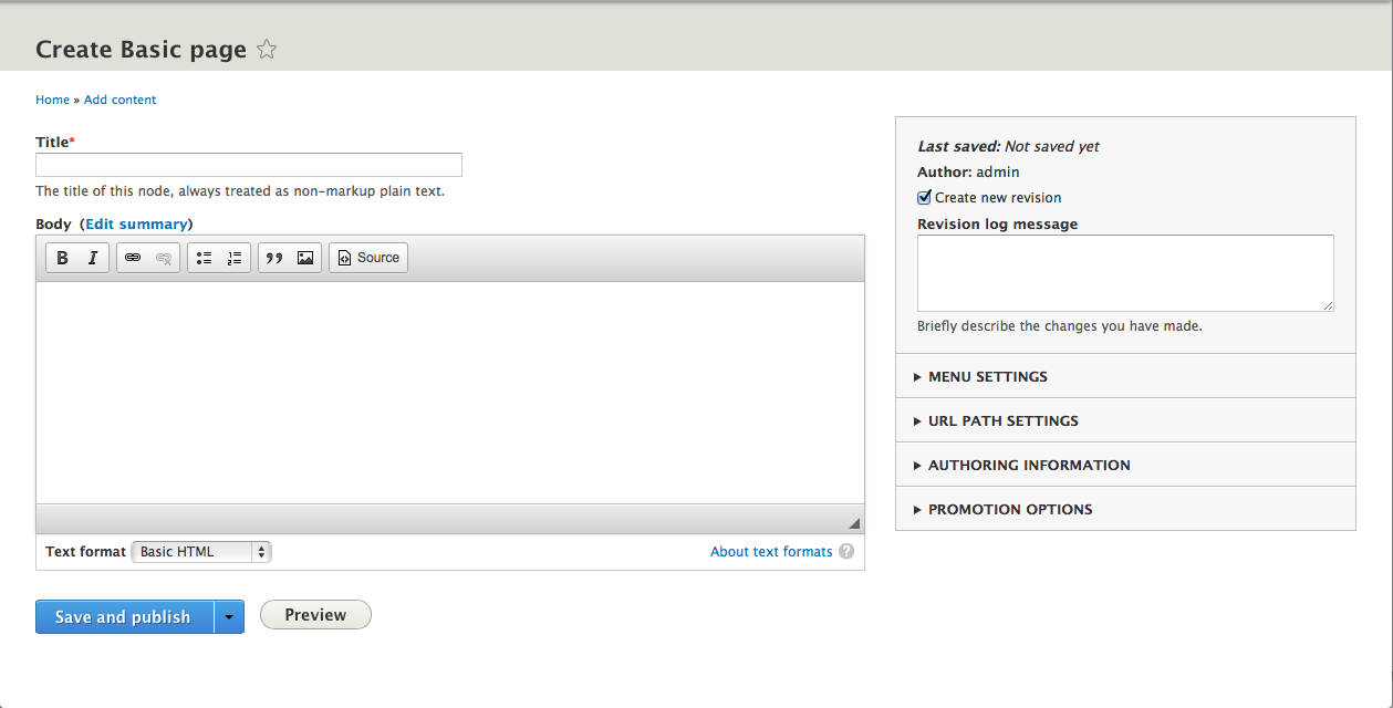
RainbowArrayHere's a before and after shot of how the sidebar looks.
To me, looks nice and neat. I like that there isn't a blank grey spot at the bottom of the sidebar. This looks good to go to me.
Comment #21
webchickMuch better, thanks!
Committed and pushed to 8.x.