 Support for Drupal 7 is ending on 5 January 2025—it’s time to migrate to Drupal 10! Learn about the many benefits of Drupal 10 and find migration tools in our resource center.
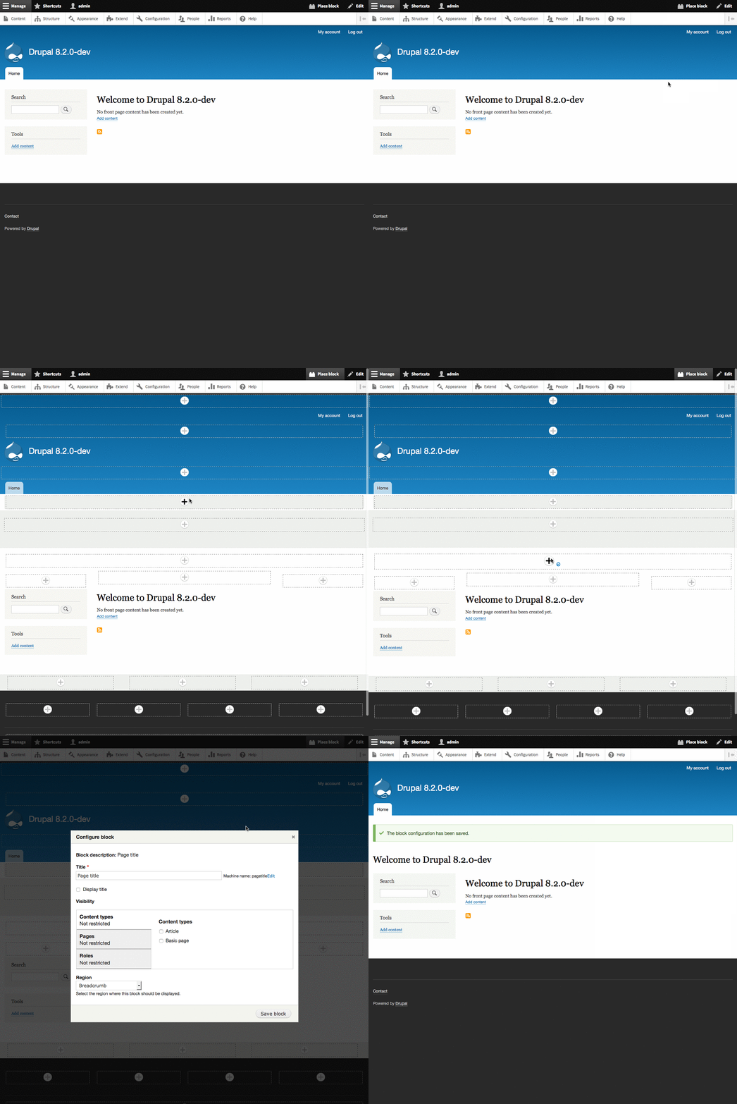
One on-hover option that was explored by @DyanneNova, and supported by user testing, but not adopted in the final patch, was also "embiggening" the plus icons as you hovered over them to create additional visibility:

The UX team was nervous about adopting this pattern as a one-off in one experimental feature. This issue is to discuss whether this pattern makes sense to adopt in more places, and how/where we might do that if so.


Comments
Comment #3
webchickComment #4
webchickComment #5
webchickComment #6
cilefen CreditAttribution: cilefen commentedWe need this at a minimum to have "embiggening" in the commit log.
Comment #7
tkoleary CreditAttribution: tkoleary at Acquia commentedNot opposed to this in principle but if we do go ahead with it it needs to be an affordance that is not unique to this type of link, especially since contextual links are similar and will sometimes appear at the same time as place block links and it would be odd to have the enlarging effect on one and not the other.
My suggestion to unify these things would be:
Comment #8
tkoleary CreditAttribution: tkoleary at Acquia commentedComment #9
tkoleary CreditAttribution: tkoleary at Acquia commentedGiven that this module has been in use as experimental and no issues have been raised about this affordance i'm marking this one 'works as designed'.