
Part of #2847582: Out of The Box initiative.
This issue is about creating the theme that implements the designs shown in #2900720: Designs for the Out of the Box experience intiative
How to contribute?
- Join us in our #out-of-the-box Slack channel. This is where we are meeting to discuss what we are working on and how we want to create the new theme.
- The theme is now being created as a standard Drupal core theme and we are styling the features and content provided by the accompanying umami demo installation profile. This installation profile is being developed in parallel to the theme.
- Tasks for the theme continue to be defined as issues in the GitHub theme repository. Note that previous efforts to produce the theme as a living styleguide have been deferred until support exists in Drupal core for such an approach but we continue to use the styleguide issues (#2881910: Create living styleguide for Umami) as our basis for theme production.
- Designs are attached to the summary of #2900720: Designs for the Out of the Box experience intiative and are also available in InVision.
- A styleguide pdf is being maintained to detail the designs for implementation as a theme and to track the custom assets that must be created for the demo. Find the latest version attached to the style guide issue in #16
- Code contributions should be created as Pull Requests on GitHub.
- There is a Google Drive folder with shared files (documents, assets etc.)
- We are working on creating an alpha version that will be ready for initial review as soon as possible with the goal of including an alpha version of the demo in Drupal 8.5
- If you would like to get involved but need some help getting started then please do ask in the Slack channel


Comments
Comment #2
ckrinaComment #3
webchickTagging it up.
Comment #4
thamasComment #5
yoroy CreditAttribution: yoroy at Roy Scholten commentedPing! What's the current status? How much of the work is done vs. still left to do? Any blockers, help needed?
Comment #6
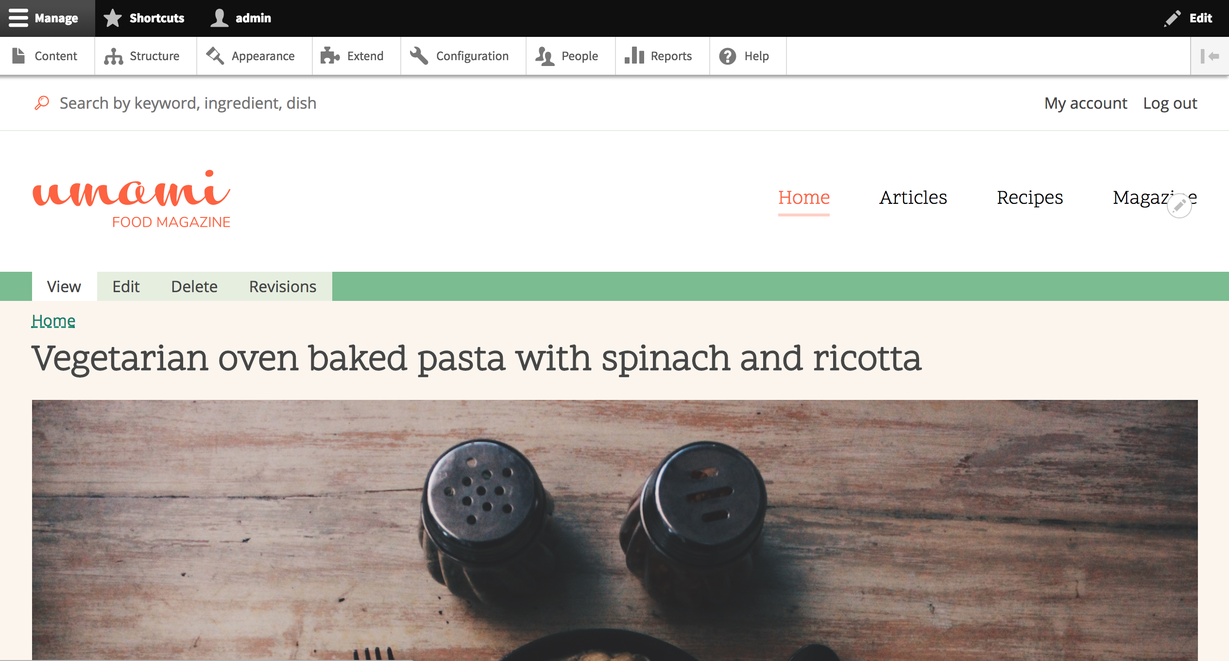
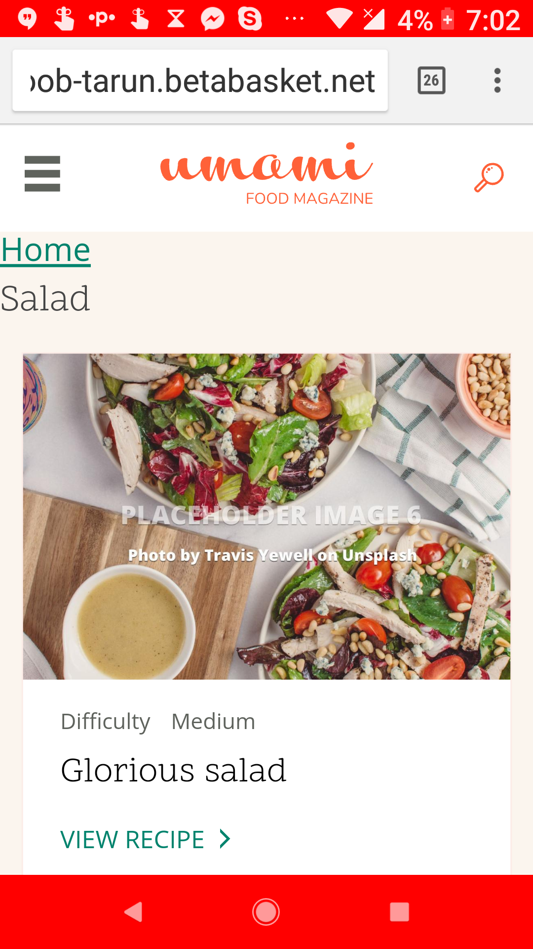
kjay CreditAttribution: kjay commentedI've updated the issue summary a little as we are progressing the theme. See the attached screenshot of a local installation I am currently working on to theme the recipe content type. This is what the theme looks like after the simple process of installing Drupal using the umami demo installation profile, adding a few stub links to the navigation and creating a recipe node.
Header, navigation, search and user menus have basic layout theming in place and a number of other theme issues have been taken care of under our previous process of creating the theme as a living styleguide. This should mean that as those features, such as icons, links, view modes start to get dropped into the installation profile, they will already be partially or fully themed.
Custom icon assets have been created including those shown on the front page and recipe page of the design.
Layouts for the listing grids are well under way.
We were starting to hit blockers with our attempts to implement the theme as a living styleguide, a decision made at DrupalCon in an effort to follow current best practices. In order to accelerate our work, we've switched to producing a standard core theme instead. Though we are doing what we can to set the theme up in a way that should lend itself to adaption at a later stage when core support is available for components.
We are currently focusing our efforts on the recipe content type and recipe listings in order to have one part of the theme that is closer to completion and to demonstrate the theme components that are already in place.
Comment #7
webchickIt might be good to hit the core queue at some point soon with an "in progress" patch of the work so far, both for the profile and the theme. It's a lot easier to review when it's smaller vs. a completed thing.
Comment #8
kjay CreditAttribution: kjay commentedThe Umami theme is progressing well and is working alongside the installation profile which is now installing sample content for us to theme against. I have just given an update for the installation profile work over at https://www.drupal.org/project/ideas/issues/2809635#comment-12345549
Our focus for the theme has been on the recipe listing page and the recipe content type.
Done so far:
Field Layout
We are currently discussing switching to a setup that uses the experimental field_layout module. To achieve the more detailed layout of the recipe content type, the theme currently places each of the fields inside of node--recipe--full.html.twig. The problem with this approach is that fields become locked to their themed positions, even if updates are made in the content type's Manage Display settings. For a demo, this could be confusing for users who begin experimenting with how things are pieced together. And of course it is not flexible.
We have an experimental branch of the theme that uses the field_layout module for the recipe content type and if we are to be using the module instead, it would be better to switch now.
Our code and related issues are in github here: https://github.com/lauriii/umami
A project page has been started here: https://www.drupal.org/project/umami
We are currently establishing a workflow for collaboration between the theme and the profile. Documentation for this has been drafted and we plan to update the initiative's main issue page with these details.
Comment #9
thamas@kjay I think the Field Layout decision have to be based on more factors:
Maybe the third is the hardest point. I think it is easier and quicker to go wit the current solution (and maybe add a note to the recipe content type fields ui in a block about the hardcoded structure) and enhance the profile with field layout in a following phase.
Comment #10
kjay CreditAttribution: kjay commented@thamas. You have summed this up really well. These are the points we need to discuss and we'll need some feedback soon because this was a point raised at DrupalCon Vienna as being quite important by @lauriii and @ckrina because we are working as a core theme.
It will slow us down if we have switch to this and so this is a conversation around what alpha first version looks like perhaps. Especially since any classes could be switched around at a later date.
Comment #11
markconroy CreditAttribution: markconroy as a volunteer and at Annertech commentedAdding patch to add Umami theme to Drupal core.
Comment #12
andrewmacpherson CreditAttribution: andrewmacpherson as a volunteer and at Annertech commentedIncomplete accessibility review of stylguide v2 PDF (from #2881910-27: Create living styleguide for Umami and the work-in-progress patch in #11 here. I skimmed the CSS, looking for bad accessibility smells by CSS keyword.
Brain-dump, grabbed from the #out-of-the-box Slack channel.
Comment #13
andrewmacpherson CreditAttribution: andrewmacpherson as a volunteer and at Annertech commentedOver at #2900720-24: Designs for the Out of the Box experience intiative webchick and I agreed that accessibility sign-off would be be handled by ongoing review in #2881910: Create living styleguide for Umami. However since that one is now postponed, I'll treat this issue as the main target for accessibility sign-off.
I think the goal for accessibility sign-off here should be (roughly), that we have covered as broad an accessibility base as we can at the design and theming level. Something like:
I'm also proposing that we try to address as many of the new success criteria form WCAG 2.1 as we can. it's still a W3C working draft, it's far enough on that we can get started, and reduce the need to retrofit it later. The timing is right, I think - see comment #33 in #2847582-33: Out of The Box initiative
There can of course be follow-up issues, accessibility aspects we miss (or deliberately postpone) first time around, which can be tracked as part of the parent issue for the whole initiative.
Thoughts? We haven't done design as big as this since the Seven and Bartik themes, and it's exciting stuff.
Comment #14
andrewmacpherson CreditAttribution: andrewmacpherson as a volunteer and at Annertech commentedComment #15
yoroy CreditAttribution: yoroy at Roy Scholten for Dropsolid commentedThanks for the review @andrewmacpherson. It would be good to make a distinction between must, should, could issues here, especially regarding the new WCAG success criteria. We need to strike a balance: on the one hand we want this to have exemplary accessibility, on the other hand, we should probably not introduce as yet unfinished standards as possibly delaying factors towards a first shippable version of this. I think you're already pointing that out in #13 though :).
Maybe the team can chime in on whether they prefer an accessibility meta issue on d.o. that tracks individual tasks.
Comment #16
andrewmacpherson CreditAttribution: andrewmacpherson as a volunteer and at Annertech commentedRe: #15
Historically, WCAG 1.0 used must/should/could to refer to A, AA & AAA respectively, but WCAG 2.0 removed this engineering-style language. Our accessibility gate says AA, so we'll certainly treat AAA as "could". Many regional regulations are converging on a requirement for WCAG AA, to the extent that it's becoming more like "AA = must, AAA = could". Meh, I preferred it when we could treat it as three levels.
From my list in #13, I'd prioritize the issues around colour, focus styles, and link styles.
As for WCAG 2.0 vs WCAG 2.1...
Kind of, but I'm leaning the other way; the current state of WCAG 2.1 is something we can design for now. Retrofitting design changes after shipping is usually awkward. Clients are typically very resistant to colour changes in particular. (I'm not saying the Drupal project is a typical client, but, you know...). Strong focus styles are also best done early (because WCAG 2.0 addresses focus styles poorly, and WCAG 2.1's UI components contrast is about fixing this).
From everything I've read, the WCAG 2.1 working group seems to think it is well on schedule, and their timeline is intentionally fast. The definitions of the new Success Criteria are considered stable; several controversial success criteria have been shelved in the interests of getting this WCAG update finalized. The remaining work is about consistency, and fleshing out the supplementary documents. It's currently a Working Draft (~alpha). The timeline for WCAG 2.1 expects a Candidate Release (~beta) in Jan 2018, and a Recommendation (~stable) in July 2018. How does this compare with an alpha/beta/stable timeline for the Out-of-the-Box initiative? It seems likely that WCAG 2.1 will be at the Candidate Recommendation stage by the time 8.5.0 is released, and hopefully a final Recommendation before Drupal 8.6.0.
The target issue for accessibility review has already moved twice :-) With GitHub in the mix too, I'm finding it hard to keep track of where I'm supposed to be commenting. I'd welcome an a11y tracker issue, and it's a place to direct other a11y contributors towards.
Comment #17
andrewmacpherson CreditAttribution: andrewmacpherson as a volunteer and at Annertech commentedThere are a few combinations which have a ratio of 3:1, which is the special exception threshold for big text. The text sizes aren't big enough though. Buttons pass in their resting state, but fail on hover.
The icons could do with some hints in the styleguide about size, and where they'll be used.
The magnifiying glass icon for the top search looks about the same height as regular text, but Portland Orange on white is just 3:1 contrast ratio. Since it's acting as the visible form label, I'd interpret this as failing the new Graphics Contrast SC in WCAG 2.1. (In v1 of the styleguide the magnifiying glass was Pine Green which has contrast 4.5:1 on white.)
Comment #18
markconroy CreditAttribution: markconroy as a volunteer and at Annertech commentedHi All,
Here's an updated patch with more work done. The theme is nearing completion and could really do with some independent code reviewers. This is quite close to the version of the theme we hope to commit to 8.5.x-alpha1 on January 15th, so thoughts on they work would be very much appreciated so we can make any amends that are needed before 8.5.0 is released in early March.
Comment #19
webchickMarking "needs review"... yay! :D
Comment #21
vijaycs85Few minor review comments.
Missing license property. Should be same as core?
"license": "GPL-2.0+",
Minor: Also shouldn't we say something about the theme on description?
Minor: Missing empty line at EOD
Minor: Missing quotes
Comment #22
markconroy CreditAttribution: markconroy as a volunteer and at Annertech commentedHi Vijay,
Thanks for those comments.
I haven't added a licence, since this is going to be part of core it will be covered under core's licence.
I have now added a new line at the end of the composer.json file - but I presume this file will be removed before we commit this to core.
I have added quote marks around multi-word region names.
---
Also, I am uploading two versions of the patch here:
Comment #23
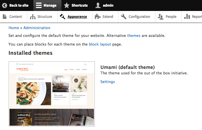
jibranThe theme is missing the screenshot as per https://du6uz.ply.st/admin/appearance.
Comment #24
markconroy CreditAttribution: markconroy as a volunteer and at Annertech commentedHi Jibran,
Thanks for that info. I have created a screenshot now, it will be in the next commit/patch.
Comment #25
kattekrab CreditAttribution: kattekrab as a volunteer commentedI've been having a play via simplytest.me - this is amazing work, and definitely hits the mark as a better "out of the box" experience for Drupal.
I like that it shows how the same content can be displayed in different ways, and exposing different fields.
I like that it's using term references, definitely a great core feature.
Well done everyone.
Nitpick: update copyright date in footer from 2017 to 2018, perhaps even make do "$this_year"? Is that even possible in an install profile?
Here's thoughts off the top of my head as I roam around this install. If there's any consensus around these, I'll spin them out into seperate tickets for followups.
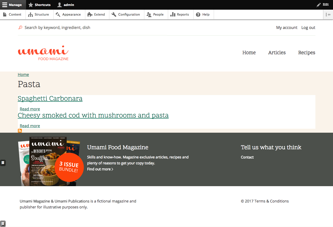
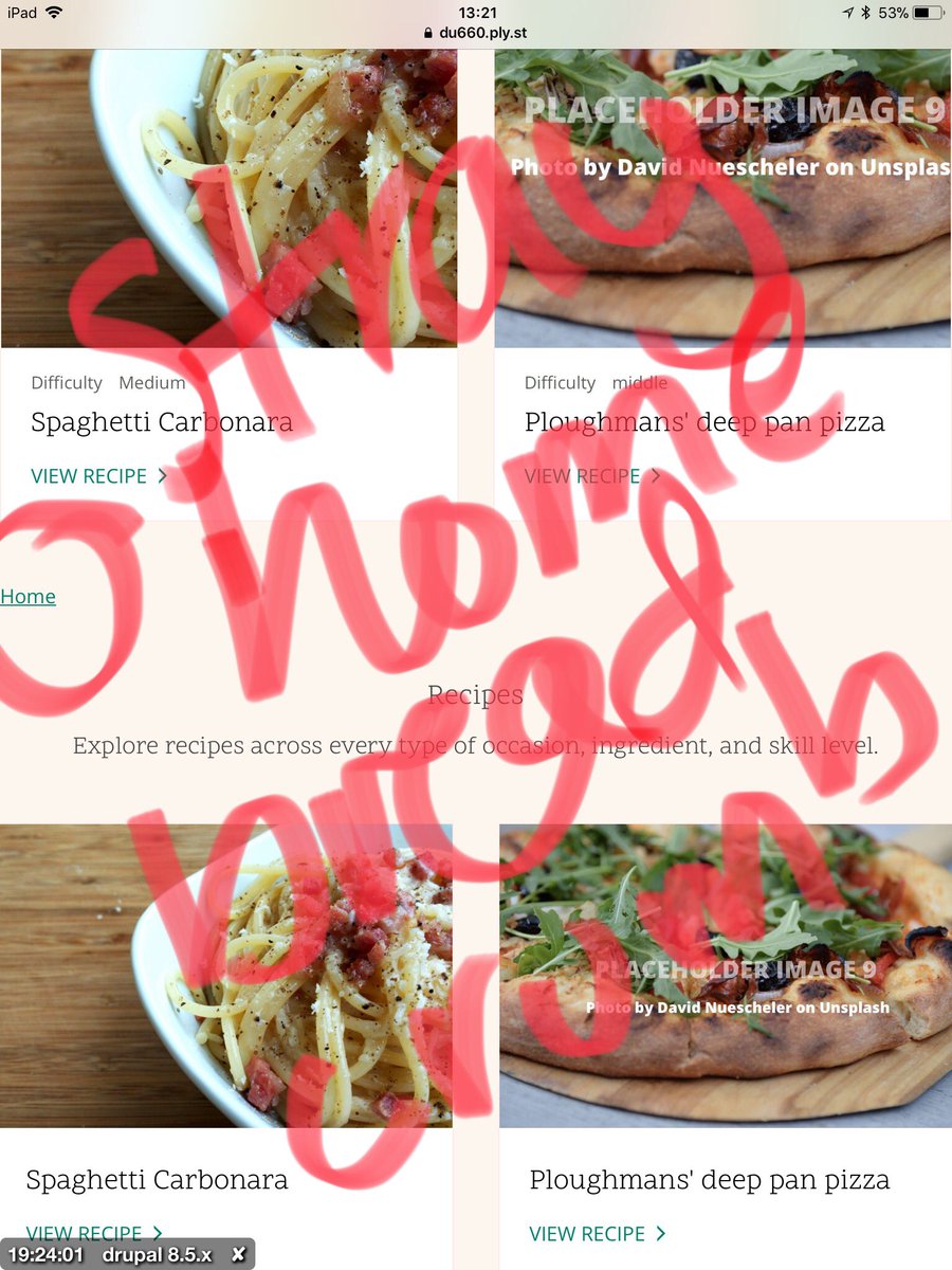
For testing: I created a new recipe - spaghetti carbonara! Visible temporarily here:
https://du660.ply.st/spaghetti-carbonara and a screenshot attached.
Clicking a term ref link leads to a page that looks un-styled and the search pages seem a bit undercooked too.
Mobile and desktop breakpoints seem to work well, but intermediate widths seem less polished.
On the articles page: Should "View Recipe" say "View Article" ?
On tablet and mobile (both ios) I'm getting a stray "home" link above the Recipes section on the homepage, that I can't replicate on macos/chrome. Is it the breadcrumb?
Comment #26
lauriiiGreat work everyone! The design looks great and it feels great to see it being turned into an actual Drupal theme.
I will do another more thorough review but here's my feedback so far. Please approach if any of the feedback feels cumbersome so we can try to evaluate if that could be postponed to an issue that could be worked on later.
We most likely should just remove the README from the core version of the theme. All the relevant parts should be moved to https://www.drupal.org/documentation.
We should remove this since other core themes don't have a composer.json as well
We should remove all references to html elements where possible. It makes both refactoring and writing CSS using SMACSS more difficult since it affects the weights.
Please go through the CSS selectors using elements. We should try convert as many of them to classes as we can since it will make future changes easier for us.
The CSS selector doesn't reflect the comment. This CSS only affects recipe views in full view mode rendered using default route. We should probably change the selector not to rely on the .page-node-type-recipe class.
According to BEM we can trust that element with .node--view-mode-full class will always contain .node class, hence it can be removed from the selector.
There are some empty selectors. Are these kept intentionally?
We have to create ES6 version of this file. More info: https://www.drupal.org/node/2815083
There's multiple todo's in the code. We should remove as many of them as we can, and if there are some difficult problems we should create issues for those and they should be referenced in the todo comments.
Nit: hook functions don't have to document their parameters.
Any reason not to use https://api.drupal.org/api/drupal/core%21lib%21Drupal%21Core%21Form%21fo... instead?
Some CSS is leaking to the admin menu
Page layout breaks when the admin menu is in vertical mode.
Should we add some horizontal spacing to the header?
"
Comment #27
kjay CreditAttribution: kjay commented@kattekrab thank you for the review. I've created corresponding issues for your feedback in #25 in GitHub.
Comment #28
markconroy CreditAttribution: markconroy as a volunteer and at Annertech commentedHi All,
Here are two more patches for the theme - one with images (needed to install the theme to see things correctly) and one without images (for use when doing code reviews).
Comment #29
markconroy CreditAttribution: markconroy as a volunteer and at Annertech commentedTwo more patches - especially for you @lauriii! - one with images, one without.
I've attended as much as possible to items 1 - 10 from your review.
ES6 version of menu.js code now has an issue here - https://github.com/lauriii/umami/issues/130
Comment #30
andrewmacpherson CreditAttribution: andrewmacpherson as a volunteer and at Annertech commentedRe: #26.11
We won't need this form_alter at all, as the reason for it is going away. At the moment it's just making the search button invisible, but this is an a11y problem and we need to keep a visible search button. There's a design already in github issue #119 More accessible search in header
Re: #29
I've added an a11y plan to that issue.
Comment #31
Tarun Lewis CreditAttribution: Tarun Lewis at UniMity Solutions Pvt Limited commentedHi All,
Great initiative with OOTB! Keep up the good work! I have reviewed it, and have observed the following. I have attached screenshots for each point as well.
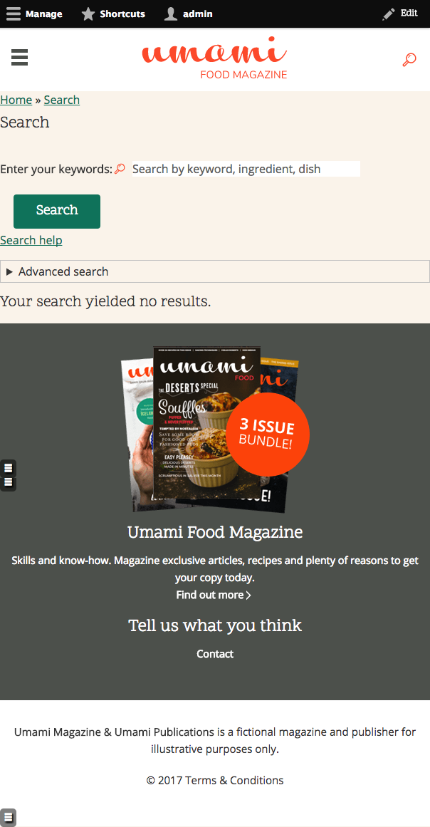
1. Search on mobile - result content listing not responsive.

2. Search is not responsive and no result behavior - spacing & segregation
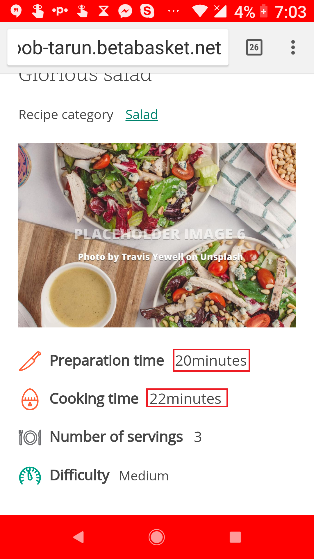
3. Spacing between 22 and minutes & 20 and minutes.
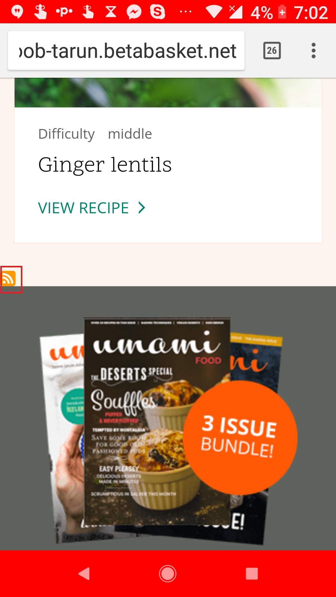
4. Difficulty: middle (middle should be clickable)
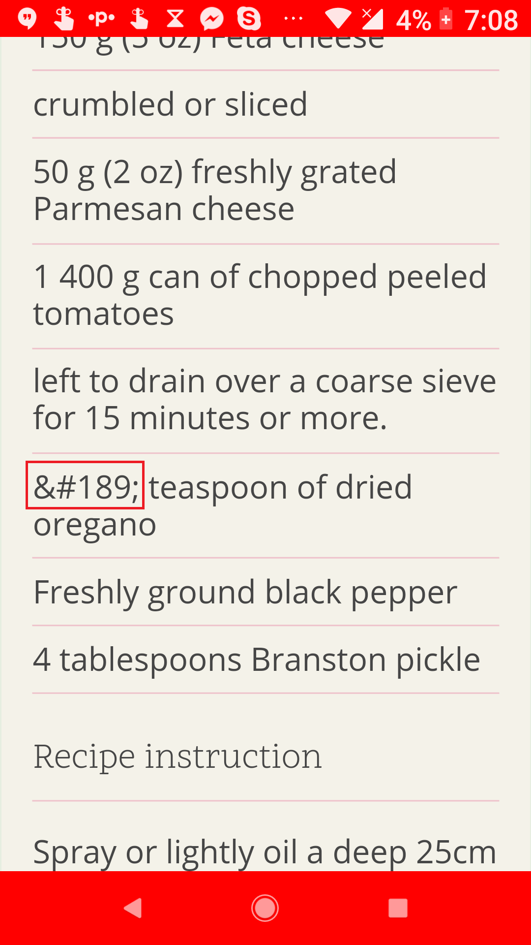
5. Some of the content is not getting converted properly (½)
6. Breadcrumbs missing in Category & Tag pages
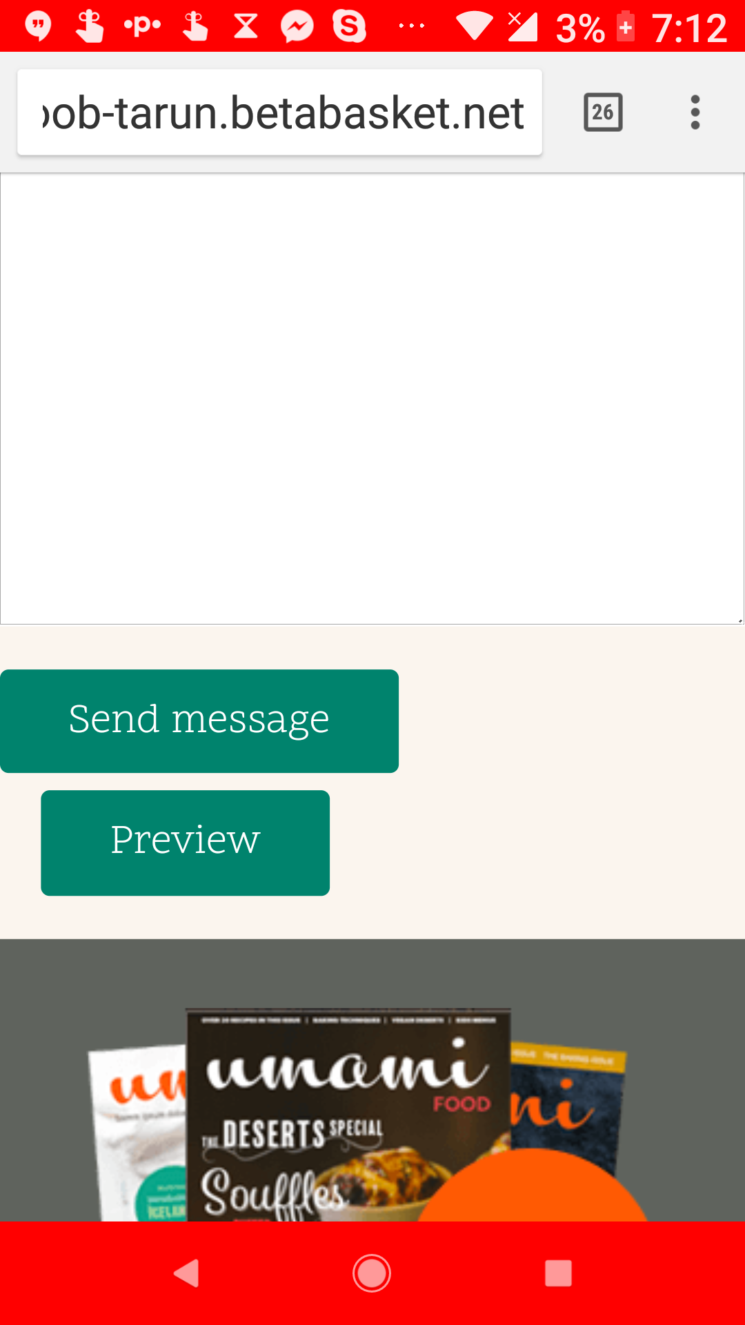
7. Contact Form is not responsive, Captcha is missing, Preview should not be there, Breadcrumb missing.

8. Contact Form status messages not aligned properly.
9. Accessibility Issue & Find Out More link should open to new tab.
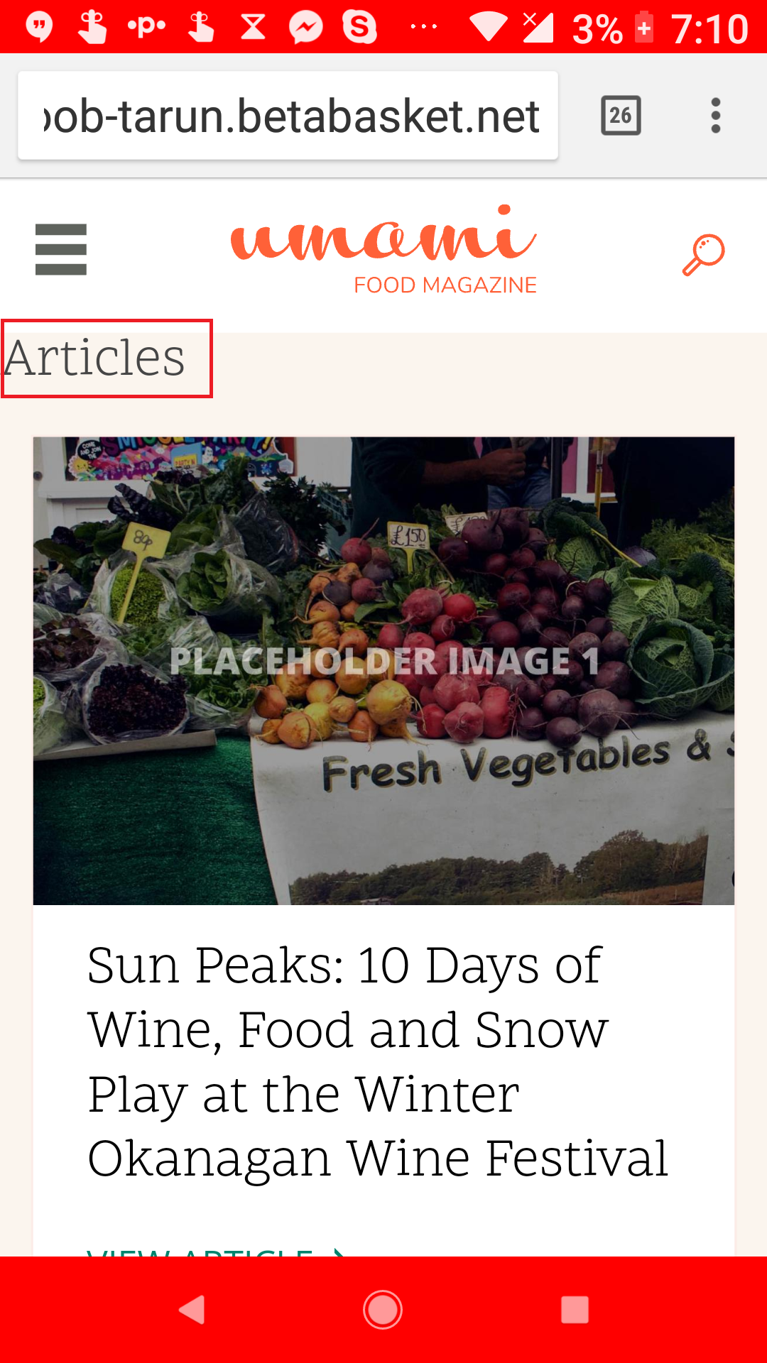
10. Clicking on Category or Tag gives an RSS feed icon. Nowhere else is the RSS icon present. RSS icon is also very tiny and easy to miss.
11. Articles heading padding is not proper.
12. Clicking on Baked Camembert:
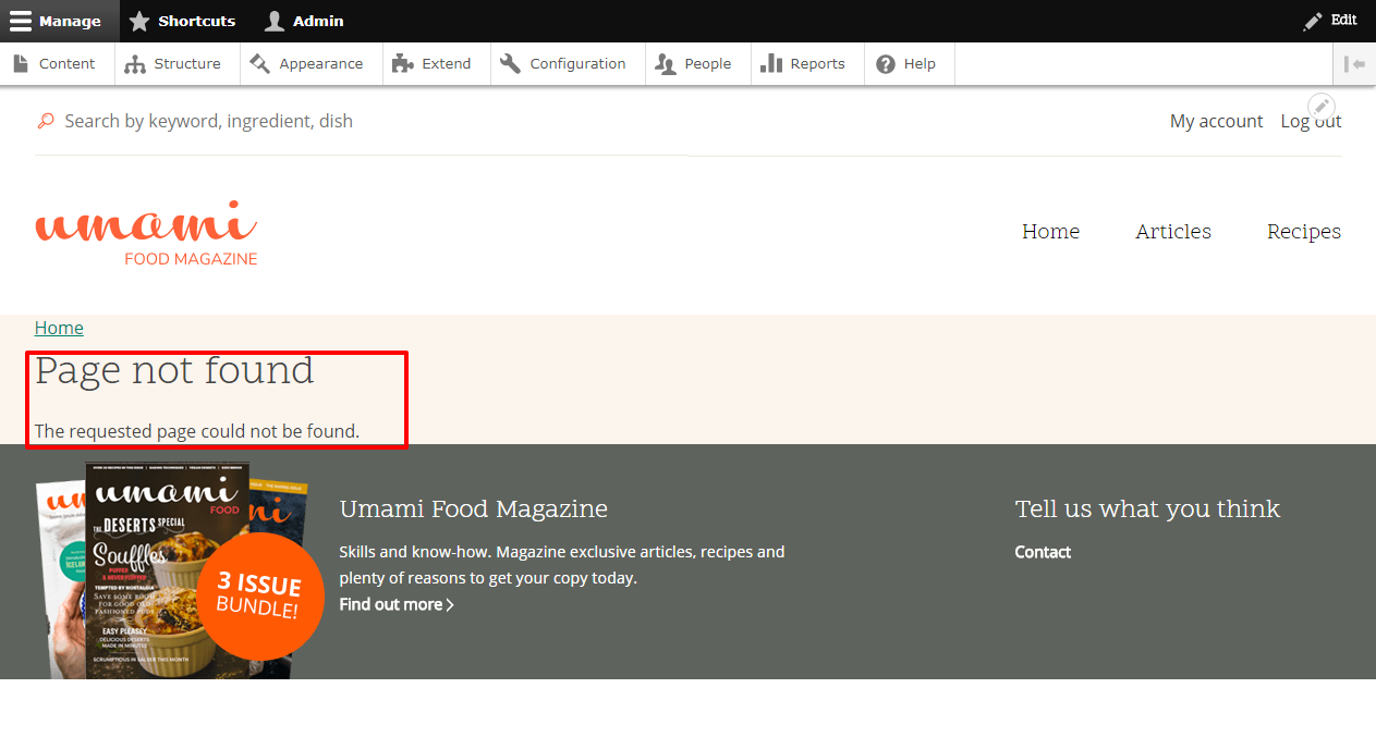
a. button on banner points to Page not found.
b. Title, description and button that appears on the banner in desktop, appears below the banner in mobile (android).
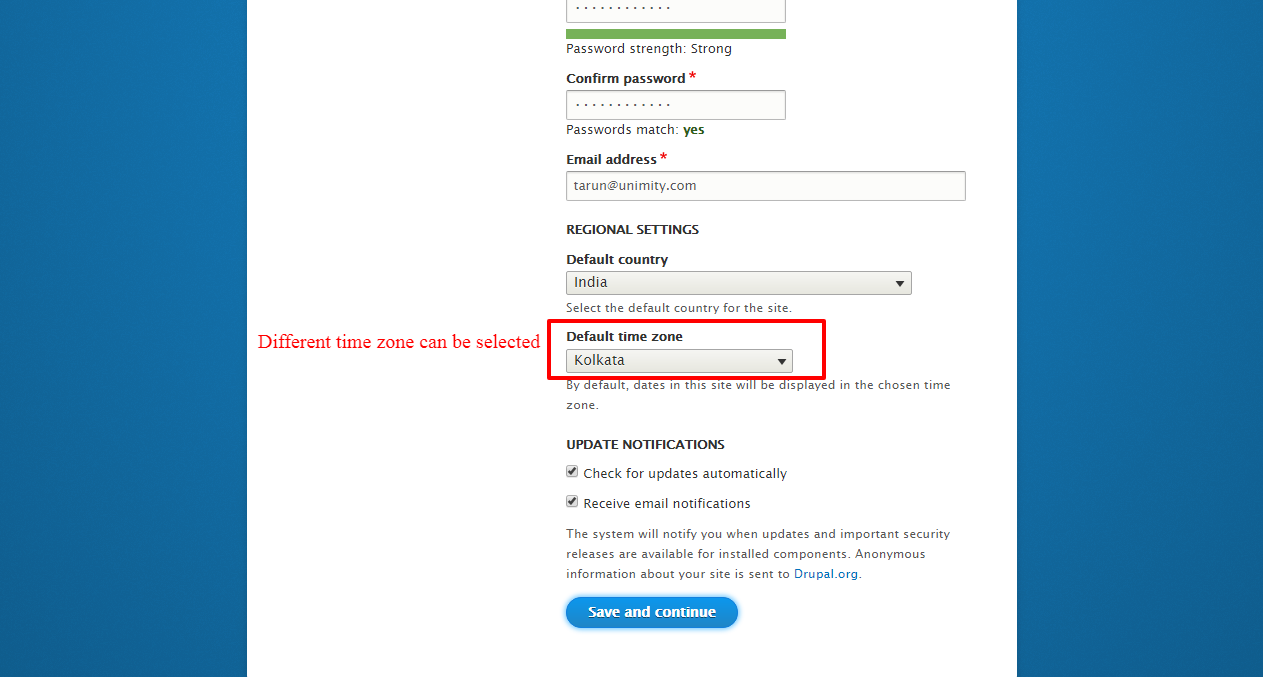
13. Default Timezone should be dependent on Default Country.
Comment #32
kjay CreditAttribution: kjay commented@Tarun Lewis thank you for taking the time to provide a review. We will feed this review into the issue tracking we are managing on Github.
Comment #33
markconroy CreditAttribution: markconroy as a volunteer and at Annertech commentedHi @Tarun,
Thanks a lot for this review. I'm going to start tackling those now (or at least the ones that are in contention for MVP). just a few very quick thoughts on them to give you some pointers on ones I may not fix just now:
We have not done any work on search pages yet, so I'll see about what we can do as a minimum to get this looking acceptable.
3. Spacing between 22 and minutes & 20 and minutes.Well spotted - thanks.
4. Difficulty: middle (middle should be clickable)This is not clickable because it is not a taxonomy/entity field. It's just a simple select list.
5. Some of the content is not getting converted properly (½)Well spotted - thanks.
6. Breadcrumbs missing in Category & Tag pagesWe have no designs for breadcrumbs. They are part of a wider discussion, but I'll see what I can do.
-- update - we have the 'Home' breadcrumb on those pages, which is all we have because the url is using the /taxonomy/term/tid rather than something like recipe-type/vegetarian (but that would mean we'd also need a /recipe-type/ page)
We also have no design for a contact form (I don't think), but it's in the spec, so I'll try fix that up now as well. There will be no captcha on the form since Drupal does not have a captcha in core.
9. Accessibility Issue & Find Out More link should open to new tab.As far as I know all our links will open in the same tab. This is an accessibility best practice.
10. Clicking on Category or Tag gives an RSS feed icon. Nowhere else is the RSS icon present. RSS icon is also very tiny and easy to miss.We haven't done any work on this yet - that's just the default view for those features.
11. Articles heading padding is not proper.Yes, that's on my todo list. Thanks.
For a. this is hardcoded just for now, so we can get theming done on it. It'll be fixed later.
I'll look at b. on this. I'm not sure what we can do given the nature of small screens.
13. Default Timezone should be dependent on Default Country.Correct. I'll get that fixed.
-- update - The most generic timezone is UTC. It's either we set it as UTC or set it as a specific country. We have the site set up so that users can change their timezones themselves.
Like I say, thanks a lot for that review - hopefully you'll continue to review patches as we make them available. A lot of our reviews so far are people reviewing the coding standards (which is great) but not many actually installing the site - so THANKS.
Comment #34
Petr IllekHi all,
I’m glad this initiative exist. It is highly needed. I’ve watched it only occasionally and most probably I missed the key discussions. Thats why some of my notes may sound negative or completly off at this point.
Anyway I’m happy I can contribute back at least with review and few notes.
For start I must admit I like the design. Its modern looking and calm –> good fit for the recipe website.
I’ve spin up a local site and done a quick visual review. I’ve used the patches mentioned in https://www.drupal.org/project/drupal/issues/2809635#comment-12403030 in case there was some more progress done in between.
Styling issues
Layout
Header area:
Typography
Responsive Menu
Contact page
Recipes view list
Notest
As this should serve as an Out of box experience showcase I think it is partially failing in current implementation.
I will provide few posible example use cases:
1) I’m a manager evaluating new CMS option for company.
2) I’m a general website developer with some experience.
3) I’m a newbie website developer who was told Drupal is awesome.
Template
As can be seen my main concern is about the templates. I can see this approach (with completely bypassing Manage display screen) can have its place on project with multiple content types sharing similar view modes.
But I consider it as an advanced approach. I believe this shouldn’t be part of the out of box experience – dive deep into template, Kint through variables and print the required field.
Also there was a big hype about Layout discovery in core few months ago – its not used here. I don’t see anything so special in the template which cannot be done in the UI.
Why the “What you'll need and how to make this dish” is inside the template? Why not use custom block and reference it with default value in the content?
Basically I don’t know who is the target audience here, but as I said in the beginning I I missed the key discussions, so these are only my consideration. Maybe I did not understand what this profile is for. ;)
Additional content
If you are still looking for content I can offer a few Drupal related recipes I’ve done over the years for our demo pages. I do have the original files if needed different crop etc.
Have a nice weekend
Cheers Petr
Comment #35
markconroy CreditAttribution: markconroy as a volunteer and at Annertech commentedHi Petr,
Thanks for those comments. I'll try get around to them on Sunday or Monday (or Tuesday).
Attaching another set of patches here which some small improvements - notably, breadcrumbs now place the current page title as the final breadcrumb (we should have that available in core).
Comment #36
Tarun Lewis CreditAttribution: Tarun Lewis at UniMity Solutions Pvt Limited commentedHi @markconroy,
Thank you for the quick reply. I had forgotten to mention in point no. 9, the accessibility issue referred to the color that the contact link takes after being clicked. Against the gray background the green color of the link is lost. In fact because of the high power my eyes have, I had almost missed it.
Will add on the patches you have given and check them out during the course of the day.
Comment #37
markconroy CreditAttribution: markconroy as a volunteer and at Annertech commentedNew patches with some fixes to Drupal-ci's coding standards, and new work on the search block in the header.
Comment #38
thamasThe new search in the header mentioned by Mark in the previous comment is still work in progress, it is not finished yet!
Comment #39
markconroy CreditAttribution: markconroy as a volunteer and at Annertech commentedoops ... silly me. I thought I saw a commit for it when I merged the last round of code.
I'm sure it will be very welcome. Thanks Thamas.
Comment #40
thamasHi Petr Illek,
Thanks for the review. I won't answer every point but I will create some issues based on your review.
About layout discovery: we discussed it at some point, but decided not to go with that because of the close deadlines and the status of field layout which would be needed too. But Umami may switch in later version.
Your notes about the use cases can be relevant but could be better discussed in the parent issue: https://www.drupal.org/project/ideas/issues/2847582
And thanks for the recipes offer! I mentioned it to @kjay who deals with them and he will contact you!
Comment #41
markconroy CreditAttribution: markconroy as a volunteer and at Annertech commentedComment #42
ok_lyndsey CreditAttribution: ok_lyndsey as a volunteer commentedPetr's three points on evaluation raise good immediate examples of expectation and purpose. I'll start some documentation (as offered in slack) but this is something that needs to be clear to users. It fits with the themes that were raised by the commerce team - an expectation is going to be that people can choose this profile, modify it and have a pretty site fast.
I've started writing up things that a tester can play with and can start to move around and change - but the relationship to the theme will mean we need some specific examples of what people can add - or it will break. My doc I've started is here - note I've written it for my purposes and I'll adapt to standard - but if people have comments/ideas go for it https://docs.google.com/document/d/16IsrfsffnW3zvBTA3EUErGG6TimoubrEPnuHxh3PU8A/edit?usp=sharing
TBH when the theme was initially raised I thought an aim was to produce something closer to complete for people that struggled with the learning curve of theme design.
Comment #43
markconroy CreditAttribution: markconroy as a volunteer and at Annertech commentedSome more patches - these ones should pass the stylelint.json rules
Comment #44
kreynen CreditAttribution: kreynen at University of Colorado Boulder commentedIf the Umami theme is only intended to be used with the Umami profile, it does not belong in core. It belongs in the profile.
Comment #45
markconroy CreditAttribution: markconroy as a volunteer and at Annertech commentedHi @krenyen
I agree. I made that point on slack this evening.
However that'll make the review even larger on the other thread to create a new demo installation profile, so I'm going to leave it in core/themes until we are ready to commit, so it's easier for people to review this item as a standalone item.
Comment #46
andrewmacpherson CreditAttribution: andrewmacpherson as a volunteer and at Annertech commentedRe: #44 - I think I asked about that a while back., but it might have been in a Slack channel. I agree, the demo theme should be in the demo profile. Otherwise, a site builder can reasonably be expected to use it on a real website.
At the moment, the profile and theme patches are on separate issues. We could move the theme in a trivial follow-up task, or prepare a combined theme + profile patch before it gets committed.
Comment #50
markconroy CreditAttribution: markconroy as a volunteer and at Annertech commentedAndrew,
I'll probably create a mega patch on Saturday or Sunday when we are ready to commit, with the profile code and the theme inside that.
Comment #51
markconroy CreditAttribution: markconroy as a volunteer and at Annertech commentedSome more patches (I think we're getting close now!).
One without images for code review purposes and one with images for installing to test.
These patches also have the composer.json, README.md, and .gitignore removed since they will not be in the final version.
Comment #52
webchickSo over in #2809635-91: Create experimental installation profile, I attempted to test the profile just on its own, and it turns out you can't, because it has a dependency on this theme. Which puts us in kind of an "interesting" place in terms of how to get these things committed.
I noticed this patch is adding the theme to core/themes and not core/profiles/umami_demo, and marking it hidden = true; presumably because of this chicken/egg problem. But that's creating quite some stuff to clean up later. :\
If we add the theme at core/profiles/umami_demo in this patch, does this accomplish the same goal of hiding the profile (because umami_demo.profile doesn't exist), but without requiring some fancy git mv magic later on? Was that already tried and failed, or?
Comment #53
markconroy CreditAttribution: markconroy as a volunteer and at Annertech commentedHi webchick
We are keeping the two patches separate at the moment to make it easier for each to be reviewed separately.
Soon (hopefully Saturday or Sunday) I'll create a patch that merges the two, with the theme inside the profile.
https://www.drupal.org/project/drupal/issues/2904243#comment-12415635
Comment #54
webchickSorry, separate patches totally makes sense. Probably even leading up to commit.
I'm asking if in this patch, instead of putting it in core/themes and marking it hidden, we can instead put it where it's meant to go (core/profiles/umami_demo/themes). As in the proper directory.
Comment #55
markconroy CreditAttribution: markconroy as a volunteer and at Annertech commentedI guess so, but it'll be tomorrow at this stage (I'm in bed).
Comment #56
lauriiiGood work everyone. The patch is starting to look quite nice. Here's final remarks from me:
Would grouping these selectors make sense?
Remaining @todo comments should have link for a Drupal.org issue where they get solved or should be removed
We should set a class for the link element. Something like read-more__link would work.
Can we remove ul from the selector?
Can we add class for the li element so we don't have to use a nested selector?
The data selector doesn't have to follow BEM. This could be just menu-main-toggle.
This isn't following BEM. According to BEM this class can be only used inside menu-[menu-name] element.
1. It is a bit strange the split the html element into two rows like this. Do we have an example of this elsewhere in core?
These classes are not following BEM since search doesn't exist
This comment is slightly wrong since the breadcrumb is actually cached, it is just cached per URL because of the cache context.
The spacing on the contact form is a bit odd (more spacing between the form elements than after the form).
The contact form has some overflow on mobile resolutions.
Breadcrumb on the search page has as duplicate title
The search page elements don't have any horizontal padding on small resolutions.
Comment #57
markconroy CreditAttribution: markconroy as a volunteer and at Annertech commentedLatest patches.
All items above attended to, except the search page items. That needs a bit more work - hopefully I'll get to it this evening.
Comment #58
lauriiiCouldn't we use something else as a selector than the id?
Is it really possible that .search-advanced would exist outside .search-form?
Could we create a class for the li element?
According to BEM, we shouldn't nest selectors like this. Because of BEM, we can already trust that .search-result__info is always inside .search-results
Space in the end of the line
We don't have to nest this selector since we can trust that .messages__content is always wrapped with .messages
We shouldn't have to include the menu-main class on this selector.
.read-more__link will always be inside .read-more, so no need to include .read-more in the selector.
These files are almost identical. Should we try to do the small override without overriding the whole template?
Comment #59
lauriiiComment #60
markconroy CreditAttribution: markconroy as a volunteer and at Annertech commentedNew patches.
I'll attend to the search items as soon as I can (maybe tomorrow).
Comment #61
thamas@laurii you mentioned more time it is sure that BEM element will be inside a BEM block in the HTML if it is done right. But I think that you are not right.
As I know a BEM element means that it belongs to the BEM block (the component) and (in this role) it is not a component itself just the part of one. But BEM structure doesn't have to follow HTML structure. (You may remember to John Albinn's flower example.)
And it comes from this: we don't write .bem .bem__element not because we know that .bem__element is inside .bem but because we know that .bem__element belongs to .bem and we don't want to increase specificity.
Comment #62
markconroy CreditAttribution: markconroy as a volunteer and at Annertech commentedNew patch for theme, for maintainer review
Comment #63
lauriiiFrom the existing feedback not fixed yet: #26.4, #56.14#58.1, #58.2-4 and #58.9.
We shouldn't have to nest the classes here
Can a .tab be outside of .tabs? If cannot, can we remove the nesting?
Since the installation profile this will be included is beta level code, we agreed with @catch that none of the remaining feedback is blocking this from being committed. To keep track of these issue, a d.o issue must be opened for each feedback point that haven't been addressed so it can be addressed later.
Comment #64
tim.plunkettThis should use RouteMatchInterface (
\Drupal::routeMatch())It's not clear how this prevents PathBasedBreadcrumbBuilder from printing the current page title itself?
This code should be provided by the search module.
Also inline @see's don't work. Are those supposed to be @todos?
Comment #65
markconroy CreditAttribution: markconroy as a volunteer and at Annertech commentedComment #67
markconroy CreditAttribution: markconroy as a volunteer and at Annertech commentedClosing. This was fixed by being added to the demo_umami profile here https://www.drupal.org/project/drupal/issues/2809635
Comment #68
David_Rothstein CreditAttribution: David_Rothstein as a volunteer commentedNote: For the "Manage Display" bugs hinted at via comments such as #8 and #34 above, I created an issue which tracks that (among other things): #2938911: Umami theme hardcodes too many assumptions about the install profile and site configuration
Comment #69
markconroy CreditAttribution: markconroy as a volunteer and at Annertech commentedThanks David,
We are hoping to be able to fix those issues once layouts/layout_builder/etc are stable in core.
I've tested briefly on simplytest using our installation and then those modules and it seems to be fine.
Comment #70
David_Rothstein CreditAttribution: David_Rothstein as a volunteer commentedRight, but the layout modules are all optional, so even if the profile wants to use them by default, the theme still has to deal with the possibility that they can be turned off.
However, I guess it's possible that the solution for that is to simply get rid of the hardcoding in the templates and fall back on the standard field presentation (where Manage Display will work correctly) in the case where the layout modules are turned off.
Comment #71
markconroy CreditAttribution: markconroy as a volunteer and at Annertech commentedI don’t think the layout being an optional module should worry us.
We’ll just be using the manage display page to set the fields we want in the regions we want. If there is no layout being used, they’ll just be listed one after the other (same as they would now if we just printed `{{ content }}`)
What we might need to do is create some extra layouts so we have one that allows us to have a 33% + 66% region to place the ingredients on the left and the procedure on the right, but that’s easy - and we could contribute that into core as part of the layout module so anyone can use it.