
Problem/Motivation
The off-canvas dialog used by the Settings Tray module has accessibility issues related to contrast ratios. In #2919837: Accessibility Issues with Off-Canvas dialog, it was identified that links in particular do not have acceptable contrast ratios, but there could be other areas of improvement as well.
https://www.drupal.org/files/issues/Screen%20Shot%202017-10-31%20at%208....
Proposed resolution
Review the CSS provided by the Settings Tray module and improve contrast ratios wherever possible.
Remaining tasks
Write patch.
User interface changes
Before


After


API changes
None.
Data model changes
None.
| Comment | File | Size | Author |
|---|---|---|---|
| #28 | 2934178-off-canvas-contrast.txt | 5.57 KB | andrewmacpherson |
| #24 | bartik-and-edit.png | 73.96 KB | yoroy |
| #22 | interdiff-2934178-19-21.txt | 9.72 KB | ragasirtahk |
| #21 | 2934178-21.patch | 6.55 KB | DyanneNova |
| #19 | interdiff-2934178-12-19.txt | 4.4 KB | samuel.mortenson |


Comments
Comment #2
samuel.mortensonThis patch tweaks the background, link, and button colors in the off-canvas dialog to follow WCAG 2.0 AAA guidelines for contrast. Things are a lot darker now, but the contrast definitely feels better.
Comment #3
samuel.mortensonHere are before and after screenshots of the contrast changes.
Comment #4
xjm(Just embedding the screenshots.)
Comment #5
yoroy CreditAttribution: yoroy at Roy Scholten for Dropsolid commentedDrupal core target is AA, not AAA for color contrast. (I lost time hunting down where we document this, I don't think we do yet but our accessibility maintainer says so in the issue summary here: https://www.drupal.org/project/ideas/issues/2864791)
For the submit button it looks like our Drupal blue #0074bd is enough to get AA contrast against its white label text.
The overall dark background set to #444 is ok with most values except for the #bbb used for the form field descriptions. I think we should remove that #bbb so that it becomes #ddd wich is ok against both #444 and #474747 backgrounds.
Comment #6
xjmThanks @yoroy. I also debated whether we needed AA or AAA compliance but recommended we go for AAA because I myself was struggling to read it. But turns out it was indeed the form field descriptions (edit: and also the labels, details legend, etc.) that were causing me trouble -- good catch!
So based on that I'm probably okay with keeping the background colors and just changing the form field description color. Let's check with an accessibility maintainer to confirm.
Comment #7
xjmComment #8
xjmComment #9
yoroy CreditAttribution: yoroy at Roy Scholten for Dropsolid commentedWhy "needs accessibility review" if the accessibility maintainer already is on the record for AA, not AAA?
(I ran all my suggestions through https://webaim.org/resources/contrastchecker/ to ensure they meet AA)
Comment #10
xjm@yoroy I don't think they did? @mgifford reported it as an issue in #2919837: Accessibility Issues with Off-Canvas dialog and I don't see any accessibility maintainer comments about it after that about this specific issue.
Basically just want a "yep, +1, that's good enough" from them since they raised it as a problem in the other issue.
Comment #11
yoroy CreditAttribution: yoroy at Roy Scholten for Dropsolid commentedI understood your comment as "lets double check AA is good enough". @andrewmcpherson says so here: https://www.drupal.org/project/drupal/issues/2919837#comment-12321300 and here: https://www.drupal.org/project/ideas/issues/2864791
Comment #12
samuel.mortensonThis addresses #5 - I also noticed that
theadelements also have the same color so I removed that rule as well. No interdiff because the previous styles were for AAA which is not needed.I'd also note that I tested the current colors on http://accessible-colors.com/ and #BBB on #444 seems to pass AA - do we need to make any changes? If there's a better tool I should be using, let me know.
Comment #13
samuel.mortensonUpdated screenshots.
Comment #14
xjmI think that's better; thanks @samuel.mortenson Tested it on simplytest.me and it's a lot easier on the eyes. So +1 for #12; it gives us AAA compliance, hurts my eyes less, and still matches the design. :)
I think there's one remaining issue. When you hover over the submit button, its background color is #458AD2 and the text is white, which fails AA. Maybe its hover color should be darker instead of lighter? Thoughts?
Comment #15
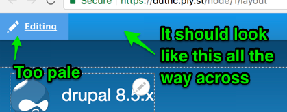
xjmAh, the edit button itself has a similar issue when edit mode is active. Previously @yoroy fixed it so that the blue gradient bar across the top matched the button (so it's just a button that grows into a whole bar when you're in edit mode). But somehow since then the button itself has regressed to be this washed-out periwinkle (#629FE3 according to my color picker) that no longer matches the blue bar gradient and fails AA contrast for the button. So I think we need to fix that too.
Comment #16
xjmOh and here's a screenshot of the submit button when hovering.
Comment #17
xjmComment #18
samuel.mortensonI noticed that too, which is addressed in previous patches but needs to be added into the latest patch from #12 to pass AA.
I'll take a look at the "Editing" button too, I agree that it should match the gradient when not hovered, which matches the top-level toolbar buttons right now. On hover we should indicate that it's clickable, but I'll see what looks best.
Comment #19
samuel.mortensonThis patch addresses #14 and #15, I also found AA contrast problems with the edit button in all of its states - because the button uses a gradient, we need to test both edges of the gradient against the text. I went through all the edit button states and confirmed that all contrasts pass now.
Comment #20
xjmOne thing I notice with the darker colors for the edit button/bar is that they're less visually distinct from the default Bartik header gradient. Not sure if that's a concern or not. @yoroy, thoughts?
Comment #21
DyanneNovaThe dark blue is close to the Bartik header color, but I think the location plus the shadow break it up enough visually to be understandable. I don't think it hurts conceptually for the Edit button to match more closely with the content area, since the intention is to directly edit the content on that page.
The patch didn't apply for me because of a spacing mismatch, so I've fixed that, but otherwise this is the same code from #19.
Comment #22
ragasirtahk CreditAttribution: ragasirtahk at Google Code-In commentedUploaded interdiff for #19 and #21.
Comment #23
tedbow@DyanneNova thanks for the review here. This patch is looking good.
@ragasirtahk thanks for the interdiff but it has a lot of changes that should not be there.
As @DyanneNova said #21 is the same as #19 except for 1 spacing issue. this was caused by #2866810: Update stylelint rule function-comma-space-after to be consistent with Drupal's CSS standards change to
settings_tray.theme.csssee https://github.com/drupal/drupal/commit/0013e901feae75545e784b45f3f39a81...Comment #24
yoroy CreditAttribution: yoroy at Roy Scholten for Dropsolid commentedI agree with @DyanneNova’s assessment. The colors are close but the separation is clear, so this is ok.
Comment #25
andrewmacpherson CreditAttribution: andrewmacpherson as a volunteer and at Annertech commentedre #5 and other comments about WCAG level AA vs level AAA. Our level AA target is documented on the core gates page - https://www.drupal.org/core/gates#accessibility
I'm taking patch in #21 for a spin on simplytest.me now...
Comment #26
andrewmacpherson CreditAttribution: andrewmacpherson as a volunteer and at Annertech commentedI've tested the various states of the edit button.
All text + background colour combinations pass WCAG 2.0 SC 1.4.3 Contrast (Minimum).
Good work! Getting it right with CSS gradients is a lot of work, because you have to make sure the background-color passes (when gradients are not supported) AND you have to make sure both colour extremes of the background gradient pass too.
Next I'll test the colours inside the dialog itself.
Comment #27
xjmUncrediting @ragasirtahk as the interdiff is not really correct (nor needed since it was just a reroll). Thanks!
Comment #28
andrewmacpherson CreditAttribution: andrewmacpherson as a volunteer and at Annertech commentedI tested all the text/background colours inside the settings tray dialog, including focus and hover states. The attached text file has my detailed testing notes.
All color vs. background-color combinations pass WCAG 2.0 success criterion 1.4.3 Contrast (Minimum), for level AA conformance. Awesome!
I did find a couple of failures of SC 1.4.1 Use of Color (A) and SC 2.4.7 Focus Visible (AA), These don't directly relate to colour contrast, so I'll open follow-ups for them. They should be easy to fix.
So this is my sign-off for the colours established here (patch #21). Is anything left to do, or is this RTBC now?
Comment #29
samuel.mortenson@andrewmacpherson I don't think there are any remaining tasks, marking RTBC!
Comment #30
webchickGreat, thanks for the awesome work here, all!
Committed and pushed to 8.6.x, cherry-picked to 8.5.x.
Comment #31
ragasirtahk CreditAttribution: ragasirtahk at Google Code-In commentedI had made mistake while applying the patch so the interdiff showed wrong data. Apologies.
Comment #32
webchickNo worries, @ragasirtahk! Thanks for contributing nonetheless. :D
Comment #35
xjmFixing credit again. Thanks @ragasirtahk for understanding; good luck in your next issue. :)