
 Support for Drupal 7 is ending on 5 January 2025—it’s time to migrate to Drupal 10! Learn about the many benefits of Drupal 10 and find migration tools in our resource center.
Originally submitted on Github
Problem/Motivation
Recent interviews and research exposed pain points around Drupal's admin experience of looking and feeling dated.
There was an amazing community effort to Create a Style Guide For Seven that vastly improved its look + feel compared to the original, but Design best practices and Drupal functionality have moved on since then.
Proposed resolution
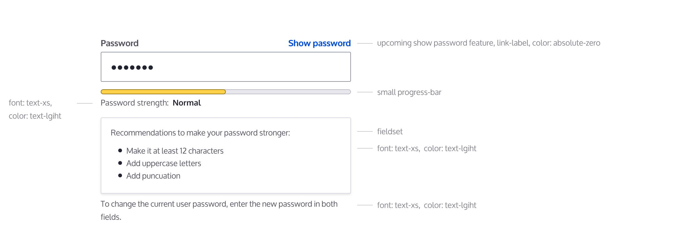
Implement new password field styles to create a favorable first impression of Drupal for evaluators and a better user experience for site authors. No functional differences.
Specs:
https://www.figma.com/file/OqWgzAluHtsOd5uwm1lubFeH/Drupal-Design-system...
General specs:
Remaining tasks
- Update
- Accessibility review
- RTL review (Right to Left)
User interface changes
All password field styles will be changed, no functional differences.
Test Pages
/user/1/edit?destination=/admin/people (create users)
/admin/people/create
| Comment | File | Size | Author |
|---|---|---|---|
| #67 | interdiff-3024395-64-67.txt | 1.43 KB | huzooka |
| #67 | claro-password_confirm-3024395-67.patch | 36.3 KB | huzooka |
| |||
| #64 | interdiff-3024395-58-64.txt | 17.94 KB | huzooka |
| #64 | claro-password_widget-3024395-64.patch | 37.47 KB | huzooka |
| |||
| #58 | interdiff-3024395-51-58.txt | 6.57 KB | huzooka |


Comments
Comment #2
saschaeggiNeeds final design specs
Comment #3
ckrinaComment #4
saschaeggiComment #5
saschaeggiReady for implementation
Comment #6
nod_Might want to prepare a show/hide version of this field, see related issue.
Comment #7
saschaeggi@nod_ it's updated, thanks
Comment #8
shaalInitial implementation of Password field style update.
We're missing in Figma one of the levels of Password strength.
In Figma we have 4 options:
In Drupal setup we have 5 options:
Comment #9
ckrinaUnless @saschaeggi says the opposite, I would use the same colour for good and for the strong one for now.
Comment #10
huzookaRe #8:
Checked only in Chrome.
Comment #11
saschaeggiAgreed, would use the same green for Good and Strong for now.
Comment #12
huzookaTest module: https://github.com/zolhorvath/password
Comment #13
finnsky CreditAttribution: finnsky at Skilld commented@huzooka i added patch in progress bar component with required states
https://www.drupal.org/project/claro/issues/3023304#comment-13034412
so maybe to postpone it until progress bar will merged?
Comment #14
ckrinaComment #15
finnsky CreditAttribution: finnsky at Skilld commentedHello!
Here we have one small problem with reusing same progressbar classes because functional js is managed on core level
https://git.drupalcode.org/project/drupal/blob/8.8.x/core/modules/user/u...
From my point of view it is better to keep it in core. And 2 options we have now:
1. Use some postcss extend plugin to extend progressbar classes.
2. Reuse progressbar variables. (done in this patch).
Another problem i met is the wrong alignment in user form globally. Should be follow up issue for it.
Comment #16
volkerk CreditAttribution: volkerk at Thunder commentedMoved color definitions to top and used generic names. Removed password field styles from progress.css. Fixed initial state (zero width), is-weak now starts at 3%. Added reduce motion and RTL rules.
Comment #17
quironShouldn't this color code be a variable?
Aside from this I reviewed and tested #16 and all looks fine to me.
Comment #18
lauriiiThe color of the border for fair strength is a one-off color, so I think it's fine it's not on its own variable.
Comment #19
volkerk CreditAttribution: volkerk at Thunder commentedI already re-rolled adding a separate color, I think it is also valid to have that reusable if the need arises.
Comment #20
quironAlso created an issue relative to the 'weak' indicator when the password field is empty and not being edited: https://www.drupal.org/project/drupal/issues/3060848
Comment #21
huzookaI'm reviewing this
Comment #22
huzookaSince this color is out of Claro's color palette, I won't name it explicitly.
According to Figma, the weight of the progress bar label is bold (it's equal to 700).
Why not using the shorthand here?
1px solid var(--color-progress-track-border)Wrong text color: the
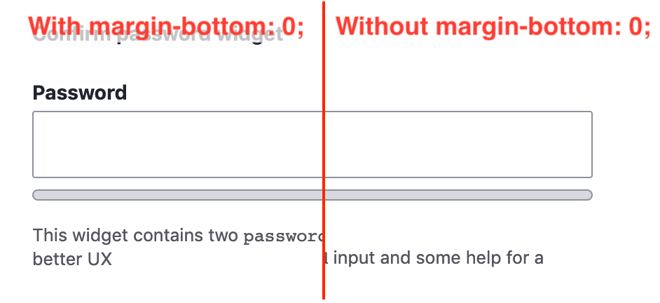
--color-progress-bar-descriptionvariable equals to#8e929cbut we need Text Light – Davy's grey:#545560.Instead of this value we need a negative margin (or an equivalent solution) for this element to match the design. Also the bottom margin has to be reduced.
Wrong border-color: the variable used here is equal to
rgba(216,217,224,0.8), but according to Figma we need Light Gray:#d8d9e0.According to Figma, we need a bigger top margin for this list.
I'd define the width for the whole widget (
.form-type--password-confirm) and not independently for its elements.Comment #23
volkerk CreditAttribution: volkerk at Thunder commentedThanks for the review, I adressed all points.
Comment #24
huzookaI'm reviewing the patch from #23.
Comment #25
huzookaRe #24:
I found an issue:
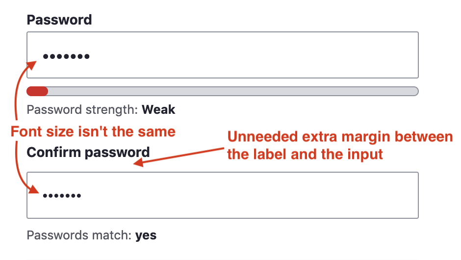
Accidentally, the password confirm input's font-size is decreased by the
.password-confirmselector. Sadly, both the input and the password-match message div has that CSS class (even thejs-prefixed CSS class).It's obvious that the intention was to decrease the font-size of the message only.
Browsing the code of the user.es6.js it's obvious that:
I think that we have to create issues for these; and until those are fixed and committed, we have to replace the user(.es6).js with our own implementation that at least uses different CSS classes for the password match message (e.g. password-match-message or something like that).
Comment #26
fhaeberleI'll have a look on this one.
Comment #27
fhaeberle@huzooka As I totally agree with you and see the downsides that this is not such a good behavior, I would not wipe our JS logic and add two missing values which are fixing the problem right on the input itself. As we have a lot of custom code for the password field anyway, I don't see a problem to go the easy way and add them. The specificity of the selector get the work done and overrides the lower specific definition as usual.
Comment #28
fhaeberleThis approach alters the
password-confirmclass on the confirm message topassword-confirm-messageand applies the styling to this new selector.Comment #29
quironI just created an issue in core with @huzooka suggestions: #3061265: Use specific class for password confirm message
Comment #30
quironComment #31
andrewmacpherson CreditAttribution: andrewmacpherson as a volunteer commentedI'm confused about the scope of this issue. I don't think the problem is well explained.
What functionality does this refer to, and how/why does the new design need to address it?
Comment #32
rosinegrean CreditAttribution: rosinegrean at PitechPlus commentedComment #33
huzookaRe #31: I guess that sentence refers to the whole Claro theme, and not this issue.
Comment #34
huzookaThis is only a re-roll of #28, no fixes/improvements.
Todo:
js/user.es6.js.password-confirm-message span,.password-suggestions ulor.form-type--password-confirm input.Comment #35
huzookaComment #36
huzookaThis should match our standards.
Fixes #34.1 and #34.2.
Comment #37
huzookaComment #38
huzookaPrepared new
Drupal.themefunctions for password confirm.Todo besides #34:
Comment #39
huzookaComment #40
huzookaWhoops
Comment #41
huzookaThis patch addresses #34.3, #38.1 and #38.2.
Only #34.4 is missing.
Comment #42
huzookaComment #43
huzookaAddresses everything from #34 and #38.
Additionals:
This is now ready for a review.
Screenshots attached.
Comment #44
huzookaComment #45
huzookaRe-rolled again, no interdiff.
Comment #46
huzookaComment #47
thamasI found one small issue with the last patch. The colour of the field labels are inherited from the body so they are #222330 but according to the design, they should be #545560.
If it is a more global decision that form labels should inherit the body colour and the design is not up to date than the patch is RTBC I think as I haven't found any other issue. If it is not the case, the colour of the labels still should be fixed.
Comment #48
bnjmnmI'm doing a detailed review so there may be more items, but wanted to mention this now as it seems like something that could potentially take a bit of time:I noticed that on RTL, the punctuation position changes based on the presence of content in the fields.
Setting back to Needs Work since this will need to be addressed, but I'll still continue with my review of the patch.It looks like relying on
:watchto build from a newly applied patch is not sufficient. Switched to:buildand the issue reported above is no longer occurring.Comment #49
bnjmnmPretty much just nits here. Also did a quick check on all OSX browsers + IE11 (incl high-contrast) + mobile simulators to confirm I got the same results as the very-comprehensive set of screenshots in #43.
Is this rule necessary since it collapses margin with the confirm field that appears after it? (perhaps it's necessary on some browsers)
This approach to hiding the field still allows it to be focused and accessed via keyboard navigation.
These two rules might not be necessary due to collapsing against the margins of elements they will always be adjacent to. There may be other reasons for this or some browsers may need it, so like my earlier comment not 100% sure they can be removed.
More often than not, despite the aria-atomic, only "Password Strength" is read by screenreaders, and not the strength level inside the span with
.password-strength__text. It seems to work any time the password strength changes, and occasionally when the change status is the same.This seems to be the case with Seven as well, so if it can't be easily addressed here I think it would be fine to just open a followup issue.
There's a good description in the function doc and variable naming here is very good so it's pretty much self-documenting, but this could use a a few additional comments. I'm thinking just enough so if someone were troubleshooting an issue with this functionality they'd be able to quickly find the lines relevant to their issue.
I see why it's necessary to add this, since the JS from the user module is not loaded, but I think it would be good to document that its essentially a copy of the JS from the that module (with a few cosmetic-only changes). I noticed Big Pipe does something similar without mentioning that it's a copypaste, but I still think it would be beneficial to document this here.
nit - make singular
s/preceedes/precedes
(there's a few instances of this in the file)
This param is not in the method
user.es6.jsdoes a really nice job of avoiding the readability problems that come with JS that adds a bunch of markup and wrappers 👌Comment #50
huzookaComment #51
huzookaThis new patch addresses most of #49.
Re #47: You're right, this is a difference. But I don't really want to make an exception just for the password form elements. (Every other form elements label color is
#222330and I'd like to keep this consistent.)Re #49:
password-confirm__passwordorpassword-confirm__confirm, this zero-margin is definitely neeeded:display: none;for thisComment #52
bnjmnmI'm pretty much ready to RTBC this, I just need some clarification on if the "show password" feature styling is in scope. Figma and comment #7 suggest it is in scope, but I think it's better to open a followup that is dependent on #2293803: Replace confirm password element with a new password element with show/hide functionality.
As a precaution, I did test this patch with the most recent patch from #2293803: Replace confirm password element with a new password element with show/hide functionality and the results are acceptable enough that it's probably not worth the headache of styling something that isn't part of core yet.
Comment #53
lauriiiI don't think we should include the show password in the scope of this issue 😇
Comment #54
bnjmnmthat's the confirmation I needed - setting to RTBC.
Comment #55
lauriiiInstead of appending HTML elements here, we could pass on the child element to the theme function so that it's up to the theme function to decide where the child gets rendered.
Comment #56
huzookaComment #57
huzookaThe Needs reroll tag is valid actually.
Comment #58
huzookaThe patch that addresses #55.
Comment #59
huzookaComment #60
huzookaWe have to cast the objects mentioned om #55 instead of appendong them
Comment #61
huzookaComment #62
huzookaIt seems that casting these object is impossible. We have to find an another acceptable soultion.
Comment #63
huzookaDiscussed this on Slack with @lauriii.
So we'll use much less templates here, but those will contain some hard-coded CSS classes used by our JavaScript.
Comment #64
huzookaNew patch addressing #63.
Comment #65
huzookaComment #66
huzookaComment #67
huzookaComment #69
lauriiiThis looks great. Thank you everyone! 🙏Next step is to incorporate these improvements to the JavaScript in core as part of #3067523: Add Drupal JavaScript theme functions for password confirm widget.
Comment #72
lauriii