
 Support for Drupal 7 is ending on 5 January 2025—it’s time to migrate to Drupal 10! Learn about the many benefits of Drupal 10 and find migration tools in our resource center.
Important: the initial proposal wasn't appropriate. Eventually an aria-expanded disclosure pattern was implemented, see comments #5 onwards.
The primary menu in the PoC is using the .has-children class on the list item to apply styling to the dropdown menu. In case of accessibility, this should be changed to applying the aria-haspopup=true to the list item.
An example and instructions on how this should work can be found here.
Also, it can be thought of adding aria-controls to the link which opens it on hover and add aria-labelledby to the expanding menu.
The current markup looks like this:
<ul class="primary-nav--level-1">
<li><a href="#"><span>Home</span></a></li>
<li class="has-children">
<a href="#"><span>Products</span></a>
<button class="primary-nav__button-expand">Expand sub-navigation</button>
<ul class="primary-nav--level-2">
<li><a href="#"><span>Black & White Photos</span></a></li>
<li><a href="#"><span>Stone Statues</span></a></li>
<li><a href="#"><span>Antiques & Artifacts</span></a></li>
<li><a href="#"><span>Replicas</span></a></li>
</ul>
</li>
<li><a href="#"><span>About</span></a></li>
<li><a href="#"><span>Blog</span></a></li>
<li><a href="#"><span>Contact</span></a></li>
</ul>
The corrected markup should look like this:
<ul class="primary-nav--level-1">
<li><a href="#"><span>Home</span></a></li>
<li aria-haspopup="true" aria-controls="nav--level-2">
<a href="#"><span>Products</span></a>
<button id="menubutton" class="primary-nav__button-expand">Expand sub-navigation</button>
<ul id="nav--level-2" aria-labelledby="menubutton" class="primary-nav--level-2">
<li><a href="#"><span>Black & White Photos</span></a></li>
<li><a href="#"><span>Stone Statues</span></a></li>
<li><a href="#"><span>Antiques & Artifacts</span></a></li>
<li><a href="#"><span>Replicas</span></a></li>
</ul>
</li>
<li><a href="#"><span>About</span></a></li>
<li><a href="#"><span>Blog</span></a></li>
<li><a href="#"><span>Contact</span></a></li>
</ul>
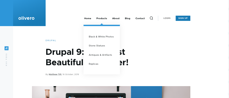
Screenshot of current implementation:
| Comment | File | Size | Author |
|---|---|---|---|
| Bildschirmfoto 2019-10-28 um 15.34.18.png | 71.79 KB | fhaeberle |


Comments
Comment #2
mherchelComment #3
mherchelThis is at https://github.com/Lullabot/olivero-poc/pull/3/files
Comment #4
mherchelMerged.
Comment #5
andrewmacpherson CreditAttribution: andrewmacpherson as a volunteer commentedPlease revert this change. The
aria-haspopup="true"introduced here (a) isn't appropriate here, and (b) isn't correctly implemented.The ARIA menu button pattern you linked to is very controversial in the accessibility community. The upshot is that ARIA menus are inappropriate for website navigation links. Some useful reading:
The PR mentioned in #3 isn't correct implementation of the pattern anyway. The presence of
aria-haspopup="true"means there needs to be an associated container with the ARIA menu role. This in turn can only contain interactive children with the menuitem role. These in turn are not conveyed to assistive tech as links.Please don't use ARIA properties in a piecemeal way like this. A HTML class doesn't affect semantics, doesn't imply a defined content model, and doesn't affect the accessibility tree. ARIA does all three, and if used incorrectly it can have disastrous results. See No ARIA is better than bad ARIA. If using one of the patterns in the ARIA Authoring Practices, be sure to implement it completely. I also recommend seeking guidance on which patterns are appropriate; they aren't suitable for all occasions. ARIA menus in particular are best suited to application behaviour, rather than website navigation.
Instead, I recommend a simple submenu disclosure pattern:
aria-expandedandaria-controlson the button.button, ul, li, aelements are sufficient.display:none;. (I saw some animation, which may complicate this. A good approach is open/close the menu in two steps. One step animates visually-hidden, another doesdisplay:none;when visually hidden. Umami ran into this problem too.)Comment #6
fhaeberle@andrewmacpherson I apologize for my fast written issue summary where I didn't outline the complete and correct way, this was created in a hurry to have a few actionable issues for DrupalCon sprinting. Thanks for pointing us in the right direction.
Comment #7
mherchelI'm breaking this out into its own discussion at #3093693: Discussion on showing drop-menu button at large widths..
Comment #8
mherchel@andrewmacpherson:
Regarding
My understanding is that
visibility: hiddenremoves the DOM node from the accessibility tree. As you said, it's useful to use this because it respects CSS transitions (whichdisplay: nonedoes not). Is this not sufficient? The DOM node isn't available to assistive devices (let me know if i'm wrong on this), and is not focusable. What additional accessibility benefit doesdisplay: noneadd?Comment #9
shaalIn OOTB Umami, we created 2 separate markups for the menus, one for desktop, and another for mobile. CSS determines which should be displayed.
We also had accessibility issues with the mobile menu and the language switcher (menu).
After many iterations we accomplished building an accessible and smooth dropdown menu.
It's a public function that is being imported to both mobile-menu and language switcher.
#3042417: Accessible dropdown for Umami's language-switcher and mobile main-menu
Comment #10
andrewmacpherson CreditAttribution: andrewmacpherson as a volunteer commentedYes,
visibility:hiddenordisplay:nonewill do equally well. Both of there remove the element and it's children from the tab order, and from the accessibility tree. That's what I meant by completely hidden.The problem is, that the menu isn't actually hidden this way when it matters.
I can see that
visibility:hiddenis being used when the focus is somewhere else, and menu is collapsed. However the menu is being revealed when the user tabs to the products link. The problem here is thefocus-withinpseudo-class is being used do reveal the submenu, by settingvisibility: visible.If a keyboard user wants to operate the "About" link, they have to tab through all of the submenu items under products. The user has no choice in this; the disclosure button may as well not be there. They can't tab from "Products" to "About".
A sighted pointer user is allowed to ignore the submenus. A keyboard user should be allowed to do the same.
Stop revealing the submenu using focus-within, and use the submenu button at both breakpoints. That way keyboard users don't have to tab through the submenu, unless they want to open it.
Comment #11
mherchelReverted this at https://github.com/Lullabot/olivero-poc/pull/17/files
Note that the discussion for implementing subnav toggle buttons has been moved to #3093693: Discussion on showing drop-menu button at large widths..
Comment #12
vulcanr CreditAttribution: vulcanr as a volunteer and at Annertech commentedShould the
ariaattributes be on the button instead of the<li>element? And I think instead ofaria-haspopupshould be usedaria-expandedComment #13
andrewmacpherson CreditAttribution: andrewmacpherson as a volunteer commentedThe
<button>:<ul>aria-labelledybyoraria-labelNo other ARIA attributes are needed for this.
aria-haspopupisn't appropriate for navigation lists, and should not be used.Comment #14
mherchel@vulcanr and @andrewmacpherson:
All items have been addressed (except the aria-controls, which I'll take care of now). Please see the comment in #11.
Comment #15
vulcanr CreditAttribution: vulcanr as a volunteer and at Annertech commentedThis is looking good now according to https://github.com/Lullabot/olivero-poc/pull/17 and tested on https://deploy-preview-17--olivero-poc.netlify.com/.
I'll mark this into RTBC
Comment #16
mherchelThanks! Merged!
Comment #17
mherchelComment #18
andrewmacpherson CreditAttribution: andrewmacpherson as a volunteer commentedI tested the changes, they are correct.