
 Support for Drupal 7 is ending on 5 January 2025—it’s time to migrate to Drupal 10! Learn about the many benefits of Drupal 10 and find migration tools in our resource center.
Problem/Motivation
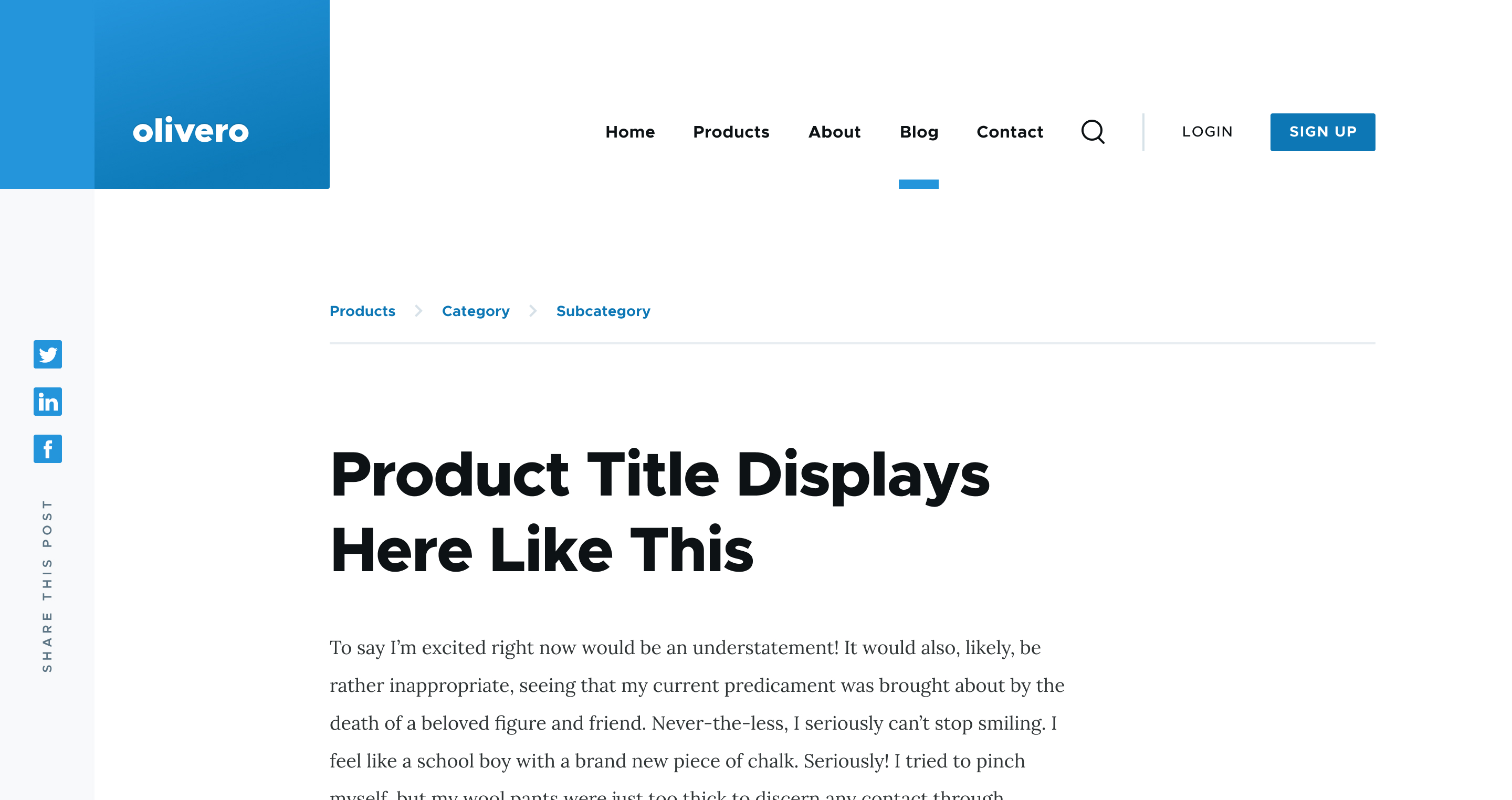
- We have a design for the breadcrumbs component and now it's time to implement this feature in the Olivero Drupal theme.
- Link to the design - https://www.figma.com/file/r8uq72Q9weTMVsNUFZKEYH/D9-Theme-Master?node-i...
Proposed resolution
- We're using the default breadcrumbs block for the theme.
- Configure the block and export the `.yml` config into this directory `/olivero/config/install/`.
- Theme/style the breadcrumbs to match with the design for desktop and mobile breakpoints.
Remaining tasks
User interface changes
API changes
Data model changes
Release notes snippet


| Comment | File | Size | Author |
|---|---|---|---|
| #23 | Olivero_Theme_-_Public_–_Figma-4.png | 54.28 KB | mherchel |
| #23 | Olivero_Theme_-_Public_–_Figma-3.png | 259.77 KB | mherchel |
| #22 | Снимок экрана 2020-03-31 в 10.17.53.png | 36.28 KB | kostyashupenko |
| #22 | interdiff_18-22.txt | 8.01 KB | kostyashupenko |
| #22 | 3117246-22.patch | 6.82 KB | kostyashupenko |


Comments
Comment #2
proeungComment #3
thejimbirch CreditAttribution: thejimbirch at Kanopi Studios commentedThe default breadcrumb block config is already in the repository at https://git.drupalcode.org/project/olivero/blob/8.x-1.x-dev/config/insta...
The current CSS in the theme from the Proof of Concept (POC) does not align with the designs. What is in the Figma link, and screenshot above is bold, not uppercase, etc.
Attached is a patch that updates the styles in the theme to match the designs, and adds an ::after to override what I believe is Drupal's default behavior.
Comment #4
Ujval Shah CreditAttribution: Ujval Shah as a volunteer commented@thejimbirch I have tested the patch. Please find below findings:
Other Findings:
Comment #5
proeungComment #6
proeungComment #7
thejimbirch CreditAttribution: thejimbirch at Kanopi Studios commentedComment #8
mhercheluse
var(--sp)here. I know the comps have 20px, but I feel like we need to keep to the vertical rhythmAgree with @Ujval Shah. We should use a CSS shape here IMHO (maybe show the corners of a box that is rotated 45deg?)
Comment #9
mherchelThis color (and the other) should be referenced in a variable:
var(--color--gray-80). See https://git.drupalcode.org/project/olivero/-/blob/8.x-1.x-dev/css/src/ba...Comment #10
andrewmacpherson CreditAttribution: andrewmacpherson as a volunteer commentedReview of patch #3.
+ color: #e7edf1;The separator chevrons are VERY pale. #f7f9fa on a white background has a contrast ratio of just 1.05:1. (See https://contrast-ratio.com/#%23f7f9fa-on-white)
If we want this to be recognized and understood as a breadcrumb, the separators need a stronger contrast.
I'm unsure which WCAG success criterion the breadcrumb separators should conform to: 1.4.3 Contrast (minimum) or 1.4.11 Non-text contrast. Basically the question is whether these need a contrast ratio of 4.5:1 or 3:1. I'm leaning towards the lower non-text contrast, however I honestly don't know so I'll ask for a second opinion in the wider accessibility community, and report back.
Try something like #949494, which provides exactly 3:1 contrast on a white background.
+ content: ' \003e ';Beware of punctuation characters in CSS
content. These are conveyed to assistive technology (by design - it's treated as content). Some screen readers will announce the presence of a "greater" when moving through the breadcrumb in normal reading mode, but that's not what we actually mean here. See this detailed survey of which punctuation is announced by screen readers.Re. #9:
Yes, I'd prefer that too, because it will be safer for screen readers. The rotated border trick will do for a simple chevron. Alternatively an SVG in CSS
content: url()will work for any other shape.+ li::before {This selector is too generic. We only want this in the breadcrumb.
Comment #11
anevins CreditAttribution: anevins as a volunteer and at Investis Digital commentedIt does make sense to enhance the contrast of the chevrons as we're using chevrons to convey information; to show the depth of the breadcrumb. As these chevrons are not just for decoration, I also recommend either making them 3:1 or 4.5:1 contrast at a minimum.
Comment #12
andrewmacpherson CreditAttribution: andrewmacpherson as a volunteer commented@anevins - thanks for your comment. The importance of the separators is certain.
What I'm less sure of is whether the separators should conform to SC 1.4.3, versus SC 1.4.11. Do you have any thoughts on that?
EDIT: oh, wait. I see you expressed a preference for SC 1.4.11 when we chatted on the web-a11y slack team. Let's see if there are any more responses to my support request there. So far 2 votes for SC 1.4.11 and no votes for SC 1.4.3
Comment #13
andrewmacpherson CreditAttribution: andrewmacpherson as a volunteer commentedMaintainers - can we get an issue credit for @anevins please? I chatted with them outside this issue queue, and they are helping to move #10.1 forward.
Comment #14
thejimbirch CreditAttribution: thejimbirch at Kanopi Studios commentedComment #15
thejimbirch CreditAttribution: thejimbirch at Kanopi Studios commentedNew patch added that updates 8.1, 8.2, 9, 11.1, 11.2, 11.3
11.1 I made the breadcrumb var(--color--gray-25) which deviates from the design, but is well over 4.5 contrast ratio.
11.3 - This compiles to .breadcrumb li::before
This does not address the mobile designb of the breadcrumbs. That needs work still. Not sure how that should be done.
Comment #16
andrewmacpherson CreditAttribution: andrewmacpherson as a volunteer commentedFurther to #10.1 - I asked on the web-a11y Slack team for a second opinion on which WCAG contrast level should apply to the chevron separators:
Outcome: the chevron separators need to have at least 3:1 contrast. It would be good to get the actual contrast comfortably over the threshold though. Any of the following colours from the existing palette will suffice:
--color--gray-20: #6E7172;provides 4.92:1 contrast against white.--color--gray-25: #5D7585;provides 4.82:1 contrast against white. Used in patch #15.--color--gray-30: #7E96A7;provides 3.08:1 contrast against white.@thejimbirch, re. #15:
Silly me. I was forgetting about PostCSS processing. Thanks for clarifying.
Comment #17
mherchelThis patch needs to be re-rolled. Some nitpicks below:
You'll want to organize the properties per coding standards: https://www.drupal.org/docs/develop/standards/css/css-formatting-guideli...
Drupal does both
::beforeand:beforestyles. I don't know if there's official standards, but in Olivero, I'm just doing:beforewith a single quote.Comment #18
kostyashupenkoNo problems with desktop breadcrumbs, but that design for mobiles (with small shadow on right side + horizontal scroll) makes me sad a little bit.
Well, we can't add scrollable content, since actually it should be done by some js carousel library. For now, in this patch, i didnt add any js-library, but
overflow-x: auto;was just added. Idk if it's enough or not.Attaching some screens how that "carousel" and scroll-bar looks on my iphone:

Comment #19
mherchelThanks for working on this! First pass is below :)
No need for grid styles on components after https://www.drupal.org/project/olivero/issues/3123305 was merged in.
Let's not use this syntax (it's not used anywhere else in the theme). Write the full classname out, please.
This border bottom should not be showing on wide widths.
Not sure if we need this template after the grid refactor was merged in.
Comment #20
mherchelAdd a comment indicating what this is (for those browsing through the code)
Instead of setting display: none, set content: none, to unset content.
Add a focus and hover states (can just be text-decoration: underline for now)
Comment #21
kostyashupenkoComment #22
kostyashupenkoThings are fixed, but few notes:
Transforms into
We still need to override that setting for
--lgbreakpoint, please check the screen under (it comes from figma):Right side of breadcrumbs is aligned with header's right side, so i decided to keep it like this.
Well, again, based on figma we should keep it always looks like. Biggest breakpoint we have is the following:
@custom-media --xl (min-width: 1300px);, but desktop mockup on figma has 1440px width and border is there.Comment #23
mherchelYeah, it's interesting. On the main page, I don't see an underline for the breadcrumbs, but on the breadcrumbs mockup, I do.
We'll leave it in for now, and adjust as necessary. I'll reach out to the designers for more clarification.

Comment #24
mherchelCommitted! Thanks again!
I made a couple changes on commit:
- Changed the separator border color to --color--gray-30: #7E96A7, which has a 3.08 contrast ratio per @andrewmacpherson's comment in #12.
- Added a @todo to remove the layout logic from the CSS. I have a plan for that.
Comment #25
mherchelI reached out to @jponch (one of the designers) and got the go-ahead to remove the border. He is also updating the mockup on Figma.
Comment #26
andrewmacpherson CreditAttribution: andrewmacpherson as a volunteer commentedRe. #18:
I think the idea of using a scrolling overflow for breadcrumbs is bizarre; I don't recall ever seeing this anywhere in the wild. My hunch is that's likely to lead to discovery problems (especially on recent
appledaft operating systems which go out of their way to hide scrollbars and make you guess which areas are scrollable). A more conventional approach is to let a breadcrumb run onto two lines where necessary, using the same line spacing as paragraph text. That way the full depth is always apparent.Re. #20:
Underline is a really poor focus indicator, because (a) it's what links normally look like in their non-focused state, and (b) goes against the established convention of surrounding controls on all 4 sides to indicate focus (it's the one thing all user-agent stylesheets agree on for focus styles).
Olivero already has a link style which is underlined in the non-focused state, and gains a 4 sided outline on focus. I strongly recommend making the breadcrumbs consistent with this. Having lots of different link styles and focus styles is going to make focus confusing to follow. (I have no opinion on hover styles for links, but note that the hover style for links elsewhere is an animated background colour which fills upwards.)
Re. #24:
Um, I didn't actually make that recommendation. What I said in #16 was "It would be good to get the actual contrast comfortably over the threshold though". What I meant there, is that I liked the choice of
--color--gray-25used by thejimbirch in #15. I didn't say that very clearly though.FWIW, I think the
--color--gray-25in #15 is a better choice;--color--gray-30is barely over the threshold. Just because the minimum requirement is 3:1 doesn't mean we should deliberately aim that low.Come to think of it, is there an explanation anywhere of the intended usage for the various colours in the palette? The list in
variables.cssdoesn't say what they are for, and I can't see a palette in Figma.Comment #27
mherchelThis comment sounds super snarky and slightly condescending to me. Did you mean it to be? I might just be in a bad mood.
I'm fine with that, and can make that change.
I can see that point of view. My thought is we'll refine a number of these styles as we get closer to completion (and we can further abstract the styles, too).
Nope. That can be a followup issue if you'd like.
Comment #28
andrewmacpherson CreditAttribution: andrewmacpherson as a volunteer commentedSorry - I didn't mean to sound snarky or condescending. I'm sure I do sound a bit pompous at times. I was trying to clarify what I thought about the stronger grey.
Comment #29
mherchelNo worries :)