
 Support for Drupal 7 is ending on 5 January 2025—it’s time to migrate to Drupal 10! Learn about the many benefits of Drupal 10 and find migration tools in our resource center.
Problem/Motivation
Right now we have a limited amount of greys on the design system and they don't have enough middle steps for some situations. Also, some of them have a different tone due to the grow of the design system.
Proposed resolution
Update the gray names here, so we end up with a gray-based scale name. But keeping the same color we have right now that have already been tested. The colors won't set exactly into the 100 scale, but will be close enough:
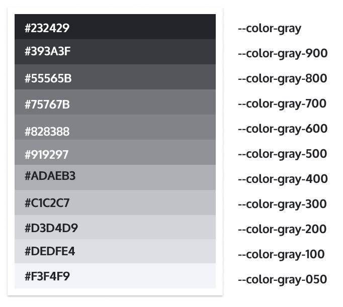
--color-gray: #232429; /* Same */
--color-gray-900: #393A3F; /* New */
--color-gray-800: #55565B; /* Davi's Grey */
--color-gray-700: #75767B; /* Moiety */
--color-gray-600: #828388; /* Old Silver */
--color-gray-500: #919297; /* Gray Blue */
--color-gray-400: #ADAEB3; /* Gravity */
--color-gray-300: #C1C2C7; /* Seashell */
--color-gray-200: #D3D4D9; /* Light Gray */
--color-gray-100: #DEDFE4; /* Light Diamond */
--color-gray-050: #F3F4F9; /* White Smoke */
--color-gray-025: #F9FAFF; /* White Smoke Light */
When this is in place, the correct values will be updated in #3123811: Grey text in Claro theme failed accessibility, which is the one that should fix the accessibility issues with gray.
Link to Figma specs: https://www.figma.com/file/OqWgzAluHtsOd5uwm1lubFeH/Drupal-Design-system...
Remaining tasks
Define new color valuesUpdate color valuesReplace existing colorsChange variable names
User interface changes
All grey colors will change.
Release notes snippet
| Comment | File | Size | Author |
|---|---|---|---|
| #49 | gray-overlay.png | 229.33 KB | ckrina |
| #49 | gray-form-boolean.png | 178.8 KB | ckrina |
| #49 | gray-claro-details.png | 117.77 KB | ckrina |
| #49 | gray-button.png | 155.64 KB | ckrina |
| #49 | gray-breadcrumb.png | 51.95 KB | ckrina |
Issue fork drupal-3154539
 Show commands
Start within a Git clone of the project using the version control instructions.
Or, if you do not have SSH keys set up on git.drupalcode.org:
 changes


Comments
Comment #2
saschaeggiComment #3
saschaeggiColors are updated in the Drupal Design System (including Colors Library & Claro in Figma): https://www.figma.com/file/OqWgzAluHtsOd5uwm1lubFeH/Drupal-Design-system...
Comment #4
kiran.kadam911Comment #5
kiran.kadam911Kindly review the attached patch.
Thanks!
Comment #6
sd9121 CreditAttribution: sd9121 as a volunteer and commentedComment #7
kiran.kadam911Sorry, I missed one variable to update. Kindly review the new updated patch.
Thanks!
Comment #8
jwilson3Regarding the code comment
/* 10% darker than base. */It's not clear from this patch that the--color-gravityis in fact 10% darker than base. Base I presume in this case is--color-lightgray(?), in which case seashell is the next color down in the scale, that i'd presume would be 10% apart, but maybe not. ¯\_(ツ)_/¯ I think it makes sense to just remove this code comment (and any other similar ones that can be found related to the gray scales).What would make this patch overall much nicer to maintain and review would be to use HSL colors to more easily confirm that the colors are all in the same Hue and only change in Lightness or Saturation to achieve the correct tone. For instance, a quick run through using a color picker shows that the bottom 4 colors have a hue of 231 while the lighter shades have a hue of 230. Very minor difference, most likely imperceptible to the eye but in the end, it is an annoyance that could be fixed and standardized.
Given that the contributors on the design side have provided only RGB colors, maybe this is out of scope, but I feel link this is an integral part of building a proper grayscale using more precise intervals and colorspace that is native for the web.
Instead of naming color variables that are near to impossible to remember if you need to lighten or darken one, I'd suggest naming the css variables on a numeric scale.
You put the 100 level scale there to allow for future expansion if it were ever needed. This would vastly improve themers experience, maybe designers too.
Of the 11 design systems I checked, 8 of them standardize around a decimal system for their neutral color variables.
The 3 design systems that I looked at that broke from this trend were:
It is clear that the reason these outliers do not use a decimal system is because they don't have a complete grayscale, but only offer a few select neutral tones. Because we're adding several more grays here, it makes sense to switch to a decimal system.
I've filed a follow-up issue for this where the topic can be hashed out in the wider community, since the problem affects all of Drupal, not just this theme. #3155258: Use American English spelling of "gray"
Comment #9
sd9121 CreditAttribution: sd9121 as a volunteer and commentedComment #10
jwilson3Comment #11
saschaeggiAnswers to @jwilson3 points:
Comment #12
kiran.kadam911Comment #13
kiran.kadam911Thank you @saschaeggi for your reply on #8 and As per your reply #11 patch is updated, Kindly review the attached patch.
Thanks!
Comment #14
sd9121 CreditAttribution: sd9121 as a volunteer and commentedComment #15
sd9121 CreditAttribution: sd9121 as a volunteer and commented@kiran.kadam911,
I have reviewed your patch and it looks good to me.
Screenshot for reference:
Thanks!
Comment #16
bnjmnmThe disabled color for button will likely be different than the disabled color for an input. This is because inputs will be on a white background, but the button text is on top of the button's background color. This could either be decided in this issue, or the changes to button color could be removed and addressed in a followup.
Figma does say "disabled 4:5.1", for but the issue summary also says "Also it should be discussed which color we should finally use for the disabled elements." and "Decide which color to use for disabled".
If the decision has been made, that should be made more evident in the issue summary as there's no discussion of it in the comments. If it hasn't, then that needs to happen.
I removed the Figma screenshot from the issue summary as it is outdated and can be confusing when checking multiple colors against the patch.
Comment #17
saschaeggiAn update on the disabled state front. Cristina & I discussed this today and we decided on the following option:

We decided to use gray-blue for disabled text. We also streamlined it accross elements (see example with input and buttons):
I hope this unblocks this issue.
(Note that this change is currently not everywhere reflected in the design system yet, but it's on our task list to do so)
Comment #18
kiran.kadam911Comment #19
kiran.kadam911Thanks @saschaeggi for your reply to go head.
I updated the patch as per #17 with New disabled color(gray blue).
Kindly review the attached patch.
Thanks!
Comment #20
bnjmnmThis needs a reroll, also noticed a few things, some may require design input. It's possible some are more suitable for followup issues so I'm open to that.
--input--disabled-bg-color: #f2f2f3; /* Light gray with 0.3 opacity on white bg. */The color assigned to this variable is not any one of the new grays. I assume it's pretty close to one of them, and should equal that instead of#f2f2f3We should either change these to one of the grays added in this issue, or explicity state that it's OK for them to keep their value despite them adding to the number of grays presented by Claro:
I suspect some of the rgba ones can stay as-is, but if they can be converted to hex thats better as the color will be consistent regardless of its background
--color-lightgray-o-80: rgba(212, 212, 218, 0.8);intentional or should it be replaced by one of the new grays?The reroll should include making sure that any instances of "grey" are now "gray", as that change was made in a commit that occurred since the last patch was uploaded.
May as well add these next to the other grays instead of at the end of the list. I considered also suggesting reordering by darkness, but that can happen in the variable renaming issue.
Is is actually specified anywhere that --color-gravity should be the value of --color-lightgray-active? It's possible I missed this, but this and the disabled fg/bg colors should be explicitly stated in the issue summary or figma (ideally both but as long as theres a single place to consult it should be fine).
Comment #21
MeenakshiG CreditAttribution: MeenakshiG at OpenSense Labs for Drupal India Association commentedRerolled the patch and implemented 5 and 6.
Comment #22
bnjmnmyarn build:cssin /core should do it.Comment #23
bnjmnmOn the Claro weekly call @ckrina confirmed that items 1,3,4,7 from #20 don't need to be in the scope of this issue.
This has the missing compiled CSS from #21
Comment #24
bnjmnmReroll
Comment #26
ckrinaWe just discussed this with @lauriii at today's weekly call to find the best way to implement ideas from #3155531: Naming convention of color shades in the Drupal Design System (e.g. for Claro) here. The plan:
1. Update the gray names here, so we end up with a gray-based scale name. But keeping the same color we have right now that have already been tested. The colors won't set exactly into the 100 scale, but will be close enough:
2. Open a follow-up to update the colors and do a proper accessibility testing revision so we don't introduce a11y regressions, and iterate in there.
This way we can close this stable blocker and fix the accessibility issues it is holding up.
Comment #27
ckrinaUpdate issue summary.
Comment #30
hansa11 CreditAttribution: hansa11 as a volunteer and at Ramsalt Lab commentedComment #31
mgiffordComment #32
mgiffordComment #33
mgiffordI think I'm missing something. The changes that I can see which would affect color contrast are just moving from: core/themes/claro/css/base/variables.pcss.css
--color-sunglow-shaded: #c;to this:
--color-sunglow-shaded: #977405;These are commented out, right? core/themes/claro/css/base/variables.css
/* Variations. */ /* 5% darker than base. */ /* 10% darker than base. */ /* 10% darker than base. */ /* 20% darker than base. */ /* 5% darker than base. */ /* 10% darker than base. */ /* 5% darker than base. */ /* 10% darker than base. */ /* 5% darker than base. */ /* 10% darker than base. *//* Variations. */ /* 10% darker than base. */ /* 20% darker than base. */ /* 5% darker than base. */ /* 10% darker than base. */ /* 5% darker than base. */ /* 10% darker than base. */ /* 5% darker than base. */ /* 10% darker than base. */Most of the changes aren't where I would be expecting them from looking at @bnjmnm's code.
Comment #34
ckrina@mgifford this issue is just to implement a new set of variables / a new gray scale and to standardize the design system first. When this is in place, the correct values will be updated in #3123811: Grey text in Claro theme failed accessibility, which is the one that should fix the accessibility issues with gray. Sorry if I didn't explain it properly during the sprints :)
Comment #35
chetanbharambe CreditAttribution: chetanbharambe for Drupal India Association commentedComment #36
chetanbharambe CreditAttribution: chetanbharambe for Drupal India Association commentedComment #38
ckrinaChanging to Needs work so there's more visibility.
Comment #39
saschaeggiSounds good to me for using only 025, 050, (potentially 075 in the future) and 100. Keeps things a little bit simpler.
Comment #40
ckrinaMoving it back to Needs Review. Let's see if we can fix this one and move forward with all the accessibility issues blocked by this one :)
Comment #41
ckrinaUpdating issue summary so the scope of this issue is easier to understand.
Comment #42
bradleyfmash CreditAttribution: bradleyfmash as a volunteer and at Kanopi Studios commented@ckrina --- If I'm not mistaken you have a PR in for this via this commit right? https://git.drupalcode.org/project/drupal/-/merge_requests/427/diffs#dif...
I can help here if needed, but seems just needs merged?
Comment #43
javi-er CreditAttribution: javi-er at Lullabot commentedI took a look to the color names on the merge request and seems right to me now, here's a screenshot with the latest values:
Comment #44
bnjmnmI can't get the current MR, or a new branch to be based on 9.3 (perhaps it's just a Gitlab blindspot on my part). This addresses the CI failures in the most recent MR + rerolls to 9.3. I didn't realize I couldn't get this to cooperate with the MR until it's too late, but here are the changes that can hopefully be part of an MR that is against 9.3!
Comment #45
paulocsComment #47
ckrinaI've just created a new MR to 9.3.x with changes from #45 (thanks @bnjmnm and @paulocs!) plus a new change I realized was missing: the primary
--color-textwas still using the old gray value, so I've updated with the darker gray from the new gray scale. I've done it in a new commit so its easier to review what I've changed.Hopefully it's ready now :)
Comment #48
marcusvsouza CreditAttribution: marcusvsouza at CI&T commentedThe patch in comment #45 correctly changes the css variables names e values.
Comment #49
ckrinaHere is a list of screenshots to help evaluating the changes:
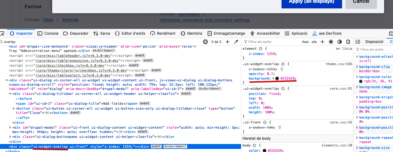
Overlay
Moves
background: var(--color-text);from#222330to#232429:Radio button
Moves

var(--input-border-color);from--color-grayblue: #8e929c;tovar(--color-gray-500)(--color-gray-500: #919297;):Claro details
Moves color from

color: var(--color-davysgray);tocolor: var(--color-gray-800);:Gray button
Changes
color: var(--button-fg-color);declaration in variables, that usesvar(--color-text)(from#222330to--color-gray: #232429;; andbackground-color: var(--button-bg-color);that is replaced by--color-gray-200(#d3d4d9).Breadcrumb
Uses
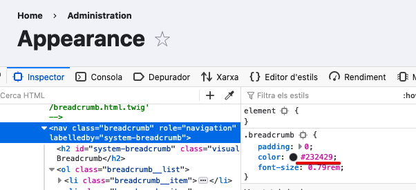
color: var(--color-text);, changed in variables from#222330to--color-text: var(--color-gray);(#232429).Action Link
Changes

color: var(--color-davysgray);tocolor: var(--color-gray-800);(#55565b):File
Also changes

color: var(--color-davysgray);tocolor: var(--color-gray-800);(#55565b):Comment #51
lauriiiGreat work here all! I really like end result of this issue!
Did some manual testing and confirmed did my best to confirm there are no regressions to color contrast as a result of this. Wasn't able to find anything so I think we are ready to proceed with this.
Committed ffb4778 and pushed to 9.3.x. Thanks!