
Opening up for discussion, this is, afaik, the first time I have seen a genuine template suggestion in a core theme. That aside I am not sure about the modification the suggestion makes. In short it moves the Links back into Content, so the render above the Book Navigation.
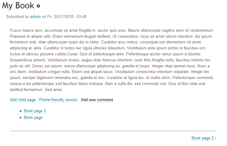
To me this is conceptually incorrect - links are actions (mainly) while the actual book nav is integral to the structure of the book, not something that comes after the fact. See screenshot.
I suspect that mostly what I am looking at in all these template reviews, is, does the ends justify the means, is it enough to justify having a whole new template for this one small change, that end user could do themselves if they want to?
| Comment | File | Size | Author |
|---|---|---|---|
| #5 | book-navigation.patch | 719 bytes | eigentor |
| corolla-book-page.png | 24.86 KB | Jeff Burnz |


Comments
Comment #1
eigentor CreditAttribution: eigentor commentedHm. The book module has been used by some Drupal-Newbies I knew because it is quite intuitive in what it does. You create pages and instantaniously you see kind
I have always liked the navigation to be clearly seperate from the content.
If it is like in the screenshot above it looks just like a page with some additional links.
So removing this clear difference makes up for a loss of usability to me.
Maybe it is more styling issues that Jarek was after? I guess we can achieve some of his goals without changing the template. This would need Jarek to comment what he is up to with this.
Comment #2
Jeff Burnz CreditAttribution: Jeff Burnz commentedYeah, I use it, and I know lots of users who use it, I like that the book nav is right below the content, you read the page and then move logically to the next page. To me the links being in-between breaks that visual flow.
Comment #3
Jarek Foksa CreditAttribution: Jarek Foksa commentedI wanted book navigation to be the last item just like pager is the last item when viewing multiple nodes. It seemed to me to be more consistent this way. I would expect navigation to be the last item on page, not "Print this page" link.
If you are going to remove this template, please make sure that there are still proper margins between navigation and links.
Comment #4
Jeff Burnz CreditAttribution: Jeff Burnz commentedOk, if that's the design you are going after we should keep it - but does it need more styling?
Comment #5
eigentor CreditAttribution: eigentor commentedO.K. this makes sense:
The "add child page" link e.g. belongs to the node much more than to the Navigation.
But if so, we should also add in a separating line above the Book navigation to seperate it more.
http://screencast.com/t/N2VhMjIwNGMt
I made the lines a little lighter, because they were too heavy if there were two.
Checked if the color used before was changed by color module: nope.
Patch attached.
Comment #6
eigentor CreditAttribution: eigentor commentedHm this puts a double border in if the Ul with links is not there. places: http://screencast.com/t/YTVjMWM4Z
It needs a better concept, if it is done ;) Maybe a condition, to check if the list in the book navigation is there.
Comment #7
Jeff Burnz CreditAttribution: Jeff Burnz commentedPatch applies cleanly, looks good, I think that satisfy it perfectly.
Comment #8
Jeff Burnz CreditAttribution: Jeff Burnz commentedHey, can you trow in the RTL stuff for that while we're at it?
Comment #9
eigentor CreditAttribution: eigentor commentedWell, did not try yet for RTL. To avoid the double border, the second border must be on the ul, and the ul needs to be set to 100% width. This should do the trick.