 Support for Drupal 7 is ending on 5 January 2025—it’s time to migrate to Drupal 10! Learn about the many benefits of Drupal 10 and find migration tools in our resource center.
Provides the Guiders-JS library to Drupal.
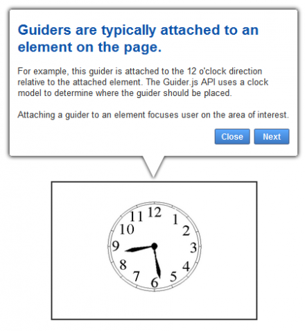
Guiders are a user experience design pattern for introducing users to a web application.
Guiders are a great way to improve the user experience of your web application.
As i don't have any time to support this module, any help as to maintaining this module is welcomed.
A Guider is a guide / walk-through for your site's pages.
The Guider can show the page parts and give a short explanation about each part's functionality and purpose.
This module is for anyone who is looking for a walk-through, guide, intro, or just a sequenced messaging system.
Features:
- Add text / html or just about anything as the guider's content.
- Choose if an arrow tip should be displayed, choose it's direction and element it should be attached to (via xpath syntax).
- Choose if a close button ("X") should be displayed in the top right corner of the guider.
- Highlight an element by setting a selector, the element will be like the guider, above the overlay layer.
- Add multiple buttons for each guider (the "Close", "Next" buttons have built in implementation).
- Add custom buttons with a name, class and a name of a JavaScript function to be called on click.
- Allow to choose from different start methods:
- autostart
- delay - an amount of milliseconds to start the pack after
- event - bind on event type to an element to start the pack
- default block - allow to start by clicking on the button on the default module's block
Important:
Every time you update your local version to a new one make sure you also update you guiders-js library to the one supported by the version.
For more information, please see the Guiders-JS Git page at https://github.com/jeff-optimizely/Guiders-JS
Project information
- Created by basik.drupal on , updated
Stable releases for this project are covered by the security advisory policy.
Look for the shield icon below.
Releases
Development version: 7.x-1.x-dev updated 23 Aug 2011 at 12:19 UTC


