
Closed (fixed)
Project:
Drupal.org customizations
Version:
6.x-2.x-dev
Component:
User interface
Priority:
Normal
Category:
Task
Assigned:
Reporter:
Created:
5 Jan 2011 at 17:59 UTC
Updated:
23 May 2014 at 18:23 UTC
Jump to comment: Most recent, Most recent file


Comments
Comment #1
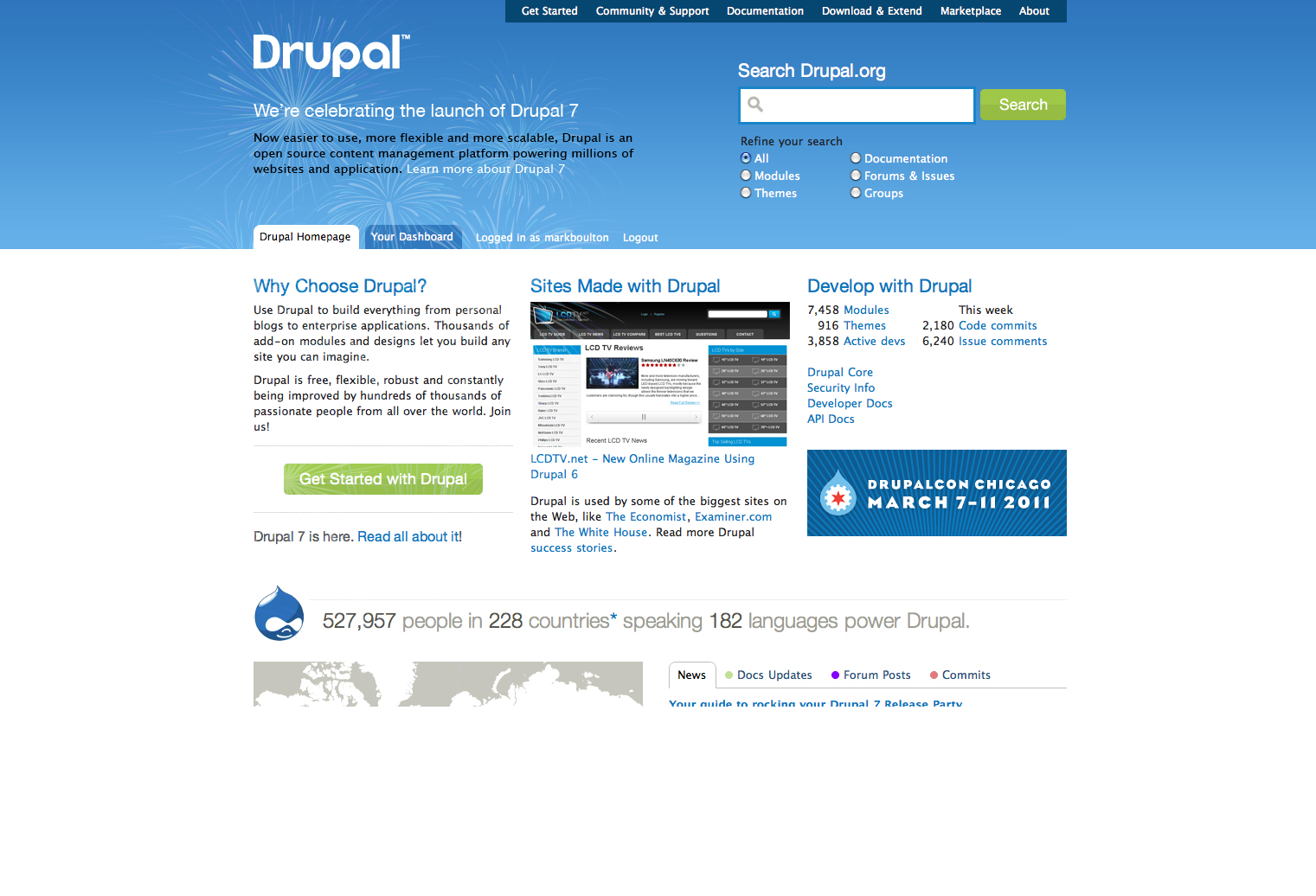
jensimmons commentedI'm on it.
Comment #2
jensimmons commentedWell, I played with a lot of possibilities. These two seemed to be the best:
But the fancier one would be hard to implement. And time is short.
I'm attaching the jpg for the simple banner box.
Comment #3
jensimmons commentedIf somebody wants to try to code the first option (the complex one), here are the image files you'd need.
Comment #4
lisarex commentedGorgeous! Is this banner supposed to link? The first one looks sexy but doesn't look as clickable. I'd love to see a 'call to action' here....
Comment #7
laura s commentedThe first one could be sweet - maybe a white line between to break up the blues mismatch? But it would take 2 wrappers + containers 960-wise to go 100% on the lower region. To my own eye, it looks better than the banner block, though.
Comment #8
drummComment #9
laura s commentedThat's gorgeous! Done, right?
Comment #10
webchickDone!! :D
Thank you, Jen Simmons!!!!!!
Comment #11
drummYep, but will be removed in a few days, just need to know when.
Comment #12
webchickLOL
Comment #13
dave reidThe grammar was bothering me. :(
Comment #14
Bevan commentedThe
wavebackground.jpgimage file used on the homepage has a color profile that causes the colors to be rendered inconsistently on some systems. See the attached screenshot. Unfortunately the blues that they get shifted to clash severely with the blue in the header. See these side-by-side screenshots.The attached file
repaired.jpgwas generated by;Or something like that. There may have been an easier way, but this worked.
Unfortunately the final image suffers from double-compression since the first screenshot was already compressed and the same data was recompressed in the final step above. The middle steps did not introduce any additional compression because PNGs were used for all the screenshots, except for one, which appears to have minimal compression.
Additionally, the original screenshot was from Apple's Preview.app, which aliases the outermost pixel on all four edges of the image. This could be repaired if the window were larger than the image or if the image was opened in Photoshop instead of Preview.app to take the original screenshot.
Since the image is 1400x417px and is scaled to about 2/3 that size in the browser (for most modern browsers and viewport widths) these issues are minor and not noticeable to me. Even at double resolution I can not see any additional artifacting.
Comment #15
drummCommitted that & deploying soon.
Comment #16
Bevan commentedThat works for me though could do with more testing.
Comment #17
tormi.tabor commentedThe colour mismatch Laura is referring at #7 is really disturbing.. Why not just use http://drupal.org/drupal-7.0 as front page?
Comment #18
joachim commentedThe page at http://drupal.org/drupal-7.0 is *stunning*. Really nice work.
But the banner on the front page looks completely out of place. Yes to a banner -- but its colour and style just don't match up to the rest of the site design.
Comment #19
timmillwoodThe colour looks very odd together and looks a little like two sites mashed together.
I think Jen's second design is much better.
Also wondering if "it's here" is descriptive or actionable enough for a high level home page. Seems to work for a smaller banner where clicking through to find out more is the natural action, but for the home page I'd rather see something like "Get started with Drupal 7", "Find out what's in Drupal 7" etc
(sorry for sounding a bit moaning, creating a bit of hate on Twitter, and not noticing this issue earlier)
Comment #20
rkendall commentedI don't want to be too critical and I also want to thank jensimmons for contributing her suggestions, but I feel that this design change was rushed through too quickly.
Unfortunately the design as it is implemented does not look as good as it could. Probably the main issue being that the colours are not in keeping with the drupal.org design, and the graphic quality is poor (over compressed?)
In jensimmons second suggestion, the colours and design of the banner is more in keeping, although the larger integrated style of the first is a good approach.
I noted on Twitter that Mark Boulton (the designer responsible for the drupal.org redesign) was not impressed.
In general having a banner is a good idea, and it's a shame it wasn't thought of sooner so that there could have been time to develop a top quality result.
What to do now? I think we need something better, but should we take the existing one down until we do?
Comment #21
markboulton commentedPrompted by rkendall, I'm chiming in. I wasn't aware of this issue.
I apologise for the tweet - not cool. BUT, a banner is a great idea. An integrated banner would be good, but I'm afraid the current design kind of destroys a lot of the visual hierarchy on the homepage (the blue is different, the typeface - although D7 branding - is inappropriate. All of this difficulty is a symptom of a larger problem that we did not have time to address in the d.o. redesign: how do large promotions fit in the homepage.
The integrated approach is cool, but needs more work. The image is also overly compressed. It looks like it is: rushed (and that's not a slight on anyone's work, just an observation).
Jen's second design is more appropriate to the styleguide and visual hierarchy of the d.o front page. I think the existing one should be taken down and replaced with this.
Comment #22
gábor hojtsyThe original image was much more blue (at least on Macs) and the current banner is more purple. It is quite a big mismatch now: https://skitch.com/gabor.hojtsy/reyna/drupal-open-source-cms-drupal.org
Comment #23
aschiwi commentedI like jen's second design, the first and currently implemented one is... uhm yeah... The blue doesn't really go with the background blue and with this approach you can't really control what it looks like since the looks depend on the browser window size.
Comment #24
steven jones commentedSubscribe.
Comment #25
tormi.tabor commentedIt's still there.. And it already "ruines the moment".
Comment #26
eigentor commentedPeople, people. I would not expect when Drupal finally embraces the strange word "marketing" everybody to jump on the fence.
This appears to be just another cultural shock to us...
I totally love the banner. It could be a bit less purple but:
Only design that is rejected firmly by some people has the chance to be good. Stuff that strives to be liked by everybody will always be mediocre.
The somehow melting through the wire-like structure impression is totally rocking. But some may not like it, find it too aggressive... But hey, this is a big, big product launch. If we are not allowed to be a bit loud now, when are we?
So a strong thumbs up from me.
And if we totally do not like it, we change it again. This is fairly switchable I think and may not be there for very long.
Comment #27
markboulton commented@eigentor: I think you're missing the point. My points about the integration are *not* subjective re the design. There are elements of the intended integration that just plain don't work: The colour is wrong, the large caps typeface (however on brand for D7) does not work, and, as @leisa pointed out, the messaging is completely for Insiders (*what* is here exactly? Outsiders have not been waiting for 2 years - they just got here).
Please take this in the way it's intended. It's not a subjective rant, but *constructive* with a clear way forward. The swirly graphic should be replaced by the banner.
It's just a shame it has to create a bunch of negativity when this should be a happy time, by rushing something through that should've been more considered. I guess that kind of thing doesn't happen with code, so why should it with design?
Comment #28
jojototh commentedI agree with @markboulton that @eigentor is missing the point, it is now about not liking something but about staying consistent on the Drupal branding
I am attaching 3 different options, from which 2 could serve as a bridge between the D7 and drupal.org branding and 3rd is based on Drupal7 release banners
If any of these would be considered, let me know and I can provide the source files
Comment #29
jojototh commentedAttaching the second design...
Comment #30
eigentor commentedalrighty :) jozef's version is also nice, a bit lighter.
But I would vote to blend is somewhat into the white instead of just having a banner like some of your proposals. The blending is something of Jens Design that I definitely like.
I was only happy that something was there at all. Yesterday we looked and completely missed a banner.
Design discussions inside Drupal, yippie!
@markboulton you are of course definitely right: everything should comply to the CI. But just as I said: this is easily replaceable, and as soon as we agree upon something it will probably go there.
But not having a banner at all still appears the worst version to me.
This goes to show again Leisa's point from the other issue about having a better timeline preparing a big launch, and what needs to be done to d.o.
So we would have had this discussion before the launch, get mad at each other and be tired but have an agreement on launch day :)
So, yes, #29 +1, but why is there a space between the tabs and the beginning of the swirl? should not be there to me.
Comment #31
robloach#29++, but I'm no designer.
Comment #32
dries commentedAdding a banner is a great idea, but the current banner isn't good enough in my opinion. I saw quite a few complaints about it; both in e-mail as well as on Twitter. No offense but I don't like the current banner either -- the colors conflict and it doesn't fit the existing design. I recommend that we revert to the regular design, and that we continue to work on a better banner.
Comment #33
joachim commented> (*what* is here exactly? Outsiders have not been waiting for 2 years - they just got here).
Yup.
But we can still keep some of the excitement, more so than with 'Get started with D7'. How about something like 'Brand new Drupal 7'? -- exact phrase to be bikeshedded, but something that conveys it's new to both outsiders and regulars.
Comment #34
laura s commentedConfirming on my browsers that the new blue is on the purple side, and though saturation is a better match, the color mismatch is now more jarring.
Comment #35
lisarex commentedIt should just be a matter of reverting to an earlier version of the homepage. I've mentioned it in infra IRC; drumm is the best person to roll back to earlier version :)
Agree, we should just focus on a banner...
Originally I was envisioning a banner ad with a call to action "Find out more". Maybe mark and leisa could offer some guidance on the options presented so far.
Comment #36
webchickI think most of this stems from the fact that Bevan's version in #14, attempting to fix some kind of colour-mismatch among certain browsers, was deployed without design review. Jen's original matched the colours of d.o great and blended very well (or at least on Mac, where the purple-ish/blue that's there now is creating a lot of weird contrast), and evoked lots of positive comments. It was changed sometime late yesterday afternoon (Pacific time) and the colour shifted quite dramatically.
I'd rather just revert to Jen's original image (which looked awesome!) than spend a lot of time working on further suggestions. This is only going to be up for a week or so, and we have a lot of new people hitting the site right now. If it feels like the home page changes every other time they come here, it's going to be very jarring for them.
Dries, we did have the site using the old home page at the beginning but it was really, really weak. Nothing about Drupal 7 other than a h3 at bottom of the "fold", and then a tiny link to "Drupal 7.0 released" at the very, very bottom. We wanted to make this a much bigger deal.
We talked to drumm about switching the home page, but that's problematic because Drupal.org has custom home page functionality, and it would require some coding to accommodate.
Comment #37
dave reidWe also need to investigate why we can't easily change the homepage... It should just require the config change at admin/settings/site-information and not any code. Users that have their dashboard set to home should still see that, everyone else the new homepage.
Comment #38
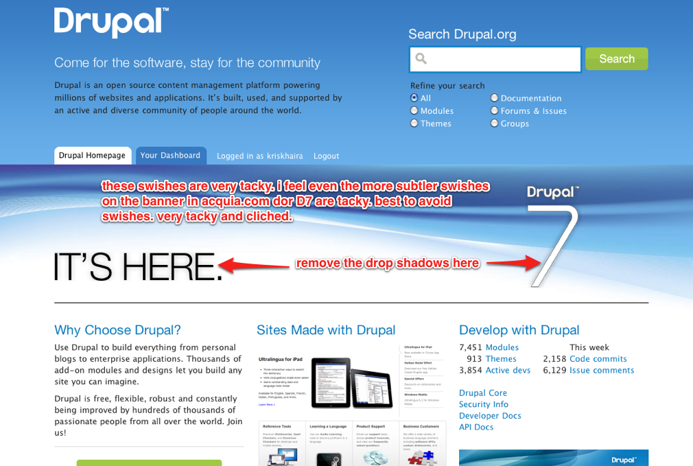
kriskhaira commentedI've attached a screenshot with some comments.
I find the swishes and the drop shadows very tacky and cliched. drupal.org was already redesigned recently and it was great. Releasing Drupal 7 like this is sort of an anti-climax. A text announcement in one of the blocks would've actually been better.
Comment #39
jameso commentedAs a Wordpress fan and Drupal waverer who was VERY prepared to take Drupal 7 with a completely open mind...I have to say the addition of this banner rang a lot of warning bells about Drupal and its community for me.
You really shouldn't be doing things this way. The homepage is like your President, your flagship store, your Head of State...it needs to adopt a serene, self-assured, resilient front that may bely the frenzied developer community that underpins it.
So this is how it looks to me:
Wordpress get it. Drupal don't.
That's a real own goal.
Comment #40
aschiwi commented@jameso: Interesting point, thank you.
Comment #41
drummI'll go ahead and revert to wavebackground.jpg from #3 here. Any further changes must have source files.
Comment #42
aschiwi commentedI know it's silly to bring this back up but I can't stop myself :) I really think this makes a bad first impression and we put so much work into press releases these last few days that I would hate for all these people to come to d.o to see this. Jozefs suggestion in #29 would be a serious improvement to the current situation.
Comment #43
drummTentative plan from webchick is go back to business as usual Saturday, after the release parties.
Alternatives do need design, implementation, and more review than #14 got. That is hard to do in 2 days with the large number of people with something to say. If someone does want to go ahead and work on something http://d7.redesign.devdrupal.org/ is a development site available to try out real implementation. Your SSH key is needed on your Drupal.org profile.
Comment #44
Bevan commentedOops! I expected my repaired.jpg image in #14 would get more testing and eyes on it before it was deployed.
I agree that this whole thing was far too-rushed. A one-week-late well-done banner would have been better than the issues caused by this under-tested one.
I am not a designer either, but jensimmons' mockups are great. mogdesign's are better because they are consistent with the rest of the Drupal 7 branding and also match Drupal.org's branding. I encourage that we replace the current one with mogdesign's #28 or #29 ASAP to cut our losses.
Comment #45
Bojhan commentedInteresting developments here, having been involved in Drupal's design quality assurance for the past two years I am very aware of difficulty here of needing to get a message out - even if it means giving up on quality. However I do not see any added value in keeping this banner up, even until Saturday, each minute its up it hurts our brand. It's important to stress that last point, we cannot afford to uphold bad messages over no-message, that is not a strategy we should promote, as critical as it may seem.
It seems there are perfectly viable alternatives, can we please revert and then take an alternative - to me this seems a decision that can still be taken in a few hours without hurting the conversion to much? (I actually observed two people, who I had to point out to, that the banner was clickable)
To be clear none of the UX-team members (inc. mark & leisa) have reviewed this before going live, for such drastic changes - especially future wise, it might be good to make sure at least a sanity check is done.
Also, let me add that jensimmons did a perfect exploration of possibilities(which she clearly pointed out) - which is needed to get to a final design, but should never be mistaken for something final. There is always a whole bunch of additional work to be done, to make it fit just right.
Comment #46
webchickFine. I'm sick and tired of arguing about this. I really wanted to spend the days following the Drupal 7 release doing something more pleasant and enjoyable than arguing with a bunch of people. Remove it, then.
Just know that once this is gone, there's absolutely no way to get to the big fancy http://drupal.org/drupal-7.0 other than an extremely subtle "Read all about it" on the home page at the very bottom of "the fold," below the big green button that people will actually see (which links directly to /start and bypasses the announcement). Which is why Jen's image was put up quickly, without waiting around for a bunch of external design review, because it is an absolutely ridiculous situation that the biggest milestone of our entire project in 3 years isn't featured on our home page.
Whatever. Maybe one day we'll have an actual marketing/branding team instead of relying on a bunch of over-worked core contributors to do this stuff, and they can come up with things like this months ahead of time and not the day of release. In the meantime, it looks like all we've done here is take a huge steaming crap over someone's hard work. Sigh.
Comment #47
webchickComment #48
Bojhan commented@webchick I'm sorry, didn't mean to piss you off. I am confused by your statement, we have only one link because I see a pretty dominant Get started with Drupal 7 right below Develop with Drupal in the ad space? Or am I the only one seeing this all the time.
Either way, lets not make this more than it is. There are viable alternatives up by @mogdesign, possibly with some additional pointers from mark we can have this up today, which can stay up for a few weeks?
Comment #49
alexmorris commentedSeems to me there's two main issues here.
1) There's no single arbiter for quality or intent when situations like this arise. Design by committee never works.
2) As an organisation, your brand and message are your currency. If no-one owns this, you risk devaluing your organisation by allowing rushed and unconsidered decisions to be made, both from a design and editorial standpoint. Someone needs to steer this big ship and they should be paid to do so. It's not realistic to expect anyone with appropriate experience or expertise to do this for love. If someone can't commit time to research, plan and see something through to the end, you get a very watered down version of their vision and intent.
The community is what makes Drupal great, but without direction, leadership and power to veto from fully committed, full-time staff, there can never be the consistency required to maintain a solid brand and product.
Comment #50
markboulton commentedLeisa, Alex and I have worked up this visual as a direction we'd like to go with the design and content. We propose replacing the proposition statement in the top left with the announcement with, yes, some subtle fireworks. Then intent is to stay with the existing d.o. homepage and use the design to our advantage (retaining the whitespace and the natural place for your eye to go). The call to action (the white link), links to the Drupal 7 announcement page.
Anyone have time (with access) to quickly get this rolled out if people are in agreement?
Comment #51
markboulton commented@webchick: Firstly, these comments shouldn't be taken out of context: we're not crapping on the design because we don't like it. We're providing constructive criticism - just as you would for a code review.
Bojhan is right: for every moment the banner is live, it undermines the brand and damages the message. It *is* ridiculous that the homepage cannot be changed to include a considered brand and marketing message. It is ridiculous that this wasn't considered weeks ago by a dedicated team with _editorial control_ (not just SVN access or whatever). And you're right, maybe one day there will be a branding/marketing team that could plan this sort of stuff (a team with _actual_ experience in that field), but until then, we are where we are.
Also, let's be clear. We're not crapping on Jen's work (well, I'm not). Far from it. Any _decent_ designer (and Jen is one) should take these comments as they were intended: constructively.
Leisa, Alex and I have spent some time working up where we think we can make an announcement that can be accommodated for a few weeks. One that sits well with the d.o. design, and one that clearly points people to the Drupal 7 launch page.
Comment #52
nicrodgers+1 for markboulton's mockup, much better.
Comment #53
instanceofjamie commented+1 for fireworks! (#50 for clarity)
Comment #54
yoroy commentedThanks Mark. Could you attach a layered PSD of the relevant bits?
This needs work then :-)
Comment #55
tormi.tabor commentedWow! #50 is really beautiful!
Comment #56
joachim commented+1 for Mark's fireworks. Looks ace.
Comment #57
tormi.tabor commentedcrosspost;)
Comment #58
webchickThanks, Mark. That looks nice.
drumm should be back online within about 6-7 hours, so should be able to make the change then. But he does need the source files (PSD or whatever) in order to do it, according to #41. If you .zip it, you should be able to attach it.
Comment #59
siliconmeadow commentedComment #60
siliconmeadow commentedsorry - got in a hurry and didn't mean that to be an issue tag.
+1 for #50
Comment #61
webchickAlso we definitely don't need a pig-pile of +1s here. We have a proposal from the original designer of Drupal.org. It's not like anything's going to trump it.
If you have actual constructive design reviews you can provide though, please feel free.
Comment #62
adrinux commentedThe positioning works better in Mark's mockup, but it seems a little restrained. (Maybe a bit to British :) This is announcing 3 years of hard work, and given its temporary nature a bit more visual oomph would be nice.
Comment #63
webchickComment #64
adrinux commentedDammit. I did not change that status or title. Reverting back to webchick's.
Comment #65
markboulton commentedAttached is the layered PSD. The fireworks image needs a mask doing, but it's all there.
Comment #66
siliconmeadow commentedyeech - sorry for showing an interest
-1
Comment #67
webchickCool, that should do it. I'll shoot drumm an email so he sees this.
Comment #68
tormi.tabor commentedOne minor typo in text:
- '..powering millions of websites and application.'
+ '..powering millions of websites and applications.'
Comment #69
eigentor commented+1 mark. and +5 #50
I realize the place mark put the announcement in is the logical position for banners and stuff.
Same way google does branding when the mood takes them.
Like this we can leave it on quite a bit longer than saturday.
Still support webchicks decision to have a banner at all than none.
I guess we now have kind of a styleguide for big announcements and frontpage banners.
also +1 to adrinux #62: yes, oomph allowed. German band oohmp as inspiration: http://angeloconcuore.files.wordpress.com/2010/05/oomph.jpg
Comment #70
rkendall commentedI think the design at #50 is great and has plenty enough oomph - can anyone honestly miss it?
I disagree with with the people that suggest it is too restrained, what do you want, something like this??!: http://www.sportsdirect.com/pages/?fnk=januarysale
A classic problem that designers have to contend with is clients who want to over-emphasise things (everything?). Just think about how you feel about emails in all-caps (with bold, red and large font).
Can it please go live now?
Comment #71
TOK69 commentedCan you say Holy Microsoft batman? The homepage that's live right now and the banners that are shown on this page all look like Microsoft. I would recommend changing this ASAP.
Having a new "7" design direction should be NEW, FRESH, and DIFFERENT to make you stand out.
Also you have a huge amount of space being wasted. Close to 300px height just for a little copy and a search box. Are you serious? It also feels like you have two banners stacked on top of each other. It's strange.
Comment #72
drummhttp://d7.redesign.devdrupal.org/ has the changes for the fireworks only. That required changing the header markup and CSS, so it needs some browser testing. (That staging site has lots of caching off, it is slow.)
The other changes are straightforward, I'll be doing them soon.
Comment #73
Bevan commentedDoes anyone have a browsercam account they can run that url through through?
I agree.
But since there is a lot of consensus for markboulton's design from #50 I support implementing that as soon as practical.
(I still prefer mogdesign's banners in comment #28. Note we could actually have both, though that is probably overkill.)
I agree entirely.
(However hiring staff and handing out such a title is non-trivial. That is a larger conversation that needs to happen elsewhere, and does not help us now with the current issue.)
I was not aware the banner was clickable till I read bojhan's comment! There is no call to action in the current banner.
(To be fair I was probably more distracted by the clashing blues on my system.)
Comment #74
lisarex commenteddrumm, http://d7.redesign.devdrupal.org/ looks good on a Mac in Chrome, FF and Safari.
Update
looks good on Vista IE8 and XP SP2 Firefox 2.0
Comment #75
webchickThis looks good, except it's missing a link to /drupal-7.0 which is the entire point of the big-ass banner. :)
Comparing against http://drupal.org/files/issues/drupalorg_revision.jpg it looks like we're missing a link "Learn more about Drupal 7" there, which presumably would point to that page.
Feedback from #drupal:
- Looks fine in chrome/linux
- Looks ok in FF3.6 and Chrome 9 on Ubuntu
- looks good in FF3.6/IE8/Opera11/Chrome9/Safari5 on Win7
A few people said that the text is hard to read with the fireworks behind it, though.
Comment #76
redndahead commentedI would be one of those people. The black on blue is already hard to read. Adding a busy graphic like that makes it even more difficult.
Comment #77
Bevan commentedSee the screenshots of Opera, Firefox, Safari and Chrome on Mac OS X. (Interestingly each of those browsers renders the blues in the background gradient slightly differently on Mac OS X 10.6.5.)
I see the background image
fireworks.pngis aligned left to the viewport which means it is inconsistently aligned with the foreground text "We're Celebrating..." when the browser-width changes. I believe markboulton's intention was that the largest "fireworks explosion" centres on the "e" of "We're".To achieve this, I think we can simply;
background-position: 50% 0;)633is2 x 316.5, and316.5is the number of pixels left we need to shift the original image from centre)I also noted that you used a 24-bit PNG image with alpha transparency, which will make the background of the
fireworks.pnggrey in IE6. (Or am I missing something?)The attached image
fireworks-bevan.pngis1200pixels wide (original image plus buffer;567 + 633) and is an 8-bit PNG with indexed transparency and a 256-colour palette, which should work fine in all browsers.I used the light blue from the bottom of the background image in the header from the homepage,
sprites-horizontal.pngas the "matte" colour so that the alpha transparency (only along the bottom 10px of the originalfireworks.pngimage) should blend in correctly. I have not tested since I can't find how to replacebackground-imagewith a local file in Firebug or Chrome Developer tools.This also shaves 70% (100kb) off the size of the file, even though it has more pixels.
With regards to text "We're celebrating the launch of Drupal 7", the mockup uses slightly heavier
font-weightthan the equivalent text on the current Drupal.org homepage (the slogan "Come for the software, stay for the community"). The mockup usesfont-weight:normalinstead oflighter. However I think this was an oversight on markboulton's part.I do not think that the above suggestions/comments should block the deploy of this feature if the feature is otherwise ready and the fixes would significantly delay deployment further. They are more "would be nice to get right" issues than "omg it's broken".
However I think we still need to test browsers on more versions of IE before we can deploy.
Comment #78
drummI like the general idea of beven's revision, but it has a lot of pixel noise in practice.
Comment #79
webchickLet's not get creative here, I don't think. Jen's banner's already been up for > 72 hours and Mark Boulton as well as the rest of us are taking a lot of heat for it. Let's get Mark's up as soon as is practical, to restore brand integrity.
Comment #80
Bevan commenteddrumm: What do you mean by "pixel noise"?
In case it was not clear; we do not need to change anything. In comment #77 I noted a couple of minor inconsistencies between the mockup and implementation and offered suggestions to fix them. If it works now, we should deploy it now, even if it's not quite correct (ie. as markboulton intended) or as performant as it could be. That has nothing to do with the creativeness of it.
I'm trying to get access to some IE environments.
Comment #81
webchickOk. This has now been deployed: http://drupal.org/ and the old banner removed.
Marking back to "remove" and "postponed" so we revisit this in a couple of weeks.
Comment #82
drummBevan, your image had some pixels lighter than the blue gradient, outside of the fireworks. So a lot of 1x1 spots that were out of place.
The tested version is now deployed.
Comment #83
markboulton commentedAwesome work. Thanks all.
Comment #84
markboulton commented@Bevan: you're right. The intention was for the fireworks graphic to hang off the grid on the left. I don't want to be picky - especially after all the hullabaloo - but one one of the ways this graphic was drawing the eye was because it was visually disruptive to the normal flow of the grid. But, ah, I'll let it slide. ;)
Comment #85
Bevan commentedAs predicted, IE6 is totally borked because of the alpha transparency in the 24-bit PNG of
fireworks.png. So is the logo/wordmark and most rounded corners mind you. I assume then that Drupal.org does not support IE6? This does not even meet a "minimal" support level. See the attached screenshot.Note that the gradient bars in the screenshot are because I am taking a screenshot of a remote Windows machine through "Remote Desktop Machine.app". I do not believe that they render this way in IE6 with a same-system monitor.
drumm: Re #82: Ah! I was afraid of that. I did look, but didn't notice any alpha transparency other than the lowest 10px. Obviously I didn't look hard enough.
Comment #86
markboulton commented@Bevan: what's the minimum browser requirements for d.o? We shouldn't be supporting IE6 should we?
Comment #87
webchickI consider things looking like crap on IE6 to be a feature, not a bug. ;)
Comment #88
jensimmons commentedSo Drupal doesn't care about Asia?
Not supporting IE6 means leaving China out. Bye bye China. Nevermind Korea.... and hundreds of millions of other people.
Comment #89
redndahead commented@jensimmons according to http://gs.statcounter.com/ IE6 usage in Asia is about 13% and falling. Where do you see the cut off point being?
Comment #90
adrinux commentedThe simplest solution for IE6 would be an IE6 specific rule to not display the fireworks background (via a conditional comment).
But looking around drupal.org in IE6 I'd say IE6 isn't supported :)
Comment #91
markboulton commented@jensimmons: That's a bit of a leap isn't it? I don't think that's what we're saying. @redndahead has a good point. What's the cutoff, if there is one? Can we sort this with an alpha transparency fix?
Comment #92
markboulton commented@adrinux that's a good solution. Just ditch the fireworks for IE6 - we still get the core of the message.
Comment #93
redndahead commentedAlthough jensimmons still has a point with 51% of china using IE6. I don't know the right answer to this, but how long do we support older browsers? Do we treat it the same as supporting a php version? What's that policy?
Comment #94
Bevan commentedmarkboulton; I do not know. And can not find them anywhere. It is hard to search for because search results are all about Drupal software, not the Drupal.org website. And Drumm is offline right now.
greggles passed on some statistics that show that IE6 users make up approximately 1.3% of site visitors, which is about 50,000 visits per month.
I expect that IE6 users are more likely to be hitting the homepage a lot more frequently than users of modern browsers do. I also expect they more frequently first-time and/or one-time visitors. Though I do not have access to statistics for this.
I agree, but when it is this bad with thousands of (mostly unique?) viewers per day it hurts Drupal's brand pretty bad. Smaller issues that do not impact access to content are acceptable in IE6, IMO.
@adrinux; Can you be more specific? Is there anything else that blocks viewing of content for IE6?
I have attached 4 images which all have zero transparent pixels and should work fine in all browsers and render correctly.
THEY NEED TESTING IN ALL BROWSERS!!!!
background-position:50% 0;) as per comments #77 and #84.Comment #95
markboulton commentedGood effort @Bevan. I agree - with a 51% share in China, d.o. shouldn't look completely borked in IE6. I was just wondering what the minimum requirements were (if any) and, frankly, surprised that there aren't any.
Comment #96
webchickWell, given that Drupal.org is specifically targeted at web developers (the most inclusive use of the word "developer" there) and not "normal" people, I actually think that the situation with IE6 looking like crap on d.o is likely far less dire than what is being presented here.
OTOH if it's a fairly simple fix to do and doesn't compromise the quality in other browsers, I guess we can probably do it. But realize that every time we make one of these changes I need to spend 10+ minutes tracking down people in #drupal to review in different browsers, and we need to tie up at least 2 of our extremely busy infrastructure folks to perform the push and clear caches in a uniform way so people don't see unstyled pages, etc.
So please, if you insist on making another revision, please make it the very last one so we can all get back to partying. ;)
Comment #97
gregglesFor drupal.org visitors from China/South Korea (according to Google Analytics) IE is 34% of the visitors and IE6 is 26% of that for a total of 8%.
In general drupal.org is further "ahead" of the data from places like statcounter.
Of course, is that self-fulfilling? i.e. we neglect those users and therefor they don't stick around?
My personal anecdotal experience is that a fair number of government and pseudo-government organizations (e.g. libraries, colleges) in the US are still on IE6.
Comment #98
drummHere are some numbers for webchick said about the audience:
FF 50.02% (maybe we recently passed a milestone there, I don't know offhand)
Chrome 24.26%
IE 12.98% — IE6 1.27%, IE7 2.14%, IE8 9.24%
Safari 8.27%
Opera 3.24%
Developing for web developers is sometimes nice.
Comment #99
drummOne other detail needed for new assets is there were a few users looking for text-only zoom, which we do strive to support. The graphic used currently fades out a few px below the normal header. Since this is going on top of the existing header, a 1px PNG tiled sprite, I want to see PNG with transparency. That should keep the colors of the two images consistent, but if it doesn't, the transparency is a last line of defense against a seam between the tiled background on the edges and the fireworks, in case of unanticipated gamma correction.
I will go ahead and look at putting in the "make PNG alpha work" hack for IE 6. We do use PNG alpha elsewhere and I have seen 1 complaint about this in the issue queue.
Comment #100
adrinux commented@Bevan Actually it's not as bad as I first thought. Most issues are in the header. Attached screenie shows how the logo looks, but doesn't show that when you hover over the tabs a white rectangle obscuring the right 80% of the tab appears. So you're right minimal effort is needed to keep it workable but not pretty in IE6.
The only stats that matter are the ones for drupal.org and at 1.3% it probably doesn't warrant much effort. Still the fireworks need dealing with, that's a bad first impression. Having them not appear for IE6 is a simple and quick solution, but if someone can test your images...
Comment #101
drumm#945768: PNG Alpha filter for IE6 for IE6.
Fun fact - the number of issues filed about IE6 after the redesign was the same as IE3, one each, see #948450: drupal.org redesign theme "Bluecheese" not compatible with IE3.
Comment #102
redndahead commentedHere is a new issue on browser support for d.o. #1019164: Create user agent support requirements
I would suggest we add a conditional style sheet for now and determine what to do in the future when/if a consensus can be reached on d.o. browser support.
Comment #103
Bevan commentedSmall fractions of large numbers are still large numbers. 1.3% still represents 50,000 site visitors per month — which is 1600 per day, and probably closer to 3000 per day with increased traffic this week resulting from the release.
@markboulton; I think there probably are, it's just they are in drumm's head and not publicly documented. :)
@webchick; You do not need to do anything. There are plenty of sufficiently skilled and resourced folk available to deal with Drupal.org. I imagine you have better things to do and other places to be; like at the Jibe! (That's where I would be if I was in Vancouver! :)
I for one do not think this is a highly critical issue. But it is an easy fix with a large impact (thousands of site visitors per day), and it need not take take a lot of effort to fix. IMO it is worth the effort — but then I am not the one who actually pushes or even commits changes; It is really up to those folk.
(Actually this thread is where most of the energy appears to be being spent! :)
@drumm: I do not understand why the image background needs to be transparent in order to support text-only zoom. The image covers the existing background image (
sprites-horizontal.png) which likewise has no transparency in the top 288px, and is handled the same for text-only zoom. Both images have the same vertical layout.It sounds like you have a solution though. Failing that (and my images from #94) I support
background-image:nonefor IE6.Let me know if I can help.
@adrinux; Thanks for the extra detail.
Comment #104
drummBack to removing this once Drupal 7 is old news. Obviously, this didn't happen Saturday. The current adjustments are not too intrusive, so a few more days is fine. Just need to know when.
Comment #105
Bevan commentedThanks for the update drumm! :)
The IE6 transparency issue goes away during page load, however now I see
alert()s with the message;See the attached screenshot.
Dismissing the message causes the page to reload which thus re-invokes the message, and leaves the user in a loop that they can not get out of unless they can dismiss the message and close the browser window faster than IE6 takes to reload most of the page. This makes the homepage less accessible in IE6 than the issue we are aiming to solve. :(
Can you reproduce the issue? Maybe it's just some instances. Perhaps this is a debugging/development feature of IEPNGFix that can be disabled? Though my guess is that it causes links in the header (and other places) not to be clickable.
In addition, some elements (form buttons primary navigation tabs) are now green in IE6. In IE6, they used to be closer to the intended color & layout than what they are since implementing IEPNGFix.
The bug is not reproducible on
/node/1. I could not test IE7+.Drumm; I still do not understand why the image background needs to be transparent in order to support text-only zoom. Can you clarify?
Comment #106
drumm#945768: PNG Alpha filter for IE6 caused that, not this issue.
Comment #107
Bevan commentedOops! Sorry for using the wrong thread. The issue is resolved now.
Comment #108
drummI discussed this with webchick at DrupalCon. Unfortunately, all good celebrations must end.
Comment #109
drummCommitted & almost ready to deploy, http://drupalcode.org/project/drupalorg.git/commit/6026c63. (Sorry I can't spell.)
Comment #110
Bojhan commented:)