
 Come together with the global Drupal community in Rotterdam, 28 Sept – 1 Oct 2026. Sessions, contribution, connection, and Early Bird savings until 8 June.
We want date in Drupal Gardens. I created these designs probably 4-6 months ago that we think improves the UI. Since they are old, some of the feedback could be outdated, not sure. At any rate, you can browse the various before/after designs here:
| Comment | File | Size | Author |
|---|---|---|---|
| #15 | default-display.png | 48.94 KB | ksenzee |
| #14 | Outlook date grid pop-up.jpg | 24.43 KB | arlinsandbulte |
| #14 | Outlook time select list pop-up.jpg | 17.1 KB | arlinsandbulte |
| #14 | Google date grid pop-up.jpg | 42.82 KB | arlinsandbulte |
| #14 | Google time select list pop-up.jpg | 39.89 KB | arlinsandbulte |

Comments
Comment #1
karens commentedWhat action are you looking for from me? I am currently focused on functionality rather than UX because there are still things not working as they should. I am certainly open to UX improvements if you want to propose them.
Comment #2
Noyz commentedWe're looking to build these changes next sprint in order to put the module into Gardens. We were wondering if A) you had any concerns with the designs B) assuming you don't have concerns, if you would accept our patches when we post them?
Comment #3
effulgentsia commentedGreat! Our goal is to:
I think these are our current questions for you:
- Move "Granularity" above "To Date".
- Reword "Granularity", "To Date", and "Time zone handling" titles.
- Change "Granularity" from multiselect to a row of checkboxes.
- Change "To Date" from a 3 option select to 2 checkboxes, where the second one only becomes visible if the first one is checked (via #states).
- Change wording of "Time zone handling" options.
If we submitted that as a patch to Date, would you be open to accepting it?
Feel free to look over the rest of http://cckdate.drupalgardens.com/, but I have some questions myself on what is being suggested in the bottom row, that I'll try to hash out with Noyz. Once I do, I'll add a comment here with more questions, but if you have time to answer the above, we'd much appreciate it. Thanks!
Comment #4
arlinsandbulte commentedI am pretty sure date does not do this (at least I am not aware of it). This MIGHT come from Date_Tools, which is a helper module to help people automatically set up a content type, date field, and calendar view... I don't use date_tools much; I prefer to do it the 'hard way' ;-)
Here are my comments on the rest of your proposed changes (screenshots):
Module Page:
Just adding a configure link - I'm not real sure about this. D7 has most of Date's configuration settings in core now, so it really does not add any configuration settings. Also, it could point to either admin/config/regional/settings or admin/config/regional/date-time.
Content Type Page:
See above, I don't think anything needs to change here.
Manage Fields:
I am not sure what you mean or have in mind here.
Global Fields:
I like the granularity checkbox idea. BUT, granularity must include all coarser settings too. For instance, you cannot check year & day. You must check year & month & day.
I am not clear about your proposal for the 'date field timezone' options. See here to make sure you understand what effect the options have: http://drupal.org/node/767182. But, I do agree that these options could use better descriptions.
Field Settings
This looks really nice to me and clarifies some things I was even fuzzy on.
Date Selector
I assume this only applies to the jquery pop-up selector widget...
This looks interesting to me, but needs some work/discussion. Combining the date & time into the same text box looks nice, but I don't really like the jquery time selector at the bottom of the pop-up calendar. Developer-x implemented a really nice time picker that I like better: http://drupal.org/project/datetweaks.
Thanks for your initiative. Going forward, I think we should split each of these improvements into separate issues. Much easier to divide & conquer.
Comment #5
Noyz commented@ arlinsandbulte @KarenS would you be willing to do a design review with us using webex and a conference call that we set up? The goal of the meeting would be to:
1. review the designs
2. flush out any unaddressed use cases
3. address any confusion you or we might have with the module
4. talk about integration logistics.
If you're open to the idea, what would be the best time to hold this meeting? For us, the best time would be between 8:00am -6:pm US Eastern time.
Comment #6
Noyz commentedFYI, I updated the designs at http://cckdate.drupalgardens.com/ to A) work on top of the latest code B) show the various alterations across the different widgets. Hoping to discuss these over a meeting. Just need to know what time works best. Proposing several times would probably be most helpful.
Comment #7
xanoI got here via @Noyz's tweet. There are a couple of things I'd like to say about the UI proposals:
1) If you need a form element description, your element title sucks.
2) IF YOU NEED A FORM ELEMENT DESCRIPTION, YOUR ELEMENT TITLE SUCKS.
3) If you managed to get to step 3, the element might actually need a description.
4) Give the "Year" checkbox a required marker rather than saying it's required in the description. This way the entire description can simply be left out, because the rest should be covered by the title, which should just be "Granularity", because the user knows it's about dates and collecting them already.
5) Same goes for the '"End" date' field. Why is "End" written in double quotes? First of all those are for quotations. Second of all I think the concept of start and end dates is hardly something that needs to be explained to most users.
6) Rename "Required" for the end date field to "Require end date". It's not about the field, but about the value. It also makes it easier to manipulate the form, as we don't use its position underneath the end date checkbox to tell it's about that field.
7) I'd try to get rid of some fieldsets. Some look like their contents don't even need to be wrapped. Others look like good candidates for vertical tabs. The reason is that nested fieldsets can make users experience the page as too jumpy.
I may seem a bit harsh, but I'm not trying to burn your plans down, Noyz. I love the improvements you suggested and my comments are based on the UX improvements that have gone into D7, plus my personal experience with copywriting.
Comment #8
Noyz commentedXano, that's not really helpful feedback. I'd like to make this work for everyone, but to do so, I need more information than "your element title sucks" Can you respond with...
1. Exactly what field your talking about - and a possible solution to why it sucks
2. "if I managed to get to step 3" I'm not really sure where your referring to. What's step 3? For example:
A. UI 1: https://skitch.com/jeff.noyes/r4yh8/date-module-cckdate
B. UI 2: https://skitch.com/jeff.noyes/r4yh3/date-module-cckdate
C: UI 3: https://skitch.com/jeff.noyes/r4y7d/date-module-cckdate (is this step 3?)
Note that each of the UI's on http://cckdate.drupalgardens.com/content/date-module has a pager, e.g. 1 or 9, 2 or 9, etc. It would help if you'd be direct and either say, "the field ABC on slide 3 of 9" might need a description.
Maybe it doesn't so long as it's capped. I will tell you though that the present UI showing To Date, took me a longer than it should have to realize we where talking about a start date. Had it said "To" date, I would have figured it out.
While I agree that "require end date" is more clear" "required" seems to be the Drupal pattern. So the question becomes, is this so unclear that it needs to break the pattern. I don't think so.
I'm not sure that I agree with you here.
1. All the fieldsets are collapsed by default, so it looks worse than the actual experience will be (see the views wizard)
2. This is the pattern for fieldsets in Drupal. Possibly, but personally I'd like to see vertical tabs go away, so you wont find me promoting them. I dont want to bikeshed on this topic, but happy to have a conversation elsewhere.
Comment #9
xanoI admit my first three comments were blunt and probably don't make much sense outside my head. I guess I made assumptions I shouldn't have. The thing with element titles and descriptions is that a lot of developers (including yours truly) tend add descriptions for the sake of descriptions or add too much text to them to make absolutely sure the user gets what the element is about. The key with form elements usually is to keep them simple. If you think you need a description because the title isn't clear enough, you usually need to rewrite the title rather than add a description. This is often an iterative process, hence the three steps. The "it sucks!" was not a comment targeted specifically at your mockups, but a general guideline.
Example
Look at the date granularity element. There are a number of checkboxes that would probably make the user think it's about configuring the date format. I'd remove the description and change the title to something like "Date elements to collect". "granularity" might be too much jargon and if you add a required marker to the "year" checkbox, that's communicated to the user as well.
The time zone element has a description that is already covered by everything else. Its title says it's about the time zone and the entire page is about configuring this particular date field already.
The "End date" field doesn't need a description either. We all know that events start and stop at a certain date and time (common knowledge), so we don't need to explain that. The concept of duration can be useful, so what about removing the description and changing the title to "Collect an end date (for calculating duration)" or something similar?
Example 2
The "Date format" element has a description that says exactly the same as the title (what it's about) and the element (which requires you to select rather than enter something) combined.
Default values are common in Drupal as well, so we don't have to explain what default means for every element that configures such values. Therefore the descriptions for "Default Start date) (why the capital "S"?) and "Default End date" can be removed as well.
I agree with the "To date" issue you raised. English is not my primary language, but I assume (not always a good thing) that "End date" as a whole doesn't have any other meanings than the date something ends on?
About "Required" being a Drupal pattern, can you give me examples? It's not a big issue here, but the reason I suggested this was to make sure the UI still makes sense without JS and CSS (it can happen, but not that often).
Fieldsets are tricky. Developers are encouraged to avoid nesting them, but most of them in these images are from Field API. What if we remove "Default formats & values" as a wrapper or is that a Field API fieldset as well?
Comment #10
Noyz commentedUpdating files based on XANO feedback (most but not all incorporated):
Comment #11
Noyz commentedAnother rev based on meetings with Karen
Comment #12
karens commentedLove the calendar picker improvements. We have to see if moving the timepicker on to the calendar will actually work.
One screen is an earlier version of what we talked about that got updated later. The screen that has 'Administrator date format' and 'Add a time buffer' is the one I thought was a total misunderstanding of what the settings were supposed to be doing. The ones that use the terms 'Choose how users enter dates' and 'Choose how users enter time' are the ones I thought we ended up with instead.
Making the year back/forward into a drop-down selector means we have to limit the options. I happen to know there are people using values like '-100' in that field. Also the current format allows you to swap in a hard-code year instead of a relative year, so you could use something like '1980:+10' which means 'go back to 1980 and go forward 10 years from now'. We would lose a lot of flexibility by forcing a limit list of options in there, plus people already using this have values that would no longer work. I know the '-99:+99' format is not totally clear, but it is useful and flexible and there is validation that tells you if you put the wrong thing in it.
Removing the 'delete' button means this field will look different from all other fields. That is a Field UI issue. I don't want to be responsible for creating a field that doesn't have the same options other fields have.
Other than that, I like these changes and they make sense. I'm all for making this easier to use.
Comment #13
arlinsandbulte commentedI am not a fan of the time picker below the calendar thing.
It goes against a lot of pre-existing conventions. Outlook, Google calendar, and most other mainstream date/time pickers use a two part pop-up field: one text field with pop-up grid for date & one text field with pop-up select list for time.
I am a REALLY big fan of the Date Tweaks module, which formats a date field with time in exactly this way. See attached screenshots.
I am using it, and it works very well, and it is more intuitive to end users IMO.
Also, I think you are confused about the field's data type setting (Type of data to store). They are all essentially the same thing, but in different storage formats.
Currently (and I could be wrong about this):
'Date' means an ISO formatted date & time value. Note that this CAN include time.
'Datetime' means the database's native date & time format (often the same or very similar to the 'Date' type, I think)
'Datestamp' means a unix format date stamp (e.g. and integer value representing the number of seconds since January 1, 1970 IIRC)
Check out this page for the handbook explanation: http://drupal.org/node/262066
But, I really like where this is going. Definitely a good thing to put some effort into usability in something as complex as dates.... No one realizes just how complex dates really are until they dive in. It takes a lot of effort to reduce that complexity into something intuitive without actually compromising on the power and flexibility of dates.
Comment #14
arlinsandbulte commentedSome more common examples of date & time pop-ups (see attached).
Note the "All Day" checkbox in both Outlook and Expedia. Date Tweaks module also supports this "All Day" checkbox.
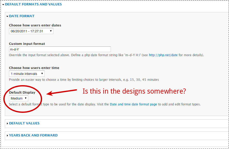
Comment #15
ksenzeeI'm starting on a patch to implement the parts of this that seem to have reached consensus, and I'm wondering about "Default Display" - did it move somewhere I'm not seeing it?
Comment #16
ksenzeeI talked to Jeff about this and here's a skitch of where we ended up.
I'm thinking it would be easiest to keep this as a meta-issue and post actual patches for incremental changes in separate issues, linked here. Does that seem okay?
Comment #17
karens commentedKeeping this as a meta issue is fine, and the screenshot in #16 looks good.
I'm not sure what happened to 'default display' in the new wireframes, but maybe it's not necessary in the current code, since you will set the display in the formatter.
Comment #18
David_Rothstein commentedFor those following along, we are in the process of following Karen's suggestion in #17 and removing the default display setting altogether from this page (i.e., the "Choose how users view dates and times" option from the screenshot in #16 will no longer be there, since it duplicates the field display settings functionality).
As a consequence, I tried to transfer those design ideas to the field display settings instead. For more details (and screenshots), see #1198320-6: Implement UI improvements to field settings page
Comment #19
ksenzeeNew implementation issues:
#1215686: Change name of date field types
#1215738: Make granularity checkboxes horizontal
Comment #20
ksenzeeAnd another:
#1216996: Change the years back and forward textfield into two dropdowns and make it more intuitive
Comment #21
ksenzeeRe #13, I talked to Noyz about adopting the dropdown timepicker from Date Tweaks module, and he agreed that was a good way forward, so I posted a patch implementing that at #233047-68: Switch to using Vega timepicker.
Comment #22
karens commentedI'm going to go ahead and close this issue. Most of these things have been implemented, and further changes have been made to some so they don't match the screenshots above any more. This encompassed a ton of additional issues, many that aren't linked here. If someone wants to dig them all up and link them they can, but I think for now I will just mark this fixed.