Note: this issue treated 2 issues (bad!) one was fixed, so I'm only mentioning the other in the summary.
Problem/Motivation
Many people confuse the "Assigned" dropdown label on issues and (for example) assign them to themselves (when in fact, they want input from others)
Proposed resolution
Disambiguate. No clear plan yet.
Yoroy suggested we don't *add* much (explanatory text, for example).
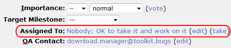
See how bugzilla does it in #11
Remaining tasks
UX/infra teams blessing needed.
User interface changes
Something should change, we don't know what yet.
API changes
No one so far.
Original report by rafamd
I suggest changing the "Subscribe" anchor text to "Suscribe options". Easy to do and IMHO it should make things much clear. I was looking to unsubscribe from a project issues and found the option when I clicked "Subscribe" only after looking after an "Unsubscribe" label for a while.
So "Subscribe options" should make things clearer, anyone agrees ?
rafa


Comments
Comment #1
dwwWhich "Subscribe" anchor text are you talking about? Do you mean on issue queue listing pages (e.g. http://drupal.org/project/issues/project_issue)?
Comment #2
rafamd commentedHi Derek, sorry for not answering earlier. Yes, it's that one.
We have: "Create a new issue Advanced search Subscribe"
While I suggest: "Create a new issue Advanced search Subscribe options"
I think it better reflects the things you can do if you follow that link. Not only subscribe, but unsubscribe also.
Comment #3
dwwYeah, I guess that makes sense. I wouldn't mind a quick review from the UX team. This whole thing is obviously flawed and in serious need of redesign and rebuilding, but in the meanwhile, I guess it doesn't hurt that much to add the word "options" at the end of that link. I'm not sure it's really going to help much, but I'm not fundamentally opposed to changing it...
Thanks for the clarification,
-Derek
Comment #4
rafamd commentedMy pleasure.
And for someone not used to those screens, I think it clarifies a lot, specially when you look for the "Unsubscribe" option.
Sure all that will be revamped in the future, but this is a fix with high ROI :)
cheers and thank YOU very much,
rafa.
Comment #5
rafamd commentedDerek (or anyone with power), as we had no response from the UX team, maybe we should go with that change.
I have another suggestion (sorry for not opening a separate issue, just ask me to do so if you think it's better).
I've seen way too many people confusing the issue "Assigned:" dropdown and putting their name on it (where that clearly isn't their intention, you must know what I'm talking about). We can add an explanation like this to get rid of this confusion:
"Assigned: (who will resolve this)"
the text in brackets should take the same styling than "Note: changing any of these items will update the issue's overall values."
cheers,
rafa.
Comment #6
yoroy commentedIn general, *adding* explanatory text should be the last option for fixing a problem, after trying to change, simplefy things first. Not a fan here either. E-mail subscription numbers are low (including many high-profile devs, granted), I don't think we can expect this change to be a bigger win than the added speck of visual noise for many many other people.
For the second 'assigned' label: different issue, and an even stronger 'No' from me for the same reasons.
Thanks for your thoughts.
Comment #7
rafamd commentedHi yoroy, your points are certainly valid, everything boils down to a cost-benefit relationship. I understand your view but don't completely share it as I personally think the relationship is more towards the beneficial in both cases.
While thinking for a solution to the Assigned issue, I was considering a complete substitution of that word for something like "Responsible" or "Who will take care of this". Opted for the proposed solution for being (IMHO) the least disruptive and clear but maybe we can come up with something else to disambiguate that drop down a little.
thank you for chiming in and for your contributions to Drupal
Comment #8
rafamd commentedGiven yoroy's input, I'm closing this issue for now (will try to provide this points to redesign initiatives though). Feel free to reopen or further comment.
Comment #9
rafamd commentedComment #10
rafamd commentedchanging title since the other part was fixed after the flag integration.
Comment #11
klonosThis issue was retitled/repurposed so many times that perhaps we should file a new issue for the final feature request. A simple issue summary would suffice though ;)
...here how bugzilla handles issue assignments (though I don't know what the "edit" link is there for and why the help text is a link either):
Comment #11.0
rafamd commentedrafamd added issue summary
Comment #12
mgiffordI like the idea in #11. I like a clear ASK. The "I will take the responsibility to address this patch!"
Coming from https://drupal.org/node/1080550