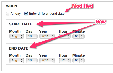
The two input widgets for start and end date are confusing because you can have multiple date input where you specify standalone dates multiple times, but in this case, you really provide an interval, and this is not at all spelled out if the end date is required and only indirectly spelled out if the end date is optional (via the "Show end date" checkbox).
By adding "Start date" and "End date" labels to the form, we make it clear these are not standalone date inputs but form an interval.
What makes it a little problematic though is that if the end date is was not shown, the start date IS the end date as well. To make this more evident, I've retitled the "show end date" checkbox to "enter different end data", which might or might not be a good idea. Ie. you did not yet enter any end date, so what would be "different"? Maybe it is best to also change the label on start date in that case to "Start/End date" and if end date is shown, change it back to "Start date" only. What do you think?


Comments
Comment #1
arlinsandbulte commentedThese labels were intentionally removed to help save some space and de-clutter:
See #1233612: Add a checkbox so user can choose to show/hide the end date
Personally, I would rather implement #1248720: In-Line 'End Date' with 'to' text. than add the Start/End labels. The 'to' text makes the dates self-explanatory, IMO.
However, #1248786: Fix appearance of marker for required date fields probably needs some attention too.
Comment #2
gábor hojtsy@arlinsandbulte: thanks, that looks like an inteteresting direction as well. Will look into which one works better hopefully soon. In the meantime, realized this date picker CSS has side effects in other areas where it was not intended, so let's stick it to only the field related UI. Just to make sure we have a proper patch.
Comment #3
Noyz commentedI like the idea of inline with a "To" string connecting them, but I'm not completely sold. Here's a list of pros and cons as I see it
Pros
1. saves vertical scrolling
2. same interaction as google calendar
Cons
1. Setting up a date is not performed this way. During setup, we ask people if they want to collect an "end date" which saves a lot of the confusion that previously existed with the 'to' date. I'd hate to bring that back.
2. 'to' is a very small word, and unlike google calendar which stands out amongst 4 select boxes, our date controls can have 12 select boxes, to which a single 'to' string could get drowned out.
3. no label what-so-ever on the start or end could be an accessibility issue (only somewhat certain). I.e when a screen reader hits this, its going to read aloud: Year, Month, Day, Hour, Minute, Second, To, Year.... Only after hearing To and Year might a blind person be able to connect the dots.
4. While less scrolling, it's really not more usable. That is, there's still the same amount of information on the screen (but takes up less vertical space).
5. This leaves us with the required issue. Which honestly doesn't sound like there's a great answer to. We can't make the legend show required. We can make all all date granularity options required (Y, M, D, H, M, S) as I'm told time is really not required. We could put an asterisk on only those that are required (Y, M, D) but doing so feels like a lame solution.
Having said all that, I guess Im in favor of leaving its formatting stacked.
Comment #4
Everett Zufelt commentedIf there are demos of the UI being discussed, I would be happy to give some feedback from an accessibility perspective. Even if the backend of the form isn't connected to anything, I can still evaluate the frontend
Comment #5
karens commentedI have tried at different times to float the start and end dates next to each other, and when you have select widgets with all those elements it gets ungainly very quickly. Plus I had problems getting the right things to float without running into other css problems (like floating elements that escape their containers in some browsers). So while it seems nice when using small elements (like the popup dates, especially if they don't have any time), it gets ungainly for large ones plus the cross-browser issues begin to get dicey.
The required marker is also problematic because we can have such a multitude of date sub-parts and the system error processing can interfere with what the date module is trying to do. I've tried handling this in different ways over the years, with mixed results. Let's leave that issue out of this one though.
I think what I will do is commit this patch for now, just to add some clarity that I suppose has been lost. We already have separate issues about floating the dates next to each other and fixing the required flag. Let's deal with those questions in those issues as a feature request and bug report, respectively.
Comment #6
karens commentedA couple problems. The labels are misformed for some widgets, the last rule needs to be something like the following, so it will work everywhere:
But more importantly, I remember now why I got rid of those labels in the first place (in addition to cleaning up the look of things). With this change the first date always is labeled 'Start Date', even when the optional end date is hidden. That label should be hidden if there is no end date, but I don't know any way to do that for the dates that are being dynmically altered using #states. It looks very odd to have a single date that is labeled 'Start Date'.
Comment #7
gábor hojtsy@KarenS: yes, I agree about the oddity there. Since we show/hide the end date with JS (through #states though), we could just as well augment this with some JS to provide proper labels. The meaning of the elements are dynamic depending on whether you have end date present or not, so I think it makes sense to make the label dynamic.
Comment #8
webchickTagging.
Comment #9
gábor hojtsyHere is just a quick reroll of the same patch against 7.x-2.0-alpha5.
Comment #10
karens commentedThis item is waiting on someone to provide some javascript functionality. I'm hoping someone can provide a patch.
Comment #11
gábor hojtsyUpdated patch for latest 7.x-2.0-rc1 file organization. No JS yet.
Comment #12
karens commentedNot a release blocker
Comment #13
b-prod commentedOnly adds a wrapper class to the patch in #11.
This helps to target start date and/or end date wrappers through CSS.
Comment #14
hefox commentedPatch applies and does what is expected.
Considering the "Start Date" label issue, could combine this with #1248720: In-Line 'End Date' with 'to' text. via replacing t('End date') with t('to') and remove Start date. Also, moving the toggle checkbox below the start date may make more sense than above?
Comment #15
arlinsandbulte commentedI liked hefox's suggestion in #14, it eliminates the need for the javascript, & keeps things more compact & simple.
So I am committing that for now, but discussion here can continue...
commit: http://drupalcode.org/project/date.git/commit/a5c66a5
I did not apply the rest of the changes, however.
See questions & comments below:
What is the reason for this change? Even if it should be changed, this should not be in this issue, but rather, a separate issue, IMO.
What is the reason for this css addition/change? I did not notice any placement or layout changes.
+1: This looks like a good idea to me, but belongs in a different issue.
Comment #16
dtarc commentedI'm right now trying to change the labels for a particular date field and I'm having some trouble. I'm not sure how I can get at the markup coming from process_data_combo().
I would think a simple solution would be to have these labels be configured by field. So, there would be label variables in field settings for "Start Date", "End Date", and "Show End Date" with these default filled in. Then the person creating the field could configure it. These could be put in the already hidden More values fieldsets so they wouldn't clog up the form.
I figure there must be some kind of reason that such a simple solution wasn't chosen for this issue. I could provide a patch to do this if desired, but I'm hesitant to do so if it's unlikely to get sommitted.
Comment #17
dtarc commentedActually I figured out how I can change these things locally. Go D7 Render API!
Since date_combo_process() calls drupal_alter(), this was pretty easy to do. I just added this hook:
function mymodule_date_combo_process_alter(&$element, $form_state, $context) {
if ('field_mydates' == $element['#field_name']) {
$element['value']['#title'] = t('Custom Start Date Label');
$element['value2']['#title'] = t('Custom End Date Label');
$element['show_todate']['#title'] = t('Custom End Date Checkbox Label');
}
}
Very easy, now that I know how to do it.
Comment #18
westbywest commentedI was not able to use the code suggested in #17 since I am using date popup fields, but I was able to insert From and To labels into a date field (named field_mydate) on a node form using the CSS3 content property:
Comment #19
mgiffordStart Date & End Date should really be LEGENDs and not LABELs. Semantically you're dealing with a group of related input types. Adding a legend here would be impossible to link to any one input field.
It would be a big improvement for accessibility for this to be just taken care of in Drupal 8, especially with #501428: Date and time field type in core
Comment #20
karens commentedThat will work only if start and end date are each fieldsets. There is an issue about making fieldsets optional (#1467712: Make it possible to disable fieldset for date field), there are people already complaining that there should be no fieldsets, plus there are no fieldsets on single value fields, and sometimes the fieldset is a wrapper around both dates, not an individual date. So 'legend' is not always going to be appropriate. Label is the only thing that will be consistently available.
I don't disagree with the idea of making things more semantic, just not sure how it's going to work in practice. Obviously it will completely break existing sites so could only happen in a new version.
Comment #21
mgiffordWell Drupal fieldsets are presently a bit of a hack. There's an effort to configure this more semantically in core for D8:
#504962: Provide a compound form element with accessible labels
Fieldsets have been basically misused by Drupal to manage a collapsible UI element. http://www.w3.org/wiki/HTML/Elements/fieldset
Comment #22
lk7889 commented#18 worked for me. Thanks for the tip!
I changed it a little so that it could replace the existing labels instead of just pre-pending the new content and so that it wouldn't affect the "time" or "to" labels:
Comment #23
incaic commentedSolving content issues with CSS3 is not ideal. For people using the date_popup field you can do the following:
In your custom module add this function.
In your template.php file add this function.
Comment #24
bmango commentedWith the date popup form, I had a slightly different solution based on #23 adding the following to a custom module:
My code might be slightly different because in the advanced date field settings I had ticked the box: 'Render as a regular field'.
I didn't need to add anything to the template.php file.