Problem/Motivation
Now that we finally fixed #34496: [meta] Add Flag module to allow users to subscribe/unsubscribe without posting a comment, there is concern on whether the place we chose for the "Follow"/"Following"/"Unfollow" button is the best. There were both actual reports that people could not spot it straight away (they were expecting it to reside elsewhere) and we also still see users posting "Subscribe" comments (which probably means that not only they don't notice the button but they are not even aware of the existence of such a feature in d.o).
Proposed resolution
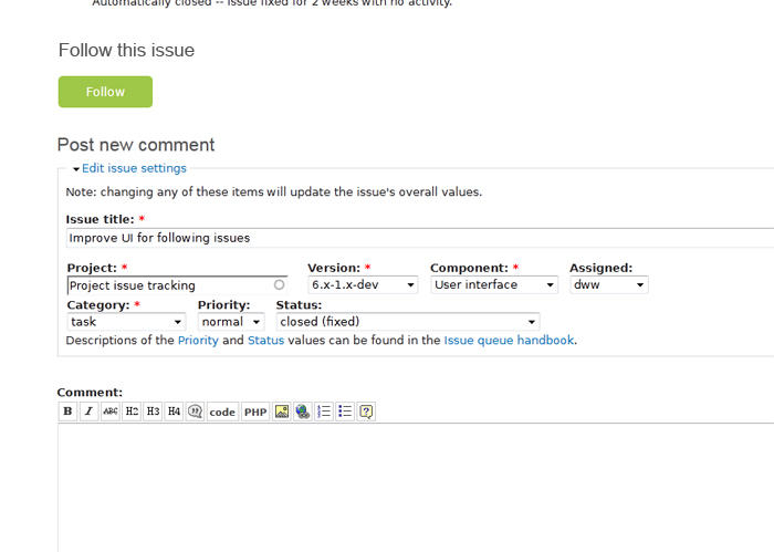
The original issue proposed to relocate the "Follow" button above the "Post new comment" section (see attached screenshot/mockup at the original report section of this summary) and also add a nice heading in hope that it would give the button some additional focus bonus. The reasoning behind proposing this specific location is because usually users scroll all the way down to the last comment of an issue in order to subscribe. If we place the button there, they are less likely to miss it.
Others seem to find the issue summary the right place for the "Follow" button, so they suggest we should keep it as is. This has its reasoning too, since we also aim to add these features:
#1304550: Display count of issue followers when viewing an issue
#1304558: Provide a page showing all the users following a given issue
(the counter itself will be a link to the page if possible)
Now, we cannot argue that the counter and the link to the followers stats page belong in the issue summary section along with the "Follow" button.
So, the next logical thing was to propose to have the "Follow" button in both places, but we currently don't have a solution for syncing the button's state across multiple instances in the page. Having the button's state at the top displaying "Following" and at the bottom "Follow" would confuse users. We simply cannot have such a major UI WTF in d.o.
There has been quite some discussion over this and so far we seem to have come to a common agreement for the following:
- We agree that the button might be hard to find for people not familiar with its current location.
- We agree that the two "candidate" places for the button's location(s) is either in the issue summary or above the "Post new comment" section (or both, but...)
- We don't want both buttons unless their status can be synced somehow.
- There is thought to deploy a single, randomized placement of the button in the two different places (summary/comment posting) for testing purposes so that perhaps feedback (or click speed/count) may help us decide on a single location. We don't want this live in d.o though.
- We currently don't have the means/time/will to do a full-fledged UX test, but...
- We do want to address this now/soon(ish), so postponing it is not an option.
- We all agree that the best thing is to solve the sync problem between various instances of the button so we can have it in both "candidate" places.
- If we're going to get this working with two buttons, we should do it in project_issue so that this feature can be shared by everyone, not just as a d.o-specific customization. So, let's not move the queue.
Remaining tasks
We are still thinking this through. Two are the main issues...
a) we haven't figured a way to sync buttons status, so till we do we need to have only one instance,
b) there is debate over the two "candidate" places for the button (either in the issue summary section where it currently is or above the "Post new comment" section) but we haven't conducted a proper usability test.
So it is safe to conclude that we need to...
- either do an actual usability test in order to see if this is a valid request + get some feedback on which place would be the best for the button,
or...
- somehow fix the AJAX sync of the state of multiple "Follow" button instances in the same page so we can have the button in both places.
...ideal being the second of course.
User interface changes
If a proper usability test is done and it concludes that the best place for the button is above the "Post new comment" section, the button will be moved there.
If we solve the status sync issue, there will be an additional "Follow" button above the "Post new comment" section in addition to the one in the issue summary.
API changes
???
Original report by eigentor
I was watching out for the "Follow" Button but could not find it. Finally I found it in the top right corner of each issue. This is all fine and good but can be missed. The top right is a place that generally has not a lot of attention from users.
The place I actually looked for it was next to the comment form.
How about showing the button there for a second time?
This could looks like this:


Comments
Comment #1
dwwRight. I raised exactly this concern in the original post at #1284694: Tweak UI of issue following (bluecheese). See also #1284694-40: Tweak UI of issue following (bluecheese) (comment #40). Part of the problem is that the AJAX stuff isn't going to auto-update all the copies of the button. So duplicating the button in multiple parts of the screen is either a lot of work or we end up with potentially confusing UI.
Also, the UI/UX folks involved in this were all pretty confident the 1 Big Button(tm) approach would be visible enough...
Some folks have raised similar concerns at #1306554: QA for issue following on Drupal.org as well.
In terms of tags no one uses "d.o. usability" -- if we want the right people to pay attention here, we want either "usability" or "needs usability review". And if we were going to have a d.o-specific tag for that, we'd want "drupal.org usability" to match other similar tags.
Anyway, yeah, I'm definitely still open to discussing this. I'm not psyched about doing a bunch of JS magic to make all the buttons update together, but that might be the best solution...
Comment #2
eigentor commentedAh, right. I was guessing the duplication would be rather easy to do, but with the Ajax stuff it can be a different beast.
But let's see what people say. I don't guess somebody will conduct a quick user test to find out where the button is best placed but if sombody would this should help.
Maybe having the button only next to the add comment box might be better in terms of visibility than the top right corner.
Comment #3
lisarex commentedDid somebody say 'user test'? dcmistry and I will be at BADCamp in a couple weeks, conducting short user tests for three days. We can incorporate this one in.
Comment #4
Leeteq commentedIMHO the button should have a heading, for example like shown in the eigentor's screenshot example: "Follow this issue" in large letters above the button, at least for a period of time until we see that subscribe comments have come to a halt.
Comment #5
klonosI hate waste of vertical space whenever it can be saved. I agree that the "Follow this issue" heading makes the button more prominent. How about having them inline?
PS: I still like the idea of duplicating the buttons best, but I understand the technical difficulty behind this task + I'd rather people spent their energy elsewhere. So if we go with only one place for the button (for now at least), then I too like Thomas' screenshot better than the top-right where we have it now.
PPS: @lisarex, @dcmistry: Yes Lisa & Dharmesh, if we gave this a usability test, it would be great! We would need to implement at least these two variations of the page (an issue node with the button as is + one with it placed above the "Post new comment" section) for testers to get their hands on.
Comment #6
Bojhan commentedThis needs testing, the initial find-ability could have its issues. I think we need some more hard evidence. Generally this is because we thought our users to ignore that area of the page, and now it suddenly holds important functionality. Changing that mental model will take time.
Comment #7
lisarex commentedWe decided to use Verifyapp so that we could reach a wider pool of participants. We will run two tests. The first one will be to have people click where they would expect the button to be, and then we will run a second, follow-up test.
Participate here:
http://verifyapp.com/c/14128
Comment #8
dwwNot sure if bojhan meant to remove this tag, but it's still relevant for tracking related issues.
Comment #9
dwwRe: heading: "Follow this issue" makes no sense as a heading once the user follows. :/ And it's harder to replace the heading as part of the AJAX when you flag the node. So, although maybe we want a heading for this, if we do we need to come up with better wording for it.
Re: Verifyapp -- uhh, wtf? ;) When I followed that link, I got some LimeWire UX test. Can we get a link directly to the test we care about? Wow, reloading that link I get a different set of 3 random UX/UI tests. While that might be a cool tool, the fact that you can't actually send people to the test you want them to take is a huge -1 on using that service for our needs (at least to me). Not that I necessarily have anything against helping other projects with this usability testing... I just think we need targeted testing if we're going to base our decisions on these user tests.
Comment #10
lisarex commentedThe test is now closed to new answers. results and perhaps a follow up test will be forthcoming.
[massive edit]
@dww, I know it happened now. The test is now closed to the responses. We decided to cut the test short and let it run for just one day to see how it performs, since we are unable to determine whether people have already seen the new follow button.
If we were to run a test like this again, we could use the multi-click test that would first have a screenshot with the question, "Have you seen the new drupal.org followed by them yet?”, and on the second screen they could click to choose the position. That way, we could segment the data to throw out the answers from people who already saw the issue queue. Or something like that ;)
Comment #11
lisarex commentedThe results:
Click for full size
Comment #12
Leeteq commented#9: how about "Subscription state:" or "Subscription toggle:" (would that be suitable as header for both states?)
Edit: or simply "Subscription:"
Comment #13
klonosThese look very good for headings indeed Daniel, but I kinda prefer the "Follow this issue" one because it is in tandem with the "Post new comment" heading we already have. They both prompt for action in a friendly way.
Comment #14
dww@lisarex: Ahh, glad to know why I was getting the random tests over at verifyapp, that makes sense (and gives me much more confidence in the tool). ;) That said, how are we supposed to interpret the results of your test? ;) Looks like most people were clicking where the follow button is already placed. Is that just because people had already seen it? Is there any reasonable conclusion we can draw from your test that would lead this issue out of "postponed"?
@DanielTheViking: "Subscribe" is not the right verb here at all. We're trying (and apparently failing) to break people out of that terminology and practice. "Follow" just adds stuff to your tracker pages. You can optionally configure e-mail notifications for issues (either all issues in a project or just issues you're following. If we start introducing UI elements with the verb "subscribe" we're just going to confuse things.
@klonos: As I already explained, "Follow this issue" is an inappropriate header once you're following, etc.
Comment #15
lisarex commentedDharmesh and i had a quick analysis and have surmised that we should leave the follow where it is.
Looking at the results:
* 99 people voted; this is a significant number of participants
* The vast majority voted to keep the button above the issue summary
* The most popular location is where it is now.
* 96 people took longer than 10 seconds to decide; this indicates they put some thought into it
Yes, it's true that we don't know how many of these participants had already seen the position of the Follow button, but drupal.org has bigger problems to solve. :)
Comment #16
klonosThis issue here is not about d.o existing users voting where they like the button to be. It is rather about if newcomers are able to locate it with ease. In other words we need to find out if the button is where most people expect it to be - not to vote whether we like it here or there.
So, I think we should leave this to "postponed" till we get an actual usability review from users that are not d.o members.
PS: by "actual usability review" I mean something like:
Comment #17
lisarex commentedklonos, we don't know if they are drupal.org users or not. It's a limitation, since we put it out there after the Follow button launched. And FYI, those usability reviews took 10+ people many, many hours to pull off. There are much more pressing usability studies out there in Drupal-land.
The Test Instructions were "Let's say you want to follow this issue on drupal.org, to stay informed. Click on the page where you'd expect that button to be."
If anything, I think the "following" button is a little difficult to spot, since it's gray and lacks strong contrast.
Comment #18
klonosSorry for assuming that, but I thought that the announcement of the existence of this test was done here on d.o alone (your comment in #7 specifically), so I assumed that testers/voters would be only people from our community that got the word. Did you announce it in other places too btw? I have to admit that I don't know how verifyapp.com works. Do they have a group of dedicated (payed) or perhaps a "pool" of volunteer testers that do this? If so, what is their computer skills level and drupal.org familiarity? Are these even taken under consideration?
Did I say or seem to imply that I thought it would be a peace of cake to do a proper review in my comment? I understand and greatly appreciate all efforts behind this "fast" version we pulled off instead because that is better than nothing. Still... not a proper usability review (merely assumptions IMHO).
I realize that too :/
My comment in #16 above has nothing to do with my personal preferences stated in my previous comments here. In case I wasn't clear, I'm not trying to say anything else besides the fact that we should leave this to "postponed" till we have *proper* usability tests (or people will simply eventually get accustomed). In the meantime, lets just leave the button where it is. I guess it was the wording you used in #15 that "puzzled" me (your mention of "people voting"). I am sure that you cannot argue with the fact that voting is not the same as testing.
As I already said in my PPS back in #5, I think that it would be ideal it if we had the time & resources to present two or more variations to testers and see which one takes less time to get the task of subscribing/unsubscribing done. One thing though:
...we need to take under account here that clicking time after page load doesn't necessarily imply taking time to think about what was asked from people to do. People might actually have taken the time to read through the issue first and that delayed them(?) ;)
Another alternative plan would be to take these steps in order to test this live here in d.o:
Comment #19
lisarex commentedklonos, I posted the test on Twitter (and it got RTed) and on Facebook. I'm assuming that's the only way the test got 585 views. I posted a link to the test in the issue as an afterthought. It's not a scientific study; just some quick feedback. :)
Comment #20
duncan.moo commentedThe test is flawed as it is being evaluated based on appearance rather than interaction. Just think it through:
Fine Facebook puts their like button for a page at the top, but the latest stuff is always at the top of a FB page.
Comment #21
klonosI share the same concerns as Duncan when it comes to scrolling down long issues and then having to scroll back up in order to follow/unfollow, but I refrained from mentioning this in my comment in #18 because I wanted to emphasize that we need proper usability testing - not what my personal preferences/concerns are.
Same goes for the static image used for the test @ verifyapp.com. That's why I said we should leave this to "postponed" (and the button where we currently have it) and finally decide once we get a proper UX review.
Comment #22
dwwI appreciate lisarex's initial efforts at trying to gather some real data, even if it's in some ways flawed.
Setting this to "postponed" isn't going to get us any closer to better data.
If there's no attempt to sync the status of the two buttons, I'm pretty concerned about rolling out pages with *both* buttons since I think it could cause more harmful confusion than it would help. I'd rather see effort go into either A/B testing with the two different locations (although that might also be confusing if it's randomly changing on d.o), or just start addressing the JS/AJAX stuff to keep the 2 buttons in sync. Ultimately, I think multiple buttons would be best (until I hear a compelling case why that would be a problem).
Comment #23
klonosFair enough Derek. So to sum it up a bit:
Does this seem right to all of you for an issue summary update?
Comment #24
dwwIf we're going to get this working with two buttons, I'd be perfectly happy for that code to all live in project_issue and be shared by everyone, not just a d.o-specific customization. So, let's not move the queue or change the title. Otherwise, yes, I think that's a fair summary of where this is at.
Comment #25
dcmistry commentedHello All,
Thank you so much for the great feedback. Without diving into the intricate details (and bore everyone to death, unless you want to hear that) about why did we chose to test using Verifyapp, My take on things:
I hope this alleviates some concerns you might have. Also, feel free to ping us if you are at BadCamp. Always like to see familiar faces beyond D.O.
Comment #26
klonosI updated the issue summary, so please take a look and see if I missed anything. I didn't get an answer on this though (so I haven't touched the issue status):
Lastly, one thing that I only shortly mention in the summary but I don't get specific on (because it is not clear to me) is what was decided on the proposal for a nice heading that would possibly bring extra attention to the "Follow" button. So, two questions in order to further update the issue with what's been discussed:
Comment #27
lisarex commentedI disagree that a heading is needed for a button. To me it is clutter in the UI. Instead, the button text and style should just be noticeable (if indeed that is the problem. I think we haven't yet determined if it's a problem for the majority). Maybe we just need to show newbies an issue page at BADCamp and ask, since it's a superquick test.
Comment #28
dww@klonos: I answered that question by changing the status myself.
I also agree with lisarex that a heading is mostly clutter. Traditionally, Drupal and d.o have been way too text-heavy in the UI -- trying to rely on lots of headers/labels and blocks of descriptive text. I don't think that helps make the UI any easier to use. In this case a label like "Follow this issue" above a giant green button that already has the label "Follow" is just a waste of pixels. So, I'm -1 to a heading entirely.
If you really want to update the summary with the debate on a header, reread comments 4, 5, 9, 12, 14, 27 and the previous paragraph. ;)
@lisarex: Re: "Following" being hard to find -- that was by design. Unfollowing is a pretty rare/edge-case operation in the UI. So, we didn't want to draw too much visual attention to it.
Comment #29
Leeteq commentedThe contrast between the text color and the button background color could be made even clearer - and the button should have a 3d design so it clearly looks like a "toggle" button.
How about the text "Click to follow" first and then changed to "Stop following" once it has been clicked?
If any header text is needed, perhaps "Toggle follow state"? I agree that in the long run the button should not need a heading, but for some weeks or months it would be practical until most people have changed the old subscribe habit.
Comment #30
dww@DanielTheViking: If anyone sees the button at all, they're not going to need a header or different button text to understand what the button does. The only valid concern in this issue is that the button isn't in a place that most people will see it. We don't need to waste more pixels on more verbose button text nor a heading/label for the button. We either need to accept that the button is fine where it is, we need to move it entirely, or we need to add a second button.
I don't buy the assertion that it needs to be 3D for people to think it's a button. That said, it's weird that the search button in the header has one style and all the other "action buttons" in bluecheese (the d.o theme) have another. That's potentially worth opening as a minor bug/task in the bluecheese issue queue, but basically unrelated to what we're trying to address in this issue.
Comment #31
Leeteq commentedAs long as the design lets most people "get" that this is a toggle function, then any solution might be ok IMHO.
Ideally it should be placed both where it is now and where people are tempted to type their "subscribe" comment.
Perhaps the header of the comment area could read something like "Post new comment OR , where the latter had the link with some text/background colorisation. Would that too be a performance concern? Even if that means hacking core, this issue is probably trigging several new feature requests for integrating this new function in several contexts.
Comment #32
klonos...talking about usability tests and d.o design efficiency, I would like to bring everyone's attention to ClickHeat (GPL) and its Drupal module Click HeatMap (seems abandoned/inactive though).
It could help us come to conclusions in cases like the one where we debate where the "Follow" button is best. All we'd have to do is implement the two instances and then check where the heat is!...
Comment #33
nottaken commentedlooking more like a button would help...twitter style follow/unfollow. It's already green.
Comment #34
porg commentedBesides layout/interface considerations: If people don't find a functionality within the user interface, they tend to use the search function or help pages.
So, as I already posted here, please ensure that the help page for "Subscription & Notification" is the first result in searches for the terms "subscribe, subscription, notify, (email) notification, etc"!
Can someone please give it a prioritized rank in the search results? Thanks!
Comment #35
dcmistry commentedOn a separate note, how do I "Unfollow" a thread?
Comment #36
porg commentedTo unfollow, hover over the Following button, which then changes into Unfollow, and you just click to confirm this your choice. Pretty simply, isn't it!?
Comment #37
eigentor commentedAs the outcomes of the first user test appear to prove that the position of the button is not so bad, shall we close this?
Comment #38
porg commentedBefore closing, can someone please respond to the aspect of finding the help page more easily (from #34). Thanks!
Comment #39
klonosThere's still the issue of having to scroll all the way up to the top of the page in long issues in order to subscribe the way we currently have it. The other way around... if we moved the button near the 'Post new comment' section, it would be more 'visible' to users 'tempted' to still post 'subscribe' comments, but on the other hand one that wants to fast-subscribe (without reading through the whole issue) would have to scroll all the way down to the bottom of the page.
I guess findability *might* not be a concern any more (are we solid on that?), but still usability is. Perhaps we should change the issue's title to "Add a second instance of the 'Follow' button near the 'Post new comment' section", since we all seem to agree that this would be the golden solution (if we managed to figure out how to do the AJAX update thing).
Comment #40
porg commentedFindability: However this turns out UI wise, please ensure that the Help Page gets a better search result rank, as Search is the last resort for users, who don't find their intended functionality within the UI, especially those who are new to the community and not yet knowing about its culture and manners.
So far no-one answered me, wether you can even prioritize a certain node's search rank with certain associated keywords on Drupal.org with its Apache Solr search engine.
Comment #41
dcmistry commented@porg: Thanks! A bit unintuitive to me (about unfollow). IMO, it would be a lot easier if I was following an issue, it should just say "Unfollow"
Comment #42
porg commented@dcmistry: I think in the default state a visual object shall reflect its status quo, and only if it is selected (mouse over, etc) the options for its state change shall be shown. Thus the design as-is is fine.
Comment #43
eigentor commented@porg: hm, Twitter does it the way dcmistry proposes, wonder how that tests.
(apart from the absolutely ridiculous translations to some languages, that is :) )
The discussion might be about keeping one button vs. one that shows the status and cannot be clicked and a second one to unfollow. Not so easy...
Comment #44
marcusx commented+1 for moving the button somewhere down the page. I normally read through the posts and than decide if I need to follow or not. So I would expect the button after the last post, or somewhere there. I talked to several colleagues and no one is searching the button where it is right now.
Thanks for the button at all by the way!
Comment #45
dwwAnother thought (from #1218230: Design for issue pages with more information) is that the block of "Jump to" links (and presumably therefore also the Follow button) could use some kind of follow-scroll functionality so that it travels down the screen as the user scrolls (like the table headers in core). Maybe via something like http://code.google.com/p/jquery-scroll-follow (although I don't know jack about best practices here and if people know better ways, please tell me). Generally, I find such follow blocks incredibly distracting and annoying, but perhaps having the follow button and jump to links always visible is enough of a win to make it worth exploring...
Comment #46
drummA better follow block could be more like Drupal's sticky table headers, along with import info about the issue's current status.
Comment #48
klonos...spam :/
Comment #49
MacRonin commentedI think a secondary reason that some people still do +1/subscribe is to let the project maintainers know about the interest. Currently while the 'Follow' button will keep the user informed about updates to the issue, the project maintainer has no idea about that interest. There could zero followers or 5,000 they don't get feedback and so can't tell.
Comment #50
dww@MacRonin: Please read the issue summary. #1304550: Display count of issue followers when viewing an issue is mentioned there to solve that problem. This issue is just about making the Follow button more findable so people don't just miss it, not other social reasons they might not choose to use it if they see it.
Comment #51
MacRonin commented@DWW Thanks for the pointer to the 'count of followers' issue. Looks like no one needs convincing that it's a good idea over there :-)
I was mainly mentioning here as an alternative expiation as to why some people still do +1/subscribe. While I personally would like the button at both top and bottom, once I knew of it's existence (I didn't notice immediately) the scroll back to the top isn't a real problem for me. Although a 'jump to top' would make it a bit quicker. to return to
Comment #53
kingandyIt's just occurred to me that a "+1" is very different from a "subscribe".
"subscribe" was only ever posted to subscribe to the issue. This has been neatly replaced by the "Follow" button.
"+1" comments, on the other hand, are used to register support for the suggestion under discussion. Though people don't always have something substantial to add to the debate (see #33), I think it's important for people to add their voice to either side of a discussion. Unless and until some sort of voting / thumbs-up mechanism is added to d.o, this is still not catered for.
So, IMO, "+1" comments shouldn't be considered when determining the prominence of the "Follow" button.
Comment #54
kingandy#33? I meant #44. Link's right though.
Comment #55
klonos#42232: Help Maintainers Manage Issue Priority by Encouraging Voting & #682254: Allow multi-dimensional rating of issue comments is what you're looking for ;)
Comment #56
kingandyAh, thanks, I was pretty sure it would be under discussion somewhere. I just wanted to make sure this issue wasn't drifting over into the conflated "+1/subscribe" ;)
Comment #57
senpai commentedBumping this up to 7.x because of the Drupal.org D7 Upgrade initiative, down to 'minor', and calling people's attention to the work that's been done in https://drupal.org/node/1706520#comment-6296232

Comment #58
klonos...as I said in #1696872: Create a block that shows the issue metadata I don't know if we're still going with this mockup, but I don't think that adding status text in the "Update this issue" and "Follow" buttons is such a good idea. Buttons should generally only include text that prompts for action and that alone. Plus if we moved the status texts out of the buttons but kept their size as is, we could perhaps use a larger font in order to improve findability.
Comment #59
senpai commentedThe meta sub-text within each button has now been moved outside, and below, each button.
Comment #59.0
senpai commented...proper summary.
Comment #60
mgiffordIs this still a concern? It's not quite as big as it is in #57, but it's certainly quite visible, isn't it?
Comment #61
kingandyI think the issue is less about how large and spanky the button is, and more about that it's just plain not visible when you're right at the bottom of 200 comments. It could be the size of your browser and flashing on and off in bright neon colours, but if it's not on the screen it's no help.
Proposed resolution still stands, we need to fix the button so multiple instances stay synced, and then get a second instance of it at the bottom of the page. Unless there's any mileage in getting the project info box to stay with the browser window as it scrolls?
Comment #62
mgiffordSo if we had a 2nd Flag block (which has the Follow button) right at the bottom of this issue (like to the immediate right of the last comment) we could get a UI win and close this issue?
Comment #63
kingandyIssue summary says "We don't want both buttons unless their status can be synced somehow."
Toggling one "Follow" button needs to toggle the other one too - apparently that wouldn't happen if we just added a second block.
Comment #64
mgiffordI expect this would be true. Thanks for clarifying.
Comment #65
drummComment #66
mgiffordThe summary could be more clear, but @drumm, there is just one follow button at the top right of the page. They are asking for another one at the bottom.
I'm fine with closing this issue or asking another one, but don't think it's an issue about not being able to reproduce it.
Bojhan marked this Postponed and remarked that "This needs testing" so think we should probably just leave it there until we have a new review.