
Closed (duplicate)
Project:
Drupal core
Version:
7.x-dev
Component:
theme system
Priority:
Normal
Category:
Task
Assigned:
Reporter:
Created:
5 Dec 2004 at 03:00 UTC
Updated:
4 Jan 2010 at 14:48 UTC
Jump to comment: Most recent, Most recent file

Comments
Comment #1
owen barton commentedThe Tango project has a good set of icons which we might be able to use.
More importantly, they also have a standardized icon naming system, so even if we design our own we can keep things easily interchangeable.
Comment #2
webchickUnfortunately, Tango icons are not GPLed and can't be distributed with Drupal or any contrib modules.
Comment #3
jjeff commentedWe've recently created a set of Drupal-centric GPL icons:
http://www.lullabot.com/articles/free_gpl_icons_lullacons_pack_1
Comment #4
cosmicdreams commentedI swear I've seen this issue elsewhere before. I note that it has been a year since the last update. Is this still an issue? Should this be triaged to drupal's theming system?
Comment #5
ximo commentedmorten.dk har a some strong suggestions for icons on Flickr:
http://www.flickr.com/photos/mortendk/sets/72157600058455386/
You also have the lovely Silk icons, without the naming scheme and open source spirit of Tango.
I think if Drupal were to use icons (which it should, at least as a contrib module), it shouldn't sprinkle them around like sugar on an apple pie. Too many icons will work against its purpose and only cause confusion. Like with everything else in Drupal, we want to avoid crust.. ehm, i mean cruft.
Comment #6
webchickNote the silk icons (and any other famfamfam ones) are also not GPLed and can't be included in any contributed modules.
Has Morten licensed his under the GPL? I downloaded the archive and couldn't find license information.
Comment #7
alpritt commentedFirst task is probably to decide what we actually need. I agree with ximo that we don't want to over do things. So every addition should be reasoned.
So what I can think of:
GENERAL
I think having an icon for help (probably a question mark) will help bring attention to the in built help files. Help is something people specifically scan for and an icon will help them find it where it exists. However, again, if there are other icons on the screen the help icon will become harder to find.
The RSS icon we already have is almost certainly good enough.
- rss feed
- help
- throbber
FORUMS
We have these in core already. However, they are far from being distinctive enough. Also, while it is a common metaphor in online forums, I don't get the use of an envelope as a representation of a forum thread at all. We should scrap the envelop unless someone can explain why it makes sense. :)
These icons, btw, are a great example of a good use of icons. They allow readers of forums to scan lists of threads and pick out the ones that they haven't read. For this reason it is worth pointing out that all 'unread post' icons should stand out as a group of icons. I guess the easiest way to do this is with colour, but we should remember the colour blind always.
- sticky thread
- default post icon (already read etc)
- unread post
- thread closed
- hot thread
- unread post in hot thread
OPERATIONS
Arrows are universally recognisable symbols.
The delete is a bit more difficult (personally I favour the 'x' over a bin as it is much clearer).
- move to top arrow
- up arrow
- move to bottom arrow
- down arrow
- left arrow
- right arrow
- delete
WATCHDOG
I'm not sure. I guess the icons bring more attention to the field when it appears. Still I can't decide if they are necessary.
- ok
- warning
- error
Anything else? Morten had icons for almost everything (http://morten.dk/blog/mortendk/icons-drupal-late-night-note-collection), but that is not necessary (and counter productive to usability). Are there any lists, for example, where a visual scan for certain icons will help spot relevant columns (like in the forums)?
We also need to think about what size we need these in. Do we need 16x16 and 32x32. Or does this depend on the specific icon?
Also what do we need for the GPL? All source files? What formats? Can we get the source files in an open format like SVG?
Comment #8
yoroy commentedI opened up an issue for the forum icons here:
http://drupal.org/node/190773
I think the forum icons would be a nice start for defining a drupal icon style.
There's some other icons I've been doing for Views and Panels here:
Views: http://drupal.org/node/179845
Panels: http://drupal.org/node/179690 <-- these might actually be overdoing things, too many, too small…
Also:
http://groups.drupal.org/node/6422 , a call for icons for g.d.o content-types, this is where forumicons refresh originated and it has some images of basic icons based on a similar list as yours:
http://www.yoroy.com/elders/drupal/icons/icon-sheet-blackwhite.jpg
I agree that first question should always be "but, does it need an icon at all?" :-)
Comment #9
Anonymous (not verified) commentedThe user experience project is closing so this issue is being moved to the usability component under the Drupal project
Comment #10
Bojhan commentedHey, there is still a lot of discussion. I like Roy's "but, does it need an icon at all?". Which applies to a whole lot of functionality, if you think something needs it you should post it here and there is a gsoc project on this.
Comment #11
eigentor commentedOK, this appears to be the most generic Drupal Icon issue.
There is already a big list of icons we need in the issue queue of icons:
http://drupal.org/files/issues/icon%20naming%20specification.txt
Actually it might have to be broken down into a hierarchy of importance and urgentness not to be overwhelming...
The related group post of yoroy that outlines some specs:
http://groups.drupal.org/node/9739
But the list is there.
A Proposal for the most urgently needed ones, as those probably are the most common tasks:
Create
Edit
Delete
Save
Download
Upload
Cancel
Settings
Arrow-up
Arrow-down
Comment #12
karens commentedThere are several issues that have to be addressed, I'm sure others have already thought of these, but I'll lay out the ones I see:
1) We need a core group of 'basic' icons that can be re-used in various ways. It should not be too big a group because it's confusing to users to see a bazillion different icons, and there's no realistic way to convey a bazillion different things in an icon. Some basic 'Edit', 'View', 'Delete', 'User', etc icons.
2) We need a 'fallback' system where you identify all the places where icons could go, using the naming conventions in #11, and then for each identify the 'fallback' icon from our shorter list of icons. Each theme provides its own version of the basic icons someplace (an info file??). A theme can provide more specific icons in place they like, otherwise we just use the right fallback icon from their version of the 'basic' set.
3) We need an easy way to tell the system to skip the icons all together (by providing an empty icon set or omitting some specific icons).
Comment #13
karens commentedOh yeah, and one of the 'fallback' options would be 'no icon', so that the basic system uses icons in only a few places, but they all exist as icon locations that themes can use.
Comment #14
yoroy commentedKarenS: that is indeed the idea behind icon module at drupal.org/project/icon but the smart fallback would only work if the module is in core itself, iirc. Quicksketch wrote up some serious specs for it here:
http://groups.drupal.org/node/9836
Comment #15
hunvreus commentedThe Tango project has been re-licensed into the public domain: http://klepas.org/2008/07/14/tango-public-domain/. Tango icons can now be shipped with a GPL project, moreover the Gnome Icon Set (http://people.freedesktop.org/~jimmac/icons/) is also GPL and provides some nice additional and modified icons based on Tango. I'd be all for having these in the core, giving us from start a vey nice set of icons and allowing the community to contribute back all the custom icons we may generate to the tango/gnome project.
Comment #16
eigentor commentedgood info. So we could work on these two sets as a basis and modify the icons to give them a bit more originality.
Moreover we got some Icons to start: the icons of Form Builder look quite generic and could be used and maybe modified.
So we got the tango icons:
the gnome ones
http://people.freedesktop.org/~jimmac/icons/#git (well those are a bit too overcolored for me)
and the ones provided by form builder:
http://quicksketch.org/demos/form-builder-example
and those provided by views, panels and those already in Drupal.
This should give us a solid starting point.
As I wrote earlier, I would propose to do:
Comment #17
hunvreus commentedI agree on the w&b ones, but I guess we can define on the go what icons may need a version with a background (circle or not).
I'd like to see these icons replacing already the icons from the misc folder, especially the ones used for the reports (misc/watchdog-ok.png and such). I was planning on submitting a patch to integrate this as described there : http://teddy.fr/blog/theming-almost-hidden. The messages and reports in Drupal could use a couple improvements.
If there are some people out there with Illustrator/Inkscape knowledge, I'd be happy to see some help; I am already getting mine warmed up. Is there a more appropriate place to discuss the icons to chose or create, or is this thread appropriate ?
Comment #18
yoroy commentedLet's discuss some more in http://groups.drupal.org/icons-drupal and revisited the issue queue once there's real icons to show off :-)
Comment #19
jjeff commentedFirst of all, I would be wonderfully happy to have an icon library included with Drupal. I think this would/could GREATLY improve the user experience.
However, in my initial experiments with the Tango library, I found that it's really more desktop-oriented than web-application-oriented. While the Tango library has icons for things like battery level, speaker volume, and copy/paste, it's a bit lacking in with clear icons for things like "edit", "delete", "revisions", "options", "add comment", "edit comment", "user profile", "edit user", "groups", "themes", "menus", and media types such as "PDF", "Word Doc", "MP3", "video", etc. etc.
I do NOT want to be seen as discouraging this thread. However, I think whatever road we take, we're going to need to be prepared to add more icons into the library. Drupal has a lot of concepts which are relatively unique to Drupal (blocks, menus, taxonomy, preview, revisions). If we're going to implement a decent icon library for Drupal, we're going to need to get some ink on our fingers.
I think the Tango library is a great place to start. And if I remember correctly, there's a great style guide showing how to create more icons in this style. This type of style guide is essential for any graphics being created by multiple people -- whether it's a GPL icon pack or The Simpsons.
We're definitely not going to find a library that we can just drop in and be done with. But I think the Tango icons will give us a great foundation to build on.
Comment #20
eaton commentedThe Tango icons aren't actually GPL'd, so including them specifically is complicated. The Gnome Icon Set, though, is definitely GPL and has an even larger set of icons. Most are "chaff" -- desktop-specific stuff that isn't really very useful for us -- but as you said there's a lot of stuff for MIME types, and random stuff like locks/flags/monitors/etc.
http://www.linuxfromscratch.org/blfs/view/stable/gnome/gnome-icon-theme.... is definitely worth checking out; it has low, medium, and high res versions of most icons as well as SVGs...
Comment #21
eaton commentedI'm stupid. I came in late and didn't read the whole thread. Everyone already knows what I posted, so ignore it. Thanks. ;)
Comment #22
eigentor commentedO.K., to get this boat rockin, I started a Google spreadsheet, which is viewable here: http://spreadsheets.google.com/pub?key=rGxN5P0Zq5mqm2k7duunPFA Screenshot attached.
Those should be the most common Icons. I added actual icons to the spreadsheet because there are very common symbols for these actions (don't hit me for the word actions) that are used all across different applications and websites. One could say they are quite deeply rooted in the common website users knowledge.
So we don't need to reinvent the wheel for that. Basically it would be taking those symbols and maybe doing nifty and unified design versions of them. Having those would be a good start.
For "add user" or "add block" it would be logical to do combinations of the add symbol with the user or block symbol. This takes away a lot of thinking again. For comment symbol we got yoroys forums icons.
Some of the icons in form builder have a healthy start in more "Drupalish" terms like blocks and taxonomy.
Everyone who wants is invited to edit the spreadsheet (just drop me a mail and I'll send you an invite). Sorry if the icons do not fit into table cells - for some very silly reason Google does not store the images inside table celles but positions them absolulte (how mad is this).
Comment #23
xanoSubscribing.
Comment #24
yesct commented#423724: Help landing page: what should be on it, how would it look. might be using icons on the start welcome page. Right now the draft uses some from root candy: a hard hat for site building, screw driver and wrench for configure, newspaper layout for content, and GPL: an art pallet for look and feel.
Comment #25
yesct commentedFor settings/configure I'm leaning toward the gear, because the wrench and screw driver crossed can look like an "x" similar to delete.
Comment #26
yesct commented#290343: Add icons to status messages. lists a red circle with a white x for error, a yellow triangle with a black ! For warning, a green check mark, and a blue and white i for information.
Comment #27
cburschkaThe blue-white i does not exist. As I said in that issue, I remembered wrong.
Unless you can find it among the image files and show it to me. ;)
Comment #28
yoroy commented#139482: Views Content Only Seen When "Administer Nodes" is on... has them, but not yet committed
http://drupal.org/node/193482#comment-1261903
Comment #29
eigentor commentedOK, I built a bit opon the idea of combining add / delete / whatever symbols with another symbol. In fact that is not an idea but common practice :)
To see if the Icons are any good concerning intuitive recognizability: Please guess what they symbolize.
Comment #30
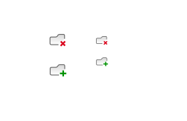
cburschkaI'd say you click those to create or delete a folder. ;)
As far as I know, Drupal core already uses many icons from the Lullabot icon set, which contains many more.
Also, the Tango icon theme is in the Public Domain, meaning anyone can redistribute them under a GPL license if they wish to. If Drupal's CVS cannot relicense by its own rules, I wonder if that could be solved by setting up an intermediate resource site that hosted a copy of the icons and the GPL license.
Comment #31
eigentor commentedWell, we are ambitious and want to build our own icon set. As said in a previous post, we don't need to reinvent the wheel and can use common symbols, just we flex it to our needs.
Hopefully, we can kickstart a solid basis at the UX issue sprint in Utrecht.
Comment #32
yhahn commentedAs requested in #484820 Initial D7UX admin header I am splitting the icon work done for the D7UX admin header into this thread.
The attached icons were created by AJ Ashton (aj@developmentseed.org) and myself using Inkscape for the admin module & D7UX admin header design by the drupal usability team and Mark and Leisa. We're not done, but we've gotten off to a good start. The icons are available under GPL/BSD dual license and the source is already available in Drupal CVS:
http://cvs.drupal.org/viewvc.py/drupal/contributions/modules/admin/sourc...
I've attached a PNG render of the current icons here.
Adjustments (e.g. some of the metaphors are not quite right like tickets for user permissions), as well as additional icon needs would be good to know so we can make time to pull these together.
Comment #33
owen barton commentedNote that the icon naming standards mentioned in my first comment are now part of freedesktop - http://standards.freedesktop.org/icon-naming-spec/icon-naming-spec-lates... - it would be great if we could try and follow the general sense of these guidelines as much as possible. The examples given are for desktop use which limits their direct use somewhat, although the contexts should be quite adaptable, as should a small proportion of the standard names (software-update-urgent). This will help facilitate sharing of icons to and from Drupal and other FOSS projects.
Comment #34
robloachWow, December 2004.
The GPL icons I like that kind of match the Garland look that I enjoy are:
Comment #35
pbz1912 commentedI'd like to create some icons.
Anyone got a list of what you want them for?
Laura
Comment #36
eigentor commentedLaura. look at comment 11 and 22 of this thread, take into account http://drupal.org/files/issues/icons_0.png. It might be worth starting from those and create grayscale and simplified versions that also work at 22x22 px or even 16x16 (this is for masters :) )
If you want a longer list, because you want to do more exotic things, look at the list of icon module: http://drupal.org/files/issues/icon%20naming%20specification.txt this has a lot of possible combination.
But I would like most, if we could hammer through the simple ones for add, edit a.s.o.
Best contact me per Mail or in IRC, for I really waited for someone to come along, so there is a task-force :) I have to sort out what happens with the icons we saw on the D7UX and young hahn created (are these the same?) in order not to duplicate efforts.
The best direct place to go is IRC Channel #drupal-usability ask Bojhan or me.
Comment #37
eigentor commentedComment #38
mcrittenden commentedSubscribe.
Comment #39
Noyz commentedI've managed to attract a professional icon designer to help us build a suite of icons, and GPL them when finished. Anton Zykin from softfacade.com will be doing the work.
To kick this off, I'm creating a new issue #606490: Drupal GPL icons - a softfacade initiative
Comment #40
eMPee584 commentedJust for the record: a year ago i created a set of language icons which can be found here http://drupal.org/files/issues/glossy-flags-theme.png. Going to try to push them into the D7 languageicons module but also wouldn't mind seeing them bundled with core...
Comment #41
q0rban commentedMarking this as a duplicate of #606490: Drupal GPL icons - a softfacade initiative