

 The 2026 Drupal Business Survey is open. Your response will help shape the future of the Drupal business ecosystem.
Probably seems like a silly request, but I will often use this theme to build a site in the hope that we will eventually make it work with a responsive design. However, sometimes that doesn't happen or isn't ready in time for launch. It would be really nice to have the ability to disable the addition of the response CSS files.
I'm using footheme, corolla, and adaptive theme. I went in and commented out the line that calls "load_subtheme_media_queries" in both corolla's template.php and foothemes template.php.
However, it seems that the footheme.responsive.layout.css file is still being added and included in sites/default/files/at_css. I'm currently trying to figure out how/why that is happening
Thanks
| Comment | File | Size | Author |
|---|---|---|---|
| #44 | image.jpg | 831.38 KB | kiranmeruvala |
| #33 | smartphonemediaquery1.png | 15.4 KB | xarchmaemo |
| #33 | tabletmediaquery1.png | 16.27 KB | xarchmaemo |
| #33 | screenshot-1340987273652.png | 31.5 KB | xarchmaemo |



Comments
Comment #1
bkosborneComment #2
Jeff Burnz commentedI'm not going to rule this out right away, its something a few people have asked me about. Lets see what others have to say first. I have to be weary of feature bloat, given that quite a few people use this theme and only a few have asked about this I am inclined not to put it in, but I will keep an open mind.
Comment #3
bkosborneI understand why it's not included at the moment. I mean, the base theme is called Adaptive Theme, it's the main feature of the theme. And I suppose it would be kind of weird to implement because you'd be ignoring many of the fieldsets for the theme settings. Thanks for considering, great set of themes you have here.
Comment #4
Jeff Burnz commentedYes, you are right. The main reason I would consider it is the reasons you stated, I can't really think of another reason. Someone else did ask for it because they wanted to use the theme without the responsive stuff at all, I just told them to use another theme, lol.
Comment #5
bkosborneWhich is probably what people should do, but it would still be nice otherwise. AdaptiveTheme is known to be one of the go-to themes for D7, so a lot of people will flock to it but perhaps not be ready to work with designers to create a responsive theme. That's the boat I'm in at the moment anyway!
Comment #6
carsonwI would love to see this as an option for the reasons stated above. For the present time, I would like to know how to do this manually.
Comment #7
Mike Serafin commentedI too would like to use this option. I started with this theme because we would like to add the adaptiveness feature down the road. It won't be ready for launch, but I can't turn it off. I tried to do the manual copy and paste from /sites/default/files/at_css but it didn't help. The theme is still adapting (I changed smartphone layout for 2-3px and tablet to 3-5px but it is still changing around 700px or so).
Comment #8
Jeff Burnz commentedHe he, I had to chuckle when you said "the theme is still adapting", there is no stopping the mobile web!!!
OK peeps, I am hearing you on this one, I will start looking at how we can do this in a fairly simple way without too much code bloat or introducing any nasty issues.
Comment #9
bkosborneThanks Jeff.
In the meantime, for anyone wishing to do this, here is a fairly hackish way.
In your subthemes template.php file AND in the template.php of the corolla, sky, or pixture reloaded, comment out the function call to load_subtheme_media_queries.
Then open up template.process.inc in the "inc" folder for the core adaptivetheme, and comment out drupal_add_css funciton call on line 91.
That will prevent the media queries from being loaded. However, you're going to need some of the CSS that is generated there. So open up the CSS file that was generated in sites/default/files/at_css and copy the last media query block. Paste it into your themes CSS file and remove the media query stuff.
This is obviously a terrible workaround, but it was a quick fix for me.
Comment #10
Jeff Burnz commentedYeah, that is where it gets somewhat tricky, well not that tricky, but its something to consider...
Question: do we want to keep the standard layout control and simply turn off the tablet and smartphone layout options (and of course disable the output of those to the layout css file).
Comment #11
bkosborneI think it's a fair assumption that anyone wishing to disable the adaptive features would like to use the standard layout.
Comment #12
Mike Serafin commentedAgreed, just turn off the others. Thanks for doing this Jeff! :)
Comment #13
ancym commentedI would also love to have a non responsive version of Adaptive Themes, initially because of client request-this time client has got it right! Especially for tablets, pinch & zoom of full page is far better. Plenty of discussion in android tablet forums of how to stop browser serving mobile versions of pages. Personally, on my 7inch tablet i use Dolphin HD, which offers a toggle between mobile and desktop view-pretty much always set to desktop. Perhaps different for phones (i only have a dumbphone), but I wouldn't bet on it. Touchscreens are getting better...
Had hoped to use an Adaptive theme (AT commerce) for all sorts of other reasons-great theme with lots of configuration options, great support...was ready to try out the disable edit suggested by bkosborne. But- the fixed width setting was not working for me, and in fact, when displayed in 5 browsers gave 5 different displays... Would have filed a support request, but went to Bartik...
Think this is a discussion worth re-opening?
Comment #14
Jeff Burnz commentedI like pinch/zoom for some sites, but I think you are confusing a mobile site with responsive design. The layout might change but the content does not - its all still there. I hate mobile sites that dumb down the content or take away options available in the full version, I mean I really really hate this. But I also hate sites that require constant pinch/zoom just to read anything, its annoying. For example I visit some forums I am regular member of and I have to pinch/zoom for everything, it drives me around the bend. I just want the dam thing to display for my smartphone so I don't need all these additional hand movements.
Frankly I really think we are way to early in this phase of web design to make a judgement either way. It will probably take another 5 years to get a better idea and probably 10 years before some maturity comes. By that time a new technology will have rolled out and we'll changing our approaches again (which is what is happening now, we're at that 10 years peak and technology is changing rapidly). All we can do now is make "best guesses" and responsive design is a pretty good idea and I feel is the best guess we currently have to design for ALL devices at the same time.
What I do think is that design once for desktop and fuck everything else (stuff you, use your pinch/zoom or die) is a tragically bad idea, because you are designing for an outdated medium - the desktop screen. In a few short years the small screen will DOMINATE, this we know for an absolute fact.
If you have 5 layouts for 5 different devices, then I would rejoice and say my job is well done.
Comment #15
ancym commentedYes, ok, that may be, re mobile vs responsive. You are right, on some websites the pinch zoom can get annoying, but it is even worse to only get a portion of the content that should be there. Best case - make sure that there is a link to full site so that the user can choose (not sure if this is in AT themes or not?)
(Sorry I was not clear re 5 different versions, but that is another issue for another day. ..later on I should have a chance to test that again, but I think that fixed width does not work in the AT themes, at least not that way I expected it to.)
I def. agree that it is early to decide one way or another...which is why I would love to see an option to choose, (don't go putting all your eggs in the responsive basket...)
Comment #16
Jeff Burnz commentedHeres the thing about "not putting all your eggs in one basket", when you do that you tend to build mediocre solutions, because you are tying to do everything for everyone. You can try to build good solutions, but adding and adding features ends in bloat and the software gets very bogged down, even slow. Extra helpings of Overlay anyone?
My point being that at some point we have to put most of our eggs in one basket. This is what I did with AT 7.x-2.x and its a roaring success - primarily because it does less things very well. Nobody knows that the original AT, which never saw the light of day, had built in contextual layout capability, but I took it out because its a mistake to have that sort of thing in a theme (context should be a module, such as CTools, with layout provided by Panels, everything managed through Page Manager).
I would go so far as to say that themes should NOT handle layout. I am quite serious about this and the ONLY reason AT does it is because the world is not ready for Panels to take over this role. We are locked into this idea of themes providing layout. Some base themes have taken this layout idea and put it on steroids, however stand any of them next to Panels and they are poor cousins at best, at worst their UX wants to make me cry. I am ranting.
I still have no idea why you think responsive themes REMOVE content, this is not so, they only MOVE content. There is no reason for AT to supply a link to the main site, you are looking at the main site. This is the whole point of responsive design -build once for all devices. Its what's so darn attractive about it, not only from a designers perspective but from the bean counters as well...
Comment #17
bkosborne^ agreed. The idea of providing a link to full site doesn't make sense, because you are already viewing the full site, but adapted to display on your device.
To dynamically disable the adaptive CSS ("view full site"), you'd want to add some sort of cookie-setting function and check for that cookie before including the responsive CSS. Not that hard, but what IS hard is that once you do that, you can kiss anonymous page caching goodbye. Now you have to work on some sort of advanced purl implementation or similar to get two different copies of your page cached. But not just two, maybe 5 because of all the different responsive design possibilities... It gets complicated fast when you try to put all your eggs in one basket.
Comment #18
Jeff Burnz commentedSomeone should try to do that, someone probably is, hilarity will ensue :) Hold on, just use device detection and serve different CSS to 260 odd mobile browsers...
Comment #19
Jeff Burnz commentedThis feature was added to the current 7.x-3.x branch (today) and will be available in DEV shortly.
There is a new theme setting, in "Global settings" tab (in the theme settings), its just a checkbox setting and all responsive-ness is disabled.
Comment #20
Jeff Burnz commentedNeeds backporting to 7.x-2.x
Comment #22
kclarkson commentedJust wanted to touch basis regarding the backport of this feature for 7.x - 2.x
Comment #23
deton8 commentedAT subthemes generate a css file found at sites/default/files/at_css/yoursubtheme.responsive.layout.css
I simply copied the standard layout css code to all the other @media settings.
(keep the original css as comments, so you can turn it back on)
It is hacked too, but I think this is a less "destructive" apporach to switch off the adaptiveness in 7.x-2.x
Comment #24
rdentry commentedI was building a website where the client changed his mind about wanting a responsive layout (wants it to look the same with iphone, ipad, etc...). I upgraded to 7.x-3.x but is causing problems since my subtheme is -2.x. I followed this page info http://drupal.org/node/1497224. it seems that many of the classes have changed with -3.x. Its not a problem making fixes, will just take some time. Long story short, just wondering if the backport to -2.x is anywhere near completion before i start modifying my css. Thanks again for the theme. Love it! Not sure why the client does not want this.
Comment #26
Jeff Burnz commentedI havent had much time for thinking about a backport I'm afraid, I will try to get some time to work on it, although its unlikely to make it into the next release.
Comment #27
hanpersand commentedI just wanted to add my +1 for thinking this feature would be an excellent addition to AT. I build Drupal sites for nonprofits that are often on tight budgets. The orgs I work with, like many small businesses, often can't afford designers who are up to speed with the concept of responsive, and/or just aren't ready to implement responsive because they may be new to Drupal, still learning, and still getting used to the whole idea that their users are on mobile devices.
But just because they may not be able to afford a responsive site in an initial build, it doesn't mean their users (and donors) cannot afford mobile devices, and aren't using them like crazy. Of course accessing the site via mobile devices is on the rise even for small nonprofits, just as for any other business. So at some point, these small businesses will likely need to implement responsive, sooner than they may anticipate.
It's part of my job to help my clients plan for the future as best I can. Instead of giving them a non-responsive site and that's it, I would love to give them the ability to adjust their themes to be responsive when they're ready--when more funds come in, when their users start asking for better displays on their tablets and phones, etc. The ability to "turn off" the responsive features initially but give an org the infrastructure to implement media queries down the road would rock my world, no question.
It would be amazing if this could be backported to 2.x, but I will be thrilled if it's in 3.x. Thanks much for your attention to this.
Comment #28
Jeff Burnz commentedIts in 7.x-3.x, its a single check box to totally disable all responsiveness.
You are absolutely right about small orgs/businesses not being able to afford the design work, but you can get pretty darn close to something decent with only minor adjustments. I helped a chap today whose parishioners all use mobile devices while in service - part of the way the services work I believe. The chapel has free wifi and their site has to look good on mobile and be easy to use.
Comment #29
hanpersand commentedYes--I just did an org site and I built the theme on AT + Sky (+ customized Footheme), and I was able to adapt Sky's phone nav to work nicely on a site with a (1 comp, not much thought put into it) donated design.
(I am a long time AT fan. It's great for the kind of org clients I serve--simpler to work with yet does what it needs to do well, leaving the more complex layout tweaking to mature, well-developed modules. Just wanted to say thanks.)
Comment #30
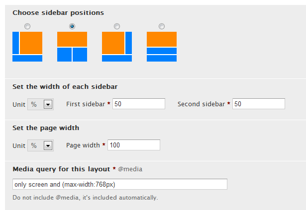
xarchmaemo commentedJeff, I appreciate all the work you have done with Adaptive themes. I am very impressed! I do have a question that maybe you or someone else on here would know. In line with this thread, I was wondering if there was any way I could disable just the smartphone responsiveness? I am using Views (I see there is a sandbox for responsive views, but this is a production site) and obviously it is not the best at displaying information at low resolutions.
However I did notice that at the Tablet Layout, the text is well aligned. So is there anyway I could 1) Disable the responsiveness at JUST the Smartphone size(Landscape and Portrait) altogether or 2) Maybe set the Tablet View settings also at the smartphone size. (Little scrolling, but not as much as the Desktop). I am using Corolla and will be using AT 7.x-3 as soon as it's released (Currently on RC6). I don't know if the second option is even possible (Please forgive me, I do not know much CSS) Any help is appreciated, thanks guys!
Comment #31
Jeff Burnz commentedxarchmaemo - you can do this with media queries.
For tablet portrait:
only screen and (max-width:768px)For both smartphone orientations:
only screen and (max-width:1px)This tells the browser to use the tablet portrait layout for all screen sizes up to 768px, and effectively disables the smartphone layouts from ever being used.
I think a real option/setting to just disable the smartphone layout is a good idea, and probably very easy to include, I will look this.
Comment #32
xarchmaemo commentedThanks for the suggestion, Jeff. I tried your recommendation in the settings but no luck. But just to clarify I am on the same page, by doing what you suggested, there should be some scrolling involved when I pull it up on my phone, correct?
Comment #33
xarchmaemo commentedHere are my settings and my output on my phone. Thanks in advance!
Comment #34
Jeff Burnz commentedThanks in advance for what?
I need the URL.
Comment #35
xarchmaemo commentedI apologize, I meant thank you for any suggestions. The link is vacationersmeet.com.
Comment #36
xarchmaemo commentedI apologize, I meant thank you for any suggestions. The link is vacationersmeet.com.
Comment #37
Jeff Burnz commentedI think your site and/or server is down right now, will check again later. Did you look in anything other than Opera Mini?
Comment #38
xarchmaemo commentedStrange, I just checked it and it's working. I also checked it in my stock Android browser, same thing. I will test around a few other things. I think I will just disable the all responsiveness for now by setting the iPad to the same 1 pixels size.
Comment #39
Jeff Burnz commentedYep, I checked in a whole bunch of browsers and devices and its working fine. Could be something to do with Opera mini cache, how they cache stuff on their servers - I have run into this before.
Comment #40
xarchmaemo commentedThanks Jeff, Appreciate the help!
Comment #41
xarchmaemo commentedOkay, I tried again in a few browsers (I also used Web Developer for chrome tool to view responsive layouts). It still doesn't show what I am expecting. Could you send me a screen shot of what you see?
Comment #42
4fs commentedThis is a great feature. Thank you. Version 3 of at is stunning.
Comment #43
Jeff Burnz commentedI want to close as fixed this again because the actual feature has been added to 7.x-3.x, any issues arising for any version should be opened in a new thread, this one is done.
xarchmaemo - if you are still having an issue please open a new issue, we can deal with it there as a support request. Cheers.
Comment #44
kiranmeruvala commentedI completed my project using adaptive theme, but due to some reason there are issues regarding design on iPad. There is no way to remove responsive CSS. I will have to rework on the entire design if I want to switch to other theme.
Comment #45
stan turyn commentedkiranmeruvala, just give your #page-wrapper some min-width - that way your site will stop being responsive when displayed below that width. And "there is no way to remove responsive CSS" is ultimately never true since you can always simply modify any CSS files in the base theme (just be careful when doing updates).