

 The 2026 Drupal Business Survey is open. Your response will help shape the future of the Drupal business ecosystem.
Hej,
is it possible to make superfish menu works with responsive design?
I have found a script from matt kersley.
can you include it?
kind regards
drew
| Comment | File | Size | Author |
|---|---|---|---|
| #12 | dropdown.png | 281.99 KB | artatac |

Comments
Comment #1
BManuel commentedSubscribing
Comment #2
mehrpadin commentedHey,
Just a quick note: I've tested this plug-in and noticed it does not work very well, I'm working on one at the moment, which should be available with the next library version. Also, danke for the suggestion. :)
Comment #3
GeorgHuber commentedDear Mrs. or Mr. Mehrpadin,
currently I'm using the combination Megamenu&Omega for a fixed-width webdesign study.
Having set Omega to fluid width to make it responsive, all hell broke lose with Megamenu.
That's why I searched the web for solutions. Fortunately, I wanted to change my menu to
Superfish anyway, so I'm pleased to read that you are about to include responsive features
with Superfish. I hardly can wait for it!
Why did I want to switch from Megamenu to Superfish? Megamenu works great, but all
development seems to have stopped, it's still in the dev phase. That makes me feel
queasy about the future of Megamenu.
If I were a better coder I would try to make the necessary changes to Superfish myself,
but the knowledge needed for such an undertaking seems prohibitively huge. And to
make a website look - at least a little - the way I want it to appear on the web takes
so much effort that I would be very grateful if some stumbling stones were taken care
of by the developers of so important a module as Superfish.
Getting forms (contact, comments, login and so on) looking acceptable is about the
limit of my skills, building a usable menu is far beyond me.
Those sentences above are the preface to my question:
How long did it take you to be able to create a module like Superfish?
I mean the total time reading the documentations, trials and so on.
(And I also have trouble understanding the so-called documentation of Drupal 7,
it leaves me more often than not clueless how to go on. Sometimes I even
wonder whether to abandon Drupal and start with WordPress or Modx but I
don't want to give up the flexibility and - in the case of WordPress - security of
Drupal. Why can't there be simple and accessible examples in the Drupal
documentation? Why is it made so hard to understand how things work internally?)
Sometimes I feel really, really stupid compared to people like you.
People like you must be ultra quick in the uptake and have encyclopaedic brain
structures as well. (It's not that I'm not used to focus myself, I'm a free-lancing
physicist and at the moment involved in the development of a highly-reliable wireless
transcutaneous power supply for an artificial heart and I do understand relatively
complex things, but since I got involved with Drupal I'm really mystified how anybody
can find their way in Drupal, especially in the menu system.)
This leads me to my second, third and forth question:
What background do you have? What have you studied? And:
How long did you wrangle with Drupal before you knew your way around?
Thank you very much for your efforts with Superfish
and best regards,
Georg Huber
Comment #4
aitala commentedAny luck on the responsive design plug in? I've tried the Matt Kersley plugin and am not happy with it either.
Eric
Comment #5
mehrpadin commentedServus Georg,
I'll answer in an email since it's mostly off-topic here.
Eric, this is what I've came up with so far, using parts of the mobileMenu:
It's not complete and it's not much tested and so on and so forth. Also, should be used like this:
PS: I don't consider responsive Web design as the sole correct answer to non-desktop users, especially many many non-smartphone mobile users with very small screens, this is why for the Superfish I will choose RESS (responsive + server-side, basically, UA string and media queries plus JavaScript (window).resize), this includes this responsiveSF plugin (temporary name indeed) and sfTouchscreen (sfTouchscreen needs to be revamped)
:)
Comment #6
aitala commentedI'm not entirely sure how to implement the code you provided... I'm assuming that it does not require Matt Kersey's code...
Eric
Comment #7
mehrpadin commentedNo it does not need that, simply save the code in a .js file, let say rmenu.js, put it in your theme folder, for example /sites/all/themes/yourtheme/js/rmenu.js , add it to your .info file, finally add this to your page.tpl.php (or html.tpl.php if it's D7) right before
</head>Assuming the block is Superfish 1.
Comment #8
tejaspmehta commentedHello mehrpadin,
I have tried above solution, but my superfish menu is still not set to responsive. any other solution or steps for debugging will be helpful.
Thank you
Tejas Mehta
Comment #9
DeNelo commentedHi,
I get an "Uncaught TypeError: Object [object Object] has no method 'responsiveSF'".
I can't get the script to run; I've added it like you said, and I've tried adding it directly in html.tpl.php too.
What to do? My problem is that on iPhone and other small screens, the menu is stacked on top of each other, and I can't access the submenus. (I've tried enabling the SF Touchscreen extension also to no avail).
I'm using the Sky Adaptive Theme.
Comment #10
hwasem commentedI'm getting the stacking menus and I can't click on any links when I'm in a small viewport (iPhone, etc). I'm using a sub-theme of Adaptive Theme's Corolla.
I installed the script above and added it to my .inof and html.tpl.php file. I'm not getting any errors, but I can see that Firebug is stopping at line 4. I'm not sure about troubleshooting JS, so if you have any additional ideas to try or places to look for a fix, I'd be happy to try.
Comment #11
promesI have the same problem with the Pixture reloaded Adaptive theme on small screens. Since others don't had luck I am eagerly awaiting a solution.
Because above comments I didn't try the mattkersley code (to busy).
Maybe the problem is in this comment of mattkersley: "A Plugin which turns your site's navigation into a dropdown (
) when your browser is at mobile widths.".
So it make an adaptive theme primary menu, allready dropped down, a dropdown again while it should be go horizontally.
Thanks for the good work.
Comment #12
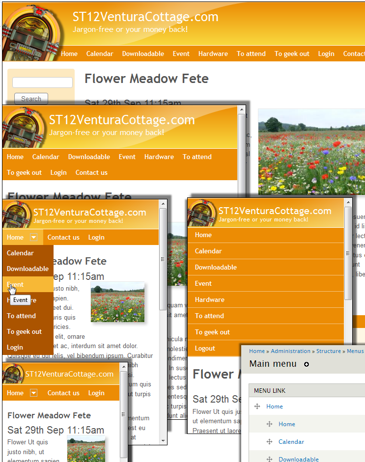
artatac commentedI have also been researching this and have come up with a workaround:
example at
http://angcomleisure.com/st08/flowers/flower-meadow-fete
ps additionally I created superfish-3 with login and contact us links to appear on narrow as well
This works for me but feel sure there is a more elegant solution a screenshot is also attached
Comment #13
promesI think Superfish works as defined.
The point is Adaptive design changes "the rules" according to the width of a screen. It uses mediaqueries in CSS and changed the direction of the primary menu from horizontal in "regular computers" to vertical in small devices.
When the width < 800px (? exactly 769px ?) this menu will display vertically, above it displays horizontally.
I think the "only" thing is Superfish should have the same behaviour as option.
Adaptive design (in Pixture reloaded) uses the #menu-bar, .sf-menu, .sf-horizontal and .sf-vertical for the definitions.
See: pixture_reloaded.css, pixture_reloaded.responsive.style.css and pixture_reloaded.settings.style.css.
I am not that well in CSS (and javascript / jquery). I hope others can find with this comment a solution.
Comment #14
drew reece commentedI've used the workaround in #12 too.
It's ok unless you have a few nested levels within the menu because the width can expand beyond the page dimensions on small screens. I guess the only other option is to switch to a select list.
Comment #15
promesI tried #12. I have the following questions:
1. I don't understand the sentences step 1 and 4: create a new top tier to the menu and add 'home' (again). Can anyone explain this?
2. in step 2: do I have to reverse the menutype from horizontal to vertical and slide-in effect from vertical to horizontal for superfish 1?
3. what are the css alterations to make? I used "nav#block-superfish-1 {display: none;}" and "nav#block-superfish-2 {display: none;}". Is this correct?
4. My menu is 7 entries level 1, each having several entries level 2 and some more levels. That's why I use a menu depth of 1. Does this alter the given rules in #12?
My result as so far (on my test system) is in small screens the menublock is 100% wide, so no level 2 items are shown.
You can see the site in http://nw.ssew.nl (whithout alterations #12). In the near future the new version of the site will be released and be found at http://www.ssew.nl.
I hope to solve this issue before the official lounch.
Comment #16
drew reece commentedI ignored the step 1 & 4 in #12, I assume it is just adding a new top level menu item. Possibly so you can collapse them all under the single menu item. It seems to be optional AFAIK.
Set it up to animate however you desire, but it helps if it is a vertical menu.
For Omega 3 you need to hide the vertical menu in the global.css & show it in the stylesheet for the narrowest view. The horizontal menu does the opposite
It looks correct on the http://nw.ssew.nl
The menu levels also are specific to your site so use whatever level works. I found that nested items will expand beyond the page width.
Comment #17
artatac commentedBy adding an additional top tier with home in but using the second tier as the sites main horizontal menu, you can re use this main menu as a vertical menu because at small widths you start at the top tier which means this min (second) tier is vertical this time, without changing super fish code
Home
- Home
- Fruit
-- apple
-- orange
- Flowers
- Contact us
Comment #18
hrodrig commentedI'm subscribing to this as well. Can we have the option of either turning the menu into a select list, or to incorporate a method like this one? http://ivanchaquea.com/creating-responsive-menu-omega-subthemes.html I'm having a difficult time using Superfish + Omega in a neatly responsive way.
Comment #19
wiredescape commentedBump...
Update on progress? Working in dev version?
Thanks,
Comment #20
dallas63 commentedHear, hear... Progress report is very much needed!
Comment #21
mehrpadin commentedIt's done, still on my local :) requires a bit of testing still, will do my best to make it available in a few days.
FYI, I've used the
<select>list method which is used everywhere, but in the next version there'll be a CSS-friendly<ul>-based option as well.Comment #22
chefnelone commentedI'll be waiting for this release too!
Comment #23
avo webworks commentedAny news on this? Would love to hear more.
Comment #24
mehrpadin commentedJust updated the development version! takes some time to be available as a download.
Comment #25
flocondetoileI tried the version 7.x-1.9-beta5+5-dev. The menu is not converted in a select menu. The option selected was based on the width of the window (740). I tried also with the user agent detection, and test with my smartphone and it's not stil working. I tried also with the two User agent detection method. Same result.
I use a theme based on Omega 3. I disabled the debug options of omega.
In addition, I use a diaparoma done with views slideshow module and flexslider on the home page. there seems to be an incompatibility between superfish 7.x-1.9-beta5+5-dev and flexslider. The slide was not working at all. The html code was present but the library flexslider js seems to be broken (I just had a stroke instead of images and text slideshow). I backup to the version 7.x-1.9-beta5 and all is fine.
The conversion of the menu in a menu "select" don't work even on pages where there isn't a slideshow based on flexslider.
Perhaps because the file sfsmallscreen.js wich is mentionned in the code is not present in the library folder ?
Do you need more information to debug ?
Comment #26
mehrpadin commentedI'm not sure what beta5+5-dev is implying but if it's the latest development version (http://ftp.drupal.org/files/projects/superfish-7.x-1.x-dev.tar.gz) and you're upgrading, you should add the path to the sfsmallscreen.js manually (explained on the homepage), perhaps you didn't and it's missing the JavaScript file hence breaking the rest.
Comment #27
oystercrackher commentedThe new dev version and new library worked for me; but i did have to manually add the sfsmallscreen.js manually as mentioned above.
I see that there is a sftouchscreen option available for beta but it does not appear to be working and I was not able to find documentation. Is this currently available and working in the dev version? If not, is there a timeframe for this feature?
Please advise.
Thanks
Comment #28
flocondetoileYes it's the latest development version and I'm upgrading.
But as i was following this issue, i don't see and read the note on the homepage, and then don't upgrade the library. My fault.
I test with the good library and it's works very fine. Awesome.
Thanks
PS : I look forward to the version CSS friendly. ;-)
Comment #29
promesThanks mehrpadin,
This is a good solution.
Comment #30
avo webworks commentedThanks mehrpadin for the time and effort you put into making this responsive. I really appreciate it and the latest dev release with the new Superfish library works great.
Comment #31
Argus commentedSo, fixed?
Comment #32
mehrpadin commentedI believe so :)
Comment #33
iaminawe commentedWorks for me - thank you so much
Comment #34
mengi commentedWorks great for me. Thanks for this!
Comment #35
Argus commentedComment #36
chefnelone commentedI'll be tuned for the css friendly version. ;) Great work.
Comment #37
theohawse commentedThe tinynav style select menu doesnt look super sharp out of the box so here's some css:
Comment #38
mehrpadin commentedLook & feel? you can try this http://harvesthq.github.com/chosen/ (http://drupal.org/project/chosen) haven't tested yet though, I guess we all know http://formalize.me/ too so not need to mention :)
Someone said Chosen & feature request? already in my to-do list ;)
Comment #39
hwasem commentedI applied the latest Superfish and am seeing the select list. It is working, but maybe a little too well :)
Each sub-menu item is separated by a "-" item and is duplicated. So the select options look like this:
child1
-
child2
-
child1
-
child2
I don't see this in my regular (non-smallscreen) superfish menus at all. They look normal without the hyphen or duplication. I'm not sure where the "-' are coming from or why it is repeating. Is anyone else seeing this?
The only thing I can think of is that I do have Special Menu Items module installed, though I'm not using anything special for this "Main Menu".
Comment #40
chefnelone commentedI just tried with http://drupal.org/project/chosen but it doesn't work. It seems like chosen is not fired up because it works on document ready and superfish select is loaded with window resize.
Anyone has tried with this?
Comment #41
chefnelone commentedhttp://drupal.org/project/chosen version 2.x works fine!
Comment #43
mehrpadin commentedUpdate: Added accordion menus to the sfSmallscreen, try the development release once updated :)
Comment #44
chefnelone commented@mehrpadin accordion menu is shown as a select list. Is there anything else to do besides cheking of checking: "Convert the menu to an accordion menu."?
Comment #45
mehrpadin commentedDid you update the Superfish library? (master branch should be used)
Comment #46
chefnelone commentedyou were right. I updated the library and it works fine. Thanks
Comment #47
nodecode commentedThe new menu looks like it's working properly, nice job! However I'm seeing the following error which doesn't seem to be affecting functionality AFAIK:
Notice: Undefined variable: maxwidth in superfish_contents() (line 1067 of /x/sites/all/modules/superfish/superfish.module).
Comment #48
mehrpadin commentedThanks! fixed that thing just now, wondering why I'm constantly missing such errors!
Comment #49
nodecode commentedworking now. nice job!
If you're looking to improve the javascript behavior in the future, there's a good example of one of these menus here: http://www.detroittechnohouse.com
Comment #50
jetwodru commentedHi,
The normal menu will first appear and then transform into a select / accordian menu every time you click a menu item, why is there a transition process ? Can't it be a natively select or accordian menu without loading the normal menu CSS when viewed on a small screen ?