Hi there!
I'm wondering if it's possible to have the sidebars stack differently than the default following the content region.
I have, for example, used views to create a block of a Date and Place field from my Event content type, and placed that block in the left column. However, in the smartphone view the left column drops below the main content area, and I would want that info (date and place) to remain at the top, since it's important.
Or, perhaps there's a better way to do this sort of thing once you have finished responsive panels? ... not sure... oh, I wish it were possible to have entirely different view modes using display suite for each media query... that would be wonderful.... then I wouldn't have to pull the fields into blocks to get content in different sidebars.


Comments
Comment #1
Jeff Burnz commentedLots of very good and interesting ideas! I will come back to this shortly and review each one, I want to have a think about this first. Cheers!
Comment #2
tchopshop commentedExcellent... I know there is a core issue related to this that swentel is working on fixing -- see http://drupal.org/node/1154382
Being able to change view modes dynamically based on media queries would be the most perfect solution, since not only could you change layout, but also content.
Comment #3
Jeff Burnz commentedYeah, I know the issue, its whats really holding us back. Have you seen the Roadmap issue #1389536: 2012 Roadmap - The Great Leap Forward, this is where I bang on about Panels a lot. Where I am going is to remove layout from themes and put it in modules like Panels and Display Suite, wtih CTools/Mobile Tools providing context and Page manager wrapping the whole thing up.
Until then, yes its possible to change the position of the sidebar, tricky, but certainly not impossible. Its tricky because you really need to know the height of the sidebar (when its horizontal in mobile view). I can work on a few ideas with CSS that might be able to get around this requirement... stay tuned.
Comment #4
tchopshop commentedHi Jeff,
I know you're working really hard right now on panels layouts... and I don't want to interrupt your flow... but I'm back to trying to figure out how to get sidebar 1 to stay at the top instead of dropping below the content region at the smaller sizes... I've been trying to use CSS to move it to the top, but without success, and then when I re-arrange the order of regions in the page.tpl.php, it messes up the system generally...
If you have a quick fix I could sure use your help... I don't want to use Omega for this since I find the theme too heavy (and I like being able to have respond.js working for IE), but it does allow the content order to change weight in the UI... perhaps I should study their CSS?
Comment #5
Jeff Burnz commentedLet me give you a tip, in Zen the navigation menu is below the main content yet appears above it, so that is a place to look for inspiration. I also wrote an article some years ago on how to add a sidebar top type region, it uses CSS along the same lines - look at the CSS in the screenshot added to this article, its way close to what could achieve your goal: http://adaptivethemes.com/how-to-add-a-sidebar-top-region-in-genesis
That will work if you get the values right.
Comment #6
tchopshop commentedthank you, I'll look at Zen. I really *hope* I didn't offend you by mentioning Omega... I love what you're doing here and would like to help if I could.
Comment #7
Jeff Burnz commentedhe he, no you did not offend me, its just my warped sense of humour, I hope I did not offend you or anyone else either.
Comment #8
Chimos commentedHi,
I'm running Adaptive Theme and AT commerce, both 7.x-3.x-dev
wow I'm amazed with so many important changes, It looks even better, and seems to work very good and faster.
I need support with this issue, so I need to keep the first sidebar always there, on the left of content.
I can know exactlý the height of this region (will be not more of 400px), it's going to hold only the logo and slogan.
thanks
Comment #11
Jeff Burnz commentedI'll put some thought on it, all of us (base theme developers) are thinking about this very problem.
I can see a few ways to do this:
I'm punting for 3 or 4, thinking to give 4 another crack and actually try to solve this (it may be impossible, is a difficult problem), and 3 is certainly doable.
Comment #12
Chimos commentedI'm not good enough to points 2, 3 and 4 I think. And the option 2 is not for me since the height of my sidebar is fixed (380px).
I am trying what I understand of point 1:
It means add a region here?
I know, and in the info file, etc... But did you mean this position in the page tpl?
Thanks
Comment #13
Jeff Burnz commentedMaybe, or higher up the source order. I am not really interested in discussion option 1 in any seriousness, there are already loads of regions that you can use for an aside type region this produces and its pretty easy if you know CSS, what the core theme needs is something all users can handle and be easily managed via the UI.
FYI The 7.x-3.x theme already has Panels layouts that can do 1.
Comment #14
Jeff Burnz commentedI have decided in the end to postpone this for the core theme. The Panels layouts can to an extent do this and its just gotten too late in the cycle to try and get this in, I need to release the theme so will consider this over the coming months for a point release, see how othere react to the theme as it hits the wild in large numbers etc etc.
Comment #15
Chimos commentedOk, I asked because I had problems trying option 1 and I am a little bit lost because subtheming and responsiveness are new for me. I think I got it now, thanks!
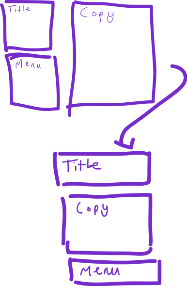
Comment #16
kimadactyl commentedI think this is the same thing I was going to ask. My use case is probably better explained with a picture! I want the blocks do to this when I wrap. Or am I asking for something slightly different?
Comment #17
Jeff Burnz commenteddaresbalat - you might want to look at this, and the new feature in the latest DEV of Adaptivetheme, it can do exactly what you are asking for.
http://drupal.org/node/1626618 and http://adaptivethemes.com/move-or-hide-regions-and-blocks-in-mobile-devices
Comment #18
kimadactyl commentedThankyou Jeff! That's fantastic. (changed my username finally on here, sorry for confusion)
Comment #19
Jeff Burnz commentedI'm marking this as fixed, I think #1626618: Unset regions in mobile, move blocks in mobile, and provide a global mobile context is about as close as we're gonna get, and its pretty good I think - the feature vs performance is very good, which is always my main concern when doing rad things like this in a theme.