
Closed (fixed)
Project:
Drupal core
Version:
6.x-dev
Component:
user.module
Priority:
Normal
Category:
Feature request
Assigned:
Reporter:
Created:
10 May 2007 at 19:22 UTC
Updated:
21 Mar 2011 at 08:47 UTC
Jump to comment: Most recent file

Comments
Comment #1
ChrisKennedy commentedAccording to http://www.computerworld.com/securitytopics/security/story/0,10801,82883... ISO 17799 includes these relevant password quality standards:
Comment #2
ChrisKennedy commentedOkay here is an initial stab at a simple implementation. Fire away. It's close to code freeze but I figured I'd give it a shot.
Comment #3
ChrisKennedy commentedTweaked a code comment.
Comment #4
ChrisKennedy commentedA few more small tweaks.
Comment #5
Stefan Nagtegaal commentedTweaked CSS..
margin/padding: 0px; is equal to margin/padding: 0;
0 is zero, no matter id it's ems, px, pt, or whatever...
Comment #6
Gurpartap Singh commentedLine 31 of user.js is:
var newClass = cssClass[result.strength];Now, when user clears the whole password, result has no value, hence, result.strength returns nothing andundefinedclass is set. It could be changed tovar newClass = cssClass[result.strength] || '';.Why is there 15px margin on left side? It looks better when it's vertically just below the starting point of the password field, i.e. margin-left: 0;.
For the strength, it never sets it to "High" unless you have a symbol is the password, even if the password is say: s1a2t3n4a5m6.
When a short password is entered, it says "Your password should be at least six characters in length for a minimum level of security.". This may even make impression that they need to provide a password of at least 6 characters length to proceed; or maybe it's just fine?
More that could be included is, let the user type the full password and then evaluate it's strength. In other words, wrap the evaluation code in
setTimeout()with a timeout delay of around 400ms. Something like:Also, the user may even paste the password using mouse. Keyup event won't detect that.
Comment #7
ChrisKennedy commentedThanks for the review :)
1. Line 31 of user.js - fixed.
2. The password strength indicator is supposed to be to the right of the field. Did you do a hard refresh (and have aggregation disabled) to get the changes to system.css? If you did and it still shows below the field there must be a bug in the CSS - what browser?
3. Yes, it is intentional that "high strength" passwords must have punctuation. I think this is reasonable and pretty common, but I'm open to tweaking the strength estimation.
4. Good point - I modified the text to make it clear that it's a recommendation and not a requirement.
5. Added an initial delay of 600ms - seems to work well.
6. Hmm the best solution I could find is to monitor the blur event so that the password monitor is triggered after the user switches to another element. I couldn't find any events in jQuery that are triggered after a mouse-paste.
Comment #8
Gurpartap Singh commented#2 Haven't tested it anywhere else, but installation configuration. Ubuntu/FF2.
#3 Maybe let such a password be considered as secure(highly)? Of course if alphabets and numbers both are at least 4 in number, totaling 8..?
Comment #9
ChrisKennedy commentedOkay I made it a bit narrow - does this fix it from going below the field? I also fixed a small bug in the delay handling.
Comment #10
Gurpartap Singh commentedIt's still down. (1024x768 resolution).
Comment #11
ChrisKennedy commentedOkay rather than continuing to play with fixed widths, I set it to automatically go below the password field on the installation page. I changed the margin-left on the password strength div to a margin-right on the password div, so when it gets pushed down it doesn't have a weird indentation.
Comment #12
ChrisKennedy commentedI got some good feedback from Steven in IRC.
The expanded patch:
Comment #13
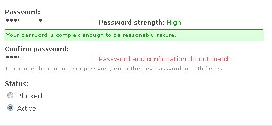
ChrisKennedy commentedHere is an example screenshot.
Comment #14
profix898 commented+1 on a password strength indicator.
But I think the 'Your password is complex enough ...' message should be removed. Why bother the user with an additional message if everthing is OK? A simple 'strength: high' on the right should be fine in that case.
Comment #15
ChrisKennedy commentedAgreed - here is an update to not show a message for the high strength case.
Comment #16
ChrisKennedy commentedCorrect patch version this time.
Comment #17
Gurpartap Singh commentedMaybe you could further have friendly messages.. and "Your password..." could be changed to "The password...". Just an opinion :)
Comment #18
ChrisKennedy commentedSounds good and makes sense considering that the password checker is also shown on the admin user creation pages. Patch updated.
Comment #19
Gurpartap Singh commented, it's only 1 password, with a confirmation repetition. And this, at first recommends six characters, user does put a six char. pass, and then discovers I need to put numbers, punctuation too(through messages shown on next strength level), that might be bit unexpected. Perhaps, how about something like this:
(Maybe it's a long message, but to the point imo.)
How about:
Suggestion:
Suggestion:
So each message's suggestion seems to be stepping down as the user keeps including each suggestion from the first message. If the strength is low, it says , if medium, it would say .
More:
Maybe?
Or
2 english pennies :)
Comment #20
ChrisKennedy commentedI made all of the changes except for the confirmation strings I did:
[Good] "The confirmation is correct."
[Bad] "The password and confirmation do not match."
That way the messages have a clear visual difference and the user doesn't have to read the sentences as closely.
Comment #21
mfer commentedsubscribing. I'll test this out in the next few days. I really like this functionality.
Comment #22
Gurpartap Singh commentedThis combination makes green/ok text readable on low resolution screens. But the same .ok class' color is used else where too, like on "Status report" page, there these colors look a lot fancy and bright no?
Still some suggestions:
"The confirmation is correct." -> "Password confirmed correctly."
"The password and confirmation do not match." -> "Confirmation password mismatched!" or mismatches?
Also at the very first time of installation, "Password strength:" string appeared(without any css) on right to the password field; no field wasn't touched yet. Couldn't reproduce on refresh, but I remember the same happening last time as well.
Comment #23
ChrisKennedy commentedCSS updated - I checked out the status report page and individual form errors and they both look fine with the revised CSS.
I made the passwordSuccess change but the proposed passwordFailure change sounds awkward to me. I prefer to keep the current string. But these can be modified during the code freeze once/if this feature is added beforehand.
I bet the reason "password strength" shows up initially is that your browser is caching the old CSS, which does not include the class to hide the password strength.
Comment #24
ChrisKennedy commentedMinor: added two semicolons to hopefully conform to the js aggregation patch, and changed the double-quoted translation string back to single quotes now that there isn't an apostrophe.
Comment #25
ChrisKennedy commentedOkay I did a full review of the changes to the .ok/.warning/.error classes. I didn't find any problems, although I did realize that the change to
div.ok, tr.ok's background suggested in #22 was no longer needed since I had made the color darker. This version reverts that to keep the green saturated.For future reference, here is where I found the status CSS classes used:
Ok: system.module (aggresive caching success string, status report), system.js (clean URLs test), themes.inc (theme_status_messages())
Warning: system.module (status report), system.js (clean URLs test), themes.inc (theme_status_messages())
Error: forms.inc (form errors), system.module (aggressive caching error string, status report), themes.inc (theme_status_messages())
I verified the colors are okay in both Garland and Bluemarine.
Comment #26
mfer commentedWorked like a champ in firefox. Got nothing in safari. Though, safari is terrible with javascript.
Comment #27
mfer commentedHere's something interesting. I tested it in webtoolkit (safari backend) with Drosera (debugging tool) and it didn't show user.js being pulled into the page load. Wonder if there is something in there safari doesn't like to load.
Comment #28
ChrisKennedy commentedApparently Safari randomly doesn't allow javascript variables named "class." Fixed.
I also changed the failure string to "The confirmation does not match." so that it fits in one line on the installation page.
Comment #29
ChrisKennedy commentedHad an extra space in it.
Comment #30
dries commentedI've tested this and it works as advertised.
Comment #31
dries commentedThe only minor gripe is that the placement of the status messages are not consistent. The "do not match" message is displayed on the side, the "too short" message is displayed below the textfield. Some errors below, some errors on the side.
It's minor and I don't have a suggestion for improvement so I decided not to mention it in first place. But maybe there are more creative people that do know how to fix this. Either way, it should not hold up this patch IMO.
Another thought that occurred to me, was that at some point, we might want to make a form type for passwords. Not sure if that's feasible with two fields but it might be worth exploring. This isn't a showstopper either.
Comment #32
ChrisKennedy commentedI partially disagree about consistency. The password strength component displays both to the right ("Password strength: low/medium/high") and bottom (extended description). The confirmation check does not really have a long enough message to *need* to go below the field.
But I do think you may have a point that the confirmation string is long enough that it might be better to move it below the field, or shorten it.
Considering that it is merely a test of equality, I am more inclined to the shortening tactic. Perhaps the message should just be "Correct" or "Incorrect", maybe with the checkmark or x-mark images from the status report displayed to the left of the message?
There is a form type for passwords: password_confirm. This patch modifies the expansion function to add specific CSS classes for the two individual fields. Although, the way FormAPI splits the password type into two elements has a bug that prevents them from being marked required.
Comment #33
ChrisKennedy commentedRevised after another round of suggestions from Steven in #drupal.
I also looked at using the watchdog icons for the confirmation message (via CSS) but they're too big for that line height.
Comment #34
ChrisKennedy commentedHere's a screenshot.
Comment #35
ChrisKennedy commentedSynced.
Comment #36
ChrisKennedy commentedI think it looks better to not end the Correct/Incorrect messages with a period, like the low/medium/high strength indicator.
Comment #37
Steven commentedExcellent eye for detail, thanks. Still, it can be improved:
These are all relatively simple to fix, so I did.
I also think it is better to move the tips box to below the confirm field, since it is much tidier, means the fields don't jump around and brings it closer to the normal description.
Before: http://acko.net/dumpx/pwd1.png
After: http://acko.net/dumpx/pwd2.png
I also noticed this change:
Because of the way shorthand properties like background work, and because there is no image, these two rules should be entirely equivalent. Why was this added?
Finally, the CSS needed to be updated for RTL. New patch attached.
To others wondering why this is so important to get 'right': this is part of the installer, and thus part of our first impression to the user. The previous incarnations were much too "in your face" and would e.g. annoy users by giving unnecessary hints while they were still typing. This needs to be useful and clean.
Comment #38
ChrisKennedy commentedThanks Steven, that all sounds good.
The .ok background CSS was recommended in #22 for low-resolution screens. I wasn't sure what the effect was so I just left it in.
Comment #39
Steven commentedFInal fixes:
Comment #40
profix898 commentedThe 'Correct' string after the 'Confirm password' textfield is a little confusing. What does that mean? I guess it means that the entered strings are identical, but you cant read this from the layout or description. Otherwise looks good from a visual inspection.
Comment #41
dries commented'Correct' might be interpreted as (1) passwords match or (2) the strength is good enough. It might be better to write 'Passwords match correctly' or just 'Passwords match: yes/no' (consistent with the other message). We're nitpicking now. ;)
Comment #42
wim leersSubscribing.
Comment #43
jacauc commentedSubscribing
Comment #44
matt@antinomia commentedNice patch! I personally think it's requiring too strong of a password in order to qualify as 'strong'... "n38f@k2d" is a very strong password, but it's only scored a 'medium'. Just my $0.02.
Rerolled tracking HEAD.
Comment #45
mfer commented"n38f@k2d" has not uppercase letters. could be stronger ;-)
Comment #46
ChrisKennedy commentedPer Dries' comment in #41, the confirmation text is now: "Passwords match: Yes/No" to be consistent with the password strength indicator.
Comment #47
dries commentedTested and committed. Thanks Chris and Steven.
Comment #48
siaiweb commentedThis addition is just great! Is there any chance to see it implemented into Drupal 5 ???
Comment #49
Crell commentedExtraordinarily unlikely. Once a Drupal version is released, it doesn't get any new features. If it did, it would be a new version. :-)
Comment #50
Gurpartap Singh commentedThere seems to be reduced side paddings. It can be observed on the first warning about status (the cron one). It's seems to be due to this patch, as it was observed the same day this was committed.
Doesn't seem intentional to me, so, marking the issue back as active.
Comment #51
Crell commentedPlease don't. :-) If there's a bug, please file it as a new bug. Tacking it on here only makes the thread longer and harder to read, and keeps the issue from being auto-closed.
Comment #52
(not verified) commentedComment #53
mrgoltra commentedsubscribing
Comment #54
Dave Faris commentedComment #55
Dave Faris commented(posted in error. please ignore.)
Comment #56
mayur.pimple commentedmd5(pass);
mayur pimple