
By chrismessina on
Update: I’ve posted a revised blog posting mockup.
I've developed some first attempts at breaking up the current node creation page into multiple tabs, which could be JS tags or more likely, new page calls. Ideally the Preview tab would be the only tab needing server-side processing.
Anyway, this is an extremely early mockup view, meant for discussion and the sake of recording progress. I hope to make much greater changes in the coming days. For now, feel free to shred:
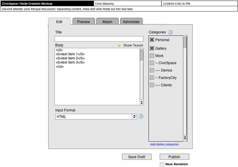
- Edit
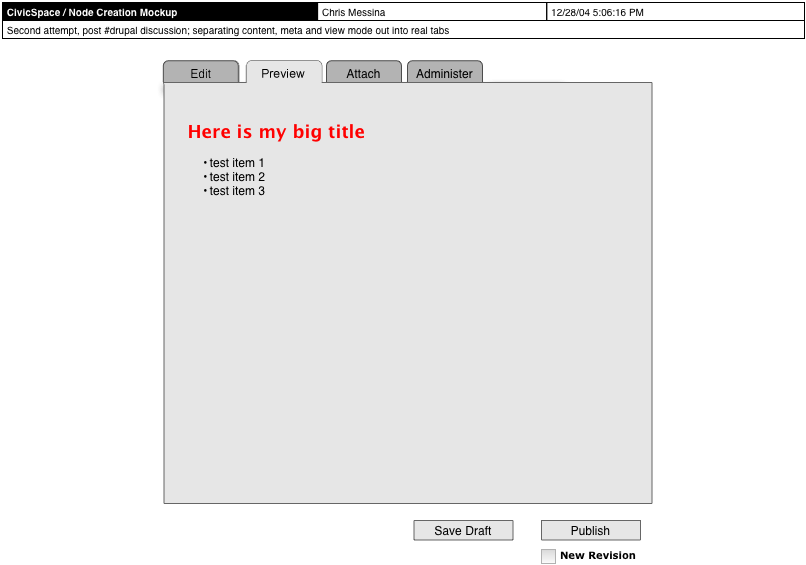
- Preview
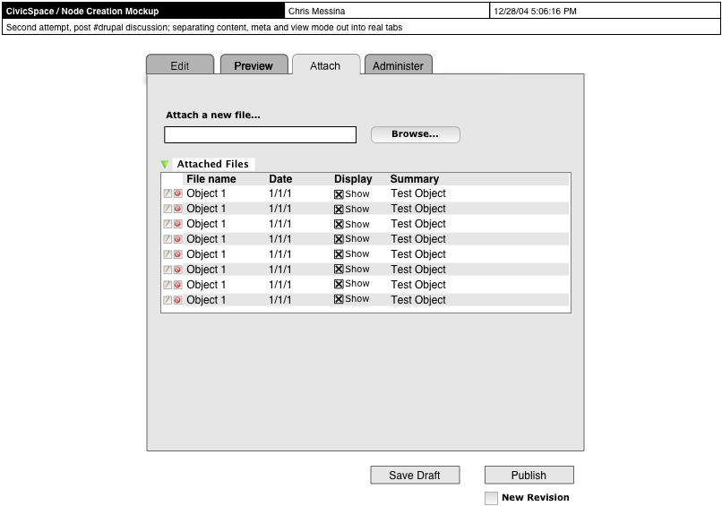
- File Attachment
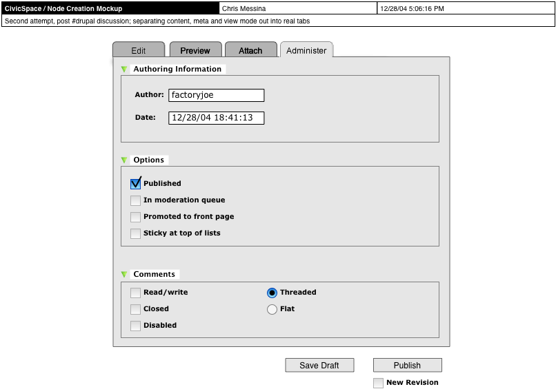
- Administer

Comments
Grat job !! Go on, please !!
You're doing a good job, expecially if most of the tabs do not require server side processing...
Matteo
Looks good
Looks very good, bring it on, the submissin does need some streamlining, would it still be compatible with htmlarea?
TIA
--
http://singularo.com/
Some initial thoughts:
Some initial thoughts:
Link fixed
I have fixed the file attachment link.
I vote for preview button
If the other tabs are local, making the preview tab a remote request would be inconsistent. How about the preview tab shows the most recently generated preview and offers a button to regenerate the preview?
User Friendly Multiple Category Selection?
With multiple category selection, it is nice to have a big picture of the categories while selecting the appropriate ones, best matching the content, rather than having one large list in a selection box like this or this.
By displaying a complete list, many categories presented may have nothing to do with the categories a user may ultimately associate with a posting. Why not have a user only drill down to certain categor(ies) by displaying/selecting the parent categories he/she feels is related?
Is multiple selection possible via an expandable menu tree? By such a method, a user may expand related parent categories, not expanding irrelevant parent categories. I'll look for a JavaScript example, but multiple selection in an expandable menu tree may be best in DHTML?
Perhaps a UI expert may have a better suggestion.
Move "adminisister/options" to 'edit'
I would like to see the "options" group currently, in the "administer" tab, moved to the "edit" tab. I change those quite a bit and would want easy access to it.
Really? Can I ask what's the
Really? Can I ask what's the scenario that requires you to change them? For me, it's only the occational turning off the comment. In about 19/20 posts, I leave all these alone.
Lots of scenarios
1) Node is no longer sticky.
2) Node is outdated and I want to remove it from the front page rather than wait to have it drop off.
3) User contributes node and I want to promote it to front page and/or move it out of the submission queue.
And let me restate: I'm not proposing that you combine the two tabs completely, just take the "options" part of the administer and throw it on the "edit" tab.
And, when you think about it, deciding where a node should appear is all part of the editing process and really shouldn't be considered to be "administration". Editing isn't just creating/proofreading text, it's deciding how to layout a site and how prominently content should be featured.
Seems cluttered
Personally, I'd the admin options find this annoying clutter... I guess it depends on how many people use things your way vs. mine.
Have to disagree
Four checkboxes don't take up much visual space, especially if they are tucked off to the side or at the bottom.
But more importantly, they are not admin options as you suggest. As I mentioned, these 4 options are editing options. Therefore, logic dictates that they will have a happier time living in the edit tab, not in the administrative tab where they would be considered misfits. Let me give some concrete, real-world examples to make my case:
When a newspaper editor decides to pull a story off the front page, that's editing, not administering. When an editor decides to not run a story, that is an editing decision, not an administrative one. When an editor decides to run with a story submitted by a journalist, that too is an editorial decision. Editing is more than just proofreading. An editor decides which stories are seen and how prominently they are displayed. And that's the kind of decisions these options carry out.
Examples of decisions that are administrative include: who to let edit, view, and update a node; allowing/disallowing comments (already there), setting times to automatically publish/unpublish a node (arguably this could be considered to be an editing task since it deals with the publishing of nodes, but since this entails automation, it has a much more adminstrative feel to it); author information, date published, date submitted, moderation points, etc.
Also, these options will be used heavily for community driven sites. With lots of contributors and lots of content, they will be used very frequently. And community driven sites was the main motivation behind Drupal. Therefore, I feel strongly they should be within quick and easy reach.
another step
I know it should be as simple as possible, but think another step in the preview process will be very useful. I saw this idea in Textpattern. Basically you have 3 views: Edit, HTML, and Preview.
The first and last views are as you've made them. The HTML view gives you the content in html after all the input filters had done their job. This would help a lot for me because my input formats had the 10% cases where they don't work together very well. It might be useful in other cases too.
Another tab will make the screen more cluttered, and this view could be hidden or only available for some user roles.
Input Filters
I assume the idea is that you can alter the processed HTML yourself? Given the dynamic and flexible nature of Drupal's filter system, this is not possible. Filtering happens on output and the database always stores the unfiltered content.
I see.
Actually I knew that. Must have stayed up too long.
Actually, I was probably
Actually, I was probably thinking right the first time. I just forgot what it was.
I was thinking about having a button to 'render' all the filters' effects. Then the processed HTML can then be altered, and saved as raw HTML. This step will be optional.
Is that making more sense now?
P.S. I realized this is probably out of the scope of this thread.
I would love that!
I would be invaluable in figuring out any filter conflicts, too. (Not that I've been stymied by any.)
--
mediagirl.org
Threaded vs Flat comment option
I wonder why you placed this option in there: after all, Drupal provides a per-user box to control how comments are displayed, and this information is kept in the user session, not in the node.
However, perhaps we should reconsider the comment controls box. After all, if some people use threaded comments and others use flat comments, I can imagine the flat people might mess up the thread structure without knowing. Still, being able to provide a choice of posts per page and sorting order can still be useful to nitpicks.
Keep info across tabs
Would this act like a desktop application, automatically keeping the input of all the forms as the user switches from one tab to the other? Does pressing "Publish" submits the fields on all tabs?
Or does the user need to keep pressing "save draft" before they can switch to another tab?
Obviously the first is preferable. I imagine a lot of time consuming data entry being lost if we require a two step process.
[MegaGrunt]
------------------------------------------
Drupal Specialists: Consulting, Development & Training
Robert Castelo, CTO
Code Positive
London, United Kingdom
----
Switching tabs should not require a preview
True, switching tabs should not require a preview or anything first. Pretty straightforward to do if you're going to the server. Javascript tabs would require DHTML, which I've noticed an aversion to.
JS tabs
We discussed this on IRC and the best idea is to use JavaScript tabs which use CSS to dynamically show/hide each panel. This can be implemented easily, and will degrade to a simple linear form like we have now when JS is disabled. JS does not have to be a mix of ugly DHTML anymore.
The only objection is that we would be mixing javascript and non-javascript tabs in the UI, which is quite bad from a consistency point of view.
I wouldn't mind if we used a similar javascript approach for the profile fields though. This was brought up before.
tab usability
it is true that it might intially surprise users when the Preview tab requires a server trip and the others tabs do not. but i think the UI gain is so great with these serverless tabs that we should not worry about this issue too much. the solution will be found eventually. we could give server trip tabs a special mark.
This server trip is what
This server trip is what makes the 'Preview' tab difficult to implement. For example, if JS is disabled, it wouldn't degrade like the other pages/tabs.
a real server trip
perhaps you are thinking that we would use xmlrequesthttp to generate the preview without a *perceived* server trip. indeed, that might not degrade gracefully.
but i am thinking that clicking on the preview tab performs a full page reload just as today. there is no degrading in that scenario; the experience is lousy for everyone :)
BTW, here is a very cool 'live preview' for textile formatter which uses xmlrequesthttp.
Server trip
The problem with having a preview tab that requires a server trip is that the link should act as a form submission button (otherwise the user's data is not sent along). This can only be done with javascript as far as I know (either javascript: or onclick). A normal preview button would be a better compromise IMO.
The alternative... (or, let's junk input formats!)
The alternative would seem to be maintaining the current Preview submission button... however, there's a question of WHAT would show up on the Preview... This change might actually make sense if we were to implement the show/hide per-post features that Dries mentioned earlier (ie, show/hide comments).
Thus a preview would show not only the rendering of your post, but the associated links, tools and author info, as you intend them to look.
While I like the workflow of being able to switch back and forth between the Edit and Preview modes, it might not be feasible with all the various input formats.
In terms of implementation, SilverOrange has done a great job with their intranet's combined WYSIWYG/HTML/Preview editor (video: 2.2mb, 16.6mb). We might consider something like that, if it weren't for the presumed need to support multiple input formats...
So I wonder if anyone has any insights about how to make the node creation system more intuitive and simple?
...Hmmm...
Perhaps it's because I'm always some kind of admin on drupal sites, but one thing I can suggest is that it doesn't really make sense to allow user-selectable input formats (i.e. on this comment form I can choose between "Filtered HTML" and "Full HTML"... WHY?!). The only reason why I think this is done is because of the processing power it takes to auto-detect content... ie... markdown, textile, html, etc. (though I could be mistaken).
Why shouldn't the site owner simply dictate the default format that he/she wants users to use and take the guesswork out of it? I know this won't be a popular idea, but more features don't always mean better software. There's something to be said for reducing complexity after all, and the whole input-formats-forcing-a-round-trip-for-preview thing can be avoided if we reduce the complexity for the user by jettisoning the input format options.
I mean, it we look outside THIS community, how many people actually use the various input formats per node? Wouldn't a simple "allow PHP in this post" checkbox accommodate most use cases if we autodetect formats or simply offer just one format per site? Of course, manual detection would be available for us geeks by adding bracketed tags at the beginning of the post (i.e. [textile]).
I think it's time we started looking to reduce the burden we place on Drupal users. I acknowledge that we may all have our own notions about what is or isn't a "user burden", but until we start doing real world user studies, I'm not sure how much sense it will make to argue only amongst ourselves...
So, before you torch me, go ask your mom, dad, brother, sister or dog and ask them to create a new blog post (in admin mode)... Ask them to speak out loud about what steps they're taking and why... remind them if they forget that they should keep speaking aloud, even if it seems weird... I'd be interested to see how many of you come back and report that "Input Formats" was something that people felt comfortable using or thought was necessary... or any of the other current admin node creation fieldsets. (Oh, and BTW, you who did this, just completed your first usability study! =D)
Anyway, flame away! I look forward to seeing where this might go!
--
User Advocate for CivicSpace Labs
Input formats
"The only reason why I think this is done is because of the processing power it takes to auto-detect content... ie... markdown, textile, html, etc. (though I could be mistaken)."
Remember that Drupal's input formats are user-defined. They are not tied to modules or anything. The default set (filtered, php, full html) is there because it is appropriate for most sites. It matches what we did before the input formats patch, plus it allows for the often requested feature for admins to bypass any sort of tag stripping. If we were to tie input formats to modules, we'd lose the ability to combine filters freely (e.g. textile + smileys + glossary).
On top of that, input filtering is a tricky situation as you need to prevent malicious content from slipping through, without requiring the user to enter 100% valid HTML. For example, consider the tricky situation of <code> </code> tags, which allow any sort of content inside and display it as-is. If tag-like content appears inside the tag, it needs to be escaped first, otherwise the HTML tag stripper might pick it up. However, the code filter can also colorize PHP code, which needs to happen after the user's content has been validated, as otherwise the color codes might be removed again.
The filter system solves this by splitting the filtering process in two (preparing and processing).
Something like the PHP execution filter cannot simply be tacked on to a random input format, as it will probably not do what people expect due to conflicts with other filters.
Though I agree the current input formats system can use UI improvements, it was a bitch to get something workable in the first place. The reason you can choose between Filtered and Full html is because you have special permissions on Drupal.org. Normal users don't get that choice. Ideally, "Filtered HTML" wouldn't show up for people who are allowed to use "Full HTML", but right now this is not possible because of how the default format is implemented.
If every role were to have their own default format, this problem would disappear, but this might get confusing from a UI point of view in the administration section, as well as get tricky when administrators start editing normal users' posts.
Input formats were introduced to offer both flexibility in format and filter settings, and thus also offer role/permission-dependant filtering. An alternative would be to store certain settings per role, but I figured that this would eventually lead to people requesting that option X and Y be configurable per role as well, and that eventually we'd have to duplicate every option. Thus, I came up with input formats, each housing an entire set of filter configuration options.
Enlightening...
Ah ha, that's very interesting stuff. Thanks for the explanation. I thought (and hoped) that there was a more detailed explanation.
Nevertheless, I think simplifying the UI for input formats is hugely important for streamlining node creation... though, as you say, this may not be an issue for non-admin users.
Still, the notion of being able to assign input format access by role is attractive and seems to make some sense.
Lemme toss together a mockup and I'll post about it separately.
Assigning by roles
You can already assign input format access by role, see admin / input formats. The problem is that there is only one global default format, and that this format must be accessible to all roles to prevent issues with editing posts and e.g. submitting data through blog API when formats are not available.
Assigning a default format per role might make the admin an airplane cockpit, as you'd have tons of radiobuttons.
And versatile formats for users
Also it is possible to set Textile, Markdown, reStructuredText, BBcode and other formats for users to use, so they can select their preference. This is very important to get as much valuable content as possible, since there are people comfortable in one of the other...
special case
i have to agree with chris that the need for multiple formats like this is rare. one admin defined format (for regular users) is usually all that is required, and i'd like to optimize UI for that case.
please no java...?
hello all-
just a few bits of info... for what its worth-
i have found drupal to be the most amazing cms out there-
but even in my limited experience- the idea of adding more java or javascript in, anywhere- makes me feel bad.
please please try to do as much as possible with php only- in 10+ years of development efforts i have never stopped wondering why people don't see that platform as the slow, buggy- and worst of all different execution results- for the most part dependent on the flavor of java that is executing on the client app or device...
but then again- think of the people that are still going nowhere fast with microsoft apps and os'es (when compared to open source power)- and there you go...
so just my 2 cents on this- but less is definitely more when it comes to java i find...
Drupal samurai for hire, based in Buffalo, New York, USA.
15+ years Drupal, 20+ years web.
http://basicmagic.net
No Java... but JavaScript as a much-needed dash of salt!
Hi basicmagic,
I'm not sure if you mean "Java" or JavaScript, since the two are not the same, especially on a webpage.
In any case, as Steven pointed out, the JavaScript that I am advocating would be simple, cross-platform and would degrade pleasantly for those without JS or those who have it turned off.
I have a demo of the tab functionality that shows off this powerful technique. Alas, I didn't write the JS myself, but have found that it works rather well on many platforms.
It is possible to consider turning on JS tabs from some admin menu, but it will require more thought based on the actual changes that we desire in the node creation process.
Anyway, thanks for your feedback and I would encourage you to share your more details regarding your thoughts.
Chris
--
User Advocate for CivicSpace Labs
On your demo I was not able
On your demo I was not able to see the trackbacks after turning off JS in FF 1.0. it worked however in a non-CSS, non-JS browser such as links. Seeing the display there made me think that I'd prefer the non-JS version to the JS one.
--
If you have troubles with a particular contrib project, please consider to file a support request. Thanks.
--
Drupal services
My Drupal services
Hmm...
It's possible that I could use JS to set the "hidden" tab's style to display:none instead of doing it inline. That way, with JS off and styles on, you'd simply see both tabs, one after the other, with anchor links to jump you to one section or the other.
--
User Advocate for CivicSpace Labs
Sounds excellent
Now we just need to agree that we don't need JS at all with this solution.
--
If you have troubles with a particular contrib project, please consider to file a support request. Thanks.
--
Drupal services
My Drupal services
Javascript = nice accessory
Javascript should be thought of like heated seats or power window accessories on a car. If you've got these features, great, it'll make life easier for you. But they shouldn't be integral to the operation of the car. So if they don't work, you will still be able to get from point A to point B, just not as comfortably.
What's wrong with that?
It can be very efficient
In dhtml, js to hide and display content can be very simple and fast. I am wary of most js stuff -- for example, some of the site tracking scripts are incredibly slow, mostly because they are pinging third-party servers. And I absolutely despise java, which always seems to set loose hamsters in my hardrive (on mac or win) with all sorts of activity just to do some simple thing like display an image. (Why?!)
But js for dhtml content can be very lean, and speed up toggling. Personally I would LOVE to see it employed with in-line display of comments on the main node page. I had that on my old blogspot blog, and loved it.
Anyway, I'm very excited at the attention and care being put into this by everyone. If I can get maudlin for a sec, it's one more thing that bodes well for the New Year.
--
mediagirl.org
It's hard to take someone serious
... who doesn't understand the difference between Java and Javascript.
Few suggestions
It looks great. Much needed functionality.
Here are a few comments:
1. Make it optional. Some of the visitors have slow machines, and we must not force on them javascript or java, or anything that would give a bad experience.
2. Integrate it with htmlarea so we get a nice WYSIWYG editor, with the ability to fall back to raw HTML mode.
--
Drupal performance tuning and optimization, hosting, development, and consulting: 2bits.com, Inc. and Twitter at: @2bits
Personal blog: Ba
htmlarea optional
HTMLarea needs to remain optional. Most of my users post using Textile, Markdown, or reStructuredText -- i.e. things they can edit off-line with a text editor and post when ready. A WYSIWYG editor is a nice option, but in my case at least more annoying than useful.
agreed
HTMLarea turned out to be a modest nightmare for me, and I had to remove it to restore sanity to the site. I would love some sort of WYSIWYG editing capablity, in this or any create content function, but I do not believe it should be made part of the core in a redesign. Not until it's ready for primetime, anyway. That's my feeling on this, such as it is.
--
mediagirl.org
Javascript
I'd rather not see it too dependent on Javascript, since many users like to turn it off. Also, it will be more browser-specific, since js DOM differs between IE, Safari, and Mozilla-based browsers.
--
Mike Cohen, http://www.mcdevzone.com/
Degradability and compatibilty
Today you can make simple, elegant Javascript solutions where the Javascript is completely external, and all you need in the XHTML is some CSS classes to mark certain elements. Examples of this include the "scalable Inman Flash Replacement" and the link that Chris posted for tabs (though that one needs a slight modification to degrade properly). As has been said before, the dynamic JS tabs would degrade to a simple linear form for people who have JS turned off.
All that is required for this is toggling the visibility of elements, which works the same across all common browsers.
Paranoid Androids?
Y'know, I've heard so many people worry about using JS... It's like a chorus line. Does anyone even know the words any more or what they really mean?? Or is just easier to repeat it than ask some tough questions about when JS should absolutely be used because anything else is like peeing off a pole vault.
A little JS maybe 3 years ago might have been a problem, but haven't we made ANY advancements? Oh yeah, we have... some of us anyway (snicker)...
Anyway, I just wonder if folks are repeating what they've merely heard about JS or whether, in their own personal experience having JS turned off that the demo I presented, for example, really would cramp their style in practice (admittedly with the fix Steven mentions)...
I just... would hate to see us not try innovating or making Drupal more usable because we're scared of the conventional wisdom that says ALL JavaScript will send you off to your miserly death.
I'm all about cross-browser coding/design and graceful degradation (both in terms of CSS and JS) so the concern is valid, but we can get away with salting our interfaces without sliding down some slippery slope into Mambo-land... hot damn! Ha!
=&
--
User Advocate for CivicSpace Labs
nope not paranoid
From my point of view Java and Javascript are both nondesired. Why?
I don't like coding in Javascript and I really don't want to have something in my drupal installation that I couldn't sit down with and try to understand. I'm really not interested in Javascript and don't plan on incorporating it into any web design. We've already got (x)html, php, mysql, and css, and fairly strict coding guidelines to boot; I'd rather stay away from adding (an)other languages to templates, or the drupal core. A module would be cool, but in terms of overall usability it wouldn't accomplish much regarding this problem.
Java, which I don't think is being considered anyway, is always giving me headaches within MS and Mac OS'es. Like it won't go away when I close it, like it doesn't actually do what it was supposed to when it started up in the first place.
Tabs imply steps?
Overall, using tabs to break the task of creating a node into simpler sections is good.
But I get concerned when tabs are used for a step-by-step process - e.g. when you have to do step 1 before step 2 makes sense. Tabs are BEST when users can do the sections in any order they want and can skip things. Tabs are usually not used for shopping cart steps - where you must do things in a certain order and cannot jump around or skip steps.
We seem to have a mix of "must do it in order" and "in any order you want, if at all" here.
"Attachments" and "Administer" are optional - most users may never care about them, so good to separate. Also, you can do them in a random order - change the admin options BEFORE you write anything, for example. Attach items before wrinting the node content. No problem using tabs.
But "Preview" does not make sense until after you have entered in some content first. Preview makes sense as a button on the edit tab, but not as its own tab.
A similar thought is "Publish" - which you have only as a button and NOT as a tab. That is a good thing since publish only makes sense after other things have been done.
So what makes more sense to me is to have Edit/Preview/Publish as a tab and attachments as a tab and "options" as a tab (the stuff that by default should be OK most of the time).
That's it
You put your finger on what was bothering me about the preview tab. Preview and Publish should be buttons at the same level, outside the tabbed box with the Edit, Attachments, Options, and Administer tabs. The Preview view should have Edit and Publish.
Good stuff
I will want to use the file attachment' pane to insert images into a post. Having to switch panes to do that will be a pain. Why not have the attachment option inline but hideable like base camp?
And I am really loving this live textile stuff. I'm seriously wondering whether it be employed to create the WYSIWIG soltution.
What if there was a 'live preview' pane that could be toggled to show up below (or besides) the body form. Then textile or html formatted text put in the text area could be rendered in real time for you to see as you type. If you throw in some JScript buttons for the textile-phobes you could have the holy grail for post creation / previewing.
New Mockup
My read of the discussion above is pointing to using a button for submitting instead of live previews in a tab. Recoding all the filters in JavaScript is well beyond the scope of just UI improvement and is unnecessary. The UI improvements can be gained using tabs without modifying the server trip structure in place. This preserves all the dynamically customizable filters and input formats in use today. I'm looking forward to seeing the new mockup.
Try the Jetbox One demo
Take a look at the Jetbox One demo at http://opensourcecms.com/index.php?option=content&task=view&id=169 (Administer > News > New news item). If we'd use a system like that, you would be able to edit attachment and use them without having to switch virtual pages.
Example
Mathias has already implemented something like this in his excellent Menu on-the-fly module.
Effectively replacing a seperate 'outline' tab with a form section which can be toggled open or closed.
[a.k.a. MegaGrunt]
------------------------------------------
Drupal Specialists: Consulting, Development & Training
Robert Castelo, CTO
Code Positive
London, United Kingdom
----
Collapsible form groups
To my mind, the collapsible form group implementation used by Jetbox is the best solution. It hides away less common options but leaves them immediately accessible. It would also degrade very gracefully if javascript is not available.
A tabbed interface doesn't seem appropriate here. Adding tabs will only complicate the code and the UI for no tangible benefit over the above implementation.
Tabs are not usable in this scenario!
Hi!
Thats a good start.
I thinks that tabs are good in setting preferences, or accessing different parts of a UI, like an HTML composer. Each tabs should be usable as it's own. Going from one tab to the other in order to complete a task is not user friendly.
However, UI-wise, a new player showed me a lot of potential : Gmail!
Instead of going left to right using tabs to complete a task, why not use the Gmail approach! Going up to down (having more that one message with the same subject lets the user look at a message by expanding it and leaving the other messages shrinked).
The node creator might want to expand all views, or expand only the one or two views he want to have a close look upon. Furthermore, once a view is closed, he might see an overview of its content. The administration view, by example, once closed, might display: "Author, 2005-xx-xx xx:xx, Promoted, etc.". And once expanded, we might see the corresponding form part.
However, I'm not certain, but with the GMail approach, each time a view is expanded or shrinked there is access to the server. I don't know if it could be done without any access.
Regards,
- Jacques
/*_*/
http://www.xmacinfo.com
My Suggestions - Quickpost
My suggestions are available in the Quickpost module, which works with Drupal 4.5.1 (the CVS version does too, and has more fixes in case you want to try it out).
At any rate, I'd like to explain why I did quickpost the way I did to add to the content creation overhaul discussion.
First, here are some screenshots
Quickpost
Quickpost Advanced
Quickpost Hidden
Here are the basic requirements I came up with for posting content on GWJ
1) Normal users should only see the options defined by the administrator (me)
2) Users shouldn't have to specify where their post goes, and instead the form should simply infer the categorization from where the user is currently browsing. Mainly due to the fact that I'm using the categories as pseudo-forums. Forums where you can post events, stories and forum topics, for instance. When you post in a forum, you assume categorization based on what you're currently looking at. You don't say to yourself "I want to post something that is associated with cats and flowers", you look at cats and flowers and say "I wanna post here".
3) Users should see a very similar form for all types of content
4) Administrators should have advanced functionality that users don't know exists
In quickpost I solve these problems by having five features
1) Quickpost presents the user with a form that has all the available node types across the top as tabs. This way, the user knows what they can post, and it's the same interface for all the different node types.
2) I embed the taxonomies and the node types in the URL, you can have a link to post stories about kittens, for instance. You don't click on "create content" then " add a story" then "this is about kittens". Quickpost can assume all that info from the link, so admins can put the links to where they want. This is also optional, so you can post to no taxonomies or use the selection form.
3) There are two extra tabs, the "advanced" and "hidden" tabs. The advanced tab is available to anyone who can post, and the hidden tab is available to people with a certain permission. This allows administrators to hide features from users, or have them tucked away in the advanced tab for power users.
4) Administrators control what features ("form pre", "form post" and "form admin" hooks) are available on what tab from the admin interface. This can also be set per node type (for instance, you may want users to be able to schedule stories, but not events).
5) Finally, all info is transfered between the tabs by a simple JS "submit form" onClick action. This has the added benefit of allowing users to change their mind and switch from a forum post to an event if they desire, their info remains. Any information not visible on the current tab is transferred by hidden form fields.
Hopefully some of these ideas are useful to the discussion. I personally like the Quickpost way of doing things, but I never even considered some of the larger issues of the general Drupal project.
We can do better
Nice work, Chris.
These mockups are vastly easier to understand than the current
screens. It's much easier for the user to understand what's happening.
However, I think we can do much better. These mockups don't
significantly change the complexity of the work flow. Rather than
thinking in terms of how best to display the current Drupal fields, we
should be thinking of how an ideal new post screen containing all of
the necessary functionality should work. It should be as easy as
possible for the common case, and other options should be as easy as
they can be without making the common case more difficult.
In your example, users see four tabs, five fields, and two buttons
minimum. In practice they'll almost always click on the preview pane,
and probably on the other two their first time around. Overall, it's
still intimidating enough that "Aunt Sally" would just give up and not
post.
Most users only need to see the "Title" and "Body" fields with
"Save Draft," "Publish" and "Preview" buttons 99% of the time. Most
people aren't administrators and don't need to see those fields. Most
of the time people don't attach files, so don't need to see those
options. As others have mentioned, since it's a one step process most
of the time, tabs don't make sense either.
Going through each one of the individual fields:
If categories have been defined for the node type, users should see
the categories pane, just like the mock-up. If there are no categories
defined that space should be blank. That way, sysadmins can easily
decide if their users should see the categories pane on a
per-node-type basis.
No one should never be able to choose input type from the create/edit
node screen. It's a confusing concept for most users. The system
administrator should be able to decide on an input type that makes the
most sense for the site on a per-node-type basis. Probably, if you
need two input types you're really dealing with two types of nodes
anyway.
No one should be able to change the "New Revision" box. The concept is
very abstract and confused me (a programmer) at first. For node types
that need revisions, like wikis, a new revision should always be
made. For other node types, a new revision should never be made.
Users should be able to see their preview and their raw message text
at the same time. Having them on separate screens will mean lots of
switching back and forth between "Preview" and
"Edit." Not good.
Since tabs don't make sense for the simple case, we shouldn't use them
for the more complicated cases of attaching files and administering
the post either. Links/buttons for "show admin options" and
"attach file" that open up panes with the appropriate controls make
more sense.
Having checkboxes for "Published," "In moderation queue," "Promoted to
front page," and "Sticky at top of lists" probably isn't the most
intuitive way to give users access to those features. These options
all do something, so it might make more sense to have buttons or links
that perform the actions, for example, "Promote this to the front page"
or "Make this post float to the top of lists."
Comment options shouldn't be decided on a per-node basis. It's another
option that's currently per-node, but should be per-node-type. Within
one site, forum comments should always work the same way. If some
forum nodes act differently than others, users will get confused. It
might, however, make sense to disable/enable comments on a certain
node for a while. An administrator action to "Disable Comments" could
do that.
That's a lot to digest. I'm interested in seeing what people think.
I agree
I've modified my version of drupal so that users don't even see categories. They shouldn't have to think about what category content should go in. That's an editor's job. Title and body is all they should see, where possible. Of course, this is not possible with more complex nodes like event. But at least that is self explanatory.
However, you of course need more complexity for people who aren't plain users. You do need advanced setting for different roles (administrators, editors, etc.).
I think there should two things should happen:
1) Administrator can control which form elements are immediately visible to various roles.
2) Users themselves can control the form elements/tabs they can see. For example, take file attachments. By default, these should be hidden. As you point out, it's used in a small fraction of posts. To enable it, user could click a link on a tab called "Advanced" which would reveal the other tabs, as outlined above.
Here' how it might work:
1) For newbies and roles without much authority, there are only two tabs: Edit and Advanced
2) For the newbies, you keep only the bare essentials in the "edit" tab. Other stuff (and other tabs) will be revealed when you click the "advanced" tab
3) As a user gets more power and authority, more stuff gets shifted to the "edit" tab. New tabs, for less commonly used functions, are also revealed automatically (without having to click the "advanced" tab). There may still be an "advanced" tab for more arcane stuff.
4) A superuser doesn't have an advanced tab, they see all the tabs. And even some of the less commonly used functions appear on the edit tab.
Since tabs don't make sense
I disagree with this. Tabs don't make sense as they are used in the example because they are trying to show the workflow, instead of using a wizard type interface to show the workflow. When tabs are used to incidate a location to a user (i.e. the "normal" location, vs the "advanced" location), they make perfect sense. When a user wants more options, they'll go to the "advanced" place, when they don't they can completely ignore the tabs. It's similar to how tabs are used in Windows programs settings boxes.
I agree with this completely, usually the user sees a post and they want to sticky it, or make it a frontpage post, or whatever. However it is nice to be able to do this when creating the node without reloading the page. Maybe having buttons in a more accesible location along with checkboxes under the "attributes" on the advanced pane.
So you don't want comments enabled/disabled on a per-node basis, but then sometimes it'd be good to do it on a per node basis? I see no reason why you couldn't disable/enable comments on a per-type basis and a per-node basis as well. Per-type under the adminstration settings, and a per-node basis on the node form. As long as adminstrators have control over what users see what options on the node form, I don't see how it could be confusing. The per-node basis is pretty much a necessity though, the ability to "lock" some nodes is pretty universal on other CMS software.
nysus, you should really check out the Quickpost module I linked to earlier. It does everything as you described right now for Drupal 4.5.1.
I did take a look
Weird. The "advanced" tab idea must have sunken into my head subconciously. I had looked at your screen shots earlier but when I wrote my thoughts above I wasn't even thinking about quickpost.
Clarifications
A few important points.
Which form elements appear should be based on the node type and permissions, NOT on permissions alone. For example, maybe a sysadmin would decide that forum nodes have categories, but wikis don't. Users should see relavent controls that they have permission to change.
I still think tabs are a bad idea for this screen. There aren't enough options to justify the increased complexity, especially after we move per-node-type options to the admin screens where they belong. Tabs imply multiple steps that probably aren't necessary in this case and force the user to change the screen entirely to see what options are available. Sections of the screen that open up when you click on links make more sense. (i.e. "Show admin functions") These would let users see what advanced options are available without forcing them to change screens, and they could be moved, so they receive appropriate emphasis.
An "Advanced" tab is an even worse idea. It tells users there are more options without giving them a hint as to what those options might be, so they have to click on it and scan the page to see if an option that they might want is there. Shifting fields around to different tabs is also a very bad idea because it forces users to re-learn where things are.
I still think tabs are a bad
Two things here. First this is exactly how Quickpost works, when you click on Advanced it shows more options along with whatever was on the standard tab. It's not an advanced tab that only has options that aren't on the normal tab and having you switch back and forth, you click on advanced or hidden and it shows the additional options right in line with the normal "title and body" part of the form. Second, you can't do it dynamically without lots of JS, which gets overly complicated and browser dependent. So no matter what you do unless you do JS, you're going to have the user have to reload the screen to see new options.
How do you suggest we handle the different types of things you can do with a node then? Wouldn't defining features on the node form per node-type as you suggest have a similar effect?
How about this, user defineable tabs across the top? Instead of "Advanced" and "Hidden" we have tabs that the administrator can define, such as "Subscriptions" and "Comments" where features go that the administrator defines. Or, we could have the modules define the tabs, so that the subscription module would say which tab it would go on. Tabs would simply be links that would open additional features on the node form, similarly to how the "Advanced" tab works in Quicktab. That way, the information wouldn't be cluttering up the main form and it would be stored in a sensible manner, either defined by the modules or the administrator.
JavaScript is ok
Sure, JavaScript is a bit more work, but it's worth it, especially since, CivicSpace has plenty of coders on-staff now.
We have the resources, so we might as well do it right.
Granularity of screens
Obviously, we can't totally eliminate having users learn different screens for different situations. The point is to strike a balance between dividing everything up so much that the user is forced to use a set of new screens for every situation and going to the other extreme by putting all of the controls for every possible situation on the screen at all times. It seems to me that a good way of doing that is to have one node creation screen per node-type. Dividing things up this way should make intuitive sense to the user (they expect different types of nodes to have different parameters), and with some tweaking we should be able to keep screens to less than 7 controls most of the time.
random thoughts
I appreciate all the work that went into this, and I think that these mockups have good cosmetics. But in terms of workflow, I'd prefer something different.
1. Rather than scattering editing tasks across multiple tabs, I'd rather have them on one tab as much as possible. I agree that the various post options under "administer" are not really administrative in nature, they're really authoring options. Apart from that, I'd rather have them visible together with the actual post content.
2. I think it's time for Drupal to get down with DHTML, especially for authoring and administering. Fewer server trips = better. One way I can imagine dealing with visual clutter is to group as much stuff on a single tab as possible, but group them in show/hide DIVs (with showing/hiding handled in javascript--now that I look more carefully, you suggest this already on a smaller level with the little green triangles--I'm suggesting the same thing at a bigger level). This could even include the node preview, which might be implemented as an iframe. Rather than having a "preview" button, you'd have a "refresh preview" button, since the box for the preview would always be there.
3. Add-on modules can add a lot of additional fields to the authoring view--a custom path, taxonomy on-the-fly, etc. There needs to be a way to integrate these logically into the editing structure. If the editing view is given a fixed outline structure (as suggested by tabs, fieldsets, etc), a module that add controls to the authoring view could include hints as to where it belongs in that outline structure.
Adam Rice
+1 on collapsible parts
I would also vote on collapsible parts, since then I could set what I would like to see together, and I would not be required to switch between different tabs to get a good overview...
I agree
I find it more intuitive, and this way display of various functions/components does not have to be mutually exclusive. It also eliminates the need to do things like 86 certain features because they don't have a good aesthetic fit on the create node page.
--
mediagirl.org
just don't loose "hidden" tab
One of the highlights of quickpost for me is the ability to hide certain options basedon roles. This should be included and deepened. For example, I like having node privacy options, but don't want typical users to be selecting who their content can be seen by, if comments or on or off, or etc. I see arguments for both tabs and expandabel functions. But to really make the workflow intuitive you must be able to keep all clutter out of view of users who have no use for it and just let them get on with their posting.
guidelines, themeing and teasers
Good job!
Looks like it goes in the right direction, but it surely is not the end. ;)
Dries points out that a "real world" page will look far more cluttered than your mockups. I can only agree. So we should add guidelines on how to add form elements.
Secondly you should not forget about themeability. Its Drupals power to be extendible. Currently there is no way to theme those node form pages, in your proposal they should be. (Case: I make a site where users can keep a blog by using a handheld: I then surely do *not* want categories to appear next to the form, in my mobile.theme I must be able to change that behaviour)
And third: The teasers: by default drupal supports teasers inline, but a lot uof users do not like this, and use flexinode or other methods to heve more power over teasers. In your mockup that seems to break, since you have a "link" for the default teaser system only, that will breeak when one has specific form-elements (e.g. text areas) for teasers.
[Ber | Drupal Services webschuur.com]
Cut down on server access - a good idea
I've read through the discussion which is a bit high-powered for me - but would like to make a small suggestion.
On my site, we are working up to a mass of content with a pretty complex system of categorisation. Since this is the first time we have done this I'm sure we'll find we've got some things wrong and will want to re-classify articles.
Trouble is today, every time a want to recategorise an article, I have to reload the whole thing (including the articles - usually quite long) into the database.
It would be nice to have some kind of option for editing eveything except the body and teaser - so speeding up down and upload times.
Come to think of it, it would also be nice to be able to edit the teaser...
Re: editing teaser
Check out the excerpt.module.
Sorry, but where is the
Sorry, but where is the exerpt.module? It's not listed in the Downloads section or under cvs.drupal.org. I'm curious to know what it does.
OT - Excerpt
http://drupal.org/project/excerpt
Some modules force their own teaser string (like recipe) so excerpt won't work on everything without patching on the broken modules. It does work well for most node types, however.
I'm in the process of rolling simple patches for the node types that set their own teaser without checking if one exists first -- Keep a lookout for them in the near future.
Great!
Hey, thanks for working on this. This has been a source of frustration for me with the flexinode module in particular.
This looks very good. I'm
This looks very good. I'm going to try it out on urlgreyhot to see if it works for me.
Tagged as 4.5
Excerpt.module wasn't tagged for 4.5, it is now. The module was still listed on the modules page and in cvs.drupal.org though. It'll show up when the next repackaging happens.
Great work. Comments on categories...
Thanks for taking the time to take this on. Great wireframes and a great direction to be going. As you can see, the scalability of the UI design is probably directly proportional to the number of scenarios you come up with to design towards.
The iframe or whatever for handling categories with checkboxes would be a tremendous improvement. The short multiple selection menus posed terrible miss-click usability problems for me with my large taxonomies (If I am selecting multiple terms and let go of the control key, I sometimes lose my previously clicked terms). This version would show more of the taxonomy and would allow for fewer miss-click errors like I describe above.
What I'm most interested in is the handling of categories in the Edit screen and the implied flow implied by the "Add/Delete categories" link. It's difficult to envision your design of the screens for those subtasks without seeing screens for it. Does the clicking of the link maintain what has previousl been entered in the content entry form (title, body, etc.)? Is this handled on the current screen and throw you back to the content entry form or is this handled in a pop up window? I'd like to see more definition around that flow as well.
Cleaning up the submission page
I have a bunch of modules installed which give users various options when creating a new node. For example: Node privacy by role, Image Assist, attachments, etc. One of my biggest gripes is that the submission page is extremely cluttered.
9/10 of my users have very limited computer expertise. When one of these users first comes to my site and tries to create a new node, they're overwhelmed by all the options they have. I've tried to create submission help where I can, but its getting very long at the top of the page because it tries to explain what all of the options are.
I personally really like the tabs. The first thing the user sees when they load the node creation page is a very simple and clean interface. I really like the check-box style categories. Most users don't know that you can hold down CTRL to select multiple options (even with an on-screen note telling them). Check-boxes are more intuitive. I also like the help icons beside the group sections. It is much cleaner than cluttering up the screen with help text and most users know to click a question mark for further help.
The separate tabs for attachments and 'advanced settings' help to shield the user from a lot of the extraneous settings. The average user won't use or even know how to use many of the options currently available. If a user sees a setting or text box, they'll feel they have to enter something there.
One thing I like about the preview tab is that it makes a very distinct difference between submitting and previewing. I had to turn 'force preview' off on my sites due to users complaining that their posts aren't showing up. There could still be a preview button on the bottom, and all it would do is direct the user to the preview tab.
One of the best features about Drupal in my opinion is the customization available to the admin. The module developer doesn't know what fields the site admin wants on the main detail tab vs the advanced option tab. That should be customizable a-la the Quickpost module. I really like that feature of that module and would like to see that officially supported if the tab method is implemented
Drupal needs to start moving in the direction of creating user interfaces for the computer inept out of the box while retaining its great advanced customization features. I think it's definately in the right direction, but these changes are critical in my opinion.
--Skorch
flash!??
Looks nice but using flash to show a screenshot!?
Javascript and accessibility
I have just been reading this thread, and noticed that in considering the use of javascript/CSS for tab-switching, there didn't appear to me to be a full consideration of the impact of javascript on accessibility.
After testing it and examining the code, I think my (rather niggling) concerns are largely unfounded, but I just thought I'd write this out anyway in case there is any mileage in it. My only remaining doubt is that the technique being deployed seems to rely on an ondocumented aspect of javascript implementation.
It seems to me that two situations covered in the WAI Accessibility Guidelines are relevant here:
Factory Joe's comment on JavaScript as a much-needed dash of salt confirms that the technique would "degrade pleasantly for those without JS or those who have it turned off", which covers para 6.3.
However, it doesn't cover para 6.4, which seems to me to leave open the theoretical possibility that mouseless but javascript-enabled user would be unable to switch tabs. This is presumably why Bobby objects to use of the
onclick()event handler.I have tried the demo, and keyboard link activation seems to work perfectly for tab-switching in IE6, Firefox 1.0, and Opera 7.54. Well done!
However, I notice that the javascript seems to use the
onclick()event handler, so I presume that the browsers are interpreting theclickevent as meaning either mouse-click or keyboard link-activation. If so, this doesn't seem to be documented anywhere in the javascript references.I know that I'm getting very pedantic here, but I wonder how future-proof this methodology is?
The W3C's Document Object Model (DOM) Level 2 Events Specification suggests that it's an issue which has not yet been resolved:
It's actually a clever trick...
Clairem, you raise some good points -- and I'm happy to hear that the demo seems to work given your accessibility concerns.
One reason why it might work is because the links themselves (which use the onclick event) actually are anchor links that jump you to the place on the page where the tab content comes from. Additionally, w/o JS, I don't think that the tabs are even created, though I might be wrong.
Essentially, the way I think that this should work w/o JS is: use link tabs to navigate to sections on a page (with # hrefs); if JS is enabled, those sections are converted into tabbed sheets. We could also use accesskeys to help w/ accessibility, but with ad-hoc generated tabs, picking hotkeys might be fairly difficult.
Does this make sense?
Chris
--
User Experience Architect for CivicSpace Labs
this looks fantastic!
I've just come across this thread ...
why has it stopped? (I'm new to this corner of drupal.org)
where is this project now?
I sincerely hope it hasn't been dumped!
Great Idea and Simple layout
This is what really simplify a lot DRUPAL admin work and user as well. Go Go Go.
P.S. for any new Reader of this Posting:
Module is ready for Drupal 5.x see http://drupal.org/project/excerpt
Contact me for drupal projects in English, German, Italian, Drupal Hosting Support.
Usability dead forum post pruning
Thank you for your suggestion about improving the usability of Drupal! We look forward to more ideas, sketches and examples.
NB: Note this forum is deprecated. As tempting as it may be, please do not reply to this post.
I have added a link to this information into the Usability Group
http://groups.drupal.org/node/14428
If you are interested in finding ways to make contributions to Drupal usability, please join the Drupal Group:
http://groups.drupal.org/usability
Screenshots, sketches, research and examples of good practice are all welcome.
This forum has been deprecated, and is no longer supported. Please do not post in this forum, or reply to this post.
I am merely trying to trawl through and find good usability suggestions and add them to the issue queue where they can be tracked. Currently, there is no way for drupal.org maintainers to "lock" this forum. This is a stop-gap measure. Thanks for your patience!