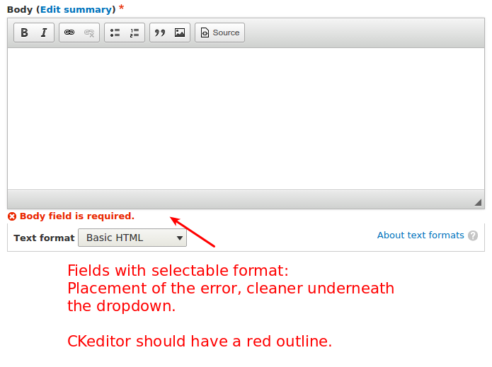
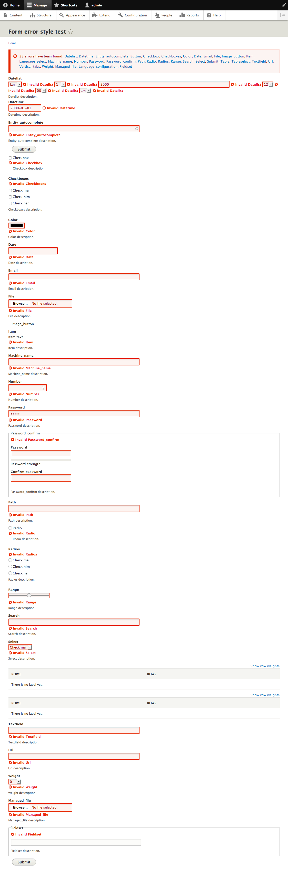
| #578 | Screen Shot 2015-06-10 at 2.17.35 PM.png | 31 KB | webchick |
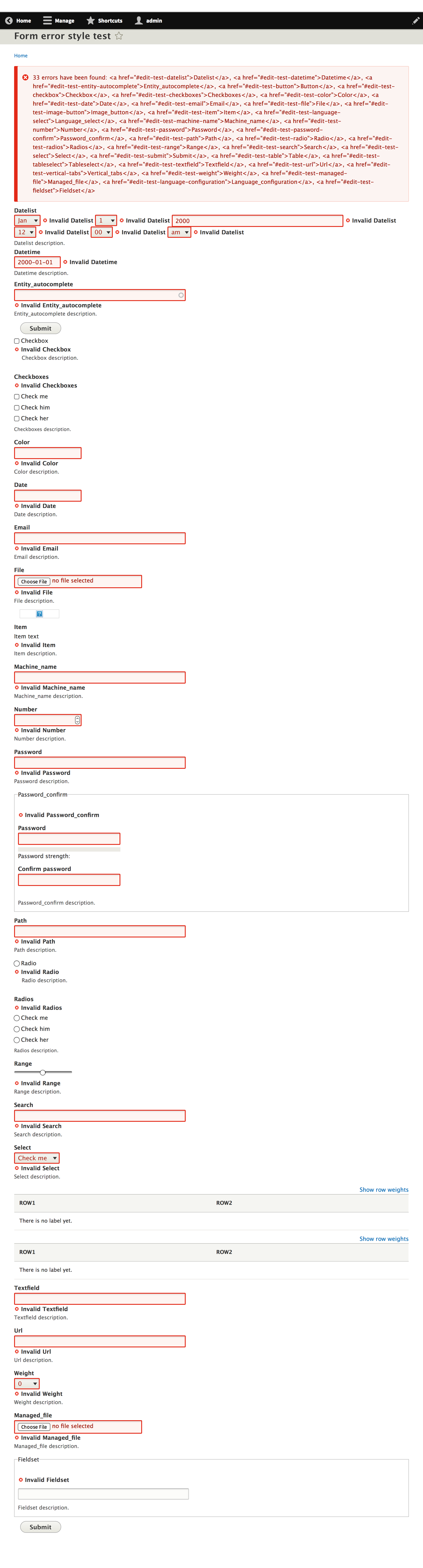
| #578 | Screen Shot 2015-06-10 at 2.11.46 PM.png | 21.11 KB | webchick |
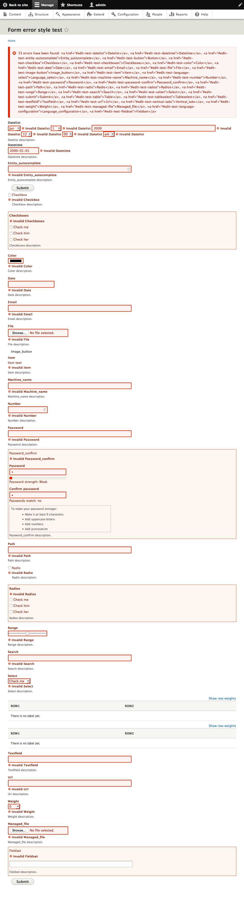
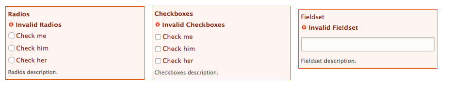
| #578 | Screen Shot 2015-06-10 at 2.11.04 PM.png | 33.51 KB | webchick |
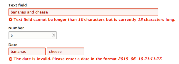
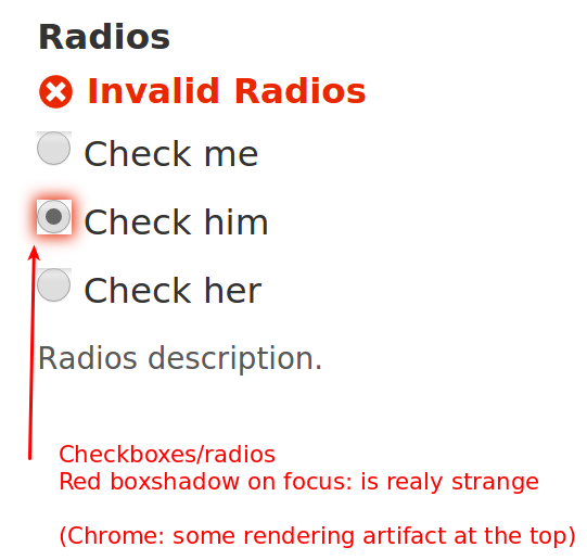
| #576 | errors.mp4 | 3.6 MB | manjit.singh |
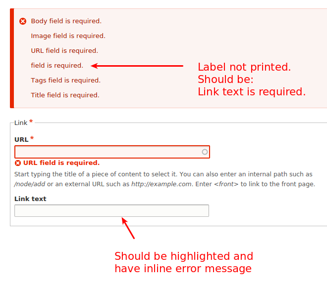
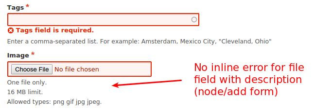
| #573 | inline_form_errors_for-1493324-573.patch | 67.65 KB | joelpittet |
| #559 | interdiff-558-559.txt | 1.51 KB | stefan.r |
| #559 | 1493324-inline-form-errors-559.patch | 67.7 KB | stefan.r |
| #558 | interdiff-557-558.txt | 1.51 KB | stefan.r |
| #558 | 1493324-inline-form-errors-558.patch | 66.46 KB | stefan.r |
| #557 | 1493324-inline-form-errors-557.patch | 64.87 KB | tim.plunkett |
| #556 | 1493324-556.patch | 57.97 KB | stefan.r |
| #554 | Screen Shot 2015-05-15 at 09.18.16.png | 64.12 KB | wim leers |
| #548 | firefox37_tabs_gain_focus_as expected.png | 48.93 KB | skaught |
| #548 | safari8_no_visual_until_last_child_has_focus.png | 143.74 KB | skaught |
| #544 | interdiff.txt | 2.8 KB | tim.plunkett |
| #544 | 1493324-inline-form-errors-544.patch | 66.78 KB | tim.plunkett |
| #538 | 1493325-review.png | 76.39 KB | kattekrab |
| #537 | 1493325-review.png | 144 bytes | kattekrab |
| #524 | interdiff-1493324-522-524.txt | 1.61 KB | dmsmidt |
| #524 | inline_form_errors_for-1493324-524.patch | 68.96 KB | dmsmidt |
| #522 | inline_form_errors_for-1493324-522.patch | 69.91 KB | tim.plunkett |
| #522 | interdiff.txt | 9.54 KB | tim.plunkett |
| #519 | interdiff-1493324-516-519.txt | 15.85 KB | dmsmidt |
| #519 | interdiff-1493324-432-519.txt | 38.27 KB | dmsmidt |
| #519 | inline_form_errors-1493324-519.patch | 67.56 KB | dmsmidt |
| #516 | inline_form_errors_for-1493324-516.patch | 65.83 KB | dmsmidt |
| #516 | interdiff-1493324-513-516.txt | 2.59 KB | dmsmidt |
| #514 | Form-error-style-test-Bartik-complete.png | 1.39 MB | emma.maria |
| #514 | interdiff-1493324-510-513.txt | 494 bytes | emma.maria |
| #514 | inline_form_errors_for-1493324-513.patch | 64.06 KB | emma.maria |
| #510 | inline_form_errors_for-1493324-510.patch | 63.58 KB | tim.plunkett |
| #507 | interdiff-1493324-502-507.txt | 756 bytes | dmsmidt |
| #507 | inline_form_errors_for-1493324-507.patch | 63.6 KB | dmsmidt |
| #506 | 1493324-inline-error-multivalue.png | 150.67 KB | dmsmidt |
| #505 | 1493324-505-inline-errors-after.png | 384.99 KB | dmsmidt |
| #502 | inline_form_errors_for-1493324-502.patch | 62.87 KB | joshtaylor |
| #496 | interdiff-1493324-493to496.txt | 756 bytes | davidhernandez |
| #496 | inline_form_errors_for-1493324-496.patch | 62.7 KB | davidhernandez |
| #493 | 1493324-inline-error-no-fieldset-password-confirm.png | 14.96 KB | dmsmidt |
| #493 | interdiff-1493324-489-492.txt | 689 bytes | dmsmidt |
| #493 | inline_form_errors-1493324-492.patch | 63.19 KB | dmsmidt |
| #489 | interdiff-1493324-486-489.txt | 2.27 KB | dmsmidt |
| #489 | inline_form_errors-1493324-489.patch | 63.36 KB | dmsmidt |
| #488 | install-password-after.png | 30.26 KB | marcvangend |
| #488 | install-password-before.png | 33.11 KB | marcvangend |
| #486 | inline_form_errors_for-1493324-486.patch | 62.68 KB | joelpittet |
| #486 | interdiff.txt | 7.47 KB | joelpittet |
| #485 | inline_form_errors-1493324-485-including-2409885-11.patch | 63.28 KB | dmsmidt |
| #484 | interdiff-1493324-480-484.txt | 2.07 KB | dmsmidt |
| #484 | inline_form_errors-1493324-484.patch | 62.01 KB | dmsmidt |
| #481 | interdiff-1493324-467-480.txt | 3.79 KB | dmsmidt |
| #481 | inline_form_errors-1493324-480.patch | 61.99 KB | dmsmidt |
| #477 | inline_form_errors-14933324-476-with-2409885.patch | 63.12 KB | stefan.r |
| #476 | interdiff-467-475.txt | 3.95 KB | stefan.r |
| #476 | inline_form_errors-1493324-475.patch | 62.03 KB | stefan.r |
| #476 | ife2.png | 25.37 KB | stefan.r |
| #476 | ife1.png | 20.03 KB | stefan.r |
| #467 | 1493324-467-inline-errors-after.png | 386.78 KB | dmsmidt |
| #467 | 1493324-467-inline-errors-before.png | 351.18 KB | dmsmidt |
| #467 | interdiff-1493324-465-467.txt | 16.46 KB | dmsmidt |
| #467 | inline_form_errors-1493324-467.patch | 61.64 KB | dmsmidt |
| #465 | interdiff-1493324-463-465.txt | 6.14 KB | dmsmidt |
| #465 | inline_form_errors-1493324-465.patch | 60.89 KB | dmsmidt |
| #463 | inline_form_errors-1493324-463.patch | 59.46 KB | dmsmidt |
| #461 | inline_form_errors-1493324-461_443_and_nested_elements_tests.patch | 60.89 KB | dmsmidt |
| #458 | interdiff-1493324-443-456-nested_elements_tests.txt | 5.18 KB | dmsmidt |
| #458 | inline_form_errors-1493324-456_443+nested_elements_tests.patch | 59.47 KB | dmsmidt |
| #452 | interdiff-1493324-443-452.txt | 11.29 KB | dmsmidt |
| #452 | interdiff-1493324-445-452.txt | 8.54 KB | dmsmidt |
| #452 | inline_form_errors-1493324-452.patch | 4.23 MB | dmsmidt |
| #445 | 1493324-child-elements-as-links-after.png | 61.75 KB | dmsmidt |
| #445 | 1493324-child-elements-as-links-before.png | 66.06 KB | dmsmidt |
| #445 | interdiff-1493324-443-445.txt | 5.05 KB | dmsmidt |
| #445 | inline_form_errors-1493324-445.patch | 60.23 KB | dmsmidt |
| #443 | inline_form_errors-1493324-443.patch | 55.84 KB | dmsmidt |
| #443 | interdiff-1493324-432-443.txt | 1.04 KB | dmsmidt |
| #443 | 1493324-styling-improvements.png | 64.37 KB | dmsmidt |
| #440 | 1493324-todo-overview.png | 361.42 KB | dmsmidt |
| #437 | 1493324-ajax-unlimited-items.png | 13.11 KB | dmsmidt |
| #437 | 1493324-ajax-upload.png | 57.4 KB | dmsmidt |
| #437 | 1493324-checkboxes-focus-error.png | 45.97 KB | dmsmidt |
| #435 | 1493324-textformats-error-placement.png | 29.13 KB | dmsmidt |
| #435 | 1493324-ajax-upload-should-use-inline-styling.png | 99.71 KB | dmsmidt |
| #435 | chrome-seven-radios-errors.png | 38.47 KB | dmsmidt |
| #435 | 1493324-link-text-not-highlited-wrong-msg.png | 43.86 KB | dmsmidt |
| #435 | 1493324-node-add-errors-summary-image.png | 24.64 KB | dmsmidt |
| #432 | inline_form_errors-1493324-432.patch | 55.12 KB | dmsmidt |
| #427 | interdiff.txt | 1.23 KB | tim.plunkett |
| #427 | inline_form_errors-1493324-427.patch | 55.11 KB | tim.plunkett |
| #425 | inline_form_errors-1493324-425.patch | 54.79 KB | tim.plunkett |
| #425 | interdiff.txt | 2.71 KB | tim.plunkett |
| #423 | interdiff.txt | 2.92 KB | mparker17 |
| #423 | inline_form_errors_for-1493324-423.patch | 57.42 KB | mparker17 |
| #415 | inline_form_errors_for-1493324-415.patch | 54.43 KB | tstoeckler |
| #415 | 1493324-412-415-interdiff.txt | 756 bytes | tstoeckler |
| #412 | inline_form_errors_for-1493324-412.patch | 57.59 KB | joelpittet |
| #412 | interdiff.txt | 1023 bytes | joelpittet |
| #412 | Screen Shot 2015-04-02 at 00.15.17.png | 207.95 KB | joelpittet |
| #410 | interdiff.txt | 6.74 KB | joelpittet |
| #410 | inline_form_errors_for-1493324-410.patch | 57.55 KB | joelpittet |
| #405 | Form error style test | drupal8.dev 2.png | 932.86 KB | lewisnyman |
| #405 | inline_form_errors_for-1493324-405.patch | 54.42 KB | lewisnyman |
| #405 | interdiff.txt | 2.7 KB | lewisnyman |
| #392 | inline_form_errors_for-1493324-392.patch | 55.7 KB | yesct |
| #392 | interdiff.1493324.reroll.392.txt | 1.82 KB | yesct |
| #392 | inline_form_errors_for-1493324-392-reroll.patch | 55.68 KB | yesct |
| #390 | interdiff.txt | 1.17 KB | mparker17 |
| #390 | inline_form_errors_for-1493324-390.patch | 58.53 KB | mparker17 |
| #390 | 1493324-390-seven-all.png | 273.37 KB | mparker17 |
| #382 | interdiff.txt | 381 bytes | mparker17 |
| #382 | inline_form_errors_for-1493324-382.patch | 58.08 KB | mparker17 |
| #382 | 1493324-182-seven-checkgroup_radiogroup_fieldset.png | 28.65 KB | mparker17 |
| #381 | inline_form_errors_for-1493324-381.patch | 58.07 KB | mparker17 |
| #381 | interdiff.txt | 4.08 KB | mparker17 |
| #381 | 1493324-381-seven-all.png | 381.59 KB | mparker17 |
| #380 | 1493324-379-seven-all.png | 297.27 KB | mparker17 |
| #379 | 1493324-379-seven-textfield-error.png | 31.96 KB | mparker17 |
| #379 | interdiff.txt | 4.66 KB | mparker17 |
| #379 | inline_form_errors_for-1493324-379.patch | 55.24 KB | mparker17 |
| #375 | error-style.png | 71.63 KB | yesct |
| #369 | interdiff.txt | 1.64 KB | rteijeiro |
| #369 | 1493324-369.patch | 50.66 KB | rteijeiro |
| #366 | interdiff355-366.txt | 2.92 KB | crasx |
| #366 | 1493324-366.patch | 50.65 KB | crasx |
| #363 | Screen Shot 2015-03-14 at 23.49.58.png | 160.59 KB | vijaycs85 |
| #362 | Screen Shot 2015-03-11 at 10.04.14 PM.png | 112.35 KB | davidhernandez |
| #361 | datelist-datetime-error-head.png | 78.64 KB | vijaycs85 |
| #355 | interdiff.txt | 1.98 KB | tim.plunkett |
| #355 | inline_form_errors-1493324-355.patch | 50.64 KB | tim.plunkett |
| #354 | interdiff.txt | 876 bytes | tim.plunkett |
| #354 | inline_form_errors-1493324-354.patch | 50.68 KB | tim.plunkett |
| #352 | interdiff.txt | 26.15 KB | tim.plunkett |
| #352 | inline_form_errors-1493324-351.patch | 49.83 KB | tim.plunkett |
| #348 | 1493324-diff-340-348.txt | 921 bytes | vijaycs85 |
| #348 | 1493324-form-inline-errors-348.patch | 27.21 KB | vijaycs85 |
| #346 | 1493324-diff-340-346.txt | 3.68 KB | vijaycs85 |
| #346 | 1493324-form-inline-errors-346.patch | 26.73 KB | vijaycs85 |
| #344 | Screenshot 2015-03-09 20.06.15.png | 54.96 KB | mrjmd |
| #344 | Screenshot 2015-03-09 20.01.53.png | 26.58 KB | mrjmd |
| #344 | Screenshot 2015-03-09 20.01.29.png | 37.68 KB | mrjmd |
| #340 | interdiff-1493324-335-340.txt | 3.96 KB | njbarrett |
| #340 | inline_form_errors_for-1493324-340.patch | 26.31 KB | njbarrett |
| #335 | interdiff-1493324-333to335.txt | 1.64 KB | davidhernandez |
| #335 | inline_form_errors_for-1493324-335.patch | 26.32 KB | davidhernandez |
| #333 | interdiff.txt | 789 bytes | tim.plunkett |
| #333 | inline_form_errors_for-1493324-332.patch | 25.72 KB | tim.plunkett |
| #330 | interdiff-321to330.txt | 2.26 KB | davidhernandez |
| #330 | inline_form_errors_for-1493324-330.patch | 25.73 KB | davidhernandez |
| #325 | user-password-error.png | 151.3 KB | RavindraSingh |
| #324 | Screenshot from 2015-02-09 09:56:48.png | 63.63 KB | mgifford |
| #321 | 1493324-321-inline-form-errors.patch | 23.47 KB | tstoeckler |
| #321 | 1493324-319-321-interdiff.txt | 787 bytes | tstoeckler |
| #319 | Auswahl_077.png | 44.23 KB | tstoeckler |
| #319 | 1493324-319-inline-form-errors.patch | 23.47 KB | tstoeckler |
| #319 | 1493324-318-319-interdiff.txt | 1.8 KB | tstoeckler |
| #318 | interdiff-318.txt | 1.26 KB | davidhernandez |
| #318 | inline_form_errors_for-1493324-318.patch | 23.57 KB | davidhernandez |
| #312 | interdiff-1493324-310to312.txt | 2.09 KB | davidhernandez |
| #312 | inline_form_errors_for-1493324-312.patch | 24.45 KB | davidhernandez |
| #310 | interdiff-1493324-299to310.txt | 1.84 KB | davidhernandez |
| #310 | inline_form_errors_for-1493324-310.patch | 24.02 KB | davidhernandez |
| #299 | Screen Shot 2015-02-01 at 2.50.33 PM.png | 30.55 KB | davidhernandez |
| #299 | interdiff-1493324-293to299.txt | 4.9 KB | davidhernandez |
| #299 | inline_form_errors_for-1493324-299.patch | 23.47 KB | davidhernandez |
| #297 | Screenshot from 2015-01-24 19:21:12.png | 55.44 KB | mgifford |
| #297 | Screenshot from 2015-01-24 19:01:34.png | 42.54 KB | mgifford |
| #293 | interdiff.1493324.290-293.txt | 1.8 KB | davidhernandez |
| #293 | inline_form_errors_for-1493324-293.patch | 24.06 KB | davidhernandez |
| #290 | interdiff.1493324.288.290.txt | 2.32 KB | yesct |
| #290 | 1493324-290.patch | 23.18 KB | yesct |
| #288 | interdiff-283.txt | 2.38 KB | crasx |
| #288 | 1493324-288.patch | 23.12 KB | crasx |
| #287 | 1493324-with.png | 89.37 KB | crasx |
| #287 | 1493325-none.png | 88.71 KB | crasx |
| #286 | 1493324-line.png | 72.05 KB | crasx |
| #285 | 1493324.png | 50.79 KB | crasx |
| #283 | interdiff-279.txt | 891 bytes | crasx |
| #283 | 1493324-283.patch | 24.12 KB | crasx |
| #279 | interdiff-273.diff | 4.02 KB | crasx |
| #279 | 1493324-279.patch | 23.25 KB | crasx |
| #278 | foo.zip | 1.78 KB | crasx |
| #273 | 1493324-273.patch | 20.75 KB | crasx |
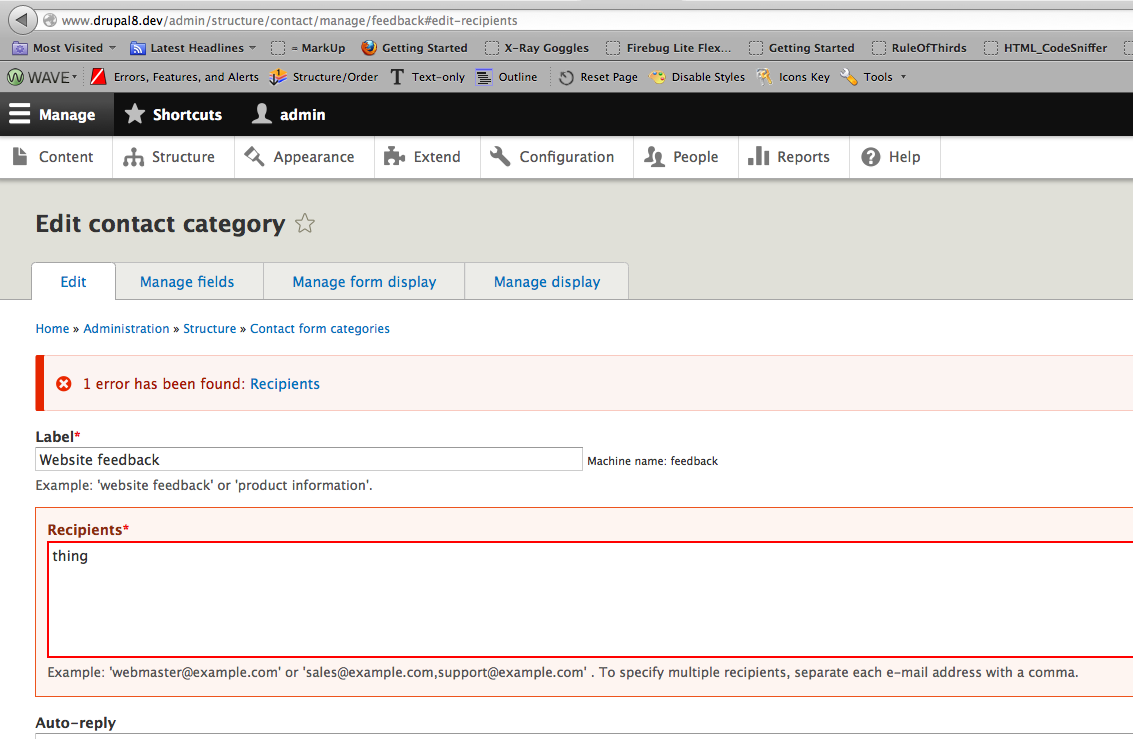
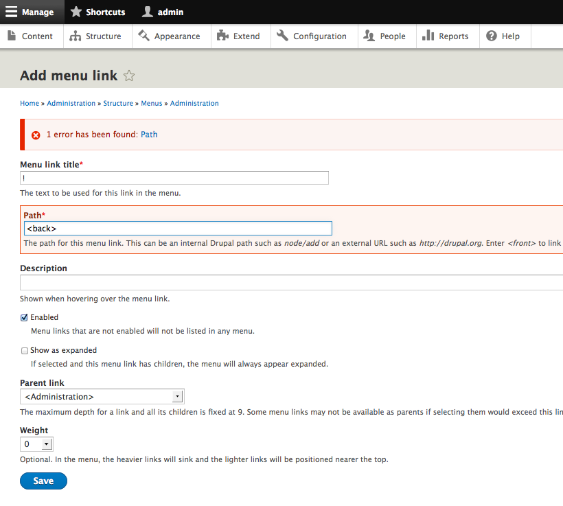
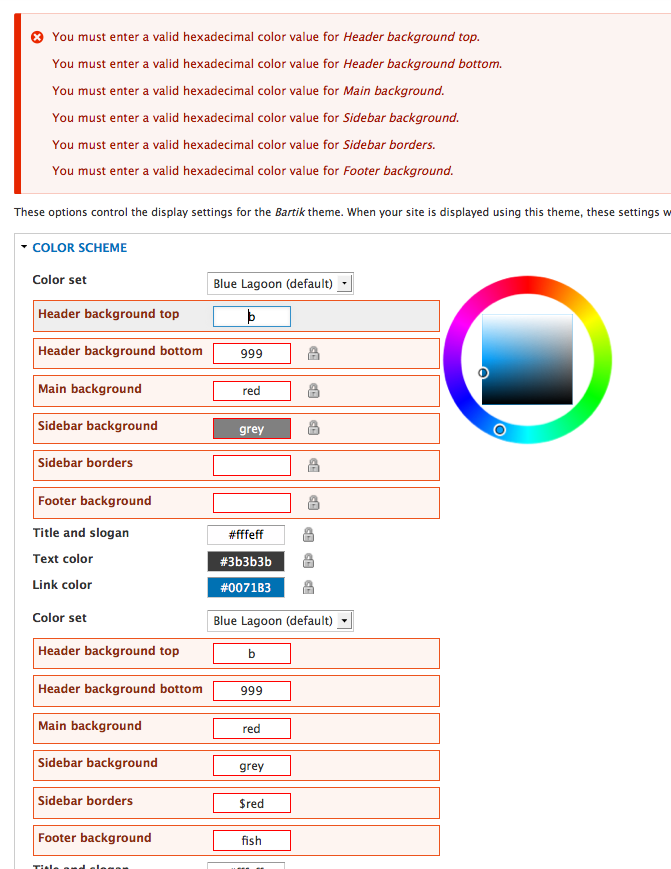
| #273 | 1493324-interdiff-270.txt | 1.66 KB | crasx |
| #270 | 1493324-270.patch | 20.7 KB | rpayanm |
| #270 | 1493324-interdiff.txt | 426 bytes | rpayanm |
| #267 | 1493324-form-errors-267.patch | 20.55 KB | tim.plunkett |
| #265 | 1493324-265.patch | 20.65 KB | rpayanm |
| #255 | 1493324-inline-form-errors-255.patch | 20.42 KB | mgifford |
| #254 | 1493324-inline-form-errors-254.patch | 20.72 KB | BarisW |
| #254 | interdiff-246-254.txt | 1.95 KB | BarisW |
| #251 | Screen Shot 2014-10-03 at 11.22.32 AM.png | 58.11 KB | mgifford |
| #246 | 1493324-inline-form-errors-246.patch | 20.36 KB | tim.plunkett |
| #241 | 1493324-inline-form-errors-241.patch | 20.36 KB | tim.plunkett |
| #230 | interdiff-212-230.txt | 461 bytes | mgifford |
| #230 | inline-errors-1493324-230.patch | 18.53 KB | mgifford |
| #226 | DoubleLabelandDescription.png | 66.43 KB | mgifford |
| #220 | 00002425.png | 335.34 KB | mrjmd |
| #220 | 00002424.png | 313.35 KB | mrjmd |
| #220 | patched_working.png | 41.72 KB | mrjmd |
| #220 | patched.png | 36.48 KB | mrjmd |
| #212 | inline-errors-1493324-212.patch | 18.92 KB | yesct |
| #212 | interdiff-tim.txt | 1.27 KB | yesct |
| #209 | inline-errors-1493324-207b.patch | 18.57 KB | mgifford |
| #207 | inline-errors-1493324-207.patch | 18.57 KB | mgifford |
| #203 | inline-errors-1493324-201.patch | 18.58 KB | mgifford |
| #197 | 3-errors.png | 121.03 KB | mgifford |
| #196 | inline-errors-1493324-196.patch | 18.58 KB | tim.plunkett |
| #195 | user-1493324-n-2239299.png | 43.71 KB | mgifford |
| #195 | image-1493324-n-2239299.png | 66 KB | mgifford |
| #195 | manage-display-1493324-n-2239299.png | 64.21 KB | mgifford |
| #195 | site-information-1493324-n-2239299.png | 102.51 KB | mgifford |
| #191 | form-errors-1493324-191.patch | 18.41 KB | tim.plunkett |
| #191 | interdiff.txt | 344 bytes | tim.plunkett |
| #188 | inline-form-error-styled.patch | 28.6 KB | Bojhan |
| #188 | form-error-consistent1.png | 76.04 KB | Bojhan |
| #188 | form-error-consistent-2.png | 41.49 KB | Bojhan |
| #187 | Maximum-minimum-image-with-no-border.png | 232.03 KB | mgifford |
| #187 | Maximum-minimum-image-with-border.png | 100.05 KB | mgifford |
| #183 | interdiff.txt | 4.34 KB | tim.plunkett |
| #183 | inline-errors-1493324-183-PASS.patch | 32.56 KB | tim.plunkett |
| #183 | inline-errors-1493324-183-FAIL-jumplinks.patch | 32.57 KB | tim.plunkett |
| #183 | inline-errors-1493324-183-FAIL-individual.patch | 32.57 KB | tim.plunkett |
| #182 | inline-errors-1493324-182.patch | 28.18 KB | mgifford |
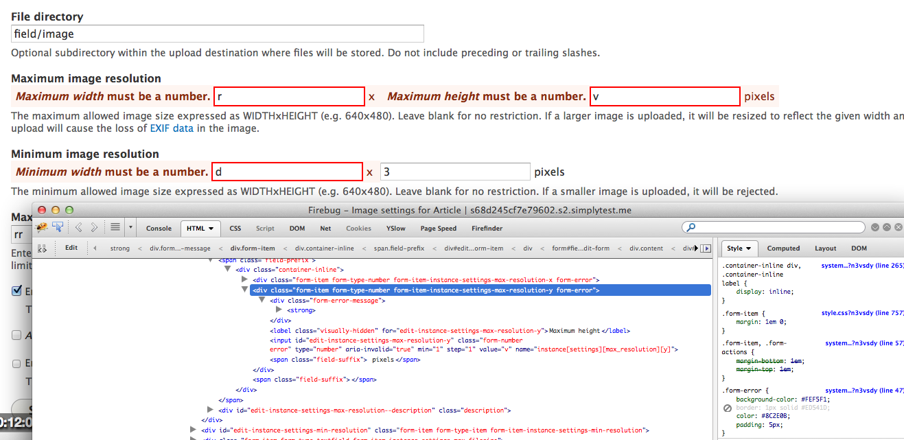
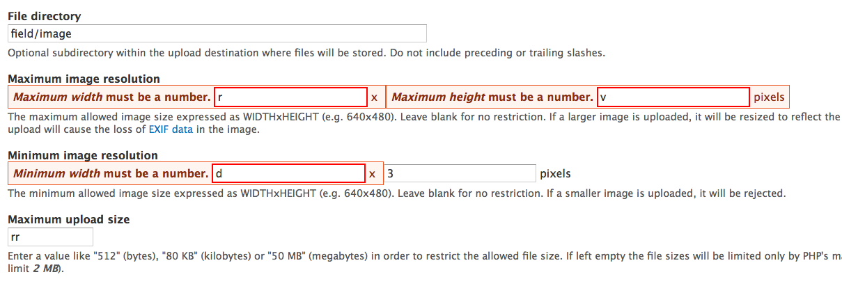
| #182 | Manage-Fields-10px-Padding.png | 71.05 KB | mgifford |
| #182 | Error-Recipients-10px-Padding.png | 123.75 KB | mgifford |
| #182 | Error-With-Align-CSS-Changes-ManageFields-10px-Padding.png | 69.39 KB | mgifford |
| #182 | Error-Body-With-10px-Padding.png | 218.32 KB | mgifford |
| #182 | Error-ManageFormDisplay.png | 69.99 KB | mgifford |
| #182 | Error-AddTerm.png | 61.01 KB | mgifford |
| #182 | Error-Body-With-Less-Padding.png | 230.11 KB | mgifford |
| #182 | Error-Add-Menu-Link-With-Less-Padding.png | 91.26 KB | mgifford |
| #182 | Error-Recipients-With-Less-Padding.png | 83.13 KB | mgifford |
| #182 | Error-Color-With-Less-Padding.png | 140.02 KB | mgifford |
| #182 | Error-File-With-Less.png | 35.66 KB | mgifford |
| #182 | Error-With-Align-CSS-Changes-ManageFields-With-Less-Padding.png | 51.4 KB | mgifford |
| #181 | inline-errors-1493324-181.patch | 27.89 KB | tim.plunkett |
| #181 | interdiff.txt | 2.64 KB | tim.plunkett |
| #179 | interdiff.txt | 505 bytes | tim.plunkett |
| #179 | inline-errors-1493324-179.patch | 26.31 KB | tim.plunkett |
| #177 | interdiff.txt | 17.14 KB | tim.plunkett |
| #177 | inline-errors-1493324-177.patch | 26.3 KB | tim.plunkett |
| #174 | inline-errors-1493324-174.patch | 12.17 KB | mgifford |
| #172 | inline-errors-1493324-172.patch | 12.26 KB | tim.plunkett |
| #164 | interdiff.txt | 556 bytes | tim.plunkett |
| #164 | inline-errors-1493324-163.patch | 12.5 KB | tim.plunkett |
| #158 | interdiff.txt | 523 bytes | tim.plunkett |
| #158 | form-inline-errors-1493324-158.patch | 12.11 KB | tim.plunkett |
| #156 | form-inline-errors-1493324-156.patch | 12.11 KB | tim.plunkett |
| #156 | interdiff.txt | 2.77 KB | tim.plunkett |
| #153 | form-inline-error-1493324-153.patch | 10.51 KB | mgifford |
| #151 | form-inline-error-1493324-151.patch | 10.51 KB | mgifford |
| #148 | form-inline-error-1493324-148.patch | 8.1 KB | mgifford |
| #142 | form-inline-error-1493324-142.patch | 8.09 KB | mgifford |
| #137 | interdiff.txt | 2.92 KB | tim.plunkett |
| #137 | form-inline-error-1493324-137.patch | 12.49 KB | tim.plunkett |
| #131 | form-inline-errors-new.png | 41.72 KB | tim.plunkett |
| #131 | interdiff.txt | 2.07 KB | tim.plunkett |
| #131 | form-inline-errors-1493324-131.patch | 11.78 KB | tim.plunkett |
| #130 | form-inline-errors-1493324-130.patch | 10.38 KB | tim.plunkett |
| #130 | interdiff.txt | 17.03 KB | tim.plunkett |
| #130 | form-inline-errors.png | 46.96 KB | tim.plunkett |
| #126 | FormBuilderTest.php_.rej_.txt | 2.31 KB | mgifford |
| #126 | inline-errors-1493324-126.patch | 12.94 KB | mgifford |
| #119 | inline-errors-1493324-119.patch | 14.49 KB | mgifford |
| #115 | inline-errors-1493324-115.patch | 13.22 KB | mgifford |
| #105 | inline-errors-1493324..patch | 13.51 KB | larowlan |
| #105 | interdiff.txt | 7.71 KB | larowlan |
| #103 | inline-errors-1493324..patch | 7.68 KB | larowlan |
| #103 | interdiff.txt | 556 bytes | larowlan |
| #98 | inline-errors-1493324..patch | 7.68 KB | larowlan |
| #93 | core-inline-errors-1493324-93.patch | 7.86 KB | nod_ |
| #86 | drupal8.form-error-inline.86.patch | 7.86 KB | mgifford |
| #76 | drupal8.form-error-inline.76.patch | 7.84 KB | swentel |
| #76 | interdiff.txt | 423 bytes | swentel |
| #74 | drupal8.form-error-inline.74.patch | 7.73 KB | swentel |
| #66 | drupal8.form-error-inline.66.patch | 7.72 KB | sun |
| #53 | 1493324.patch | 8.71 KB | bleen |
| #45 | 1493324.patch | 9.31 KB | bleen |
| #30 | error-without-element-title.png | 49.14 KB | andrewmacpherson |
| #27 | Site information | d8.png | 111.41 KB | bleen |
| #27 | 1493324.patch | 10.58 KB | bleen |
| #27 | foo.zip | 1.97 KB | bleen |
| #16 | 1493324.patch | 7.75 KB | bleen |
| #15 | 1493324.patch | 8.4 KB | bleen |
| #12 | 1493324.patch | 6.53 KB | bleen |
| #8 | 1493324.patch | 2.08 KB | bleen |
| #8 | Site information | d8-1.png | 36.36 KB | bleen |
| #10 | 1493324.patch | 6.54 KB | bleen |
| #6 | 1493324.patch | 5.31 KB | bleen |
| #4 | 1493324.patch | 5.28 KB | bleen |
| #4 | 1493324.patch | 5.28 KB | bleen |
| #5 | Site information | d8.png | 79.09 KB | bleen |
| #1 | error-color-mockup-3.png | 103.88 KB | bowersox |


Comments
Comment #1
bowersox commentedComment #2
mgiffordThis really is ready to get into core for D8. A sandbox would be useful for this, but mostly we just need some patches to start considering.
Brandon, thanks so much for pushing through with this.
Comment #3
chertzogJust in case people have not seen these yet, there are two modules in contrib that attempt to do this.
http://drupal.org/project/inline_messages
http://drupal.org/project/ife
I have not yet tried these out, but they both have D7 branches.
Comment #4
bleen commentedOk ... here is a first swing at a patch.
There are few things that are not good/not ready for prime-time:
This needs tests, and I'm fairly certain that this will fail some tests...
Comment #5
bleen commentedoops .. uploaded the patch twice instead of the screenshot

Comment #6
bleen commentedThis patch fixes the anchor links so that they work in the overlay, but if there are multiple anchor links and you click one of them, then scroll up and click another everything dies.
Not sure how to create those links so that they always ... ya know ... work
Comment #8
bleen commentedEDIT: ignore the patch in this comment, see #10
This patch should solve many of the test fails (but not all). In addition it puts the css in the correct place and adds the "X" icon to help separate the error message from the title... Still havent figured out a better place to grab the error than the them_form_element(). Must figure that out...
As for the issue with multiple anchor links in the overlay: #1542472: Clicking on multiple anchor links while in overlay causes a page refresh potentially causing form data to be lost
Comment #10
bleen commentedOooops .. wrong patch. Lets try this
Comment #12
bleen commentedOk .. this patch solves a bunch of the tests locally. Lets see what testbot says
Comment #14
bleen commentedHere is an update on the current patch and the remaining issues:
The link in the top error message does not work in overlay at presentThere is a bug in overlay when you click an anchor link after you have already clicked one. See #1542472: Clicking on multiple anchor links while in overlay causes a page refresh potentially causing form data to be lostCurrently I am adding "messages" and "error" classes to the form element but that is not correct. Should I add these class definitions to system.css? If not, where?FixedComment #15
bleen commentedHere is an update on the current patch and the remaining issues:
The link in the top error message does not work in overlay at presentThere is a bug in overlay when you click an anchor link after you have already clicked one. See #1542472: Clicking on multiple anchor links while in overlay causes a page refresh potentially causing form data to be lostCurrently I am adding "messages" and "error" classes to the form element but that is not correct. Should I add these class definitions to system.css? If not, where?FixedA from that redirects the user on submit even if an error occurs is not handled properly. For an example, try using the search block without entering any keywords. You should be directed to /search/node and see this error: Please enter some keywords. Since we are no longer using drupal_set_message at the time of the error is discovered (via form_set_error) the error is no longer stored in a session early enough.Should be fixed by this patch.Comment #16
bleen commentedA couple fixes for stuff I broke in #15
Comment #18
Bojhan commentedOops, I didn't follow this one. Sorry!
Can anyone tell me why we have a bounding box + icon? I thought the consensus was that we had a signal like "!" or so.
Comment #19
bleen commented@Bojhan: I added the icon because the error and the title looked confusingly similar
In other news, the current patch has issues with checkboxes/radios ... both the group and the individual form elements get the error state. Wont have time to look until later this week.
Comment #20
mgiffordThese are definitely good patterns. I do wonder if on a code level we should also be looking at adding HTML5′s required attribute as well as ARIA’s "aria-required".
http://www.w3.org/TR/2011/WD-html5-20110525/common-input-element-attribu...
http://www.w3.org/TR/wai-aria/states_and_properties#aria-required
This coming from @feather's articles on required field best practices:
http://simplyaccessible.com/article/required-fields-right/
http://simplyaccessible.com/article/required-form-fields/
And also worth pointing to:
http://www.alistapart.com/articles/aria-and-progressive-enhancement/
Comment #21
bowersox commented@mgifford, My feeling is that we should add both the ARIA and HTML5 markup to indicate required fields. However, I believe that is a separate issue and we should not try to tackle it in this issue. I know the markup for required fields introduces some complexity about the ability to use the "Cancel" or "Previous Step" buttons in multi-step forms, so it should definitely be a separate issue that we address carefully.
Comment #22
mgiffordGood point. Adding #1623098: Add HTML5 & ARIA for Required Form Elements and also tagging this issue for the sprint.
Comment #23
bleen commentedI clearly have not had a lot of time to try and plow through some of the roadblocks I've come across already ... I still plan on working on this, but I dont want anyone to wait on me if they want to take a swing so I'm unassigning myself
Comment #24
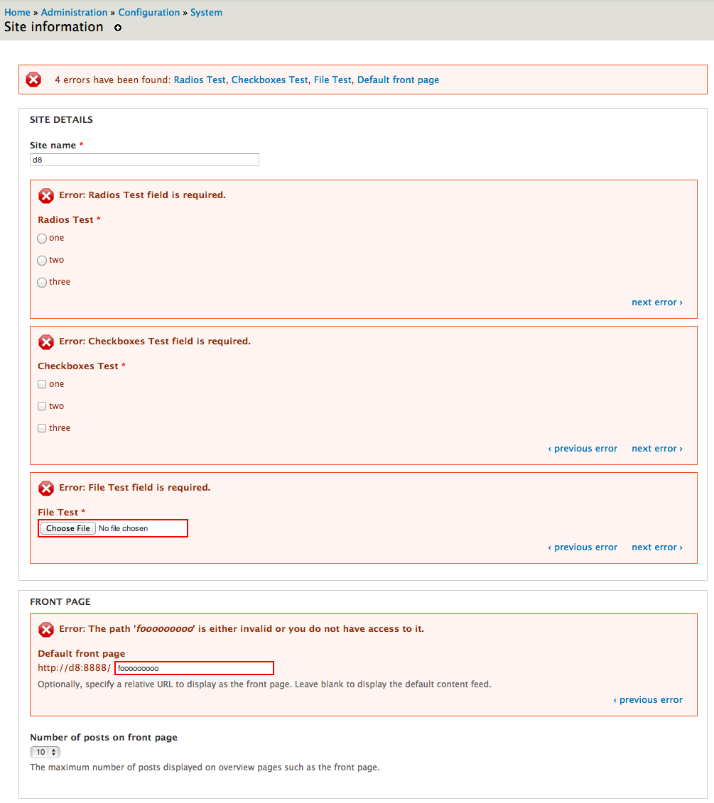
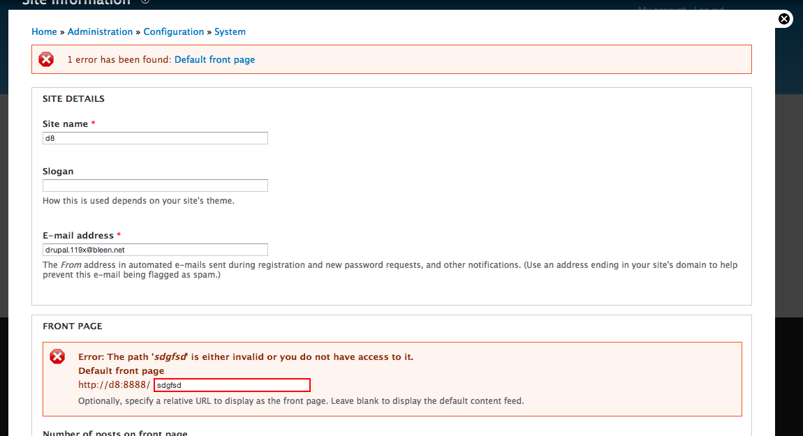
bleen commentedOk ... I've been looking at this issue again and I'm determined to figure it out. I need some feedback though:
I think that the only to fix for https://skitch.com/bleen/eyhxf/site-information-d8 is to add another FAPI property called "#hide-errors" (or something) and automatically apply that to radio's that are part of radio groups and checkboxes that are part of checkbox groups. This property might be useful anyway, but I'd love to get another opinion.
I dont want to go too far down this rabbit hole only to find out that there are strong objections to adding a new FAPI property.
Thoughts?
Comment #25
mgiffordLinking to related issue about validation of complex form elements #179932: Required radios/checkboxes are not validated
@bleen18 - are these types of errors all tied to compound forms that probably should be in a fieldset anyways? #504962: Provide a compound form element with accessible labels
I'd just like to know how to repeat that nasty error you got. Not opposed to the #hide-errors. Something we might be able to talk about on the weekend at the a11y code sprint.
Comment #26
bleen commentedMgifford: currently these errors are only tied to radios elements and checkboxes elements but I havent tested much with more complex forms yet. Basically it would effect any form elements that share a #name the way the radio element (correctly) shares a name with its parent radios element. Makes sense?
Comment #27
bleen commentedThis patch:
Still to do:
Important Notes:
Comment #29
Bojhan commented@bleen18 Thanks for keeping this issue moving, I really love to get this in soon so we can usability test it.
I don't really like that during this thread, we tend to randomly add functionality. It's taken quite a while to reach concencus on some of the fundamental parts, lets get those in first. A quick review;
1 ) Lets lose the icons, per field - I never liked the icon, and it only adds a whole lot of clutter on the page.
2 ) The error should be next to the label, not above.
3) The next/previous is to me, functionality that hasn't been agreed upon - so lets keep that out of the patch.
I honestly, don't see how the fieldset is adding anything. If I am color blind, I have no idea what a "gray" box around a field communicates. As some who can see this color, it adds a whole lot of unnecessary clutter. I thought we just needed some signaling, like a "!" in front of every error.
Comment #30
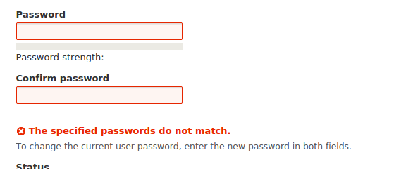
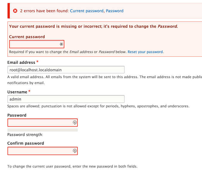
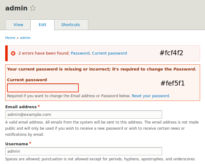
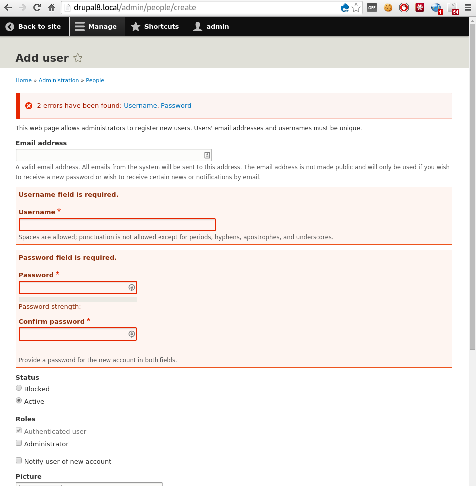
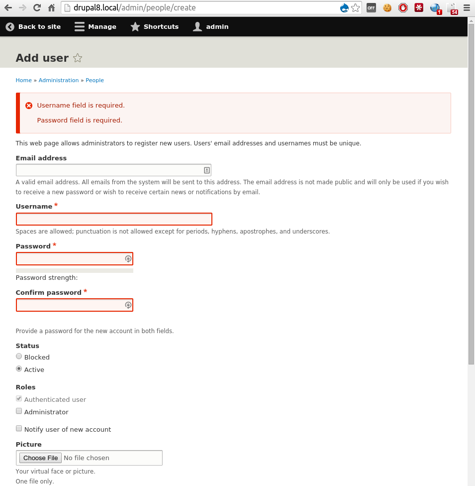
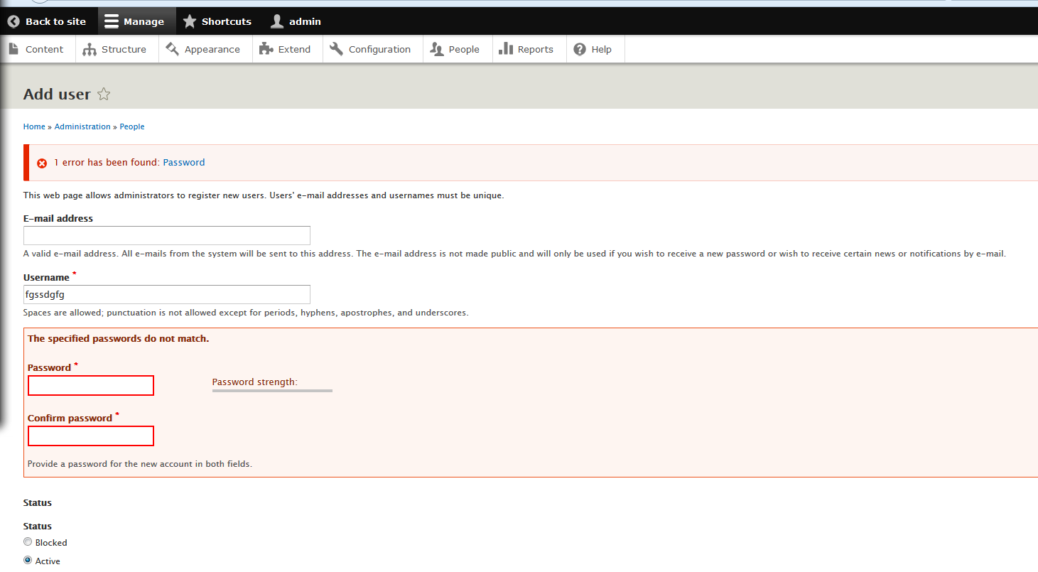
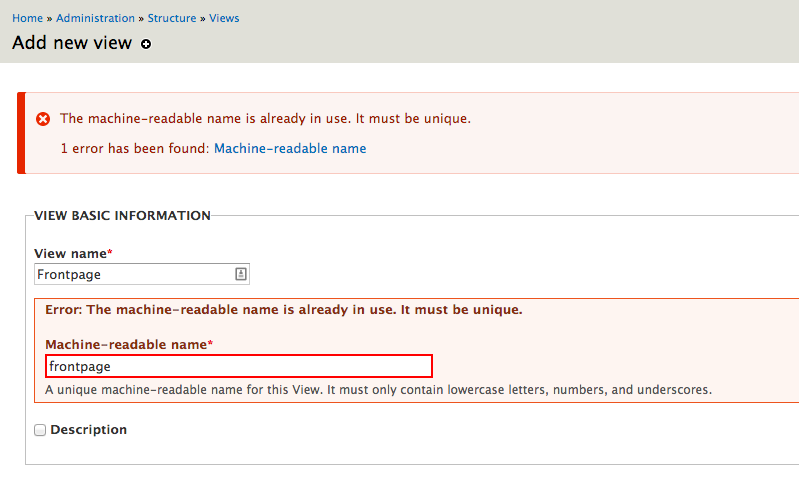
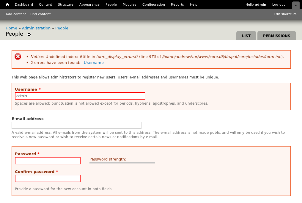
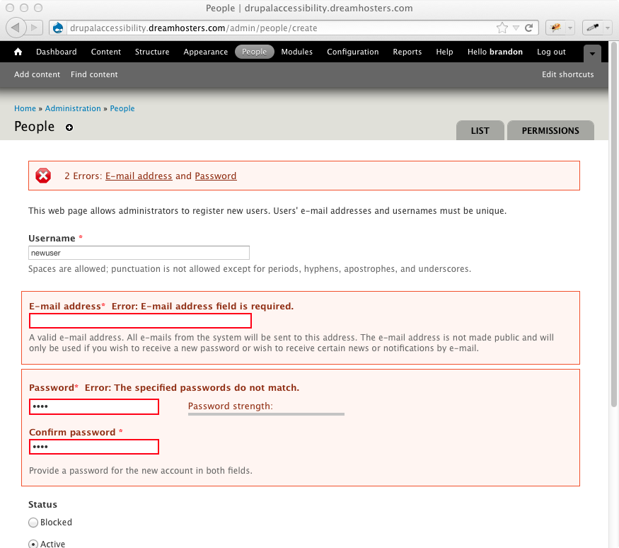
andrewmacpherson commentedThere's an interesting problem with the Confirm Password field from user.module
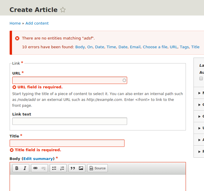
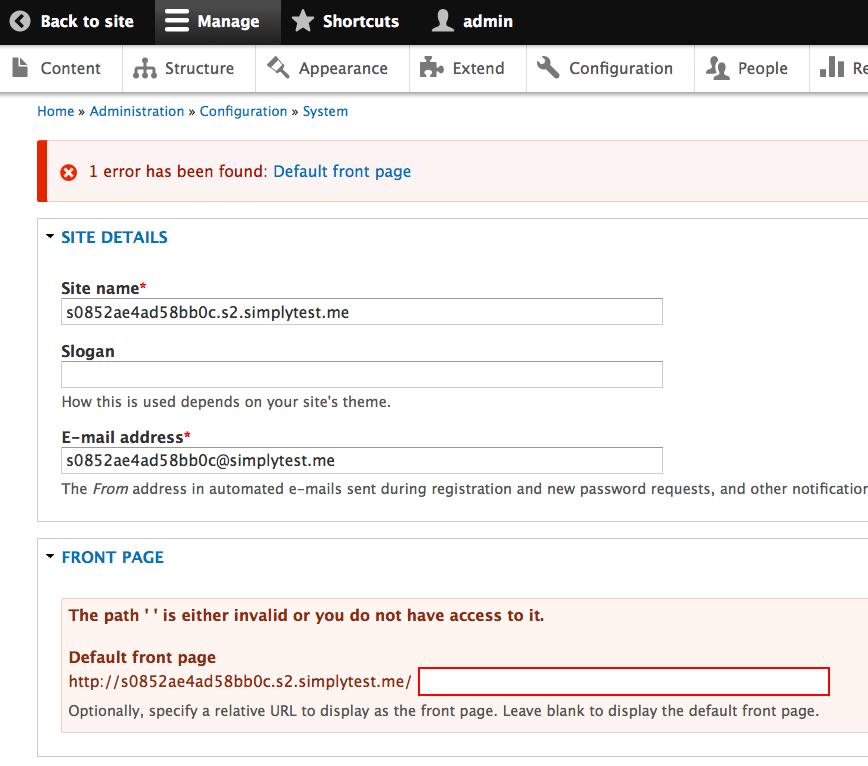
When submitting mismatched passwords, the confirm password field is correctly highlighted, but isn't included in the messages area. Here's a screenshot from /admin/people/create. I deliberately chose a username which I knew already existed, and provided mismatched passwords, so there are two errors. The messages area reads: "2 errors have been found: , Username".
The problem is that the confirm password element doesn't have a #title property. Instead, it has two password elements as children, which have their own #title properties. So we need to find a more reliable way to include the field name in the messages area. The test results from comment 16 shows approx. 100 failures from form_display_errors(), so I guess this problem extends to other fields too.
Also note the position of the comma. form_display_errors() isn't listing the error-fields in the same order that the fields appear in the form, which is somewhat confusing.
Comment #31
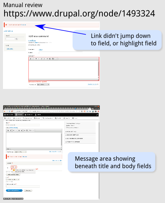
andrewmacpherson commentedThe links in the error-messages area aren't very easy to use if you're a sighted keyboard-only user.
An example scenario: visit /admin/people/create, and trigger an error by providing a username which is aleady in use (e.g. admin). When the form is returned with errors, try to correct them using only the keyboard...
(This test was using Firefox 13 on Linux + KDE.)
Currently the error-message links use the id attribute of the elements as their href. Using the link changes your place in the tabindex order, but it doesn't actually focus the input.
Suggestions:
Another weird behaviour I sometimes observed: after following the shortcut to the username field, the page shifted in the viewport, and the username input was concealed beneath the toolbar, so even if it did gain focus, you wouldn't be able to see what you were typing.
Comment #32
bleen commentedRe #29:
1 & 2) I'm not married to the icons, but putting the error next to the field labels extremely problematic for long field labels and terribly confusing when the error appears on a non-required field (aka with no "*") offering any kind of separation. Suddenly the field looks like its title & the error message are concatenated into one string. I feel pretty strongly that the error should not appear next to the title for these reasons; I dont feel strongly at all that we need the icon.
3) This issue is about UX. If there is a good usability argument for getting rid of the next/prev links I think we should definitely discuss but just because these links were not in the screenshot in the original is not a good reason to nix them. Think about the UX on a long form:
Thats a terrible UX compared to:
Can we at please keep this open for discussion?
Re #30:
Thanks for taking a swing with this ... I knew there'd still be some problems to deal with.
Anyone have any ideas about this one? Off the top of my head, nothing seems to come to mind.
[edit] I hadnt finished that last sentence before hitting save - DOH!
Comment #33
nod_Well if you really want that kind of link inside error messages, why not a link "return to top" instead of next/previous? You don't have to scroll to the top.
That said prev/next feel way to "invasive" to put by default in core.
Comment #34
bleen commentedre #31: hmmm ... this one is going to suck but definitely needs to be addressed. The biggest challenge I see is that some form elements are groups of elements (ex: radios) and some are not.
Maybe we can add an ID to the error message itself a link to that? Then the tabbing *might* work out more better? Maybe?
Comment #35
Meal replacement shake commentedI agree with Bohjan. It seems focus gets lost and we are not maintaining focus on the primary issues at hand.
Comment #36
bowersox commented@bleen18: I agree with Bohjan too. Even though I see your argument about the "next" links being helpful to users rather than scrolling, I still feel we should stick to the consensus that was reached. Later improvements can become another issue later if we can build consensus around that.
We have spent since April 2009 on this issue (it started as #447816). Let's please get the part we all agreed on into Drupal 8.
Comment #37
bleen commentedThis issue is about improving the accessibility and usability of form errors. I appreciate that there was a lot of work done prior to my getting involved in this issue and I don't mean to minimize that but at the end of the day we all want an improved experience, right? That said, I don't believe there was any consensus around either of these two issues in the wiki for this issue.
1) regarding the position of the error next to the label: Evan Donovan made this comment, http://groups.drupal.org/node/209513#comment-710049, where he made the identical point I am making: the error should be on a separate line. That comment was not discussed or responded to. No consensus was had...
2) the next/prev navigation: there was no consensus around this because it was never discussed. In the wiki the only example of a "very long form" is a form that has only 7 fields. This is minuscule. There was no discussion at all about how this would work with a form that has dozens of fields. I maintain several modules that have forms like this (DFP and Dart for instance) and without the next/prev nav (or some other solution) I would argue that what we have now is more usable (though definitely not as accessible). Disclaimer: both of those modules use v tabs heavily to improve the UX of the large forms but even still there are individual tabs with far more than 7 fields
I understand that there was discussion ahead of time on this issue and I have been involved in several d.o. issues where someone has come along and tried to derail a consensus but I have also been involved in issues like that where someone has come along and derailed the consensus because something important had not been considered. The reason I am being stubborn here (you can look back at other posts of mine and see that I am never stubborn like this) is because it is this exact UX problem that my users suffer and that I want to see fixed (errors on very long forms).
Consensus is good. Consensus is important. But a good consensus should not prevent us from making good adjustments. If you don't think these are good improvements, please make those arguments and I will gladly listen but don't just dismiss them because no one brought them up 4 months ago.
Final note: this is my last plea... If people still think we should just do exactly what is in the original post without any changes at all I will not argue after this. Although I've always though that stepping up and actually bringing the code held more weight in this community...
Comment #38
Bojhan commented@bleen18 You are totally right, and I am sorry. The reason why we might respond somewhat harshly, is because its been a really though issue to reach concencus on - that is however no excuse not to respond to your suggestion. From my point of view we have reached concencus on the fact that we need; error links on top, error messages inline and some visual signaling inline that there are errors.
Let me argument, why I think this particular improvement of placing next/prev links isn't good:
1) The functionality if I understand correctly, it is primarily nice to have when there are many errors and when the user is navigating by keyboard. To me both the first and last argument, do not apply to a majority use cases and our audience.
2) It adds controls that are optimized for keyboard users, visual users are going to be far more adapt to scanning the left side - finding the red labels. I find it highly unlikely, one would scroll to the top - to go to the next error.
3) The links as they are now, require some visual boxing - such as a fieldset. I don't think we need a fieldset, therefor it will either require redesign of these elements or make these "hanging in air".
4) Last is the fact that it takes up a lot of screen estate, for something that is not required. If you look at how this could look on mobile, we are getting into quite messy waters.
Again sorry, for not responding on your suggestion initially.
Comment #39
bleen commentedOk .. these are some discussion points I can work with :). Lets see if we cant go through them and either come to a general agreement why these links should stay, change or go...
1) Yes, you are correct. these links are most useful for a form with several errors. If there is only one error, no links would exist and if there are only two, the first one would only have the "next" and the last would only have the "prev". I agree that in a majority of cases no one would see any of these links in which case we're both happy :) In the rarer case of multiple form errors however, that is when these links are most useful
2) I've tried writing a response to this one a couple of times and so far I have (internally) vehemently agreed with you and vehemently disagreed ... It just feels like if we can make it easier we should. One thing I will say is that if we ultimately decide to nix these next/prev links perhaps we should keep them for keyboard users the way that the "skip to" links work - I'm not quite ready to concede the point yet, but it's worth thinking about.
3) This one I dont understand. You briefly mentioned fieldsets earlier in #29 (I think) and I forgot to ask about it then, but as it stands there are no fieldsets being added anywhere. Can you elaborate.
4) My argument here is (again) it only takes up that extra real estate when it is useful ... and scrolling on a mobile device (an already crappy experience) is exactly the time I think this functionality is most useful.
Does the fact that these nav elements only appear when there are multiple errors help alleviate your concerns? Also, a disclaimer: I barely gave any thought to the positioning/styling of those next/prev links so if there are suggestions on that front that might help to settle this that could work too.
Thanks for talking this out with me ... I'm sure that we'll come to a good conclusion at the end. In the mean time I'll try and spend some time this weekend on the issues raised in #30 & #31 as this is all moot if those bugs dont get squashed.
Comment #40
bleen commentedOne other question unrelated to the next/prev debate...
The FAPI property I added is called #hide_errors:
Comment #41
nod_We seem to assume we're going to have a form with lots of errors here, I agree with bojhan that for the typical use-case this is not true.
Showing form validation errors is an UX fail in and of itself. It means there is no client-side validation (HTML5 can do that to some extend) and that the descriptions/labels were confusing, not explicit enough.
While I understand your point bleen18, I think making the HTML5 integration of form validation would be a better way of addressing this issue because if you can reduce the number of errors to begin with, this simplify the problem. When validation error do happen the agreed upon way of dealing with it might not be the best, but it's good enough. What's important is that contrib is still able to tweak it and add prev/next buttons to form errors.
Comment #42
bowersox commentedRegarding the question raised in 40, I think we can handle nested elements with logic like this:
Hopefully with that pseudo-code idea we can do this without introducing a new FAPI #hide_inline_errors property.
Comment #43
bowersox commentedRegarding the prev/next links discussed in 38 and 39, my feeling is that they are more harm than help. They add a lot of UI clutter/overwhelm without delivering much help to users. At the top of the page there is a summary of the errors with a link to each erroneous field. Any user who is having trouble finding which fields have errors can return to the top of the page and use those links. Scrolling back to the top of the page is a quick gesture on a trackpad or a 1-finger touch at the top of an iPhone/iPad screen.
@bleen18, I do want to thank you for your passion to make this UI good and your willingness to explain your arguments and work through this decision together.
Comment #44
bleen commented#42: there is no element[parent][error] ... That would be stupendous though as it would solve this particular issue perfectly.
Re next/prev ... I appreciate that people have started to make some decent arguments against the merits of this functionality (and not just the fact that it is a change) and it seems that most of them make reasonable points against the proposal so I'm going to remove it from my next patch (after some much deserved BBQ).
Comment #45
bleen commentedOk folks ... I need some guidance:
This patch does 3 things:
Comment #46
bowersox commentedFeedback on these first 2 items:
element[parent][error]).Is that feasible?
Comment #47
bleen commentedRequiring title would work great but I like your suggestion of "error in this text field" as a fallback.
As for your point about hide errors...
More feedback welcome.....
Comment #48
sunWe do not babysit broken code, and setting a form validation error after form validation has completed is broken. This can/should be removed.
1) It looks like this should be moved to the end of drupal_validate_form() instead.
2) We likely want to limit this additional processing to non-programmed forms.
Need to think about this idea some more, but FWIW, I think that this should rather read #error_use_parent or similar. #hide_errors is absolutely misleading.
Comment #49
bleen commentedI'm not sure what you mean by this... can you elaborate?
Are you mulling over the idea of using a property like this? or just the name of the property (which I agree needs changing)? I dont want to keep going too far down this rabbit hole if this solution is ultimately a dead end.
Comment #50
mgifford@bleen18 - With form_display_errors($form), why was it added here? Can it be moved up in the processing so that we're not validating it twice?
@sun - any thoughts on @bleen18's response? Just want to get some clarification here. Might make sense to do this on IRC. What's the best way to get feedback from you on this issue?
Comment #51
sunre: #49:
i) I meant that the specific call to form_display_errors() I referenced should be wrapped in a
if (!$form_state['programmed'])condition.btw, it looks like you can skip the
else, because if the initial if condition is positive, then the call to drupal_redirect_form() will end the request.ii) I meant the name of the #property only.
Overall, I need to spare some time to give this patch some more thought though. However, it would still be a good idea to get these known issues out of the way already.
Comment #52
bleen commentedThis patch addresses @sun's comments in #48 and in doing so address @mgiffords comment in #50.
The big issues that still remain include:
Comment #53
bleen commentedoops ... forgot to attach patch
Comment #55
mgiffordLooking at @yatil's js code now - https://github.com/yatil/accessible-form-js
Probably not something we can draw on, but interesting model.
Comment #56
bleen commented@sun ... re: #38
So what should we do in the case of the test that is failing on the search block? In that case, of search_box_form_submit? In that form submit function errors are set but there is no way to pass the test that makes sure the user is redirected if the form is empty if that validation functionality is moved from form submit to a validation function. (http://api.drupal.org/api/drupal/modules%21search%21search.test/function...)
Thoughts?
Comment #57
mgiffordCould an exception be made for search?
@bleen18 Are there other examples where where we might need form validation done there?
Comment #58
bleen commented#57 that was the only one i saw, but once I found it I stopped looking. The point here though is that even if we just have one exception, then i would need to put back the code that @sun suggested I remove in #38.
That code would handle all exceptions and it couldn't easily be altered to only handle one or two exceptions if that was the desired functionality.
Basically we are talking all or nothing: we either put in code that handles form_set_errors in a form_submit function, or we dont.
Comment #59
sunsearch_box_form_submit() is the exact definition of broken code. ;) I wasn't aware we have that in core. Let's create a separate issue to fix that (but check for a possibly existing first, please).
Comment #60
bleen commentedcreated #1789768: search_box_form_submit() improperly calls form_set_error()
Comment #61
mgifford@sun can this patch proceed on it's own now that there is a separate issue for search_box_form_submit()? Also, I'd like some ideas on how to better tag @bleen18's new patch. Not sure if a WTF tag is the best way to get folks to look at and review this issue.
I'd just like to see that we can't have better inline form error handling in D8 at the moment and want to see that we address these. We could mark it as postponed possibly, but not sure how related it needs to be.
Comment #62
mgiffordGreat to see that there is now a patch to try out #1789768: search_box_form_submit() improperly calls form_set_error() to deal with the search_box_form_submit() issue.
I really think we should be able to keep working on the patch in #53 at the same time though.
Comment #63
franzNeed to use soft-tabs, your editor is inserting tab characters.
Comment #64
mgiffordThis is important to fix, but the bigger issue is that it seems like the whole diff needs to change and no longer applies due to some recent submits.
I tried to just quickly do an upgrade manually but too much has changed since August 16h when this patch was rolled. Looks like it needs to be rebuilt...
Comment #65
franz#1789768: search_box_form_submit() improperly calls form_set_error() Kindly needs a careful review, please. =)
Comment #66
sunRe-rolled against HEAD.
This still needs a lot of work.
Comment #68
mgiffordPatch still applies nicely, but there are 17 fail(s) in the tests.
Hard to do the manual testing with - #1797438: HTML5 validation is preventing form submit and not fully accessible - as the browser validation gets in the way.
Comment #69
owen barton commented#66: drupal8.form-error-inline.66.patch queued for re-testing.
Comment #71
bleen commentedre #68: ... to test I used firebug/chrome to remove the "required" attribute from the input manually after the page had loaded. Not ideal, but Drupal doesnt know the difference and it stops HTML5 validation from pestering you
Comment #72
attiks commentedFYI: I created #1845546: Implement validation for the TypedData API to try to solve this on all levels, since there are only 10 days left, we need to figure out what needs to be done before feature freeze and what can be done later.
Comment #73
mgiffordCan someone re-roll @sun's patch from October? There's more progress now on #1789768: search_box_form_submit() improperly calls form_set_error()
Comment #74
swentel commentedRe-roll
Comment #76
swentel commentedThis should fix at least all the notices.
Comment #78
mgifford#76: drupal8.form-error-inline.76.patch queued for re-testing.
Comment #80
mausolos commented(Drupalcon PDX code sprint) I'll take a look at this.
Comment #81
mausolos commented#76: drupal8.form-error-inline.76.patch queued for re-testing.
Comment #83
mausolos commentedStill fails, and I got distracted with other stuff. Out of time, might take another look some other time.
Comment #84
falcon03 commentedtagging
Comment #85
falcon03 commentedComment #86
mgiffordsystem.theme.css moved into css/
Comment #88
mgiffordI'm pretty sure I didn't intend to remove these (User interface, mobile) tags.
Looks like a few tests need to be adjusted.
Comment #89
cbMy only concern with the current solution (which looks great otherwise) is that there is no correlation or relationship between the field error and the field, besides a wrapping div.
I'm wondering if there is something that can be done to establish a connection between the two, an aria describedby perhaps?
Otherwise, it looks good. The jump link in the top errors works and is clear, the wrap and error on each field is clear and obvious.
Comment #90
mgifford#86: drupal8.form-error-inline.86.patch queued for re-testing.
Comment #91
mgiffordI just lost a much bigger comment and I'm running out of time, so quickly.
I think this is a good idea. Follows the example provided here:
http://www.karlgroves.com/2011/10/10/accessible-form-labeling-instructions/
I think it can be done with some simple changes to function _form_set_attributes() or form_builder(), but it means that we're going to have to ensure that describedby can handle multiple attributes.
Main concern I had was that we should be focusing on the existing errors so that we can get the existing code into D8. If we can add in this additional semantic relationship that would be a big bonus. We just need to see more progress on this issue.
Comment #93
nod_Reroll, might need some styleguide love too. All that red is really aggressive :p
Comment #94
Bojhan commentedWhat are we doing? That it changes style?
Comment #96
xanoRemoving some unneeded tags.
Shouldn't we use NestedArray::getValue() for this?
Comment #97
mgifford@Xano so it should be something more like this:
And we can just drop form_get_element().
Let me know if that's right and I'll do up a new patch. The bigger issue though is still the 11 fail(s).
Comment #98
larowlanRe-roll after FormBuilder service
Comment #100
mgiffordI didn't see any problems implementing this patch in STM. I'll try to retest it.
Comment #101
mgifford98: inline-errors-1493324..patch queued for re-testing.
Comment #103
larowlanWhoops
Comment #105
larowlanLayer upon layer
Comment #107
mgifford105: inline-errors-1493324..patch queued for re-testing.
Comment #109
tim.plunkettThis is a huge problem. We're actively trying to REMOVE global calls to form_get_errors(): https://drupal.org/node/2131851
This is really bad :( First, you probably want $this->request->attributes->get('_raw_variables')->all() as the second param, but this is really strange.
Comment #110
jessebeach commentedIt seems that timplunkett and larowlan are working on refactoring form error handling here #2131851: Form errors must be specific to a form and not a global. We should hold off this issue and consult with them on the other one.
Comment #111
bleen commented@jessebeach .. the link in #110 is to this issue. Is there another issue?
Comment #112
tim.plunkettAdded related issue.
Comment #113
jessebeach commented@bleen18, sorry, I've updated it to #2131851
Comment #114
jessebeach commentedThe form errors issue is passing tests #2131851: Form errors must be specific to a form and not a global.
Lets go through it and see if we can port the accessibility changes developed here on top of that proposed patch.
Comment #115
mgiffordI think it mostly applies. The only error was in core/lib/Drupal/Core/Form/FormBuilder.php
Where we were using:
'#error_use_parent' => FALSE,But the present code in Core uses NULL:
Here's a re-roll of the patch. I'm not actually sure how well it works.
Comment #117
tim.plunkettYou can check $element['#errors'] now. Please see _form_set_attributes and consider merging these checks
I still don't think this is the responsibility of the FormBuilder.
Comment #119
mgiffordHere's a re-roll with _form_set_attributes() - I can't comment on the Form Builder. I just want the desired output to work so am open to suggestions.
Comment #120
tim.plunkettThis line is still going to cause hundreds of errors and tens of thousands of exceptions.
You completely misunderstood me. I meant to look at the internals of _form_set_attributes, it already does a check for errors!
Comment #121
mgifforddamn.. I definitely misunderstood. Scratch the patch in #119.
The big attributes added are 'form-error' & 'form-error-message' in this patch. I'm not sure how to integrate this in _form_set_attributes()'s:
I don't think you're suggesting that we integrate with theme_form_error_message().
I was hoping to be able to nudge this ahead, but can't take this any further.
How do we address this in FormBuilder? Who can take this on?
Comment #123
anandkp commentedBackground
While this issue is getting some attention, I just wanted to mention something a matter of concern.
When a form generates an error after submission and the page reloads, I've found when testing with JAWS that there's absolutely no indication to a screen-reader user that something went wrong.
I may have been missing something and my tests were a long while ago but... I feel that if this is still the case and at least one or two other people could verify this, then I'd like to propose one addition to the work performed on this issue:
Proposal
It would be wonderful if we could get the Form system to hook into the theme system to dynamically add an error message in the
<title>field or at the start of the body. Doing so would ensure that screen-reader users would be informed immediately on page load that the form they just submitted returned errors.A different way to handle this would be use
Drupal.behaviors()to alert the user after page load is complete. I'm thinking about the fact that the JavaScript alert function (e.g.alert('The submitted form has errors.');) is pretty much as noisy as it gets. It will ensure the user has been notified and acknowledges the problem by having to click a button like, "Ok" or something.The same behaviour will help on mobile devices.
One more thing to do would be to set focus on the offending form. All forms in Drupal have an
idattribute. If we use JavaScript to increase the friendliness of the system, then we could very well place focus on the form right after the proposedalert('...');message is dismissed.Thoughts?
PS: One of the links on the original design-discussion for this solution made me think of using JavaScript's
alert('...');. I'd originally thought that we might place the markup of the message at the very start of the<body>tag.Comment #124
mgiffordTake a look at Drupal.announce() that @jessebeach was able to bring into Core -
https://drupal.org/node/1973218
She & Wim presented in Portland - https://portland2013.drupal.org/node/2158
I don't think that putting the error in the title will be useful, although ARIA can certainly be useful for some screen readers.
There are definitely other examples that can be emulated such as https://github.com/wet-boew/wet-boew/wiki/Form-validation
But, a huge part of the problem is establishing the semantic relationship between the error and the form element.
I think that the existing patch goes a long way to addressing known accessibility problems with the error messages. It needs to be tested with JAWS & VoiceOver of course, but it needs to pass the unit tests too.
I would like to see if we can fix the known problems first and extend it with testing. This has been an issue that has been discussed for a long while and I know we don't need to go back to the drawing board.
Comment #125
anandkp commentedHey there @mgifford! :o)
mparker17 and I have been in touch and hope to work on this in the next few days. Thanks for your comment above! I do hope to get the alert/notice in at the same time as it's definitely related. I'll let you know how things go if we're the first ones to make further progress on this.
Thanks!
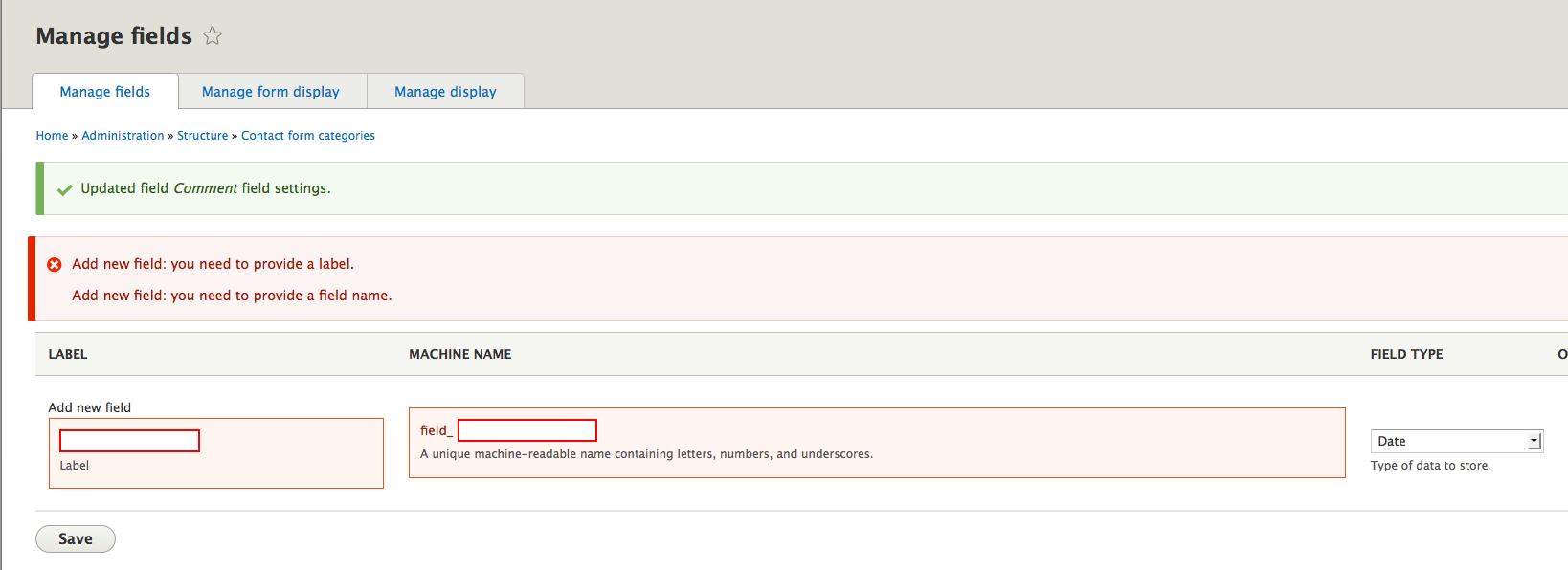
Comment #126
mgiffordA re-roll, but the in FormBuilderTest.php 3/4 of the fragments aren't applying any longer.
Comment #128
mgiffordI guess this function got removed from FormTestBase.php:
PHP Fatal error: Call to a member function drupalStaticReset() on a non-object in /var/lib/drupaltestbot/sites/default/files/checkout/core/tests/Drupal/Tests/Core/Form/FormTestBase.php on line 138
Comment #129
tim.plunkettI'm working on this.
Comment #130
tim.plunkettThis is more what I had in mind. The interdiff is bigger than the patch itself, but I attached it anyway.
This includes unit tests for the new FormElementHelper, but not web tests yet for the actual links and error divs.
The FormBuilder doesn't have to care that this is happening.
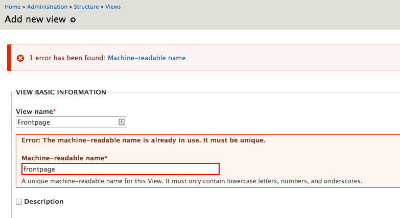
Here's an example of trying to make a view with a duplicate name:

Comment #131
tim.plunkettWhoops, looking at that screenshot I noticed that I was still displaying the messages at the top.
Fixed!
Updated screenshot:
Comment #133
tim.plunkett131: form-inline-errors-1493324-131.patch queued for re-testing.
Comment #137
tim.plunkettUsing setFormError() and friends from a submit handler is effectively the same as just drupal_set_message($message, 'error').
Because it does not interrupt validation, it is not even really an error, just a message.
For now, I put in a workaround to allow it to still show the error message, but we might want to consider changing all of those to d_s_m directly.
Comment #139
tim.plunkettfile_save_upload makes this extra tricky because it is sometimes called from validate and sometimes called from submit...
Comment #140
mgifford137: form-inline-error-1493324-137.patch queued for re-testing.
Comment #142
mgiffordre-roll... because of Hunk #7 FAILED at 2803.
1 out of 8 hunks FAILED -- saving rejects to file core/includes/form.inc.rej
Comment #144
tim.plunkettI'm not sure how we went from 12.49K to 8K, did you drop something?
Comment #145
mgiffordI certainly didn't try to drop anything. There was just that one fail when I applied the patch manually and then worked through the failed chunk.
Comment #146
tim.plunkettOh, this conflicted with #2152213: Convert theme_form_element() to Twig, and the patch keeps using $attributes while HEAD now uses $variables['attributes']. So this needs a real reroll.
Comment #148
mgiffordOk. I think there was only one '$attributes'.
Comment #149
tim.plunkettThe patch is missing the entire FormElementHelperTest, seen at the bottom of the patch in #137.
Comment #151
mgiffordThanks @tim.plunkett - with the all important tests this time!
Comment #153
mgiffordForgot about _theme()
Comment #156
tim.plunkettYou also left out the FormElementHelper class, which was the major change in this issue...
And the form errors weren't even printing anymore, because $output is no longer used.
I started to update it, but after checking with joelpittet on IRC, he encouraged me to inline this directly in form-element.html.twig
We still need a web test with some xpath to assert the errors are all shown in the right place.
Comment #158
tim.plunkettStill needs tests, I don't have the time to work on them, but just an xpath showing that there is the top region as well as the inline error would be enough.
The errors are already passed through t(), so we can't double-escape them.
Comment #160
mgiffordThanks @tim.plunkett for continuing to push this important issue further. I really don't know where things went so very wrong with my earlier patches. I really don't think I was doing anything all that unusual. Git didn't apply but usually this helps override that and identify where there is a conflict:
patch -p0 < form-inline-error-1493324-137.patchAnyways, there is progress!
Comment #161
tim.plunkettgit apply --3way should work, or if not, git apply --reject.
Or the issue was that you did not git add the new files before diffing.
Anyway, the last fails are all for elements using #error_use_parent: radios and checkboxes.
Whoever authored the original patch, what exactly was the mechanism to make them show up in their parent or elsewhere?
Comment #162
mgiffordI'll have to play with
git apply --3way&git apply --rejectI think my main problem though was not git adding the new files. Thanks!
There's probably a good chance that #2192419: Use a WCAG-compliant fieldset (fieldgroup) for #type radios/checkboxes broke this as it deals with radios & checkboxes.
Comment #163
bleen commentedAt the time, the errors were showing up for both the parent and the individual checkbox/radio. The #error_use_parent property simply prevented the error from displaying on the individual checkbox/radio. Clearly a lot has changed since I worked on this patch though.
Comment #164
tim.plunkettThat indeed broke it, thanks for the pointer!
It incorrectly removed checkboxes and radios from the elements that are considered "form elements", and now they are the only input elements that aren't run through form-element.html.twig.
Comment #165
sunThe compound elements of #type radios/checkboxes are no longer wrapped in a form element, but in a fieldset instead. A fieldset is a form element wrapper already; i.e., a fieldset is not wrapped into an outer form element.
Those two #types are not really form elements; they are simply expanded into multiple sub-elements, but technically they do not present an own form element - each sub-element is processed on its own.
Markup-wise, it wouldn't make sense to output a
<div class="form-wrapper"><fieldset>...</fieldset></div>- especially because the form element has its own logic for outputting a label and stuff that the fieldset has on its own already.Due to that, the patch in #164 duplicates the #title of the element into (1) the fieldset legend and (2) the wrapping form element label.
There's quite some duplication of logic going on between theme_fieldset and theme|template_preprocess_form_element in the meantime, and it would probably make sense to move all of that into a shared helper function.
It might be best to convert theme_fieldset into twig first, so that both form wrapper functions are using preprocess functions, and once that is done, we can easily move the shared logic into a new preprocess function that is shared between both.
→ #2152209: Convert theme_fieldset() to Twig
Comment #166
tim.plunkettIf I still had this assigned to me, I would unassign it.
I fundamentally disagree with the changes made to remove checkboxes and radios from the form element flow, and I don't have the time or patience to wait on slowly reversing that mistake in another issue.
Comment #168
tim.plunkettPostponed on the revert of the issue that causes the regression in checkboxes and radios.
Comment #169
shyamala commentedAdding tags
Comment #170
andypostis there a reason to postpone?
Comment #171
yesct commented@andypost I think @tim.plunkett was referring to comment #20 in #2192419: Use a WCAG-compliant fieldset (fieldgroup) for #type radios/checkboxes. But that has not been reverted.
@sun in #165 says this might be easier after #2152209: Convert theme_fieldset() to Twig and that is fixed and in.
Comment #172
tim.plunkettReroll, we'll see if this works. If not, then fieldsets are still wrong.
Comment #174
mgiffordJust a re-roll.
use Drupal\Core\Render\Element;is now already defined.Comment #176
tim.plunkettWorking on this again.
Comment #177
tim.plunkettOkay, going back to the approach of not using form errors during submission, since they *don't do anything* outside of calling d_s_m in HEAD/D7.
Comment #179
tim.plunkettWell, that was a lot of fails.
Comment #181
tim.plunkettComment #182
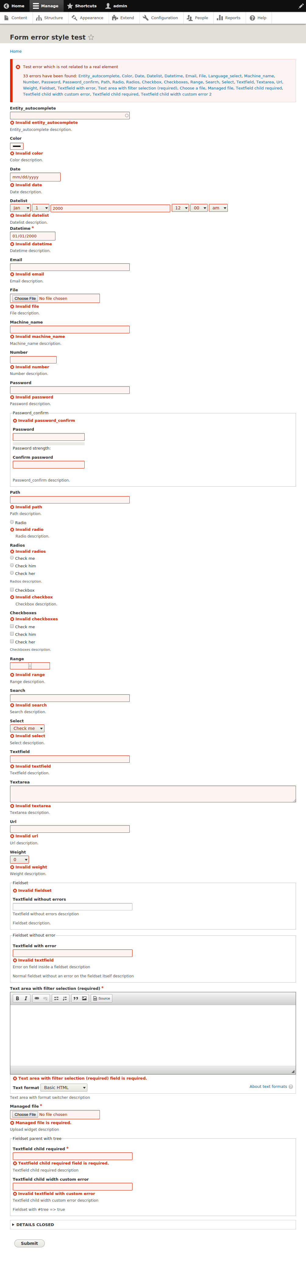
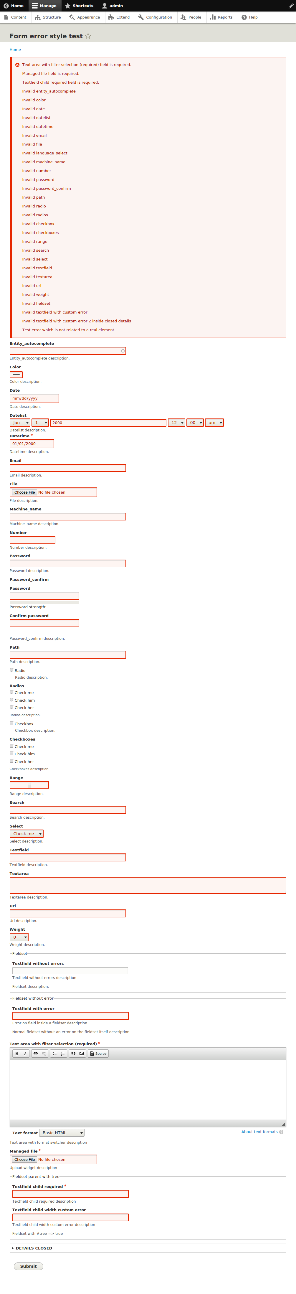
mgiffordThat's great, the bot's like it. Thanks Tim.
Now, some minor CSS issues I noticed. I think this looks better. Screenshots attached.
Comment #183
tim.plunkettOkay, I've added a test.
Uploading just the test in isolation is obviously going to fail, since the markup is changing.
Instead I've uploaded two failing patches, one with the per-element error handling suppressed, and one with the form count-the-errors handling suppressed.
Comment #184
tim.plunkettUpdated the issue summary with the API change.
Comment #185
tim.plunkettAlright, now just for some reviews.
Comment #186
Bojhan commentedI think we don't need the outer border on the error state. Since we already have a red border on the form itself, having two borders is unnecessary signaling not needed for a11y and also more bloat from a visual design perspective.
@mgifford could you comment on if this is going in the right direction, because we dont have errors inline nor something different than color? or am I missing something?
Comment #187
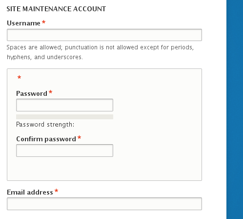
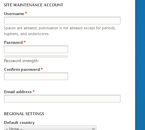
mgiffordBojhan, just as an example, some comparison images. First with the patch:

Next without the external border:

Taken from:
/admin/structure/types/manage/article/fields/node.article.field_image
Comment #188
Bojhan commentedHere you go, I think this will work. Its now more inline with the other Seven styling.
Comment #190
tim.plunkettI had a working 32K patch in #183. You removed 4K and now it is broken, but provided no interdiff or even summary of code changes.
Please don't do that.
Comment #191
tim.plunkettTurns out you just left out the new files.
However, because we're now making an API change here, and its being held up on visual changes, I'm splitting the validate/submit changes out to a new issue.
This is now blocked on that.
Attached is the interdiff of changes made by @Bojhan. The patch will not work until #2239299: Form errors should only be set during validation goes in.
Comment #192
Bojhan commented@timplunkett My mistake - I tried to get it right. I only changed 3 lines though. Lets keep this on active while we make sure that the visual changes pass a11y review. Then we get put it to postponed when its ready to go in but waiting on #2239299: Form errors should only be set during validation.
Comment #193
mgiffordThe patch is definitely coming along. The errors are inline now, but there should be a short summary at the top like there was. Ideally there would be a summary of the messages with a link to take you down to the error. I had seen those earlier but haven't been able to replicate them with the latest patch.
It showed up here in an earlier patch by adding menus, recipients & terms:
https://drupal.org/files/issues/Error-Add-Menu-Link-With-Less-Padding.png
https://drupal.org/files/issues/Error-AddTerm.png
https://drupal.org/files/issues/Error-Recipients-10px-Padding.png
I can easily create errors here:
admin/structure/types/manage/article/fields/node.article.field_image/field
admin/structure/types/manage/article/fields/node.article.field_image
admin/structure/types/manage/article/fields/node.article.body (uploading an image)
admin/config/system/site-information (spaces)
user/password (nonsense)
admin/structure/contact/manage/feedback
admin/structure/types/manage/article/form-display (edit body)
I think it would be clearer if it was prefixed with:
"Error: Maximum width must be a number."
"Error: No file selected."
"Error: The path ' ' is either invalid or you do not have access to it."
"Error: The list of allowed extensions is not valid, be sure to exclude leading dots and to separate extensions with a comma or space."
"Error: Sorry, nonsense is not recognized as a username or an e-mail address."
"Error: Recipients field is required."
I also think the formatting of the text is way too similar to the Label.
Maybe the label should be black if it is separate from the error message.
I'm trying to find instances to test template_preprocess_form() but haven't been able to identify them. In #165 @sun talked about "mov[ing] all of that into a shared helper function."
I'm looking forward to seeing:
drupal_set_message(format_plural(count($error_links), '1 error has been found', '@count errors have been found') . ': ' . implode(', ', $error_links), 'error');expressed.
Comment #194
tim.plunkett#193, this doesn't work yet. I said that in #191 when I marked it postponed.
I don't see how this can be active while it is non-functioning, but that's what @Bojhan wants.
Comment #195
mgiffordRight. I wasn't sure exactly how it wasn't functioning. However if we apply both patches, it's much easier to evaluate.
admin/config/system/site-information

admin/structure/types/manage/article/form-display

admin/structure/types/manage/article/fields/node.article.body

user/password

So we just have to focus a bit more testing on #2239299: Form errors should only be set during validation for now I assume.
Comment #196
tim.plunkettRerolled
Comment #197
mgiffordOk, just about to RTBC this. Two things I'd like some clarification on.
First, do we want to have proper punctuation?
vs (with the "and" & "."):
Finally, is there anything that can be done about the cases where there is no link provided in the header error? For instance there is no link if you enter a value that isn't a number here:
admin/structure/types/manage/article/fields/node.article.field_image/field
"Limit must be a number." is simply repeated in the header & then along with the form element.
Similar issues:
admin/structure/contact/manage/personal/fields
admin/structure/comments/manage/node__comment/fields
admin/appearance/settings/bartik
This is probably bigger than what can or should be addressed in this issue, but would like to address it.
Comment #198
star-szrMaybe this is naïve (I'm not fully up to date with this issue but I don't think it's been mentioned) but why not display the multiple errors w/ links as a
<ul>/item_list? Then we don't need to worry so much about grammar which has different rules for different languages.Comment #199
mgifford@Cottser - I like that idea, but think we should spin it off on another issue.
I took a brief look and could find the same problem in:
core/modules/views_ui/views_ui.theme.inc:
$variables['displays'] = empty($variables['displays']) ? t('None') : format_plural(count($variables['displays']), 'Display', 'Displays') . ': ' . '<em>' . implode(', ', $variables['displays']) . '</em>';core/lib/Drupal/Core/Extension/InfoParser.php:
$message = format_plural(count($missing_keys), 'Missing required key (!missing_keys) in !file.', 'Missing required keys (!missing_keys) in !file.', array('!missing_keys' => implode(', ', $missing_keys), '!file' => $filename));core/modules/system/lib/Drupal/system/Tests/Form/ValidationTest.php:
$top_message = format_plural(count($error_links), '1 error has been found', '@count errors have been found') . ': ' . implode(', ', $error_links);core/modules/system/system.install:
'value' => format_plural(count($modules), 'The %modules module is disabled.', 'The following modules are disabled: %modules', array('%modules' =>implode(', ', $modules))),core/modules/taxonomy/lib/Drupal/taxonomy/Plugin/views/filter/TaxonomyIndexTid.php:
form_error($form, $form_state, format_plural(count($missing), 'Unable to find term: @terms', 'Unable to find terms: @terms', array('@terms' => implode(', ', array_keys($missing)))));core/modules/user/lib/Drupal/user/Plugin/views/filter/Name.php:
form_error($form, $form_state, format_plural(count($missing), 'Unable to find user: @users', 'Unable to find users: @users', array('@users' => implode(', ', array_keys($missing)))));I think having a consistent pattern is probably more important. I'll happily start a new issue for this. EDIT: Added #2242631: Plural lists should use HTML lists rather than simply implode(', ', $var)
The remaining issue I see is probably outside of scope too. I just wanted to raise it before marking it RTBC.
Comment #200
andypostOverall looks great!
This needs follow-up issue for
"Limit must be a number."and then rtbcPS: Is it possible to re-use joy-ride (tour) to navigate between errors? That could be done in contrib a-la beautytips to display full error message...
Suppose this needs change notice
maybe better to get rid of strong tag here and use css to style?
Comment #201
mgifford196: inline-errors-1493324-196.patch queued for re-testing.
Comment #203
mgiffordJust another reroll.
Comment #205
mgifford@tim.plunkett - Thanks.
@andypost That would be really cool to "re-use joy-ride (tour) to navigate between errors"!
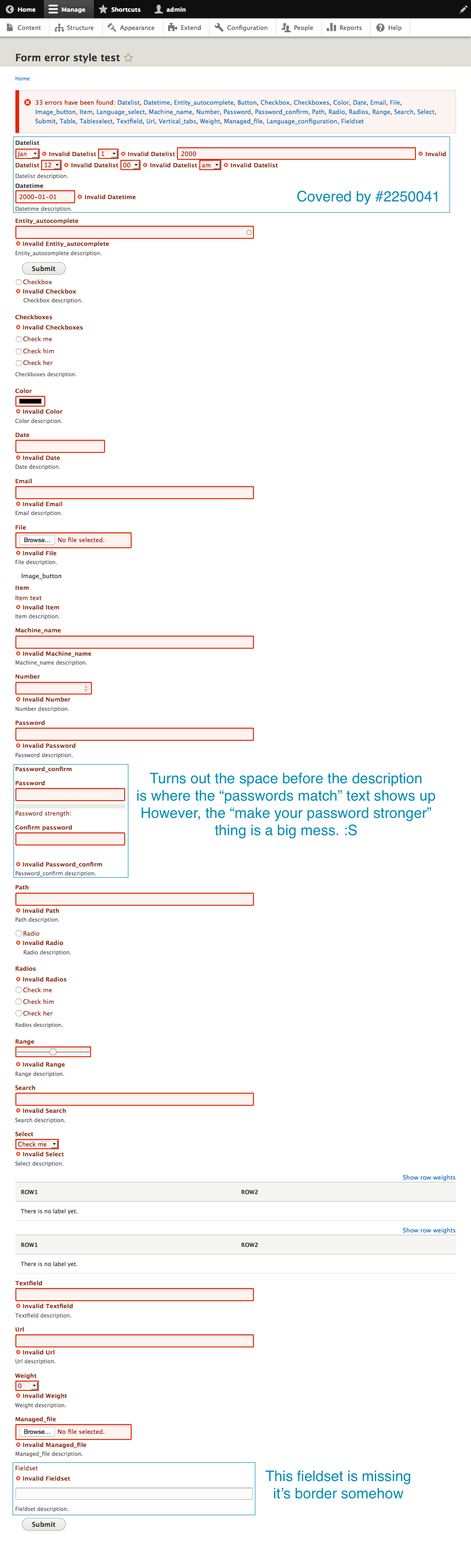
I wrote up a follow-up issue #2250041: No link provided in the header error to the "Limit must be a number." problem.
1) I'm not sure if I'm going to have the chance write up the Change record for a bit, so hoping someone else takes it on.
2) It is more semantic the way it is now and would be more useful for assistive technology than just styled CSS.
So do we need to wait for the Change record before marking this RTBC?
Comment #207
mgiffordJust a re-roll.
Comment #209
mgiffordComment #210
mgiffordComment #211
yesct commentedI dont think this needs a change record. (I guess a committer will correct us if it does.) @andypost though it might in #200 1. but that doesn't seem like change record kind of change...
I'm going to reroll this now.
Comment #212
yesct commentedconflicts were from #2209977: Move form validation logic out of FormBuilder into a new class
I did just a straight reroll, redid the same changes where the code had moved to, but had phpunit seg fault.
@tim.plunkett helped me find that issue added tests which used drupalSetMessage(), which this issue removes.
The interdiff is the changes tim found compared to my seg faulting reroll.
[edit]
upgrading my version of php got rid of the seg fault. maybe related to #2246775: Suggest 5.4.11 as minimum PHP version for Windows and MacOS if XCache is enabled
Comment #214
mgiffordAs per #200, now setting this to RTBC.
Follow-up issue [##2250041]
in #211 YesCT suggested a change record isn't needed.
I argued to keep STRONG in #205.
So hopefully this is good to go!
Thanks @YesCT & @tim.plunkett for the recent work on the re-roll.
Comment #216
tim.plunkettRandom fail from when HEAD was broken (Drupal\simpletest\Tests\InstallationProfileModuleTestsTest)
Comment #219
tim.plunkettRetest was green.
Comment #220
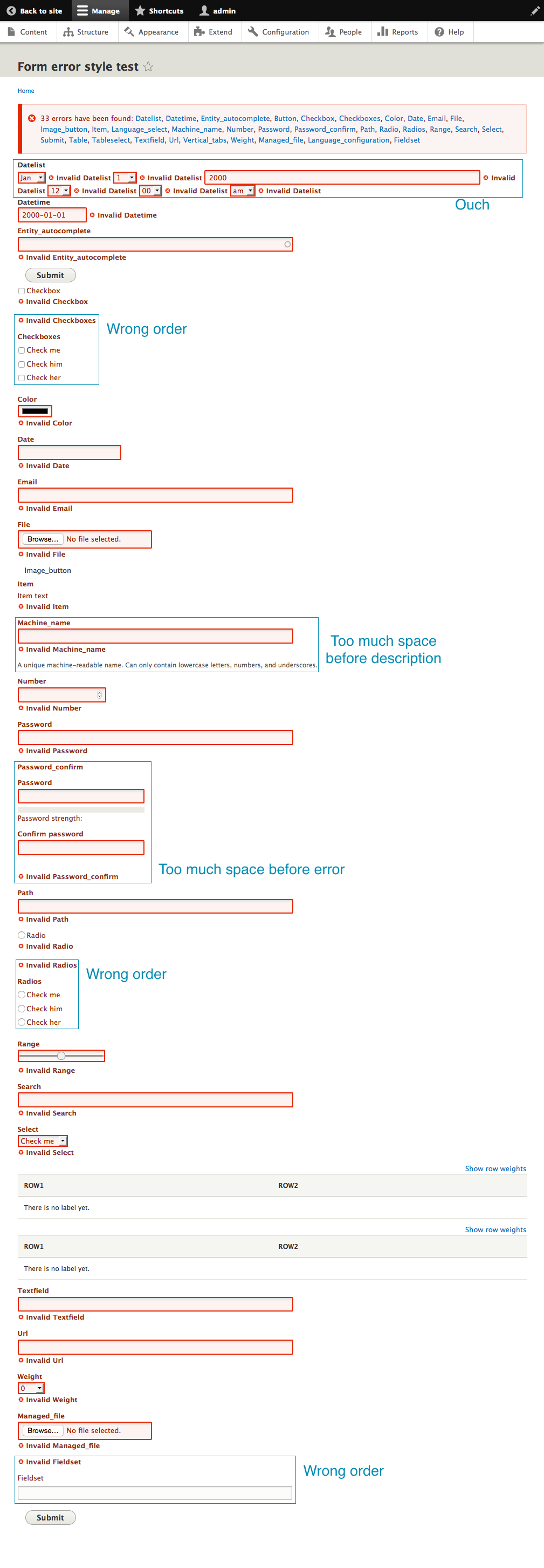
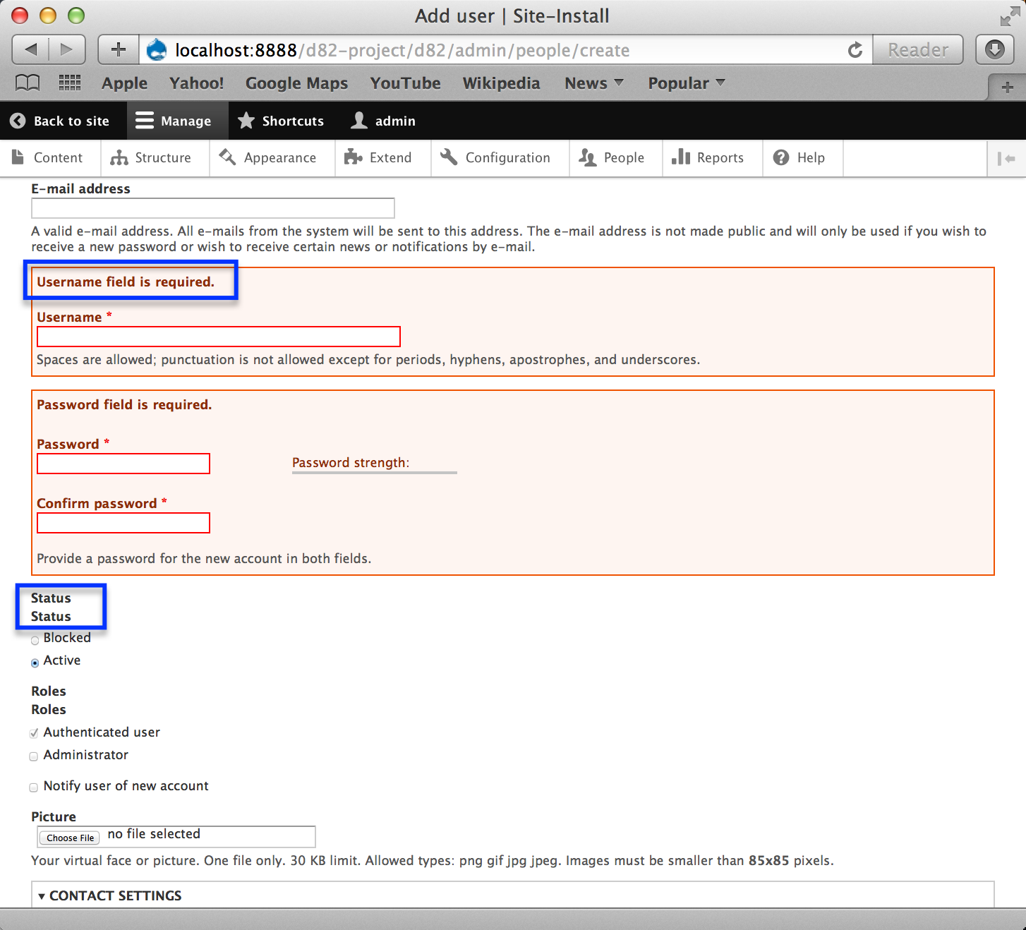
mrjmd commentedI did a round of testing on this and discussed it with YesCT, marking it back to Needs Work because of duplicate labels showing up:
When I first applied the patch from #212 to a fresh clone of HEAD, I didn't notice any change in behavior at all:
I tried a few different things, and finally was able to reproduce the expected behavior:
In the screenshots above I was using Firefox. In Firefox and Chrome, unless I filled in all required fields before submitting the form, I was getting behavior like the first image above. If I filled in the required fields but caused some other validation error, I would get the expected behavior.
In Safari this seems to work as expected, BUT there seems to be an issue of duplicate labels appearing.
Comment #222
bleen commentedThis is due to browser-based HTML5 validation. You can turn this off for testing purposes: http://novalidate.com/
The double-label issue is still a thing (I'm assuming, I have not confirmed)
Comment #223
mgiffordI just confirmed the double label (and description actually).
It occurs in every instance where radios & checkboxes are from what I can see. Doesn't require an error message either.
admin/config/development/logging
/admin/structure/block (block configuration modal)
admin/structure/types/manage/article/fields/node.article.comment
/admin/structure/comments/manage/node__comment/fields/comment.node__comment.comment_body
It doesn't happen without the patch.
Comment #224
tim.plunkettCan you test it without the patch? Is this a new regression in HEAD itself? I don't know where this patch could be causing that.
Comment #225
yesct commentedre #224
there is a before screenshot of head in the issue summary in the UI changes section, check near "Screenshot before applying #212 patch"
with the patch, there is both:
missing label on fields with the inline errors
and
duplicate labels elsewhere
the missing labels can be seen on earlier screenshots, for example in #197, but.. that was not embedded in the comment, so not as many people probably saw it.
[EDIT: oh! the labels are not missing, it's just that the errors are not after/inline with the label as in the proposal screenshot in the issue summary (which is from comment #1).]
for clarity:
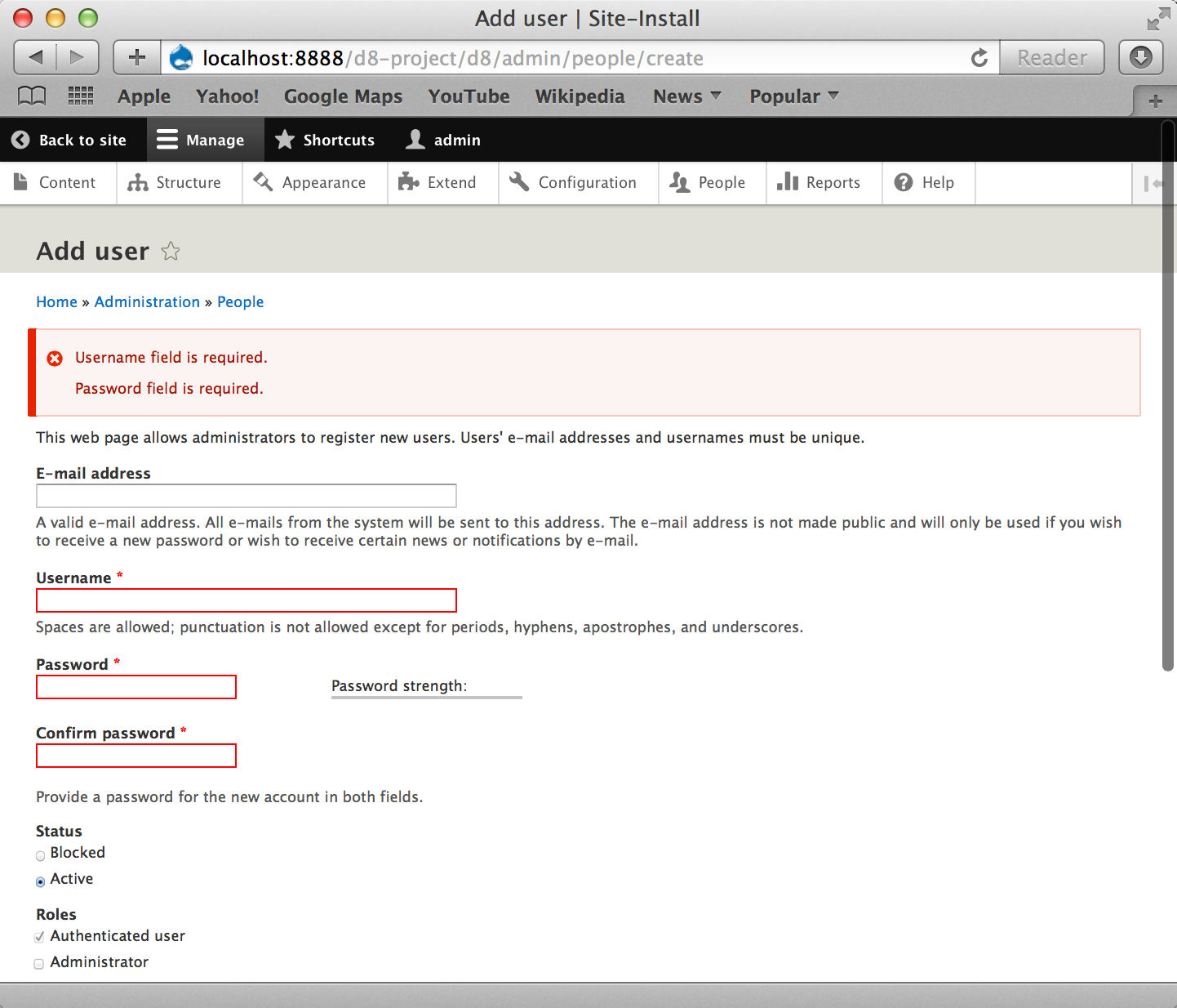
head without patch
with patch from #212

Comment #226
mgiffordComment #227
mgiffordI tried it again with git reset --hard, git pull and rm'ing the two added files in the patch. Still got the same results.
This is another screenshot after clearing the caches several times.
Comment #228
mrjmd commentedPoked around some more, it appears to be this line in the patch that's been added to core/includes/form.inc that is causing the issue:
Manually removing it got rid of double titles and descriptions for me. Is this code needed for other reasons? Should I reroll a patch without it?
Comment #229
mgifford@mrjmd that fixes it for me! I had to look back at that code to see how long it was in this patch.. Looks like it was introduced in #164. Let me go re-roll it without that.
Comment #230
mgiffordHere's the reroll & interdiff.
Comment #232
tim.plunkettI didn't add that for fun. It was to work around the breakage sun caused in his other issue.
See #165.
I have no idea how to proceed here, he gutted radios/checkboxes too much.
Comment #233
mgiffordI didn't suggest that you did it for fun or out negligence. All I did is work to quickly identify where it was introduced. Nobody questions that you know Core well, care about Drupal and write anything but solid patches.
I don't know who gutted the radios/checkboxes. I'm assuming it's @sun from your link.
He suggests to "There's quite some duplication of logic going on between theme_fieldset and theme|template_preprocess_form_element in the meantime, and it would probably make sense to move all of that into a shared helper function.", but don't think there's a new issue for that.
In my reading of #165 there's no suggestion of how to deal with errors, just a clear and logical argument for why a wrapper isn't needed. This sadly seems to leave us with no means to provide inline errors for radios & checkboxes.
Maybe we can separate radios/checkboxes from this issue. Commit this issue with the vast majority of input types. It's not ideal, but it will be serious progress.
Comment #234
yesct commentedWell, we cant have the double field Iabels,
and I think we should have inline errors for all elements.
(I do not think we should put radios and checkboxes in in a separate issue.)
Seems like this issue is blocked on fixing something. I'm not sure what that something is, but I took a guess. The problem should be clarified by someone who understands this better... #2275373: Add function for shared logic between fieldset and form element Marking postponed on that.
Comment #235
webchickAgreed... while I'm certainly sensitive to all of the work that's gone into this, and the later patches are looking great, we really can't commit a partial fix here, IMO. "Doubling up" checkboxes/radios labels *or* having randomly (to users) inconsistent error handling on forms both leave Drupal 8 in a non-shippable state. We can't horse-trade a major bug (even a 2+ year old one) for a critical one, IMO.
I'm not necessarily averse to revisiting old decisions on radio/checkbox markup to unblock this, but I'm confused by the cryptic comment at #232. I believe it's in reference to #2192419: Use a WCAG-compliant fieldset (fieldgroup) for #type radios/checkboxes but the issue it was requested to postpone that one on is #2152209: Convert theme_fieldset() to Twig which has been in 8.x for months.
Comment #236
tim.plunkettIn #2192419-18: Use a WCAG-compliant fieldset (fieldgroup) for #type radios/checkboxes I asked for that issue to be rolled back, as it caused this current problem
After that, it was identified as having caused #2236789: Styling of inline radios broken: inappropriate trailing colons (breaks EditorImageDialog), itself a major bug.
It was never explained how #2152209: Convert theme_fieldset() to Twig would help alleviate either of these problems, and it clearly hasn't.
Basically, the radios/checkbox issue made those elements NOT form elements, and instead manually prepends the label and description. This issue tried to turn them back into form elements, since the error handling is for *form elements*.
But now they are getting the standard label handling from being a form element, as well as manually handling for the labels.
I don't know how to fix this without reverting that other issue.
Reverting that would also immediately fix the double colon bug.
Comment #237
webchickThat issue doesn't cleanly roll back right now, unfortunately (and not just because of PSR-4). But in reading the patch in #9 in that issue, I don't see where radios/checkboxes are special cased. Tried grepping for "radios" "checkboxes" "options" etc.
Comment #238
tim.plunkettThe changes are in form_pre_render_conditional_form_element, which is assigned to radios and checkboxes in system_element_info()
Then, in fieldset, handling was added for the title:
So radios and checkboxes are no longer form elements, they are just wrapped by a fieldgroup with explicit title/description handling.
This issue tried to make them form elements again, but can't revert the fieldgroup changes.
Comment #239
mgiffordIs there no way around this? It's really discouraging that we can't seem to find a solution to this.
Seems we're at an impasse here between @tim.plunkett & @sun
It's postponed based on #2275373: Add function for shared logic between fieldset and form element but there's been no progress on this.
@webchick - do you have any insights here? Is there any other way to address this? This is a long issue, and this thread is the summary of a long issue.
This is actually an important accessibility problem that it seemed we were very close to fixing.
Comment #240
tim.plunkettIt depends, do you consider checkboxes and radios to be form elements?
There are two ways around this.
Either we pretend checkboxes and radios are NOT form elements, and add a workaround to get this in.
Or @sun can undo the API changes he made to the checkboxes and radios elements, and this will Just Work™.
Comment #241
tim.plunkettReroll of #212.
I guess we'd also need tests to catch any double labels?
Comment #243
rooby commentedAlthough I'm not fully across the related issues in this situation, technically speaking they are not form elements.
Checkbox and radio are but checkboxes and radios are not.
It's only from the end user's point of view that a group of individual checkbox/radio elements is a single field.
Comment #244
tim.plunkettSo, they should also not receive form errors?
Comment #245
joelpittetCheckboxes and radios (the group) need form validation errors.
Pretty Example: http://bootstrapvalidator.com/examples/icheck/
Comment #246
tim.plunkettThat was a rhetorical question. Of course they need form validation errors.
It will be a real shame if this gets bumped to D9.
Comment #247
joelpittetRhetorically answered in support:P
If it's a rollback that's needed lets do that.
Comment #251
mgiffordRadios & Checkboxes look good - http://sc72d4e211e4c3c3.s3.simplytest.me/user/1/edit?destination=admin/p...
No duplication like seen in #225
Putting spaces in the default front page gives me this error - http://sc72d4e211e4c3c3.s3.simplytest.me/admin/config/system/site-inform...
Fatal error: Call to undefined function l() in /home/sc72d4e211e4c3c3/www/core/includes/form.inc on line 481
Same error when requesting a new password:
http://sc72d4e211e4c3c3.s3.simplytest.me/user/password
May be unrelated, but looks like it's tied to
$error_links[] = l($title, '', ['fragment' => 'edit-' . str_replace('_', '-', $key), 'external' => TRUE]);Works great here:
http://sc72d4e211e4c3c3.s3.simplytest.me/admin/structure/types/manage/ar...
Image uploads works well:
http://sc72d4e211e4c3c3.s3.simplytest.me/admin/structure/types/manage/ar...
Comment #253
tim.plunkettYes, l() has been removed. Should be
\Drupal::l($title, Url::fromRoute('<none>', [], ['fragment' => 'edit-' . str_replace('_', '-', $key), 'external' => TRUE]));Comment #254
BarisW commentedChanged the l() calls.
Comment #255
mgiffordThink the second one should be:
Comment #256
BarisW commentedAh, sure. You are totally right. It has been a long day ;) Thanks!
Comment #257
mgiffordBeen the most productive day in the d.o issue queue I can remember for a very, very long time!
Comment #265
rpayanmrerolling...
Comment #267
tim.plunkettThis issue is still very upsetting to me. What a shame if this doesn't get resolved.
Forgot the interdiff, but it was just this:
Comment #270
rpayanm@tim.plunkett thank you, my bad :)
Comment #272
crasx commentedWhen I tested this locally I found format_plural no longer exists. - https://www.drupal.org/node/2173787
I'm going to update the patch
Comment #273
crasx commentedRan 270 locally and got a ton of fails (like 150) only running Drupal\system\Tests\Form\ValidationTest.
changed format_plural to \Drupal::translation()->formatPlural
With this patch I now get 8 fails only running Drupal\system\Tests\Form\ValidationTest
I will work on the 8 errors today
Comment #275
rootworkcrasx go ahead and assign it to yourself if you're actively working on it. (Just don't forget to unassign it when you're done so others know they can work on it too.)
Comment #276
crasx commentedThanks, will do
Comment #277
crasx commentedI'm done for the day, here's some intermediate work to fix a couple of the fails. Will work more on this tomorrow
Comment #278
crasx commentedHere is an updated version of the foo module for the latest drupal 8. You can access the test form at admin/foo
Comment #279
crasx commentedMade some progress on this, but I don't think I did it right. I ended up wrapping the fieldset in a div. Will this introduce other issues? Is it not done the a11y way?
[edit]
oops, shouldn't have named it .diff
Comment #283
crasx commentedThe fail in the last test comes from an issue in the Shortcuts module. For now I updated the failing test to check for the right error message, and created an issue #2409885: Switch shortcut set form has accessibility issues.
Comment #285
crasx commentedadded screenshot
[edit]
to get these screenshots I had to use the inspector in chrome to remove the required field
Comment #286
crasx commentedThis is why I put a div around the fieldset, compare radios field to checkboxes field.
The radios label has a line through it because it is a fieldset, and the error should be above the label for consistency
Comment #287
crasx commentedupdating screenshots
Comment #288
crasx commentedFix twig formatting
Comment #290
yesct commentedadjusting the whitespace in the twig template for whitespace standards based (thanks davidhernandez for your help in irc)
Comment #291
tim.plunkettWhat's with the '@'.$key thing? I read the comments since my last patch and found no explanation.
If we need to keep this, please put spaces around concatenation.
Comment #293
davidhernandezAdding back the fix for the shortcut test that was originally added in #283 and adding the spaces for #290.
It would be nice to find a way to get the message into the fieldset without using the wrapper div, but I didn't try it, so not passing judgement.
Comment #294
davidhernandezSorry, meant #291 not #290.
Comment #295
crasx commentedThe @ in the first array is not nessecairy, I added it to make it clear that the index in error_titles is paired with the index in error_links. The @ is required in error_titles for String::format.
Thanks for fixing the spacing. I was thinking last night it may be possible to do it without the div. You would need to find a way to get the label within the fieldset to not appear at the top. I tried it this morning but couldn't figure out how.
Comment #296
davidhernandez@crasx, what you are seeing is how the browser renders the legend/label of a fieldset by default. (with the line through it). I think to remove the wrapper div you'll have to absolutely position the legend to get it to go below the error text.
Comment #297
mgiffordI went through a bunch of the problems in #195. This definitely needs manual testing as it's an important.
No problems with the duplicate labels here admin/people/create

We are still using "Error message 3 errors have been found: Default front page, Default 403 (access denied) page, Default 404 (not found) page" rather than with proper punctuation "Error message 3 errors have been found: Default front page, Default 403 (access denied) page, and Default 404 (not found) page." (we're missing the "and" and "." when there are a series of errors - admin/config/system/site-information)
I'm getting duplicates here though with images:

Both when the filetype isn't approved or if the image doesn't meet the minimum file size.
Seems way closer than we have been in a long time though. Been a really great community effort.
Comment #298
skaughti know managed_file has it's own ajax response for messages (normally triggered after adding a file to the field, and hitting 'upload'..this behaviour will probably need to be changed globally.
Comment #299
davidhernandezI reworked the fieldset template to avoid the 'if's and wrapper. Also, moved the css class from preprocess to the templates.
Re: #297, I'm not getting the duplicate errors on an image. Maybe that needs specific conditions? I'm not sure how to address creating an English list, with 'and' in it, in a way that is translatable.
When I get multiple errors that are not for fieldsets I see them separated. That's not unusual, but if that is the case shouldn't error text be more specific? Does it look weird to anyone else? See attached image.
Comment #300
Bojhan commentedI am really not sure what to review here. If I look at #286, I am pretty worried. Over 10 months ago I already mentioned that the fieldset around everything is pretty erratic. Just the red form should be enough.
@David This does not look weird.
Comment #301
aspilicious commentedI agree with Bojhan that the giant red squares are not pretty at all...
Comment #302
aspilicious commentedBut looking at the screenshots I think we need a wrapper to display the message. Can we improve the styling so that it matches the styleguide a bit more.
Comment #303
joelpittet@david would format_plural do the trick if the count is the error list length?
sorry that is a d7 function but I'm on a phone I think it's \String::formatPlural() now if I remember right.
Comment #304
davidhernandez@Bojhan, is the issue just the red box? I'm late to this issue, so I don't know consensus for adding it. Just skimming the issue, it seems to have been there for a while.
@Joel, this is the line. It is already running through formatPlural. I believe it only supports two options, but we might need three.
1 error has been found: foo.
2 errors have been found: foo and bar.
# errors have been found: foo, bar, ..., and baz.
And since the error list is simply attached to the end, I'm not sure how to work in the 'and' so it gets translated. Translate it by itself? That seems like overkill. If anyone knows someplace else in core that prints lists like this I can copy it.
Comment #305
joelpittetHmmm, initial thoughts are:
becomes
Comment #306
davidhernandezThanks, Joel. I think you left out the last bit, but I see where you're going. That seems workable, but might have to forgo the serial comma, which goes against the style guide. I'd have to play with it (unless someone else wants to!)
Comment #307
joelpittetThere is a style guide for words in drupal? I blame Oxford and U of Chicago for this! Strunk and White FTW
Comment #308
joelpittetIf you want that serial comma, this is a variation. http://stackoverflow.com/a/18476638/80281
Oh yeah I forgot the 'and' bit:)
Keep in mind with those !vars that we have a PITA in core of recent that expects all passthrough variables to be marked safe. I kinda hope that gets reverted... #2399037-24: String::format() marks a resulting string as safe even when passed an unsafe passthrough argument
Comment #309
tstoecklerThere's not really a standard for this. Elsewhere we just leave it at all commas. That doesn't mean we shouldn't pursue the current approach further but if we do we should get a sign off from @Gábor Hojtsy in terms of translatability.
Comment #310
davidhernandezAdded code for the message text. It is functioning for me under the three conditions I mentioned in #304 and includes the serial comma. I also fixed CSS mistakes I had in the previous patch. Not sure how that happened.
Comment #312
davidhernandezThe test was not expecting the new sentence structure. Also fixed a errant space.
Comment #313
yesct commentedI think we should just leave it a comma separated list and not worry about the last ", and".
@tstoeckler can we link to an example in core that is just comma separated without the last and?
Seems like that would be a separate issue.
Comment #314
yesct commented@aspilicious #301 #302
I'm not sure if you are talking about the english ", and" style (https://www.drupal.org/style-guide/content#english), or the red error style.
If it is the red error style... We should add a link to the style guide you are referring to to the issue summary, can someone do that?
Comment #315
gábor hojtsyRight, we don't do ", , and " magic elsewhere. If we need to do it here for some reason, then we can make something like the following happen:
t('@errors and @last_error' ....);where you remove the last item from the list to display separately. Languages that do not have this construct can add a comma in place of ' and ' in this string and get the same. However that would require a high level of attention from the translator to figure out.Why do we need this here even though we don't use it elsewhere?
Comment #316
gábor hojtsyYesCT asked for examples of commas. A quick grep on code we use to tell admins when .info files are invalid or dependent modules or themes are missing:
Comment #317
yesct commentedThanks! #2419461: Use ", and" before the last item in a list of things programatically created for UI facing text in case we need to further discuss (I dont think so) or document that particular thing.
Here,
@davidhernandez
can you undo the bit you added to make ", and" ?
Comment #318
davidhernandezI think this is the point to emphasize, which probably explains why we aren't doing this elsewhere in core.
I removed the aforementioned code. A reverted the previous commit from my local, so the test changes is gone, but isn't in the interdiff.
Comment #319
tstoecklerI wasn't very happy with the additional
String::format()for generating thedrupal_set_message()so I revised that. I also improves translatability because it does away with the string concatenation.I also found that the red error background for form elements does not quite match the red background for messages which looks slightly weird:

Re @Bojhan in #300: Looking back to your #188 the current style looks fairly similar. Can you be more specific in what needs to be done here?
Comment #321
tstoecklerYay, for test coverage!
Comment #322
tim.plunkettThe changes in #319 and #321 resolve my last hesitation about this patch. Thanks @davidhernandez and @tstoeckler so much for working on this.
I think we still need tests for the double label bug from before?
Comment #323
skaught#299 @davidhernandez -- '& lists' issue: https://www.drupal.org/node/2242631
Comment #324
mgiffordReally great progress on this issue over the last two weeks.
Would be good to have more manual testing done on this.
This isn't a big deal, but the password example in #319 the "Password" link is looking for the "edit-pass" anchor and not "edit-pass-pass1". Not sure if there is an easy way to deal with this type of form.
The pages here look good now admin/config/system/site-information
@tim.plunkett - Any chance we could move double label bug testing out to a follow-up issue?
Probably not as I just found another one here - admin/config/people/accounts/fields/user.user.user_picture?bundle=user
Comment #325
RavindraSingh commented@mgifford , I didn't see this error on accounts/fields/user.user.user_picture?bundle=user page. When I upload the wrong extension file it throws the error on and on trying again incorrect file it just replace the previous error. Can you please pull the 8.0.x first then test it out.
Please see the screenshot.

If you are still getting the same error. please detailed out the steps to reproduce with specific browser.
Comment #326
tim.plunkett@tim.plunkett - Any chance we could move double label bug testing out to a follow-up issue?I don't see why we should punt test coverage for a bug we've already discovered.
Comment #327
mgiffordInteresting... I repeated the bug.
Those links should work if you're viewing it in the next 24 minutes.
Comment #328
davidhernandezJust commenting to say I can confirm what mgifford is seeing. I'm only seeing it happen on the settings for an Image field (the default image part.) I haven't tracked it down yet. Not sure if it's ajax causing it.
Comment #329
davidhernandezI tracked this down to the prefix (the one with id containing ajax-wrapper) being added twice. It is being wrapped around the form item and the input. I also realized this is happening in head and isn't caused by this issue. Can someone confirm? If so, I'm fine with calling it out of scope and fixing it in another issue.
Comment #330
davidhernandezCopying the changes to Classy theme now that those System templates have been copied over.
Comment #333
tim.plunkettFixing the phpunit coding standards.
Comment #334
star-szrAlways happy to see this moving :)
I can confirm what @davidhernandez mentioned in #329, the duplicate error reported in #324 happens on HEAD as well, so that should be a separate issue.
Below is the only thing I could spot out of place after a quick code review. The patch seems to make a lot of sense.
Minor: extra space after
=I can also confirm @mgifford's report from #324 where in this error
2 errors have been found: Username, Password(scenario from the issue summary), "Password" links to#edit-pass, but that element doesn't exist.Comment #335
davidhernandezI removed the extra space. I added a hack to get the #edit-pass link to work. The problem is the password confirm field is a bit of an oddball. It's not a fieldset, or a true field group, but contains multiple inputs. We just need to get the id there. An alternative is to change the link to point to the first child, but that started looking more complicated.
Comment #338
mgiffordWhat happened to core/themes/classy/templates/system/fieldset.html.twig?
Comment #339
davidhernandezClassy's subfolders were just reorganized. We neglected to add a change record to that issue, which I just added. The system folder is gone, and fieldset moved to the form folder.
#2349559: [meta] Discuss the organization of subfolders in Classy
Comment #340
njbarrett commentedRerolled on 8.0.x
Comment #341
mgiffordI added a follow-up issue about the duplicate here #2448967: Duplicate labels in admin/people/create
Tested these pages:
/admin/config/people/accounts/fields/user.user.field_link
/admin/config/people/accounts/fields/user.user.user_picture
/user/1/edit
/admin/config/system/site-information
/admin/config/system/actions/configure/user_add_role_action.administrator
/admin/config/media/file-system
/admin/config/regional/translate
/admin/appearance/settings/bartik
Errors only where expected (other than the main page at the moment due to another issue).
EDIT: This is looking great!
Comment #342
davidhernandezI'm misunderstanding that. Are you saying you only got the errors you expected?
Comment #343
mgiffordIt worked properly. I was testing for errors, and they appeared as I expected. No problems thus far. Would still like more manual testing though.
Comment #344
mrjmd commentedI've done a pretty thorough review, overall this is working great! As far as the code itself, I have only one minor coding standards gripe as an extra blank line has been inserted here:
As for a functional review, a couple of things I ran into (screenshots attached):
The only one of these I'd call a real issue is the login form issue.
Screenshot of login error
Screenshot of login error after logging in
Screenshot of user add, clicking password link doesn't highlight
Comment #345
mrjmd commentedComment #346
vijaycs85Looks like template_preprocess_form is getting called too far after the status message rendered as the form is inside a block which is inside a render region etc. We might need to set the error message more close to to form_state to get it rendered before message get rendered. Moving the drupal_set_message calculation to formState.
Comment #348
vijaycs85Ignore #346 for now. We need to move the error code bit higher than preprocess, but @tim.plunkett advised to write the test that fails the patch in #340 as explained in #344. Here is a test.
Comment #350
tim.plunkettWorking on this now.
Comment #351
vijaycs85@tim.plunkett: FYI, Spent couple of hours on the failure when moving the setFormErrors() to FormValidator (https://www.drupal.org/node/1970534#comment-9702939). The only problem is l() function not available in unit test (because of no container). If we can fix it, it would work? I don't see any other place to set drupal_set_message before any render start.
Comment #352
tim.plunkettIMO the answer is to add a new collaborator, not to complicate FormValidator.
Now if you want to completely change how errors are handled, you can override that without interfering with accidentally breaking validation.
This has a couple @todos for needed docs, but I wanted to post the patch first.
Comment #354
tim.plunkettComment #355
tim.plunkettOkay, this needs manual testing, but I think this is in a good place.
Comment #356
mrjmd commentedI did another round of testing on this... it seems to be working great!
My second and third bullet points from #344 still exist but are likely not in scope of this issue.
I will leave it in "Needs Review" to get more eyes on it, but I could not find any reason not to RTBC.
Comment #357
davidhernandezThe third item in #344 I agree sounds like the toolbar. The second one though we should probably try to fix. It sounds like what I was trying to fix in #335. @mrjmd can you check what it produces for the anchor link, and see if the password wrapper is getting the corresponding id added to it?
Comment #358
vijaycs85Thanks @tim.plunkett. Just grabbed all @FormElement to see how they look with error. Except those never get any error (like, of type value, token, hidden), Most of them looking good. Looks like datelist and datetime need some UX love.
Just created a dummy github issue to attach screenshots instead of hammering this issue with another 10 images. https://github.com/vijaycs85/styleguide/issues/1
Comment #359
vijaycs85#357: #344.2 - yeah, it's trying to link #edit-pass which is a wrapper
Comment #360
tim.plunkettHow does datelist/datetime look in HEAD? That seems like a valid follow-up.
Comment #361
vijaycs85It looks fine in HEAD as there is no inline error. Added a follow up #2450703: Fix inline form error styling issues for datelist and datetime elements
Comment #362
davidhernandezThe #edit-pass anchor link is working for me.
One thing I noticed, if I enter a bad 'current password' but a good 'password' and 'confirm password' both report errors. I don/t know if it should work that way. If it should, we should make sure the password grouping is working right. The two fields each get an 'error' css class added, but it does not get an error message and the wrapper does not get styled.
Comment #363
vijaycs85This is the current behaviour as well. When try to change password with invalid current password, the password & confirm password fields are set as 'error' without any message. I guess, this is to tell the user that they need to re-enter the new password again.
So this is a generic case for inline message. If a field is set to be error without any message, it will get listed in the top message, gets error class, but no inline error.
Comment #364
vijaycs85Comment #365
davidhernandezThe current functionality though doesn't indicate two errors, as this patch does. There is only the one message. I think it is odd/confusing to show the password fields as erred, but without a message or additional highlighting.
In any case, it would seem to be a consequence of how things currently work, so I'm ok calling it out of scope to move this along.
Comment #366
crasx commentedreroll, no conflicts
Comment #367
crasx commentedadded follow up for #362 - #2455933: Error highlighting and reporting problems for the current password on the user profile form
Comment #368
bladwin commentedAt MidCamp Sprint today (3/22/15) - reading from #344 down to #367. Will add any remaining follow up issues as they arise.
Comment #369
rteijeiro commentedThe code looks fine to me. Just fixed a couple of nitpicks in comments.
Comment #370
bladwin commentedThe functionality looks good - this issue has come a long way over many many many (almost too many) comments so instead of polluting this queue with another request, I created #2457373: Inline form error links should bring form element title, form element and the error in view.. Otherwise, marking this RTBC!
Comment #371
bladwin commented... forgot the status update ...
Comment #372
Bojhan commentedSigh.
Looking at #362. This still looks horrible. There should not be red form elements with red bounding boxes. As noted in #186.
You can only mark this RTBC with thorough visual review, we need to go past a whole bunch of errors and evaluate whether it still looks and feels usable. Because at large this change is making it less usable, because of all the visual distortion it adds. Our forms are not designed for near errors, and it shows.
Comment #373
tim.plunkettProvide actionable feedback, please.
Otherwise you might as well close this issue.
Comment #374
nod_I think he's referring to the styleguide, there is an inline form error style, and I believe the icon is an important piece of it.
As for the password thing, there is an issue to get rid of the separate fields but it looks like it won't make it to D8 #2293803: Replace confirm password element with a new element that allows toggling to view the typed password.
Comment #375
yesct commentedI updated the remaining tasks.
Here is what the style guide [edit: added link] from https://groups.drupal.org/node/283223#Text_fields shows.
Comment #376
Bojhan commented@tim.plunkett "There should not be red form elements with red bounding boxes" -> #186
I am not sure if the style guide approach is achievable, it probably doesn't work with descriptions?
Comment #377
tim.plunkettI don't know who wrote the markup or the CSS for this issue. I am only responsible for the changes to the Form API that allow it to function at all.
So I leave it to someone else to tweak the styling.
Comment #378
mparker17I'll see what I can do
Comment #379
mparker17I've added some styles for Seven that make it look like the Seven styleguide. Quick screenshot and patch attached.
I'll have a screenshot of more form elements shortly: special thanks to @vijaycs85 for making an example form with All The Errors. :) Leaving as "Needs Work" until then.
I'd appreciate some direction for Bartik, Classy, and Stark: AFAIK none of these have styleguides so I don't know what inline errors should look like. Should they all look like Seven? Should we keep the current styles for Classy and Stark; but make Bartik look like Seven? Something else entirely?
I'm aware that the
url()in the new CSS is less than ideal. I'll fix that.Comment #380
mparker17Okay, here's a screenshot of errors next to all the controls in Seven, along with reminders to tell me what I need to fix:
Extra special thanks to @vijaycs85 for throwing together A demo module that spits out All The Errors at
/error-style/form.Comment #381
mparker17Okay, more progress. The checkbox / radiobutton groups and fieldsets look better, as do the descriptions.
Also, I discovered:
... so I'm leaving this assigned to me and "needs work".
Comment #382
mparker17I managed to fix the fieldsets, checkbox groups and radiobutton groups quite simply:
The Password Confirm widget is still a mess when you type into it though. Working on this with @nod_.
I did some cross-browser testing: looks good in Firefox, Chrome, Safari, and Opera. Haven't tested IE yet though.
Comment #383
bladwin commented[REMOVED]
Comment #384
mparker17This morning I reached out to @emma.maria, @JohnAlbin, and @mortendk to ask how inline form errors should work in Bartik, Stark, and Classy respectively. I'm about to reach out to @Bojhan too.
If this gets committed as-is, at the very least, we should:
float: left;)Comment #385
bladwin commentedComment #386
yesct commentedThanks for leaving this needs work.
I'm glad we are taking Bojhan's feedback seriously.
Reaching out to the theme maintainers is great... but some of them might not be super active. It might help to look at issues for those components and see if we can identify some more people that seem to be around a bunch in their issues.
Might be good to try that same massive form in a RTL language.
Comment #387
vijaycs85The module that has the form elements is at https://github.com/vijaycs85/errorstyle, if anyone want to try.
Comment #388
mortendk commentedso all class creation should be removed from the core templates & only used in classy
ex:
remove all that we dont want classes in our core templates unless its accessability classes or a js-fooo thats needed by javascript
Comment #389
emma.mariaI'm reading through all of this now and will post some feedback today.
Comment #390
mparker17Here's an updated patch.
As suggested by @nod_, the I've removed the
float: left;(and corresponding CSS,clear: left;, andfloat: right;for RTL languages).Also, since the password confirm widget is a group of fields, just like the checkboxes and radiobuttons form elements, I turned it into a fieldset, since that seemed logical and made errors on the element group look better.
Here's the screenshot:
I noticed that, for some reason, the error messages are now double-escaped. I assume this is due to a recent commit to core, but I don't know which one, or whether I need to change anything in this patch.
Remaining tasks:
... I've updated the issue summary with updated remaining tasks, steps to reproduce, and I reformatted the API changes section to be more readable.
Comment #391
yesct commentedpatch does not apply. I am rerolling this now.
Comment #392
yesct commented@mparker17 Thanks a ton.
Here is the reroll.
only conflict was with #2457887: Use Utility\SafeMarkup class instead of Utility\String for placeholder(), checkPlain(),format() functions in a context line.
just doing a reroll to make it apply, and then a patch and interdiff for the changes we need to make from that issue.
note, the comment in this hunk we are adding in FormErrorHandler:
mentions String/SafeMarkup::format() ... but the code sends it through formatPlural. Maybe we could improve the clarity of the comment a bit.
Comment #393
aspilicious commentedFor some reason people keep ignoring Bojhan, so I'll help him...
Can we ****please**** remove the red border on the outer fieldset.
Or find another why to make this *less* scary. The latest screenshots still look crappy.
Comment #396
emma.mariaI had a huge read through of everything.
Can we please have @lewisnyman and @Bojhan weigh in on the latest default admin theme styling please?
It looks like Bojhan hasn't seen the latest take on it and from the screenshots they do not look 100% ready (those harsh red borders are still there). I don't feel comfortable weighing in for Bartik based on the default admin theme that isn't ready yet.
I'm pinging @lewisnyman and @Bojhan in the morning.
Comment #397
mparker17Just had an epic but fruitful conversation with @emma.maria, @aspilicious, @YesCT, @lewisnyman, and others in IRC.
I've volunteered to update the issue summary based on this conversation.
Comment #398
mparker17Okay, I've made an attempt at overhauling the issue summary. Some notable changes:
Some progress updates:
There are also some things I was unable to complete, and need help:
Comment #399
mparker17Comment #400
yesct commentedVery nice update. Thank you.
I added these specifically to the remaining task list:
Comment #401
lewisnymanHere are the color values inline with the Seven styleguide implementation of error messages:
Comment #402
mparker17Updated issue summary as per #401: thanks @LewisNyman!
Comment #403
Bojhan commentedI want to review this, but it seems like some changes are yet to be implemented? The changes from Lewis for example.
Can we remove the styling on the boxes. We should only have per form errors, not per fieldgroup/fieldset. I know that for some strange reason we support that, but a individual theme can do that - Seven shouldn't? I think the consensus in https://groups.drupal.org/node/209513 can be overruled, that was from the age that we didn't have a style guide nor Uber was a thing :) - so like ages ago!
Comment #404
lewisnymanSorry I was in a rush before and accidentally read the colors wrong, I've updated the issue summary with:
background-color: #fcf4f2;,color: #a51b00andborder-color: #f9c9bf;. The canonical "error red" color referenced in the styleguide is#e62600and used for the icons and the big left border on the site messages and it looks like we are already using that for the error indicator.Comment #405
lewisnymanHere's my interpretation of the styling. The only styling that I think should go across all themes are the icons. Everything else is non-functional.
I also removed CSS that was trying to make fieldsets in Seven look good, that is not within the scope of this issue.
At some point we lost the error classes on labels and descriptions :( I don't think that we introduced that regression in this issue so we shouldn't be concerned with it.
Comment #406
davidhernandezLooking at the screenshot, the "invalid" message shows up below a single checkbox or radio, but above a group?
Comment #408
davidhernandezThe first test fail looks to be a mismatch in the count of disabled items. Not sure if something is wrong or if the count needs updating. I'm counting 42 in the source. The second one is caused by the error messages being escaped. We can see that in mparker17 and Lewis' screenshots.
Comment #409
tim.plunkettComment #410
joelpittet!passthroughonly works if the value passed in is safe too and the implode, unsafens it.Comment #412
joelpittetMade a couple of mistakes in the last patch, missing use statement for SafeMarkup and missed a {%
Another screenshot.

Comment #414
aspilicious commentedLooking much better. :)
For some reason I wonder if it would look better if the error message got printed after the description.
I got the feeling the connection between the description and the form element got lost.
I looked at the styleguide but there wasn't an error message with a description.
@Bojhan could you give some feedback?
Comment #415
tstoecklerI just looked into the
FormTestfailure and because we now render a<fieldset>around a password confirm field, which in itself gets a disabled attribute, there is an additional disabled element. So it's safe to simply change the assertion.Did that.
Comment #418
mparker17@Bojhan, seems like nobody has answered you yet...
AFAIK the colors still need to be changed. Moving back to "needs work", leaving myself assigned.
I don't think it makes sense for it to be possible for someone to throw errors on a fieldset by itself (e.g.: what happens at the bottom of the errorstyle form), but I do think that we need a way to style errors on compound-elements. Here are some examples of where being able to do so would make sense:
... maybe it would be worth researching what other sites / frameworks do in these cases.
I'd personally be fine overruling this if someone has a better idea.
Comment #419
lewisnymanI think that the current styling for fieldsets is fine. The error is already contained within the fieldset which visually groups it with the other fields. Bear in mind we would have a more meaningful error message in a real world usecase.
Let's see what the actionable items are from Bojhan's review first. I think the current colors are consistent with the current error implementation in Seven.
Comment #420
gábor hojtsy@vijaycs85 said this may need a translation related review. I only found some minor problems in tests. These would be nice to fix.
These technically should not be t()-ed like this. Use format plural as in the live code.
This does not reflect the use of format plural in the live code. Should use the same source strings, not concatenate it differently.
Comment #421
mparker17@LewisNyman, thanks for the helpful comments in #405!
@davidhernandez, regarding #406, yes, error messages show up below normal form controls but above groups. I made that change in #381 because:
@tim.plunkett, thanks for clarifying the form subsystem maintainers in #409! Where did you get that information from? I could not find a form subsystem in MAINTAINERS.txt when I looked at the time (it may have changed since then).
@joelpittet thanks for helping fix the test errors in #410 and #412!
@aspilicious, regarding #414, my only concern about putting error messages after the description is that would be less-ideal for someone using a screenreader. Hearing:
... helps me get my work done faster than ...
... especially if the description is long (see some of the descriptions on the controls on
/user/register, for example).@tstoeckler thanks for fixing the last test failure in #415.
@LewisNyman I agree with you in #419 that the error in the fieldset control (the one with a border at the bottom of the test error page) does group the error properly, both visually and when heard using a screenreader.
@Gábor Hojtsy, thanks for the code review in #420! I will address the problems you found shortly.
Comment #422
tim.plunkett@mparker17 We usually refer to all of these as "subsystems", but as you can see from MAINTAINERS.txt and the issue queue component, they're actually "systems".
http://cgit.drupalcode.org/drupal/tree/core/MAINTAINERS.txt#n103 has the maintainers, but Frando hasn't been involved in D8 at all and sun hasn't been around in almost a year.
Comment #423
mparker17@tim.plunkett, ah, okay, thanks!
@Gábor Hojtsy, I've attached a patch to address the issues you pointed out. Good catch! Not uploading a screenshot since the changes were only to automated tests.
I'm setting the issue back to Needs Review as-per #419.
Comment #425
tim.plunkettMissing \Drupal::translation()-> on those calls.
Comment #427
tim.plunkett...
Comment #428
yesct commentedneeds work still (see #418 about colors)
Comment #429
mparker17(sorry for the comment-editing spam, I wanted to make sure my comments / commits were properly attributed to one of my organizations, MallDatabase.com, when applicable).
Comment #430
lewisnymanFrom what I can see the current patch has colours which are consistent with the styleguide. See the screenshot in #412
Comment #431
lewisnymanI have created an issue to style Seven's fieldset elements: #2470137: Style Seven's fieldset elements
Comment #432
dmsmidtWorking on this issue @devdays.
Here is a re-roll (auto merge) which applies cleanly to the latest 8.0.x-dev.
(My interdiff is failing, so no interdiff)
Comment #433
mparker17Comment #434
mparker17Here are some before-and-after screenshots for UX review.
Comment #435
dmsmidtSo I identified some problems related to the error reporting.
Please help identifying the importance.
1) File field on node/add form


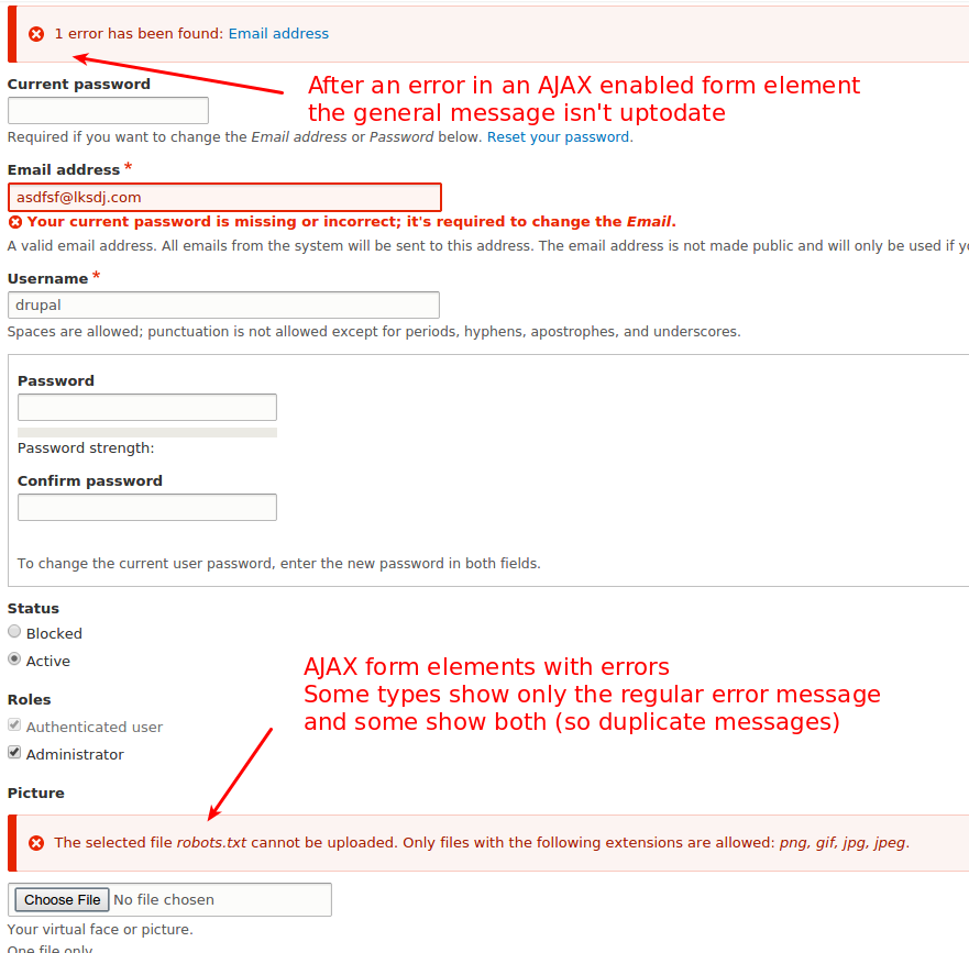

2) Link field (edit: separate issue)
3) Radio's / Checkboxes (edit: separate issue)
4) AJAX - Update message at the top of the page / reduce duplicates (edit: separate issues)
5) Fields with format selector (CKeditor)
Edit: Added numbering / Indication about what has to be fixed in another issue
Comment #436
mparker17My initial thoughts on #435 are:
robots.txtfile after the page was loaded, or did you select the file, not click the upload button, and try to submit the form? I've added this to the remaining tasks in the issue summary.@YesCT, I have also embedded the latest before and after screenshots at the bottom of the issue summary.
Comment #437
dmsmidtReply on #436 (See #435 for the screenshots)
.form-item input.error:focus, thus it's no browser issue. The checkbox/radio will become red after getting focus. Which looks really strange.Point 4, problems with AJAX fields
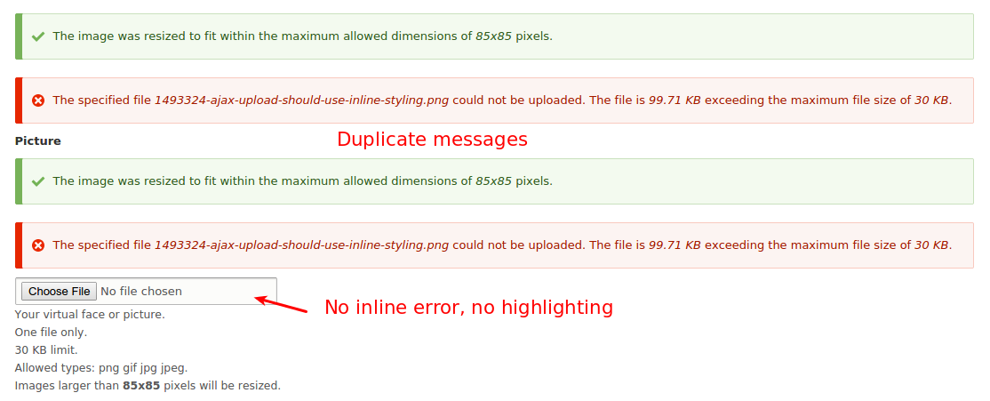

There are many things wrong or inconsistent with AJAX enabled fields. And in the first place with upload fields.
4a) As can be seen here (user edit form) after adding a file with a too high file size and dimensions.
(Edit: separate issue)Double messages is handled here: #2346893: Duplicate AJAX wrapper around a file field
But still, they should be inline errors right?
4b) Or a required field with unlimited items. Two messages with the same content are too much.
Edit: Added double messages issue link
Comment #438
dmsmidtComment #439
nod_For moving ajax error messages to the top, it would be possible to use the API proposed in the following patch: #77245: Provide a common API for displaying JavaScript messages to manage that with the Ajax API. Instead of adding the error message on top of the ajaxified field, it would add it at the top of the page.
Comment #440
dmsmidtAfter discussing with YesCT and LewisNyman we came up with the following todo overview for this issue.
Note: the orange comments are for this issue, the blue ones for other issues.
(Use my forked errorstyle module to create this view)
I will be updating the issue summary, previous comments and work on these issues right after this post for the rest of the week or until we have it in core. If I don't work on these issue's for some reason (like sleep) I'll leave it in a comment.
Comment #441
dmsmidtComment #442
dmsmidtGoing out for dinner, please post a message if someone starts working on things. Otherwise I will pick up work the first moment I can.
Comment #443
dmsmidtOk here is a change that fixes the issue with styling for text areas with format selections.
Furthermore I changed the border width of the red borders to one. This doesn't change the boxmodel, but it does make the error highlighting more inline with Sevens guide to use crisp lines.
Because we introduce inline errors there is already enough red per element.
I discussed this with @LewisNyman.
Comment #444
dmsmidtContinuing on the other issues. (And I'll fix some css coding standard things from the previous patch).
Comment #445
dmsmidtSo this patch, in addition to the previous, deals with the problem that not all errors on elements got links in the general error message on top.
I found out that the old test module by vijaycs85 didn't show all real case scenarios (although it is a really helpful module!).
I've forked the module and added extra scenario's and hid some less important ones. Use that for your testing and/or a normal node/add form please.
So the problem of links not showing up traces back to nested form elements. This caused almost all fields on node/add to to not throw errors as link (because the actual fields often have a child element called 'value' or 'upload') etc. In my forked test module I added scenarios with nested elements.
In my first attempt to fix the issue I tried to refactor
FormElementHelper::getElementByNameto get the right element.This worked for simple nested form elements but for fields with children like 'value' or 'upload' it became a mess.
The current approach flips the logic of 'showing errors' and 'setting the elements as having an error'.
Now a list is created from elements that really have errors. And this list is used to create error links. All left over errors are shown in the old fashioned way.
Also fields without a title and no children with titles didn't create a link, but hid the original error and added a comma in the links error list. In my additions to the patch I check if there is a title and otherwise fall back to the old error on top of the page. (All fields should in fact have titles, if a title doesn't need to be shown it can be made invisible with #title_display)
I also did some css cleanup from the previous patch.
A node add form screenies:
Before:

After:

Comment #446
dmsmidtI will be working on the last problem (managed field) tomorrow or this evening, if somebody else wants to do it in the mean time, please leave a message, so that we don't both work.
// Added extra related/child issue in the summary (needs real issue)
Comment #447
tim.plunkettI need to spend more time reviewing the changes to the form system in the last patch.
If getElementByName() is that broken, we should remove it (Ideally we'd fix it).
Additionally, if displayErrorMessages() was not functioning as expected, then the unit tests for it in FormErrorHandlerTest need to be updated.
Comment #449
tim.plunkett"All fields should in fact have titles"
Please see #933004: Test that all form elements have a #title for accessibility
That patch failed tests, as I expected.
Comment #450
dmsmidtThanks for the comment @timplunkett.
I could use some help tomorrow from people with form (api) and testing knowledge. As well as people who can help me create sub-issues. I'll be around the Frontend sprint room from 9:30 am French time and on IRC.
Updated the issue with some new tasks (tests, getElementTitle()) and added the related issue about always having titles.
(Started working on (re)writing tests).
Comment #451
dmsmidtOk, while rewriting and debugging tests I found the following issue that blocks the test "Tests switching a user's shortcut set without providing a new set name." (ShortcutSetsTest) from passing: #2409885: Switch shortcut set form has accessibility issues
Comment #452
dmsmidtThis patch improves the following points:
- Rework some of the failing tests due to the changes
- Improve code comments
- Flip order of methods displayErrorMessages() setElementErrorsFromFormState() to be consistent with order of execution
- Hide error links to elements with the property: #error_use_parent
- Check if the elements #name has been set in setElementErrorsFromFormState() (added @todo for exotic cases)
Discussion points:
- What to do with the label of the upload child element of managed fields, it adds a link with the text: choose file, instead of the field label in cases of errors.
- What to do with the cases that a form element has no #name set?
Note: added two interdiffs to make reviewing my overall changes to FormErrorHandler easier.
Comment #453
dmsmidtgo bot go
Comment #454
dmsmidtComment #455
tim.plunkettWhat I'd like to see (and in order to remove the "needs test" tag) is a reroll of #443 with new test coverage that fails, and then the changes since then also with that test coverage, passing. It's important to do that sooner rather than later, before #443 becomes out of date.
Comment #456
dmsmidtIgnore my last patch, woops.
Creating patch which will show that the previous functionality of formErrorHandler fails for nested items.
Comment #458
dmsmidtAs requested by @tim.plunkett.
The patch from #443 combined with updated tests to show that errors on children elements fail.
Edit: Needed rebase, see #463 for the rebased patch
Comment #460
dmsmidt-removed-
Comment #461
dmsmidt- Ignore this patch, outdated -
Comment #463
dmsmidtPatch from #443 rebased (automerge) + only the updated tests.
To confirm that nested elements with errors don't work as expected.
See interdiff on comment #458 to review the test changes.
Should fail in more than one test.
Comment #465
dmsmidtTo make reviewing changes easier, here is a clean patch including the changed tests and FormErrorHandler logic changes (from #433 and onwards) and a fresh interdiff (showing only the FormErrorHandler logic changes + some styling)
As expected only one test fails (for creating a new shortcut set). This has been fixed in another issue #2409885: Switch shortcut set form has accessibility issues.
Comment #467
dmsmidtSo it seems that this patch fixes all open problems.
I did an overall cleanup. In addition I also fixed the datetime and datelist inline errors.
Summary of changes:
- setElementErrorsFromFormState does not rely on
$element['#name']anymore- Updated the tests FormErrorHandlerTest & testSetElementErrorsFromFormState in accordance to the above
- Update testShortcutSetSwitchCreate test in preparation of #2409885: Switch shortcut set form has accessibility issues
- Fix inline error for required managed files field
- Fix datetime / datelist inline error messages
- Cleanup two twig templates (discussed with lewisnyman)
- Added new before / after screenshots.
Comment #468
emma.mariaThank you @dmsmidt for the huge amount of work you have put into this issue at Drupal Dev Days.
Comment #469
dmsmidtUpdate
Comment #470
yannickooThis is so great, thank you <3
Comment #471
aspilicious commentedThis looks waaaaaaay better! :D
The only odd thing is the difference in placing between a single and multiple checkboxes.
But that shouldn't stop this issue anymore!
THANK YOU ALL!
Comment #472
dmsmidt@aspilicious, Thanks! And by the way: the radio/checkbox styling is already in the list of child issues.
Comment #473
stefan.r commentedThis looks great! :)
Looks like we're covered for tests?
Comment #475
davidhernandezI confirmed the error for the shortcut test is fixed by #2409885: Switch shortcut set form has accessibility issues
The other fails are for the file field. The error summary shows up with two links,
2 errors have been found: Choose a file, [field name]. I assume that is incorrect?Comment #476
stefan.r commentedThis gets rid of the "Choose a file" error, only displaying an error on the parent element anymore :)
Comment #477
stefan.r commentedJust for reference and to check whether this is green now, this is patch 476 with the fix from #2409885: Switch shortcut set form has accessibility issues applied to it.
Comment #479
dmsmidtHi thanks for working on this! We both worked on it... :-(
Could you wait a bit? I found another bug I addressed in my patch (with image fields and title child field)
Uploading..
Comment #481
dmsmidtSo this is what I was saying when I noticed stefan.r's upload:
- Better element is visible test (including access check), needed for some child elements (images field with title #access=false)
- Fix: ManagedFile upload child element shouldn't have own error link
- Update FileFieldValidateTest to work with new ManagedFile upload inline error handling (correct label)
- Small code simplification
Comment #482
dmsmidtAaah bot you beat me! So quick now everyone is asleep.
Comment #484
dmsmidtIntegrate some of the changes of stefan.r.
Comment #485
dmsmidtPatch #484 including #2409885: Switch shortcut set form has accessibility issues to check if we are green.
Comment #486
joelpittetJust a bit of nitpick cleanup.
Edit: I am including it.
NotIncluding that patch from #2409885: Switch shortcut set form has accessibility issuesComment #488
marcvangendI'm manually testing the patch on real life use cases (not the error messages module). Something strange happens on the "configure site" form of the installer: after the patch the password fields are surrounded with a box.
before
screenshot
markup
after
screenshot
markup
Comment #489
dmsmidtThanks Marc, I'll have a look at it.
In this patch some fixes and cleanup for the twig files in system.
Is this acceptable? @mortendk
Comment #490
marcvangendI also found another error concerning error messages during the installation, but it seems that it's not caused by this patch. We will still need to test that scenario with this patch though. New issue at #2474039: Error messages during installation are not properly cleared.
Comment #492
joelpittet@dmsmidt Is this the issue for the password confirm related fieldset?
Comment #493
dmsmidtThis removes the fieldset, fixes the styling, and doesn't change how the password stuff works.
@nod_ has a related issue for this widget to make it more awesome.
@joelpittet, lol you beat me with the comment
Comment #495
tstoecklerSo with #493 #415 needs to be reverted as well. Basically the hunk from FormTest can be removed, that should bring us back to one failure.
Comment #496
davidhernandezChanging FormTest back, so we should be back to only one failure.
Comment #498
xanoWith regards to the screen shot in #493: I checked the reason behind the error appearing on the password elements if the current password is incorrect and this is caused by the
ProtectedUserFieldconstraint on the user password base field. You will notice that the email base field suffers from the same side-effects. I believe this is not a problem caused by the patches in this issue, nor is it something this issue should aim to solve. It is a minor bug that has been in core for a long time and this issue only puts it in the spotlights.Comment #499
davidhernandezAlex just committed #2409885: Switch shortcut set form has accessibility issues so that makes this green now?
Comment #502
joshtaylor commentedReroll.
Comment #503
joshtaylor commentedComment #505
dmsmidtNice it's green :-)
Added new after screenshot
Comment #506
dmsmidtAnother thing still needs work...
Links to errors in multivalue fields don't work.
Guess we have to write a test for that as well and fix it.
I'm not working on it at the moment, so be my guest!
Comment #507
dmsmidtOk, the source of the problem of #506 is that the elements of a multi-value field didn't have titles. So it was not really a bug in the patch.
I guess this is in violation with #933004: Test that all form elements have a #title for accessibility, so added them invisibly, this makes inline form error links work with multi-value fields.
Comment #508
dmsmidtComment #509
Bojhan commentedIs there a reason this fails to apply using simplytest.me?
Comment #510
tim.plunkettBecause the patch needed a reroll.
I still need to thoroughly review the changes to the form system, I should have time this week.
Comment #511
Bojhan commentedIts surprising so many errors are hard to trigger due to Chrome stepping in and providing it based on the HTML5 elements.
I've looked at:
The feedback so far:
Overall it looks like we are in much better shape. I think its fine to fix the field set/group styling in a later issue, that should be a edge case.
@dmsmidt Your overview in #440 was very useful.
Comment #512
dmsmidtBojhan, thanks for looking at it.
That is why the test module adds a novalidate to the form, this way we can better check.
To test any form in Drupal add this to a bookmarklet:
javascript:jQuery('form').attr('novalidate', true);And click it before submitting a form. (Assumes there is jQuery).It seems only the 'required' error works well. I agree we should make the other errors also inline.
I discussed this with LewisNyman, because it is What You See Is What You Get we don't want to make the background red, because people won't get a red background after saving their content. I think for a follow up it would be nice to remove the error styling once a field input changes. Maybe then we can make it red.
Actually I already fixed this. Updating issue. (See: https://www.drupal.org/files/issues/1493324-505-inline-errors-after.png)
Comment #513
lewisnymanWait, so which errors aren't included? I thought it was all errors
I looked over the CSS:
hmm why are we affecting the main messages styling in this issue? This is out of scope for this issue and is likely to introduce a regressions across the different themes. The message placement a little tricky.
Comment #514
emma.mariaIncredible work so far everyone.
Bartik review
I had a look at Bartik. I have added styles for the error messages and added in the ckeditor border that was added to Seven also in this issue.
Patch + my work screenshot:
As Bartik does not have any of it's own form item error styling yet, I will take that work (red backgrounds/borders/text/hover states etc) outside of this issue as a follow up once this is commited.
I fully intend to use the styles Seven uses and have created the issue here #2476439: Add form-item error styling to Bartik inline with Seven's styles..
No more work is needed in Bartik as part of this issue. Thanks!
Comment #515
dmsmidtMessage to prevent double work: I'm working on a new patch.
Comment #516
dmsmidtThis patch adds inline error messages for images and fixes #513 (too much css added).
Todo for inline errors for image:
- make the link to the element with error work (after AJAX has replaced the HTML, the ID of the input element is changed, label "for" is also wrong). (Move to separate issue, it's not a problem introduced by this patch)
-
reduce links to one if there is only one error (wrapper element wrongly also generated error link)
(fixed in later patch)The images widget is still a bit of a jungle for me, too many things are still messy when using AJAX (duplicate messages, strange markup, ID's, etc..)
Note to self about the interdiff:
- I'm not too happy intercepting error messages, what if somewhere along the road there are other non related error messages set.. Looking at better approach.(Fixed in later patch)Comment #518
marcvangendExcellent work. I've been reading the whole patch to see if I could understand the changes and comments. All I found was three tiny nitpicks.
Maybe this follows some kind of coding standard I'm not aware of, but I find this statement pretty hard to read.
Comments should end with a period.
Comments should end with a period.
Comment #519
dmsmidtNote: In this patch I reverted some of the changes introduced by me earlier because I was able to fix the initial problem in a more neat way (in getElementByName(), see below). The current patch is thus more in line with the logic of the patch in #432. Hopefully this makes reviewing also easier (@timplunkett).
Note: Two interdiffs provided, to be able to review the changes between #432 and #516 separately.
This patch changes:
Comment #520
dmsmidtComment #522
tim.plunkettThe recent changes to file_managed_file_save_upload() are incorrect and are causing the failures.
I like this change, +1
Nice fix!
Good optimization
This is now unnecessary, yay!
I cleaned up the FAPI code, I'm happy with that part of it. Let me know if you need more help with the file stuff.
Comment #524
dmsmidt@timplunkett thank you for reviewing the patch and doing some cleanup. Also the work on the tests is greatly appreciated.
As discussed on IRC we will split out the inline errors problems for file upload fields. The fix proposed earlier can work but is not a neat fix, and only works around the real issue in file_save_upload(). A fix for file_save_upload() is out of scope and will have it's own issue.
Hereby a patch without the file upload quickfix.
Comment #525
dmsmidtComment #526
dmsmidtCreated new issue for inline errors on file/image upload fields: #2482783: File upload errors not set or shown correctly
Comment #527
stefan.r commented@mgifford: you tagged this "needs manual testing" 3 months ago, we reckon there's been enough of that over the last few weeks or are there still any parts we're unsure about?
@dmsmidt what do you think?
Comment #528
dmsmidt@stefan.r I did a week of manual testing during the drupaldevdays and @marcvangend did also some manual testing.
During that time we narrowed down the most prominent issues, discussed those with stakeholders and fixed or split them off in separate issues.
The test module has also been improved to cover even more cases, it has to be noted that it still doesn't cover all real use cases.
Therefore I manually created new node types and added all kind of field type combinations. As far as my manual testing went, they are now okay. Any issues that would arise from some exotic forms I didn't test can be handled in separate issues I guess.
Still, I think it wise that someone besides me manually clicks through the Drupal admin interface and test the patch.
Anyone who dares to RTBC this is kindly invited to do a last manual test :-)
Comment #529
BarisW commentedHi Daniel,
thanks a lot for all the work. I've tested a lot of different fields, single and multiple. Also tried all default Drupal forms I could find and they all seem to work as expected.
+1 from me!
Comment #530
tim.plunkettThanks everyone!
Comment #533
tstoecklerComment #534
kattekrab commentedComment #535
Homotechsual commentedTested on the following:
Found no issues based on expectations from the comment thread. LGTM!
Comment #536
rooby commentedMy thanks to everyone that worked on this issue in any way. This is a fantastic improvement.
I haven't looked at the code yet but for those in the know, would it be technically feasible to backport this to drupal 7 contrib or not?
Comment #537
kattekrab commentedTesting using the module on github was a bit beyond me, so I tested this patch using simplytest.me (praise be to @patrickd as always) and did similar things against HEAD as it stands at the moment.
I found a couple of minor issues that may or not be related - and need someone else to triage those.
1. The link in the message area for a required comment appears not to link to the comment area or highlight it.
2. The message area is appearing beneath the title and body fields, instead of the top of the node.
I don't think these are major issues. If related, they could be dealt with in follow ups.
I also did a couple of screencap vids while testing - I'll whack 'em up on google drive in case anyone's interested.
No patch - vanilla D8
https://drive.google.com/file/d/0B92-pLJ-tP6YV2hNX3AyUFhhZ3c/view?usp=sh...
With patch.
https://drive.google.com/file/d/0B92-pLJ-tP6YSFhUXzVzUWdTZms/view?usp=sh...
Comment #538
kattekrab commentedWeirdness with my screenshots.
Trying again.
Comment #539
dmsmidt@kattekrab, thanks for testing and the vids.
Both issues you mention are known, and won't be handled in this issue.
This is only the case with CKeditor enabled. Because the original field is hidden. It has been noted in the "Related / Child issues" part of the issue summary.
This is because that part is refreshed by AJAX. It's not breaking any functionality, but I totally agree it should be handled in a nicer way (has been noted in the "Related / Child issues" part of the issue summary).
@rooby I guess there won't be a backport since there is this module: https://www.drupal.org/project/ife, I haven't looked at it though.
Furthermore a backport won't be really feasible since D7 only sets errors in the old drupal_set_message() way.
Comment #540
kattekrab commentedThanks @dmsmidt. Given that's the case this is an unreserved ++ for RTBC from me.
Comment #541
mgifford@stefan.r - I'm removing manual testing. It's had a bunch of testing at this stage.
Special thanks to @tim.plunkett, @dmsmidt, @kattekrab, @davidhernandez, @joelpittet, @mparker17, @LewisNyman, emma.maria and so many others that have been pushing through on this. Also, wanted to highlight @bowersox who put so much work into this back at the beginning of the D8 release cycle.
So happy that this is RTBC. Looks great from my testing. This is a big step forward for accessibility.
Comment #542
alexpottI think we need to document #error_no_message somewhere.
Do we need to check #error_no_message here too?
Why are these changes necessary?
Unrelated change
I think seven has classes to add to elements for colors. Will check @LewisNyman about this.
Comment #543
lewisnymanSeven does, but these classes also include background colors, intended for use with the system status report tables. They wouldn't be appropriate here, although maybe in the future we could think about expanding these classes.
Comment #544
tim.plunkettAddressing #542:
1) Punting on #1617948: [policy for now] New standard for documenting form/render elements and properties, none of those keys are documented in core, all are through the FAPI docs anyway.
2) Yes, the two in form.inc were updated, this was just an outlier.
3) I think these were changed by @dmsmidt while refactoring FormElementHelper, it should be unnecessary now.
4) Reverted
5) Addressed by @LewisNyman
Comment #545
stefan.r commentedChanges look good now and address all of #542.
Do we have #error_no_message documented anywhere yet, even if just in a draft for future inclusion into Form API docs?
Comment #546
stefan.r commentedComment #547
alexpottCan someone go through the followups mentioned in the issue summary and ensure that they are not bugs introduced by this issue. For example:
Sounds like something that should block commit.
Comment #548
skaughtI had just manually tested tabbing through a form. If this is referencing just the visual highlighting then this might be related browser issue. Firefox highlighted and tabbed through a node add form as expected. in safari, as the other the checkbox focus was visually missing-- but, not when you tabbed to the 5th in the last.
Comment #549
skaughtComment #550
Bojhan commentedCan we hold of a bit on marking it RTBC? Lets have it open for at least a day.
Comment #551
dmsmidtConcerning #547 - # 549: The issue with checkbox/radio styling is certainly not introduced by this patch. It's already a problem (in some browsers). I discussed this with Lewis during the devdays, and it should not be addressed in this issue.
The follow ups are to my knowledge not introducing bugs to existing functionality, just tasks to make inline-form errors even better.
Concerning #542 point 3:
$form_state->setErrorByName($upload_name, t('The file could not be uploaded.'));The $upload_name value is not correct, so there will be no error on the form element.
Can be handled in separate issue.
Comment #552
stefan.r commented@tim.plunkett it sounds like point 3 in #542 was actually necessary, maybe we should put it back into this patch?
Comment #553
mgiffordI'm trying to see how $upload_name could make it through this:
and not have a valid value. @dmsmidt I haven't looked at this function recently but if it's not a valid name, it wouldn't be a file so would just be returned as false, right?
Definitely defer to @tim.plunkett on this.
Comment #554
wim leersTested with Quick Edit, works mostly fine. It seems that somehow validation is happening twice. See the attached screenshot for an example. Make the tags field required to reproduce it yourself.
Comment #555
dmsmidt@mgifford, the value of $upload_name is not invalid for files->get(), but it is for setErrorByName(). The difference is the glue used while creating the name from the #parents array, for files it seems an underscore but for form element names the glue needs to be ']['.
So instead of using $upload_name for the error I changed setErrorByName() to setError() because we already have the element.
@Wim Leers, thanks for finding that, it seems something changed in core since May 4 that broke it. Because I couldn't reproduce it until I rebased the new changes in core locally. The title field throws just one error with Quick Edit, however other fields throw two. Needs work, anyone?
Comment #556
stefan.r commentedre-roll
Comment #557
tim.plunkettThat patch was missing a ton of code (added files). Compare the file size.
Comment #558
stefan.r commentedThanks @tim.plunkett, I had missed
FormElementHelperTestthere.This adds back the change from #542.3 as it may still be in scope for the current issue.
The issue mentioned by @Wim Leers however looks to be out of scope as the same issue exists without the patch. There's both a not null validation (on field_fieldname) and a required validation (on field_fieldname][target_id)
Comment #559
stefan.r commentedJust a small nitpick and a change in
ContentTranslationUITestthat may have gotten lost in the re-roll (or maybe that was on purpose?)Comment #562
mgiffordI did some testing today on NVDA to see how it performs in a screenreader. It's a big improvement. Looking forward to this being RTBC.
Comment #563
marcvangendThanks mgifford, that's great.
So what else do we need to get this to RTBC? More manual testing? UX reviews (Bojhan?)? Or simply someone brave enough to change the status?
Comment #564
tim.plunkettWe need to address #547
Comment #565
marcvangendre @tim.plunkett in #564: @dmsmidt replied in #551:
Comment #566
mortendk commentedSorry im a little late to the party but ...
well actually NOT to make this issue even longer I wanna know if it would be better to add a followup issue on template's - classy - files and classnames ?
else we need to change the
form-error-messagetofield-item__error-messageandform-errortoform-item--erroretcbut would prefer it in its own issue tbh :)
Comment #567
mgiffordComment #568
mgifford@mortendk I think it would be better to open a follow-up issues.
@tim.plunkett given @marcvangend response, is Alex's concerns in #547 about the follow-up still a blocker?
Comment #569
kattekrab commentedI'm going to be bold here, and put this back into RTBC.
Tim, Alex, Marc, Mike - if it's not in fact ready, might I suggest you try all to coordinate a real time chat to hash out the remaining concerns so we can move this forward to commit or won't fix?
From my perspective this is a really big win for accessibility, and we can carry on with follow ups, but as it is, it's a huge improvement over the current baseline.
Morten - have you created issues for the follow ups for classy? Or should I add a note to the IS saying they're needed?
Comment #570
kattekrab commentedComment #572
kattekrab commentedBut of course it needs a reroll first! :)
Comment #573
joelpittetRerolled and I'm on the "fix the other things after" bandwagon especially with the age and # of comments. So this is RTBC++ from me.
Comment #574
marcvangendI completely agree with #566, #569 and #573: Let's wrap this up and create new issues for improvements that are out of scope here.
#563 was me trying to figure out why this wouldn't be RTBC yet, but I have not seen any reasons to keep this issue open any longer. This is a huge improvement - many thanks to everyone who worked on this.
Comment #575
mortendk commentedfollowup created so we can fix the classes there #2501903: inline form errors classnames to follow namestandard
Comment #576
manjit.singhFacing some issues after apply #573 patch. Please check out the steps in screencast i have followed.
Comment #577
tim.plunkettYou have to rebuild your container after changing core.services.yml. Try
drush cr.Comment #578
webchickUnfortunately https://github.com/dmsmidt/errorstyle fell out of sync with D8 at some point. Going to error-style/form gives me:
Site-Install
Error
The website encountered an unexpected error. Please try again later.
Going to admin/reports/dblog, I see a lot of:
And the death knell seems to be:
LogicException: Settings can not be serialized. This probably means you are serializing an object that has an indirect reference to the Settings object. Adjust your code so that is not necessary. in Drupal\Core\Site\Settings-&gt;__sleep() (line 67 of <code>/core/lib/Drupal/Core/Site/Settings.php)No idea how to debug that, so moving on. :)
Next thing I tried was going around to e.g. http://8x.dd/admin/config/system/site-information and causing some field required and invalid e-mail errors. This also didn't work, because HTML5 butts in with "Please fill out this field/Please enter an email address" coming from the browser, bypassing Drupal's form API entirely. :P
Attempt #3. I added some dumb fields to the article like Date, Text, Number, etc. and set some weird validation rules there, like "text can't be longer than X" (had to manually edit the HTML in Firebug to remove maxlength) and "number can't be > 5" (no dice; HTML5 intercepts it) and so on.
The thing that is unfortunate about this patch is it leaves us in a situation where there are three possible ways for form validation errors to present themselves to end users:
HTML5 validation (from browser; prevents submission of the form entirely):
Default validation for complex fields (e.g. Image):
Newfangeldy validation, but only for some fields (text, date):
So while I understand there are valid technical reasons for this visual disconnect on the various types of validation, the bottom line is that overall this does ends up making Drupal look sloppier as a product, and even worse, does so for our least capable users (end users of Drupal sites). :( It also opens up a new open "front" in D8, with buckets of follow-up work to do in order to get us back down to the previous state which was only 2 possible error "looks and feels" (browser-side + server-side), while we are at the same time trying very hard to remove things to do to ship Drupal 8.
I am therefore inclined to hold this until it's "really ready," myself, which means eliminating the "old school" Form API error styling altogether, and switching wholesale to the new Form API style. I realize though that there was ample pushback on that idea, though... not the least of which reason is this issue is pushing 600 comments. (OTOH, we shouldn't exactly be setting precedent that the way to get something controversial in is to make generate enough comments that core committers feel bad for you. ;) We're still cleaning up stuff from a few patches that went in during feature freeze where that was the case. :\)
However, on the flip-side, this issue is definitely a huge improvement on its own accessibility-wise (as well as design-wise), at least for the fields it touches. And it also introduces some minor API changes that'd be nice to not do after 8.0.0 (though I wonder if those could be done in a BC-way?). And I honestly and truly understand and appreciate all of the tremendous effort that's gone into getting us this far. Really. :(
But, TL;DR: I need a second opinion on this. I'll try and raise this issue with the other core committers on a call tomorrow and see what they think.
Comment #579
xjm(Adding KatteKrab and bowersox to the proposed credit as per the summary.)
Comment #580
marcvangendRe. #578:
While this patch is a huge usability improvement because of the inline placement, I have to agree that the visual disconnect between different types of error messages becomes very visible.
I was going to comment that it's not fair to judge this patch on the visual disconnect between Drupal-generated error messages and browser-generated error messages. That visual disconnect is already present in the current D8 core and we don't control how browsers work. But then I found this article which demonstrates that you can (albeit with javascript) place and style the browser-generated messages just like the Drupal-generated ones. Specifically the "Alternative UI #2" from that article could be relevant for our use case.
If I understand correctly, the image field example of "default validation for complex fields" is not related to the complexity of the field, but caused by the way errors are added to AJAX responses. But anyway I guess it could be styled to look similar.
Personally, I feel like this issue is already much bigger than is workable. If core committers decide we need the follow-ups to be able to commit this, I propose we put this issue in some kind of "Postponed yet RTBC" state and start working on the follow-ups in separate issues.
Comment #581
vijaycs85@webchick, regarding logicalException mention in #578, I'm working on it in #2502195: \Drupal\Core\StringTranslation\Translator\CustomStrings should be serializable, but contain \Drupal\Core\Site\Settings which is not and the PHP warnings on datetime_format in #2502923: PHP warning on Drupal\Core\Datetime\Element\Datelist::incrementRound()
Comment #582
rootworkThe method for suppressing the browser-generated HTML5 validation error bubbles in #580 is VERY interesting — that would tamp down one big source of confusion with what looks like pretty minimal code.
I'm not sure if it'd be easier to write code/test coverage to address those error bubbles, or write code/test coverage to address the complex/old-school Form API errors webchick points out in #578. (Obviously, eventually, we'd want to do both.) But if it's acceptable to address one of the three states in order to commit this, and unacceptable to leave them all still active, looking at the HTML5 error bubbles gives us a second path in the near term.
Comment #583
webchick@vijaycs85: Yay! Thanks. I know a lot of work went in to making this patch easily testable, so it would be wonderful if the module could be fixed back up again.
@marcvangend/@rootwork: Oops, sorry for the red herring; HTML5 errors are a "pre-existing condition," so there's no need to do anything with them as part of this patch (a spin-off to explore making HTML5 errors match Drupal's sounds very good though). That was mostly just me whining about how difficult it was to test this patch given HTML5 is smart. :P
The bug that this patch introduces is multiple stylings of server-side errors, the Image field being one example (good point that this is actually an AJAX form, not a "complex" form).
I think one thing that would help is a really good list of what's actually left to get this to "done." There are various comments here and there like "oh we can do that in a sub-issue" but I don't know that those sub-issues have actually been created, nor that there's an up to date list of them anywhere. If we had that, it might build more confidence about "oh, those are actually fine and could totally be done in 8.1.x" or what have you.
Is the list under "Related/Child issues" in the issue summary complete and up to date? How many of those are "must-have" vs "nice to have"?
Comment #584
mortendk commented@webchick to me it sounds like visual design issues on the error messages (and yes html5 form errors are sweeeeet!) - At the end of the day its a markup & .css design issue that we should not try to fix in this 584 comment thread.
May i suggest that when we do the followup on cleaning the classnames [# #2501903] as were gonna do anyways, as soon as this patch is in to align them with the standards for D8 & get the form theming aligned as well.
My fear on waiting on this to long is that it will give themers about 1hour to fix all forms before we hit RC1 - So we will end with form's that are "less than ideal" for theming in D8.
Comment #585
mgiffordThere's an existing issue with the HTML5 errors. I suggest we deal with this there.
@mortendk - Just added your issue to the list of Related / Child issues
@webchick I don't know how many are mandatory with follow-up.
Comment #586
webchickOk, second opinion is: "we should try and get this in now, despite the inconsistencies." Yay! :D
Two blockers before that can happen:
1) A new "Plan" issue called "Finalize new inline form errors" or whatever. In the issue, we need a list of "must-have" (major) vs "nice to have" normal/minor of the follow-ups in https://www.drupal.org/node/1493324?page=1#related-issues, plus whatever else is missing. "Must-have" means "Form errors will continue to look/behave inconsistently to end users until these are fixed." The AJAX request showing an "old school" error that I ran into during testing would be one such issue. I think the one about making the markup consistent would qualify too, since that impacts themers quite a bit.
2) We don't have UX sign-off yet, and Bojhan has pushed back on this multiple times, so he needs to look at this patch. Assigning to him.
Comment #587
mgiffordThanks @webchick - I created a follow-up planning issue here #2504847: [meta] Roadmap for stabilizing Inline Form Errors module (IFE) - please feel free to re-order the summary. It's just a first hack at prioritizing this list.
@Bojhan - let me know if you need anything.
Comment #588
Bojhan commentedAlright, reviewing - this is one beast to look into. It would be nice if we can ensure that the Plan issue gets to a mature state before this goes near RTBC.
@mgifford Could you split out the normal issues, from the ones that are an effect of the visual disconnect
Comment #589
Bojhan commentedI think its fine to proceed, we are now far beyond the point that we can have a productive effort on another significant problem.
The AJAX errors should be resolved, however I think its OK if we do that outside of this issue. Lets get this part in.
Comment #590
marcvangendNow that #568.1 was created (#2504847: [meta] Roadmap for stabilizing Inline Form Errors module (IFE)) and #568.2 was completed by Bojhan in #589, it's back to RTBC.
Comment #591
alexpottDiscussed with @catch, @effulgentsia, @webchick and @xjm - we agreed that we'd commit this once we had a plan in place for the followups - we do. And this issue has @bojhan's sign-off and it does.
wrt to commit credit rather than go through even comment every person has made I've applied the simple rule - if you uploaded a file (regardless of type) you've got credit and if you've made more than 1 comment.
Committed 215b967 and pushed to 8.0.x. Thanks!
Comment #593
xanoTHANK YOU THANK YOU THANK YOU!
It's been a long and bumpy ride, and I greatly appreciate all the time and effort everybody has put in this. It's an amazing improvement that will have an enormous impact. Well done!
Comment #594
bleen commentedWow!! I didnt think it'd ever happen. /me wipes tear
Comment #595
mortendk commentedhigh fives to all of ya!
We will now call in the markup marines to cleanup the css ;)
Comment #596
hass commentedThis has broken a feature in Google Analytics. How can I get the form messages like it was possible in D7/D6?
Comment #597
skaught@hass
of course, this issue is toward drupal 8.. I'm assuming your working of GA for D8.
for D6/d7 you can use https://www.drupal.org/project/ife alone with your project. but i think you'll find it adding it sitewide to have alot of tricks/flaws to it..
In 6/7 sites i've found it best to use IFE on select forms, rather than the entire project. You'll see once you experiment with it. best wishes!
Comment #598
hass commented@SKAUGHT: My question was how to fix the now broken GA D8 feature broken by this core patch.
I'm not looking for unpopular D6/D7 modules implementing the D8 feature.
Comment #599
tim.plunkettFeel free to open a support request, but we're almost at comment 600, not the best place to discuss this.
Comment #601
mr.baileysComment #602
cilefen commented#2579779: Regression: When A Login attempt is unsuccessful two sets of conflicting information are displayed
Comment #603
webchickPeople following here should be aware of #2578561: Move "Inline Form Errors" functionality to optional module and restore D7-style form errors by default.
Comment #604
skaughtthis still needs to be fought for.
Comment #605
mogio_hh commentednot working in 8.4
Comment #606
skaught@mogio_hh
although this isn't a good place to say 'not working'...please verify that the "Inline Form Errors" module is enabled/on. It is not on by default. otherwise you should see if other issues are similar to yours. Then perhaps open a new issue if needed.