

 The 2026 Drupal Business Survey is open. Your response will help shape the future of the Drupal business ecosystem.
Style does not load in IE.
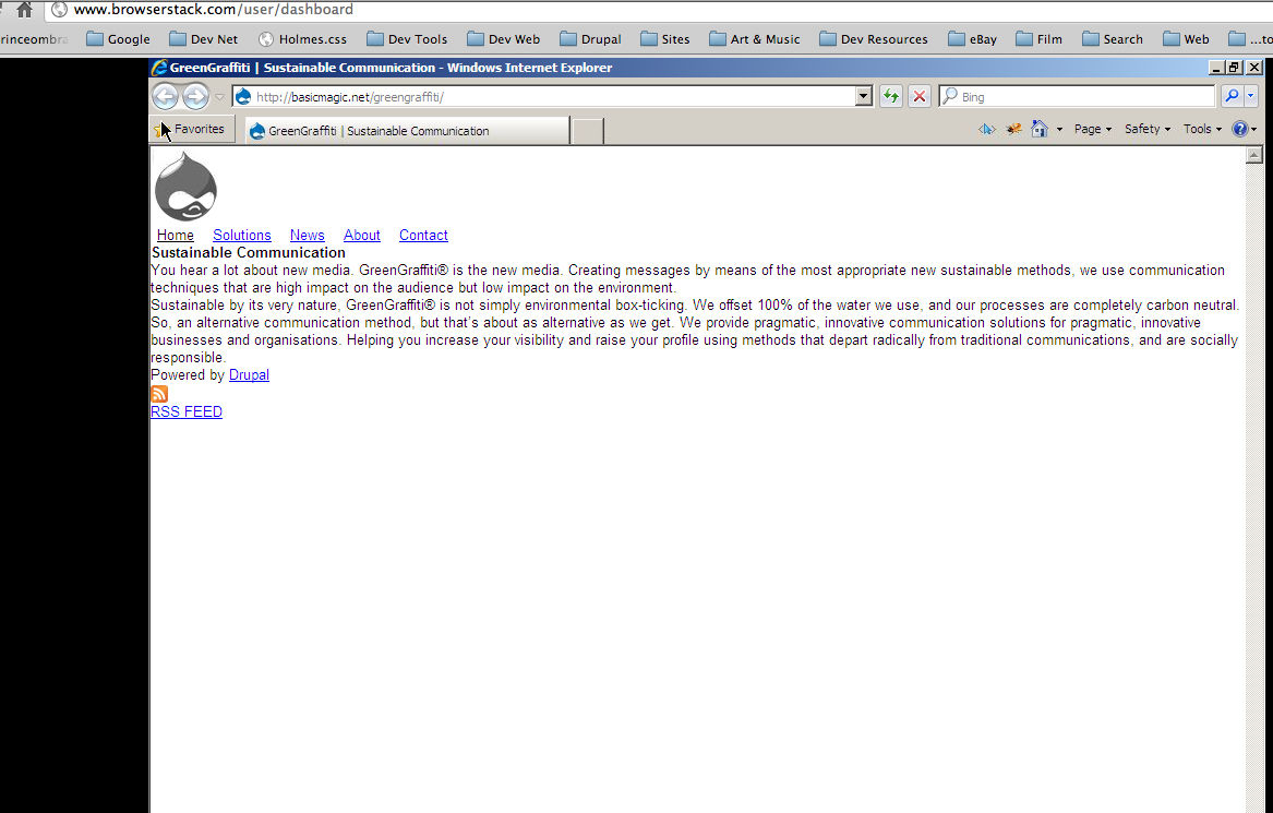
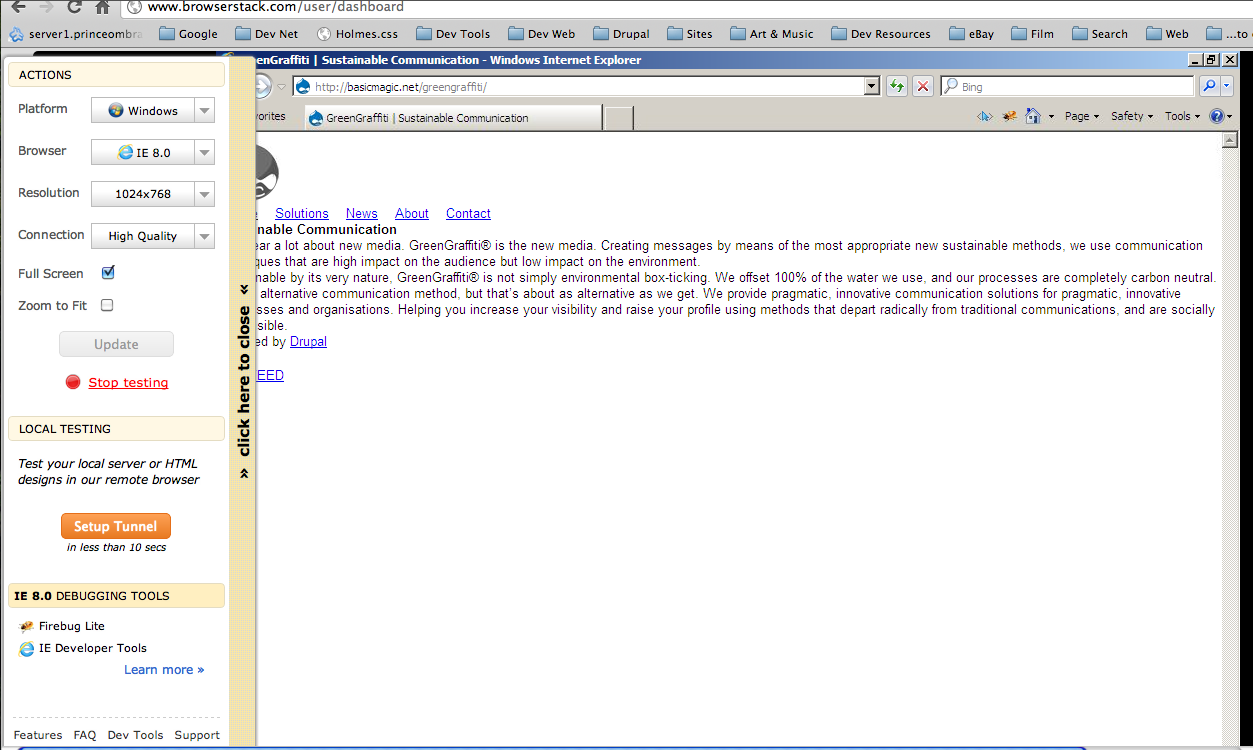
see attached image
| Comment | File | Size | Author |
|---|---|---|---|
| #3 | browser stack 1.png | 113.49 KB | basicmagic.net |
| #3 | browser stack 2.png | 168.01 KB | basicmagic.net |
| zentropy-IE.png | 97.33 KB | munir.alviani |


Comments
Comment #1
knaffles commentedHmm...me too. I'm stumped. I've enabled the html5shiv, but for whatever reason, IE 8 and below does not respect any layout styles. Any hints are welcome.
Comment #2
alexweber commentedI'm on it, expect a fix int the next few days!
Comment #3
basicmagic.net commentedi love this theme- your work is fantastic, thanks for sharing it.
but i too have been experiencing the following issue:
in a simple, two column layout- with content left, and (second) sidebar right...
IE 7 & 8 is dropping the display of the right hand sidebar below the content, vertically-
instead of aligning it flush right, like it does on all other browsers, including IE 9.
looking forward to any insight / fixes on this... i have tested it on IE 7 & 8, past few days...
trying everything i can to make it work, but no go so far.
responsive css and media queries are working fine for IE 7 & 8 as far as i can tell-
its just the display of the sidebar that appears (to me) to be bonked.
i have attached a few screencaps... showing the incorrect display.
thanks again-
vincent, in buffalo
Comment #4
alexweber commented@basemagic_net, thank you very much for the compliments and detailed bug report!
I will try my best to look into this today or tomorrow and release a new version with IE working 100% :)
Comment #5
basicmagic.net commentedthanks so much-
your theme is hands down the best rock solid html5 responsive monster out there.
i have tested it across all browsers and resolutions, especially mobile and tablets-
as soon as you can get the sidebar to not drop on IE 7 and 8, its golden.
i have like 5 clients that are waiting for their killer new theme to be done-
because i saw how good your work was, and want to adopt it for their sites.
looking forward to the fix!
also, i did simply allow for the second-sidebar to drop below, for the resolutions less than 768-
which is what i want in that case, and it works fine.
only issue is getting the sidebar to line up on the right hand side in IE 7 & 8.
please let me know if you want to see any more screencaps or sample of the slight modifications to the theme, whatever...
can't wait til you have this clocked- its so sweet.
big thanks from buffalo,
vincent
Comment #6
knaffles commentedPretty sure it's because both respond.js and css3-media-queries.js require that the min/max widths be specified in the css stylesheet not in the link or @import tag.
+1 for loving this theme. This is going to be my starting point for any new themes I develop. Thanks!!!
Comment #7
alexweber commented@knaffles are you sure about the max/min widths be specified in the stylesheet? The respond.js demo page has a media query on a link tag and it seems to work ok :S
Comment #8
alexweber commentedOk, so after banging my head against the wall for a but I figured this out, the media queries ARE actually being loaded, except last one (min-width 1382px).
Not sure why, but adding max-width: 9999px to it made it work.
I figure its harmless so it has been committed here.
This alone warrants a new release so I'm pushing out a new RC in a couple mins, thanks all for the detailed bug reports and please let me know if this doesn't fix it!
Comment #9
alexweber commented+ 7.x-2.0 release blocker tag
Comment #10
basicmagic.net commentedthanks again for the improvements and fixes...
unfortunately i am still experiencing the same issue?
i just enabled and did a totally clean install of the latest 7.x-2.0 you uploaded to the repository-
but IE 7 and 8 are still dropping the sidebar, below the content...
here is an almost totally unchanged live demo of your newest version-
http://basicmagic.net/greengraffiti/
i wonder what is happening...? i am testing it in IE 7 and 8-
and the right hand sidebar still is dropping...
thanks again-
vincent
Comment #11
knaffles commentedYou're right, @alexweber, the media queries in the link tag aren't a problem. However, stylesheets referenced via @import are not parsed by respond.js - confirmed that in the documentation. Ultimately, I discovered two issues:
1) if you have not yet enabled compressed, aggregated CSS files (in Configuration -> Performance), then all your stylesheets are referenced via @import. When you aggregate/compress, Drupal uses a link tag to reference the stylesheets. I'm not sure why there are two different approaches, but regardless, respond.js is not going to parse the uncompressed @imported stylesheets. So only until you aggregate/compress, does respond.js start parsing.
2) In the .info generated for a Zentropy subtheme, it says for media queries to work in IE 6-8, you need to do one of three things. One of them is:
* Enable the Modernizr additional Zentropy component and build a version that includes Respond.js
I may be wrong, but I assumed this meant checking off the "Media queries" option in the "Extra" block: http://modernizr.com/download/
So I was including modernizr with the media queries option and without a separate respond.js or css3-mediaqueries.js script. But that didn't seem to enable the media queries in IE. Once I added respond.js separately, things started working. So either I did something wrong with my modernizr download, or maybe the comments in the .info file are not accurate.
Anyway, between those two, I *think* everything is working as expected now.
Comment #12
alexweber commented@knaffles oops, I should update the documentation in a couple places! :)
Thanks!
Comment #13
alexweber commentedComment #14
hozt commentedAlex, can you clarify where this was fixed? I have tested with both rc5 and dev the version and followed the directions from #11 above, but still in IE 7 and Camino 2.0 the stylesheets do not load. The only way to get the layout to work in these browsers is to disable responsive styles in the html5 settings.
Comment #15
alexweber commentedI'll let you know what commit it was I can't remember off the top of my head
Comment #16
andyhu commentedAlso need to know how I can fix it, thanks!
Comment #17
dmitriy.panyuta commentedHallo, please check last dev version. I think now all work well. (but need to test)
i move media query from attribute to css file and change referenced to css file from @import to link tag.
I think the main problem is this:
respond.js not understand media query like (only screen and (min-width : 480px) and (max-width: 768px)). If you wont to use media query with min-width and max-width you need to choose a css3-mediaqueries-js.
Comment #18
alexweber commentedThanks Dmitriy!
Comment #19
creaoy commentedComment #20
creaoy commented