On this page
- Installing Views
- Views overview
- Creating new views
- The Views main configuration panel
- Configuring filters
- Adding and editing filters
- Configuring view fields
- Adding view fields
- Editing view fields
- Configuring sorting
- A few more basic Views settings
- Pager
- Access settings
- Displays
- Creating and deleting displays
- Display-specific settings
- Overridden configuration
- Elaboration: How far should I override?
- Views formats
- Row style
- The Views preview
- Example implementation of basic Views configuration
- A block with a random image
- Page, block and RSS feed with the latest articles
- Exercises: documentation site
- Recently updated documentation pages
- How to demo
- Preparation
- Suggested solution
- Comments
- Exercises: News site
- Section editor overview
- How to demo
- Preparation
- Comments
9: Views basics
Drupal 7 will no longer be supported after January 5, 2025. Learn more and find resources for Drupal 7 sites
The Views module is the most used of all the contributed Drupal modules. The flexibility and generality of Views makes it difficult to describe what the module does, but in the simplest cases it is used to make lists of nodes, users, files or other content on the website. In more complex cases Views could be used to:
- list titles of content related to an article
- create image slideshows
- display a map marking latest news pieces published on the site
- show a block with a calendar containing lessons related to the course a visitor is viewing
- create a page with a timeline containing all comments posted during the last 24 hours.
Technically, Views is a tool to fetch data, process data and display data, which is a quite broad field to work in.
Using Views in an efficient way is one of the most important skills a Drupal developer has to learn. It often marks the difference between a beginner and an experienced Drupalist. This chapter covers the basics of Views, but is written more like an inventory of functionality than a description of cases of how to use them. It is strongly encouraged that you look closer at a few of the implementation examples and exercises to see how to use Views in real life.
The initial version of this section of the Community Documentation came from the book Drupal 7: The Essentials, courtesy of NodeOne and Johan Falk.
Installing Views
Views are installed like any other module. The module is downloaded, extracted and moved into the sites/all/modules folder. (See Appendix 1 for more details about how to install modules.) To be able to set up views you will need both the Views and the Views UI modules (the latter may be turned off once your views have been built). The Views project also holds the module Views exporter, which can be completely replaced by the Features module (described in the section about exporting settings in Appendix 1).
To enable Views you must also have the Chaos Tools module enabled on your site. (The module is a part of the Chaos tools suite project).
Views overview
The overview page for the Views module is found at the toolbar, Structure, Views. It contains a list of all views available on your website. With Views comes a number of pre-configured default views that you can enable. Some of them include Archives, Backlinks, Front Page, and Glossary, which can be seen in Figure 9.1
In the overview, each view is listed with a short description, any path used by the view, and some more information. The default information provided is pretty sparse, but as you play around with Views, eventually the list will provide you with quite a good summary of many of the functions on a Drupal site.
At the right side of each view, there is a drop-down menu with some links. They are used to enable/disable the view, edit it, clone it, export it and finally also delete it. Note that views provided by modules, such as the default views included in the Views project, cannot be deleted manually. Instead they have the revert option, removing any overrides you have made to its original configuration.
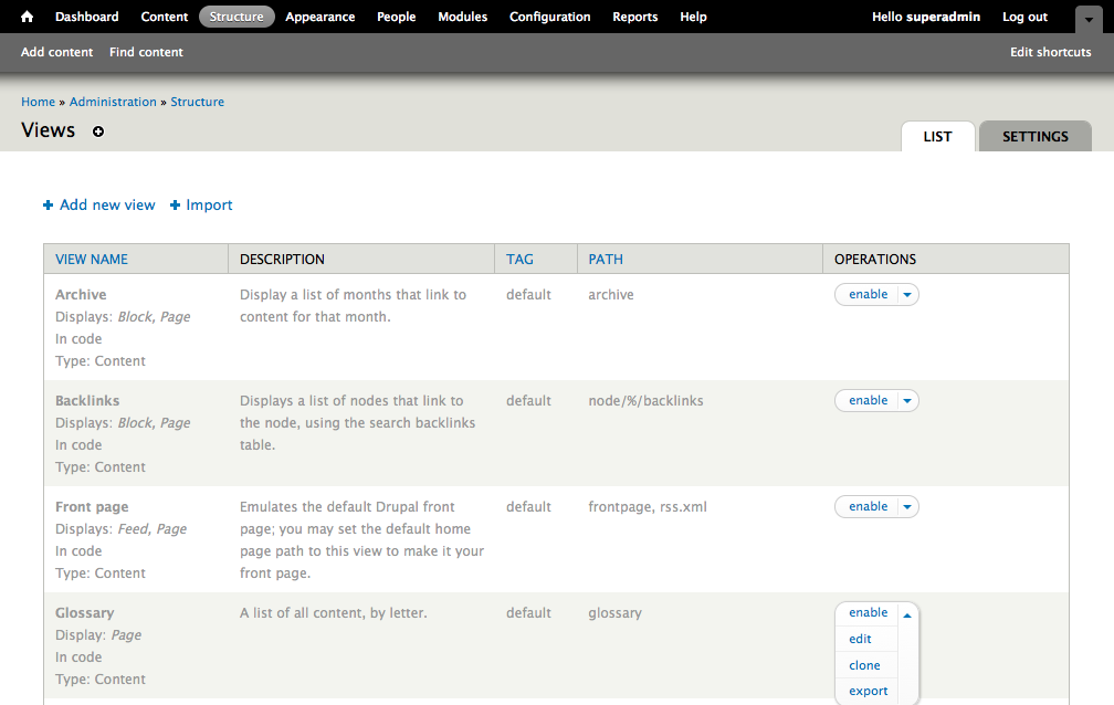
Figure 9.1: Views provides a number of pre-configured views you can enable. Any manually created views will also be displayed in this list.
TIP: Views has excellent support for the Advanced help module, providing help links in different parts of the graphical interface. Views will notify you if you do not have Advanced Help installed and enabled. You can turn these messages off at the tab settings found at the Views overview page.
Creating new views
The best way to learn to use the Views module is to start using it. A good way of starting to use the module is to create a new view. This is done on the Add new views page (structure > views > add new view>, or http://example.com/admin/structure/views/add). (These kind of links are called local actions, by the way.)
The link takes you to a page where you can set the most common and important settings for a view (see figure 9.2) without having to interact with the rather scary page containing all the view settings (see figure 9.3 on next page).
The quick-wizard for adding a view allows you to create a view through the following steps:
- Give your view a view name, an administrative name not visible to end users. Based on this, Views will also suggest a machine name – which cannot be changed once saved.
- Check the description box to provide your view with a short administrative description, explaining what it does or where it is used. Best practice dictates that each view should have a description.
- Select what kind of site data should be displayed in the setting starting with show – for example users, files or content (nodes). If you select nodes you may also limit the view to display only certain content types, or nodes marked with selected taxonomy terms. Finally you can also select how the view should be sorted. Note that the type of data listed, the first choice on this row, cannot be changed once the view is created.
- The option create a page provides you with a page of listed results. If you check this option you will get a few more options, such as which path the page should be available at and if it should have a menu link. You also get to choose how the data should be formatted. The default is a teaser list similar to the default front page.
- The option create a block provides you with a block containing the list results. This block can then be placed in a region, just as other blocks on the site. Further options include specifying the formatting of the results, as well as the number of results to display. (Note that you can have results provided as both a page and a block!)
- The button save & exit completes the configuration and redirects you to the page that you have set up for the view. The button continue & edit brings you to the full configuration panel for the view.
The most common data to list with Views is content (nodes), which explains why this option has more options and settings than other data types. Nodes are, however, far from the only data type with great use cases in Views.

Figure 9.2: The quick-wizard for creating a new view is indispensible for anyone wanting to create a view without hassle – and a good tool even for people enjoying digging around in advanced Views settings.
TIP: Views can fetch and process data outside your Drupal site, too. Usually this requires specific modules for each web service or databank you want Views to access – check out the modules Apache Solr Views, SharePoint, YQL Views Query Backend, and XML Views if you want some examples.
The Views main configuration panel
The brave souls choosing the continue & edit button at the quick-wizard page will be confronted with Views' main configuration panel (see figure 9.3). The same challenge awaits those who click the edit link for any existing view, be it from the Views overview page or the shortcuts available to administrators when looking at views on the website.
The main configuration page, in this book called the Views main panel, contains an overview of the settings in the view, divided into groups for ease of use. The effort in creating and configuring views consists almost entirely of clicking and editing these settings. The effort in learning Views consists of learning what all the settings mean and how they interact.
All the buttons and options in the Views main panel may seem overwhelming, especially the first hundred times you encounter them. It is of little comfort that what you see in the Views main panel is the tip of an iceberg. Configuring a view is usually a process of opening new settings by clicking somewhere in the main panel, which in turn open further settings and so on. Learning to use Views efficiently takes time and effort. It is without doubt worth it.
Below is a summary of the most important settings, in the order they are usually configured when creating views.
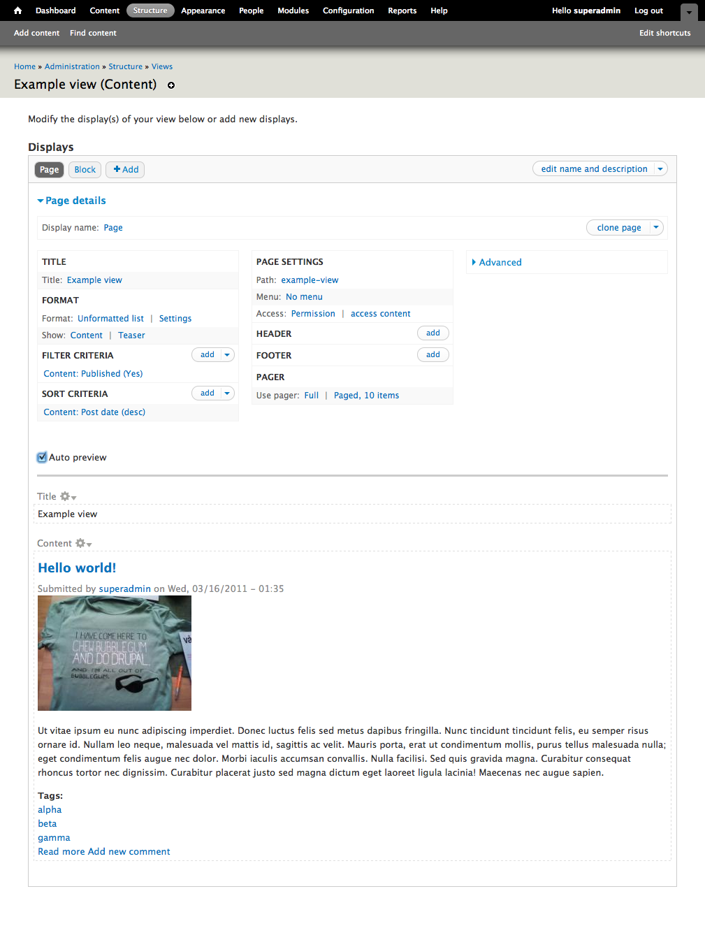
Figure 9.3: The Views main panel contains an overview of the view's settings, and links to change them. A lot of information, and a lot of possibilities.
TIP: Views that never have been saved may be lost if leaving the Views main panel. It is a good habit to save your view early – note that the continue & edit button doesn't save it for you. A view displaying error messages cannot be saved until the error is addressed.
TIP: The user interface for Views described in this book is a recasted version of an older interface. Much of the online documentation is still adapted for the old interface. Don't be confused if you see screenshots displaying a different user interface.
Configuring filters
A good start to configuring views is to set filters. A view will, by default, fetch all available objects of the data type the view is based on. A node view will fetch all (accessible) nodes on the website. Filter settings makes it possible to restrict the results to nodes of a certain type, created by a selected user, or those that have been updated the last week.
Adding and editing filters
You add a new filter to your view by clicking the add link at the group filter criteria in the main panel. This opens a dialogue containing a list of all the data fields Views can use for filtering. (See figure 9.4.)
The magnitude of the list depends on the data type of the view. Node views have enough data fields to fill a few screens. You will learn a lot by browsing this list and seeing which options you have for filtering. Once you have become more familiar with the filtering options it is convenient to use the search or filter options to quickly find the data fields you want.
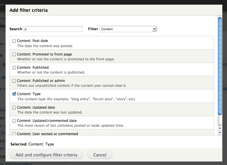
Figure 9.4: You can select which filters should be applied to the view by marking them in the long list of available data fields.
New filters are added by marking one or several data fields and clicking the button add filter and configure criteria. This opens another dialogue of settings, where you set how you want to restrict the selected data fields. You can for example require that the data field content: type should have the value article to restrict your node view to articles only. The options available depend on the selected data field. You can for example require that a node title contains (but isn't necessarily equal to) a given string, or that a time stamp is later than -7 days. (See figures 9.5 and 9.6.)
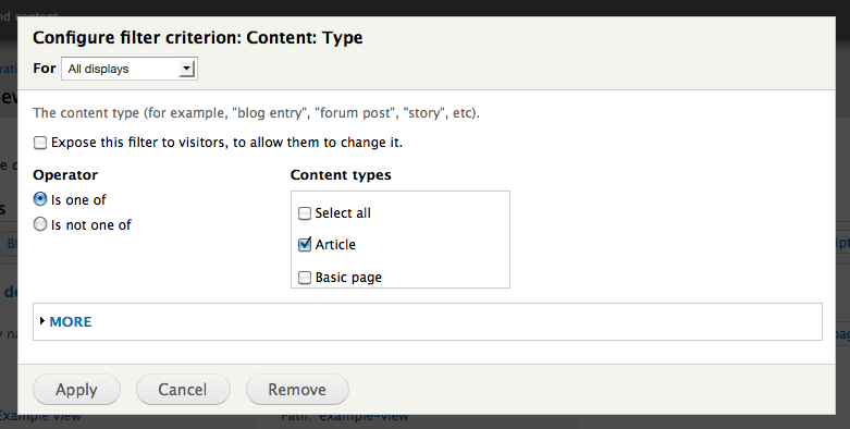
Figure 9.5: Filters are configured individually.
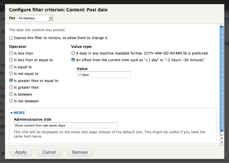
Figure 9.6: The settings for each filter varies with its data field. It is a good habit to give administrative titles to filters and other Views components that you configure.
Hidden under the more settings in the filter dialogue is an option to set an administrative title to the filter, making it easier to overview your settings. If no administrative title is set, the name of the data field will be used – which works fine in most cases.
The filter settings contain two options that are described in separate sections. The checkbox expose this filter to visitors, to allow them to change it is explained in the section about exposed settings. The option configure […] for all displays in the dialogue head makes it possible to have different settings between (for example) pages and blocks for the same view. See the section about displays for details.
When you save your filters, the dialogue is closed. You can change settings for existing filters in three different ways:
- You can change settings for individual filters by clicking their name, thereby re-opening their configuration dialogue. (See figure 9.7)
- You can create logical AND and OR groups from your filters by clicking the and/or option available in the menu at the add link for filters. (See figure 9.8)
- You can delete filters from their respective configuration dialogues, or from options available drop-down menu at the add link.
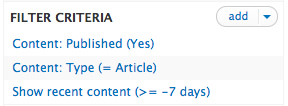
Figure 9.7: Each added filter becomes available in the Filter Criteria group.
Click the Add dropdown, and select "And/Or, Rearange" to open the filter configuration dialogue.
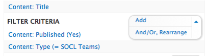
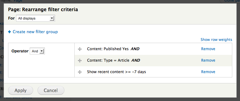
Figure 9.8: You can create logical groups of filters to allow more complex filtering.
TIP: Views does not automatically exclude unpublished nodes from its results. A filter to exclude unpublished nodes is added by default when a node view is first created, and if you remove this filter you should make sure that only trusted users are able to access the view.
Configuring view fields
As soon as the filters are set, and sometimes even before that, you usually add your view fields (labelled fields in Views, but here called view fields to separate them from entity fields). View fields are the data fields that the view will display to end users. Even if the view has access to all data about (for example) a node, you can choose to only display title, author and the time when the node was updated.
TIP: Depending on the settings in the Views quick-wizard, your view will either display entire nodes or single fields. To configure view fields you must have the row style (in the format group) set to fields. See the section about row style for more information.
Adding view fields
New view fields are added in the same way as filters. A click on the add button in the fields group will open a dialogue, allowing you to choose from all available view fields. (See figure 9.9) By checking one or more data fields and clicking add and configure fields a new dialogue opens, where you provide further settings for each view field. (See figure 9.10)
The settings for view fields are more extensive than those for filters and may vary considerably between different types of view fields. The settings usually include the following:
- Formatter: This setting is available for entity fields, to determine how they should be rendered in the view. You can either choose the default formatting (according to the display settings for the entity field), or any of the other formatting options provided by the field and its widget.
- Link this field to the original piece of content. This option creates a link to the node this view field belongs to. You may combine this setting with the output this field as a link option, to manipulate the link properties. (See the rewriting view fields section.)
- Create a label: This provides the view field with a label, usually displayed right before the view field's value.
- Exclude from display: This makes the view read and process the view field, but won't display it publicly with the other view fields. This may be useful in more complex manipulation of the view output. See the rewriting view fields section.
- Style settings: These settings allow you to change the markup for the view field. This can make it much easier to style the view field with CSS.
- Rewriting: These options allows you to change the content of the view field before further processing, including options to turn the view field into a link. See the rewriting view fields section for details.
- No results behavior: With these settings you may affect how the view should interpret and react on empty view fields – for example by completely hiding the field (including any label).
- Multiple field settings: View fields with multiple values can be displayed on a single row. These settings allow you to control how this should be done.
- More/administrative title: The administrative title will be used in the Views interface to represent the view field. Setting a customized title is especially useful to tell the fields apart if you use the same view field multiple times in a view.
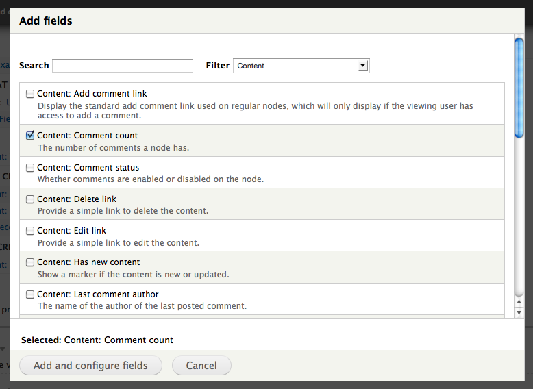
Figure 9.9: You add new view fields in the same way as filters, by checking one or more of the choices in a long list of data fields.
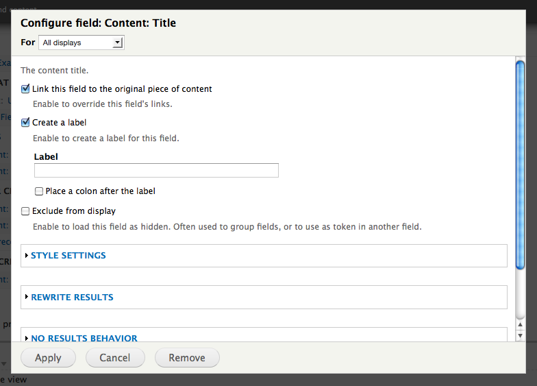
Figure 9.10: Each view field is configured separately. More options are hidden inside the collapsed fieldsets.
Editing view fields
You handle and edit existing view fields much in the same way as you do with filters:
- The configuration for each view field may be changed by clicking its title, to open its configuration dialogue.
- The order of the view fields may be changed by clicking the sort option in the drop-down menu accessed by the add button.
- View fields can be deleted from their configuration dialogues or by a link in the drop-down add menu.
Configuring sorting
The settings for controlling how view results are sorted follow the same patterns as filters and view fields. You add new sorting criteria by clicking the add link in the sort criteria group, selecting one or more data fields to use for sorting, and selecting whether the sorting should be ascending or descending. (See figure 9.11)
It is worth mentioning that more than one data field may be used for sorting. If so, any additional sorting criteria will be used only as tie breakers for previous fields.
Sorting settings can be exposed to site visitors. This is described in another section.
TIP: Most data fields are available as both filtering, view fields and sort criteria, but not all. There is, for example, a data field global: random available for sorting only, sorting the results in a random order.
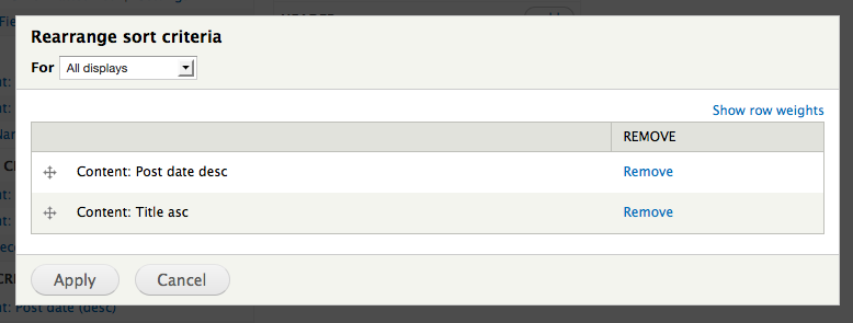
Figure 9.11: By clicking the rearrange button you may change the order of the sort criteria.
A few more basic Views settings
You can make a View considerably more useful with the help of the following settings:
- Title: A click on this setting opens a dialogue where you can enter text to use as the title of the view.
- Header/footer: You can add elements above and below the view, for example to insert help texts. It is also possible to add views as headers and footers.
- No results behavior (in the advanced settings): This setting controls what should be displayed if the view doesn't yield any results. An interesting alternative is to load another view, but you can also display text telling the visitor just how sorry you are that no results could be found.
Pager
You may limit how many results should be fetched by a view, and you can separate the results on different pages. You access these settings at the pager option.
The setting has four main options:
- Display a specified number of items: This limits the number of results in the view and displays them all on the same page.
- Display all items: This displays all the results at once.
- Paged output, full pager: This makes the view fetch all results, and by default divide them to show 10 results per page – with a pager allowing the visitor to go forward and backward in the result. You may change the number of results per page, and you can also put a maximum number of pages to display. You can expose the pager settings, to have the user change these settings, see separate section for details.
- Paged output, mini pager: This option is similar to the one above, but has a more compact pager (without an overview of page numbers).
All the alternatives above include the offset setting, making the view skip a number of results at the top of the list. If a pager is used you can also set a pager ID. If more than one pager is on the same web page, all pagers with the same ID will be affected by the same forward/backward links. This is usually, but not always, an unpleasant effect.
Some modules may change or extend the pager options.
TIP: Settings that include sub settings are in the main panel separated by a vertical bar, for example Use pager: Full | Paged, 10 items. When changing the main settings you are automatically forwarded to the sub settings, but the next time you want to change the sub settings you have to click the sub setting title.
Access settings
In the middle column in the main configuration panel is a small but important setting with the name access. It can be used to limit the access to the view in three different ways:
- None: This means no access restriction – anyone may see and use the view.
- Permission: This allows all users with a selected permission (such as administer content) to use the view.
- Role: This allows all users with at least one of the selected roles to use the view.
Node views have the access setting to the permission view published content by default. Views showing unpublished content should have additional access restrictions.
Displays
Before a view can be shown on a Drupal site it must have one or more displays. Displays determine how a view may be called from Drupal. Without a display a view is only a database query with no way of being displayed.
A default Views installation has four types of displays:
- Page: This makes the view available as a web page on the site, with its own URL and optionally a menu link.
- Block: This creates a block of the view, which can be used on the site like any other block.
- Feed: This creates an RSS feed at a given URL, and is optionally attached to other displays in the same view.
- Attachment: This display item will be attached and displayed before or after other displays in the same view, much like using the header/footer setting and embedding a view.
Creating and deleting displays
You can create both a page and a block display in the Views quick-wizard, but it is also possible to add and delete displays at the Views main configuration panel.
All the configured displays are listed as buttons at the top of the main panel. (See figure 9.12.) A click on each button changes the main panel to show the settings relevant to the selected display. To delete, clone, or disable a display, with the display selected, click on the small down arrow at the right of the "view …" or "clone …" button located at the right and slightly below. To the right of the display buttons is another button, used to add new displays to the view.
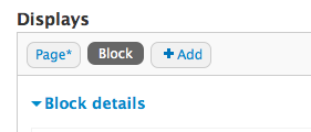
Figure 9.12: At the top of the Views main configuration panel are tools to switch between, and add more, displays.
To the right of the display-switching buttons is the aptly titled edit view name/description button, used to change the name and description of the display. This is particularly useful to keep track of several displays of the same kind. Pressing the drop-down arrow indicator reveals options for cloning and deleting the display.
TIP: Among the items in the edit view name/description drop-down menu is an option for reordering displays. Changing the display order could be useful when access to the view is restricted, as the first display a visitor is allowed to access will be used, or if you have several attachment displays and you want to control the order in which they attach their content.
Display-specific settings
Most displays add a new group of settings to the middle column in the main configuration panel. Page displays, for example, add the options to set path and menu items, while block displays allow you to set an administration name for the block.
Apart from these settings, each display has three specific settings hidden in the advanced section:
- Machine name: This is the display's unique name within this view. It is usually not displayed for visitors (except as CSS classes).
- Comment: This setting allow you to add comments about how the view is configured. This is useful if it contains unexpected settings that other developers might overlook.
- Display status: This setting allow you to disable the display, making it unavailable without deleting it.
TIP: Some display specific settings are required and will yield error messages if missing. Be sure to set all required options to be able to save your view.
Overridden configuration
Often you will want to have several views that display almost the same information, such as a page with the ten most recent news items, and a block with the three most recent. In these cases it is very useful to have several displays in one view and use overridden settings to vary each display individually.
When editing settings you will (when possible) get a select list in the settings dialogue header allowing you to select if you want to save the settings for all displays (except overridden) or for this display (override). The exact wording varies depending on the type of display you are editing. (See figure 9.13) The latter option is used to apply your settings to the active display only and make it different from the view's default (master) configuration.
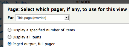
Figure 9.13: The settings you make will either affect all displays in your view, or only the display currently being edited.
By overriding settings, one single view may be reused for many different purposes saving a lot of work.
There are a few more details worth knowing about overriding view configuration:
- Display-specific settings cannot be overridden.
- You may return overridden settings to their default values by editing the setting and specifying that the configuration should Revert to default.
- When working with the Views 2 interface, overridden settings are indicated with a broken link in the Views main panel (See figure 9.14). In the Views 3 interface overridden settings are indicated with italicized text.
- All groups of settings with add buttons are overridden as one unit – you cannot, for example, have a single filter configuration overridden and the other filters in default.
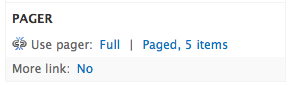
Figure 9.14: Overridden settings are displayed with a broken link in the main configuration panel when using the Views 2 interface.
Elaboration: How far should I override?
When working with views you must often decide which settings should be made default values, and which should be overridden. One approach is to make the most common settings the default. Another approach is to keep all settings in the most-used display in default mode.
A related question is when to create a new view rather than create another display (within an existing view) where half the settings are overridden. One approach is to collect all displays managing the same kind of functionality in the same view. Another, perhaps more common approach, is to move separate displays into new views when too many settings require overriding. There may also be technical limitations forcing your decision. Feed displays, for example, can only be attached to displays in the same view.
Views formats
How view results are displayed to end users is ultimately determined by the view format. A layer of Views formatting, processing and wrapping the data when a view displayed is called to be embedded by Drupal.
A standard Views installation has five view formats (see figure 9.15):
- Grid: This provides a grid with a configurable number of columns, with one view result per grid square. Grid settings include if the results should be ordered horizontally or vertically. It is worth knowing that the grid format uses a HTML table, which some would like to avoid to style presentation.
- HTML list: This provides an ordered or unordered HTML list.
- Jump menu: This creates a shortcut menu, linking to a URL provided by a selected view field. Format settings include whether the current path should be the default option in the jump menu.
- Table: This provides a table of the view data. Settings include making the table headers click-sortable and the option to display several view fields in the same column.
- Unformatted: This provides a list of the results without any special markup.
Each view format can have a number of extra settings. (See figure 9.16) Many modules provide additional view formats.

Figure 9.15: The view format can change the view presentation completely – for example into maps, tables, calendars or jump menus.
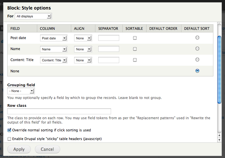
Figure 9.16: Each view format may have a number of format-specific settings. These are the settings for the table format, including click-sortable columns.
Row style
In the Format settings group, below the Format setting, is the setting for row style, which is labled "Show". The value of this setting can be either Fields or Content. The most common value is Fields, allowing you to select which fields to include in the view. This is sometimes the only option available (for example when the Format is set to Table), in which case the the row style setting is hidden. For node views the row style can also be set to Content (see figure 9.17). The Content row style displays each resulting node in one of the view modes available on the website, such as Teaser or Full content. In some cases, such as the display for RSS feeds, the row style must be set to Content.
If the row style is Fields, sub-settings are available, including the option inline fields. This can be used to show several view fields in the same row, with a configurable separator. There is also a setting for automatically hiding empty fields. (See figure 9.18.)
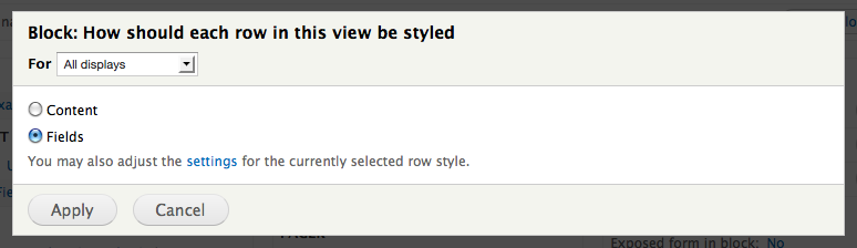
Figure 9.17: Node views can either be outputted field by field, or as entire nodes.
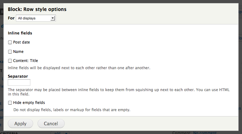
Figure 9.18: You can configure fields to be displayed on the same row.
TIP: Using the content row style may be slower than the fields row style, since preparing a node for display in a view mode may require input from a lot of modules.
The Views preview
At the bottom of the Views main configuration panel is a preview of the view content, showing that your settings work as intended. It is also possible to use the preview to change most of the settings in a view. Clicking any of the gear links will display menus to change most of the view's configuration. (See figure 9.19)
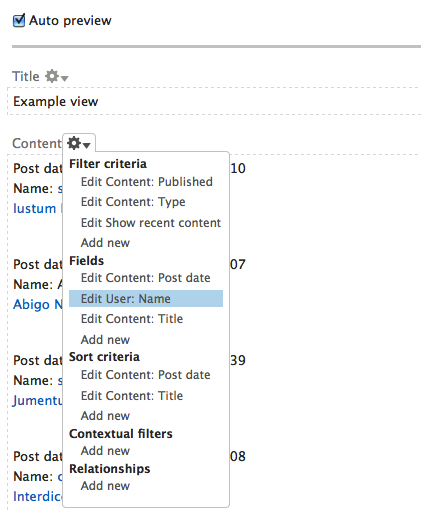
Figure 8.19: Much of the view configuration can be managed from the contextual links in the preview.
TIP: If you prefer to configure your view from its preview, you can collapse the main panel by clicking the header page details just below the display buttons. (The actual link name depends on the current display.)
Example implementation of basic Views configuration
This section contains examples of how the concepts and functionalities in this chapter may be used. You can find more examples in the exercises.
A block with a random image
As a visitor on a photo site I want a random photo uploaded in the recent week to be displayed in the sidebar. This is important since it helps me find photos I otherwise would have missed.
The functionality above can be achieved by the following steps:
- A node type for photos, containing images (such as the article node type).
- A new node view, with the name random image. In the quick-wizard, the block is checked (while page is left unchecked), and the block is set to display one result only.
- In the main configuration panel, a filter fields: field_image – fid ("file ID") is added to filter out nodes where the relevant image field is empty.
- Another filter content: post date is added, configured to only display nodes posted the most recent week.
- A new view field fields: field_image is added, displaying the content of the relevant image field in a style that fits the websites sidebar. The view field for node title, automatically added by the quick-wizard, is removed.
- The use pager is inspected, to assure that only one result is displayed, without any pager.
- A new sort criteria global: random replaces the one added by default, to allow selecting a random image.
- The view is saved, and the site's block settings are updated to display the new block in a suitable region.
Page, block and RSS feed with the latest articles
As a visitor at a news site I want to always be able to see the three most recent headlines. Along with the headlines I want a link to a page displaying more news, and there should also be an RSS feed for the news. This is important since it makes it easier for me to follow the recent news.
The functionality above can be achieved by the following steps:
- A new view, with the name recent articles. The quick-wizard is set to list nodes of the type articles, sorted with newest on top.
- In the quick-wizard, the option for creating a block is also checked, the option for adding an RSS feed to the page display is checked, and both displays are set to display an appropriate number of results.
- In the main configuration panel, the block display's setting more link is overridden and enabled.
- The view is saved and then placed in a suitable region from the block administration page.
Exercises: documentation site
These exercises build on previous exercises in the documentation site suite. They can be carried out individually, with some preparation, or in sequence with the previous exercises. The exercises require using the concepts described in previous chapters in this book, including part A.
Recently updated documentation pages
As a site member I want a list of documentation pages that were updated recently. This is important since it helps me keep track of updates in the documentation on the site.
Figure 9.20: An example of how the list of recently updated documentation pages may look.
How to demo
- Log in to the site.
- Verify that there is a clearly visible link on the site with the text Recently updated documentation.
- Verify that the link leads to a page with a table of (at most) 25 documentation pages, containing information about page title, topic, update time, number of comments and a text marking any pages that were changed since they were last viewed.
- Verify that the list has a pager if there are more than 25 documentation pages available.
- Edit a documentation page and re-save it. Verify that it appears at the top of the list, as most recently updated.
Preparation
- The site should have a documentation page content type, as provided by the first exercise in this suite.
Suggested solution
- Go to the views overview page and add a new view. (See views overview.)
- In the quick-wizard, give the view a name and a description explaining what it does – such as recently updated documentation pages and a table of most recently updated documentation pages on the site. (See creating new views.)
- In the quick-wizard, also select that you want to display content of type documentation page. Check that you want a page, and that it should display a table of fields, 25 results at a time, using a pager. Also check the option for creating a menu item, adding it to the navigation menu with the link text recently updated documentation. (See creating new views.)
- Click continue & edit to enter Views' main configuration panel.
- Add a new view field content: all taxonomy terms, and at the more settings, limit the terms to the topic vocabulary only. (See configuring view fields.)
- Add a new view field content: updated date, and set the format to time ago with “ago” appended. (See configuring view fields.)
- Add view fields content: comment count, and the content: has new content fields. (See configuring view fields.)
- Edit the title field added by Views by default. Add a label title, to provide the related table column with a header. (See configuring view fields.)
- Remove any existing sort criteria and add a new, content: updated date, with sort order descending. (See configuring sorting.)
- Save the view.
Comments
- Adding customized administrative titles to the view configuration may help you and other developers in the future.
- Don't forget to save your view often.
- An alternative to adding a menu link to the navigation menu would be to add it to the primary links – having it appear as a large tab. However, the long link text makes it unsuitable in a tab.
- In the quick-wizard there's an option for adding an RSS feed to the view. It is not a feature mentioned in the user story, but since the list will change often it could make sense to add a feed even without a request to do so.
Exercises: News site
These exercises build on previous exercises in the news site suite. They can be carried out individually, with some preparation, or in sequence with the previous exercises. The exercises require using the concepts described in previous chapters in this book, including part A.
Section editor overview
As a site visitor I would like to have a list of all news section editors on the site, along with their e-mail addresses and a link to the section news list. This is important since it makes easier for me to trust news when I can contact the people responsible for publishing the news.
How to demo
- As an anonymous user, verify that you can find a link section editors on the site.
- Verify that the link leads to a page listing all users responsible for a news section, along with name, e-mail address and a link to the section news list.
- Log in as administrator. Edit a user account and either add or remove the user's section. Verify that the list of section editors reflects the changes.
Preparation
- The site should have a sections vocabulary, as provided by the sections and sub sections exercise in the taxonomy chapter.
Comments
- Public listing of e-mail addresses should only be made with the consent of the e-mail owners.
Help improve this page
You can:
- Log in, click Edit, and edit this page
- Log in, click Discuss, update the Page status value, and suggest an improvement
- Log in and create a Documentation issue with your suggestion
