
 Come together with the global Drupal community in Rotterdam, 28 Sept – 1 Oct 2026. Sessions, contribution, connection, and Early Bird savings until 8 June.
By lisarex on
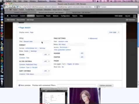
On Nov 1 2012, we tested the Views UI (7.x-3.5) with intermediate-level Drupal users at the BADCamp UX/UI Summit to provide the community with a clear picture of the usability bottlenecks in the Views UI, which is now in development in Drupal 8. We have identified a number of major problems and a large number of small ones, each of which now has an issue in the Drupal Core issue queue, where we discuss solutions, provide code patches with screenshots of the changes, come to agreement and put these changes into Drupal 8.
The study planning, participant profile, findings, videos and more are explained below.
Contents
Overall findings
Study summary
Screeners and study guide
Findings from study
Next steps
Video recordings (YouTube)
Overall findings
Participants thought that Views was “powerful” but complained about the steep learning curve to understand the concept and using the Views UI when they were first introduced to it. They relied on extensive Googling, face to face explanations from colleagues and video tutorials to learn Views. When they were thrown into unknown territories, their frustrations with using the UI were palpable.
Study summary
- Number of participants: 8 (1 advanced user, 6 intermediate users, 1 beginner user)
- Session length: 45 minutes
- Study Focus: Using Views in Drupal 7
- Understand existing user’s views usage & experience [behavior focused]
- Uncover critical/major issues with existing users [UI focused]
- How users navigate and operate the advanced settings
- Gather data quickly so that actionable improvements can be incorporated into Drupal core before the feature freeze
- Compensation offered: Google Open Source t-shirt
- Recruitment method: Twitter (from BADCamp, @lisarex, @dcmistry), email to BADCamp UX Summit attendees. The email was quite successful.
- Date: November 1, 2012
- Type of study: Moderated usability study (in-person)
- The sessions moderated by Dharmesh Mistry (dcmistry) and Lisa Rex (lisarex). Our volunteer note takers were Olga Biasotti, Angie Byron, Neerav Mehta, Lewis Nyman, Bojhan Somers, and Brian Young. Other volunteer contributors to the usability study planning include Bohjan Somers, Becky Gessler and Garen Checkley. Special thanks to Jen Lampton for coordinating the UX/UI Summit and putting up with us!
- All the sessions were streamed live on Google+ and are available on YouTube (linked below)
Screeners and study guide
Potential participants filled in a screener survey to see if they matched our profile, and a followup screener was used to help us clarify, when the scope of the study was narrowed.
We wrote a Views usability study guide (like a script), with the input from the Views in Core team.
Participant profile
- Participants were targeted to be intermediate users who have done Drupal site building and have familiarity with Views (They have created basic Views and have dabbled with the advanced views). To keep the data focused, this is a report of findings of 6 intermediate users and 1 advanced user only. Data from the beginner participant will be added to future beginner level study data.
- All participants were screened to be fluent in English.
- Participants are comfortable with technology in their personal and professional lives.
Detailed findings
Positive comments
- The first screen of Views UI get’s the user’s foot in the door
- Participants rated their experience ratings higher as they got more exposure to views
- Participants like the ability to preview and create custom CSS
- Participants found theme template information useful
Critical, major and moderate usability issues
- Critical Lack of guidance: The views UI wizard page helps participants get the foot in the door but provides little guidance when they land on the second page. This is because the terminology is unclear and the visual hierarchy is flat. The problem gets severe under “Advanced” section.
Possible solutions:
- Use the Views UI wizard anytime a new display type is created.
- More visual hierarchy on labeling and/or positioning
- Contrib module with guided tour of Views
- tooltip on hover of difficult labels
[needs exploration + design]
- Major Too many items under configuration options for fields/ filters/contextual filters/ relationships: Participants feel “overwhelmed” when they see the long scrolling list of options. The problem gets worse because the participants do not necessarily see the “Search” option. The search option is visible only when you are on the top of the modal.
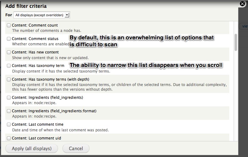
Possible solutions:
- Limit initial list to user created fields/filters.
- Reduce visual clutter caused by descriptions.
- Divide ‘filter’ (e.g. content, global) and criteria (e.g. Body, Comment count) into two columns, making the criteria more scannable
- Search box has no visual weight and/or fixed positioning.
[#1832862]
- Major Using “Contextual Filter” is difficult: When a participant selects a field in contextual filter, they are presented with a lot of options in a flat structure making them unsure how to proceed. This is mostly because of lack of workflow. The expectation was to select a default argument first and then move into related steps based on the choice. A related issue is the help text was unclear “Also look for node and node author ID” The advanced tools like contextual filter, relationship, exposed form require more guidance because it is a harder thing to do.
Possible solutions:
- Progressively disclose the functionality instead of all at once
- Revise the text to be less Boolean, more human
- Provide short UI / help text in a standard help block on these section to explain what they are
[needs exploration + design]
- Major Several participants forgot to save/didn’t realise they need to save in order to see their changes to the view when they click “view page”. On smaller screens you can’t see the drupal_set_message() warning of unsaved changes.
Possible solutions:
- Provide an ‘Unsaved changes’ signal/notification within the main area of the Views UI, where they are looking [needs design]
- Move save to button towards the bottom of the page (between preview, or at the end, or both)
[#1831894]
- Major Participant had difficulty determining where the view showed up. If it’s a Page you can see the path. If it’s any other display type, you have no way of knowing where those displays appear on the site (P4).
Possible solutions:
- Show on the views listing the region where the block appears
- Show in the views ui where the block appears (Attachment does this!)
- Show when there’s an attachment in the Views listing (Block, Feed, Page appear in alphabetical order)
[#1834576]
- Major Disconnect in the workflow of adding a block, as you have to create the block display, then save, then go out to the Blocks UI.
Possible solutions:
- Add “place block in region’ to the Views wizard.
- Add “place block in region”to the advanced views.
[#1836390] and [#1836394]
- Moderate People often forget to add a path on a page, and if they hit save, they don’t see see the dsm() letting them know. If they haven’t saved, they still don’t realise the path is missing because the default / is very small and subtle. It’s also a very small target area for such a critical step in creating a page view. (P3)
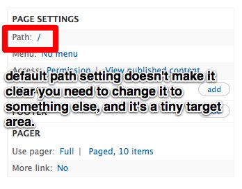
Possible solution:
- Replace the / with text such as ‘path is undefined’
[#1831142]
- Moderate ‘View page’ link goes to the home if the path isn’t set, causing confusion because people think that is what they created when in fact its not.
Possible solution:
- ‘View page’ is not an active link until the view has been saved
[#1831696]
- Moderate ‘All displays” is the default option, even when there’s only a single display. This is unnecessary and is one more decision a new user has to fret over.
Possible solutions:
- Hide “all display/This page” options e.g. filtering when there is only one.
- Significantly decrease the visual importance of this functionality.
[#1836384]
- Moderate Other related issue to “All displays”/ “Override this display”: In order to override a display you have to go to the drop down on the top left of the modal and to apply the display you have to go to the bottom right. As users are focused on the task at hand, they don’t realize that they have to change the filter and may accidentally apply to all displays. What makes the matter worse is that when it is changed to "Override this display", the label changes to "Apply (this display)" but the difference is so subtle that the user did not register the difference.
[#1836392] - Moderate Participant did not understand the Preview was updated automatically. They didn't use it, and just went straight to 'view page'.
Possible solution:
- Show when the last time the preview was updated
[#1836470]
- Moderate On Views listing, participants have trouble determining what’s active and what’s disabled.
Possible solutions:
- Split them into two tables, with disabled underneath
- Have the inactive views on a separate page, which is a gallery of possible views.
- Change them to a tabbed display, with Active being the default tab
- Fix the accessibility of the listing:
[#1830822]
- Moderate The More section only contains the Administrative title. The “More” area is perceived as this magical area, where you might find something magical. Participants opened it and were disappointed to only find the administrative title.
Possible solutions:
- Move it out of this section until there’s more than one item, or label it with something less vague.:
- Only show it upon clicking a checkbox using states, e.g. Add administrative title.
[#1831080]
- Moderate 'Theme: information' label is misleading.
“Theme information name is misleading because we are talking about templates. I have been on this page so many times and it’s still complicated. How are you supposed to know that this has theme’s real output?” (P4)
Another participant didn't know what Theme: information meant.
Possible solution:
- It should be relabeled to something like Theming: templates (P4)
[#1833834]
- Moderate People often click the “Settings” link when they see “HTML list | Settings” which causes them to miss how to change the main formatter settings.
Possible solutions:
- Merge the two settings
- Make settings a tab of HTML list.
- Moderate When adding a field, “Create a label” is checked by default but we observed most people deselecting this. It’s only mostly useful for table display. (P4, P6, P7, P3). Needs more discussion to determine if this observation is accurate.
Possible solution:
- Deselect by default, collapse options. Limit # of items isn’t labeled so participant was unsure how to limit items on a block display. Assumed Pager label was specific to pages.
[#1831674]
Less-actionable issues
- There are 3 places the user sees for titling the page. (P2) http://screencast.com/t/S3BL6wdcflj
- Medium: Help text is not helpful “also look for node and node author” (P4)
- Large: Participants arent’ clear on what contextual filters are or when to use them (P2, P4)
- Large: Participants arent’ clear on what relationships are or when to use them (P2, P4)
- Medium: Grouping on fields is not widely understood
- Grid display is not responsive because it is table based (P1)
- Format level doesn’t signal about display (HTML/settings) (P6 & P7)
- Preview contextual filter doesn’t have format settings (P6)
- Large: observed people applying changes to All displays when they meant to override
Next steps
We will discuss the issues and explore other alternatives in the Drupal core issue queue. Relevant issues are tagged BADCamp2012UX.
Video recordings (YouTube)
Participant 1
Participant 2
Participant 3
Participant 4
Participant 5
Participant 6
Participant 7
Participant 8 (new user)

Comments
This is some great stuff.
This is some great stuff. Something I often find to be the biggest hurddle is the learning curve, mostly because of lack of clear and concise documentation on things, even some core API functions in d7 are still undocumented. Although at this high level I think we need something better than what adv help offers.
Chris McIntosh
(812) 250-4103 | cmcintosh@wembassy.com
_
I have an idea about implementing views in drupal 8. Views is an easy to use module for advanced users and it needs time that beginner users can work with it. I saw many users that have a lot of problems and questions about using views module in first steps. I think you should change this module somehow to make it much more easier to use if you want to add it to drupal 8 by default. Currently one of the reasons that attracts many webmasters to use wordpress for their websites is because its easy to use. Drupal is much more powerful than Wordpress but newbie users find it difficult and they avoid it. Adding this great module and other good features to drupal should concurrent with making it easier to use in my opinion.
on views usability
Kudos on the interest in improving user interface and usability of views, but some of the issues are just trivial except for points 2,3,5,6,14. serioiusly, drupal is point and click, any serious developer should read and experiment. i appreciate the efforts though, but i think views is fantastic and no major dumbing down should take place because some developers refuse to read or be imaginative.
if they had clients that wanted to pay them, i believe the results would have been different.
and please no disrespect intended toward the participants. if i offend you, just smile.
kudos again.
Good for intermediate - advanced users
I agree with most of the points covered but I'd say for people that are experienced in Views, the fact that it's 'flat' means that we can very quickly and easily configure options. I'm not a fan of using wizards as they tend to slow down the development process and frustrate people that already know what they want to do. Good luck UX
experts working on Views :)
......................................................................................................
Marton Bodonyi
http://www.codesidekick.com
.........................................................
+1 on deselecting "Create label" by default
This is terrific work and exactly the sort of the thing the Drupal community should do when adding massive bits of functionality like Views to Core. Huge props to everyone involved in this.
I've been using Views for ages now and I still run into some of these from time to time. But the worst -- by far -- is the labels on by default. I find if I add anything more than 2-3 fields at one time, I miss turning off at least one of the labels.
Other thoughts:
a. Learning Views, I remember being somewhat confused by "Theme: Information", and then pleasantly surprised upon learning that it has some really useful stuff in it.
Actually, "not knowing how something works and then being pleasantly surprised by its usefulness" is a pretty recurring theme in my Views education, now that I think about it...
b. I frequently forget to change the context of a change ("overridden" / "not overridden"), which changes the context of everything else, making me unsure of what is now overridden and what is now not. If I notice I've done that, I'll often just click "Cancel" and redo whatever I'd done all over again, in order to prevent breaking some other display.
c. Nomenclature has never really been the strong suit of the CTools family -- see, for instance, "Panels Content Type" vs. "Pane" vs. "Panel" vs. "Content Type". All are unique, but could be interpreted as synonymous (The first is the kinds of content you add to Panels, the second is a piece of content added to a Panels layout, a Panel is a layout structure, and the third is completely unrelated and instead has to do with the Field API.). "Contextual filters" really confused me at first -- "arguments" seems to make more sense, but that conflicts somewhat with Panels arguments (Which itself is different from -- yet similar to -- a Panels context, which itself is completely unrelated to the Contexts module, I think.). Confused yet?
The CTools family is such an important part of high-end Drupal development -- as elements like Views are added to core, I think it would be a fairly good idea to collectively sort this all out before a whole new wave of users becomes accustomed to CTools', um, "unique" vocabulary.
d. That all said, I do like how quickly I can build something in Views and how streamlined that experience is. Please, don't replace it with a trillion wizards (Or, if you do, at least let there be a "Developer View" or something that's streamlined)!
Ændrew Rininsland
News Developer and polynerd
http://www.aendrew.com