The idea is to split up the (often huge) node form into tabs. This way, the fields can be separated into more sensible groups, making it quicker to e.g. just change the menu settings or attach an image.
Here's a mockup showing how this could be done:
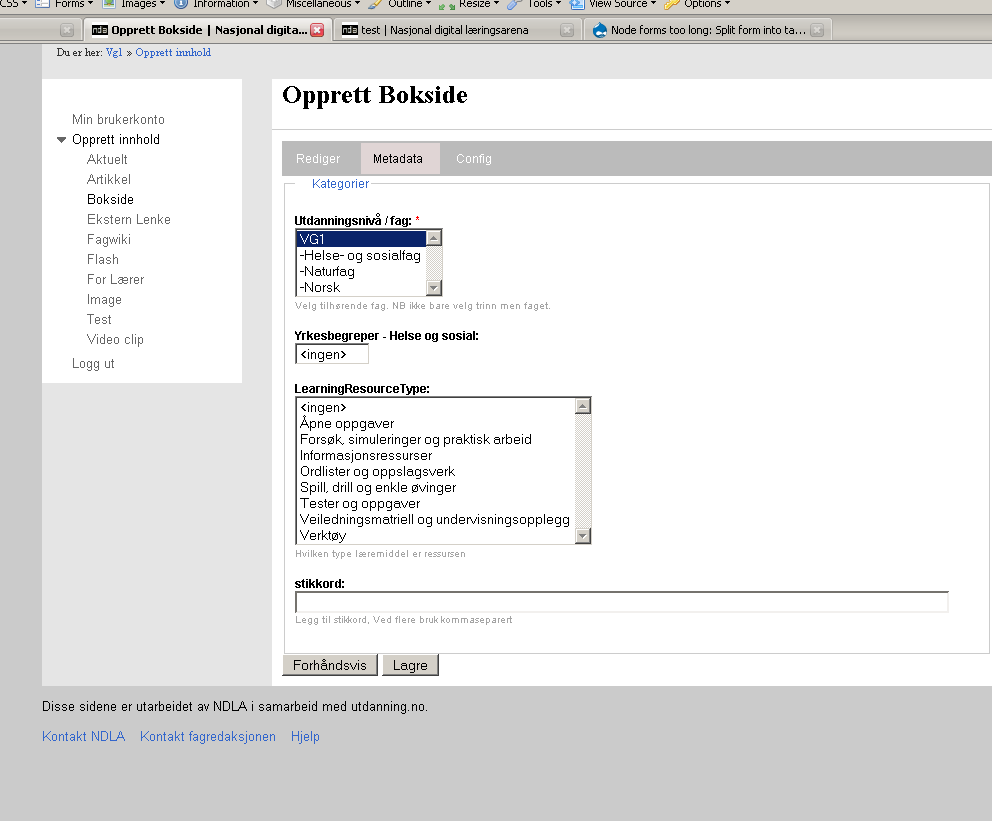
http://kreativmango.no/dev/drupal/node-tabs/
Another idea (also part of the mockup) is to use AJAX to load the tabs into the contents of the page.
There are other ideas for cleaning up the node form, by using e.g. panels to show relevant fields to the right of the most important fields (e.g. Title and Body). These two ideas could be merged into one, having the most important fields nicely layed out on the Edit tab and more advanced fields in the Settings tab.


Comments
Comment #1
cosmicdreams commentedI closed the other issue but forgot to post my feedback to this one:
I like the mockup but have a few alterations:
* When separating the options to extra tabs, collapseable sections should be expanded to reduce mouse clicks.
* The number of tabs should be reduced to View, Edit, Upload, Settings.
* Edit should contain the extra options related to the text of the post (input format, Publishing Options, Author information)
* Upload should contain file and image upload management
* Settings should contain all the various admin and author settings (Comment Settings, Menu Settings, URL Path Settings)
If we were to continue with a 1 page content creation we could group these options as well. We could expand the groupings instead of each individual option. And of course, we could use permissions to control which option to hide and hide the group if all the members are hidden.
Comment #2
elv commentedI wouldn't give uploads a dedicated tab.
Especially for images and any media files because you may want to insert them at a specific place in your content. So it's gonna be difficult if the body field is not in the same tab! And separating image upload and image insertion in two tabs would also be bad.
My take on tabs would be:
- View
- Edit: every module that alters or add to the content itself (media, uploads, wysiwyg editor...)
- Settings: every optional setting. Includes modules that can modify a node's display (teaser tweaks, menus and comments settings...)
- Properties: still unsure about this one, but I think content "properties" like dates, author name, published/unpublished, are about the state of the content, not it's settings or behaviour, so they're apart. In fact what's actually under "Publication options" could be split as "Sticky at top of lists" and "Promoted to front page" are settings, but I guess they're all added by node.module so it may not be easy.
- Translation deserves its own tab IMHP.
A few other modules, like Book module, also add a tab. In the case of Book I wonder if it will still be needed in D6, as I think in now integrates better with standard menus. Too many tabs would kill the tabs!
Comment #3
alpritt commentedChanged title to reflect both the problem and the proposed solution.
My main negative point here would be my overall problem with tabs; i.e. you don't know what is behind them until you click. That said, I think there are also already some positives here:
1. The ajax allows you to easily flip back and forth between the tabs. I'm not sure we actually need ajax, since loading up the whole page in one lump is not that resource intensive (possibly it is less because you are making fewer server calls?). Regardless, I think the instant load makes tabs work much more successfully.
2. The main edit page is definitely a lot friendlier to deal with. It just feels better to have a cleaner layout; it is less daunting.
One thing that immediately strikes me as a little silly is the number of preview, submit and delete buttons. The javascript makes it feel much more like you should be able to make any changes you want, on any, tab and then click submit. If this is the case, you would want these buttons to remain a constant part of the interface, rather than something that appears separately on each tab. I remember the first time I tried to edit my profile on drupal.org and found that when I click on a new tab I lost all my changes. Same problem here.
Elv makes a great point about inserting images. Even now, it is annoying to have to scroll in order to insert an image. However, what does work reasonably well (though I dislike popups) is something like IMCE where you click a button, do the image uploading while you cannot see the edit form, and then are automatically brought back to the edit window when the popup disappears. So I don't think there is necessarily a problem with temporarily losing sight of the edit box, as long as the user is not disoriented and they are brought back to where they need to be when they are done uploading.
Comment #4
elv commentedIdeally we wouldn't need to change the admin page at all, but just add some jQuery magic to split it into tabs. So the whole page would still be loaded, tabs would display instantly, and the same buttons would always be visible at the bottom (I think It's how ximo's buttons actually work).
But if I understand correctly, some filedsets are already kind of grouped and it won't be that easy to rearrange them.
Regarding images, as alpritt said pop-ups may not be the most loved solution but it works. You can still see your content below the pop-up so you don't totally loose the context. Plus you probably already clicked exactly where you wanted you image inserted.
What sequence do you think works best:
A- Upload an image, then place it in your content
or
B- click in the content field then upload an image to be inserted (you can still move it afterwards)
?
Comment #5
cosmicdreams commentedIf we depend on jQuery then I propose the following:
We never require a user to go to a page where the node title and node body isn't seen.
We can put the tabs below the content box and simply replace the collapsible sections with tabs.
OR
We have a guilded workflow user story in using the tabs. Meaning:
1. We name the tabs: Step 1, Step 2, Step 3, etc.
2. We provide arrows: on each side of the "Step" text to illustrate workflow directions
3. We provide previews of how the current node will look like at each step.
As you may see, this is similar to the checkout process of an ecommerce website.
Comment #6
ximo commentedI like elv's grouping of tabs even more now. Reserving the Edit tab only for fields that effect the visible contents makes sense. I'm unsure about the properties tab though, can't those fields be part of the Settings tab?
Do I understand you right, that what could be done is simply grouping all the fields into overall fieldsets of the Edit form, such as Settings, Images etc.. And then use jQuery to turn those fieldsets into tabs? I think that could be done pretty easily.
alpritt:
The naming of the tabs should give you an idea of what's behind each tab. I don't think it would take you long to get a feel of what's where.. And I agree with the buttons and how that's confusing. Preferably, the buttons could be styled like this (see the bottom paragraph): http://www.uie.com/articles/web_forms/
And I realise that the ajax suggestion should have been an issue of its own.. Loading all tabs (or fieldsets?) in one go and only using jQuery to tabify it would be much better.
Comment #7
gaele commentedExcellent article, ximo!
The same currently holds true for collapsed field sets.
I see a problem with tabs, though. The View tab, that is. The Edit, Properties and Settings tabs can all be made so you can switch instantly, while the submit button stays in view. (Behind the scenes you stay on the same page, it's just jQuery/CSS.) However, clicking on View will move you to a different page, and you lose all the editing you did unless you clicked Save first.
Just have a look at ximo's example at http://kreativmango.no/dev/drupal/node-tabs and see what happens.
This means: the View tab (and Translations tab for that matter) is of a different class. Which means View, Edit, Properties and Settings are not equal and should not be put next to each other.
What to do?
Comment #8
ximo commentedActually you wouldn't lose data if you click the View or Translate tabs! They are all just divs being hidden and shown. But it's not clear that it's so. And one might think clicking the View tab would give you a live preview, which it won't.
So there are some things that need to be worked on for this to function.
1. The buttons could be styled to indicate that they apply for all tabs, like these buttons do (see also this suggestion)
2. If you edit a field in, say the Settings tab, and move on to another tab, a discrete message div could show up at the top letting you know you have unsaved changes..?
Comment #9
elv commentedPerhaps the "view" tab is already flawed: right now if you edit the content then click the View tab, you loose the changes (unless you click the Back button) without warning.
We could get rid of the View tab. If you need to go back to the view when you edit, just click "Cancel". That way you know you won't save the changes. It's more explicit.
Then, the "Preview" button could become a tab. The idea being that if you are in a tab, you ARE editing, and probably need to Submit. In normal view, no tab would be active then.
I had this idea just a few minutes ago, I have to give it more thought.
Other comments:
1. It works well with a small dialog box, but in Drupal even if we split the admin page, we will probably never see the buttons and the tabs at the same time, so it's not as efficient.
2. yes some kind of reminder as soon as something has been changed would be great.
Comment #10
elv commentedTo expand on the "flawed View tab" :
- click Edit on a node and change some content
- click View
- click Edit again: you lost your changes!
It strikes me as something totally broken now.
Comment #11
cosmicdreams commentedCurrently, it is the role of the Preview button to show how a change is going to look like before the change is saved. This effectively is the edit -> view -> edit function you describe. Perhaps our reorganization could include a change in the content creation process.
Why not change view into preview. Then we can order the tabs as Edit, Preview, Settings
Or keep the terminology and have the tabs as View (which effectively previews), Edit, Settings. Then have the UI make it appear visually obvious that these 3 tasks are all apart of the same step of the creation process.
Personally, I think when people get to the content creation page, they intend to create or edit content. So I think the primary function (in this case, Edit) should be the first tab.
And I think you can make an arugment for the complete exclusion of the View tab. It doesn't view your current edited work, you already have that view. It doesn't access a customized view of the content that was created by the view module. And it doesn't preview your work. Instead it discards your edits and returns to the previous version of the node.
So if we want it to stay around, it should be renamed Cancel or Discard. Or change its function so that it replaces the preview button. Otherwise get rid of it.
Comment #12
gaele commentedOkay, I've had a serious look at Plone. I think we can learn a lot from Plone. E.g. see the second form (Edit Image) here. Doesn't it just look like the Mac screen mentioned above?
I believe we should leave the default Drupal tabs alone, and create a new Mac-like row under Edit. This second row would concern everything related to editing the node: edit the page itself, the properties and settings. The second row tabs would be just CSS/JS (no ajax). And the first row would stay the same and behave the same: clicking a tab means leaving the page.
Whenever something is edited we could subtly change e.g. the border of the edit form to indicate any unsaved changes. (BTW Plone pop-ups a message if you want to leave the edit page without saving).
Comment #13
cosmicdreams commentedThe second screenshot or the first? I had been thinking about something like this recently too, but the second screenshot is a better implementation that what I was thinking.
As I've said before I'm a fan of providing fewer choices and fewer steps. A default install of drupal has wonderfully few options for a default authenticated user. Just type in the box and hit submit. So we're talking about the case where the administrator has turned on extra functions of Image Handling, different output filters, custom publishing options, etc. for the authenticated user.
This interface accomplishes the goal making subsets of tasks for a given task. Here the parent task is editing (or creating) a node. The children tasks are editing the content, setting publishing options, setting author information, etc. The children tasks are grouped to reduce complexity.
Comment #14
mlncn commented+1 on a subset of tabs under edit that would allow for switching between between these tabs without losing changes. (Solves my concerns).
It would be frightening to train people this way, but for javascript-enabled browsers save could even be the default: unless you click "Cancel changes" clicking on "View" will save what you've done in the edit tabs.
benjamin, Agaric Design Collective
Comment #15
alpritt commentedXimo in #6: "The naming of the tabs should give you an idea of what's behind each tab. I don't think it would take you long to get a feel of what's where.."
Well sometimes that works, but it is very rare. So yes, sure, you know behind the 'settings' tab you are going to find some settings for the node. But what settings? You don't know until you go look. Yes, you can go learn them, and probably do so quite quickly; but really this is just weighing the solution towards experts rather than beginners. Maybe this is acceptable since node editing is something you do frequently and will soon become an expert in. However, I'm not comfortable with the compromise.
Elv in #9: "We could get rid of the View tab. If you need to go back to the view when you edit, just click "Cancel". That way you know you won't save the changes. It's more explicit."
Yes! Sounds like a good idea to me.
#9 again: "Then, the "Preview" button could become a tab."
I like this too. Again, I'm not a fan of the tab metaphor, but this seems like a sensible move in its prime sense.
Comment #16
elv commentedBenjamin Melançon in #14: "unless you click "Cancel changes" clicking on "View" will save what you've done in the edit tabs."
It means View would act exactly like the Submit button, which is not a good thing. At the moment View is a way to go back to the original node *without saving*, so reverting this behavior would be a dangerous move. Plus two different controls for the same action on the same page is usually bad from a UI standpoint.
Gaele: I like the idea of a second row, mainly because it avoids modifying the original tabs. If our suggestions need less core changes, they will be more likely to be accepted.
But I think the way it's done in Plone doesn't fit here, as we have too many "settings" for a single horizontal row.
Comment #17
mlncn commentedelv in #16:
As long as data is saved within subtabs (e.g., they're just hidden and displayed divs) I'm happy with the UI.
The idea of actually removing submit and letting saving changes be the default would be dangerous for people's interactions with other applications-- but not so dangerous for Drupal users. The idea that we can't change default behaviors isn't a strong one. That said, I'm not too quick to embrace change myself and the idea scares me for putting too much reliance on javascript not to fail (graceful degradation to current behavior not so hard though). It's an idea, not one I particularly want to see in Drupal core. However, I could see "assume save" – the logical result of having gone to edit something in the first place – become the standard implementation on the web, and everything else will feel clunky and slow.
Comment #18
elv commentedI believe nobody suggested removing Submit. Saving has to be a conscious action IMO.
A warning or even a popup if the editor is about to leave without saving would be good though. No, I should say it's needed. Every desktop app offers this, and nowadays most wep apps too. You can see it in GMail, Plone, Typo3...
Comment #19
ximo commentedgaele, #12:
Very good suggestion! It makes perfect sense now that you mention it. I also like Plone's editing interface, particularily the sub-tabs in the second illustration.
To have sub-tabs like that in Drupal, we could just turn the existing fieldsets into tabs using jQuery. There's an obvious pitfall to this; a lot of modules generating a lot of fieldsets would result in too many tabs to render horizontally.
To solve this, one could place the fieldsets into a pre-defined and agreed-upon set of tabs. A module adding a fieldset to the form would then specify which tab it should belong to, or add its own tab if it needs one. The responsability would be on the module developers, but with good documentation and a clearly defined set of sub-tabs it shouldn't be too hard to live by, me thinks.
elv, #9:
I agree that the View tab is flawed, but I don't think it should be removed. Regardless, users really need to be warned when leaving a form they've edited and not yet saved. This is dead easy in jQuery (I guess a one-liner) and would remove one source of frustration from Drupal. (Note to self: write a patch for this!)
cosmicdreams, #11:
I agree that the Preview function as of today is horrible. I think a Preview tab would be great! This should maybe have its own issue? It's not really related to splitting up the form into tabs..
Comment #20
elv commented-1 for several sets of tabs. Bloat awakes ^_^
Plus we'll end up with nearly empty sets of tabs, and big sets larger than one line. It would add complexity for the module developers, and that's exactly what we don't want.
Anyway we shouldn't have two rows of tabs IMO. Tabs + links, or tabs + buttons, whatever, but not tabs all the way. If you look at the Plone screenshots, the second row does not hold tabs but dropdowns. They're a mix of settings (publication status, display), editing stuff (add item), etc. which is probably not a good thing.
Comment #21
ximo commentedYou're maybe thinking about the first illustration, not the second one?
When I say tabs, I don't mean tabs just like the second row of tabs we have now. I'm thinking something along the lines of the second illustration from Plone, which looks more like a tabbed fieldset. Not "page tabs", but "field tabs".
It could be done by adding a new element to Forms API.. An attachments module could then add its own tab (if it needs one) and fields to the node form like this:
The "Attachments" tab would be built with the whole form, so it could be on either a "first row" tab or a "second row" one. I agree with elv in sticking to one row of tabs for the node form. After the tab has been built and output, jQuery and CSS would do the rest.
As for which tabs to use.. I'm not thinking a large set of tabs, maybe just "Content" and "Settings". The "Content" tab would only hold fields that contain the contents of the node (Title, Body, CCK fields..), while "Settings" would hold all other fields. Individual modules can then add their own tab if needed.
So we may have a pre-defined set of tabs with modules being able to add their own. There are obviously other ways to get to node form heaven, but I think this approach is pretty feasible. It provides a much cleaner node form without any radical changes.
I should make a mockup of this...
Comment #22
gaele commentedI was thinking about the second illustration.
Comment #23
Bevan commentedsubscribing
Comment #24
ximo commentedAllright, I've given some more thought to this (#21), and have come up with a mockup.
I said some confusing things about first-level and second-level tabs in my previous comment. To better grasp what I tried to say, have a look at the mockup.
First, I found out that instead of having ALL fields put into these sub-tabs, it's much better to do it somewhat like Joomla or MODx - by having the most important fields visible at all times. These fields may be Title, Body and other vital fields.
A potential pitfall here is ending up with too many tabs. One tab for each contrib module's current fieldset sounds like a horrible mess. So for this to work out, we would have to figure out which set of sub-tabs to provide as a default, so that contrib modules can put their fields into appropriate tab.
Some modules might require a tab of its own, but I don't think there are so many that there would be too many tabs on any given setup.
I'll be awaiting your comments and feedback :)
(PS. You can try out a working copy of the mockup if you're on a Mac. Just download this Dashboard Widget..)
Comment #25
gaele commentedximo, this is great. Just what I was thinking of.
- This is just how it should look like and work: switching tabs instantly, title, body and buttons at the bottom are static.
- The choice of fieldset-tabs could/should be part of form-API. Could even be restricted to a few general choices, so there won't be too many. Like: settings, options, the ones elv mentioned somewhere.
- The tabs look good centered. Is this the right location though (as everything else is left aligned)?
- Will they look clickable enough in reality?
- I like the graphical design / alignment of the body text area and the tab in the mockup. How will that look like in reality?
Comment #26
elv commentedI really love this too! Now I get it, and it seems a better way to implement tabs than the initial idea. As I said on IRC, it's quite Plone-ish but in a good way.
Pros:
- body always visible, so we don't have to deal with people forgetting to submit after they make changes in another tab
- separation between "functions" (local-tasks) and "tabs" (views of the same context)
- shorter edit page. Still requires some scrolling, which is OK in my opinion
- probably no big changes needed in core
Possible cons:
- we need to limit the number of "sub-tabs", i.e. we must define a few tabs and stick to them
- shouldn't the filters be visible when you enter content? They feel a bit misplaced/buried in the Settings tab. Plus they're a part of the body's form-item, so they may be difficult to set apart (but they could be placed in a... collapsible fieldset!)
- same old "mystery meat" problem: you can't see what's in the tabs until you click on them
Regarding the tabs look, they need to look clickable, more than they do on the mockup.
The alignment is not that important as we can change it in the style sheet, but as everything is left aligned everywhere else we should probably stick to it.
Comment #27
eigentor commentedHah, passing the elk test. Ximo drives no mercedes A class. This is just a perfect idea combining optical appeal (something round in the middle can be associated with balance, peace for me) with a practical good position. Somehow it "feels" good. Isn't it amazing, how moch those small changes matter?
Rock on
Comment #28
gaele commentedRegarding filters: I would like to see a poll how often the filter settings are actually used (i.e. how often a user changes the default).
- If a WYSIWYG editor is used the filter settings should not even be shown
- If only one option is available the filter settings turn into a help text: an explanation of what could be entered and what happens at display time. This should certainly not be placed inside a tab.
- If more options are available I'm not so sure. Perhaps the settings could be in a tab, but the help text (repeated) under the body field?
Comment #29
gaele commentedelv (and others) said tabs should be considered views:
I just ran into this quote from Dries:
There you have it.
Comment #30
elv commentedYeah I was aware of this, and even of this topic about tabs' birth in Drupal, but have always though it was a strange UI decision.
Hey I just realized the sub-tabs with rounded corners and centered really look like OS X tab views. Was it done with XCode or another OS X tool?
Comment #31
elv commentedI just re-read the old initial tabs topic from 2004, and I think I didn't get it the first time.
If Dries meant tabs are links to actions, then it makes a lot more sense.
Buttons are "actions", obviously: when you click a button, it triggers an immediate action on data (Submit, Post comment, Attach...).
Top right buttons in Joomla are adequately designed as buttons
Tabs don't trigger anything in Drupal, they take you to a page, where you usually can trigger an action. If you click on an Add field tab, it won't add anything yet, but will take you to a field creation page with an "action" Add button at the bottom.
Initially I thought the local tasks could be styled as buttons, but now in the light of this discussion I'm stepping back: as they are links to pages this would be misleading.
Comment #32
olemsa commentedI find this thread most interesting.
Im working on the same thing. Node forms should definitely be split into tabs
Comment #33
chx commentedAlways think on this needs to have a fallback w/o JS (overlong form? can be acceptable) because if there is no JS then the subtabs are not good because you can simply forget to save.
So, to actually implement this, we need to a) move things into fewer fieldsets b) probably add a flag for subtab c) render subtabs as, well, subtabs.
How can we get a) done? ximo's mockups are great but then they do not everything just core can have on a node form, not to mention contrib.
Comment #34
eigentor commentedThis topic is nothing else but complex ;)
I believe we won't get away from building working samples, so one can try out in live test which solution works best. It is sure a lot of work, but as certain worth the effort.
So three or four feasible alternative solutions have to be coded, and in the end most of it gets discarded. But it is probably the only way to get ahead.
Since the theming level and maybe a bit deeper is all I'll get to, a question to the coders: is it feasible with a reasonable effort to build a module that helps performing the tasks chx mentions
so also the not-so-coders can contribute to the process? It is nothing that has ever to be an official module, just a working tool. I imgagine it to make it more handy to provide options where to put this or that option. Bundling certain options into divs with a class so one can handle it would also be a start.
Comment #35
ximo commentedchx:
To provide a fallback for non-JS browsers, the fieldsets will have to be rendered as normal fieldsets on page load. Then a quick jQuery-line at the bottom of the page would apply classes to the fieldsets, rendering the subtabs even before the page has fully loaded, and of course only for JS-enabled browser.
As for a), that's a tricky one. There is no limit to how many fieldsets there can be on the node form, and there is a limit in horizontal real-estate on our monitors. SteveJB's suggestion over on g.d.o with tabs rendered vertically easily solves this problem! It keeps all the Pros of our proposed subtabs, while we also don't have to make any changes to FormAPI - it should work on the existing fieldsets only CSS and JS.
eigentor:
I think you're right, we need to make some working examples to see what actually works and what doesn't. I think a lot can be done in jQuery and CSS. It's much easier to assign classes, encapsulate elements etc. in jQuery than in PHP, and the rest is really just CSS. I'd like to try this out right now, but I'll be busy for the rest of the month. I'll give it some love in february :)
elv:
I used DashCode ;)
Comment #36
mlncn commentedNote that doing this work in CSS and JavaScript doesn't have to be wasted– only one approach can be used by Drupal core, but we should strive to make other approaches possible for Drupal themes. So other approaches can potentially be used by that, and you can launch a very good consulting career specializing in making Drupal not look like Drupal ;-)
Comment #37
ximo commentedVery good point :) I'm already doing that, and trust me - people like having a CMS that doesn't look like one.
So absolutely, we should strive to make this, whatever form we end up with, easy to theme and make look totally different. Shouldn't be a problem as it's all CSS and jQuery, but it's something to keep in the back of our minds as we go about this.
Comment #38
sutharsan commentedMoving issue out of User exprience project.
Comment #39
ximo commentedClosing the issue, as I'm glad this idea has been taken further in the form of vertical tabs. (Thanks, dmitrig01!)
http://drupal.org/project/vertical_tabs
http://drupal.org/node/323112