Problem
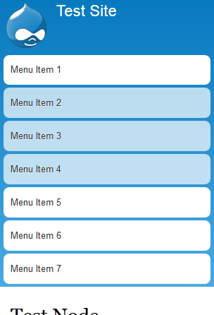
Let's imagine we have more than 5 menu items.
Main menu of a site fills all height of window on smartphones up to 460px width.
Please see screenshot below.
Solution
Make the main menu collapsible and give possibility to expand/collapse it.
See screenshots below.
Collapsed:
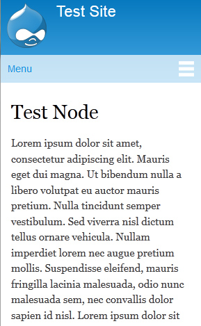
Expanded:

Demo
Please take a look at implemented solution http://komelin.com/.
Tests
The solution has been tested in several browsers, such as:
- Opera 12.11 (Win7)
- Safari 5.1.7 (Win7)
- FireFox 17.0.1 (Win7)
- Chrome 23.0.1271.97 (Win7)
- IE 9 (Win7)
- IE 7/8 Compatibility modes (issues with PNG backgrounds)
- Mobile version of IE 9 (WindowsPhone7)
- Android native browser (HTC Desire S)
Also, tested via responsinator.com.
Tested RTL language support (Arabic).
Tested on different Bartik color schemes.
I'll provide a patch in 10 minutes.


Comments
Comment #1
Konstantin Komelin commentedHere it is.
Please review.
Comment #1.0
Konstantin Komelin commentedUpdated issue summary.
Comment #1.1
Konstantin Komelin commentedUpdated issue summary.
Comment #2
Konstantin Komelin commentedSorry, I lost binary file of toggle icon in #1 patch. Please ignore it and use improved one.
Comment #3
Anonymous (not verified) commentedthe binary file "images/toggle.png" is not created. Applying patch trough TextMate on Apple MAc
Comment #4
Konstantin Komelin commentedDon't know what's the reason. Using console git diff --binary / git apply
I've attached toggle.png to the comment. Please put it into images folder manually if you have problems with #2.
Comment #5
Anonymous (not verified) commentedthe patch #2 works perfectly. Pls commit.
Comment #6
mjohnq3 commentedThis looks great. Let me play around with it for a while and I'll look at committing it.
Comment #7
expressdave commentedpatch #2 still has ie 8 issues for me. Each menu item appears as stacked horizontal bars.
Works well and collapses nicely on all other browsers.
Comment #8
Konstantin Komelin commentedexpressdave, thanks for your tests!
Could you please provide screenshot of the issue?
I'm not sure we have mobile devices with IE 8.
Comment #9
Konstantin Komelin commentedComment #10
expressdave commentedhttp://rmchait.com/bartikRes.png is an image of the Responsive theme as it appears in ie8 (Footer 1st - 4th column column also stack like menus). Mobile ios and android look ok (except toggle.png is in image file, but does not show), but unfortunately since ie8 (large screen) does not work, cannot use responsive theme. Perhaps there is a ie8 patch?
Comment #11
Konstantin Komelin commentedexpressdave, you probably should not change the issue title and Category. Please create a separate issue for your IE 8 problem instead.
mjohnq3, please pay attention to it.
Comment #12
expressdave commentedhttp://rmchait.com/bartikRes.png is an image of the Responsive theme as it appears in ie8. Other modern browsers look ok. Is there an ie8 patch?
Comment #13
Konstantin Komelin commentedRollback of the issue category and title.
Comment #14
mjohnq3 commentedCommitted and pushed to 7.x-1.x.
Comment #15
mjohnq3 commentedComment #16
Konstantin Komelin commentedGreat! Thanks!
Comment #17
Konstantin Komelin commentedmjohnq3, are you interested in D8 patch?
Comment #18
mjohnq3 commentedThat might be interesting. You could at least propose it for D8 Bartik and see what people think.
Comment #19
Konstantin Komelin commentedCreated core issue #1880488: Make menu collapsible on small screen resolutions
Comment #20.0
(not verified) commentedUpdated issue summary.