Problem/Motivation
It is sometimes hard to find a module in the code base:
- Modules may be organized in (nested) folders
- Module machine name does not necessarily match its readable name
- There are different places (core/modules, profiles/.../modules, modules) where Drupal is looking for modules
Proposed resolution
Display module location in expandable detailed information section, together with machine name and version
Remaining tasks
Agree if this solution should be part of core, or moved to contrib (see comments #45, #49)
User interface changes
New line in detailed module information section
API changes
No API changes
Data model changes
No data model changes
Original report by @mlncn:
Use case: You just installed contrib module img_assist, nat, or i18n and are therefor most familiar with it by the name you just saw on the file when you downloaded it (or installed it with Drush).
You go to your modules page to enable this module for the first time, and faced with the huge list of modules, you fall back on ctrl+F to search for what you were just dealing with. There's a chance you won't find it because only the human-readable name for the module can differ a bit from the file name: Image assist, Node auto title, and Internationalization in this example, but contrib can get even more cryptic.
That's the basic use case but the point is that most people who will be using the module administration page will be handling the module files themselves at some point, one way or another. We shouldn't be hiding the module's system name for the sake of a slightly simpler interface.
A good spot for the system name would be right before or above the version number.


Comments
Comment #1
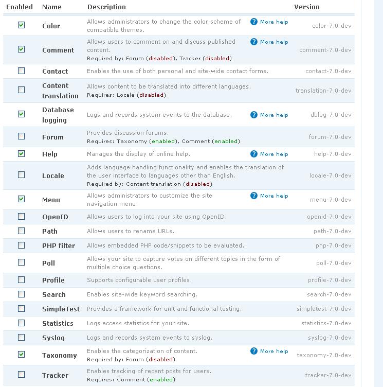
galapas commentedAttached, find two patches.
The first (system-admin-inc.193034.patch) satisfies the request raised with this issue as it renames the module 'Name' column to 'Module Name', and adds a new column called 'System Name'. Further, 'System Name' is populated using the path of the module.
As feared, this solution does clutter the system module list, therefore I am including an alternative patch (system-admin-inc.193034-alt.patch) that leaves the columns as they were, however, hovering your mouse over the module 'Name' causes the module path to appear in a pop-up.
The alternative patch has the advantage of not adding clutter to the system modules page, though it does have the disadvantage not being searchable.
Note that the alternative patch is complemented by an update to system.module (system-module.193034-alt.patch) to provide help that reveals the otherwise hidden feature.
Comment #2
catchComment #3
mlncn commentedThese patches all work. Thanks galapas! If people like what they do, they're ready to be committed.
I'm still holding out for, somewhere -- maybe right before or right after the description, so most of the time we wouldn't even be taking up any more space on the page, vertically or horizontally, having just the system name (without the path). The path, which now that I've seen it on the modules page thanks to galapas' patch, is awesome to have but could be a pop-up, since there's not really any call to be able to search for it.
I tried to make a patch that did this, just a variation of galapas', but I screwed it up somehow. I'll try again in a day, several deadlines to make first.
Comment #4
galapas commentedPlease note that the alternative patch (files system-admin-inc.193034-alt.patch and system-module.193034-alt.patch) do provide the pop-up already.
To be clear, the initial patch (file system-admin-inc.193034.patch) adds a 'System Name' column.
And the "*-alt.patch files provide the solution as a pop-up.
Comment #5
mlncn commentedYes– and I think the best solution is the system name (without path) somewhere where it takes the least room, with the path as a pop-up ;-)
Comment #6
pasqualleI agree with showing the help link only on admin/build/modules page. see: http://drupal.org/node/192962
So please move the module system name to the help page. It is as good as the tooltip solution.
Comment #7
pasquallebut accept other reviews. did not mean to change the status
Comment #8
robin monks commentedSounds more like a feature request to me.
Robin
Comment #9
dmitrig01 commentedI don't like this. It's not useful. It makes the UI confusing.
Comment #10
sutharsan commentedMoving all usability issues to Drupal - component usability.
Comment #11
cburschka+1, I not only love this, I need this. System names of modules are very hard to find out without opening a shell, and finding out where the module is (the equivalent of "which" in Unix) is impossible without doing so - and looking at {system} if the module is installed in multiple places.
If four columns are too much clutter, consider removing the version column, which is only useful if you are neither using update status nor CVS to keep your modules updated.
Comment #12
Bojhan commentedPlease provide screenshot.
Comment #13
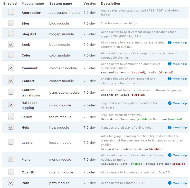
panchoOne year after the last patch, the code has completely changed. I therefore rewrote the following variants:
Enclosed are 3 patches and 3 screenshots (including 'as-is' but not the hover version).
Now this is really CNR...
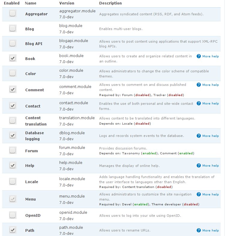
Comment #14
mlncn commentedFantastic, Pancho. Combined hover is awesome! I think it would be even better with the .module part of the module name removed (since this will always be there, it's not adding information), but even with that I'd call combined-hover.patch ready to be committed.
benjamin, Agaric Design Collective
Comment #16
catchre-testing.
Comment #17
dries commentedI prefer the combined view as well. I wonder if we should also use the small font size for the combined column? No real preference, just floating the idea.
Comment #18
Magnity commented+1 for combined column.
Smaller font seems like a good idea too - after all, if its mainly there for search purposes then it doesn't have to be too big - and small means the page doesn't get quite as cluttered.
However i'm not sure we need the hover function if the system name is visible anyway though.
Comment #19
mlncn commentedHover gives the path. Not needed for search, but a big bonus in letting you know exactly what module is in use (a module could be located in profiles/example/modules, sites/default/modules/, or sites/all/modules for instance).
Comment #20
Bojhan commentedI am kind of disturbed by this patch, it seems to add a lot of clutter to a interface that is already very hard to scan trough. Calling for a smaller font basicly means, we want to make it less prominent (which I dont think is achieved by a smaller font). I see the case for people who have trouble finding the module, but does the occurrence of this problem weight up against the valuable screen real estate it takes up?
Comment #21
mlncn commentedThe occurrence of the problem is frequent for anyone who builds or maintains a Drupal sites with many modules. Modules file names (which are your main reference for the module in the Drupal.org project path and when you download or use Drush) are equivalent to the system names, so it is key that they appear, and be searchable, on the listing page. Over the version works very well (echoing the tar file packaging) and makes good use of space.
Here's a small tweak to remove the ".module" file extension from the display. (Using substr– there's probably a better way, but at least you can see it, slightly de-cluttered.)
benjamin, Agaric Design Collective
Comment #22
Bojhan commentedCan you please supply a screenshot with your change? I still think that this patch would add to much clutter, isn't there a better way to solve this problem (at its occurance, the naming in CVS?)
The problem only exists, when you install a module that has a conflicting map name versus actual module name. Where we would like to use this page for more purposes, and making it a easier starting point to set permissions and configure your module propperly (illustrated here : http://groups.drupal.org/node/10919#comment-38637 ) however if we add system names to this page, we have to carefully rethink for who and if we still can balance this page.
Can't we put more emphasis on the modules, that have just been uploaded?
Comment #24
tstoecklerComment #25
jon pughHere's a patch that does three things:
I like this because it unclutters the module name and description, AND gives me the full package name, so I think it solves both problems described here.
I also just think it looks better. The specific version information isn't all that helpful except in specific situations. This makes just browsing and visually searching the modules page easier on my eyes.
Comment #26
catchScreenshot looks good to me - would make it actually possible to find modules using CTRL-F in firefox instead of getting lost in the dependency sea. Patch needs some whitespace fixes though. Also I think it's probably OK too leave the $version variable rather than using $extra.
Comment #27
Bojhan commentedI am still convinced that this patch adds a lot of clutter (making it gray, doesn't account for the 100 words + column more on this page), especially concerning all of the new ideas that are for this page that might be more in line with the workflow - we should really find a way to fix this without this method.
Comment #28
jon pughYeah, I wasn't sure about the $module['version'] variable... I added it to $extra because the $module array comes direct from module_rebuild_cache. I didn't want to mess with the $module['version'] var in case it was used somewhere else.
re: #27, I do understand that the modules page needs a total overhaul, I just thought this small modification would help start that.
Comment #29
Magnity commentedI like this idea best out of the ones proposed so far. Mainly because it doesn't add another column, and only mimimal text. Its definitely a step up from the current ui, even if there could be a better alternative still.
Comment #30
mlncn commented@Magnity - This does add another column-- I still think this system name can:
1. appear under the name (small and gray, careernerd's look in that respect is fine by me)
2. have the system path in a title tool-tip on hover-over!
@Bojhan - this provides lots of information and usability with almost no extra space and minimal clutter. Usability win. (I also agree that core should have a page of recently added modules featuring configuration links, but that should be a separate issue.)
Comment #31
jon pughFirst off, it doesn't add a column it just moves it.
Secondly, I think this page could use a multitude of enhancements.
Some information I think we should add:
Of course, adding all of this extra information would clutter up the form. We should try to keep this page as simple and clean as possible if we are say we believe in making things easy for novices.
This issue is probably best merged with #363319: Redesign module page ...
I think any more work on this should be part of work towards a total redesign of the modules page.
Comment #32
jon pughAdded a screenshot of a mockup for a total overhaul of the modules page... on this ticket: #363319: Redesign module page
I think we should close this ticket and move all discussion to that ticket.
Comment #33
mlncn commentedLet's keep this issue for now. This is a small, focused usability win, whereas the other issue is a very big change.
Comment #34
mlncn commentedThis is D8 now. I still really, really, really want this and think most people who use the modules page are 60% of the time enabling a module after getting it via a download or drush (and so see the project name in both cases) would really benefit from ctrl f here.
Adding system name search to module_filter module and trying to find a good way to put this in contrib are my D7 priorities.
Finding someone to hold Bojhan down while this gets committed is my D8 priority ;-)
Comment #35
mlncn commentedAnd, last mention until D8 dev begins... as a general principal, i don't think we should veto small wins on the basis that a much bigger win is necessary. That said, the disparity between the *projects* on the admin/reports/updates page versus the *modules* on admin/modules makes me think that lacking the project name, rather than the module system name, is the key usability issue. So enforcing grouping by project (the lowercase end of the d.o/project/namehere path, not any fickle changeable title), and turning package into a tagging/sorting option is a better fix...
Comment #36
Bojhan commentedAnyway, I am not convinced this is necessary for a majority of our users and even only for a small subset - even webchick and merlinofchoas said it probably won't be above 10%. Polluting the module functionality screen with stuff that will be useful only occasionally, to me sounds silly - since it will have a big impact visually adding another element. I am not saying we shouldn't do small improvements, because there are larger fundamental issues - but I am saying, we should aim for a solution that has little to no impact visually - using a title attribute could work for example.
You can hold me down, but this is not a matter of opinion - its a a UX argument and you are not considering it.
Comment #37
valthebaldI hope that in the current module list outline (with expanding description) adding internal module won't add much of a clutter, but provide information that would be useful for many. I even suggest going further and provide module location, not only internal name. Here's how it looks like after the patch:
Comment #38
traviscarden commentedPatch works great, @valthebald; it just has a little extraneous whitespace. Here's the same thing with that cleaned. Hopefully with a few more reviews this can be RTBC-ed, because it's super useful and practically free.
Comment #39
panchoI'm not sure about #37/#38.
It is true that we have enough space after the redesign, but still it's not for free.
Extraneous information about internals does contribute to making things "feel complicated". Extending the Drupal install finally should be Plug'n'Play. We're not there, but if we now keep adding more technical infos, it's not getting better for the regular admin.
I like Jons idea in #25, which seems a good compromise, so we'd have a line such as:
Version: og_ui 8.0-2.4
It's quite some help even for developers, while not cluttering the information for the others.
It might be even better to make it link to the project or even to the release. Having project documentation and release notes at hands would be both intuitive and a lot more helpful for the non-developing admin.
And I think this would be the maximum we can still get into d8 after feature freeze.
In D9 and/or contrib we can later discuss 'verbose' modes and/or whatever else developers need.
Comment #40
traviscarden commentedI think that the module location is important information. Suppose the case of a multi-site installation where the module could be in numerous different places—there may even be multiple versions of it in different directories. Such is the sort of case that motivated me to pursue this functionality, which a mere machine name does not address. Admittedly it's of less value to highly experienced developers, who'll probably use Drush to find such information. But this would be really helpful for newbies and folks who don't have access to Drush.
Comment #41
pancho@Travis:
I absolutely agree that the module's location is important, and there are situations where it would be very convenient to have it displayed just there. However, people like you and me and most developers know how to find stuff. We don't need "nodes" be called "content" or whatever.
Now what I was talking about, is how easy Drupal feels for the average guy installing it the first time, checking out some modules, making the first steps in building a simple site.
And what you're talking about, is how convenient Drupal is for intermediate admins and newbie developers.
That's two different audiences, and for both there are good arguments.
I'd argue that core should cater to the absolute Drupal noobs, because that's the area where we lag behind other CMS. Newbie developers can be catered by an additional contrib module.
Maybe we can even find a good solution for both. But first of all it would be important to know to which extent this can be improved in the D8 schedule.
Comment #42
valthebald#41: Let's not underestimate novice Drupal users/admins. If they were able to download/unpack/install Drupal, would they be confused by paths to module file?
Comment #43
panchoHow about this patch?
I'm providing both systemname and location, but exposing only the systemname, while enabling devel module to expose the location as well.
Also enclosed a patch for devel.module which does the rest. Use together.
This solution should cater about everyone while keeping things simple and clean.
Comment #44
valthebaldI think we're a little bit stuck between 2 options:
I personally don't think that module system name and file path create more confusion for novice site admins, than module system name alone, but it would be great to know someone from "UX squad"
Comment #45
Bojhan commentedI have already provided feedback in #22, #27, #36. I do not see this as necessary information, for the ordinary site builder. It sounds like this would be a fine contrib module, this would have been more important when the modules folder was still in the root of the Drupal download, but its not anymore - so the only usecases I see are 1) multi-site setups 2) you can't find the module folder corresponding with the module name.
For usecase 1), multi-site setups we already made that "upon adjusting settings.php" this kind of arguments the idea, that from a core perspective we consider this usecase small. So far my comments, have not even been discussed - so stop calling upon the UX team when you don't discuss their feedback anyways. The best step forward here is to get committers feedback, because the feedback you are getting is being ignored.
Comment #46
valthebald@Bojhan: I was under impression, that changes in module list display made #22 and #27 less relevant (there is no additional clutter in module list anymore, at least in default state without expanding description block). Adding text in expandable block, IMO, falls nicely into "little to no impact visually" niche mentioned in #36.
I wouldn't submit patch in #37 without mentioned changes in module list display.
Regarding use cases that you see, it's 2) that seems to me more painful, having nested project folders (data/data_entity? Or, even less obvious, ctools/page_manager?)
Thanks for your feedback anyways
Comment #47
pancho[edit:]
@Bojhan: As valdebald says, your feedback in #22, #27 and #36 refers to the situation before the module page redesign and to particular outdated patches. So a new usability review would indeed be helpful now that we're talking about adding a row to an collapsed fieldset.
Also t
There is a large number of both contrib and core modules where the displayed module name differs from the module name in the filesystem, see "Interface Translation" vs. locale.module
Now if we say, we don't want to cater the 10% use cases of admins that do stuff in the filesystem (such as applying patches or modifying minor stuff), then it's fine with me. devel module can cater them adding some more information.
But the sheer internal name of the module is important to know even for admins that never touched any code. Whatever information they can get about say locale module on the d.o site or somewhere else will refer to 'locale module', not to 'Interface Translation'. So it's not just a matter of 'finding the module in the filesystem', it's a matter of 'knowing what you have enabled' and 'finding information about it in the net'. And that is a usecase 3) which is relevant for about every site admin.
That's why I think my patch in #43 is a slick solution for core and a nice enabler for devel.
However I'd be fine with either solution.
If we'd go for #38, we should remove the 'if ($version || $location || $requires || $required_by)' check, because every module has a $location.
Comment #48
panchoSorry.
Comment #49
Bojhan commented@Pancho The fact that we have a disclosure method, does not mean its a good idea to put more stuff in there - we really tried to keep introducing all these features out of the module page issue, simply because it adds so much more clutter, progressively disclosed or not. I am not convinced that this is a prominent usecase, given that core should support prominent use cases - I don't think this should be part of core. I am sure there are usecases, and locale is one - but exposing this still adds clutter to an interface we purposely tried to keep really clean because its easy to feel overwhelming for beginners and intermediates.
However as said, I think this needs committer feedback.
Comment #50
panchoThat's fine with me.
I'm adding a third, combined option as prefered by Dries in #17 (pre-redesign, though).
And I'm providing screenshots for all of #38, #43 and #50, so everybody has an immediate idea of what the patches are doing:
Screenshot with patch #38:

Screenshot with patch #43:

Screenshot with patch #50:
No matter which version we're going for, I believe the search function should bring up both display names and module names, so a search for "locale" brings up "Interface Translation".
This would be a very helpful followup improvement, but requires displaying the module name in the fieldset, because otherwise it would be rather obscure.
Comment #55
xjmWhat and what kind of committer feedback does this need? Product manager review?
Comment #56
Bojhan commentedWe need a decision, don't think its really a product level decision.
Comment #57
valthebaldComment #59
valthebald@xjm - updated issue summary, added references to comments that asked for committers feedback
Comment #60
traviscarden commentedComment #73
smustgrave commentedFor the feedback and will need to be updated for 10.1
Comment #75
nicxvan commentedComment #76
nicxvan commentedI'm wondering if we close this and open a targeted issue.
The original issue and most of the discussion is around adding the machine name and allowing search by machine name, both exist in core.
There has been a lot of back and forth about the location, but I really don't think the ui is the place for it and while the issue summary seems to have been updated for that the title has not and I do not see a strong consensus asking for it, even the title seems to imply it's not necessary.
I'm going to mark this as postponed for now to give a chance for response.
If there is a strong desire for just the location I think a new issue is warranted and related here.
Comment #77
nicxvan commentedI'm going to close this as outdated for the reasons in 76.
If someone really thinks the location is worth adding still I think contrib and a report subpage is the place to add that first.