The module administration page could serve more purposes than it does currently, and this could significantly reduce the barrier to entry for new users.
Currently if a user enables a 3rd party module, they must navigate to /admin and sort by module just to easily find the configuration and help links for the module. This (while useful to those of us who've used it a while) is kind of obscure for new users, and frankly we could all benefit from a change in the UI of this. Thus I'm going to dredge up an old issue and post an example of what this could really look like.
I think this is REALLY important. I've had to explain how to find this stuff to highly technical individuals... I shouldn't need to do that, and for the less technical folks, I can't imagine how difficult getting past this curve is.
With that said, what I propose is this:
Configuration and Help links should be present for all enabled links ON the module admin page. The theme admin works this way, and helps make it easily accessible to the non-technical.
The current uninstall process is more than a little annoying. Again, this should ALL be maintainable from the module admin page w/o having to make any extra "un-obvious" steps. I'm proposing an ajax popup that prompts the user to uninstall the module when they disable it. This is similar to how the whole friend mechanism of facebook works.
I'm going to leave it at that.
This has been mentioned before here.
And my mockup for how this could work can be found here.
Again, I'll reiterate, this is really important in my opinion. The more we can streamline the admin in general the higher our adoption rate will be (I believe). I know that the "Enable"/"Disable" buttons probably won't be super well received (from previous examples) but again, I'm going to ask that we consider it even though it's a little different.
Ok, I'm lining up in front of the firing squad. Fire away.
Eclipse


Comments
Comment #1
alpritt commentedRight now the easiest method I've found for discovering what a module does is to open up the .module file and read the code; which is pretty insane. I think adding a help link next to each module entry is a good idea to help here. A link that is greyed out if no implementation exists.
As for the configuration screens having a link, I'm not sure how much of a good idea this is. It makes some sense, because you will always know where to look. But modules tend to (and should be encouraged) to integrate throughout the interface; so how would this work, for example, if all the module did was add a new filter or a new block?
I would also consider how update_status could be combined into this interface (though perhaps we shouldn't tackle that yet because of higher priorities).
On the subject of uninstalling... First; A modal popup is not a good solution. It forces you to make a decision before you can do anything else. If you don't want to uninstall you should just be able to do nothing. This is particularly important for developers, since enabling and disabling modules is a common thing and I rarely want to uninstall when I do this. We also need to be particularly careful with uninstalls because you can lose data this way. A yes/no question is asking for trouble since you are too likely to hit the wrong button. I'm not sure uninstall should actually be that prominent for this reason.
The button replacement for the checkboxes is an interesting idea though. If this is an ahah call it will allow the opportunity to dynamically alter the table row with different data for the enabled modules. For example it could go green, the help text link could activate and so on. It will save an extra click, and a scroll down to the bottom of the page to click the save button. Good move in my opinion.
Comment #2
alpritt commentedHelp text is often used as a crutch, so let's look there for problems...
Fair enough.
An example of buried functionality. If we improve the inbuilt help system, perhaps we can automatically make implementations of hook_perm() show up in the modules default help page. The module developer could then add to this if they wish.
This seems like the wrong place to talk about performance. I'm not sure if this suggests a UI problem with the throttle module somewhere.
This needs integrating better once you enable a module. Or automated? I frequently forget to do this myself.
Again, another example of buried functionality. I've just realised that admin/by-module kind of implements what I was suggesting to do with the help pages. The problem at the moment, is that by-module does not seem to enter into the natural workflow. It says something that I have found it more intuitive to read the code than to go to this page to grok a new module. I wonder if this screen should somehow be integrated with help. hmm
Again, I think update_status and the main module page should be integrated. Admittedly this makes the problem a bit more complex, but I think it is a worthy goal.
Comment #3
alpritt commentedA rough idea of what two changes would look like.
1. When a module is enabled the row turns green so that it is easier to see what is enabled and what is not.
2. The enabled modules also gain a link to the built-in help pages.
I've just realised that the help pages for each module already contain links to their relevant administration pages. Checking the help pages should be the default activity users enact when they install a module that is new to them. Hopefully this will put it into their workflow.
Comment #4
alpritt commentedI'm pulling out some relevant quotes from the older issue. This is a long comment, but the thread is much, much longer ;) Some of the UI ideas didn't get resolved in that issue. I'm not sure if there were further discussions?
Re. Buttons.
The original idea was to use links instead of buttons for enabling/disabling a module. The argument for buttons and not links was made: "In addition to being "what the spec calls for" using buttons prevents problems with some browser extentions. Certain web "accelerators" will follow all links on a page which has disasterous consequences for pages like this." (http://drupal.org/node/76340#comment-431061)
I believe d6 makes it easier to create image buttons so we have this choice (think views, for example) to make buttons more appealing.
"I kind of prefer the old checkbox method for enabling and disabling modules. Merlin and I talked about this in IRC... Its technically more clicks with the checkboxes, but I see it as more round trip time to the server...
I'm more concerned about page requests than clicks. [...] I also see buttons as more prone to accidental clicking." (http://drupal.org/node/76340#comment-431073)
If AHAH is implemented this won't be an issue any longer. While the user is waiting for one module to install, they will be able to click on other modules. So this should speed up the process for anyone with js enabled.
Re. uninstalling modules.
"It needs to be made WAY more clear than it is right now that uninstalling modules is totally destructive. By playing with the interface, I managed to delete all of my primary links and menu customizations, all comments on my entire site, all the taxonomy terms and vocabs I had setup, etc. It's just a test site, so I don't care. :) However, an new user randomly clicking stuff to see what it does is going to be in for a world of hurt." (http://drupal.org/node/76340#comment-431099)
Re. Links to configuration pages.
The pages in this screenshot are separated based on whether they are enabled (http://drupal.org/files/issues/modules-enabled-0820.png) or not (http://drupal.org/files/issues/modules-disabled-0820.png). Submitted in this comment http://drupal.org/node/76340#comment-431089 and the following comment
Another screenshot with the configuration links moved to below the description (http://drupal.org/files/issues/s_0.png). From this comment (http://drupal.org/user/12932).
Responding to a suggestion to redirect the page to the module's settings page after a module is installed: "Going to the settings page is not necessarily a good idea; for one, not every module even has a settings page, and for 2 it's not certain where that settings page is, and for three, you may be enabling several modules. People are already going to complain about the checkboxes being gone. That said, modules that provide a settings page might put a link to that via drupal_add_message, so you can quickly go there if you like." (http://drupal.org/node/76340#comment-431128)
"Using drupal_set_message() for that purpose is not going to work. It's extremely transient. If I click even one of the links in that message and return to the screen, the message is gone. If I enable two modules, I only see the message for the second. And so on." (http://drupal.org/node/76340)
"Personally, I think there are too many links. It starts to ressemble an airplane cockpit. Rather than focusing on the task you accomplish directly after installing a module, it now seems to become a central hub for all administrative tasks (an alternative dashboard). I'd prefer if we'd enforce good practice and consistency. I feel that we haven't put enough thought in this yet, and that we're trying to rush the UI. Let's keep in mind who we are writing this force and how we prevent that module maintainers add their kitchen-sink to the list of links." (http://drupal.org/node/76340#comment-431145)
"The reason I advocated for this is based on Lullabot's experience doing the Drupal 101 training in DC and walking newbies through enabling modules and watching their reactions to navigating the Drupal admin interface (which is of course second-nature to all of us so we're immune to this). To be frank, it confused the living crap out of some of them." (http://drupal.org/node/76340)
"Regarding the use of [configuation] links, I'm torn. I was opposed to them at first and felt they were both unecessary and cumbersome. Then I actually installed the patch, expecting to pick it to pieces. I realized that it was really, really, really nice. As webchick noted, it's hard to argue with the logic of a user who asks, "Why not just put those links in one place?" We spend a lot of time hammering out the right placement for config screens based on task-oriented administration, but it seems to me that 'configuring an installed module' is a helpful and useful way to get a user to the right screen without a lot of hunting. Many many times I've missed features that were 'hidden away' by modules because I had missed one screen tucked into admin/content or something like that." (http://drupal.org/node/76340#comment-431148)
"I think webchick adequately defended the use of links on this page. I think the way that m3avrck laid them out is a very good way to do it, and I think it makes this page look really sharp and really useful. I've shown these mock ups to a couple of newer Drupal users and they all react very favorably to it. The huge list of links is not nearly as intimidating as one might think, because they are all very neatly categorized by module, and that is a categorization that is intuitively understood by anyone who has gotten to the point of understanding what a module is." (http://drupal.org/node/76340#comment-431149)
Comment #5
eclipsegc commentedOK,
So, I know the ajax pop-up boxes are going to be controversial, this version doesn't have them. However I submit that for uninstalling a module they could be rather useful. Everyone continues to discuss how:
1.) Current Uninstall system sucks,
2.) If it's too easy to do users can find themselves in a world of hurt
I think that the pop-up system could display an appropriately dark and warning message to users if they were to click the uninstall button w/ a "Would you like to proceed" dialog. This would:
1.) Make Uninstalling easier, and more accessible
2.) Still protects the users somewhat
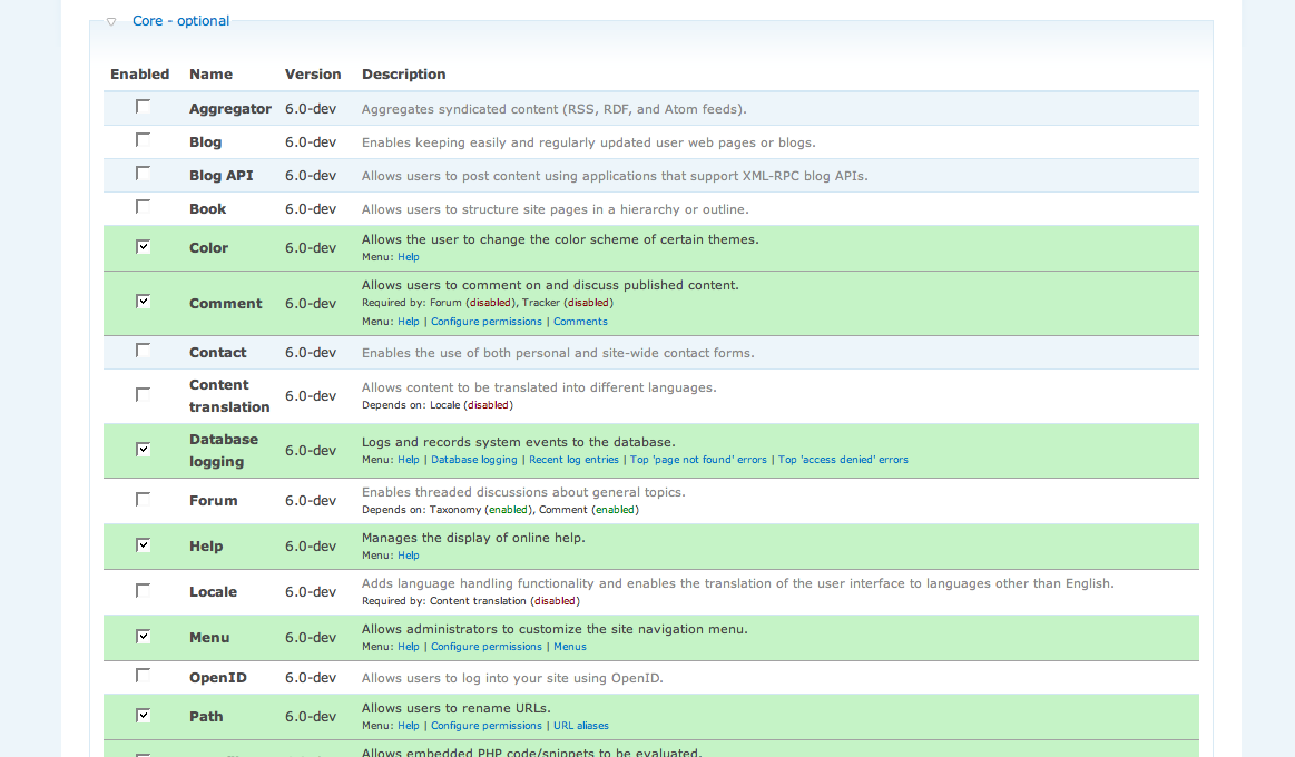
I liked the idea of color coding modules that are installed, so I went ahead and mocked that up. Since my original idea was so incredibly close to what is in the old thread, I took a couple of cues from it.
1.) I've labeled the buttons as "operations" as that makes good sense
2.) I went ahead an added the uninstall button. This was a big issue in IRC each time it came up so I went ahead and did it.
Now as I've said I think that the ajax pop-up is a GOOD thing for the uninstalling of modules. We can prompt and warn and do whatever else we'd like w/ no need to disrupt the user by navigating to another page and then navigating back again.
With that said, it's not on this mockup, but I can put it up easily enough. Let's hear some feedback.
Eclipse
Comment #6
Bevan commentedsubscribing
Comment #7
miksago commentedInstead of always asking "Would you like to proceed with ... ?", or "Are you sure you want to do ... ?", why not let the user "Undo they're actions?".
Also, why not merge all the buttons into one, [ change ], which would bring up a dialog asking the user what they'd like to change in the module. Changes might include:
This way, the configuration buttons would not be pushed out of the way as small links somewhere in the description. The Uninstall button should be to one side, the other buttons to the other side. The uninstall button should be brightly coloured, a warm red maybe, to alert the user of impending danger.
One other thing one (who is a bit of a novice) finds is that you can just check all check boxes on the current design, this could be an idea. similar to the "Users" management page.
Comment #8
ezyang commentedAs claimant of the GHOP task for this bug (http://code.google.com/p/google-highly-open-participation-drupal/issues/...), I have a few comments:
This task sprawls, and it also appears that implementation of the ideas of the previous discussion was spotty. I am not considering any of the previous discussion, which is too long and everything including the kitchen sink ended up being thrown in. Here is what I am going to (at least attempt) to implement:
Things I will not fix:
If there are objections to these decisions, please say so! I believe that this task will take more than 3 days, however. I don't have a very good idea of what's easy to do and what's not (I suspect miksago's suggestion of "undo your changes" will be extremely complicated).
Comment #9
ezyang commentedAfter considering this issue, as well as browsing the source code, I have a few questions:
Would changing row colors be more appropriate in theme_system_modules or directly as an extension to form_builder?Updated question: is it possible to attach a class attribute to rows inside theme_system_modules?Yes it is. Patch will be updated accordingly.The forms API is near incomprehensible to me, but maybe I'm just stupid. There is a validation_modules key which "Store[s] module list for validation callback". What is the validation callback the code speaks of?This doesn't seem to be relevant to the task at hand, so I'm going to ignore it.I will need to use module_invoke() in order to extract the necessary data from the module pages (namely, what the menu links this module defines are, and whether or not our help page guess works). Will hook_menu/hook_help cause side-effects in any case?These two look fairly safe, so I'm going to say no.Thanks.
Comment #10
ezyang commentedThis patch adds a "Menu: link1 | link2 | ..." to all enabled modules that properly implement hook_menu with admin/ links. It was diffed off of the Drupal 6.x from CVS. I've probably stepped on some coding standards, so please comment!
(Note: updated patch posted below)
Comment #11
ezyang commentedUpdate patch status.
Comment #12
ezyang commentedNew and improved patch! Implemented functionality:
The only thing missing now is the uninstall link! Some notes about the patch:
$i = module_invoke('help', 'menu');is used, and then the $i['path']['title'] is used to identify the module the help file corresponds to. This is a pretty good heuristic, although I haven't tried it against a large enough set of modules to really say.Zebra stripes for green looks plain weird, so that's not included (the change is as simple as fixing the CSS declaration for even/odd). Still waiting for some advice on the uninstallation link.
Comment #13
ezyang commentedAttached a screenshot of the current patch functionality. For those of you who don't want to apply the patch! :-)
Comment #14
snufkin commentedIf this link would take me to the confirmation page directly I think its a good idea.
Yes this might be out of the scope of the GHOP task.
On the configuration links part chx' comment on IRC was that you might want to try adapting code from the system_admin_by_module, "rewriting system_get_module_admin_tasks as this piece of code tries is such a big no"
Comment #15
ezyang commentedUpdated patch that uses system_get_module_admin_tasks()
Comment #16
ezyang commentedFinal patch implements uninstall links.
I am very leary about this patch (and would recommend committing only system-modules-sans-uninstall2.patch), because it will automatically execute module.install code of any module in the directories they can be found. This is because we need to determine whether or not there is an uninstall hook, and there is no way (presently) of doing this without including the file. Using the tokenizer functions would be a way of doing this otherwise, but it is beyond the scope of this bug.
Note that this security vulnerability exists already in the Uninstall pane.
Other notes: admin/build/modules/uninstall/confirm/$modulename now will display the confirmation page for a specific module name without needing a POST. I don't believe this to be a security risk, although the way I made it do that was a little hacky.
Otherwise, I'm done! Review me please! :-)
Comment #17
webchickWow, this is a HUGE improvement! Nice work!
I found a few minor issues as I was looking through:
* Various coding standards issues. Please run it through Coder module.
* Missing PHPDoc on the new function you created
* There's an "Array" where the core required modules used to be. Probably something minor.
Comment #18
ezyang commentedUpdated patch that addresses webchick's issues.
Comment #19
ezyang commentedUpdate patch status.
Comment #20
ezyang commentedFinal updated patch. Now secure too! (Module install file is only included if it had been installed at some point in the past)
Comment #21
ezyang commentedNow with beautiful dark blue colors! (Since green implies everything's OK)
Comment #22
webchickMoving the the Drupal core queue. Didn't realize it wasn't there to begin with.
The blue is a big brash, but it was my suggestion (I didn't want people to think that everything was hunky-dory on their sites because of the green colour), and changing the colour in the CSS is a minor thing, really, that we can always do later.
This is just *one* small step away from total and utter world domination, which would be integrating update_status colouring right on this page, along with #jump_to links to the status page with the download links, etc. However, I'm pretty comfortable enough with this task's progress as-is to mark it as complete, and we could maybe make update_status integration a separate GHOP task.
However, I defer to snufkin on this since he's the "owner" of this task. :)
Comment #23
dmitrig01 commentedOk, I have several comments
// for uninstallation checks- Put this on the previous lineOtherwise, it's great
Comment #24
Bevan commentedThis concerns me. The previous discussion should be the basis for your contribution here. Without considering previous discussion it is likely you are missing important problems and solutions around this usability bug that others have taken the time to contribute.
I would suggest you communicate your goals with by first putting together a simple wireframe; a black and white boxes and text image showing what is and isn't on the page. You might need to make more than one if you have asynchronous interactions on the modules page -- one for each state. See these slides to see how information architecture (wireframes) can be applied here http://www.civicactions.com/blog/what_makes_websites_work_bringing_infor...
Ideally you should do this and get some feedback BEFORE commencing on code.
Also, going by the description on http://code.google.com/p/google-highly-open-participation-drupal/issues/... this task doesn't require you to have the patch fully tested and RTBC, just create a working patch that implements a solution. The community can take it from there, or you may like to follow up after completion of the the task.
Don't include undo at this point because a complex system backend is required to support this and is far out of scope for this task and even drupal 6.
Comment #25
Bevan commentedOn review, it seems the added features are probably too minor to need wireframes. Perhaps I was expecting too much out of this task. I'll let the task owner decide.
Comment #26
ezyang commentedCan do.
webchick told me to run the Coder module on system in order to determine coding standards violations; in the process I noticed a few other errors that I decided to correct. Feel free to omit them from the patch, but they're real minor formatting nits.
Perhaps I wasn't very clear about what I meant. New features often turn into wishlists by non-technical people that are exploding in size; at times they don't even really know what it is they want. It was important for me to keep the task at a manageable size, and also issue 76340 had been already "complete" (I did scan over it).
The basis for the new patch is simply the conversation on this issue, especially alpritt's useful summary post. That was considered.
Well, I suppose that's a personal requirement of mine. :-) The patch does implement the solution delineated by EclipseGC.
Thanks. I'll post an updated patch addressing dmitrig01's concerns this afternoon.
Comment #27
snufkin commentedOn the other hand he provides a good explanation on where the difficulties are for this goal, and provides a solution that fits into the timeframe of the ghop task.
Webchick and I came to an agreement that the task is considered as completed, because it implements most of the description that can be implemented within this timeframe, and gives a good discussion for those features that are left out.
Comment #28
snufkin commentedi changed the status by accident, back to needs review. good job ezyang!
Comment #29
ezyang commentedNew patch that addresses dmitrig01's concerns. Thank you all!
Comment #30
Bevan commentedRE: #27 @snufkin
Great! I was a bit premature in my comments. I should have reviewed in more detail before commenting. Sorry all.
Comment #31
ezyang commentedNew patch that fixes bad SQL change, and another missed uncaps comment.
Comment #32
dmitrig01 commentedJust don't touch system.install, ok?
Comment #33
ezyang commentedPatch without system.install and system.module changes. (basically the last two files' diffs in the previous patch removed)
Comment #34
eclipsegc commentedProject changed per webchick's request. I copied what she did from comment #22
Comment #35
webchickComment #36
snufkin commentedezyang: could you upload the patch to the google issue tracker please?
Comment #37
ezyang commentedDone!
Comment #38
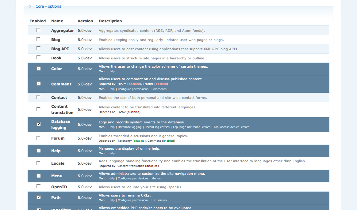
eclipsegc commentedOK, which colors do we like better? I wasn't all that partial to the blue in the patch, so I started playing. These are two of the options, though I must admit I really did like the green option I mocked up originally better.
Gimme an opinion!
Comment #39
eclipsegc commentedAs I said, I prefer the green, so here's another example of that again for comparison.
Comment #40
jrabeemer commentedThe blue backgrounds are strong and dark. Maybe too dark and contrastive. I just need a subtle hint of color.
Comment #41
webchickI like #3 a lot.
The green colouring will be back with http://drupal.org/node/197486, which will update the colours for *all* statuses right on the main modules page. :)
Edit: -1 to the green. It gives the impression that things are hunky-dory when the module could be missing a critical security fix.
Comment #42
ezyang commentedFor the record, the color used on number 3 is #779FBE
Comment #43
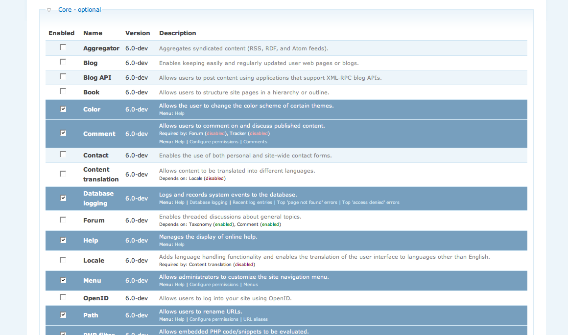
eclipsegc commentedI'm liking #2 the best, but I'm thinking of lightening it up quite a bit and changing the text back to their defaults (look at #5). I'll put up some more examples tonight or tomorrow. As soon as this color stuff is figured out, I want to see if we can get some RTBC action going on this!
Also, seems that if something is in the system.css, color module doesn't modify it. Should this coloring be "modifiable"? Let me know.
Eclipse
Comment #44
eclipsegc commentedOk, I think I'm liking this one "bestest" thus far. The colors are easy and straight-forward (blue, which is fairly neutral). All the text has been reset to it's original color, and the links are easily visible and obvious. This color is acceptable to me as of right now. Give me some feedback and we'll keep this moving forward.
Eclipse
Comment #45
agentrickardYes for #6. I despise white text in all cases.
Comment #46
keith.smith commentedIndeed, Picture 6.png looks sweet.
Comment #47
gaele commented#6 is great.
Could the "Menu: " label be removed? It doesn't add anything, and might even be confusing.
Comment #48
eclipsegc commentedgaele: I thought about that too, but decided against it since if the module only has a "help" section it'll look very odd indeed.
Comment #49
senpai commentedThree cheers for #6, and the improvements this patch makes are a great springboard for Update Status to one day rule the world.
Sometime soon, we might be able to place a 'delete' button right there in the /admin/build/modules tables rows, rather than handling everything on a separate tab.
Anyway, I give this entire project's concept a two-thumbs-up.
/me downloads the latest patch for testing...
Comment #50
senpai commentedThe patch in #33 is little scary, and here's why. If you install it over a fresh update of head, and then immediately change your Garland's default color set to Shiny Tomato, the admin/build/modules page show all enabled modules as BRIGHT RED! Scary!
Is there any way around this? I'm sad to say I can't think of one, and I wish I could cause like this concept and I really wanna mark this baby as done and send it on down the road.
Screenshot is attached.
Comment #51
senpai commentedI've done some more testing and playin' around with this patch, and here's what I discern. Since this patch will be coming to the users as part of a full install, there's no way we can hold it in CNW status for this tiny glitch. The patch, and the GHOP project, have accomplished their goals, and have done so admirably.
Here's what goes on. If the color.module has been invoked on a garland-themed site, all rows on admin/build/modules which are activated will inherit the color scheme of the site. Yes, this patch works as intended, and I can't find any bugs with it. A second patch might come along after this one and do a little more invasive theming of the admin/build/ pages so that site owners who think the color.module settings in garland only affect the pretty header bar up top won't inadvertently think that somethings wrong with their site if those module rows are glowing red rather than a soothing blue or green or ...
Send this one on down the road, and let's switch over to EclipseGc's styling issue and keep working to make D6 better. Congrats Ezyang!
Comment #52
gábor hojtsyGuys, are you absolutely sure that adding this amount of clutter to the module form is worth it? I have seen that people are finding the module page intimidating enough already. The description column is already "overloaded" with the dependency information.
I can sympathize with more remarkable colors for enabled modules, but I would not do dropping their whole menu there. This page is a big form, so any contrib module can go in and form_alter() such as http://drupal.org/project/util does by hiding as much stuff on the modules page as possible. Most of this patch can be dropped into the util project's form alter.
Let me react to some of the original points, although I know not all functionality ended up in the patch.
It is hard for a reason. Dropping a facebook friend is probably more recoverable then for example dropping all CCK content types and a few thousand posts you have in them. We purposefully made it hard to uninstall something, so it can never happen that you accidentally click on a window popping up in your face just to make it go away fast and let you work.
Uhm, so who would expect they will find their menus on the Administration >> Site building >> Modules page? How easier it is to tell them to go to Administration >> Site building >> Modules page then telling them to go to Administer >> By module? Also, the later page is not cluttered with lots of stuff you *never* need for site admin tasks. Who cares what it depends on. Who cares what version it is. Who cares if I can disable it? Are these very small barely noticable links making things easier? I would not even be able to click on such small links.
Sorry if I am not constructive enough here, but it is quite shocking to me to see this marked as a usability improvement.
Comment #53
gaele commentedI'm sorry. Senpai, you were right in #50. This is a usability issue. A bug.
The color of the rows is not part of the theme style. It has a signaling function. See e.g. admin/logs/updates and admin/logs/status for other examples.
So the color which will be chosen here will signal "this is enabled". From then on it should be used consistently throughout Drupal.
Comment #54
senpai commentedWell, Gaele, you're confirming what I originally thought when I first saw this patch, but I was under the distinct impression that this patch paves the way for Update Status to rule the admin/build/ pages as well as its own page. Although, there *has* been a lot of convo about this issue, so perhaps I'm mis-understanding the ideals here.
@Goba: You're right! This addition of the menu links to each module's row is something best accomplished by Utility module as a selectable option. That way, sites that wanted it could easily have the feature, but it wouldn't be forced upon grousy old sysadmins who "know how drupal works". I think that the form alter should, in fact, be pulled outta here and moved to Utility, rather than being included as a core improvement.
Comment #55
gábor hojtsySenpai: There was another issue about moving some info from update_status to this form too, but dww stricly opposed that one (AFAIR it was won't fixed). He said that both the update status and the module admin forms are busy enough in themselfs.
Comment #56
webchick@Gabor: I think the idea is that "The modules page is where I go to get info about my installed modules." But currently, if you want to get ALL of the info about your modules, you need to go to (at least) three places: admin/build/modules, for a list of enabled/disabled modules, admin/by-module, to know what options are available, and admin/reports/updates to check for security updates. If everything was just in one place, it would make it much easier.
That said, there may be ways to streamline it better so that it's not so intimidating to people.
Comment #57
gábor hojtsywebchick: the problem is that everything in one place does not fit into a table row with small fonts, especially when most of the time, you don't need most of that 'everything' and what you don't need just bothers you. We already have two places for menus, the administration and the admin by module page. Adding another by module listing here and especially this way does not seem like a good idea to me.
Comment #58
eclipsegc commentedGabor,
Greetings, I don't think I've had the pleasure before. I'm going to respond to your responses first and then I'll get into anything else that needs addressing.
Absolutely understandable. This feature didn't make it into the patch, and it's not really worth discussing for that reason, I think it's a point to talk over at another time, so I'll leave it at this.
I'm not suggesting that admin/by module be "done away" with, I'm suggesting that my first inclination, as a user, is to have instant gratification, which means, that once I install a module, I have access to all the stuff it does. I've been running with this patch installed for a few days now, and I'm more convinced than ever that this is absolutely the right way to go. Is there a better layout for it? Probably, but this one is NOT bad. The system is getting more and more complex (drupal) and as such, we have more modules, with more links, with more abilities, with more updates... etc etc etc... who knows what 7 or 8 or 9 might bring. I would take a small amount of clutter (which I've done my best to minimize here) over the hunt and peck I have to perform now. The fact that it's easier for me to open up the .module file and find *_menu and manually go to the different pages is a sad commentary on the user interface as it currently stands. This patch has eliminated my need to do that really, and I think it'll make everyone's life easier. I'll not argue HOW it should be implemented, just that it should. if the patch to system.module is unacceptable, and there's some better place for it, then that's great, but I really do think this should be in CORE, as an option at the least. A... "beginner mode/expert mode" perhaps. I'm not the only person to make this argument. Other's with far more weight in the community than I, have made the same argument before.
In closing, I'll simply say that there's no functionality in d6 (concerning this) that I think should not be there, I just believe this option should be available as well. Multiple paths to perform the same function is not a bad thing, as long as those paths don't confuse the user. I don't believe this will cause any confusion.
Eclipse
PS: If I didn't quote right, I apologize
Comment #59
ezyang commentedI don't see why not. Most modules, I noticed, have more links than will fit in one row, and this doesn't appear to negatively impact appearance or accessibility (note that the true purpose of the module administration page, selecting/deselecting modules, boils down to a single checkbox on the left side that is as simple as ever.)
I suppose I should be defending my patch, but I can't but think that there is a BETTER (TM) way. Please see Issue 198919 for more details.
Comment #60
gaele commentedwebchick:
Like... a dashboard? It seems the project name dashboard is up for the taking.
I agree with Gábor. The enable/disable modules page shouldn't be abused.
As this topic seems to be controversial I get the feeling this is going towards a module anyway.
See http://drupal.org/node/191825 for more discussion about this topic. There definitely is a need.
To conclude with a few suggestions for the patch (which might turn into a module):
- Change the label "Menu:" to "Options:". As I said "Menu" is confusing.
- Signaling colors: we already have #FFCCCC for "this needs your attention" and #CCFFCC for "this is in order" (see e.g. the status page). #CCCCFF for "this is enabled" would go with that. See attachment. (OMG it's a triad! ;-)
Comment #61
gaele commented(I meant the former project dashboard is up for the taking, and it seems it could be heading this way.)
Comment #62
gpk commentedThe one part of this that I consider *essential* is the link to the module's help page. Example: you enable Color module. Then where do you go in order to use the module? The first time I used color.module it took me over 1/2 an hour (possibly longer) to find out that I needed to go to the file system settings page to enable public downloads, thence to the theme's config page. At the time there wasn't even a help page in the handbook and I had to search the forums etc. Let's not forget that for many modules there is no callback for admin/module-name so it can be hard to find where to go next.
A simple link "Help" to help (if available) for each module would only add a minor amount of clutter to the modules admin page and provide a way for responsible modules to resolve most of the real concerns in this topic.
It would be really great if this could make it into 6.x; the rest we can argue about later ;)
Comment #63
gaele commentedgpk, would this solve your concerns?
Enabling modules results in display of links for those module
Comment #64
gpk commentedSome great ideas and improvements there, but it isn't much help if you want to go back later and find the info you are looking for. A simple persistent "Help" link could do the trick very neatly. We probably need both!
At the moment a module's help page is typically the place where you'd look for info on it and often it includes links to the admin pages. So actually maybe this is the right place to put these links ... Putting dozens of admin links in the message at the top of the modules page after enabling/disabling several modules might be overkill ... but perhaps the "Help" links *should* go into the message as well as in the table, along with some but not all of the other stuff suggested, e.g. notification of which modules were enabled/disabled and a link to the uninstall page if relevant.
HTH
Comment #65
gaele commentedThis is what it looks like with just the "Help" links.
1. enable a module
2. a Help link appears
3. follow the link
4. the help page explains what the module does and what configuration options/pages are available
I guess this is a reasonably unobtrusive adjustment of the modules page. Gábor, what do you think?
Comment #66
gpk commentedI like it :)
How about having the Help links immediately after the Description, in the same row?
Looking at (for example) Comment module, I think it would make (even) more sense to have "Help" out of the way of the "Required by" message - rather as a kind of continuation of the Description.
Comment #67
ezyang commentedFor those watching this bug, a patch has been posted for http://drupal.org/node/198919
Comment #68
dman commentedJust a random contribution. Hopefully constructive.
Don't lose the help links. If you want them optional, make them on by default!
They need to be in-your-face until disabled.
Same with the settings. I want them there. It makes sense to me.
My earlier (much older) suggestions re what help a user gets on first install appear to be getting addressed here. Like "WHAT A NEW MODULE HAS ACTUALLY DONE FOR ME". Yay.
I dunno if this is in or out of scope for this 'task' but my current practice is to use my modules README as my help text. I do this usually by just inlining the file in my hook_help (with page-break filter).
Now ... would it be silly to just arbitrarily do that for modules that don't provide their own help???
It's dead easy, would really push the internal help system along, partially automate it, AND really reduces duplication, as we all know that docs are the first things to get out of sync with the actual code.
Sorry if this is off topic, I just thought I'd throw that out there.
Comment #69
gpk commentedYes, the help links are the key IMO.
The help page automatically includes the admin (settings) links, provided that the help hook exists (see http://api.drupal.org/api/function/help_page). If no hook_help is implemented then I think the 'No help available ...' message should still be output (so another issue is needed for that * ) along with the admin links.
http://drupal.org/node/198919 is also addressing some of your earlier suggestions.
Finally I reckon that your final (and fine) suggestion is probably the realm of a contrib module, at least at this stage.
I still stand by my #66 subject to the above. This is all becoming very similar to #3. Let's get the Help links in and sort out the rest in separate issues.
(*) The only snag I see is that it is a bit counter-intuitive to have help links to help pages that say "no help available" ...!
Comment #70
pasqualleWhy don't you make the module name as a help link? I always wanted to click on it :)
Comment #71
gábor hojtsyPasqualle: feel free to click on it. It is a label to the checkbox in Drupal 6, so you can enable/disable a module by clicking on its name, no need to pick the few pixels where the checkbox is located.
Comment #72
pasqualleoh, my bad :)
Comment #73
eclipsegc commentedI too would settle for just help links making it into D6 (although I must say that I would be disappointed at the loss of the rest) but I really do think this is a critical issue. If users are confused about what to do next (and I often am, which is why I resort to actually reading the .module file) then they'll go find another CMS to use that makes these things easier. Want more, new users? Make this easier.
Comment #74
dvessel commentedI agree with Gábor here. Less clutter the better. The help link isn't to my liking either but I can see how it would help so my vote is that have that in at least. Maybe go a step further into the help area and add the menu links in there cleverly embedded into the help text.. but we are in string freeze. too late for that.
And how about changing "help" to "more help..." and keeping it on the same line. Keeps it consistent with the help stub used on some pages. Makes it easier to connect that the links lead to the same place.
http://api.drupal.org/api/function/theme_more_help_link/6
Comment #75
senpai commentedI'll cast my vote here one more time in favor of actually holding the hand of the person who's just installed a module, enabled it, and now has no freakin' clue what to do next. "Read the README file", you say? NO! I don't have to do that when I install something in a Mac, or Vista. Why should I have to go and create stuff, enable more stuff, and read up on how to configure the elemental settings of a module that's not even being presented on the same page as the "Congratulations on installing that spanky new module" message.
That message really should say, "Congratulations on installing that spanky new module. Good luck finding the thing and actually making it work!"
I'm just sayin.
Comment #76
gpk commentedOK I agree how about:
1. On the modules page we have the help link, but just with the text "More..." (for enabled modules) since the module description isn't really help. If the module doesn't provide help then a suitable message is displayed ("Sorry etc. ...") on visiting the help page, but the module's admin links should be displayed here regardless, or another suitable message if none. Calling the link "More..." avoids the problem of clicking a "Help" link only to be told there is none.
2. When a module is enabled/disabled, a more informative drupal_set_message() ... this would belong in the other issue IMO http://drupal.org/node/198919. My vote would be not to include all the admin links since they would not be persistent and there could be a lot of them. On enabling a module, I would go for: (a) "Module xxx successfully enabled". (b) Link to help page, called "Start using this module" if the help hook is implemented or if it provides admin links; "More..." if not (you then get both "Sorry" message about no help being available and no admin links being available). (c) At the bottom of the dsm(), a direct link to the Configure tab (3. below) if it's been implemented: "See config options for this/these and all other enabled module(s)". When a module is disabled, A. "Module xxx disabled". B. If it implements the uninstall hook, a direct link to the Uninstall tab: "To completely uninstall this module and the data associated with it, visit the Uninstall page"
3. To avoid cluttering up the modules page with what could run to dozens or even hundreds of admin links, have an extra tab ? "Configure" that looks much like the main modules page but lists all the links, and also the link to the help page. I think this this page should have a short paragraph explaining what it is. This page wouldn't necessarily replace the "usual" way of navigating to a module's config pages (often via the admin page) but gives another way of finding the relevant admin page (i.e. if you know which module you are dealing with then you can find its admin/config page(s) by this page; if you know which functionality you are dealing with but not which module provides it then you might prefer to navigate via the main admin page which groups functional areas together sensibly).
I consider 1. essential for D6 usability.
Given the string freeze, it Gábor's call (??) whether 2. and 3. make it into D6. I consider these sufficiently critical for usability that they should be included. (It all depends how critical usability is :-P) Of course if 1. isn't deemed critical for usability then the string freeze would also inhibit some of what I am suggesting for 1.
Finally:
@gaele: Can you provide the patch that allowed you to generate the screenshot at http://drupal.org/node/192962#comment-658030, so we can take this forwards? (Or did you fake it ;-) ?)
Comment #77
gábor hojtsyWell, I am still not convinced that adding more to the module page makes it any more usable, I think it makes it more cluttered. We are overusing the module page for too many stuff already (ie. we report update module messages on top, some suggestions include reporting update module status on the module table rows as well, oh well..).
Anyway, can have "more help...", and only display that if the module will actually provide more help (ie. it has a help page), and then depend on those modules actually providing valuable help. Even if you try this with core modules, some provide explanation and links about the features, some might not (I did not try, I am guessing from translator experience). So this can be as misleading as well.
I think that you are trying to throw in quick (maybe good looking but far from problem-solving) solutions, while we actually need to rethink how people find config pages, and how people find out features of particular modules. You provide examples of Mac and Vista. On a Mac, you know you have the application menu, and there you have your preferences with all applications. You cannot access help links and preferences from the Finder's Applications folder (the analogy of the modules page).
Comment #78
Bevan commentedI agree with Gabor. However I think there are ways of integrating the ideas discussed here AFTER the modules and updates admin pages are fixed in regards to usability. I don't think anything proposed or dicussed here should go into drupal 6 as they are not improvements for the majority, and d6 is pretty-well frozen anyway.
Please see my proposed goals for the SoU on how these pages can be fixed, then added to; http://groups.drupal.org/node/7965
Comment #79
alpritt commentedIf we want to do this right we need to not only consider this page in isolation, but also how the help system works, where users can find modules in the admin menu, how admin/by-module works, how we set permissions and so on. So the solution is potentially quite disruptive. Considering we are fast closing in on RC2, I don't think the minor improvements we could make (which we do not yet have consensus on) are worth hurting the freeze. Let's focus on doing this right for D7.
Gábor in comment #77 wrote:
"On a Mac, you know you have the application menu, and there you have your preferences with all applications. You cannot access help links and preferences from the Finder's Applications folder (the analogy of the modules page)."
One of the nice aspects of how you install a Mac application is that you usually move the application to the applications directory manually, and also to the dock if you want it there. You therefore know exactly where to find it. If we provide links to the settings pages straight from build/modules, then this is the method users will have learnt to get to those settings pages. It is, therefore, likely that they will continue to go this page when they want to configure modules in the future rather than finding it on the normal admin pages. We should think through the implications of this.
Comment #80
senpai commented@Alpritt in #79: What if users could have a single place to 'admin' their modules, rather then trying to guess which of the administration submenus will contain the module they've just installed. Try this sometime. Install LoginToboggan, enable it, and then go to Site Configuration to change how your site handles logins and registrations.
But wait! There's nothing there?! Now what?
I agree with you 100%.
Comment #81
gábor hojtsySenapi: this is why we have the by-module admin page. We can make it more prominent/visible in D7 for example.
Comment #82
gábor hojtsyErm, don't take me wrong, I don't think the by-module page is the solution, I don't like it at all :| I think we need to rethink this from the ground up.
Comment #83
Bevan commentedVery good point.
Comment #84
gpk commented>this is why we have the by-module admin page
Ahhhhhh ... oohhhh ... I must have seen that page before but maybe I hadn't ... or maybe I'd forgotten. That's telling in itself. If you had asked me I'd have sworn that no such page existed.
>need to rethink this from the ground up
Absolutely.
Pls take a look at this patch. Very small, and is I think in line with as much consensus as we were able to muster previously. To my surprise I found myself reading all the help pages! Have you ever heard of anyone doing that before?
I put the [more help...] into a column of its own since it was mucking up the row layout. (I've implemented this rather badly for now - had trouble with it breaking onto 2 lines.)
Picture attached (module_help_link.png), and also of a couple of other cases from those I tried (using just "Help" as the text of the link, and not right-aligning it, which tends to make the page feel cluttered, more so in real life than in the screenshot).
Suggest having a quick play with this. It helps hugely in the case of a module like color where you *have* to read the help text to find out where to go next (color.module doesn't have any admin links). If the module *does* have admin links then they automatically appear on the help page. Also note that all the core help pages have a link to the relevant drupal.org handbook page.
Comment #85
gpk commentedComment #86
Bevan commentedI like this. I think it is an enhancement. I think it's small enough to not cause more usability issues (unlike previous patches). I've tested it and it works well. I think it should display help pages for disabled modules too.
Is it checking that a help page actually exists? This is important for contrib modules.
I think Help only inline looks best, but that is subjective. There is little difference from a usability POV.
With those changes I would set it to RTBC and hope Gabor agrees! :)
Comment #87
gpk commentedThanks for your comments and for taking the trouble to look at this. Yes, the patch checks that a help page actually exists (similar code to main Help page and admin/by-module page). I had the same thought about displaying the help page for disabled modules but that might be best left for 7.x because Drupal doesn't make provision for invoking a hook in a disabled module AFAICS. Would probably have to manually include the .module files (from within help.module) and I'd be concerned that that could open a whole can of worms; besides I don't think its exactly desirable to do so.
The presentation of the help link as implemented in the patch has a minor technical advantage in that it uses an existing theme function call - theme('more_help_link', $url) and so keeps the patch really small*. Would need to fix my naughty use of nowrap though.
* Although maybe it doesn't really need to be themeable.
Comment #88
Bevan commentedThat's all very good reasoning. I would say this is RTBC...
Comment #89
westwesterson commentedwhat about using jquery? when you hover over an item, you can see the more helpfull links, but when it doesn't clutter the page when you aren't hovering over an item. Or we could use a more link which via jquery adds the links to the bottom of a module listing.
Comment #90
gpk commented@westwesterson: I'm sure Bevan will consider this among the various options as part of his SoU project http://groups.drupal.org/node/7965.
@Bevan: Perhaps you were thinking of this small patch for D6 not D7?
I've modified the patch at #84 to generate better markup for the help links and also improved the code. Works well in all core themes, Ff and IE7. Exception is Chameleon theme in IE7 which is messy on my XP PC (which has custom font size setting of 138%) but from previous experience this will be more an artifact of my own PC's settings than anything else. And the patch isn't the cause of this anyway.
Obviously we are kinda late for D6 but this may still be thought valuable .. let's see..
[Just to emphasise: all this patch does is to add a "more help" link (if help page exists) next to each module's description on the admin/build/modules page.]
Comment #91
Bevan commentedI'm not sure if this is 'allowed' in D6 given the various freezes. Gabor will decide. Looks good to me.
Comment #92
gábor hojtsyNew stuff goes to 7.x, we are fixing bugs in 6.x, sorry.
Comment #93
gpk commentedFair enough, though I'd call this a usability bug... ;-)
As in, enable color.module, then where do I go? Enable path.module, then where do I go (the answer is that I need to look for "URL aliases" on the admin page). admin/by-module can help with path.module, but not color.module.
For color.module (and others presumably) I need to go via the Help which has all the info I need with a link to the themes admin page plus a link to the drupal.org page for color.module. Having the link on the modules page makes it much more intuitive (since on the main Help page the modules are listed differently, and this also requires an extra click). It begins to connect code/modules to functionality/tasks/behaviour. It's not so much something new as wiring together what's there already.
OK I admit defeat! :-P Roll on 6.0...
Comment #94
Bevan commentedlol
Comment #95
dries commentedCommitted to CVS HEAD. Thanks!
Comment #96
floretan commentedThis is a great improvement already, but I would add some finishing touches to the interface.
Rather than concatenating the help link with the module description, putting the help in a separate column results in a cleaner layout, especially on narrow screens (see screenshot).
Also, the label "More help" doesn't really make sense in this context, since there's no help already being displayed. Changing the label of the link to "Help" would fix the semantic issue, and also keep the form less cluttered.
Comment #97
senpai commentedMaybe a word like 'administer' might be effective in this case, since you are on this page trying to turn on and off certain functionality for your site, and you need a way to control the new information and settings that this module offers?
Comment #98
aaron commentedmoving to d8, as i'm pretty sure the ui is frozen now.
Comment #99
klonosJust wanted to point to #857090: D8 Modules' page: Add links to module help, project page + merge operations links to one cell. + subscribe.
Comment #100
Bevan commentedActually Drupal 7 has this.