There are two issues here.
The first is that I found the teaser / full body dropdown options a bit confusing and I had a couple of possible ideas for simplifying it.
The second issue is that it is possible to choose static displays for both the teaser and full body, thereby rendering the fivestar useless since there isn't a way for anyone to vote. So perhaps there should be a way to disable static display options on the teaser when it's selected for the node body and vice versa. This ties into how this section was a bit confusing, and there's a possible solution listed down below.
Part of the confusion was that I was equating the teaser with the
code, because "above the teaser" and "below the teaser" means something different here than it does when creating a node. When creating a node, "below the teaser" means that whatever is below the teaser break point doesn't show up in the teaser view at all, and it just appears within the full node display. But here, "below the teaser" means IN the teaser view, but below the teaser text -- and not necessarily within the node body display at all.
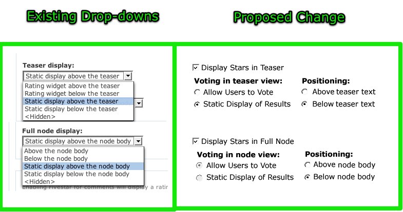
Also, it seems to me that it might be simpler to have two radios and one checkbox rather than five jargony drop-down options.
I say jargony because it's not immediately obvious that "Rating widget" equates to users being able to actually vote and that "Static display" means that users can't vote. That combined with this convention only applies to the teaser display since the "Full node display:" completely drops the "Rating widget" and just says "Above the node body" or "Below the node body."
In both cases, the stars are either above or below the teaser text / node body. And users can either vote or not. So these two could be radio options.
Finally, the option could be a checkbox that would "Display stars in teaser" or "Display stars in full node"
I'm experimenting with a mock-up, but the UI goal is to simplify the text by removing some jargon, and have all of the options viewable at a glance instead of digging through the verbose drop-down options.
And also, it'd hopefully be easier to use javascript to make the static display options mutually exclusive via radio buttons so that the user won't ever select the static option for both the teaser and full node.
Mock-ups coming shortly...


Comments
Comment #1
KentBye commentedOops. Input filters filtered out a bit of code.
It should've said, "Part of the confusion was that I was equating the teaser with the code
<!--break-->, because "above the teaser" and "below the teaser" means something different here than it does when creating a node."Okay, back to the mock-up...
Comment #2
quicksketchSounds great Kent. The javascript options probably won't be necessary because there should *always* be the option to allow for both the teaser and full view to not allow votes or be hidden. The reason for this is leaving the possibility for manual theming, where a site will use hidden for both and then manually place it in the node.tpl.php files. Another possibility is using the static display for both and then providing rating via some other means, like a rating widget embedded into a Flash video player.
So you could possibly give options such as this:
Another, more flexible option I've thought about is giving the user a weight option rather than just "Above" and "Below" (which equates to -10 and 50 weights in actuality).
Comment #3
KentBye commentedWell, here's the mock-up the mock-up that I had in mind before I read your latest comment.
I didn't think of manual theming, but still -- if they're both set to static, then they won't be able to vote on that content type at all anywhere right?
UPDATE: Okay. I just re-read you comment to see that some people enable voting via theming node.tpl.php files or via a rating widget embedded into a Flash video player. I was assuming that setting static would disable voting altogether, but obviously this isn't the case.
Comment #4
KentBye commentedAnother quick note about the mock-up is that when the "Display stars in teaser" is disabled, then it should probably disable the other two selections for the voting & positioning.
And instead of having a "Above..." or "Below..." radio options for Positioning, then you could have a drop-down weight options as you suggested. Yet I've heard that the DnD stuff in Drupal 6 was supposed to deprecate the confusing weight system for good ;) But if it'll give more flexibility and control, then that'd certainly be easy to throw in a drop-down in there with this set-up.
The only other thought was to wrap these two sections into a fieldset -- or each one into a fieldset to cluster them together. I couldn't think of a good title though, and so theming the "positioning" form elements to the immediate right of the "Voting..." radios would help keep things compact & close together.
If this change goes in, then I think the admin would straight forward enough to add in the option to change the "Average:" and "Your vote:" titles as described back over here: http://drupal.org/node/203162
Comment #5
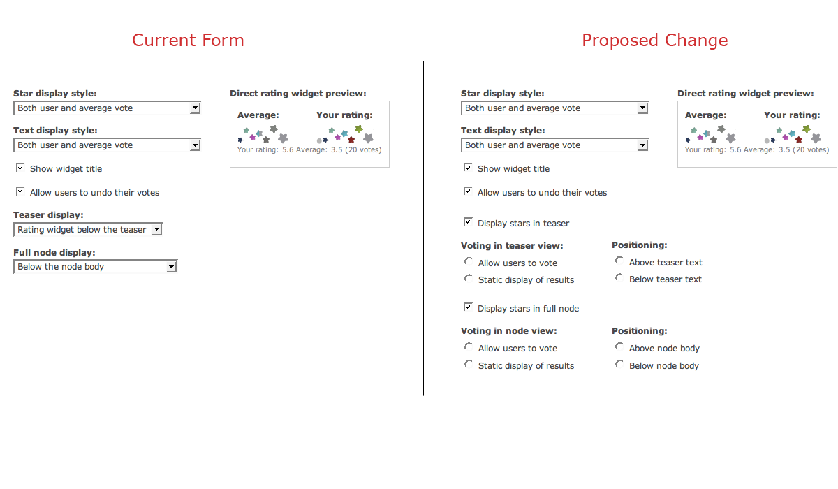
quicksketchI like the changes in general, but I'm really afraid of the sheer size of the admin form. Here's a before and after screenshot (Firebugged) to see what this layout would look like. It really is just... too much :(
Looking at the two forms, I can't say that expanding the options is really going to be that much more helpful. There are just as many form items to choose (5 in both cases) and actually more text by exploding it out. Additionally, I'm not really sure that these form elements are actually associated with each other.
Comment #6
KentBye commentedAgreed.
It does make the form longer.
I still think that the text could be reworded, and possibly reordered.
1.)
<hidden>2.) Allow voting above the teaser text
3.) Allow voting below the teaser text
4.) Static display above the teaser text
5.) Static display below the teaser text
Same thing for node body, but replace "teaser text" with "node body"
And possibly even renaming it from "Teaser display" to "Display stars in teaser" -- which might make the option less intuitive (e.g. Display stars in teaser ->
<hidden>). Ditto for "Full node display" -> "Display stars in full node"Comment #7
captcha commentedOkay, I have some suggestions for this issue.
I think radio buttons and checkboxes makes for easier selection, but listboxes are more compact, especially if it's a single selection list.
It would be nicer to have more consistent titles. One way for Re-wording could be as below:
As the legend of the fieldset is "Direct rating widget", I would suggest that we use that to relate to the options provided for the set.
Below are some suggested title changes:
Now -> Proposed Change
-----------------------
1. Teaser display -> Display style in Teaser View
2. Full node display -> Display style in Full node View
Proposed List Options (for teaser view):
A)Enable voting & display widget above teaser.
B)Enable voting & display widget below teaser.
C)Disable voting & display widget above teaser.
D)Disable voting & display widget below teaser.
E)Hide widget.
Similarly, for Full Node view.
On another note, is there is a reason for the title "Direct rating widget", do you think we can simply call it "Rating widget" or "Fivestar Rating widget". I mean is there a special significance to why the term "direct" is being used.
Further, we could have
Star display style -> Display value
(as it's really the choice of value being selected here, the "widget display style" should ideally be in the Fivestar configuration settings - where one can choose stars, hearts, etc - and we can also remove "Star" as we may have some other widget style other than 'Star'. So we could either have 'Fivestar Display value' or simply 'Display value')
List options:
A)Average vote.
B)User vote.
C)(no change)
D)(no change)
Comment #8
KentBye commentedExcellent points.
I agree with the "Enable voting..." & "Disable voting..." & "Hide widget" convention since it's consistent action verbs.
I also completely agree that "Direct rating widget" is pretty much meaningless to me, and I noted this as well but couldn't think of something better.
The only difference is that I'd say "Display stars in Teaser View" instead of style, but other than that, these look like great suggestions.
Comment #9
captcha commentedThanks KentBye for responding to my suggestions on your post so enthusiastically.
I just realized that the 'Direct rating widget' legend is given perhaps to differentiate it from the 'Comment widget'.
I think the legend could now be 'Content rating widget'. Or if it can be done easily, one could even have the Content Type in the fieldset legend.
So, we could have 'Story rating widget', etc.
Comment #10
quicksketchIn the end I've only updated the text to be more clear and consistent between teaser and node options. I went with the following text:
This patch was applied as part of http://drupal.org/node/203286.
Comment #11
Anonymous (not verified) commentedAutomatically closed -- issue fixed for two weeks with no activity.