
Closed (works as designed)
Project:
Drupal core
Version:
8.0.x-dev
Component:
dblog.module
Priority:
Normal
Category:
Feature request
Assigned:
Unassigned
Reporter:
Created:
6 Feb 2008 at 21:36 UTC
Updated:
18 Jan 2015 at 12:04 UTC
Jump to comment: Most recent, Most recent file

Comments
Comment #1
BrightLoudNoise commentedI'm releasing these icons as GPL
They can be dropped in to place without any code changes.
Comment #2
cburschkaTo be honest, I kind of prefer the existing icons, especially error and warning... what makes these ones more polished?
Edit: The new ok icon is fine, though. It really does need a clearer outline.
Comment #3
BrightLoudNoise commentedMaybe polished was the wrong word to use, however I think the current icons look very dated, especially the ok checkmark.
What specific criticisms do you have of the error and warning icons? I'm interested in suggestions.
I based the outline color on the main icon color itself, and the background it would likely be on. This reduces the amount of visible aliasing. In fact the outline on the new OK icon is more distinct than on the one currently used.
I've attached comparisons of the old and proposed icons as seen on the status page and during install for review.
Comment #4
Stefan Nagtegaal commentedI can't see any advantages of the *new* icons, when I compare them the old ones. And to use your own words, they both look "poor"..
Perhaps it is wiser to spend some time on ho we could theme these icons easier/better instead of re-inventing the icons of choice.. (Search on drupal.org for 'improve theming watchdog icons' for more info)
Which icon to use is a theme thing, and so the out-of-the-box examples are good enough for the purpose they are serving..
BTW: feature requests are against Drupal 7 now, so let's mark this as such...
Comment #5
BrightLoudNoise commentedSigh, I regret my comment about polish. However I do still believe that the current icons look dated.
While I agree that it would be nice to be able to handle these icons at the theme level, that really is a seperate issue.
The checkmark [OK] icon is seen early and often in the new Drupal installer, and I don't think the out-of-the-box examples put our best foot forward visually.
I also understand that I'm late to the party in submitting this feature request, but felt that since it didn't involve any code changes it might applied to D6.
Comment #6
cburschkaWith more detail: I'll give you the OK swoosh - but I think the round error symbol is smoother than the octagonal one, and the new warning sign has a monochromatic "plastic" look that doesn't really fit with the other icons. It shows a bubbly, bright, stylized warning sign compared to the "real" old one.
Ironically, I like your OK swoosh because it does precisely the opposite - giving the swoosh some dark borders makes it look more "solid", fitting in with the other icons.
Comment #7
BrightLoudNoise commentedComment #8
panchoSorry, but I don't like the new OK sign either. The convexity makes it look abstract, harsh and unfriendly, so it ruins every feeling of ease an 'okay' symbol should communicate. While this is in contrast to the other new icons, the whole set has in common, that it is more bubbly and plastic-style than is acceptable a default icon set.
Let's compare the icons of other CMS' and then decide on whether we want to improve the old ones or move to new ones. But not this set.
Comment #9
kkaefer commentedI'm sorry, but I like the existing icons also better. Your icons somehow remind me of some KDE icons I once saw.
Comment #10
lilou commentedMark #180832: watchdog icons as a duplicate issue.
Comment #11
yoroy commentedWell, with the new forum icons in, the least we can do is make them 24+8 bit PNG files for nicer transparency.
I also made a start with some, see here: http://skitch.com/yoroy/58fs/status. Definately needs work but at least using the same approach as the forum icons.
Comment #12
yoroy commentedSVG source
Comment #13
xanoGood start! I'd change the border colour of all icons except the warning icon. Grey doesn't match with the rest IMO.
Good thinking!
Comment #14
dmitrig01 commentedyoroy's need review
Comment #15
yoroy commentedtag
Comment #16
xmacinfoThis is a duplicate #193482: Styling status messages in system.css, where yoroy also introduces new Watchdog icons.
Comment #17
yoroy commentedRe-opening, I tightened the scope of #193482: Styling status messages in system.css to a no-icons bare-bones default approach.
Let's discuss the watchdog icon refresh seperately here, it's a story of it's own.
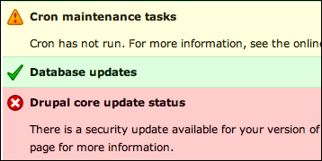
recap:
Current:
An early proposal from comment #7 here:
From #606490: Drupal GPL icons - a softfacade initiative:
And my own latest @ http://drupal.org/project/protocons:
And I'm sure there's a couple of themes out there that provide their own set as well. I think mine would be the best choice and besides ego there's a couple of more reasons why :)
- Core is generic, the Softfacade ones are a bit too cute 'n cuddly in appearance
- The Softfacade ones are made in photoshop. Protocons are checked into d.o. CVS and are made with open source tools (Inkscape) in an open format (SVG).
- Softfacade icons are a more complete set at the moment, but are also lacking a few core essentials: forum icons, file-types. Current versions were done by me too and I'm reworking them to match overall protocons styling.
But, what say you?
Comment #18
dries commentedI like yoroy's latest ones from Protocons best. It would be a nice refresh. $sexy++;
Comment #19
xanoThe Protocons icons are indeed a bit more generic. The tick does look a little weird. What about positioning it a bit more like the tick from the softfacade icon? It looks less wild. Perhaps a bit more professional.
Comment #20
mgiffordOk, I was just going through these icons to look at http://drupal.org/node/639368#comment-3211194
Can we get a list of basic messages? Then we can get a list of basic colors for those messages and finally a list of images..
I think this is mostly done.. I do think there is some confusion between alerts & status messages.
Basically boils down to Ok, Warning & Error for the alerts & then a status icon too.
Comment #21
mcrittenden commentedSub.
Comment #22
sun#1246722: Replace or rename redundant watchdog icons slightly conflicts with this issue.
Comment #23
mgiffordAdding this other issue as a duplicate #721772: Replace Watchdog icons
Comment #24
klonos...coming from #721772: Replace Watchdog icons where Developpers Icons and Function icons were proposed.
Comment #25
xanoThe Developpers icons look like they are not GPLv2 compatible.
Comment #26
klonos...yeah, they might not be. I don't really know since I didn't check - I simply copy-pasted the links mentioned in that issue so that the proposal for consideration does not get lost.
Comment #27
mgiffordThere are the jQuery UI icons #1744278: Make use of jQuery UI Icons in core
Comment #28
mgiffordI think this would add to Drupal's usability.
Comment #29
Bojhan commentedWe can just use the new ones.
Comment #30
yesct commentedcorrecting the tag to the more common one.
Comment #31
mgiffordSo do we just need a patch with the SVG icons from #12 to review? This issue seems to be stuck.
Comment #32
mgiffordComment #33
lewisnymanWe've already replaced the icons with Libricons in #2083947: system.module: Update use of icons to new standards Yay!