
 Come together with the global Drupal community in Rotterdam, 28 Sept – 1 Oct 2026. Sessions, contribution, connection, and Early Bird savings until 8 June.
This one is probably not a Novice task, since I imagine we need to spend some time picking a compatible colour of red. The actual patch should be pretty easy though.

Comments
Comment #1
sivaji_ganesh_jojodae commentedHow about this ?
Comment #2
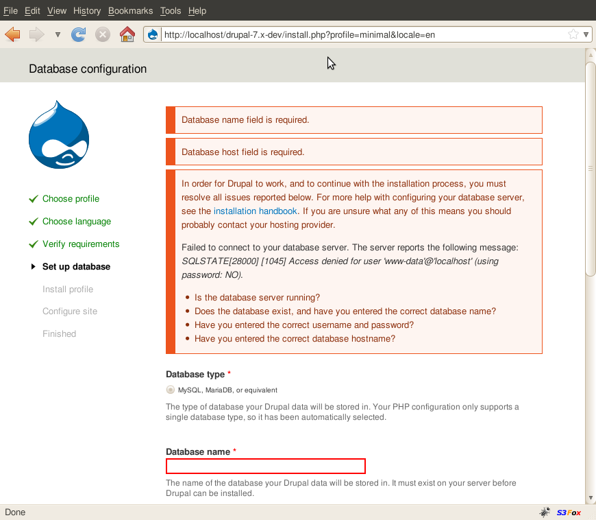
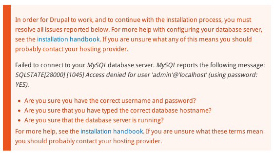
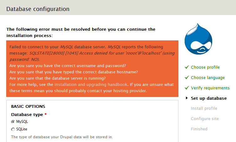
ruplI noticed this problem to a greater extent when I didn't have the correct MySQL information entered in during installation.
I tried making it more legible while maintaining the current theme's error background color. I'd appreciate any feedback! I uploaded screen shots of before and after along with a patch.
Comment #3
ruplswitching status
Comment #5
sivaji_ganesh_jojodae commentedThere is a similar issue here #638430: Error in error message not readable
Comment #6
marcvangendPersonally I wouldn't say that the blue-on-orange links are an assault on my visual cortex, but I can see that there is room for improvement.
In general, I think we should respect the choices made by the designer and not invent our own color schemes here. That doesn't mean we can't change anything, but when we do, let's try to stay as close to the original design as possible. The patch in #1 does not do that in my opinion. I will try to get a hold of the original designs to see if they can help us choose the best solution.
The problem mentioned in #2 has already been fixed in #638430: Error in error message not readable.
Comment #7
scroogie commentedBlue on red/orange I personally find horrible. Perhaps something like http://colorschemedesigner.com/ can help.
Comment #8
marcvangendYou mean like this? Sorry, but a tool is not a guarantee for quality. Your proposal for a better color is very welcome.
Comment #9
scroogie commentedSorry, but your doing it wrong. Not all colors on a scheme can be combined. Click on "Page example" in the lower right to see the usage. You won't find no blue text on red background there (I hope). Perhaps my wording was wrong. Such a tool _can_ help. It's no guarantee, but I didn't say this anyway.
Comment #10
marcvangendOf course I'm doing it wrong, that's exactly my point: Even with good tools, you can make terrible things. Maybe I misunderstood your "please use this tool" remark, but I'm glad that in fact we do agree.
Meanwhile I have been looking for original design files to see if they can help us choose an appropriate color that the designer would agree with, but no luck so far. Personally, I think #333 would be an option. We also used it to display SQL errors inside the error box, see #638430: Error in error message not readable.
By the way, if there are any accessibility experts listening: isn't it required or recommended to underline links?
Comment #11
marvil07 commentedI was playing a lot with colors and I think #742 looks good for links
Comment #12
webchickWow, that actually looks great to me. Would be nice to get some designer eyes in here.
Comment #13
marvil07 commentedchange status accordingly
Comment #14
marcvangendI like the direction, but in my opinion, there isn't enough contrast between #742 and the orange background. I'll try to send in my own proposal later today.
Comment #15
marcvangendI played with the colors some more and I must say: it's quite a puzzle.
We have to take into account that the orange box can not only contain links, but also error messages. In #638430: Error in error message not readable the color of those error messages was set to #333 (however that issue is still open for improvements). Besides that, there are many more colors on the install page, such as the green progress indicators, the warm grey bar at the top and the three shades of blue in the Druplicon logo. I have tried many colors for all types of text and I have come to the conclusion that adding yet another color does not improve the design. That's why I focused on the colors that are already in the page.
The link color I'm most pleased with is #D2D2CB, which is the warm grey from the top bar, only slightly darker to enhance the contrast with the white paragraph text. See attachment.
Comment #16
webchickHm. I had to stare at that for too long for the links to "pop" out at me with the grey. But good call that we need to have the links styled differently than the error text.
Curious, what does Garland look like?
Comment #17
marcvangend@webchick, #16: I know, the small amount of contrast between links and regular text was the trade-off I made in #15. If possible, we should try not rely on such subtle differences because they can disappear completely on certain monitors or under certain lighting conditions.
I think the perfect solution (if it exists) would combine the following criteria (not in order of priority):
1) use colors that look nice together
2) sufficient contrast between paragraph text, links and error message
3) sufficient contrast between all text colors and the background color
4) respect the current design by:
a) not adding completely different colors to the palette
b) not changing distinctive colors such as the orange background
c) not underlining links (except the :hover state)
PS. If we really want to deal with this holistically (like webchick said in http://drupal.org/node/638430#comment-2343272), I think we should be asking ourselves why there are error messages, status messages and help messages (and glued-together combinations) all in the same orange box. I wrote about that in http://drupal.org/node/638430#comment-2298862. Oh, and this is related too: #563390: Seven theme lacks formatting on common html elements such as lists, paragraphs & <code>.
Comment #18
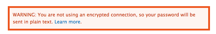
webchickHere's another question. Why does the error message /have/ to be in a different colour? If we got rid of that and made it just made it white (or italicized or something instead), we could use the existing non-eyeball killing dark red for links instead, like #11. Yes? I mean, when you get a form submission error, it just shows up in white text on orange background. I don't see why SQL errors need to be different.
I'd have to see a screenshot of what it would look like to separate the messages out. I'm not necessarily opposed, just can't really picture it.
Comment #19
marcvangendGood questions. (I notice that this issue is shifting focus a little, from links-in-errors in general to errors in the the install system, but I think we should just let that happen because they are so interconnected.)
I have not really considered displaying the error message in the same color, simply because it was already different when I started working on this, both visually and in the markup (wrapped in
<p class="error">). We could make it white, but italicizing is not really an option because there already are italics inside the error message.So do SQL errors need to look different? In general, I don't think so. Drupal already makes a difference between status, warning and error messages and they all have different colors. Drupal_set_message() takes care of the difference between those types of messages. The install system is a little different. When the db layer throws an exception during install, the SQL error and help messages are glued together in install.inc and then passed on to theme.maintenance.inc, where everything caused by an exception is displayed as an error. During install, there is no difference between status, warning and error. In Q1 2009, Josh Waihi probably realized this and wrapped the error in a class:
$message .= '<p class="error">' . $result . '</p>';(see #349508: Require UTF8 database encoding, #19). In #23, Sun says about that line: "Not sure whether our theme classes are prepared to work on paragraphs..." but it has not changed since. (Yeah, that's fun, CVS archeology :-))My conclusions so far:
- Drupal core has a good way to handle different types of errors, but we cannot fully use it during install. It's too late now to fix that for D7. (For completeness' sake, I'm still attaching two firebug mock-ups of separated help messages.)
- Josh Waihi provided some kind of work around, but we have to decide if we want to use it (make it look different) or ignore it (make text white).
- For post-installation usability, we simply need to change the link color and be done with it. AFAIK, p.error is not used anywhere except during install. In my opinion, the color from #11 does not have enough contrast with the background. Earlier I said #333 looks good, but #501700, which is a really dark shade of the background-orange, looks even better (see the third attachment).
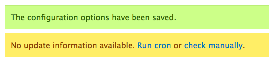
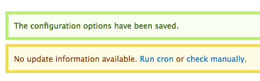
Comment #20
webchickHm! http://drupal.org/files/issues/install_help_as_warning.png is kinda nice, actually. Is that by any chance easy and non-invasive to do? ;) I prefer it over help_as_status.png because those are messages the user needs to act on, rather than normal "I just saved your form" kinda stuff. You should get a +1 from one of the regulars in #drupal-usability before going down that road, though.
If not, http://drupal.org/files/issues/seven_error_link_color_501700.png looks great to me and would perfectly solve the problem, assuming we don't colour the SQL errors.
Comment #21
webchickComment #22
marcvangendSplitting the error into two parts was actually Yoroy's idea, so I guess there is a good chance that the usability team would agree. However, I don't see a nice, easy, 3-lines-of-code way to do it. My knowledge about OO-PHP and throwing exceptions increased by 1000% this evening and I think the bottleneck is line 361 of install.inc:
throw new DatabaseTaskException($message);Right now, $message needs to be a string, so that is all you can return. In order to split up the error, I think we would have to extend/alter the DatabaseTaskException class so it can throw an object or array. That's beyond 'easy and non-invasive' as far as I'm concerned.
No wait, I just realize that there is one really ugly dirty hackish way to do it quick and easy... But that would be to throw an error message like this:
<p>This is the error</p></div><div class="messages warning"><p>This is help text.</p>Note the closing and opening of div's in the middle, anticipating the div it will be wrapped in later on... How's that for causing death to eyeballs?
One final remark: I noticed that line 356 of install.inc (
$message .= '<p class="error">' . $result . '</p>';) causes an HTML validation error because the $result that it wraps already contains a<ul>. Definitely something we need to fix, but fortunately this p.error can be removed completely if we get rid of the error message coloring.So what do we do next? I'm afraid that all we can do now is changing text colors... but I'd be happy to roll a patch.
Comment #23
marcvangend(oops, don't know how that happened)
Comment #24
dave reidJust notice this, but is there a reason why we don't have links underlined in Seven? That in itself seems odd and would help distinguish text vs link.
Comment #25
marcvangendI think Mark Boulton is the only one who can answer that, but I assume it's an aesthetic choice. One could argue that a functional theme like Seven should be as accessible as possible and try to meet the highest WCAG standards. See http://webaim.org/blog/wcag-2-0-and-link-colors/ for an article about link colors and underlining.
Comment #26
rickvug commented#11: seven-links-inside-error-class.patch queued for re-testing.
Comment #27
rickvug commentedThe patch in #11 fixes the primary problem here. My eyes are no longer bleeding! The code is good and follows the standards. FWIW, I have a design eye and think that the change is consistent with the existing design. Let's commit this patch and then carry on with larger changes (ie. the list in #17).
Comment #29
seutje commentedstraight re-roll, but I'd like to point out that the selector is inconsistent with the others used in the stylesheet
Comment #30
bleen commentedhere testbot
Comment #31
mgiffordTook a look at @seutje's patch in #29 and checked it for color contrast.
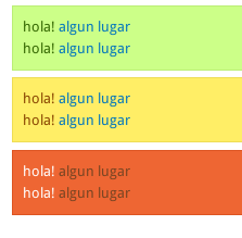
#774422 #ee6633 - Luminosity Contrast Ratio 2.5:1 (fail), Difference in Brightness 57 (fail), Difference in Colour 170 (fail)
So, a move in the wrong direction for accessibility and readability.
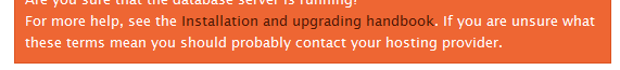
However, in using Juice Studio's Firefox Colour Contrast Analyser plugin I looked at the existing patch:
Error Message
#ffffff #ee6633 - Luminosity Contrast Ratio 3.19:1 (AA pass for large text only), Difference in Brightness 118 (fail), Difference in Colour 374 (fail)
Link in Error Message
#0074bd #ee6633 Luminosity Contrast Ratio 1.56:1 (fail), Difference in Brightness 47 (fail), Difference in Colour 390 (fail)
It's not good. It's better in the messages, but not ideal:
Green Message
#336600 #ccff88 - Difference in Colour 442 (fail)
Warning Message
#884400 #ffee66 - Difference in Colour 391 (fail)
So I decided to propose a rather radical change (sorry) to the error messages that I think addresses the painful problem of the readability of that huge orange block (ouch!).
This type of approach is going to be easier for everyone to read & is very obvious for the user.
Comment #33
marvil07 commentedgreat change mgifford!
I tried the patch, it works, not sure if head is still broken, but the fail is completely not related.
Comment #34
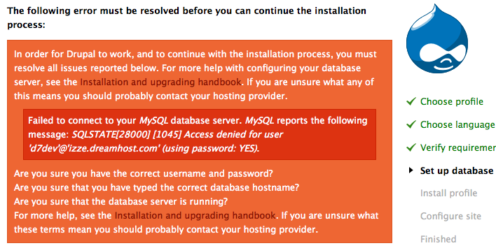
marvil07 commentedhere a snapshot of an install error for handy review
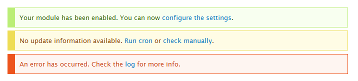
Comment #35
mgifford#31: 639368-seven-error-links-31.patch queued for re-testing.
Comment #36
mgifford@marvil07 glad you liked it and thanks for the bigger error message. It's much more readable than having that block in all bright orange!
Comment #37
Bojhan commentedLook I am oke with changing this error message, it most definitely needs an improvement. But we need sign in from the commiters that we are allowed to change something drastic as this.
Onto the actual design, I am not sure losing all the background colour is favourable. The actual thickness of the border is incredibly distracting rather than putting attention to the text at hand. I would rather strive to go for something, while keeping the colour or at least the visual affordance of the colour by reducing tone and/or increasing the text contrast.
Comment #38
mgifford@Bojhan - thanks for your thoughts on this.
It's really hard to make the text readable when the background color is so variable and so dark (or mostly dark). I was trying to meet a compromise in the patch, by reducing the intensity of the background color & increasing the width of the border. I'm not going to claim to be a design or usability person.
Perhaps, we could make only the error message have a thick border and keep the others thinner so that they are less distracting. Can you put up an image of what might keep the "visual affordance of the colour" as you suggest by reducing tone and/or increasing the text contrast? I was just using http://www.colorschemer.com/online.html to lighten/darken what the initial hex codes were.
Also, who needs to be notified to get sign off on this change. Which committers need to be notified?
Comment #39
bleen commentedIMO the change proposed in #31 is an excellent improvement. I think it makes the text *much* more legible. I disagree with Bojan's comment about the thick borders taking away too much from the text of the message. To me, the first goal is to get the user to recognize that an error has occurred and the second goal is to inform the user what happened and how to address it; this is accomplished by #31 with the big borders, again IMO.
Re Bojhan's comment about getting some buy in from someone who worked on the design of seven. On this I definitely agree. I think mcrittenden was one of the implementers of seven (I think)
EDIT: Mark Boulton designed the seven theme... I'm told, but I dont know his d.o. name
Comment #40
dries commentedRe Bojhan #37: I'm OK with changing the look and feel of the error messages this late in the game.
I'm not sure these fat borders are an improvement -- it actually makes it _harder_ to keep my eyes focused on the text. It is really distracts from the reading.
If we want to bring attention to the error, maybe we should be more clever about where these messages are displayed relative to the browser's view-port?
Comment #41
mgifford@bleen18 - Thanks! I'll reach out to http://twitter.com/markboulton on twitter and see if he wants to chip in on this. I don't know @mcrittenden though.
@Dries - Great to know we can change this element. On the borders, my thought was that since I was taking the colour out of the background it would be good to have something to emphasize it to mark it off from the rest of the text. For accessibility they could be all be made thin or medium width and that would be fine. Makes the box more subtle.
I figured that if all of the outlines were the same width on the box it would look more consistent & professional. However, I've since reconsidered that and perhaps we can convey importance using the width of the border. In the examples below I've got the every day messages with thin borders, but the more important they become, the bolder the menus are. It's yet another way to also help have more than color be used to help people differentiate the messages.
In anycase, looking forward to the feedback.
Comment #42
aspilicious commentedI prefer the soft border (always) like the green notice message.
Comment #43
markboulton commented@mgifford asked me to chime in...
We don't have bordered boxes anywhere else in the Seven (or at least we shouldn't). From a design language POV, we should just be using coloured boxes.
So, the issue is one of conspicuity and saving webchick's eyeballs. These errors are designed to draw the eye, but shouldn't visually compete with either the content in them (links included) or the the content around them (so the user can visually move on to amending the error, or completing their task without their eye being drawn to the error all the time). That's the rationale we should be keeping in mind, anyway.
I propose keeping the rich coloured backgrounds for status and errors, and using a high conspicuity colour for the link. For orange that could be a darker colour (one that is tonally sympathetic), for error states (on red) that link could be a bright yellow.
Comment #44
marcvangendI understand that the colors introduces in #31 are an improvement, even though I really liked the original, more saturated backgrounds from a graphic design perspective. I'm not keen on the variations in border width; I don't think that border width communicates the severity of the message and it looks messy to me.
The patch attached is an attempt to keep some color while not distracting the reader too much.
Comment #45
mgifford@markboulton - thanks for looking at this. You've put forward some important responses from the design language. I really don't know that we're going to find a green/yellow/redish combination that is going to have the contrast and luminosity that we need to meet WCAG 2.0 requirements. There are @webchick's eyeballs, but more so there is everyone else. I don't think we're going to find the right contrast unless the background gets a lot lighter & the text gets a lot lighter. I do also think that error messages should stand a bit apart from the rest of a theme. We want them to jump out. However, you know far more about design than I do.
@Dries - I forgot to talk to touch on "If we want to bring attention to the error, maybe we should be more clever about where these messages are displayed relative to the browser's view-port?" - but that's out of my experience. I do hope that someone else picks it up. Seems like a good idea.
@marcvangend - Interesting option. I like the extra wide left line. I like it. Wonder if we just leave the left border that thick and make all the rest no border that we'll have something that fits in better with @markboulton's vision. It would still alert folks and probably also not likely draw folks away from the original text as some folks here have commented.
Comment #46
marcvangend@markboulton: thanks for your input. Although webchick's eyeballs triggered this conversation, the latest iterations have been inspired by accessibility standards and contrast ratio calculations rather than personal opinions.
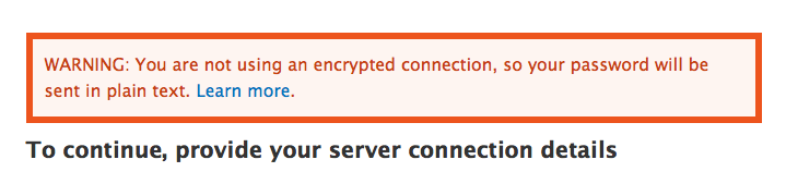
@mgifford: Thanks for the feedback. I got exactly the same idea when reading Mark's reaction (which he wrote while I was posting my #44 patch). Here's a new patch and mockup/screenshot doing just that: a thick left border (exactly as thick as a fieldset's left padding, so it aligns nicely on /admin/modules for instance), but no top, right and bottom borders. Personally I like the effect, but the resulting contrast between the message background and the white page background is very small.
Comment #47
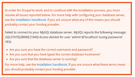
marvil07 commentedAgain, a snapshot of a big error(at install) to see it in action with the last patch.
Comment #48
mgiffordThat's exactly what I was thinking! Did an accessibility review using http://www.webaim.org/resources/contrastchecker/
div.messages - WCAG AAA
color: #036;
background: #f0f8ff;
div.warning - WCAG AAA
color: #840;
background: #fffce5;
div.error - This fails WCAG AAA for normal text. The colour could be darkened to #8c2e0b to pass
color: #c64110;
background: #fef5f1;
div.status - This fails WCAG AAA for normal text. The colour could be darkened to #234600 to pass
color: #360;
background: #F8FFF0;
However, I'm WCAG AA is sufficient for D7 so I'd be fine with this too.
Comment #49
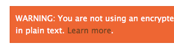
yoroy commentedPlease post screenshots showing more of the actual page, too, we need some context to really evaluate this. But I can say it looks very bad as is :\
Comment #50
scroogie commentedyoroy: You mean it looks bad in #47 or in the original unpatched d7?
I think #47 is a huuuuuge improvement!
Comment #51
yoroy commentedSorry, I meant to say the screenshot is #47 is where my eyes start hurting from the intense mediocrity that comes from combining a weak background color and a border and 3 text colors and 2 text styles. With strong border and with weak bg color used together as the main offender here. I'd much prefer we find a solution without using that particular trick and find a solid orange/red that does combine well with either black or white text.
Comment #52
mgiffordI've done some looking about for this, but I really think a solid red/orange background with white or black text is going to be just really hard to read. With the background,
you could go this dark:
#a5260c / #fff
or this light:
#f3745a / #000
which would meet accessibility concerns of the main text, but it doesn't help with giving a 2nd color for the link.
Comment #53
mcrittenden commentedWhy are we talking about completely redesigning the status messages here? We're just trying to make links more readable. Let's just do what markboulton suggested, which is to make the link a dark color ala #2.
Also, re: #39, I didn't help implement Seven, I'm just the maintainer of the D6 backport of it.
Comment #54
markabur commentedThe problem with #2 is that the links are indistinguishable from the new error text color (see http://drupal.org/node/638430) for colorblind or color-deficient people. Dark red and dark gray look the same for these folks. Why not just make the links in this box the same color as the surrounding text, but underlined?
Comment #55
ryank76 commentedAre any of the patches applied to the latest release? I tried 7.0-alpha6 and the contrast for installation error messages is not compliant with accessibility standards.
http://www.snook.ca/technical/colour_contrast/colour.html
Foreground colour: 0074BD
Background colour: EE6633
Comment #56
mgiffordI am quite sure than none of the patches here have gotten into core.
Comment #57
marcvangendIndeed, nothing has been committed because this issue keeps grinding to a halt. It seems that no one (including myself) dares to make a choice between optimizing accessibility and sticking to Mark's design. Attempts to combine those two (like my #46) could not please everyone (see #51).
I guess that in discussions about design, it's hard to make decisions when many people are involved. I'm tempted to suggest that we lock a designer (markboulton? yoroy?) and an accessibility expert (mgifford?) in a room and not let them out before they reach an agreement... but maybe someone else knows a more humane solution.
Comment #58
mcrittenden commentedRe: #43
What does "tonally sympathetic" mean here?
Comment #59
mgiffordAccessibility is an important aspect, but what we have right now is just ugly.
People have suggested that there might be a color that goes well against the orange that would meet the accessibility requirements, but nobody has come up with any details. And we need two colours - one for plain text and another for the linked text.
The division seems to be around having a border or line rather than the plain solid background. To get the proper contrast the background has to be pretty light. Having a line really is necessary (I think) to have it stand out as a warning.
@yoroy - any thoughts on this? Want to have time to chat about it on IRC?
Comment #60
mgiffordadding missing accessibility tag
Comment #61
Druid commentedJust a comment on the original issue of "Contrast between [colors] causes death to eyeballs" — a little basic physiology here: the human eye (cornea + lens) cannot properly focus two colors widely separated on the spectrum, such as red and blue, at the same time. Your eye keeps trying to focus the red, notices the blue is out of focus, focuses blue, notices red is out of focus, etc. ad nauseum (or at least, ad exhaustion!). It's very fatiguing for the eye to try to focus on red and blue very close together. It's not a matter of "contrast" — it's a matter of inability to focus such different wavelengths (hues) simultaneously. If our eyes were designed like an apochromatic refractor telescope, using a multipart lens of different refractive indices, we wouldn't have a problem (another argument to use against so-called "Intelligent Design"!).
So, if you're going to have a reddish background, the text needs to be not only contrasting, but not far away in hue. I wouldn't go any shorter in wavelength than the yellows or even the greens. Certainly not into the blues. Watch the contrast, and keep color-blindness in mind. It might be a better design to have a more neutral (shade of gray) background with red text than a red background. You can have reds and blues on the same page, but don't have them right together, especially if one is finely detailed, such as text.
It's another issue (that's been brought up here), although just as valid, about having redundancy in presented information. You should have at least two different ways of denoting something that's different, drawn from color, background color, shape (e.g., font family or italic variant), size, weight (e.g., bold), and decoration (e.g., underline). A prime example are HTML links, which by default use both color (blue) and decoration (underline) to help the widest number of people notice that there's something different (i.e., "interesting") about such text. Text color alone is insufficient, as someone colorblind/color-deficient could have trouble noticing that the text is different.
Comment #62
mgiffordWe've got a known problem both with accessibility & usability.
We've got a nice looking solution in #46.
Mark & others have had a chance to propose alternate colors to address a border-less solution which might be more consistent in Seven.
I'm not a design person, but I don't think that the visual element that is introduced is really a big deal for the overall presentation. However, it is a big deal as far as not causing a lot of folks pain or simply unreadable messages.
I'd like a usability person to either mark this RTBC or propose a viable color combination.
Comment #63
marcvangendThanks mgifford. I'm re-testing the patch in #46 to see if it still applies.
#46: 639368-seven-error-links-46.patch queued for re-testing.
Comment #64
mgiffordOk, so in talking with @yoroy on IRC I think that the problem with the patch in #46 isn't so much how it looks but how consistent it is with the rest of Seven.
Now there are other threads on this: #665790: Redesign the status report page & #538666: Seven theme not right with the status report screen
But I think this is a reasonable step to a more unified & accessible look.
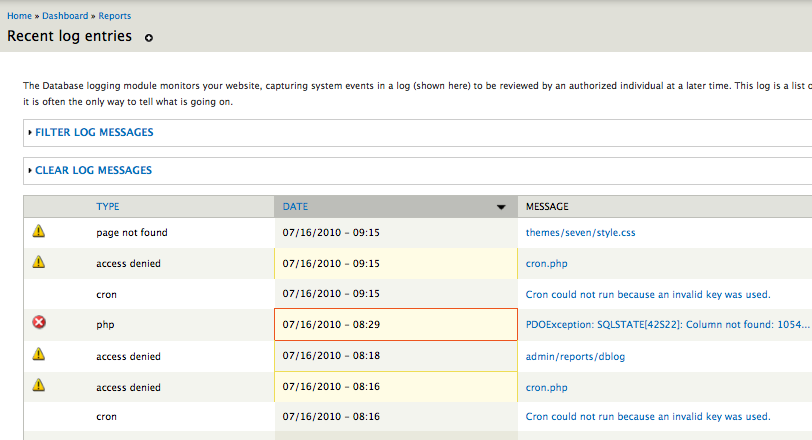
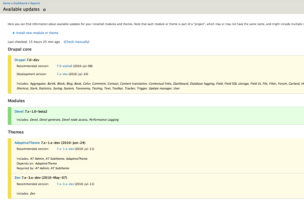
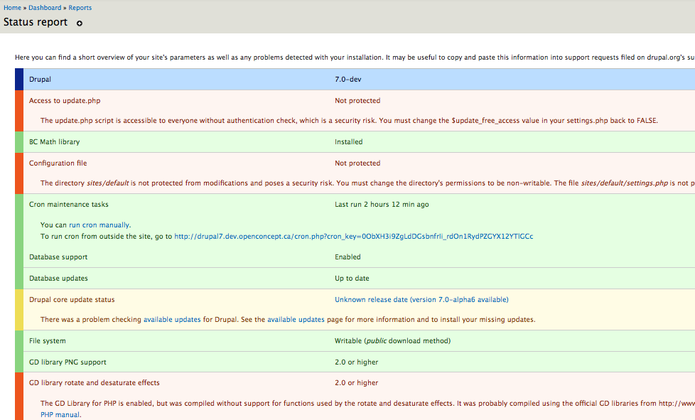
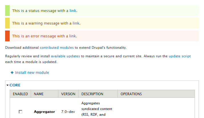
Many of the same problems with accessibility here showed up on the Available updates page & Status report page too.
My approach here was to over-ride module defaults in Seven's style.css
But changes to default should also be made in:
- modules/dblog/dblog.css
- modules/system/admin.css
- modules/update/update.css
Amazing how many ways there are that just simple background colors there are in Drupal. I tried to write up a spreadsheet illustrating all the different tags that are used in an effort to get more consistency (even in colors) and it's not easy.
Comment #65
mgiffordOk. I've reined in the left sidebar a bunch and left that only on the messages.
I've also added the images to those messages for consistency & accessibility.
Finally I nixed the dblog as it was just too inconsistent. Who knows what any of those backgrounds are supposed to mean.
Comment #66
bleen commentedI think the images you added are a big + ... but there needs to be some right padding (you can use a border-right with the same color as the BG to fake this).
Other than that, I think the patch in #65 creates a clean look that is consistant with Seven (IMO), makes the messages obvious to users AND doesn't cause death to eyeballs.
Comment #67
Bojhan commentedI do not feel we should clutter this issue by adding in status images, please remove them.
Lets finish the messages discussion, I am somewhat on the fence whether we really want a bar on the left. Looking at it in context, it most definitely looks worse then in #46. Yoroy what are your thoughts on this?
Comment #68
mgiffordOk, I can open up a new issue for the images. They definitely help with accessibility. I think about 10% of guys are color blind after all, so it's really good to have a fall back to an image or something that gives folks who can't tell red from green an alternate.
That being said, I first want to get this patch into core so that Seven is respecting color contrast. So, I'll follow Bojhan's suggestions & yank the images.
Given the need to make the background such a light color the sidebar is there to make it blatantly obvious what color it is (no need to be subtle about warnings & errors after all). Ultimately however it's the combination of color & background-color that matters for accessibility (and also for those who just don't like pain in their eyes by looking at that orange background with red/blue on top of it.).
Comment #69
markabur commentedLooks good, I think this solves the original issue and the change looks fine in the context of the theme. I'm tempted to RTBC but I've only looked at the screenshots.
I agree that we need to use pastels for the overall background colors in order to have good contrast with the text, and that using a stronger version of that color as an accent is a nice way to emphasize the state. I'm a bit red/green deficient and the red error color stands out ok whereas the green and amber look pretty close to each other. That doesn't really bother me though, especially if there will be icons added in a separate issue.
Comment #70
markabur commentedOk, installed and tested on latest HEAD. Works great, looks fine with the design imho. Are we picky about trailing spaces in css files? Caught a couple in the new section at the end. Otherwise I say RTBC..
Comment #71
cliffNot that anyone asked my opinion, but I think the dark bar at left with a muted version of the same color used as the general background for the message is sharp, effective, and evocative of the tape strips often used to flag corrections, signature lines, and the like in printed documents. (They have one end darkly colored and are either colorless or a very light version of the same color everywhere else.)
If this were to go to actual usability testing, and not just a popularity poll among Drupalists, I suspect we would find it to be far, far better than any previous method of highlighting errors, alerts, and the like. In other words, we would find that people would recognize the messages as being important (thanks to the left bar, which could include a simple image to distinguish errors from alerts from other messages), for one thing, and be able to read the text easily, for another.
Mike, I'm having trouble grabbing the color pairs from my laptop, but it looks like we're right on the edge of WCAG 2.0–conforming contrast. Have you plugged the hexadecimal values into Contrast-A? If not, please do so, because only a slight tweak of the blue (for links) or the background hues is needed to achieve conformance.
Overall, this looks not just good, but great. Outstanding!!! If I were sure of the contrast levels, I would mark this RTBC in a heartbeat.
Addressing a few points from earlier comments:
@Druid, you are absolutely on target with the need for redundancy. We do need to have something other than color that not only makes these messages stand out but also makes it possible for everyone to be able to recognize the type of message — alert, warning, or whatever other types might exist.
@Yoroy, you asked for a color with appealing appearance when used with red or orange and sufficient contrast against that hue. Good luck! Various shades of orange and blue-green are next to impossible to pair with anything to achieve sufficient contrast. In fact, with the contrast thresholds originally proposed for WCAG 2.0, it was impossible to achieve sufficient contrast with one of the colors being either of those shades — they are too light to contrast sufficiently to white and too dark to contrast sufficiently to black. All the more reason to get on board with the dark tab + much lighter general background. Add a series of meaningful icons, and we will address aesthetics, accessibility for the visually disabled, and even accessibility for the cognitively disabled.
Comment #72
bleen commentedthis is the identical patch as #68 except without the whitespace issues ... and given 69,70 & 71 I think we are ready for RTBC
Comment #73
markabur commentedSweet, RTBC.
Comment #74
Bojhan commentedThere is no design-review, good-to-go from any of the maintainers on this, lets not rush things here. @yoroy could you comment?
Comment #75
aspilicious commentedThis is back to needs review... Srry guys ;)
Why?
1) It needs a serious design review from one of our specialists before it can be rtbc'd.
2) I think the reason they didn't come in yet is that they aren't convinced this is the way to go
Comment #76
Druid commented@Cliff, specifically are you calling for a dark tab (low luminance, RGB values under, say, #44 each), or are you calling for a highly saturated color, with one or two RGB values much lower (say, by #80 or more) than the other(s)? Agreed that could be paired with a very light (unsaturated and high luminance, close to a bright gray, with just a touch of the tab's hue) background for the black text itself. However, it doesn't have to necessarily be dark (unsaturated and low luminance). A vivid Red (#FF0000) or Green (#00FF00) would be a quite attention-getting "tab" and quite bright (not dark, being my point). It also has a better chance of being seen as color (not gray) by anyone not severely color-deficient in their vision.
Different themes might use fancier tricks with the messages — such as using a gradient background image going from somewhat saturated at the left (next to the saturated tab) to quite unsaturated at the right, blending into the larger section or page background color. All sorts of visual effects can be done, while still keeping the text highly readable for everyone.
P.S. Use an alt="Error message" or the like for the tab, so that screen readers will say something to people using them. That would require an image rather than a filled <div>.
Comment #77
yoroy commented@71, cliff: "Various shades of orange and blue-green are next to impossible to pair with anything to achieve sufficient contrast. " <-- Exactly, that's the core of what we've learned here in this issue. With the 'fat orange' as the biggest issue here: it doesn't work with the blue link, but new for me was that that specific color can't work accessible enough, ever. Not even against white or black.
@#76, druid: Thanks for those definitions, that's helpful. This whole case study is basically begging for a handbook page on accessible color-picking :)
So, acknowledging that, the new design simply has to leave the 'fat background color' approach behind. Still, the design has to catch the eye. You could make it really big or make it move, both sure ways to get attention, put not really a feasible long-term strategy…
So, the new design adds the needed visual hook by adding a big fat left border:
From:

To:

===
From:

To:

===
Large screenshots, after:
single line error on configuration page: http://img.skitch.com/20100725-q4yx1ik1s6ybx59xeqwjbf6at6.jpg
single line of green on search settings page: http://img.skitch.com/20100725-es7h4e4fu33ys3e52f96kg91ft.jpg
Left is good for LTR readers: makes you start at the beginning. (Aha! RTL styling seems to be missing here)
Looking at the last two, notice that even in case of small message boxes on top of biggie config screens, the bright fat border-left really sticks out. In that sense the design seems quite effective to me. And without the big fat background the message text becomes easier to read for all.
I've clicked around a fair bit toggling between the two stylings and I think the current proposal works quite well.
As for aesthetics, it's not as pretty as what we have now: the light background tints are kinda wishy-washy. Are they needed then? I think so:
http://img.skitch.com/20100726-gbs92guxdqg66hab9skjajps77.jpg (No, you can't really fix that by adding small borders again: http://img.skitch.com/20100726-nxenp89qtee23hn8t86j72yjr1.jpg)
The full color bars can make pages quite top-heavy, the new design is less heavy but still effective, which is better for the long-term experience.
Soooo,
- Needs work to add RTL styling but I see Seven is missing a style-rtl.css :( so I'll open a separate one for that. Already there: #766458: Seven theme lacks rtl styling
- Needs review because Cliff's question from 71 needs an answer still: do we really conform to the desired standards with these latest color pairings?
- Design-wise: lets do this.
Comment #78
marcvangendYoroy, thanks for the thorough review.
Good catch regarding the RTL styling.
Comment #79
marcvangendReroll against style.css r1.59.
Comment #80
mertskeli commentedAnother possible option: message areas are the same, just different watchdog icons.
Comment #81
Bojhan commented@mertskeli Sorry, no - things been decided. Not changing route again.
Comment #82
mertskeli commentedSure, no problem. It was just a suggestion.
Comment #83
cliff@mertskeli, the direction you are headed is perfect. I would like to suggest that you begin a new issue to add a coherent set of icons to these system messages. It probably should be tagged a feature request, even though it clearly improves the accessibility of the interface. People who are colorblind and people who have cognitive disabilities will be able to better distinguish one class of messages from another with these icons.
@Druid, thanks for the very quick lesson on color attributes. I can use the analysis tools, but I know very little about color theory — frighteningly little, as my local Drupal group asked me to teach them more about selecting color palettes. (I did open my talk with the warning that this was merely a technique for a programmer with no access to a designer to pick a color scheme that would at least not make the customer puke — or cause eyeballs to die.) I guess I do mean "highly saturated," although "low luminance" might also work for the color one of one type of system message. (Wouldn't that produce a dark grayish bar? For example, a color like "dark charcoal brown"? If so, I think you could use one such color but, if you were to use another low-luminance color for one of the other system messages, it would be hard for a lot of people to tell those two colors apart. But that's an uneducated opinion; the right example could prove me wrong.)
Comment #85
bowersox commented(subscribing--I like the direction in #77 and I'll try to review the latest patch soon)
Comment #86
Druid commented"Highly saturated" colors have a vivid amount of "color" to them. You would look at a saturated red and say, "Now, that's red!" Low saturation, or unsaturated, colors are close to a shade of gray (red component almost equals green almost equals blue). "Low luminance" would be something dark — red, green, and blue are all fairly low. The gray-scale equivalent is dark gray, approaching black. Low luminance usually goes hand in hand with low saturation, although not perfectly — say, 60% blue + 0 red + 0 green would be a fairly saturated blue, but dark on the gray scale (7.8%, quite low luminance).
A "dark chocolate brown" (yum, chocky!) would be fairly low saturation, as well as low luminance. Brown is a dark yellow (red + green, which are the most visible of the triad). Say, something like 30% red + 30% green + 0 blue, which is a 26.1% gray, while still having a rich (fairly saturated) color.
Now, what's the right choice for colors? It depends on visibility (saturation and luminance), contrast with neighboring color blocks, the effect of color-deficient vision in many people, and social conventions (e.g., usually red for danger). The smaller the block of color you want to draw attention to, the more vivid it should be (so it won't be overlooked). A bright red (100%,0,0) block would be garish if it covered more than a few percent of a page, but appropriate for something the size of a few letters.
Finally, there's a whole field of arts and sciences in what colors go well together (are "complementary"). You would be interested in this if you want to use a color with something other than black, white, or a shade of gray. Blues and greens feel "cool", while reds, oranges, and yellows feel "warm". Some combinations are pleasant, while others make people uncomfortable. And as mentioned before, don't force people to try to focus on widely-separated wavelengths, where the human eye can't focus on both at once.
Comment #87
webchickThis issue is fascinating. :) Thanks for the colour lessons, Druid!
Comment #88
cliff@webchick, I hope this adds to your fascination while possibly moving this issue closer to resolution.
Analyzing @yoroy's screen captures:
So we have good, solid conformance for the color pairs used for these messages in Seven. In fact, these color pairs produce conforming contrast ratios even for all types of colorblindness. Very well selected! From the standpoint of how well the messages and link text stand out from their background, we're RTBC in my book.
But there is still one problem: Not all of the heavily colored bars contrast to white well enough to make them readily recognizable to everyone. In assessing this property, I used a contrast ratio threshold of 3:1, which is the level AA conformance standard for large text:
In other words, people who are colorblind will hardly be able to tell that the yellow bar of an alert is even there, let alone whether it is different from the green bar of a status message. The typical solution to this accessibility issue is to pair each color bar with a distinct icon — much as @mertskeli demonstrated in #80 — so people who cannot recognize the color will be able to rely on recognizing the icon. Add alternative text to each icon, and even people who are relying on screen readers will be able to tell what kind of system message they are about to hear.
Earlier I had suggested opening a new issue to add icons as a feature request. But now I recognize that this is clearly a closely related accessibility issue that we would be wise to tie up now.
In other words, the initial problem was that the color pairs in use assaulted @webchick's eyes (mine too, actually). But a corollary problem is that for some people the colors were not stimulating their senses enough — or, in some cases, at all! So the real issue here is selecting an appropriate means of conveying the type of system message clearly. The redesigned color fields work well for people who can see them. We can take care of this issue for everyone else by adding simple, standard, distinct icons. So why not?
"Things have been decided" is not a good reason not to fix this problem, as that decision was poorly informed.
Comment #89
Bojhan commented@Cliff My decision to say "things have been decided" was motly not to cause another "lets do this 20 comment discussion" - but rather to wait on responses of color validity(should have said that). I mean if the only way to fix this issue is to add icons, I would gladly do that - but lets be clear that is the best solution without turning our color ratio discussion into one of extreme reds, extreme greens and extreme yellows (extreme as in uglyness).
I am sad to say its not as easy as adding a color merely for "those who can't see the colors" it add distinctive element to the design of these messages and thus changes the context in which certain designs work and don't. I am not sure if this current design will work with icons.
Comment #90
cliff@Bojhan, I think I'm hearing two points from you:
What should those icons be? The suggestions made by @mertskeli in #80 — a dark checkmark for status messages and a triangle with an exclamation point for alert or warning messages — are very close to the mark. Add something like an octagon (representing a stop sign; for errors) and the set is complete. (I might be wrong about the octagon's being the best icon for errors. If so, I'm sure someone like @mertskeli could come up with a suitable alternative.)
The size of @mertskeli's icons is about right. They should be positioned in the center of the strongly colored band at the edge of the message. [Edited to remove from here the idea of using the icons as actual bullets for text. Bullets have no alternative text associated with them, so that would not work.]
How does that approach sound?
Comment #91
mcrittenden commented@Cliff:
I don't know if I'd go that far. We're not using color as the ONLY way, because after all, the text itself is what conveys the message (i.e., you can tell what is an error and what is a status message from the message itself). The color is just a supplement to that, IMO. Given that, and the fact that I agree with Bojhan that icons just aren't a good fit with this design, I'd also be against adding them.
Comment #92
Druid commentedCareful! You're assuming that people will always carefully read the text! If there is nothing "exceptional" about the text color or face (let's say the user is quite colorblind and doesn't see the color bar), the user might skim over it or even completely skip it. I think that an icon located where it is sure to strongly contrast with its background (which might not necessarily be the colored bar) would be good redundancy.
After all, the standard HTML styling for links is blue text (as opposed to black) on white, with an underline. Redundancy in action for anyone with color vision problems.
Comment #93
Bojhan commented@Cliff I am not saying they are ugly, not beautifull either. But they fail my point being, for them to be fixed they probably need to border uglyness in terms of contrast ratio's as we are desperately trying to keep a "calm" feeling to the interface.
I would be for adding icons but we should probably change the design a bit then, if everyone agrees I would like to move on and add icons to the messages and explore designs with that. I would imagine removing the left bar, lining out the icon to the left and taking our normal warning, error and whoo! icons :)
Comment #94
bleen commentedI actually like the idea of icons BUT mcrittenden is exactly correct - the text of the message gives the context and the color is an enhancement of that message. Icons could be a further enhancement, but we should discuss that in a separate issue... lets handle the color issue now (because the current implementation = death to eyeballs) and discuss icons later.
Comment #95
cliffIf we're considering icons a separate issue, then this is RTBC, based on @yoroy's comment in #77:
and my testing of the color contrast, as documented in #88, the results of which were that the color pairs used for text and links contrast sufficiently from the background color to conform with WCAG 2.0 at Level AAA.
I've opened a new issue for the icons.
Comment #96
cliffOops! Meant to actually change the status…
Comment #97
webchickAgreed with a separate issue to discuss iconization. Screenshots at http://drupal.org/node/639368#comment-3247466 look great to me, have design team sign-off, and passes accessibility team review.
Committed to HEAD! Thanks so much for all the hard work on this issue! :D
Comment #98
Bojhan commentedehh, fyi adding icons means we will change the design again. Somewhat wierd to fix this issue knowing the follow up will change it, but oh well.
Comment #99
webchickYes, if the follow-up gets done. :P This issue took 9 months to sort out, and I certainly hope Drupal 7 has a few point releases behind it in another 9 months. ;)
Comment #100
Bojhan commented@Cliff So we are oke with AA WCAG validation?
/me is terribly confused, as in other issues people press on AAA validation.
Comment #101
marcvangendGreat, thanks everyone. I always feel honored when some of my code gets in :-)
@Bojhan: I'd say "release early, release often" - this is a major improvement over the previous error messages, so it's right to commit it, regardless of the outcome of #874370: System messages need identifying icons (WCAG 2.0).
Comment #102
mertskeli commentedSorry, until now I didn't realize that it was a pure Seven theme issue and completely agree with Bojhan that icon are inappropriate for this theme.
But anyway my suggestion with icons was mostly targeted as an alternative to "thick left border" solution (which I agree is not so good).
Drupal already has various icons in its distribution package, and they are there neither for blind nor for mentally disabled :)
Drupal is not the first software in the world, and not the only one which needs to display system messages. Experience of other OSs can be used, i.e. Microsoft Windows is being used by billions users in the world. Very clever and talented people have been designing it. It is not a shame to use its successful features. The same can be said about major web applications.
For system messages 3 options are commonly used:
Option 1 - Colourless background with icons (de-facto standard),
Option 2 - Colourless background with colour border,
Option 3 - Solid colour background.
Sometimes they are combined.
Drupal's way is Option 3. Good. Just it is important not to oversaturate. That original happy orange fill is too screaming. More of that, the colour itself is wrong. It should be just red - for errors, yellow - to draw attention, green - for various "ok" (without extremes, as Bojhan has already mentioned). So that fill should have been yellow. "Calm" yellow. That's all.
I realize that I am a newcomer here. But it is a public discussion (not private, right?) so I believe any suggestion can lead to a successful solution. The more - the better.
Me myself I use Options 2 and 3 combined. It is just an iconless div with pale colour fill (like rgb 255,204,255) and a 1px border (like rgb 255,128,255). But I do not want to see all this crazy zebra in system reports tables where I just use default watchdog behavior.
And... I do have some minor problems with colour perception :) and I do believe that the flag of Japan is the most perfect flag in the world from usability point of view :) nothing can be compared with red dot as an attractor.
Anyway, notwithstanding the issue's title, no one will die :)
Comment #103
cliff@Bojhan, yes, this also conforms with WCAG 2.0 at Level AA. I was merely analyzing the colors presented in the approved design, not trying to select a particular color. Level AAA is a higher threshold. Had the proposed colors met only Level AA, I would have been satisfied. If we can meet the higher standard — and we have — that's better, so there's no point in making further changes as far as accessibility is concerned. Also, I've restricted my analysis to the specific issue raised here: Appropriate contrast between the foreground colors for text and links in various types of alerts and their respective background colors. Whether the indicator colors enable people who are colorblind to see the difference between a warning and an error will be dealt with in our new issue.
@mertskeli, welcome to the discussion. I empathize, because I've been deeply involved in these discussions for at least a year and I still feel like a newcomer. FWIW, I agree that red would be the better color to associate with an error message. And icons alone might work. As you point out, icons are used not only for the colorblind and the blind, but also for people in general. But using color alone to convey meaning is a barrier to accessibility to anyone who cannot perceive the color, and, unfortunately, that's what seems to be the norm among Drupal themes. Hopefully the discussion in #874370: System messages need identifying icons (WCAG 2.0) will lead us to a clearer concept of how each theme can be modified to better handle this issue.
@marcvangend, thanks for hanging in there, and congrats on this commit!
Finally, @webchick, many thanks for raising this issue and letting the community have time to work out a resolution. This is an important improvement to this core theme.
Comment #104
Druid commentedColor and icons are redundant means of highlighting (i.e., drawing attention to) what is more or less "in line" text. If someone misses one of the cues, hopefully they'll notice the other. Unlike a Windows error message, these are not modal "pop ups" that scream for attention, despite not having garish colors. My point was that if you don't draw attention to the message text through something that differentiates it from the surrounding text, it's all too easy to skip over. People don't necessarily read all the text on the screen, so it is insufficient to simply bury an error message in the screen. You need to draw attention to it, without causing a user's eyeballs to pop and splatter. That's why a strong background color can cause such problems, if care isn't taken to control the color of all text being used. I would like to see a thick "notice me!" colored bar on one or both margins, and ideally an icon (for the benefit of people with color perception problems) as backup. The message itself could be on a slightly tinted background, just enough to be different from the rest of the page. In that case, you can make the color bars a bit narrower, as they're assisted by the larger background. But in the end, color alone or an icon alone are insufficient. That's well known.
Comment #105
cliff@Druid, I couldn't agree more about the need for icons, and I hope you will join the discussion at #874370: System messages need identifying icons (WCAG 2.0).
Comment #106
jbrown commentedWhat about this?
Each message gets styled individually, instead of the whole group.
Comment #107
jbrown commentedHere's an updated patch and some more screenshots, showing multi-line.
Comment #108
mgifford@jbrown - I'm not opposed to this, but you added a visual element to the patch in #72 above. There's now a 1px border around the other 3 sides (where there wasn't one before).
The comments by @yoroy & @Bojhan are all to a different look/feel than that proposed in #107.
I think that your changes to includes/theme.inc are valid & it does seem to simplify the code. Certainly adding <ul class="messages"> seems like a good way to gain more control to themers.
I liked your longer error messages too. Those are useful to see. Especially the database configuration one.
If this new visual element was discussed earlier I must have missed it. I do think it is important (especially as threads get longer) to specify exactly what was changed. This description doesn't mention adding the visual element - "Each message gets styled individually, instead of the whole group."
Should we open a new issue for this now that it's been committed to head?
Comment #109
jbrown commentedYes - I should have mentioned the 1px border. The reason I put it in is because the background colour is so light and similar to the white around it - I find it very difficult to look at, e.g. http://img.skitch.com/20100725-es7h4e4fu33ys3e52f96kg91ft.jpg
I'm happy to continue the discussion in this thread.
Comment #110
marcvangendA quick note about the 1px borders: they were in fact present in my patch in #44, but taken out in #46 because of what Mark Boulton (the original designer of this theme) said in #43... I quote:
Comment #111
jbrown commentedIn my humble, non-designer opinion, I think your original version with the 1px border looks much better. It makes you read what is inside it. Coloured boxes don't work if they are that faint.
Seven has bordered boxes all over the place, e.g. here.
Comment #112
webchickUnless yoroy or Bojhan feel really strongly that #107 is a tremendous improvement, I'm not eager to hash this out again. I'll reiterate that it took 9 months to reach consensus on this issue, and we've had UX freeze since December.
Let's get D7 out the door, folks!
Comment #113
yoroy commentedI threw out borders before right here in this thread: http://drupal.org/node/639368#comment-3074272
It's not a tremendous improvement :)
Please open follow-ups for further refinements and link to them here. New directions after a commit and 100+ comments in rarely works.
#874370: System messages need identifying icons (WCAG 2.0) seems like the place to continue the next important bit.
Comment #114
jbrown commentedOkay I posted on #874370: System messages need identifying icons (WCAG 2.0).
Comment #115
duellj commentedFor some reason the links color in error messages has been changed to white, which makes it completely unreadable. Posted issue here #886176: Error links unreadable
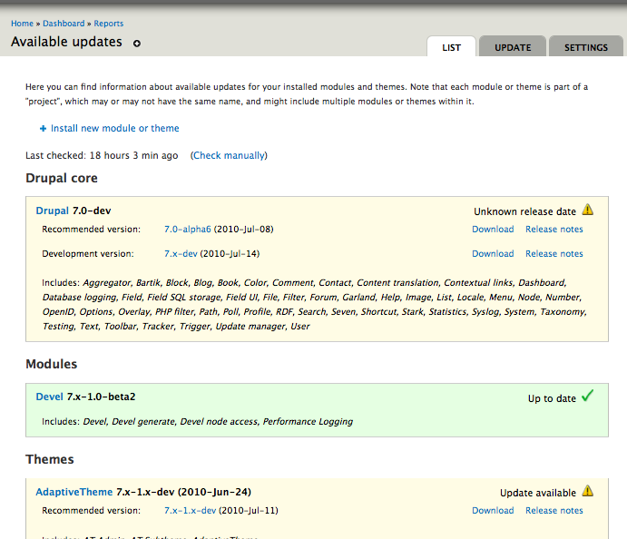
Comment #117
dwwFYI: This broke the colors of security updates on the available updates report in seven. See #934148: Colors for security updates on available updates report are wrong. Thanks.