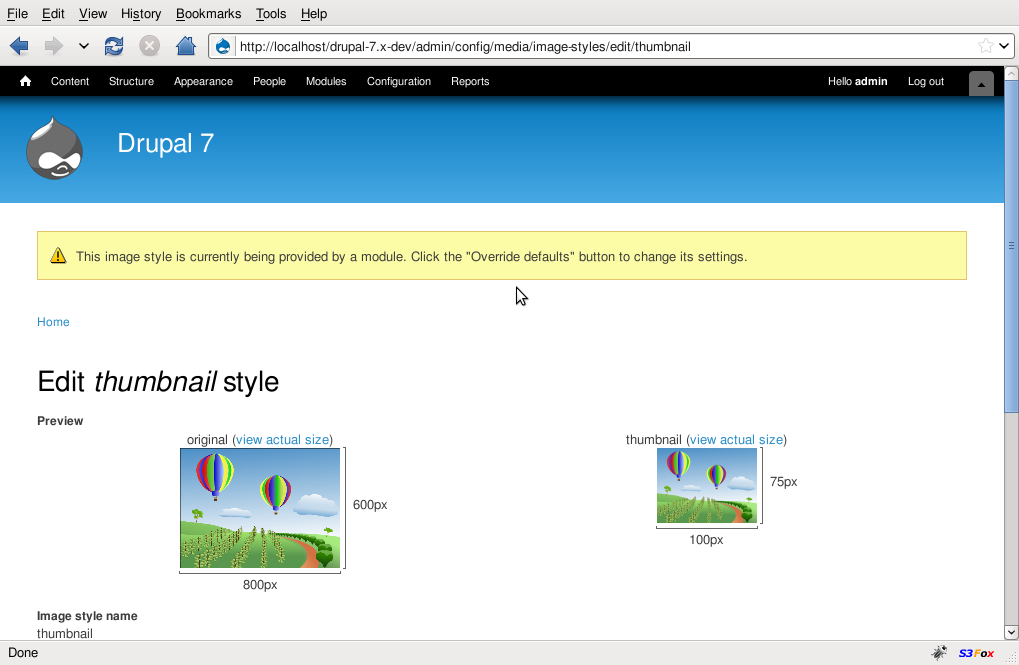
In solving Contrast between error and link colour causes death to eyeballs, we uncovered another issue: If you can't see the color, it's awfully difficult to tell a yellow warning message from a reddish-orange error message. Without the information encoded in the color, both are simply a description of a problem and a link to something relevant.
Furthermore, if you can't see the color, it's difficult to tell at a glance even a green status message from a warning or an error message. You would have to read each message to be sure it didn't tell you that something should — or must — be fixed. Having to read every message to get the same information others can get at a glance is not an equivalent, or even comparable, experience.
In other words, this feature of Drupal — that people can tell by glancing at, say, the Modules admin page whether that aspect of their site is all right — is inaccessible to people who are colorblind or fully blind.
We are in this bind because we have overlooked one of the basic tenets of accessible design: Never use color by itself to convey a message. In this case, we are using color to tell what kinds of messages are present:
- Reddish orange means, "You must fix this for your site to work."
- Yellow means, "You should think about this, because it poses a problem that might break your site."
- Green means, "This is OK!"
The answer is simple: Add a unique icon to each swath of color to convey the same message. If used with appropriate alternative text, the icon set shown under "Alerts" in this image of an icon set proposed in Iconize most important items would work if modified to ensure sufficient contrast. (For those who cannot see the images, the icons are essentially a check mark for status messages, an exclamation point inside a triangle for a warning, and an "X" in a circle for an error.)
I am not skilled in creating images, but it seems to me that we only need the icon to be embedded in the richly colored area at the edge of the respective message for this to work:
- The check mark could be black, or a very dark (highly saturated and low-luminance) green. It would sit against a green background. Its alternative text should be "OK."
- The exclamation point within a triangle could be a simple black image, with a background color to match the yellow field it would occupy. Its alternative text should be "warning."
- The circumscribed "X" could also be black, with a background to match the reddish-orange field it would occupy. Its alternative text should be "error."
With this change, we can make Seven an exemplary module. Its error messages and the links within them are highly legible. With the color system, people can still get a sense of the site status (or whatever the current page can tell them) at a glance. And people who are either blind or colorblind will have almost the same experience, because they will be able to quickly find a meaningful icon, properly equipped with alternative text, to convey the same message.


Comments
Comment #1
webchickI could swear that yoroy already made icons for these messages in some issue somewhere. I even thought they were already committed. Hrm...
Comment #2
Bojhan commentedYup, and I even think we had a design already that was near commitable, just never happened as far as I know.
Comment #3
marcvangendwebchick, bojhan, do you mean #218674: Update watchdog-*.png status icons ?
[edit] There is another proposal for a consistent core icon set in #735656: Iconize most important Items, #720528: Softfacade icons, rework some of them into protocons? and #606490: Drupal GPL icons - a softfacade initiative.
Comment #4
yoroy commentedMine are here: http://drupal.org/project/protocons
Comment #5
mcrittenden commentedSub.
Comment #6
cliffSo if the icons exist and have been approved, why are themes — especially core themes — not using them?
FWIW, the "X" inside a red octagon as suggested in #218674: Update watchdog-*.png status icons makes much more sense to me than an "X" inside a red circle as used in the protocons — assuming the implicit message is "Stop and read this, or your site will not work!"
Comment #7
mgifford@yoroy - I like your icons & would love to see them used more and more consistently in D7
Comment #8
yoroy commentedCliff: I did consider the octagon shape but in the end decided to follow convention (do a google image search on "error icon") and go for the circle.
Comment #9
cliffThanks, @yoroy. So it looks like we're essentially going for the icon set standardized for Windows — which is OK; after all, the point has been made that people spend much more time on other sites than they do on ours. That's a very good reason not to build branding into our icon sets, or password checkers, and the like.
Besides, we could have done worse. Much, much worse. ;-)
Seriously, @yoroy, I find the icon set a great idea and the icons in it quite good. Perhaps this is looking ahead to D8, but how can we get it more widely adopted among Drupal themes and modules?
Comment #10
Jeff Burnz commentedOh man, I wish this would go in core (as in system core) and not just Seven - save me loads of fecking about with my starter themes trying to decide on decent message styles and icons etc. I'm trying to chase Seven with the style changes right now so I can be consistent with the default admin theme - be splendid if I didn't have to ;)
Comment #11
jbrown commentedCheck this out.
Comment #12
Bojhan commentedI would say, move them to the left (it clearly has to be left aligned from a design perspective, it makes no sense to have them on the right) - to achieve this remove the color left-bar.
I would avoid using core its icons here, we kinda already know those look bad. I would suggest to try out:
#606490: Drupal GPL icons - a softfacade initiative and http://drupal.org/project/protocons
Comment #14
mertskeli commented+1 for icons on the left
+1 to remove left thick border
+1 for colours saturation (almost none background, i.e. "calm" one)
+1 for 1px border (imo, it's impossible to keep UI "calm" with calm colour fills and without this border)
Actually, only 3 icons are required: [ x ], [ ! ], [ v ].
Btw, that individual separation of messages looks not bad at all, imo. It ephasizes "multipleness" of a problem/issue..
Comment #15
jbrown commentedAny screenshots?
Comment #16
mertskeli commentedSomething like that.
(Sorry for icons gray background, it shouldn't be of course).
Comment #17
jbrown commentedComment #18
Everett Zufelt commentedRemarking this as a bug. Although this is not a critical bug, accessibility problems are bugs and not tasks.
Comment #19
jbrown commentedThe title is currently a task - you need to rewrite it.
Comment #20
mertskeli commented@jbrown
Perfect.
Just for a long message (with more than 1 line) icon should be aligned to top.
Comment #21
jbrown commentedOkay - I've implemented it for all themes.
Hopefully I haven't cocked anything up!
Comment #22
damien tournoud commentedI'm really not a big fan of the 1px border. We should probably change those icons too, but this can be done in another issue.
Comment #23
jbrown commentedBut the lack a border around the faint boxes surrounded by white is the work of Satan!!
Comment #24
damien tournoud commentedMaybe, but it looks better :)
Comment #25
webchickYeah, I don't think the borders are going to pass design team review. Didn't know the design team members were agents of The Dark Prince, now it all makes sense. :D
(kidding ;))
yoroy/bojhan, could we get a definitive mockup/spec here, so we don't eat up a lot of time trying different solutions?
Comment #26
yoroy commentedIa iak sakkakh ia sakkakth shaxul. Ia kingu ia chtulu azbul ia azabua.
Comment #27
mertskeli commented1. Border does look too contrasting. Should be softer. But still should be present. Taking into account such a pale background its absence is doubtful.
2. Icons shouldn't be "sexy". There's no sex in computer icons. They should be as generic as possible. Current D7 core watchdog icons are quite sufficient (but have PNG alpha channel transparency incompatible with some browsers and should be redone). But let's try the other icons suggested in this issue.
They are: http://drupal.org/node/606490 and http://drupal.org/project/protocons
They are almost identical (for 3 principal icons discussed here: error, warning, ok). Still softfacade's look more harmonic, imo (for instance, protocons error "X" is too big, and ok "v" is awkward).
But anyway both of the sets are inappropriate here cause they use complex shading and multiple 24 bit colours. For colourblind people they will look more ugly than generic ones. Although there is still an option to convert their colour depth to 4 bit. Also, they are not proportional.
3. Colours should be equal in terms of brightness. Once again, for some people there is no colours at all. There is only brightness for them (aka shades of gray).
Red (rgb 255,0,0) and Green (rgb 255,0,0) are not equal in brightness. You can clearly see that while printing colour documents with a standard black&white laser printer.
To be exact,
Red rgb 255,0,0 is equal to rgb 77,77,77 in grayscale palette,
Yellow rgb 255,0,0 is equal to rgb 227,227,227 in grayscale palette,
and Green rgb 255,0,0 is equal to rgb 150,150,150 in grayscale palette.
So colourblind people wil see almost black silver and gray accordingly (see attached Image 1).
First of all it is necessary to decide what will be the brightness without colours - in grayscale only.
I'll consider rgb 240,240,240 as a background, rgb 230,230,230 as a border (to make it less contrasting), and rgb 128,128,128 as icon filling colour (see attached Image 2).
Then it is necessary to convert this brightness to rgb colour mode.
It results to:
Red background - rgb 255,233,233
Yellow background - rgb 255,255,128 - (note: this will be unbearable for normal people, so we have to make it rgb 255,255,218; colourblind people will see almost a white background, and that's another reason for a border here)
Green background - rgb 218,255,218
Red border - rgb 255,216,216
Yellow border - rgb 240,240,218 (the same problem as in background, so we need to reduce yellow intensity from max 255 to 240)
Green border - rgb 194,255,194
But, it might be a good idea not to have colour borders at all. They can be light-gray for any type of message.
4. Text colour should be default. No colour for message text. Firstly, there are already enough colours and contrasts. Secondly, due to the above-mentioned grayscale brightness.
All that combination is in the attached Image 3 (with light-gray borders) and Image 4.
Comment #28
Bojhan commented@mertskeli Do you happen to have a patch? I am trying to try this out, ie getting a feeling for it by browsing to a bunch of errors/ warnings and success messages :) I do already favor number four, but I feel its not "quite there yet" for example ! its shape is a little bit too rounded and ! isn't standing out enough.
I don't think we have to worry too much about accessibility here, as the icons themselves are far better affordance then colors.
Comment #29
mertskeli commentedSorry, I do not know what is "patch" or how to have/make them :) I know most of the html/css tags but not a single php code. I have taken screenshots from my current D7 localhost test site, making manual changes to css.
For icons I absolutely agree - they are not perfect, neither in shape nor in colours. I just took softfacade icons to make screenshots, for general positioning and colour matching.
There is also an interesting article here: http://msdn.microsoft.com/en-us/library/aa511277.aspx
Comment #30
webchickA patch http://drupal.org/patch is basically a standard way of sharing code modifications with other core devs so we can see what you see. :) It takes a little bit of wrangling to get set up to make them, but once you are, you can do anything! :D
But, failing that, a manual "I changed XXX to YYY in file ZZZ" would cut the mustard, and allow someone else who's set up for it to make a patch.
I highly encourage you to learn how to make and apply patches, though, since it'll make code sharing with other devs a lot easier. You can always come on IRC in #drupal-contribute to ask for a hand.
Comment #31
cliffWhat can I say — I like long titles! Actually, I wanted any late-joining participants to be clear that this is an issue for accessibility, not merely aesthetics.
If @mertskeli has a learning curve to tackle to write a patch, is there another participant in this discussion who can write patches quickly? If so, what files, etc., would he need to supply so they could help out?
Comment #32
Jeff Burnz commentedLots of us can write the patch, can someome summarize what needs to be done design wise.
Comment #33
jbrown commentedI think changing the icons that come with core can be discussed elsewhere.
I made some improvements to my patch:
Comment #34
mcrittenden commentedRe: #33, corners should not be rounded in Seven, and borders, if they are indeed kept, should be lighter than the screenshots you provided.
Comment #35
Bojhan commentedSorry, although long titles are great - they suck for attracting people, it makes em feel heavy and honestly there is no need to sacrifice scan ability (of mine and many others their issue queue) here either.
@jbrown Can you try to make http://drupal.org/files/issues/Image%204_3.png your patch?
Comment #36
jbrown commentedThe colours in #27 are not pleasant (screenshots attached).
No one like the curves in #33?
Comment #37
aspilicious commentedComment #38
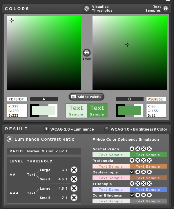
cliffFrom an accessibility standpoint, the warning and error icons in #36 are fine, but the check mark for "OK" needs some work. I've attached a couple of pdfs showing color swatches with hex values to give an idea of the options available:
At least as sampled by me (sorry that I'm not adept at getting it directly from the code yet), the green check mark and the pale green background do not contrast sufficiently for people with low vision to be able to detect the icon. Oddly, there is not a problem for people who are colorblind — the color pair conforms at level AA for all four prototypical types of colorblindness! The problem is that people with normal color vision but low vision overall would not be able to see this check mark.
The swatches in the pdf show that just a little deeper green will achieve conformance at level AA. There are also a wide range of greens that conform at level AAA. I've included a number of examples in this set of swatches, holding the pale green constant and varying the deeper green. Here's how to use it:
So unless my color sampling produced errant values, we have to adjust the green, but there is a wide range of conforming hues. The swatches show a few such options.
By the way, I just noticed that the messages as displayed in #33 are also up for consideration. All of those icons, including the status (or "OK") message, conform with WCAG 2.0 at level AA or better. (In #33, the background color for the status message is a neutral tone instead of the pale green used in #36.)
So if we can live with the background from #33, the foreground is fine. If we want the pale green background of #36, we need to work on the foreground.
Comment #39
mertskeli commented@webchick - Thank you for your help. Maybe I'll try. Sometimes I do feel myself handicapped here.
@jbrown - The colours in #27 are not pleasant - Too pale?
@Cliff
I agree, in terms of icon colours there are no problems so far.
But still the graphics itself can be modified. D7 warning icon is just bigger than the other two icons (although that's not so critical).
As for background+border colours, we need to decide it.
@Jeff Burnz
1. We need 3 icons: watchdog-error.png, watchdog-ok.png, watchdog-warning.png. All 16x16 px (right?), 4-bit colour depth (4-8 colours in each palette).
2. We need 3 exact colour sets (background + border) for every type of the mentioned 3 message types. In RGB and HEX.
3. Finalize CSS values (padding, etc.)
4. Make a patch.
Comment #40
Jeff Burnz commentedOK, well I don't want to comment on design issues here or get involved with building icons etc, and if someone supplies the icons and can't write a patch I'm more than happy to.
Comment #41
jbrown commentedI updated the colours from #33 and removed the curved corners (although I do prefer them).
There is now a consistent hue for each message type:
status - 90
warning - 53
error - 16
So, for each message type, color, border-color and background-color have the same hue.
@Cliff - the reason the backgrounds are so pale is #639368: Contrast between error and link colour causes death to eyeballs
Comment #42
jbrown commentedIt also looks nice bold...
Comment #43
jbrown commentedAnother screenshot.
Comment #44
naheemsays commentedIts a shame to get rid the padding on the left IMO - that with the icons on the right did look really distinctive IMO.
Comment #45
jbrown commentedLike in #11? I totally hate that now.
Comment #46
cliff@jbrown, the color combinations in #42 and #43 have adequate contrast.
To clarify, my concern wasn't that the backgrounds were so pale. In fact, for adequate contrast, they have to be pale. The problem with the pale green was that it wasn't different enough from the deep green in the foreground for people with low vision to be able to tell the difference.
If the designers are OK with it, let's RTBC it!
Comment #47
jbrown commentedI think it is best with the 2px border and curved corners, but not the bold text.
Attached is the patch and example screenshots.
The patch also puts the icons in messages for Garland and Bartik.
Comment #48
mertskeli commented@41 - Looks good. i'd vote for this as the final version. Still I believe the best option is to use silver border for all messages. And default font (not coloured).
@42 - Imo, overemphasized. Colour + border + icon is more than enough to attract.
@47 - The majority says the border is not necessary at all. But seems that the same majority agrees for it if it is not too contrasting.
As for 2 px, imo there's no necessity in it. 1px will do.
For rounded corners, well it is not bad. But I believe it depends on theme design. If it is in concordance with the theme's design it can be used. And contrary, if a theme is "angular", system messages shouldn't be styled differently.
Comment #49
cliff+1 to that, @mertskeli.
Comment #50
Jeff Burnz commented+1 #41, I dont think seven should have rounded corners on messages and the fat 2px border looks a bit heavy for this theme. Good work!
Comment #51
mertskeli commented@#39.1
Comment #52
mertskeli commentedSorry, forgot to replace blue for transparent.
Comment #53
mertskeli commentedIcon colours:
ok = green / rgb 0,128,0 / hex 008000
error = red / rgb 255,0,0 / hex ff0000
warning = yellow / rgb 255,255,0 / hex ffff00
border = gray / rgb 128,128,128 / hex 808080
checkmark, cross = white / rgb 255,255,255 / hex ffffff
exclamation mark = black / rgb 0,0,0 / hex 000000
Comment #54
jbrown commentedLooking at this fresh, I don't think 2px borders and curved corners is right.
I'm most happy with #41.
I think the the changing the icons discussion should be a separate issue. There are already several.
Comment #55
cliffThanks for the hex values, @mertskeli. Whatever the icons' shapes, the red and green you have picked will have sufficient contrast to any of the respective backgrounds proposed in this thread. So even if the error icon is placed against a pale pink bacground, and the status icon against a pale green background, as in #36, people with low vision will be able to see them well enough to tell what they are.
Your green (008000) even works against the light green background of the status message in Bartik. Your red (FF0000) almost works against the light red background of Bartik's warning message. Changing the red to F50000 or the Bartik background from FFCCCC to FFDDDD is all that would be needed to make it work in Bartik.
Of course, we can't come up with a color that will work in all settings, which in this case means the way every themer will want to render their system messages. And we probably can't come up with a set of icons that works in all themes, either. After all, any themer who feels so inclined should be able to make the error icon for their theme be Justin Bieber's face. :D
But if we could get an okay from the design team on one or more sets of icons to be used in the core themes — perhaps one set for Bartik, another for Seven and Garland, or perhaps even a third set for Garland — I think that would be enough to set the example for other themers. How about it?
Comment #56
mertskeli commentedLet's temporary change the issue title.
Seems there is no decision whether we need such icons.
Question: Do we need icons in system messages?
Answer options:
1. Yes
2. No
3. Other
---
Count:
1 - 0
2 - 0
3 - 1
Comment #57
damien tournoud commentedThere is no discussion: we need icons or text here to satisfy accessibility rules of WCAG. Given that nobody is suggesting adding text here, we need to go with icons.
Comment #58
mertskeli commentedComment #59
mgiffordThe screen shots in #47 look great.
I'm not sure why there would be resistance to adding these icons.
Comment #60
Jeff Burnz commentedThis is a bug.
Comment #61
marcvangendI just returned from a week's holiday and I'm a bit worried that this issue is moving in several directions at the same time. Summarizing, the following topics are being discussed:
1. Should messages have icons?
Answer: yes, see #57
2. Which icon set do we use?
Opinion: I like Yoroy's Protocons.
3. Should messages have a different background color?
Answer: In any case we need to use accessible colors. The current colors were carefully selected for accessibility in #639368-88: Contrast between error and link colour causes death to eyeballs.
4. Is this topic about the Seven theme only, or about Drupal core in general?
Opinion: We need both good styling in core (so the default is accessible and looks OK) and overridden css Seven (to match the design even better). If this topic fixes both at the same time, that's fine by me.
5. Should messages have borders?
Opinion: I think they should in the core default, but not in the Seven theme because of Mark Boulton's comment in #639368-43: Contrast between error and link colour causes death to eyeballs. For Seven, I prefer the styling that came out of that issue, provided that it can be combined with icons.
6. Should message borders have rounded corners?
Opinion: No, and definitely not as default. Themes can add their own rounded corners when appropriate. Rounded corners make no sense as default styling and they look terrible in Seven, Bartik and Garland.
Is this everything, or am I missing something?
Comment #62
cliff@marcvangend, I think you summed it up perfectly. Thanks especially for stating clearly the question of whether this is Seven only or all of core. I had been thinking along the same lines, but could not get to such a succinct statement.
As I said before, as long as the colors have adequate contrast, I leave the decision on icons for core to the design team.
Comment #63
jbrown commentedI don't think we should discuss changing the icons in this issue. When a patch from this issue gets committed, then the current icons will be seen and people will be motivated to change them in a new issue.
I just tried HEAD without my patch and it caused death to my eyeballs. The background colour is so faint that the boundary of the edge of the box is not clear. This makes it extremely unpleasant to look at. Borderless boxes are fine, but they don't work when they are this faint. The borders are essential.
I have updated my patch in #41 to work with file upload errors and tabledrag warnings.
Comment #64
webchickWe don't have time for "in a new issue". We need to get Drupal 7 out the door. Fix them once, here, or not at all IMO.
And I believe Dries expressed interest in Protocons in the other thread, so let's just use those.
Comment #65
aspilicious commented*** I hate issues like this ***
So here is my try to get it done.
Working fine except the block table drag messages, those ones have no styling.
I added new icons to misc folder.
Resized them to be as big as the previous ones.
Screenshots attached.
Comment #66
aspilicious commentedForgot the images.
*** Why don't we support rar??? ***
Comment #67
aspilicious commentedOk I repared block.js.
So everything is working now.
I rly like this and I don't like a new discussion :)
I grepped for the div that was causing problems.
Only block.js had it.
Comment #68
mgiffordI applied it to my sandbox http://drupal7.dev.openconcept.ca/
It looks good to me. I've attached screenshots for core themes.
Comment #69
mgiffordforgot this one. anything else need to be done before it's marked rtbc?
Comment #70
aspilicious commentedMaybe someone can tweak the paddings for garland and bartik a bit.
It's not so nice to have the icon and the text not being aligned.
Comment #71
Bojhan commentedSorry but the icons are beside poorly implemented (in terms of shape I do not see them similar to yoroy's library) also I think in terms of value #606490: Drupal GPL icons - a softfacade initiative brings a lot more, why?
1. The gradient in those bring the icon more towards the front.
2. The outline enhances this effect, creating depth in the icon.
3. There is more space around the !, V or X, allowing it to breathe more and therefor look better.
I mean I love yoroy's work, but at the end of the day holding my quality stick up being transparent - I have to side for softfacade ones.
So setting this back to needs work. In #28 I expressed that softfacade has some small issues, but I feel we can fix that easily - depending on how well it matches with the current proposed background. So, I am sorry to change the direction of this issue here but I feel it got somewhat derailed on #36 not implementing #35 and some people having a from a design perspective not argumented preference for protocons, this includes Dries :P.
Comment #72
marcvangendRegarding my preference for Protocons:
- IMO, the softfacade icons are too glossy. It reminds me of the Joomla dashboard.
- Sure the softfacade icons bring a lot more, but I'm not sure we need all of it. I'm a bit worried that some module developers cannot resist the abundance of available icons, so we'll see them popping up all over the place (possibly out of context).
Comment #73
Jeff Burnz commentedCouple of things:
1. This issue is about adding icons to messages, not about changing the output to a list. Why are we doing this? The original issue appears to have been interpreted as requiring an icon for every message - really? Why is not sufficient to have one icon to denote the entire group? A visual border of sufficient contrast can contain the group. I've been doing this in contrib and professionally for years and never had this raised as an issue by a single client - including government and international .orgs with accessibility very high on their agendas.
I raise this now because in reading through this issue I cannot see where this has even been discussed, at all. It just got stuck in there and stayed, but this represents a quite major change in the markup and display of messages - both for sighted and unsighted users.
I much prefer the old markup - multiple messages of the same type grouped within a DIV, in a list, with a heading, and add a single "type icon" to the top left corner to denote that these are "warnings" etc. I do not think this list markup approach is an improvement, if anything it simply ads yet more lists to Drupal core output, not such a good thing for many screen reader users who now are forced to listen to ...
"Heading level two", "Status message", "List item containing one item", "List item one", "The update has been performed."
As opposed to:
"Heading level two", "Status message", "The update has been performed."
2. system-messages.css is missing a proper doc block and the standard CVS tag for css files
/* $Id$ */3. protocons-[type].png - why the "protocons" namespace - its meaningless in Drupal core and pertains only to something that exists in contrib - if anything it should probably be message-error.png etc.
4. If this list markup concept were to stay there's no need to repeat the type class on every list item, it can be set once:
Comment #74
cliffBojhan, if you want to delay Drupal 7, considering the softfacade icons instead of @yoroy's would be an effective way to do it. Because the gradients produce varying levels of darkness and saturation, the softfacade icons would be hard or impossible for people with low vision to see. Consider the status icon, for example: the white checkmark has adequate contrast (provided the icon is not too small) to the shade of green below it, but not to the shade of green above it. It's anybody's guess what that would end up looking like to a person with low vision.
And the gradients would give themers a tough challenge when is comes to selecting backgrounds. Improving contrast for the lighter top of these icons will make contrast worse for the darker bottoms of the icons.
The sample set of icons in issue 606490 illustrates how hard finding a conforming background will often be: against the gray background used in that sample set, only the top of the warning icon has sufficient contrast. Now I realize that few, if any, themes would display these icons against gray, but the results with the sample set illustrate the broader problem: if your background presents a problem at one end of the icon, the adjustment you make to improve contrast there will lead to poorer contrast at the opposite end.
The illusion of shininess makes it impossible to know for sure that we can achieve conformance with WCAG 2.0 with this set of icons.
Let's not add that complication. Keep it simple. @yoroy's protocons, with the colors adjusted as worked out in this queue, are clean, simple, and reliable. Clean, simple, and reliable is what we need in core.
Comment #75
cliff@Jeff Burnz, looks like we were posting at close to the same time, so I didn't see your message in #73 before I posted #74. Here I just want to add that I agree with you on points 1 and 3. (Not being a programmer, I can't evaluate 2 and 4.)
Comment #76
Bojhan commented@Cliff Look, I am all for keeping it simple but also all for keeping it "beautiful" all your arguments are about accessibility, not the visual values. This is not a critical issue so won't hold up the release.
So you are saying softfacade are hard to see, or could be? I don't see how the gradient would effect low vision, since the gradients are very subtle (and could be more if needed). Your implying a lot of things, which to me don't seem inherent to to this icon set as opposed to yoroy's. Can you do the testing required, and simply see what parts don't evaluate well - and we can fix them?
@marcvangend I understand your point, I think part of it is changing the gradient only a little bit, the shapes are good. Lets not worry to much about what developers might and might not do :) - we can't be in that guessing game for this one, as there are no real clues as to what they will do.
Comment #77
mertskeli commentedComment #78
jbrown commentedNice overview mertskeli!
softfacade++
It seems softfacade as a whole has been delayed to D8 for some reason: #606490: Drupal GPL icons - a softfacade initiative
Perhaps we can just steal these three icons and put them in a single image file.
I agree with #73.1 - its not in the scope of this issue. I think for Drupal 8 we should do this. The form system should group its own errors into one message, but thats a different story.
Comment #79
jbrown commentedA good example of where it makes sense to not group messages is http://drupal.org/files/issues/Multiline%20Error%20-%20Seven.png
Comment #80
damien tournoud commentedBased on #77, I agree with Cliff and would my vote would go to Protocons because they are more contrasted and as a consequence easier to see.
Comment #81
cliff@Bojhan, the whole point of this issue is to improve accessibility. I'm sorry that you find clean and simple icons ugly, but the softfacade icons simply will not improve accessibility in all the core themes. The gradients are an intrinsic problem. If you want testing and values, why don't you look into the tools available online and invest a little of your own time into doing it?
As I said, because of the gradients, it's practically impossible to know how these icons will appear against any given background to people with low vision. Against any background, you will have one value at the light end, another value at the dark end, and a range of values in between. The gradient would have to be adjusted theme by theme to ensure that the icon worked with any given theme.
@Bojhan, it would be nice if just once your comments would reflect an objective evaluation of an issue. Your highly subjective notions of beauty and elegance have dragged out many issues designed to improve accessibility. It's incredibly frustrating for those of us who have stepped in to try to make Drupal a highly accessible CMS. The time and energy we have spent trying to meet your personal tastes on these important issues could have instead been devoted to fixing many other issues — or perhaps even developing our own projects. Please stop being a roadblock to making Drupal 7 accessible.
By the way, simply speaking aesthetically, my favorite of the bunch as shown in #77 is current D7 core. @yoroy's icons would be better if larger; my eyes hurt trying to make out small details. As the whole point of these icons is to highlight important messages, making them too small undermines their purpose.
Comment #82
Bojhan commented@Cliff Sorry, but I feel its as much of a usability as an accessibility argument. I can invest my own time sure, just not an expert on it so excuse me for asking the one with the expertise.
When it comes to different themes, I am somewhat on the fence why its not the same case with other icons - the gradient doesn't necessarily lessen the saturation? I mean, I tested it with a few themes now for D7 and I didn't find any occurances where the contrast was very low, then again thats not a WCAG compliance.
@Cliff I am very sorry you feel that way, but I find it somewhat weird to say I am blocking issues? (Also find it a bit unfair :( given how much time I spend working on finding a good solution in those) I mean at the end of the day I am as passionate about making Drupal beautiful and unusable as you are about making it accessible. Whenever those roads cross we should consider each others arguments and find a solution, not trow them away as being subjective or not objective? I mean my arguments really aren't unfounded, I clearly stated 3 arguments why I found softfacade better - to now those arguments haven't been discussed at all.
http://drupal.org/node/874370#comment-3351052 Although right, is indeed somewhat misleading as they are not all the size.
Comment #83
Jeff Burnz commentedOk, so lets round this up again and get some scope into this patch:
Icons: Looks like the majority including webchick like the Protocons. Lets go with the Protocons - simple, clean, accessible, beautiful.
Changing to a list: Not workable, some situations where this breaks down. Lets drop this from the patch.
Core/Seven (scope): Seven should, ideally, simply inherit cores styles, which means the styles and icons go into core e.g. system-messages.css and misc etc, with styles removed from Seven.
watchdog message & icon usage: In some tables icons are added using img element - one thinks we need to update these to use the Protocons (and kill the old watchdog icons). Also some colors conflict with standard message colors, such as the 404 watchdog error being green, when it should be the warning color (it has a warning icon) - the green is actually the same as the OK tr background color in the Status report table - not good.
Update Status table: Issue here with color I believe, while you can read through the table, its not at-a-glance information. Needs the icons like normal messages (but smaller icons, like the watchdog size icons).
Webchick said earlier to just fix all the issues now, here - these are all issues pertaining to core messaging. The earlier bikeshedding over color and icons is just soaking up time and space when there are simply so many other horror stories surrounding icon usage and color issues in messages, table messages, status reports and so on - for example most of the styles for status reports in admin.css look totally redundant (need confirmation before removing, could be another issue?).
Like I've said earlier, I dont really care that much about the style, although I do prefer the protocons, but I havent followed the colors debate that closely, all I am interested in is seeing the styles and icons are consistent and the CSS is less not more - and switching to core pushing out something accessible that looks good (nothing wrong with this for messages - these are key to accessibility). Personally I think its stupid to have core doing one thing only be overridden by every core theme except for stark. Seems like needless duplication for something that can be consistent - like toolbar.
What this patch does is pull all this together into one scope crept big patch - to unify Drupal core message colors and icons. This is probably needing work - its a big patch and I have included many screenshots to show what this does. I have not accounted for Bartik nor Garland here, they might need some work - right now just focusing on core (system, admin, dblog etc) and Seven (mostly removing styles).
Ok, lets see if this bird can fly. Give me hell ;)
Comment #84
Jeff Burnz commentedComment #85
Bojhan commentedOk, here by my unsubscription from this issue. With yoroy away, the nice words of cliff, I am the only maintainer and I am totally getting sidetracked on all decisions here including from our commiters who provide no design argument. The whole community in this issue is avoiding to have a design discussion and rather goes, ohh I like this - patch.
Nobody working on the patches seem to care about the style and that makes for a mediocre core in terms of visuals.
Comment #86
Bojhan commentedOops
Comment #88
Jeff Burnz commentedBojhan, patches are our way of discussing things in "code". I think you miss the point of the patch - to show the rather messy situation that is Drupal core messaging - some places uses img element for icons, some use CSS background image, some use core images, others have none, the same color used to denote two different message types, the CSS is all spread out in multiple modules and stylesheets with inheritance issues and difficulties, some elements have classes missing and it goes on, and on.
I back the protocons -I think they look clean and simple and suit the Seven theme very well. Cliff has outlined several times why the softfacade icons could be problematic, webchick has made strong indication we should use the protocons. I have to use something in the patch so I make a well reasoned and thought out design decision.
Comment #89
Jeff Burnz commentedcross post with bot.
Comment #90
Jeff Burnz commentedLeave out simpletest changes see if this can pass. Use the protocon image pack in #83
Comment #91
marcvangendBojhan, I really respect the work you're doing to make Drupal more usable and beautiful, but I think you're putting way to much emphasis on design arguments. Suppose that 7 out of 10 people would say they prefer Van Gogh over Matisse, without giving design arguments - would that be meaningless to you? Not to me anyway. I honestly believe that the choosing happens before you put the arguments into words, and often arguments are made up after the fact because we don't dare to trust our intuition. I agree that arguments can add value to an opinion, but don't dismiss opinions without them.
Comment #92
mgiffordOk, I want to see the patches here, but not sure what I'm supposed to see here. In Seven it looks all pretty bleak. I tested it in Bartik too.
Where did all of the theming, colors, icons go?
Comment #93
aspilicious commentedcleared cache?
Comment #94
mertskeli commentedI disagree with Bojhan pretty often, but I'm absolutely sure he has that inborn feeling for what "looks good".
In maintainers.txt one can see yoroy and Bojhan listed as user experience and usability topic coordinators. It is no way accidental. Let's accept it and respect it. Otherwise, everything will turn into chaos.
Sometimes I completely disagree on this or that issue. In such cases I tell myself: "I don't care. I'm always free to do it MY way in MY website."
@Bojhan
No, you can not quit. Seems yoroy doesn't care about this issue. So you are the only one to blame, and this issue should be assigned to you.
Sometimes we are a bit rude. It's ok, it's a normal clash of male ambitions, a normal defense of one's point of view. There are no girls here.
I agree that we spent too much time discussing such a simple issue. It's time to make a decision. So, please, announce the verdict :)
1. What icons will be used?
a). Current D7 core
b). Current D7 core modified
c). Softfacade
d). Softfacade modified
e). Protocons
f). Protocons modified
g). Brand new
("brand new" means "other" and can be taken from other sources or can be done from scratch)
For now we have such votes:
Softfacade = 3 votes (Bojhan, jbrown, mertskeli)
Protocons = 9 votes (yoroy, Dries, webchick, mgifford, marcvangend, aspilicious, Cliff, Damien Tournoud, Jeff Burnz)
To modify = 3 votes (Bojhan, Cliff, mertskeli) - I call them perfectionists :)
So, Protocons would be a good solution (even without modification), which I'd gladly support.
2. What will be the border color and thickness? Please provide exact hex values for all 3 types of messages.
3. What will be the background color? Please provide hex values for all 3 types of messages.
So, you have all the arguements, ideas, samples, screenshots, etc. Please make the final decision.
Comment #95
Jeff Burnz commented@92 - mgifford, those messages should not be in a list - so either the patch did not apply cleanly or somethings up etc. That big patch I posted does not change theme_status_messages() like the previous patches.
It might help to break that patch up and start some new issues - there are more issues in that than we have originally been discussion (obviously), but I stuck them in because we've gotten bogged down in a design argument and need to move forward with identifying the broader issues that need fixing also (eg other places where color is used to convey meaning and need icons also).
Comment #96
mgiffordIt was likely a conflict with other patches I'm testing. I'll nix most of my sandbox & try again. The images go into misc?
@aspilicious - ya, I tried clearing the cache & changing browsers. But if you got it working then it doesn't sound like there was a problem with how it was rolled.
Comment #97
aspilicious commentedI'm experiencing the same problems today...
Going to try a fresh install.
Comment #98
Jeff Burnz commentedI ran an update from head and was able to apply the patch in #90.
The misc-protocon-pack.zip (in #83) when extracted will contain a folder with 8 images (ok, error, warning, info in two sizes each - 16px and 24px), copy/paste those images into /misc root.
Did a re-reroll adding support for Garland and Bartik, both of which override the colors (did not touch those for normal messages), just adjustments to padding. Fixed up a small issue in the dblog reports table for Bartik (made it more consistant with Bartiks table styles).
Comment #99
mgiffordOk, this is looking good to me know. Must have been some wierd conflict of previous patches.
I'm attaching lots of screenshots for the other two core themes.
I didn't post a link to the admin/modules as warning messages seem to be eliminated from Garland. This seems like a strange inconsistency, but one that is beyond this issue.
Looks good to me Jeff!
Comment #100
Jeff Burnz commentedScreen shot showing garland warning and OK.
Comment #101
cliff@mertskeli, I appreciate your trying to spread a little oil upon the troubled waters (wow, that's no longer an innocuous allusion, is it?), but the simple fact of the matter is that I raised this issue out of concern for accessibility.
You note that Bojhan is a topic coordinator for usability. Well, then he should realize that usability is not a beauty pageant. Plain and usable beats beautiful and unusable, no matter who's judging the level or nature of beauty. And the issue here is that the system messages are not readily distinguishable to people who are colorblind, so we have to achieve a usable result for them or else we have not solved this issue. With their color gradients, the softfacade icons do not solve the usability problem for people who are colorblind. Thus, people who are colorblind will not have a good user experience. I guess I would take Bojhan's aesthetic appeals more seriously if I got a sense from him that the user experience for people with disabilities mattered to him. In issue after issue, he has used an argument of aesthetics to throw up a roadblock to enhanced accessibility, giving us no further guidance to help us find a way around it.
Truth be told, if they are made big enough and placed against an appropriate background, the softfacade icons do look more appealing to me. But they can't solve this issue, so my aesthetic preference doesn't matter.
@Bojhan, I'm glad you mention that a number of themes use gradients in backgrounds. Yes, gradients in background colors can be a challenge for accessibility. That doesn't mean they can't be used — it just means that you have to check the contrast of each color used for text and meaningful images to the full range of colors that can be behind them. Or perhaps you have to play with the slope of the gradient to ensure that the background behind text doesn't vary too much.
Bottom line: We had this issue solved 30 comments ago. If the problem is that developers are implementing icons poorly in their patches, help them implement them better. But don't derail us at the very end of the line. Been there, done that, the other issue is still unresolved, and this is getting really old.
Comment #102
jbrown commentedAnyone on this issue @ Copenhagen?
Comment #103
Jeff Burnz commentedjbrown - are you in Copenhagen, I can meet you tomorrow or any day if you want to discuss and get some work done on it.
Comment #104
marcvangendI'll be there. We could meet in the chx coders lounge (http://cph2010.drupal.org/chx-coders-lounge) monday afternoon?
Comment #105
Jeff Burnz commentedOK, chx coders lounge it is - I probably be dropping by most evenings in any case.
Comment #106
jensimmons commentedsubscribe
Comment #107
markabur commentedI don't think the last set of icons is as helpful for usability as it could be. If I ignore color and just pay attention to the icons, the triangular one stands out as being "more warningish" than the others, which are all round. But the one with the "X" in the middle is supposed to stand out more, since it's a more severe warning. If only one icon is going to be non-round then it out to be the red one. Really though if shape is going to be used for differentiating one of the icons then it should be used on all of them.
As a reader I find icon shape by far the easiest/fastest way to notice the more important messages. When an icon is the same shape as another, it takes me an extra moment to "read" its contents. But when things are different shapes it's more recognition that reading, which is a good goal to work toward when you're designing a system of symbols.
Comment #108
Jeff Burnz commentedFWIW when I think "error" I think red hexagon with a white cross, some variations here http://www.iconfinder.com/search/?q=error
Comment #109
cliffGreat to have all this new blood. Please do note that this is an accessibility issue: We need icons so people who can't distinguish between pale green and pale red — or pale red and pale yellow — can easily tell whether any given system message is an error message, a warning, or a status OK message. The icons must also have enough color contrast to their surroundings, and the foreground within the icon must have enough contrast to the background within the icon, for people with weak vision to be able to easily see and recognize each one.
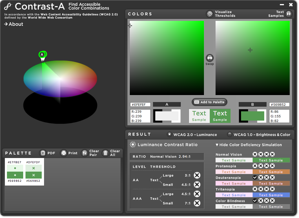
In situations like this, there is a great shareware tool for assessing color contrast. It's called Contrast-A, and there is an online version as well as a downloadable version as an Adobe AIR application.
You can enter hex values or RGB values for color pairs. (One weirdness: After changing a value, you must press "Enter" while the cursor is in that field, or Contrast-A will not process that change. If you goof, just put the cursor back in that field and press "Enter.") Once you've entered the initial values, you can see down in the area labeled "RESULT" whether the color pair has sufficient contrast. Provided we make these icons large enough — and if we follow @markabur's reasoning, we will — we're shooting for at least WCAG 2.0 Level AA for large text, which means a contrast ratio of at least 3:1.
If a color pair fails, this is where Contrast-A is particularly useful. Back up in the area labeled "COLORS," click the "Visualize Thresholds" button. Dotted lines will appear on the two color squares. Each line shows how much you have to change that color to make the pair conform at one or another level of WCAG 2.0. Choose the color you want to modify — background or foreground; lighter or darker — and move its cross to an aesthetically appropriate saturation/darkness setting that does afford adequate contrast. Then read out the new hex value, and you have your color pair. If you want to try playing with hue instead, edit the RGB values or move the slice on the color wheel that represents the color you want to modify.
Under the "RESULT" section, you can also see whether this color pair provides adequate contrast for each of four different extremes of color blindness. But remember — even if the color pair conforms for all types of color blindness, it must also conform for people with normal vision. Conforming with the contrast level means that people who have weak vision should be able to see the icons. So we need people with weak, but not color-deficient, vision to be able to see these icons just as we need people who have weak vision and some form of color deficiency to be able to see them.
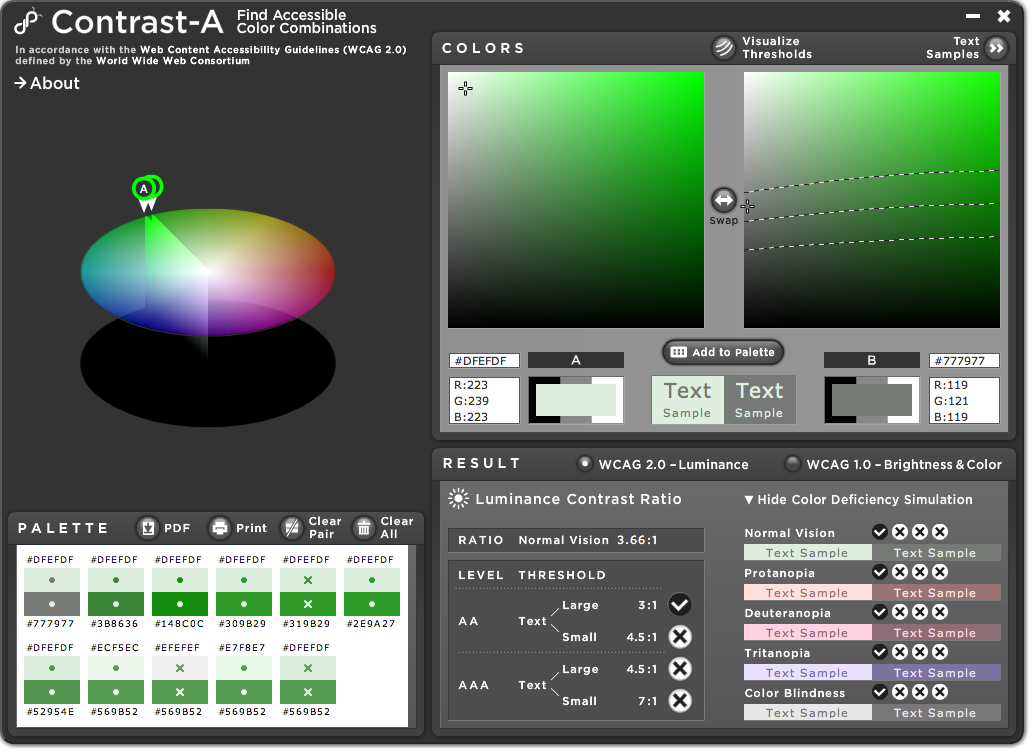
As an example, I'm attaching screenshots of an assessment of the status OK icon from the icon set proposed in #35. The first result (example1.png) shows that there is inadequate contrast. Note that changing the saturation level of green does very little to fix the problem — with the lighter color, you can take the green out completely and still fail (example2.png); with the deeper color, you need to make a relatively large change in saturation to achieve conformance (example3.png, which barely fails, and example4.png, which barely passes). Of course, a number of solutions that conform at level AA are possible (example5.png through example7.png), as are solutions that conform at level AAA for large text (example8.png) and even level AAA for small text (example9.png). At higher contrast levels, people with even weaker vision will still be able to see the icons, but, of course, we want color pairs that work well in our core themes in general.
I hope that with this information you will be able to efficiently develop a set of icons that is aesthetically appealing and solves the accessibility problem that triggered this issue. Although we did not mark this as critical for Drupal 7, it is by no means a minor issue. If we can solve this before the next release, that would be a big step forward.
Comment #110
mertskeli commented@#108 - Not a bad idea. Like road signs. Different by colour and different by shape.
@#109 - Cliff, probably you could provide best hex values for icons + border + background ? (for all 3 types of messages)
And a couple of things.
1. Regarding WCAG. It's not only about colourblindness. Many of us spend a lot of time in front of monitors. LCD screens have gamma distortion, poor contrast, bla bla. Sooner or later we start to decrease the monitor brightness, and colour balance becomes more and more shifted, and those faint backgrounds become almost invisible. So I assume icons would be useful not only to colourblind but to all active computer users.
2. There are no Softfacade or Protocon icons so far. We only have the scaled-down images with all the consequences of anti-aliasing. Who will draw the final icons?
Comment #111
Jeff Burnz commentedre #109 - great post Cliff, just want to clarify that Contrast-A is not a Mac only ap, its an Adobe Air ap: http://bit.ly/gpkdb
re #110 - discussed with Cliff and Bojhan last night regarding the icons - what I think we're all after here is something that has the nice looks and shape of the softfacade icons but with the clarity and inherent accessibility of the protocons.
A safe color palette is a good idea, very good, while this will be somewhat restrictive and cannot account for all possibilities it would at least give designers some direction here and save time - this is a critical hard in core at the moment and would dearly love to get this fixed before beta rolls.
So yes we need a set of icons as neither set is ideal at the moment.
Comment #112
mertskeli commentedGood news.
Questions:
1. What size? 16x16, 18x18 ?
2. Error & ok - round, warning - triangle, right?
Comment #113
jbrown commented@jensimmons thinks a darker background colour is good.
I've tweaked the colours and ported to protocons. The icons set from #83 are required. watchdog is also updated.
We shouldn't be interfering with the status report page.
@webchick has mentioned that we should not change the colours, so I will update my patch to the current colours and post some screenshots in my next comment.
I think it is good if each icon is a different shape.
Comment #114
jbrown commentedHere's my patch with the current HEAD colours as @webchick requested - looks good!!
Comment #115
Jeff Burnz commented> We shouldn't be interfering with the status report page.
OK, we can attack it later, it has the same issue though, color used to convey meaning.
> I think it is good if each icon is a different shape.
Yes, I think very standard is:
warning - triangle
error - hexagon
ok - round
Comment #116
yoroy commentedI've been updating the protocons following some of the feedback and I'll have a go at the octagon shape for the error icon. There's a bit of a white glow added to all the icons for added fancypantsness. Will have a look at which web safe colors to use for the main hues.
Comment #117
cliff@mertskeli, with me not being at DrupalCon and being busier than usual at work this week, I'm likely to be out of synch with the discussions. I don't want my unavailability to hold things up, so I took the time to explain how to use Contrast-A to adjust colors.
Ideally, a designer can now follow those instructions and examples use Contrast-A before proposing an icon design so they could (a) be confident that the colors they propose are accessible and (b) use their designer's eye to determine the best fix to a color pair that lacks sufficient contrast — change the hue? make it darker? change the saturation?
The neat thing about Contrast-A is that it shows you the full range of possible solutions. For me to pick one of those many possibilities would be like throwing a dart at a board; for a designer, the process would be a lot more reliable.
As for the size, let me ask this: Is it possible to make the icons a larger size but then have them display at the smaller size? And, if so, would that make them scale up more smoothly — that is, avoid pixelation on zoom? I also saw somewhere that sizing an image in ems (perhaps in the img tag?) at a rate of 1 em = 18 px would improve the zooming results for the image in more browsers. Does that make sense? (I know next to nothing about controlling image size, so if I'm speaking gibberish in this department, just carry on.)
Comment #118
cliff@Jeff, you keep referring to hexagons (six-sided). The standard stop-sign shape is an octagon (eight sides). Isn't that what you mean?
Comment #119
Jeff Burnz commentedYes, jeffs hexagon = octagon, so I mean octagon ;) Sheesh, sorry guys...
Comment #120
yoroy commentedProblem is, at small sizes it's quite hard to discern an octagon from a circle:
Comment #121
mcrittenden commented@yoroy is that really a problem? Better to have an octagon at non-tiny sizes and a circle when tiny than a circle all the time, right?
Comment #122
markabur commentedIs the plain X icon a possibility, or is it set in stone as meaning "delete"?
Comment #123
cliff@yoroy, I tend to agree with @mcrittenden. For the icon to be recognizable, wouldn't it have to be at least as big as the middle of your five examples above?
Also, is there any way we can use a deeper red? I sampled one of the lighter areas of the largest octagon above and got a hex value of F96365. One of the deeper-red areas gave a hex value of EA0011. I checked those for color contrast against the grayish border (which seems to be hex 90938F), the whitish X (which gave me several different, but similar, hex values; I used hex F8FFFF in my tests), and the background used in error messages (hex FFCCCC for Bartik and Garland; hex FEF5F1 for Seven). Basically, the results were that we don't have enough contrast. See the attached pdf named octagonreds.pdf for the various comparisons. They're not good: The deeper red contrasts very well to the whitish X and well enough to both background colors. The whitish X contrasts well enough with the border color, but there's scarcely any border around the X. But none of the other color pairs have adequate contrast. Notice that the lighter red within the octagon, which isn't very light, really, lacks sufficient contrast to the grayish border, either background, and even the whitish X. Consequently, to a person with low vision, this icon would appear to be a distorted smudge of some sort.
I used Contrast-A to examine how changing the saturation and darkness of the red inside the octagon without changing the hue would affect contrast. In deeper-reds.pdf, I show each of six different shades of red contrasted against the other four colors: the whitish X, the grayish border, the background used by Bartik and Garland, and the lighter background used by Seven. None of these reds produce sufficient contrast against the border, but that isn't really a problem, because each of them produces at least sufficient contrast against all the other colors. In many cases, the contrast is outstanding.
@yoroy, does any one of those reds, or a red somewhere within their bounds, work for you? Of course, if these or similar reds work aesthetically, you could also use a combination of two or more of these reds to give the image some depth and character. Is that doable?
Comment #124
yoroy commentedI'm not sure we want to add 32px sizes here. But thank you very much for that color analysis, the best scoring ones look perfectly usable to me, I'll incorporate this in my next iteration. Thanks again.
Comment #125
bowersox commented+1 for getting this into D7. Great work, y'all. You've done a lot on this in just a few weeks.
Comment #126
jbrown commentedI've been playing around with solid colour blocks, no borders, white text and blue warnings.
Comment #127
mcrittenden commentedCan we all agree that #114 + protocons is the way to go?
Comment #128
Jeff Burnz commentedYes, 114 + the new protocons yoroy is working on.
Comment #129
webchickJust piping in to ask if someone in this issue could take #109 and please please PLEASE put it in the handbook somewhere, so that we can refer to it more easily for others new to accessibility patches? Great post!!
Comment #130
cliffOka-a-a-ay. (Sigh.) I was planning on doing it eventually. (Has it really been only 6 days since I wrote that?) And thanks for the compliment!
I'll also mine other comments in this thread — part of @mertskeli's #110, for example — to round it out. I'll update this post with a link when I have it in place. In the Themers Handbook entry on color and contrast, I've described Contrast-A and linked to comment #109 in this issue for a detailed example of its use. At some point, I will go back and create a standalone example that can be worked into the Themers Handbook itself.
I've also modified the Accessibility page to add a link to the discussion of color and contrast in the Themers Guide.
Comment #131
jbrown commentedI've updated my patch. It now does the following to messages:
status-16x16.png and status-24x24.png go in misc.
message-icons.png goes in themes/seven/images.
Comment #132
mcrittenden commented#131, I don't think we can really go back to highly saturated boxes in Seven after the lengthy discussion it took to get rid of them in #639368: Contrast between error and link colour causes death to eyeballs. Let's stick with #114.
Comment #133
Jeff Burnz commentedFor a warning there is a blue message in the admin section, but in the front-end its yellow? That's asking a lot from the user (this could be the same message even...).
Also I think the blue warning message could easily be misconstrued as information - visitor information signage and icons are frequently blue. The international warning sign is a yellow triangle so I think we're really disregarding convention to use blue for a warning.
I hear what Mark Boulton is saying, but in reality its very hard to make it work.
Still backing #127 (which is #114).
Comment #134
marcvangendThanks Jonathan, I like the direction this is going. I didn't test the patch myself but I do have some remarks based on the screenshots.
Nice job in the new colors and icons for Seven, I think they fit that theme very well. That said, I agree with the others saying that blue may not be the right color for warnings. (I do expect to hear some usability experts saying that the saturated colors draw too much attention, especially because some messages tend to repeat themselves. IMHO, that is something the should not be solved in the message styling, but in the module code producing the message.)
In 'Seven 2.png' and 'Seven 4.png' I see that the icons are vertically centered. I think that the icon should be in the top left corner, because it looks better when the message box gets higher.
Maybe we should also have screenshots how this looks in the Stark theme, so we can see if that base styling is usable and accessible as well.
Comment #135
Jeff Burnz commentedJust adding a note that I do not think that bold is a sufficient indicator that something is a link - is it important or a link? Please don't make me think.
Comment #136
jbrown commentedI updated my patch from #131 to put the icons at the top, links are underlined and tweaked the green a bit.
I don't think it matters if different themes have different colours for messages. The type of message is communicated by the icon.
I couldn't make the yellow work in Seven - I like the blue.
Comment #137
aspilicious commentedSrry I don't like this. Just had to say this...
Comment #138
marcvangendjbrown, if you really think that the type of message is communicated by the icon, then why use color at all? Seriously, the icon is there because we cannot rely on color alone, but color is a very strong communicator and we shouldn't confuse people. Think of traffic lights and road signs; red = stop, yellow/orange = warning, green = OK, blue = information.
Comment #139
Jeff Burnz commentedAn X does not indicate an error - a white cross within a red octagon does. This is the combination of shape and color that triggers the brain to respond. An X on its own may just as well entice the user to click it to close the message.
Same goes for warning - an exclamation mark inside a yellow triangle - this is a warning. We all know this. Yellow = warning.
Blue for warning - no, this just doesn't work. Anytime you mess with convention you better have much better reasons other than "I want to use saturated colors" or "I like it better".
The saturated colors have been tried and ultimately removed. Its very easy to see, on a balance of pros and cons, that the better option is light backgrounds with a border and icon. They are clean, simple, effective and accessible.
Comment #140
jbrown commentedI've further improved my patch. It now has rounded corners and the icons are centred vertically again. The X did look a bit like a close message button when it was in the corner.
When people first experience a warning message in Seven they will take a moment to understand that what it is (based on the icon). From then on they will know the convention. I think this will be the same regardless of whether it is blue or yellow.
I've finally found a solution that I am happy with. If this doesn't get in I will probably use it anyway for my own projects.
Something based on #113 / #114 would be fine, but those advocating that will need to put in the work to make it happen. Just about anything would be better than what is currently in HEAD.
Obviously, community consensus will determine what happens.
Comment #142
markabur commentedFWIW the bare X doesn't bother me; it doesn't look clickable. An X inside of a circle or square is what makes me think "close button."
Comment #143
Jeff Burnz commentedThis issue is primarily about accessibility and adding icons to improve accessibility. Patches and discussion proposing a complete redesign (saturated colors for example) are totally out of scope and require a separate issue entirely.
Webchick has already made two strong recommendations - use the existing colors (already approved) and the protocons. This issue has to be about the icons and nothing more.
So far very little has been analyzed with regards to the protocons. I have analyzed the protocons using Color Contrast Analyzer and VisCheck.
This first screenshot is of the patch in #114 which uses the protocons in #83. On the left are the results for the lightest part of the gradient (near the top of the symbol) and on the right for the darkest part of the gradient (near the bottom of the symbol).
Color Contrast Analyzer expects a 5:1 ratio to pass - however WCAG AA only expects 4.5:1*, so where CCA states a "fail" I believe this is not actually the case. Furthermore 4.5:1 is for small text, whereas for large text the requirement is just 3:1. There is no indication in WGAG AA (afaik) what the ratio must be for block colors such as images or icons. We can use CCA to at least get the ratios as a starting point for analysis.
Error - a single, very close fail on the top, passes on the bottom - pretty good. Passes 3:1 no problem.
Warning - passes all - excellent.
OK - fails top and close fails on the bottom at 4.5:1, mostly 3:1 passes but may need work.
Info - passes 4.5:1 on top, passes bottom - good.
*See SC 1.4.6.
In this next screenshot we analyze the patch in #114 using Vischeck color analyzer. As you can see - despite the apparent fails indicated by CCA the icons are still clearly discernible for each color blindness condition. The message background and font colors are also OK. Even in grey scale they're fine. The screenshots were taken in Stark.
Looking at these findings IMO the patch in 114 colors and icons are very good - possibly even commitable. I think the fails according to CCA are overstated and the checks using Vischeck clearly show the icons are discernible for the 3 most common forms of color blindness. I would think a fair assessment is to use 3:1 ratio as a benchmark.
It would be good to get some verification from Cliff and to hear what the status on the new protocons from yoroy (I believe the error will be an octogon and the backgrounds fully pass 4.5:1).
Note the image I attached for the vischeck was the wrong one, but this has been corrected and this post now shows the right screenshot (as uploaded in 144). I also found this guide to websafe colors that pass the required contrast ratios: http://trace.wisc.edu/contrast-ratio-examples/ColorSets_6x6x6_OnWhite.htm
Comment #144
Jeff Burnz commentedcorrected screenshot for 143
Comment #145
yoroy commentedWow, great review. Thank for that.
- 'ok' has indeed the weakest contrast in the set – I deepened the green
- 'error' is now an octagon shape. I added a white border here, mirroring real world usage. Experimental tweak, probably not prettier, but might be effective. it's an error after all.
- 'warning', black and yellow are about as contrasty as it gets, so no wonder this one passes best. I actually toned down the black of the '!' here to a dark gray.
Attaching the 16px updated versions here. Committed (including other sizes) against protocons as well.
Comment #146
Jeff Burnz commentedThis is a re-roll of #114 with a few updates for RTL and gives the core themes consistent message styles. The zip (in #147) contains the new protocons (the go in /misc root).
Comment #147
Jeff Burnz commentedThe new protocons...
Comment #148
Jeff Burnz commentedOps, except I forgot the dblog stuff...
Comment #149
Jeff Burnz commentedThis time with dblog messages as per 114 (changed from img element to background images with CSS).
Needs the new protocon pack from #147
Comment #150
cliff@jbrown said:
Wow! If "they will take a moment to understand," then we've made them think. That's a usability problem.
And after taking this moment, "from then on they will know the convention"? Um, no. They've spent their lifetime absorbing the international conventions to the point that they don't need to process them. A moment of sorting out cognitive dissonance is not going to undo all that training. Keep in mind that each time they get these messages they will be trying to get something else done! Whenever we divert their full mental capacities from that task, we create a usability problem.
And based on seeing real people in real situations in more usability tests than I care to count, I can guarantee that following a well-recognized convention will make a difference.
If we were talking about anything but a core theme, I would say that we should let anything go. But themes in core must not impair the usability of the system.
Follow @Jeff Burnz' lead. He's headed the right way. Only one minor correction, Jeff: It's a common misconception to think of adequate color contrast and perceivable color differences for people who are colorblind as the same thing. But they're not. Contrast addresses the issue of whether people with low vision are likely to be able to recognize the message.
Ideally, we need for the color contrast to be adequate as seen with normal vision and as seen with each type of colorblindness. That way, we ensure that each of these groups of people will find our content accessible:
So although Vischeck gives those of us with normal color vision an idea of the visual experience for people with each form of colorblindness, it's not a measure of whether we've fully addressed the issues of color contrast. Contrast-A will simultaneously give you the ratios for each form of colorblindness as well as normal vision.
Oh, and one tip: CCA 2.2 has the correct thresholds for WCAG 2.0 — 3:1 for large text and 4.5:1 for small. Updating mine from version 1.1 took just a minute or so; you might want to update yours, too.
Comment #151
mgiffordJeff, this is a great improvement. I've applied this in my sandbox (with the new icons).
The icons certainly make it look more professional. Looks fine in Seven Bartik & Garland. It looks fine in RTL too.
I'm assuming that yoroy is approving this and has given a usability stamp of approval to this addition. I don't think that Bojhan would need to give a second opinion on that (but it's always welcome).
I'm going to mark this RTBC as I think it's ready for core.
This does not add images to the Status report page - admin/reports/status
Comment #152
webchickAwesome. Great work, these look wonderful now. Committed to HEAD.
I guess we need one final accessibility follow-up issue to add these icons to admin/reports/status, where we're still only using colour to indicate status. Could someone take care of that quickly so we can finally put all this message futzing behind us? :)
Comment #153
mgiffordThat's great news. I've set up this as the followup issue for the Status report - #906738: Status report need identifying icons (WCAG 2.0)
Comment #154
Anonymous (not verified) commentedThanks for the great work here, folks! They look great.
The addition of these icons helped me notice another bug present in errors that are returned via AJAX during a batch operation: #906922: Error message icon is tiled for when the message appears on a batch page in place of a progress bar
Comment #155
xmacinfoOne of the original issue also dealt with adding icons to error messages: #193482: Styling status messages in system.css.
Awesome. Thank you everyone for all the efforts put to fix this issue.
Comment #156
mertskeli commentedGood to see this issue fixed.
Still I failed to find any reasonable explanation why the text and the borders are coloured.
Comment #158
deekayen commentedI hate re-opening issues, but these images weren't smushed before being committed. I ran these through ImageOptim. I'll do a separate issue if desired.
./misc:
message-16-error.png
message-16-warning.png
message-24-ok.png
message-16-help.png
message-24-error.png
message-24-warning.png
message-16-info.png
message-24-help.png
message-16-ok.png
message-24-info.png
Comment #159
xmacinfoWe might also want to create 1 or two sprites for these icons to save on the amount of connexions.
Comment #160
Jeff Burnz commented@xmacinfo - that would be possible if we set the icon as a background on the H2 heading, i.e. instead of hiding the entire heading we just hide the text inside it, then we could use a sprite for these messages.
Comment #161
xmacinfoAs for using the H2 element-invisible might be a good idea. We may also consider adding a div to clip the icon properly. My guess is that we should create a new issue and probably tag it performance.
Images in #158 are OK. We indeed save more than a few bytes. Let's commit those.
Comment #162
webchickCommitted #158 to HEAD. Smuuuush!
Comment #165
mgiffordMarking as fixed. see #2125263: Issue status not taken from last comment during D7 migration