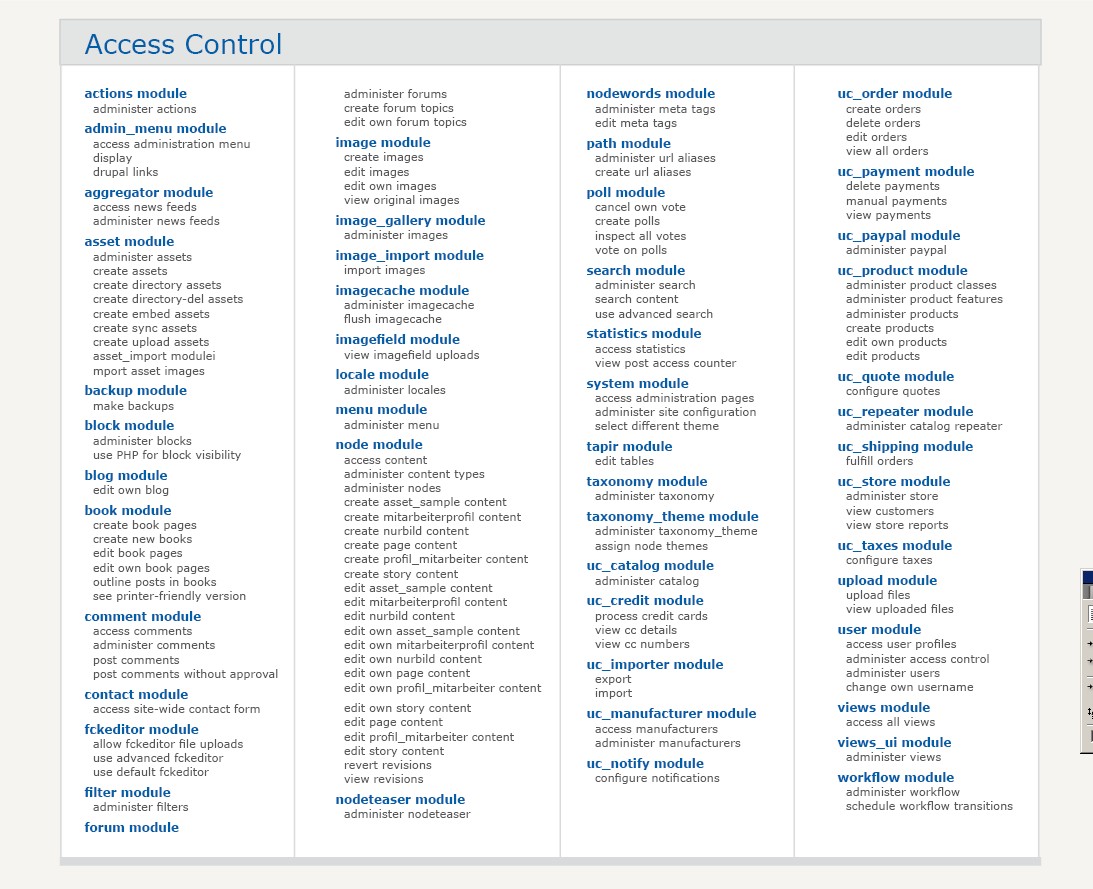
The Access control page of Drupal is one thing: long and serial. One crucial thing has been improved in Drupal 6: the table header is sticky on top and always visible even as you scroll down, This helps. But still: A record-holding page for me regarding lack of structure.
Webchick had a good idea about adding Descriptions to make it easier for people not so acquainted with drupal to understand what the options mean. http://webchick.net/node/21
In my comment on the thread, I had some ambitious ideas. This is what this task is about:
Do you have structural and/ or graphic ideas how to structure the page? It should be made sure or enhanced users don't overlook options, otherwise things might get worse.
Apart from that: be bold! What are your wildest ideas? Produce mockups and wireframes and add some explanation for your approach.


Comments
Comment #1
cwgordon7 commentedThis is a DROP task.
Comment #2
eigentor commentedehm - Gordon, did you claim this task or not? on drop page it is marked claimed, shouldn't it be assigned here (*confused*)
I'm nervewrecked by the how-to ;)
Comment #3
cwgordon7 commentedYes, I could assign it to myself here, I suppose.
Comment #4
Bevan commentedPart of this task could include looking at the workflow involved in the task of enabling a module. I think setting permissions needs to be part of that workflow. Many in the usability group on g.d.o agree, although I can't recall where to find links right now for references. Part of this would involve the Permissions page being filter-able by module.
For example, after enabling the views, panels and cck modules, the user is redirected to admin/users/permissions/module/views+panels+cck, where they are presented a short version of admin/build/permissions, with only the permissions from those modules.
Possibly this ACL table/form would be integrated into the admin/buil/modules page(s), but having the framework there and considering this would be great. Consider also how the permissions page is currently filterable by role.
Comment #5
cwgordon7 commentedComment #6
eigentor commentedWhat's the status here? Well - surely everyone's gotta recover from Boston ;)
I'd love to see your Ideas.
Well, I could not wait. So I made some mockups. They are inspired by the Modules overview page on Joomla.org, as cited here: http://groups.drupal.org/node/9568
Attached my mockups. Should be self-explaining.
It is supposed to be done using Thickbox. I don't believe overlays are always a good solution, would prefer to have a fixed region for the settings like in Views 2 Ui. But as the table with all the modules settings is so huge - it is just not possible without scrolling. I always hate the slow loading time of overlays in thickbox. But maybe this can be optimized.
Concerning the rendering of the multiple columns: I know that CSS3 is not quite here yet. But using Javascript it can be done, I've found a nice script: http://randysimons.com/pagina_129_NL.xhtml and it appears to work: http://randysimons.com/overige/multicolumn/
Comment #7
mroswell commentedI like your jpg samples, with one caveat: there should still be an overview page that shows all permissions.
Basically, what you've illustrated is a great way of doing data entry, but I feel there should be another tab that shows all permissions, similar to how it's done now. You could enter and view content through either interface.
I think it's important to be able to view all permissions together. Patterns will show up that won't if you view one module at a time.
(I could use a wordsmith on how the two tabs would be named. Maybe something like this:
Set All permissions | Set Selected Permissions
Note: the joomla.org page is how modules are presented on the web, not how they are presented in the software.
In general, I do favor more content per unit of screen area. One thing I like about your jpg is that the list shows more information in less area.
We'll want to be careful that items remain together by module, instead of possibly having any "widows" or "orphans" at the bottom or tops of columns.
Best,
Margie
Comment #8
mroswell commentedI just looked at
http://webchick.net/node/21
I like the concept, but my concern is that it increases the the size of the page, showing fewer items above the fold, and in each "fold" (scroll area)
I think the descriptions may be better handled through mouseover text.
Or maybe a little mouseover question-mark icon, or Information icon.
Comment #9
keith.smith commentedFYI: The permissions description patch that webchick discussed on her site (and referenced in the last post) has already been committed to HEAD. So whatever changes are made to the permissions page will now have to incorporate these descriptions in some way.
Comment #10
cwgordon7 commentedI am marking this completed and awarding chx and dmitrig01 the points.
Comment #11
eigentor commentedSolution is given here: http://drupal.org/node/229193
Moved the layout ideas here and created a new issue:
http://drupal.org/node/232152
So now it does not mix up with the DROP task.
Comment #12
Bevan commentedPeople didn't have much trouble understanding the perms page in the Usability Testing at UMN. They did have trouble finding the page and setting it at appropriate times, like after enabling modules, adding roles and adding content types.
The larger issue of ACLs in drupal is that users want to set them contextually while doing other tasks.
Comment #13
Anonymous (not verified) commentedAutomatically closed -- issue fixed for two weeks with no activity.