
 Come together with the global Drupal community in Rotterdam, 28 Sept – 1 Oct 2026. Sessions, contribution, connection, and Early Bird savings until 8 June.
Problem/Motivation
We've commonly had problems with the placement of the password strength indicator, especially on narrower screen sizes. See: #1887558: Password Strength indicator overlaps with input field in Narrow screens #2100509: Password strength indicator for site maintenance account is aligned incorrectly on the installation screen #1882474: Password strength indicator display broken in install process #2041793: install-page.html.twig markup and CSS
Proposed resolution
Redesign!
Remaining tasks
- Test design in Stark and Bartik
- Remove any redundant CSS related to the password indicator.
User interface changes
The password strength indicator
API changes
None
| Comment | File | Size | Author |
|---|---|---|---|
| #32 | 2247049-password-indicator-32.patch | 5.69 KB | herom |
| #32 | interdiff-2247049-27-32.txt | 408 bytes | herom |
| #32 | seven-password-strength-width-mobile.png | 7.19 KB | herom |
| #29 | 2014-07-27-qep4x.png | 21.7 KB | corbacho |
| #27 | 2247049-password-indicator-27.patch | 5.47 KB | herom |

Comments
Comment #1
Bojhan commentedComment #2
lewisnymanHere's a good example of what I'm thinking, a password indicator that is flush with the input above it, no extra horizontal space required, so this won't keep breaking all the time.
Comment #3
lewisnymanHere's a design from dropbox:
Here's an old design from dropbox:
Here's another from strength.js
Twitter also uses an indicator embedded in the input
I noted that all these designs do not use colour as the only indicator, so they are fully accessible.
Comment #4
Bojhan commentedInline validation like the last would be great, but is setting the wrong expectations. I really like the first idea.
Comment #5
lewisnymanI was tempted to play around with this, here's a patch. Note how much CSS I deleted to achieve this design :) There is probably a lot more to remove and simplify from Seven and Bartik.
As you can see from the screenshot, we're going to have to see how this work against the new focus styling in #1986418: Update textfield & textarea style
Comment #6
sqndr commentedAh, this looks really good Lewis. Nice work!
Comment #7
sqndr commentedForgot to mark it as RTBC, woops (http://cl.ly/image/1K3o231X1W32)!
Comment #8
alexpottSo let's do this here no?
Comment #9
alexpottbtw huge +1 to this - nice work :)
Comment #10
lewisnymanComment #11
sqndr commentedWhile I was looking at the patch again, I found that 0.3em is really small. Especially when the element is focused. This is also due to #1986418. Maybe we could increase the size a little bit? Don't wanna start bikeshedding here.
Here's before and after, with and without focus:
Before:
After:
Adding a patch and an interdiff with patch 5. As you can see, I just changed the 0.3em to a higher value (0.5em) to make sure the element is visible when the text area has focus. I think it looks slightly better when it's bigger. Any ideas?
Comment #12
sqndr commentedComment #13
sqndr commentedAh damn it, forgot to add the interdiff and added the patch twice.
Comment #14
lewisnymanYep, I was about to suggest increasing the height, at least until we have the text fields in.
Comment #15
sqndr commentedAnother small remark.
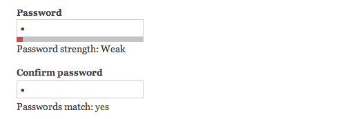
Passwords match: yesis hidden in the css by default. Then the javascript comes in and checks if it should hide the message or not. If so, it applies the css directly to the element. So, I've added this line again to make sure the field is hidden by default. And once again, a nice little interdiff.Comment #16
dcrocks commentedWhy make the font that small? Is there a specific reason?
Comment #17
dcrocks commentedI hope I didn't stomp on your status change.
Comment #18
lewisnyman@dcrocks It looks like it's using the standard base font size?
Comment #19
sqndr commentedHere's a whole new patch. I've removed all the styles in Bartik for the password indicator. Only had to add a margin to make the indicator stick to the password field. Screenshots added when using Bartik (before/after patch) and Seven (after patch):
Comment #20
lewisnymanHere's a screenshot from Stark, looks good enough for me.
Comment #21
dcrocks commentedSorry, I should have read the patch. You were referring to the height of the bar, not the text.
Comment #22
sqndr commented@dcrocks: No problem!
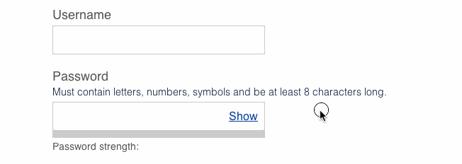
Comment #23
sqndr commentedWould it be useful to implement that show password button? I've started with Bartik as admin theme, looked something like the screenshot that's added. Useful, anyone?
Comment #24
lewisnyman@sqndr Take it outside! (to another issue) #2293803: Replace confirm password element with a new element that allows toggling to view the typed password
Comment #25
lewisnymanNow that #1986418: Update textfield & textarea style is in. I'm actually quite happy with this. The visual indicator is noticeable when you're typing and the text even more noticeable being below the password field. There might be a few design opinions once it's committed but I think we are in a good place to tweak things later one. Much simpler.
Comment #26
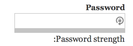
alexpottIn RTL the colon is on the wrong side initially in Bartik.
Also can we get RTL screenshot for all themes. Thanks!
Comment #27
herom commentedI found two issues with RTL styles, one in bartik and one in seven theme. Fixed in the patch.
Added before/after screenshots for the fixes in seven and bartik, and a screenshot for stark theme.
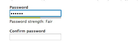
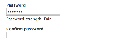
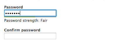
Seven before (#19):
Seven after (#27):
Bartik before (#19):
Bartik after (#27):
Stark:
Comment #28
herom commentedAlso, the colon position mentioned in #26 isn't really an issue. It's just the result of putting English text in RTL direction. As you can see in the screenshots, the position is correct in the translated text flow.
Comment #29
corbacho commentedGood work herom. Patch applies, and works as expected, Tested in IE9, IE10. http://monosnap.com/image/YroFpneYVgzS2JKaoRjqVHj2pZzJ8Y
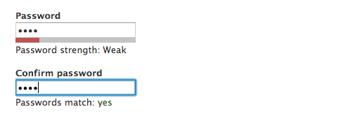
I found that in narrow screens, in the Seven theme, the password field takes the full 100% width, but the strength bar is 40% width.
Is this ok? I suppose the CSS for the progress bar needs to be theme-agnostic, so I think this is good.
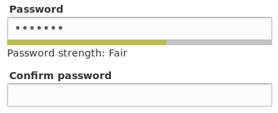
Sorry for bike-shedding, but do you think we could update the background color to be lighter (like #DDD), so it increases the color contrast. Currently is a poor 1.2 when "Fair" strength is displayed. It's difficult to see it, specially in Chrome because of the blue-focus border.
PS. That strange icon is Lastpass extension
Comment #30
corbacho commentedI think these are minor complaints after all. I will mark it RTBC
Comment #31
alexpottFrom the issue summary:
However from #30:
Let's get this right first time.
Comment #32
herom commentedSeven was the only theme with that issue. fixed.
Comment #33
corbacho commentedThx herom.
issue is fixed. Narrow screen tested in all themes. Thumbs up!
Comment #34
chx commented(by the way did anyone test the pwd strength indicator with password filling extensions like https://chrome.google.com/webstore/detail/supergenpass-for-google-c/bmmm... this? Most indicators break because there are no keypresses. followup obviously but wanted to note.)
Comment #35
corbacho commented@chx we are listening the "input" event, that is triggered by any type of change, typing, copy/paste with mouse, even drag&drop, etc. Also I tested with chrome extension Lastpass generation tool and it works.
I tried that extension that you suggest but that specifically didn't work, until you switch to the next field "confirm password". But anyway, the extension it's used only by 765 people and we can't cover every single possible tool out there.
As you said, we should open follow-ups and not derail the issue. This is only about the placement of the box (CSS)
Comment #36
lewisnymanNew issue created: #2311279: Tweak the colours of the password indicator
Comment #37
alexpottCommitted 615f564 and pushed to 8.x. Thanks!
Comment #39
nod_tag