
 Come together with the global Drupal community in Rotterdam, 28 Sept – 1 Oct 2026. Sessions, contribution, connection, and Early Bird savings until 8 June.
I initially posted this at http://drupal.org/node/295369, but by popular demand, and opening a new issue.
I'm just going to copy my comments from that issue (which is also related to changing this text):
I like catch's patch. But, while I usually don't like a lot of rhetoric in my software packages, I think we miss an opportunity with this page to really set the tone for new users. I think we should spice it up big time.
Attached is another option, that I hope helps "draws" in the first-time user. I feel strongly that unlike most of our other text (since this goes away) this needs to be engaging as it can be.
It would be nice to have a bit of graphics on this page, but alas, I'm not much of an icon guy. Perhaps someone could step up and do that.
Edit: And, yes, technically, this goes far afield of the issue title. If catch prefers, I can move it out of his issue into a new "change the welcome message" issue.
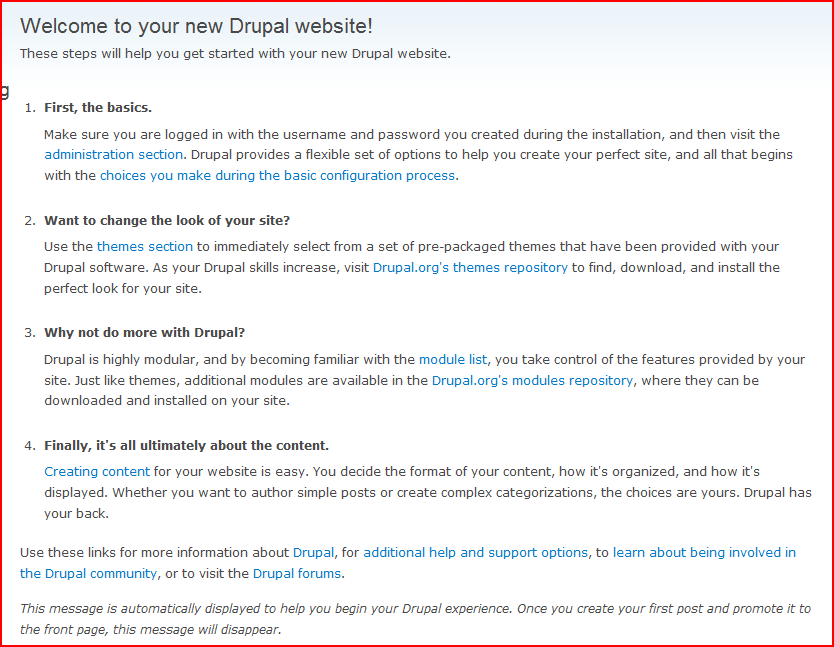
Edit again: I made a screenshot.
| Comment | File | Size | Author |
|---|---|---|---|
| welcome_text.PNG | 52.24 KB | keith.smith | |
| welcome_intro_change.patch | 5.6 KB | keith.smith |

Comments
Comment #1
dmitrig01 commentedSeems neat
I have two problems: "finally, it's ultimately"
what about removing the "finally"?
and, the second sentence of #2, I don't like the "as your drupal skills increase", why not just "or,".
Lastly, what about putting it in a drupal_renderable array and making it drupal_alterable?
Comment #2
keith.smith commentedYes, all good points.
I'm actually rather embarrassed about "finally, it's ultimately". That was a bit redundant.
The part about "as your skills increase" -- well, sometimes its not exactly plug and play to download a module or theme if you've just started, and I didn't want to represent that it was. I'll try to think of some other way to phrase that.
And then finally, you'd see including this perhaps in the profiles so that it could be altered as necessary? That could be useful.
Comment #3
Gurpartap Singh commentedCan we scale the welcome page to also make it help's main page[1]? Or an alike sister page, at least.. by "alike" I mean to keep them similar, and let the user not lose the instructions on the welcome page after he/she may create a frontpage post.
[1] http://groups.drupal.org/node/13270
Comment #4
keith.smith commentedThanks for that reference. I had, in particular, not seen yoroy's take on this page, and he has some excellent ideas, many of which I plan to shamelessly steal.
And, as a landing page for help, that also makes sense. I seem to recall that at usability testing, there was some confusion because the "guide" went away as you successfully followed its instructions.
Comment #5
Bojhan commentedIn Drupal we usually add a lot of content - while we should focus on necessary content only and be VERY cautious of adding any content.
There are a couple reasons why this welcome page is wrong, but the foremost important one is scan ability.
I understand your push for more personal looking information, but in this context it means that spicing this up decreases the overall usability of the page. Every word on your page should be useful, as people are more task driven and time starved we should completely focus on the task and don't confuse happy talk with tips.
I am VERY worried about this development,
http://www.uie.com/browse/writing/
Comment #6
keith.smith commentedBojhan,
Thanks for your comments. What are your thoughts about the mockup at http://groups.drupal.org/node/13270? I'd certainly be willing to do something more along those lines.
In my view, this is a unique page that (though this may change) occupies an unusual position in Drupal: namely, it goes away after a while. That's why I consider it a candidate as almost a "brochure" piece on Drupal. "Happy talk" aside, people should feel some type of accomplishment when they have completed installation, rather than just wondering, "OK, what now?"
Comment #7
Bojhan commentedI agree with the last paragraph, we should just consider that people don't like to read (see this in context). So go for necessaries only and then slightly add more if it really makes a difference, rather then adding a lot and then filtering out constantly. If you strip the setting the tone, you will probably end up with much like what we have now - so what do we have now that really needs extra information?
I do agree that you should feel like an accomplishment, but we all know that if you can install drupal that still doesn't mean you can acctually use it. You can set a very wrong expectation by making the welcome page really usable :D. Anyhow that's probably a funny paradox rather then something we can work on right now. (In a world where its all about expectations)
Comment #8
xanoAlso check out UX sprint group 1 (dissapearing help) progress which is partly about the welcome screen.
Comment #10
lilou commentedSee: #335122: Test clean HEAD after every commit and http://pastebin.ca/1258476
Comment #11
mikey_p commented@dmitrig01 I have a patch at http://drupal.org/node/126221#comment-1188745 that makes this alterable and themeable.
@Gurpartap I also have a patch in that issue at http://drupal.org/node/126221#comment-1189065 that allows the page to be displayed at / different when there are no promoted nodes. In that patch I have defaulted it to admin/help, but ideally it could go to admin/help/getting-started, or whatever is fleshed out from http://groups.drupal.org/node/13270.
Comment #12
Bojhan commentedComment #13
dave reidComment #14
todd nienkerk commentedSuggestion: The default front page should (1) explain how to get content to show up on this page by default (i.e., publish nodes that are promoted to front page) and (2) provide a link to the admin page that allows you to change the front page. It's not at all intuitive that either option is required to make real content appear.
Comment #16
yoroy commentedFixed in the sense that we don't have any instructions on the welcome screen anymore.