
 Come together with the global Drupal community in Rotterdam, 28 Sept – 1 Oct 2026. Sessions, contribution, connection, and Early Bird savings until 8 June.
Patch does exactly what it says.
This was a major usability issue at UBUserTesting09
screenshot at http://skitch.com/beeradb/b886c/content-localhost
| Comment | File | Size | Author |
|---|---|---|---|
| #59 | add-content2.patch | 1.1 KB | jody lynn |
| #57 | add-content.patch | 1.01 KB | jody lynn |
| #49 | Screenshot-Roles | d7.7 - Mozilla Firefox.png | 38.07 KB | catch |
| #34 | create-content.jpg | 60.77 KB | karschsp |
| #34 | create-menu.jpg | 72.72 KB | karschsp |

Comments
Comment #1
beeradb commentedoops
Comment #2
swentel commentedWouldn't it be more logical to put the link above the table ? If you have a long list, you have to scoll down to see it.
Comment #3
yoroy commentedDiscussed this with beeradb in IRC. The actual improvement of adding this link is without discussion of course:
Almost all test participants went to this page expecting it to be the place to create new stuff. If people expect this to be a main task on this page we should put the link above the table.
Comment #4
karschsp commentedWhat about putting the link at the top of the page (see screenshot: http://skitch.com/karschsp/bekd3/content-head.dev )?
The "Show only items where" and "Update options" fieldsets are directly related to the table of existing content below. I'm not sure it makes sense to stick the "Create Content" link in the middle of all that.
Comment #5
dries commentedBoth below and above are missing 'something' but I can't point my finger at it. It's probably some design and consistency. ;-)
One other pages, like vocabulary pages, we use tabs for this. Eg. there is a "add vocabulary" tab on the vocabulary page, there is a "add path alias" tab on the path alias page, there is a "add menu item" tab on the menu item page, etc.
Clearly, this isn't an one off thing for comments or nodes, there is a pattern here and it is probably best to come up with a generic guideline (unless there is a good reason not to).
Comment #6
karschsp commentedSo something more like this? (screenshot attached)
Comment #7
yoroy commentedScreenshot of the initial proposal:
Screenshot in #6:
Thing is, even when I knew the last screenshot would show a 'create content' link in the tabs area, my eyes still were lost and scanned around the page a couple of seconds before finding the link.
It's hard not to keep Garland out of this issue. Nor the "findability" of tabs in general. Adding it as a tab is an easy way to get consistency, but then it's located out of context. Just adding a tab is not a real solution imo. Don't have a real answer to this yet, but imo in these cases context is more important than consistency.
Comment #8
mlncn commentedTabs are easily overlooked but are useful as a Drupal standard. I vote for both a "Create" tab (singe-word action is sort of a Drupal standard) and a "Create content" (or even other wording) link below the table. Should this link be indented or bulleted somehow?
Note: A create tab means that the list of available content must be seen both in the admin section and at the usual link. I don't think that's confusing, but it's a consideration.
Comment #9
chrisshattuck commentedI'm curious if a couple of recent patches indicate the need to create an additional convention for 'operation'-style links. Don't want to derail this conversation, so I started a new one here: #404820: Problem: Several important links have no good placement options.
Comment #10
karschsp commentedI think I like it as a tab. The more we keep things like "List" and "Create" up in the tab area, the more users expect important stuff to be up there, and they'll (hopefully) look there first. Wherever we end up putting it, it's 1000% better than what we had before.
I also agree that I think part of the problem is the styling of tabs in Garland. It's just so easy to overlook them. Maybe that could be a separate issue.
Comment #11
chx commentedyes, the nontabs of Garland really should be fixed to look Tablike. Just throwing down a create link here helps particularly little. Either a tab -- and or what about a child link in the navigation menu?
Comment #12
beeradb commentedA few comments on the direction this is going:
Tabs are easily overlooked. That shouldn't necessarily be a deal killer, since we shouldn't confine what we do to garland specific solutions, but it's at least worth noting.
Other than that my big concern with going to a tabs based approach is that during testing almost everyone who was presented with these types of screens would scroll around on them, get to the bottom, realize they hadn't seen what they were looking for, and just kinda freeze.. "what now?". Would we have seen this as frequently with a nice prominent "Add a new " at the top of the page? I could see the argument go both ways, but my gut tells me we probably would have. Users had a tendency to want to feel pages out, scroll around them for a minute and learn what there was to be done, and then decide where to go next. The natural flow of this process tends to leave them hanging out at the bottom of pages wondering what their next action should be, and we're consistently leaving them without a logical next step.
Anyway, just a little background on what we observed during testing.
Comment #13
pwolanin commentedThis should NOT be a tab. That makes no sense. Put a link just above "Show items where" and make it stand out a little if needed. Put it at the bottom also.
Other places where we have a "create X" tab, we should look at changing those to links or maybe buttons.
Comment #14
pwolanin commentedComment #15
leisareichelt commentedI agree. Tabs placement doesn't solve this problem.
The 'create content' will continue to be overlooked if it's placed in a tab because a tab is not the appropriate/conventional treatment for this kind of a call to action. You really want a button or at least a link. Preferably before and after (top and bottom of) the listing form.
(yay! my first ever posting to issues. be gentle!)
Comment #16
beeradb commentedComment #17
karschsp commentedGood point. I guess I fell into the trap of "hey, we do it this way over here, let's repeat that." I need to remember that just because we are already doing this a certain way doesn't mean that it's right!
I agree with pwolanin that once we land on a usable solution for this Create/Add Content issue, we should probably look to implement a similar solution elsewhere (taxonomy, block, etc).
Comment #18
karschsp commentedAttached is a patch that puts Create Content links above and below the table. There's probably a better way to do this but apparently you can't call drupal_render twice on the same item?
Screenshots:
http://skitch.com/karschsp/bequf/create-content-header
http://skitch.com/karschsp/bequj/create-content-footer
Comment #19
mfer commentedI'm wondering if the 'Create content' link should be themed to pop a little more. Right now it looks like a link. Should it somehow register that this is an action?
Comment #20
karschsp commentedyeah, I thought of giving it a class like "create-link" so each theme could style it differently. then we could add a style definition to garland's css to make it stand out more.
Comment #21
akahn commentedProviding a class to allow theming makes sense. I think a class name such as
create-content-linkis more descriptive thancreate-link.As far as giving the link more 'pop,' that's a tough call. There is already a bunch of busy-ness going on with the form at the top of this page, and this link would have to compete with that. I'm not sure what a good solution would be.
Comment #22
karschsp commentedThe only reason I thought 'create-link' as opposed to 'create-content-link' is that if we start to adopt this approach elsewhere (Create Block, Create Vocabulary, Create Term) we can style all the 'create-link's consistently with one class. Maybe I'm just being overly optimistic! :) I'll roll a patch later today with the 'create-link' class added.
Comment #23
yoroy commentedI think even a more generic "inline-action" or even "action" would be good to have as well. Big chance we will be putting other links than "create" ones in the content area. I'll ask the tpl-refreshers (johnalbin, eclipsecg) to have a look here
*edit: either way, let's not get too hung up on this as there is a big overhaul of all CSS namespaces in the works anyway, so let's just pick one for now.
Comment #24
jrefano commentedRight now D4D is working on the namespace for new CSS classes (not sure who is leading this). Since it's not done, I'm just speculating -- but it seems to me it should be more semantic. I'd vote for something like:
action-create-content
Since it's performing an action, and that action is to Create Content.
Including the word "link" seems silly to me, it's going to be wrapped in an anchor tag anyways.
Comment #25
johnalbinI agree with yoroy's #23 edit. We'll make sure the class names make sense in the big picture later when we start reviewing all the CSS files for D7.
Comment #26
karschsp commentedI also think that the D7UX project may provide some better data around where the links/buttons/flashing druplicon with "Create Content" speech bubble should be placed on the page. Anyway, here's the latest patch that incorporates everything we talked about so far. We can certainly revisit this when we get further down the line with design & usability.
thanks!
Comment #27
beeradb commentedIt'd be great to get some opinions from people like Bojhan, yoroy, leisa, etc. on whether they feel like this is enough, or if we need some other treatment for this.
As others have said, whatever we decide here should become a pattern we replicate elsewhere, so we should definitely make sure we're hitting the mark before rushing into this.
Comment #28
beeradb commented@karchsp are these still accurate?
http://skitch.com/karschsp/bequf/create-content-header
http://skitch.com/karschsp/bequj/create-content-footer
Comment #29
karschsp commented@beeradb yup, still looks the same, i just added a class to the link.
Comment #30
Noyz commentedI did a design for this awhile ago. IMHO, you don't need two buttons, just one obvious one at the top (so that it's always accessible without having to scroll). You're more likely to create content than delete it, so move the update features to the bottom. Update makes more sense at the bottom anyways because users work from top to bottom (select item at top, move to bottom to delete).
Comment #31
leisareichelt commented@noyz I really like this button. Would be tempted to move it from right to left tho' - more in the line of vision / path eye is taking down the page.
the button at the top is by far the most important, however it could also be useful to have it at the bottom. Consider the use case where you're scanning a long list of content to see if something already exists, get to the bottom having found it does not, and there's the create content button waiting for you. nice but not essential, esp if I have clocked the create content button on the way down.
Comment #32
beeradb commentedI think this button approach is by far the most visible of the ideas we've look at so far. It also has the added side effect of looking rather nice :).
I had a reaction similar to Leisa's, in which I was thinking it would be useful to have it at the bottom as well. Talking with noyz on irc though, he seemed convinced that just having one button above the list would work. I think we should get more opinions on this.
Additionally, it would be really nice to see an example of this button used in a context where it's not directly above a table. The two main use case outside of this I can think of is places like the node/add page, as well as the menu listings, which both use DL's I believe. Being able to have consistency and apply this fix to those places would be awesome.
Comment #33
mfer commentedAdding the needs design review tag. If we are going to make a button look good we should not it to the designers.
Comment #34
karschsp commentedHere's a few screenshots to show what this button would look like on the content, menu and block admin screens.
Comment #35
chrisshattuck commented+1 on the left orientation. On the right, it ends up competing with the help link, and is less visible.
+1 on the link on top and the bottom. For one, it addresses something beeradb mentioned about what he saw in the usability tests, which was that often people end up looking at the bottom of a page for a call to action. As a side effect, the repetition on a sparse screen also makes it more obvious that the button is an important element on the page. For new users, it's clear that "create ___" is the thing to do. After there's more content, the second button becomes less visible.
Comment #36
Bojhan commentedSo just having a "create content" link up there basicly solves 80% of the issue, lets make sure we don't add to much visual weight to it and just get it done with some good positioning. (copyright beeradb)
Lets not kill kittens and talk about where else we could all apply this pattren, lets just get this link in and worry about that in other issues (overview pages and action tabs)
Comment #37
mfer commentedWhat is the appropriate file to put the css in and right place to put the image location? default.css and /misc or should this go in Garland? Some place else?
Comment #38
karschsp commentedI would say it belongs in Garland, since the styling of the link should be theme-independent, right?
Comment #39
sunThis is not sufficient and only a solution to one place where a cross-link would make sense.
If we would implement it this way, each and every module would have to output a similar link.
Hopefully, using a similar location.
And why are some tasks displayed as local tasks, and this task not?
We do not want that. Seriously.
What we really want is a generic solution for this issue. Closely tied to #408160: Normal users should not see the create content link appear by default in a menu called "Management".
Modules must be able to define local tasks that point to an existing, other menu item in the system.
See also: http://groups.drupal.org/node/19171#comment-66016, which proposes something like:
Comment #40
mfer commented@sun, what does this issue have to do with what you suggest? This issue is about adding a 'create content' link in a different location on a page than is currently happening. See http://drupal.org/files/issues/create-content.jpg for a mockup. Can you describe how this overlaps with what you are suggesting?
Comment #41
BrightLoudNoise commentedI think #34 looks pretty good. We should give the link some more vertical breathing room though, create-content.jpg might induce claustrophobia.
Comment #42
sun@mfer: If we add a link to admin/content/node, then we also want a link on admin/build/types. And we are still speaking of nodes only.
Comment #43
mfer commented@sun I guess I'm looking for how this is an issue with the menu system that relates to 'Allow local tasks to cross-link to an existing path'. This is really a usability issue. If there is something above and beyond usability can we get another issue? If this is part of the usability effort on this how does it relate?
Are we talking about a second level of local tasks separate from the tabs? Is that it?
Comment #44
yoroy commentedI'm having the same questions as mfer.
Sun, please clarify your position a bit more in depth than the "this is insufficient" and "we do not want this" statements you've made so far. I can see how we might want to make a generic solution for these kinds of action links. But this is not about adding an item to the existing tab/local task system.
Back to the original topic for now please.
Comment #45
seanrI agree with Sun, actually. I've needed that in the past, and I think it'd make it far easier for us to solve some of these usability issues. I think we can probably agree that this link we're trying to add would function better as a tab than just a text link buried in the page. That is currently not possible in Drupal without adding a callback to your module that redirects to the target page.
Comment #46
mfer commented@seanr functions like this should NOT be tabs. This has been discussed. There is a difference between a tab and a button/action like this. Please read up as there is a lot of talk about this.
I think we have a good location(s) for a create content button and a good default look here.
I see 2 possible additional things here from a technical standpoint that are being raised that might need to be address:
Thoughts?
Comment #47
catchI don't like the 'add' tabs on vocabulary and term listing pages - they're much better next to the table (and usability testing confirms that users expect to be able to add stuff next to where they can see and edit it). While it's more critical on admin/content/node because of a complete absence of a link anywhere, I think we need to revisit those other pages once this goes in. The main issue I see with that is duplicating a link in two locations, but I'd even go so far as to remove the tabs in favour of this if that's deemed a problem.
While a standard place for such links to appear is good, at the moment I think we need a pattern (which the proposal on here seems like a good start on) rather than an API. We may not have a 100% consistent place for these links to appear, and at the moment they're embedded in the content region pretty deeply, which is sort of the point.
Comment #48
mfer commented@catch I agree with you. My two points are better served as two new issues. I think we take the existing work, as seen in #34, and turn that into a patch to be applied to this page.
Comment #49
catchmfer, that sounds great.
Just to show this isn't an entirely new pattern for core, admin/user/roles has a textarea and a button to add a new role in the table listing itself, with no tab. While I really like this, it's not going to work for all (or even many) things we need to add in core - but the placement there is much more natural than a tab - and the #34 approach maps to it really well.
Comment #50
beeradb commentedComment #51
dvessel commentedLeisa or anyone else, is there more information on the reasoning behind this? As far as I can see, the single "Add X" button comparison to tabs isn't fair since it is styled so differently so it stands out. The positioning helps for the button but if we want consistency (which I do), I hope this new button is implemented with Drupal as a whole in mind.
I'd like to ask, in how many contexts does this make sense? What does this imply for tabs when there are exceptions. Will they be another layer of "local tasks" for the sake of close proximity?
Tabs are easily overlooked because they are visually very plain. Proximity with other tasks can hurt its discoverability *initially* but couldn't they be styled to stand out? Having a strong and consistent standard is what I'm most concerned about. I'm not pushing for either direction.
Comment #52
yoroy commentedanother example of a "create" link in d7ux proposal for user management page:
http://www.flickr.com/photos/_leisa/3569783069/sizes/o/in/pool-903403@N22/
What I think we're looking at in general might indeed be a new layer of local tasks.
Local tasks we have are rendered as tabs. Tabs are primarily a pattern for seperating different 'views' on data, different information spaces. Right now, we are also putting 'actions' in there, stuff that should be buttons or links. Besides being easily overlooked, we're mixing both 'view' and 'action' operations in the local tasks and we need a mechanism that treats the two as the seperate things they are.
Tabs for tabs, links and buttons for actions. Tabs along the top, actions right there where you need them, in context of the element(s) you perform that action on (probably meaning: free to be placed where needed).
Comment #53
dvessel commentedOkay, I see. I must have got stuck with the back-end term of "local task" which implies more action than a space. –tabs are generated from a handful of *_local_tasks functions
But yes, this makes perfect sense.
Comment #54
leisareichelt commentedwell said Yoroy. I agree with this entirely.
Comment #55
sunFWIW, I agree as well.
However, when tabs are kept as what "local tasks" are now, i.e. driven by the menu system, and tasks become links somewhere else on individual pages without reference in the menu system, then modules like admin_menu can no longer provide directly accessible links to "Create foo" or "Add bar". At least I am heavily using those links to quickly create new content, blocks or whatever.
Two options to keep them:
a) Classify what we have now in tabs and local tasks. Technically, that means using MENU_LOCAL_TASK and (a new) MENU_TAB constant for menu items. Display tasks in a "set" like tabs, but differently and in a different location on the page.
b) Also "classify" to keep tasks in the menu, but don't display them. Tasks are manually output as links somewhere on the page instead. However, modules like admin_menu can still expose them.
Comment #56
dries commentedVisually, the top part of http://www.flickr.com/photos/mboulton/3569318373/sizes/o/in/pool-903403@N22/ shows how this could be done nicely, IMO. I'd like to see us add the search feature in a follow-up patch which would balance out a 'Add new content' link. Looks clean and simple.
Comment #57
jody lynnHere's an 'add new content' link at the top of the page. Simple enough.
Comment #58
stborchertIf there is no content type available (fresh, minimal install) the link shouldn't be displayed. Otherwise you'll get an "Access denied" by clicking on it.
Comment #59
jody lynnGood point. Updated.
Comment #60
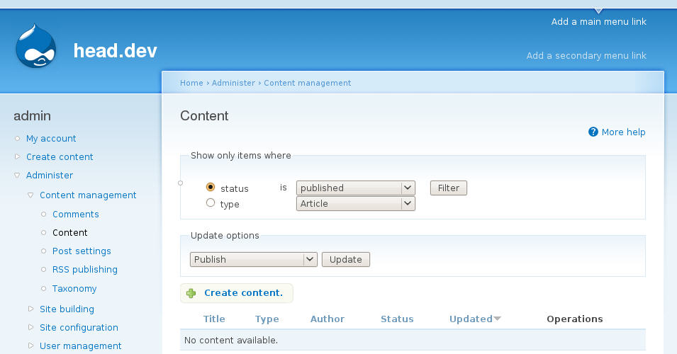
Bojhan commentedCan we have a screenshot?
Comment #61
dries commentedI committed this to CVS HEAD.
We can work on creating a generic framework for adding tasks later, if that is deemed necessary. I'm still not sure it is because it is pretty straightforward to add such a link. In the mean time, this patch addresses an important usability issue. I'm leaving this issue at 'needs review' so we can discuss clean-ups and strategies to make this more generic.
Comment #62
dries commentedPossible clean-up:
- The permission check could be delegated to the form API.
- We could also consider moving this outside of the form API.
- I still like what Noyz did with the update operations (i.e. moving them to the bottom). See screenshot in #30. I think we should make an issue for that.
Comment #64
mlncn commentedThe testbot can say what it likes... this patch has been committed.
Comment #65
mlncn commentedNeeds review for further cleanup and making more general, see Dries' #61 and #62.
[Um, per below, so much for my battle with the bot, apparently an interim status of Fixed isn't enough to tell it to leave well enough alone...]
Comment #67
Bojhan commentedFixed in current Drupal 7.
Comment #68
sunActually. Although this has been committed, the code that was committed here has been partially reverted.
The proper, generic implementation was committed in #542658: Move action "tabs" out of local tasks, so I'm marking this as duplicate.