
 Come together with the global Drupal community in Rotterdam, 28 Sept – 1 Oct 2026. Sessions, contribution, connection, and Early Bird savings until 8 June.
Building on my post here - http://groups.drupal.org/node/20189
And this blog here - http://www.standards-schmandards.com/2009/wai-aria-landmark-roles-in-cms...
I thought I should really introduce some basic css to allow it to be very clear what form element the cursor is on:
input:focus, input:active, a:focus, a:active, select:focus, select:active, textarea:focus, textarea:active {
  background-color: #ffd;
  color: #000;
}
This just provides extra definition so that if you're tabbing through a form you're very clear where you are on.
Mike
| Comment | File | Size | Author |
|---|---|---|---|
| #2 | screenshot-77.png | 71.87 KB | mgifford |
| #2 | screenshot-78.png | 73.67 KB | mgifford |
| #2 | screenshot-79.png | 25.73 KB | mgifford |
| garland_focus_style.css_.patch | 603 bytes | mgifford |

Comments
Comment #1
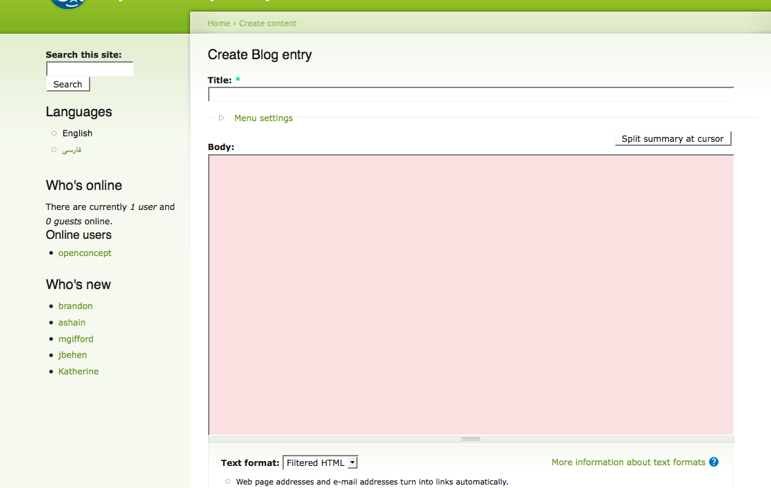
moshe weitzman commentedscreenshot would be lovely.
Comment #2
mgiffordGood point, thanks!
Comment #3
Bojhan commentedDon't think we really need more visual emphasis.
Comment #4
mgiffordHi Bojhan,
Have you tried to navigate through a Drupal site using tabs? It's brutal to know where in a form you are.
Would like to know if you have any usability or accessibility testing to back this up or if it is just an opinion. Know you've got lots of experience from your profile, but if you navigate without a mouse for any length of time it's much more difficult and highlighting is very useful!
My testing is mostly focused here:
http://www.youtube.com/watch?v=NyIHtNHYroM
Mike
Comment #5
damien tournoud commentedTrying to make Drupal website more accessible is a noble goal, but I don't think this particular patch is such a great idea, for at least two reasons:
- making focused widgets pop out is mostly a browser / UI toolkit issue. It shouldn't be a website concern, except if we want to manage all the aspects of form widgets.
- on Firefox (at least), using any "special" CSS on form widgets will make the browser fallback to its internal, ugly widgets.
Comment #6
Bojhan commentedHey, Mgifford
So I did some research on this, where I ran a test which had this change as well, all users actually liked this change - however there where a couple things diffrent, for example there where less forms and a light yellow color. But most notably, all of the participants saw this change - which may sound like a good thing, but I feel this isnt much of a good thing.
Especially in Drupal which is form-wise far more intense, it might cause some frustration(in its lightest sense) as this patch adds a lot of visual emphasis (clutter) on every active form - especially as your tabbing trough fast.
I wouldn't be able to judge from an accesability standpoint, however from a pure usability standpoint this might be an improvement that could go wrong - even though nicely applied in a lot of diffrent applications. Also, I havn't really encounterd many issues with people not knowing in which form element they are.
Bojhan
Comment #7
mgiffordHey Damien,
Thanks for your feedback. I'm not sure that form input should be left up to the browser. I think that the /user form could really use some zipping up for instance and think that putting some attention into formatting inputs would get folks excited about Drupal 7. I believe that defining the forms with a bit more intention will help Drupal look more professional by being more intentional. Just my opinion though.
I've got my sandbox up here with a number of accessibility issues defined:
http://drupal7.dev.openconcept.ca/
The search and login blocks in the side give you the focus change I've suggested here.
Some related links that might be of use for improving Drupal's input form:
http://www-03.ibm.com/able/guidelines/web/webforms.html
http://www.webcredible.co.uk/user-friendly-resources/web-accessibility/a...
I'd like to see changes in core that provide a best model to develop from.
Please let me know what you think of the implementation of D7 above.
Mike
Comment #8
mgiffordHey Bojhan,
Thanks for doing some testing on this. I'm not focused on the color. Would be nice if it were flexible enough to be a % of one of the colors chosen in the color module, but that's probably over doing it. Lighter yellow, stronger defined border, whatever. I just want to have something that is obviously different that isn't depending on using a good browser (since many people don't).
I'd think it would be even better in a big form since it gives someone a better visual queue to know where they are. It's a landmark, which in a large landscape (like so many Drupal forms are), it is critical. Adding visual emphasis is critical if you are trying to scan quickly up/down through a long series of input fields in say a webform.
I'm trying to see what other folks are doing "in the wild", Section 508 has some references, but could be more clear.
I can get more advice from the accessibility community. And yeah, there's ways it could go wrong. But if folks in your focus group liked it.. Maybe we should see if there's a way it can go right and be a big improvement for everyone. It's easy to know what form element you are on if you are using a mouse. If you are tabbing it is much more complicated (as every link on the page counts as an item). The video above demonstrates this pretty well I think.
Can you run your focus group through a longer form with the input form highlighting in it?
Mike
Comment #9
xanoI wouldn't say this is an accessibility issue. I'm with Damien Tournoud on this. Form elements are special browser elements. We should not mess with them, otherwise we will run into situations like the one Damien described about Firefox rendering ugly internal form elements as soon as it detects the slightest bit of CSS being applied to them.
Comment #10
xmacinfoAll form focus visuals should be left to the browser default behavior. For instance, Firefox 3 adds a blue glow border to this comment textarea automatically.
Also, any other changes to the visual of form focus elements should be left ultimately to the themer. All core theme should not try to override the browser form focus visual formats.
Comment #11
Bojhan commentedSorry, I still believe that this either needs work (handled by the browser), I am not convinced this won't influence a lot of other things.
Comment #12
Bojhan commentedPlease provide some research, how this could be handled by just the browser.
Comment #13
xanoWe don't need research for that. If we decide this is up to the browsers, it's their problem and not ours anymore. We don't make browsers do stuff, we make Drupal do things.
Comment #14
mgiffordThis isn't a respectful response Xano.
This has been discussed in the accessibility group - http://groups.drupal.org/node/20189
It's inline with recommendations to change the background colour of the focus state - http://www.webcredible.co.uk/user-friendly-resources/web-accessibility/m...
This is another reference I stumbled across in another discussion thread, although quite old, recommending it - http://www.sitepoint.com/print/simple-tricks-usable-forms/
I've provided other links and a video indicating how for people with mobility challenges this is a major limitation for Drupal. Not clearly knowing where a user is as they are tabbing through a site is a problem.
If there is a convention about what is or should be defined by the browser and what should be defined by the server please send us a link. Make a case with external references about where the line should be drawn.
Mike
Comment #15
mgiffordBojhan - I do have a development environment here with form focus added to it - http://drupal7.dev.openconcept.ca/
Not sure what else it is affecting. Please sign up and have a look.
Comment #16
Everett Zufelt commented@mgifford
Are tere any w3c wcag 2.0 conformance requirements or techniques that could be referenced here?
Comment #17
mgiffordThere are actually WCAG 2.0 requirements for this:
http://www.w3.org/TR/UNDERSTANDING-WCAG20/navigation-mechanisms-focus-vi...
Some mechanisms to implement this are suggested here:
http://www.w3.org/WAI/WCAG20/quickref/#qr-navigation-mechanisms-focus-vi...
Comment #18
xanoThe W3C notes state that user agents should provide these visual indicators.
Comment #19
mgifford@Xano
There are some areas where this is possible. However, both links and the vertical tabs are very poorly highlighted in D7 at the moment. For many basic form elements relying on the browser may be fine. However, given the complexity of the interface that's being introduced into Drupal 7 you can't expect the browser to just take care of it.
Please try tabbing through the admin interface. Knowing where you are isn't trivial.
Comment #20
xanoI agree that we should look into highlighting links and other 'custom' elements. However, as form elements are browser-specific we should avoid touching them as much as we can.
Comment #21
mgiffordSo to improve the visual focus, is it a matter of adding what I'd already proposed (but with a reduced scope) and possibly only to Seven:
or is it a matter of doing something with jQuery that allows all links to receive focus? In many ways form focus is the easiest to implement. Although it's arguably the browsers responsibility.
Comment #22
Everett Zufelt commentedIt sounds like we aren't talkig about form fields anymore, but links. Perhaps it would be best to mark this issue as "won't fix" and to move the discussion to tissues on specific UI components where focus is indicated poorly, e.g. vertical tabs.
Comment #23
xmacinfoAgreed. :-)
Comment #24
mgiffordNot re-opening yet, but putting in link to related best practice from:
http://webaim.org/blog/10-easy-accessibility-tips/
"Sighted keyboard users generally navigate through the links and form fields on a web page using the Tab and Shift+Tab keys on the keyboard. To help ensure they can visually identify which link or form field they have navigated to, you can add the following to your CSS file:
The colors may need to be customized to fit your site design, but they should be fairly distinctive.
To take this tip one step further, you can search your CSS files for a:hover and in each instance change it to
a:hover,a:focus. This will ensure that keyboard users get the same visual highlighting when they navigate to items as mouse users get when they hover over an item."Comment #25
mgiffordThis should also be brought up with the browsers, but I do think that theme specific focus elements could be a very nice touch. Opening up this thread again, after some consultation:
https://twitter.com/opdavies/status/333590693731782656
Comment #26
Bojhan commentedNot in the core queue, yay :)
Comment #27
mgiffordThanks Bojhan, sadly it is still a Core issue, so I created #1993574: Add focus styling to all interactive elements with links back here.
Comment #28
joachim commentedThis feature is now in D8 core.
It's very unlikely that Garland will see any D7 development, unless someone volunteers to maintain a branch for it in this project. Hence closing as won't fix.