
Closed (fixed)
Project:
Drupal core
Version:
7.x-dev
Component:
node system
Priority:
Critical
Category:
Task
Assigned:
Reporter:
Created:
21 Apr 2009 at 01:03 UTC
Updated:
15 May 2014 at 10:00 UTC
Jump to comment: Most recent, Most recent file

Comments
Comment #1
mcrittenden commentedNice patch! Applies cleanly, works well, degrades gracefully, abides by standards, very efficient algorithm, it has my vote.
Side note, why change "Submission form settings" to "Submission settings"? I think the former is a tiny bit more understandable. (Apologies if there's an issue floating around somewhere I haven't seen).
Comment #2
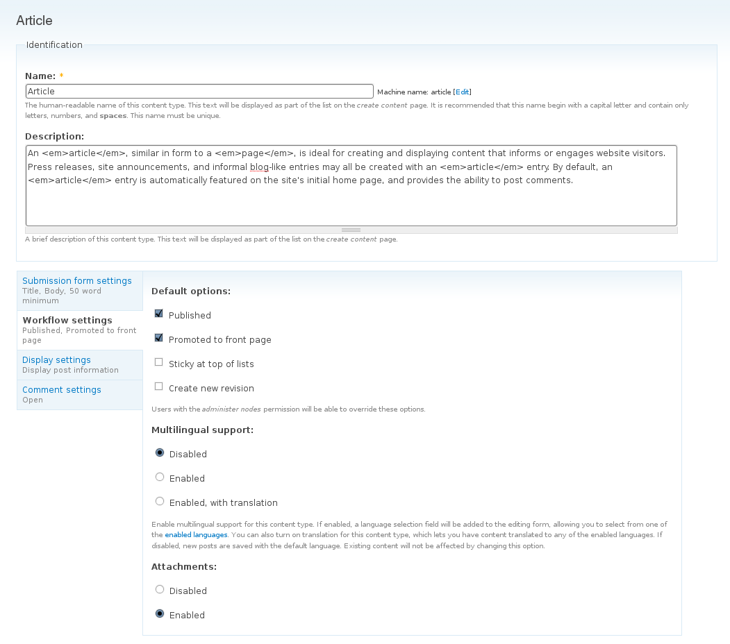
moshe weitzman commentedVery nice. When toggling Attachments, the Summary just sayd Enabled/Disabled but does not say Attachments so it is not informative. Add that to Summary and I will RTBC this.
I think 'Submission settings' is fine, personally.
Comment #3
robloachThis patch doesn't provide the summary for the attachments or language settings because if it did, the summary would become a bit more then a summary.
Comment #4
ugerhard commentedWhy not go all the way and make the "Identification" fieldset part of the vertical tabs? The summary could contain name and machine name.
Comment #5
robloachOn a side note, #181831: Wrap Form Fields with ID's (useless form-item class syndrome) will improve the JavaScript performance here because it will give us the wrapper IDs, so we arn't limited to checking the name attributes.
Comment #6
Jaza commented@ugerhard: I disagree; I think the "Identification" fields shouldn't be in the vertical tabs OR in a fieldset (they're currently in a fieldset). It would look more consistent with 'title' and 'body' in the default node form, to have 'name' and 'description' standing by themselves at the top of the form. 'Identification' is IMHO a fieldset (or tab) name that tells you nothing useful. The basic identification fields for a content type don't need to be part of any group. They're special :P.
@moshe: agreed, would be nice for the summary to say 'attachments' or 'no attachments'. 'Minimum number of words' should be in the summary, too, although only if it's set to a non-zero value. If left at zero (which it usually is), that probably means the user doesn't care about it, so putting it in the summary will just add clutter.
Otherwise, this patch looks good - the node type form is indeed one of the logical next spots to "vertify".
Comment #7
Bevan commentedNice. Based on the screenshot in the initial post I would 'approve' this from a Usability PoV. I suspect a few more technical iterations are required though, so I'll hold off for a bit and apply and review the patch later.
Comment #8
kkaefer commentedThis is a place where vertical tabs make perfect sense. @ugerhard: I also don't think we should move 'Identification' into a tab pane because it is the main thing that is being edited on that page (we also don't put the node title and body in a pane on the node add/edit page).
Comment #9
Bevan commentedUnlike node edit forms, changing the title and body fields is probably not the primary task people have for this page. Though, I'm not sure we can identify what the main reason is that people use this form. I suspect it's fairly evenly distributed between the tabs though. I suspect comment settings may be more-often sought after than others, though not enough to pull them out of the tabs.
Comment #10
dries commentedI'm not convinced to be honest. We should avoid applying the vertical tabs patterns everywhere we can. I think it makes OK sense on this page, but not perfect sense.
Comment #11
mcrittenden commentedDries, granted it doesn't fit quite as well as it does in the node add/edit form for example, but I think it's a good idea even if just for the sake of harmony. The node add/edit form and the node type form are similar enough that I think what is done to one should be done to the other if possible.
Comment #13
catchCould we see a screenshot of this with comment settings active? I've been wanting to move that to a separate tab for a while but not done so yet, doesn't necessarily conflict with this patch though.
Comment #14
moshe weitzman commented@catch hints at the real benefit. This form grows very long and inconsistent once you install a bunch of contrib modules. so many modules choose to add to the workflow fieldset instead of create yet another fieldset on the page. i think this patch will encourage them to add own vertical tab. we really do need this patch IMO. it is just that we can't see the full benefit with just core modules.
Comment #15
robloachThis patch provides the summary for the minimum amount of words. If we want the attachment summary in there, we should fix the removal of the radio buttons' IDs: http://drupal.org/node/181831#comment-1500338 . Then, instead of using
input:checked[name='attachments']for the jQuery selector, we could use#attachments-wrapper input:checked. Much nicer on the JavaScript performance.Comment #16
catchtranslation module's only settings are hidden in the workflow tab - having them as a tab would validate moshe's point pretty well.
Comment #17
Bojhan commented@moshe So lets provide a screenshot with contribs? I am having trouble reviewing this - soley on "contribs" will use this. I am with Dries that we need to carefully concider using vertical tabs on pages like these, especially as one would look at all (would they?) settings while setting up - if we hide settings it is only an extra interaction we are adding.
Comment #18
moshe weitzman commentedTheres the rub - there are virtually no Contrib modules available for HEAD. I'll try D6 and we can all imagine.
Comment #19
catchD6 with location and any others + all fieldsets expanded would illustrate it pretty well.
Should we consider doing translation in this patch as well?
Comment #21
robloach#445130: Namespace the Drupal jQuery functions
Comment #22
meba commentedConsidering themes with two sidebars, these tabs might get very unusable because there won't be enough space for them?
Comment #23
michaelfavia commented+1 Subscribing. This was my next step in the process of moving the per content type node settings for comments and node settings under here. Thank you rob et al for beating me too it.
Comment #24
moshe weitzman commentedI still think this is a good idea, given the heavy contrib alteration of this form.
Comment #25
robloachUpdated to HEAD now that the Fields API UI went in.
Comment #26
moshe weitzman commentedWorks well. I think we could quibble about whether things like 'Require preview' belong in the summary. Lets not do that :).
As promised, attached is a screen shot from a content type admin form for a D6 site. You can see how contrib modules just love to clutter up this form with settings. We need vertical tabs to visually tidy things up.
Please wait for green result from our napping test bot before commit.
Comment #28
webchickOh, testing bot...
Comment #29
zoo33 commentedVery nice! However, isn't Comment settings supposed to be a vertical tab too? That doesn't happen on my install (fresh CVS update, fresh install). No JS or PHP errors reported.
Comment #30
moshe weitzman commentedComments are in the vert tabs for me. Perhaps you have comment module disabled?
Comment #31
webchickThis looks really nice, IMO. Didn't immediately see anything wrong with the code. Committed to HEAD!
Comment #32
zoo33 commentedVery nice!
For the record, the comments became a vertical tab next time i checked. Weird...
Comment #33
Bojhan commentedI am totally not convinced that this is a improvement. Although I do see the need to make this more usable, especially as contrib push their functionality in this list - we have to be far more careful in considering this pattren. With code freeze and all its easy to make fast judgment calls on this, putting a fast-to-use interaction over something that will make sense in the long run.
One of the points we put out a while ago is :
Because vertical tabs are meant to be skippable if possible, in this case its very likely you would have to go past every single vertical tab to see if its correct for that content type.
Scalability
As shown in the screenshot by moshe, these vertical tabs could easily turn into 7 to 9 vertical tabs. Which decreases their efficiency significantly. I think if we took more time, looking at this we could have found a far better middleground to increase the usability off modules adding fieldsets (maybe putting those in a VT) then just putting everything in vertical tabs.
Also, there have been concerns raised by Dries and Bevan (who originated the Vertical Tabs pattren) and by me which have not received any follow up discussion? I wasn't aware we where actually pushing this trough, with all of the other activities - but it comes somewhat of a surprise to me.
I dont see how Needs usability review was removed, without anyone from the UX-Team actually reviewing the follow discussion - I dont know, I dont really like that.
Lets revisit this after code freeze, because I don't want core to have inconsistent use of Vertical Tabs.
Comment #34
yoroy commentedMust agree with bojhan here, this kind of slipped by us and his concerns are real and it's unfortunate the 'needs usability review' tag was removed (inadvertently? tags appear/disappear all the time)
Vertical tabs was tested earlier this year on the node add form. They were a succes there because most of the participants just ignored them. Which is fine there because there are no critical settings in there for creating a basic piece of content. Not so much in this case, you really want people to go through these when setting up a new content type.
Comment #36
bowersox commentedFYI: The vertical tab summaries on this Node Type form are no longer working: #630486: Edit content types missing vertical tab summaries from content_types.js. Thought ya'll might want to know about that issue.
In the very first patch here in this issue, the content_types.js was attached, but somewhere along the way it appears this has been lost.
Comment #37
catchUntagging 7.x issues.