Further to yoroy's video about this and Dries's subsequent endorsement of the idea, here's something to get the ball rolling.
In brief, the idea is to be able to perform operations on individual items in long lists without having to click through to another page, i.e. loading the config/edit form via ajax and having it submit via ajax. I've started with the user management screen (admin/user/user) but the final pattern of how this works should be re-usable in other places in core and eventually by contrib modules.
The patch at this stage is just to get it out there and see if anyone wants to collaborate on this. My approach could be completely off the wall for all I know (this is my first time working on anything in core).
Major things that need to be done are:
- Figure out if this general approach will work, where the ajax callback for loading the form is in system.module, which checks to see if a function exists for the type that was passed in, in which case it calls that function, which returns the form, which system.module passes back as a json reponse.
- Figure out how to restructure the user edit form so that it works with this system and also in a non-js set-up - I'm thinking the 3 operations you might want to perform on each user account would be edit, change status, or cancel, which means they'd need to be separate forms. For now all I have is the existing big edit form loading, including the cancel account button, which shouldn't be there at all.
- CSS please! it's quite hideous
- Figure out what sort of feedback to give on submission of a form that's loaded in this way.
I'll be continuing to work on it...


Comments
Comment #1
yoroy commentedwoohoo! Tagging and subscribe for now.
Comment #2
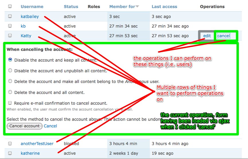
katbailey commentedOK, here's a screenshot, none too pretty but that's how it's looking right now - I've annotated it to make it clearer. And a new patch - this time with both the 'edit account' and 'cancel account' options showing for each user. Really need to nail down how to restructure these forms. The cancel account form doesn't submit via ajax, presumably because of the way it works with batch, but I have yet to look into this.
Comment #3
cwgordon7 commentedFirst of all, thanks for kicking this off! Some thoughts on the interface:
- I find it weird that the "operations" links only appear when you hover over the form row. Also, having a "cancel" link appear there is confusing, because if a user clicks the edit link, they may attempt to click the "cancel" link to cancel the current operation. Something like "delete" might be better now if we're using an interface like this. (This is also a problem with the user delete form - I laughed to myself when I saw the interface "Cancel account" / "Cancel" ;). That, of course is for another patch).
- I know this patch is in an early state, but I'm not sure if you've thought of this - I would have expected the "Cancel account" button at the bottom of the user delete form simply to close the form, not go to another page. I would also have expected submissions of the form to take place in the same cool AJAX-y way.
- When changing forms, I think it would be more user-friendly to remove the form from the page first, then go to the AJAX and add the form.
Some thoughts on the code:
- Coding standards stuff: harmonica.js is indented weirdly. Stuff wrapped in (function($) { ... })(jQuery); doesn't need to be indented further, and also code comments need to start with a capital letter and end with a period.
- We now always use a space between the . concatenation operator and a string.
- I see you're using the index of the result ($i) to generate the id="user-harmonica-'. $i. Is there any reason not to just use the user's id?
Otherwise, this is looking good! I understand you're just starting out, so please don't take the feedback above as criticism, but rather as enthusiastic support. :)
Comment #4
katbailey commentedHi cwgordon7,
thanks for this - I most certainly do take it as support and not criticism, I'm just delighted to have someone else looking at the code :-)
It sure does need a lot more work, it's not much more than a proof of concept at this stage I guess. I made only minimal changes to the code in user module to get it working like this but what's really required are some major changes to how those various forms are structured (user edit and user cancel). For example, the cancel button shouldn't even be on the edit form, because that's what the cancel form is for, right? But the forms need to work outside of this interface as well so I'll probably need some guidance as to how to achieve that.
As you noted, ajaxSubmit is not working for the cancel form. I only implemented the most basic ajaxSubmit functionality as well, haven't even tested validation issues yet. This is where the most work is needed.
I will make the coding standards changes this evening and also change it so that the old form disappears before the loading of the new one starts. As for why I'm not using the user id in the element id, I guess I just preferred those ids to be numbered according to their row position, rather than ending up with something like #user-harmonica-128492 or whatever, but maybe that's just as good.
Thanks again for the feedback!
Comment #5
dries commentedOh yeah.
Comment #6
timmillwoodsubscribing
Comment #7
tstoecklerLet's not make him mad. =)
Comment #8
moshe weitzman commentedSubscribe. Inline editing can get complex. Someone should ping nedjo since he used to dabble with ActiveEdit module.
Personally, I could do with just the hover links and have them href you to another page. So, just a declutter, not a major workflow change. For starters.
Comment #9
timmillwoodAfter quickly looking into the feature request and the patch code, I think it would be great if this feature was made as universal as possible. Much like 'Thickbox' can be added to any link just by giving it a 'thickbox' class, 'Harmonicas' should be able to be added to any table link by giving it a class or attribute.
This makes the code lighter, and integration with core and contrib modules easier.
It also need to be made so if JavaScript is not enabled to link goes to the standard settings page, and if JavaScript is enabled the settings page is rendered in the Harmonica.
It'd be great to hear other thoughts and ideas on the feature.
Comment #10
yoroy commentedAgree with Tim. I'm pretty sure the objective already is to make this into a generic ui-pattern as possible. As moshe says, it can get complex, fast. Implementing only the hover is useful too.
But let's use this user page as a test case for inline editing as well. Seems to me the amount of options on a single user edit form is oversee-able. Can we work on this particular case here, try to go all the way and then follow up issues for 1. generic hover 2. with inline edit options for other list pages?
Comment #11
timmillwood@moshe & @yoroy: What do you mean by hover?
Comment #12
johnalbinYummy++.
Comment #13
yoroy commentedtimmillwood: http://www.yoroy.com/2009/floaded-state-harmonicas, hide operations initially, only show them on hovering the row you're actually ehh, hovering over.
Comment #14
dman commentedIs someone able to retitle this initiative into English?
The video is cool, but the label looks like spam poetry from a randomizer . :-)
I can't suggest a name until I understand better
Comment #15
timmillwoodFirstly sorry its a module and not a patch, it's just a little easier to work with.
This is a very early work in progress type of thing.
It converts all links in tables to harmonica links, I think this would be manual finally.
It then adds a row below the row in which the link was clicked. This row will finally display the settings form. Maybe using menu_execute_active_handler()?
Anyway very much work in progress, but the kind of idea I was thinking.
Comment #16
katbailey commented@timmillwood - first of all, great to have you on board with this! :-)
I had meant to respond to your initial concerns in #9 before now but haven't been able to spend any time on this over the last few days. But basically, the code in my patch is written with a view to being totally flexible and allowing any module, be it from core or contrib, to hook into this just by exposing its own set of harmonica links. Also, the hrefs of the links are not changed, so a user without js is always directed to the required form. So, graceful degradation withouth js and reusability are built in ;-)
At this stage we do need to reach a consensus about what we're trying to do here.
@Moshe I understand your concerns about this perhaps being a little too ambitious. However with the massive changes to JavaScript handling in Drupal 7, including for example the ability to pass js settings locally to Drupal behaviors, I feel this really might be achievable. For one thing, if it's a core patch then we can make small changes to the structure of the forms involved (even just to build in some sort of reaction to ajax submit) then it won't come up against the same problems that contrib modules have in trying to achieve this.
Anyway, I realise that the patch I have so far submitted may not be enough to convince y'all that this is doable and will try to find time to get a little closer. I'm not giving up on inline editing quite yet ;-)
But yes, getting Nedjo on board would be awesome - I'll try pinging him to see if he can at least take a look at this and share his thoughts.
Comment #17
cwgordon7 commentedI'm going to work on this for a bit. While I intend to work from the patch in #2 (it's a patch rather than a module, which is both the intended product and much easier to work with), I also do intend to abstract the code so it will be reusable on other forms. (Sorry for temporarily stealing your issue katbailey, it's just too awesome. I'll give it back, I promise!) :)
Comment #18
yoroy commentedGo for it!
Comment #19
katbailey commented@cwgordon7 - no worries at all, have at it! I have no time right now to work on it so it's great that somebody can :-).
Comment #20
gábor hojtsyThese harmonicas were also adopted in the d7ux.org planning, see at the content page for example: http://www.d7ux.org/content/ Not sure what would trigger any other action but deleting, since only deletion has a button, but the concept is definitely there, so looks like we have quite a broad support for this concept.
Comment #21
timmillwoodI think harmonicas need to work for all links within tables.
So maybe we need two classes or attributes that can be applied to links. One for hidden links, shown on hover. One for always on links.
This links then work much like the popups module. Render in a new row is JS is on, or on a new page is JS is off.
That's what I tried to show in my module, just without the rendering of the content. I realize I need to get it into a patch, should it be part of system?
Comment #22
cwgordon7 commentedFixing cross-posting.
Comment #23
dries commentedI agree that the first step should be just the hover and hiding the links so we can apply it to most overview tables. Inline editing could be left as a follow-up patch.
Comment #24
yched commentedSubscribe. I suspect "harmonicas" could be a major tool in the yet-to-be-designed Field UI.
Comment #25
dries commentedMight be some overlap with #504072: Hide operations links.
Comment #26
katbailey commentedSounds like Dmitri's patch takes care of the hover part - shall we keep this as the inline editing part then, i.e. forget about the hide/hover issue and focus on what happens when you click on the links? That is the juiciest bit after all! :-P Though I'm not sure which direction cwgordon7 is taking things in the work he's doing on it now...
Comment #27
cwgordon7 commentedI abstracted the harmonicas into a drupal_add_harmonica() function, inspired by drupal_add_tabledrag(), only without a ridiculous number of arguments. To demonstrate its ability as an API, I further converted the admin/content/node page to the harmonicas. This brought up a series of interesting problems which I solved by allowing the inline edit callbacks to indirectly specify javascript and css to add to the page. It's an interesting bit of javascript, and I welcome feedback from those who are more javascript-literate than I. I also cleaned up coding standards a bit, fixed a few problems in the interface as I outlined in #3, and made the message-setting procedure work from the PHP side rather than the javascript side so that, for examples, errors could be displayed. It might still need some work as node previews do not, for example, work, but I feel that this is a very good start and is ready for reviews. Some of the complex stuff that forms can do is perhaps best covered in a followup patch so that this patch does not become immense.
Comment #28
Stefan Nagtegaal commentedAny screenshots to share perhaps?
Comment #29
kika commentedComment #30
dries commentedHere is a little video. It is obviously a bit rough, but it is a functional prototype. I'm not sure I'd load the entire node form, but I think that is a proof-of-concept.
It will need some design work, but that should probably wait until we have the new admin theme that is part of the header/overlay work. That said, I think we can continue on this path, and refine what we can, but worry about the final design later.
As a next step we could: (i) review the code, (ii) improve the design a bit and (iii) figure out what the form should look like instead.
Comment #31
kika commented1. The patch works, but technical implementation seems short-sighted.
Instead toggling "show" class in
you should toggle the class in the parent <td> I propose to re-use already existing class "active" and toggle that:
By this we could add additional visual pizazz to the whole row. In order the interaction work properly, we need visual emphasis on the row we are hovering on, like having light blue CSS background on whole row.
2. Ah, the bikeshedding: "harmonica" methaphor is alien to many and I have not found any reference on similary named UI pattern out there (yoroy, show me your papers! ;) Closest I found is very vague http://quince.infragistics.com/Patterns/Work%20With.html . Can we just stick to the "active row"? "active operations" ?
3. Dries's mov is cool but shows a very important problem: disclosing editing UI inside table really breaks when there is more than 1-2-3 line simple form to use. I propose to drop the editing part from this issue and properly figure out in new issue. My initial suggestion is to use jUI dialog for these cases.
Comment #32
moshe weitzman commentedWe should use #attached_js instead of drupal_add_js(). The latter is not cacheable by drupal_render(). Perhaps create a #attached_harmonica property and expand that with #attached_js properties during the process phase for the element.
Comment #33
kika commentedMoshe, what is needed to have ONE way to attach js properly? We are in this JS/UI craze right now and the API issue keeps popping up in many places. Can we keep this particular issue clear of this debate and solve it properly in #315100: Allow to add JS/CSS libraries (sets of files, settings, and dependent libraries)? How can we help?
Comment #34
moshe weitzman commentedHamonica engineering is under review here in addition to harmonica UX. I do not agree with relying on a separate issue to tackle this. Hamonica's need to support modern rendering now that this is in core. The issue you point to is also triying to ignore modern render properties.
I moved this back to CNR so we can get more reviews. But I won't support an RTBC with #attached_harmonicas. I am happy to help get there.
Comment #35
kika commented@moshe: I understand that "we can help by make this issue a reference case of proper js attaching and so it helps convince the ones who do not see the light yet". Whatever helps us to make to get to #attached_js-land is good. It would be nice to see that "proper way" in real code to see how it compares.
Comment #36
cwgordon7 commented#28/29 - Dries' movie in #30 is much better than any screenshot I could create, so I removed the "Needs screenshot" tag.
#31(1) - I refactored the patch to add an "active" class to the table row rather than the div.
#31(2) - I'm going to stay out of that argument. :) "Harmonica" is fine for me.
#31(3) - I solved the long-form problem by setting the maximum height of the form to 400px, and adding a scroll bar if it goes beyond that. I'm not wild about using scroll bars for this, but I think it's an improvement over just letting the form take over the page.
#32-#35 - I changed it to use #attached_js/#attached_css through use a #harmonica form property rather than a drupal_add_harmonica() function.
I think that covers everything, so this is really at needs review now. :)
Comment #37
yoroy commentedGuys, I just mixed up my musical instruments, of course this is about accordions, not harmonicas.
Comment #38
moshe weitzman commentedThanks for the enhancements.
'access arguments' => array('administer site configuration'),We want inline editing to be available to non admins too, no? Lets change the path in the patch from edit/inline to admin/edit/inline or somesuch. A module which lets regular users to perform inline edit will register own menu item.
Comment #39
dries commentedlol at #37!
Comment #40
cwgordon7 commentedThat's pretty funny.
Rerolled to be about accordions rather than harmonicas. :P
Comment #41
yched commentedYay for the work going on there. I probably won't have the JS qualifications to be of much help, just a couple remarks:
Hardcoding paths in the form "edit/inline/' + tab.entityType + '/' + tab.entityOp + '/' + tab.entityId", and the
part both look a little restrictive.
Field UI, for instance, would probably need a 'formatter settings subform for (object type, bundle, field, build mode)', so hardcoding just a $type and an $id won't fly.
+ I think people will scream "de-$opify !" ;-)
If I trust Dries' video in #30, the patch doesn't try to tackle 'update the edited row' (e.g display new node title). I might be mistaken, but I think a popup-based UI will also need to solve this, and possibly has already ?
AAMOF, for a naive eye (such as mine), 'sufborms in harmonicas' and 'subforms in popups' kind of appear like different visualisation of more or less the same feature. Not to say we shouldn't have both; rather than both possibly have lots to share ?
Comment #43
kika commentedI think this patch should be splitted into two:
1) table-goes-accordion: there is still some stuff left to do: CSS visual treatment on active table row. It's tricky since we already have too many colored states on table cell (see Mark Boulton d7ux sketch http://www.flickr.com/photos/mboulton/3569318373/sizes/o/in/pool-903403@N22/)
- tr.odd
- tr.odd .show (accordion)
- tr.odd td.active (tablesort)
- tr.odd .show td.active
- tr.even
- tr.even .show
- tr.even td.active
- tr.even .show td.active
- tr.odd .selected (checkbox selected on row)
- tr.odd .selected .show
- tr.odd .selected td.active
- tr.odd .selected .show td.active
- tr.even .selected
- tr.even .selected .show
- tr.even .selected td.active
- tr.even .selected .show td.active
2) define interaction when action links are clicked. My vote goes for more standard and flexible popbox.
Comment #44
dman commentedReverting title as per #40 :-}
I said I couldn't understand the title.
I thought you guys were talking about a new concept I'd never heard of, and was waiting to some day understand why you were calling it a "harmonica"!
Now can anyone say why it's being called "flooded state screens"?
Comment #45
moshe weitzman commentedI don't think is an accordion either. An accordion collapses and expands. jQuery UI has a classic one.. I would call this hover operations or hoverops.
Would be nice if the video showed the interaction when we have an invalid submission (e.g. empty title). Thats probably the hardest part.
This is looking nice.
Comment #46
yoroy commenteddman: 'flooded state' is one of the four main types of screens in software UIs. Flooded state is basically about "What happens when you have 10.000 nodes on the page?"
(The other states would be Blank slate, Regular and Error, bojhan mentions them in this presentation: http://www.slideshare.net/Bojhan/complexinterfaces). Any long listing page in Drupal might be considered a flooded state screen. You get to see a *lot* of repeating ui elements. The hoverops (nice, moshe :-) tries to remedy that.
Comment #48
gábor hojtsy@yched: well, Popups module in D6 solves the "changed title" issue by Ajax-reloading the #content part of the page, if possible, or the whole page if the Ajax loading was not possible. Since it is not doing inline forms, it can freely reload that part of the page without fear of stuff jumping out of the users hands. If you use inline forms that might not be the good way to go IMHO. We'd probably need more targeted altering possibilities / callbacks.
Comment #49
dodorama commentedWhat happens on touchscreen devices like the iPhone where there's no :hover state?
More info by googling:
http://media.wiley.com/assets/1327/11/Wrox_Blox_Sample.pdf
http://www.evotech.net/blog/2008/12/hover-pseudoclass-for-the-iphone/
http://www.quirksmode.org/blog/archives/2008/08/iphone_events.html
Comment #50
owen barton commentedAccording to those links, the iPhone does have a :hover state and event, it is activated by a single tap on a non-clickable element. It doesn't have a hover for clickable element (e.g. links) because that wouldn't really make sense, and either way I don't think it matters much (and if it does could probably be handled in contrib, not core).
Comment #51
Bojhan commentedTime to subscribe, I am unsure what this patch does. Does it create a generic pattren we might be able to apply, or a specific use case implementation? Either one, can it be provided with a screenshot, how it looks like now.
Comment #52
dries commentedBojhan: there is a video in #30. Reading the comments there has not been any visual changes so it should still be valid.
Comment #53
kika commentedI still think this patch gets a speed-up by splitting it into two as proposed in #43
To make things simpler, it's even better to split it into 3 parts:
1. Just the hover interaction and td.active class magic.
2. Follow-up for sophisticated CSS cell style trickery (stark, slate, garland)
3. UI what appears when links are clicked
Comment #54
dries commentedWhat kika said in #53. I think item 3 should be a separate patch.
Comment #55
EvanDonovan commentedI watched the video & I like the concept, especially on the user edit page. However, on pages like admin/content/node, a modal dialog might be more helpful, since there's a certain point at which the number of fields becomes too great for the accordion (?) to hold reasonably well. Is there an issue going to add modal dialogs also?
Comment #56
EvanDonovan commentedCorrect me if I'm wrong, but it looked like the modal dialog patch that was the most currently active was at the tail end of #87994: Quit clobbering people's work when they click the filter tips link. I wonder where the line is between what's good for a modal dialog & what's good for one of these "accordions".
Comment #57
Bojhan commentedEvenDonovan: That's a different issue, and should almost never be a solution to be used.
Comment #58
EvanDonovan commentedOk, I just wanted to check. But why should modal dialogs almost never be used?
Comment #59
cwgordon7 commentedThe problem I had with splitting the patch into three as outlined in #53 is that the more I think about it, the less the hovering stuff makes sense. Why would we hide the links in the first place? I think this is a usability regression - perhaps we remove a bit of clutter, but at the high cost of not presenting the available options to the user. As dodazzi points out in #49, touch-screen devices do not have meaningful :hover states: on an iphone or similar future hardware, a user would have to physically click on the row before seeing the option to edit. I imagine that for users with screen readers, this will be even more of a problem. So, I have removed the initial hiding of the operation links in this patch, but have kept the highlighting of the table row upon hover. I have also opened #518020: What approach should be used for displaying operations pages in flooded state screens? to address the question of what to do upon clicking the link.
Comment #60
Bojhan commented@cwgordon7 - I am not sure, if the intend was ever to hide all the links. But it was to expose a form, when clicked on edit, instead of a separate page for short forms.
Comment #61
gábor hojtsyWell, I think it was a definite intent to hide the links to remove a sea of similar links on the page. See the mockups for Find content in d7ux, it actually shows the delete "link" (image) when you hover: http://www.d7ux.org/content/ So how does other sites using such hover behaviors solve this with mobile devices? Sniffing? Clever interaction tricks?
Comment #62
dman commentedLike cwgordon, I also don't see the advantage of deliberately hiding contextual clues like 'what actions are available for this item' unless it is actually going to save screen real estate, or will be intuative enough to make up for the information that is being taken away.
Looking at a menu admin page - admin/build/menu-customize/navigation - which is described as 'flooded' :-/ I see a bunch of information at a glance. Specifically, it does a strong job of communicating what I can do on this page
If those action buttons were hidden, that page becomes more blank.
And I'll have to chase my mouse all over the screen to see the difference between menu items I can delete and menu items I can't.
(This 'problem' could be solved in other visual ways ... Do we need to do that?)
I can't see where my mouse should go until I get there and the button then appears. Very web 3.0 maybe ... but will it actually work for inexperienced users?
So lets keep on with the accordion inline edit enhancements, but split the feature that proposes to remove the current useful visual cues into another issue.
(Hm, This is the opposite of what Dries said in #23)
Comment #63
kika commented1. It's good to have an active class row what reacts on hover, we can rely on that for assuming where user's focus is at
2. We need to reduce unneccessary visual duplication
3. We need inform the user what actions are available per row
So what about not hiding action links but just supressing their visual importance -- make them more grayish / blueish when row is not active and pop them out when row is active. It is a bit tricky since "less importance" can also mean "disabled" when pushed too far but it's imho worth of try.
Comment #64
cwgordon7 commentedUpdated patch including the accordions this time, it doesn't make too much sense to split it into its own issue any more, I think. This patch includes changes suggested in #53 and #63. It also fixes a bug in which the administration theme, is not used for the accordions, thoroughly messing up all page content if an administration theme is enabled.
Comment #65
catchIn terms of hidden links - if we resume work on #301902: Allow more users to see the node admin page then users really will have some rows with edit/delete and some without (edit foo content type, delete foo content type, delete own foo content type) - I can see hover operations being really, really confusing in that context.
Comment #66
dries commentedI think catch raises a good point in #65. This would suggest that the node admin page can't hide the duplicated links. We can still hide the links on many other tables, I think. As long we have that flexibility we should be good ...
Comment #67
Stefan Nagtegaal commentedPlease understand me well.. I do *not* want to be the next asshole who shoots issues pointlessly, but:
- What are the benefits of loading the form inside the table when clicking one of the operations (Like "edit")?
I mean, we have a perfect overlay window in a few days/weeks/months which distinguishes our administration from the content again. Let's get that form in the overlay, and not in out overview tables.
To me it doesn't make any sense at all to do such a thing.. Am I missing something?
What I do like is the fact that the operation only appear on hover! Looks much cleaner...
Comment #68
gábor hojtsy@Stefan Nagtegaal: The overview table itself is an administration screen, so will show up in the overlay. Clicking on an operation navigates you away from your overview. Having the form inline keeps you in the overview, so you can do actions on other items.
Comment #69
Stefan Nagtegaal commented@Gabor:
But why? It doesn't make sense to load an edit-form in an overview table, right?
And, why is it bad to move away from the overview? Clicking an operation does mean that someone would like to "edit" the current node. So, it moves away from the overview. That is natural imo and it does make sense..
We are not reducing the number of clicks either. I think I'm absolutely mssing something, to understand why this is such a wanted behaviour..
We try to get pages/tables/forms cleaned up, and now we are mixing overview-tables and forms together.. That sounds a bit unlogical..
I *do* want to see the benefits of this, but I can't think of any. I'm afraid that this will only clutter our interface more, instead of less..
As Dries says "lets keep things as simple as possible" and "Less IS more".
Comment #70
yched commented@Stefan Nagtegaal:
The typical use case is not the 'administer nodes page' use case IMO, but rather Imagecache presets (screenshot) or Field UI (screenshot).
When viewing the subform to change a field widget type, or the one to change the widget settings, it makes sense to stay in the overview.
Comment #71
Bojhan commentedExactly, I think it was noted before that the 'node' overview page is not the best example to use. As this pattren would not be able to apply.
Comment #73
catchHaving the forms inline should be quicker as well - since we can avoid a full bootstrap and page rendering just to show a few form fields. One of the things which currently concerns me a bit about the admin overlays is our admin pages are so sluggish - something taking time to load in the normal browser window doesn't seem as obviously slow as it does if you're looking at a big AJAX spinner. If we can compensate for that a bit by having more speedy interactions on users/content/modules and other screens which are accessible via the header, that'd be niice.
Comment #74
qbnflaco commentedI downloaded the latest d7uxdemo from google code and it seems there is an issue with firefox 3.5.1 and the admin content listing page. When I click on the edit in firefox, no scroll appears for the overlay, not allowing me to see the entire form. This works as expected and gives scrollbars in safari for windows, chrome and IE7. Here's a screenshot... http://screencast.com/t/q5PzIS0j0f
Sammy
Comment #75
yched commentedIs this going somewhere ? Are there identified roadblocks ?
Field UI could really use that for its subforms (field settings, widget type, formatter settings...)
Those *needs* to be separate forms with separate submissions, the values selected in one subform form affect the content of the other subforms (this is re catch #73)
Comment #76
yoroy commentedTough nut to crack, but we will someday!
Comment #77
moshe weitzman commentedcrickets ....
Comment #78
sunHover operations are incompatible with mobile/touch devices.
Comment #79
yoroy commentedIt was a pre-mobile idea :) But yes, that's essential to keep in mind.
Comment #80
robloachI still like this a lot! How did Contextual Links get around the mobile/touch issue?
Comment #81
Everett Zufelt commented@Rob
See #849926: links wrapped in .contextual-links-wrapper divs are not accessible at all via keyboard alone also problems with screen readers and #1138844: Add touch support to contextual links.
AFAIK contextual links don't work for keyboard, screen-reader, or touch users, but I haven't looked in a while.
The new UI pattern proposed here (I have only read the summary and comment 80) will need an accessibility review.
Comment #82
owen barton commentedCould we add an onclick event for the entire row that operates the same as a hover? This seems like it might work for mobile. We would need to make sure we leave enough "space" outside of the contents of the row (which may also be links) such that you can click on the row without clicking on the link.
For accessibility it seems like as long as the "operations" links are .visibility-hidden (and not display:none) they should still be usable, but we should test to be sure. We will need to ensure the newly existent AJAX loaded accordion is perceivable (which I am guessing will require ARIA?) also.
Comment #83
Everett Zufelt commented@Owen
visibility: hidden does nothing to help accessibility.
.element-invisible.element-focusable does make an element available to screen-reader users, and visible when it recieves focus. If we were going to consider using this approach (I have other serious concerns, like discoverability), then we would need to do thorough testing with a number of mobile products to ensure that the approach is accessible.
Comment #84
wim leersIn the D8 world, we now have a dialog/modal in core. It seems that's what should be used instead now. I'll ask Bojhan/yoroy if this issue should be closed now.
Comment #85
Bojhan commentedWe can close it and revisit this when needed. Modals and the pattern proposed here are in different realms, although they can both be used for the "quick" edit type actions, doing it in a table and in a "new" window - is a very different experience. However I think on for example the module page we already applied the concept used here, I don't see any immediate need to bring that to other screens.
Comment #86
yoroy commentedAgreed!