
 Come together with the global Drupal community in Rotterdam, 28 Sept – 1 Oct 2026. Sessions, contribution, connection, and Early Bird savings until 8 June.
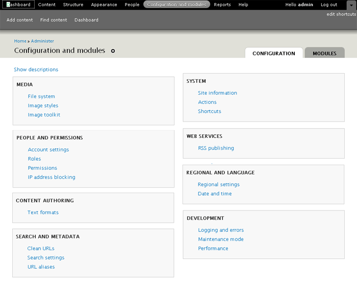
As proposed in http://drupal.org/node/508458, the creation of an Configuration page which houses all configuration of Drupal.
"The majority of the site is dedicated to making the site administration tasks easily findable. We have approached this primarily by regrouping and sometimes renaming the individual items or their groups for clarity." - Leisa
It's important to note that building tools such as Blocks, Menu's, Views, Panels ect should be housed under Structure.
Lets start working on the IA of this page, its important to get it right for users but also allow it to scale for the large amount of contribs that will live here.
![]()
| Comment | File | Size | Author |
|---|---|---|---|
| #52 | reorder-0911.png | 27.93 KB | eigentor |
| #39 | module-workflow-c.gif | 91.62 KB | kaakuu |
| #38 | module-workflow.gif | 92.31 KB | kaakuu |
| #33 | admin-modules2.gif | 75.08 KB | kaakuu |
| #30 | admin-modules.gif | 69 KB | kaakuu |

Comments
Comment #1
Bojhan commentedResources
The sketch
http://farm3.static.flickr.com/2483/3668341944_a81692b1ee_o.png
The IA mapping of 40+ important modules
http://spreadsheets.google.com/pub?key=r3NqKYK4UMfelsw-YQsKxdA&single=tr...
Yoroy's explanation
http://www.yoroy.com/2009/reorganize-drupal-admin-items-within-d7ux-fram...
Explanation by Leisa Reichelt
http://www.d7ux.org/d7ux-information-architecture-a-detailed-view/
Needs user testing
Anything that we decide upon will require user testing and iteration to find out whether it actually works.
Comment #2
webchick(Note: This is webchick the Drupal hacker talking, not webchick the Drupal 7 core maintainer; these are opinions, not mandates. :))
So the nice thing about the current "dumping ground" approach of the links with very few categories is we noticed during testing that people were able to find what they were looking for relatively quickly, as long as the item was categorized well. This is because there's a maximum of 5-7 things for them to "horizontally" scan, before they get to the point they need to do "vertical" scanning:
But moreover, what happens is once you use this dashboard a couple of times, you don't even need to scan the headings; your mouse will automatically move in the direction most appropriate and you can start vertically scanning right away:
With the proposed mock, this is what my eye has to do to find "Languages":
Everything I've always read said that more than 5-7 of something is too much for people to keep in their heads. I think that this concept applies here.
I try to apply my familiar "mouse head start" and really can't:
This is particularly problematic for the site builder who needs to know which of these settings are important for her to configure and which can (and generally should) just be left alone. In the current system, she can ignore everything under "Site configuration." In the new system, she needs to read every. single. link. here, and make a judgment call.
And finally, I'm concerned about this approach from the perspective of contributed module developers.
Here's how contributed module authors look at the current screen:
And for the most part, they do make their modules conform to one of the top-level categories. The exceptions are extremely rare and notable "mega" modules like Organic Groups, Panels and Ubercart who simply promote /themselves/ as top-level categories.
Here's how I'm strongly betting contributed module authors look at the proposed screen, based on evidence about how they look at packages:
So, in summary, I would lean toward fewer categories that attempt to encompass all modules' settings/configuration.
Your turn! ;)
Comment #3
kaakuu commentedGreetings. Your figures are not labeled 1,2,3 etc neither they have title - so a bit difficult to refer in discussion.
+1 for 20090704-cwe6pcuc2ud8wd578n9x3egj9y.png
In fact +100
Anything else will be disastrous.
Two questions
#
Where is the ''Administer by Modules'' tab which lists the modules alphabetically making it the easiest to find in case of long lists (like they are in the permissions page)
#
Will site admins and editors who have been using D4.7, have learnt D6 already have to again learn AFRESH if 0090704-gpd91fwpgcag1b2u4c5rintsnr.png is implemented (negative impetus for upgr to d7)? Will they have to learn again when D8 comes? Or there will be a skin for them ( like classic windows on windows xp) so that it can be easily enabled for them?
Comment #4
leisareichelt commentedwebchick - thanks for sharing your thoughts.
the idea behind creating additional categories like this is to actually enhance the scannability of the page and to make finding things faster, so it is kind of ironic that you've suggested that the experience will in fact be slower for you - that's something that frankly I'd like to test, and we'd need to test with a whole range of user groups and not just people who are as familiar with Drupal as you are.
I'm afraid that, in some cases, things might at first be a little slow for people who are v familiar with Drupal (in fact, this is almost guaranteed to begin with because you'll have to deal with your previous model of Drupal until a new one beds in - that's an issue with almost every redesign ever done, but it doesn't make redesigns a bad idea)
the 5-7 items is actually about remembering, which is not really relevant here as you don't have to remember anything, just recognise it on the page (yes, it is a frequently cited piece of research but almost invariably mis-applied)
things that I would be very happy to consider:
- moving the more frequently used tasks to the top of the page so that they are discovered with less effort
- comparatively testing 'a few large categories' with the 'more smaller scannable categories' for speed/accuracy with a range of end users
- providing guidelines to module developers to discourage the creation of new categories wherever possible
on that final note, I know that we are hoping to work cooperatively with a lot of the more frequently installed modules to make sure they have a happy home in the IA and that should really work well to providing a much clearer guide as to whether other contrib modules should put their stuff
Comment #5
grandmaa commented+1 for webchick.
Install some 50-100 modules and ask a newbie to find out.
Imagine what would happen to the Dictionary if it was made neo-usable!
Comment #6
David_Rothstein commentedIf I am reading @webchick's comment correctly, it is not just referring to her own current experience, but also is based on previous rounds of actual user testing.
Certainly her comment feels right, based on my murky memories of my early days using Drupal. I didn't understand the boundaries between the 5-7 admin categories (nor do I really understand them now!), but at least there were only 5-7 things I didn't understand as opposed to 20 things I didn't understand :)
I think it's also worth mentioning that Drupal already has a page that looks a bit like the proposed mockups - that is the "administer by module" page at
admin/by-module. Has there been any testing of that page? Anecdotally, I know that page is useful to experienced Drupalers (who already know the module they're looking for), but not sure about inexperienced users - perhaps the inexperienced users simply don't know that page is there, though :)Also, any thoughts about whether adding search functionality to this page would help people find things better, as in #102254: Add an administrative search feature? If I knew I were looking for "Languages", seems like searching for it rather than scanning for it might always be easier.
Comment #7
kaakuu commented+1 for the "administer by module" side by side.
I asked about that "administer by module" in #3
It actually helped me and a few of my absolutely new friends who went on module spree and downloaded dozens of modules to test. The alphabetical sorting helped them instantly to find the module as they knew what was the starting alphabet of the module (and its name) when they downloaded it.
May be the "administer by module" tab can use a separate highlight color and more informative, helpful title like "Quickfind a module by alphabet" - a balloontip on hover on this tab which says "this tab leads to a page which helps you find instantly the module you downloaded just now or in the past by listing all the modules alphabetically and links to their settings/configurations, permissions, and help files".
Comment #8
leisareichelt commentedgood point, I neglected to mention in my previous comment that we don't talk at all about the fact that you can access the full module list from this page as well and configure on a per module basis. This is definitely not going away.
Comment #9
Bojhan commented@webchick - So one of the things we didn't really test in any usability test, how well this page preformed with modules enabled. At the last Baltimore I squeezed one task in, and most people seemed to have trouble finding where Search belongs. Their pattren was similair to your third picture, that they went and scanned down the page.
1. The current /admin situation
I feel strongly that the behavior that is currently situated in /admin is not ideal for actual finding stuff. Although the orange and yellow are positioned well. If you need to find anything beyond the yellow, orange and blue you have to scan all the links.
The aim of the new proposal, is really to handle moduless, the core site configuration will indeed be spread - therefor harder to find. But I think this will mostly set off people who used Drupal before. Since, if you don't know that all things you really need much lives under site configuration - you will look there every time - until you figured that out.
1. See, webchicks picture of the orange,yellow, red
Orange addressed by /content or /structure.
Yellow addressed by /structure
Blue is partly on /peoples
Red is top left on /configandmodules
Red is seperated. Right now Site configuration is kind of a dump place, for anything which has configuration. Making it a long list of links - which generally requires you to scan the whole list to find the item you need.
The proposal is especially to split this section up, into sensible sections. Due to links their nature, they are generally harder to scan then headings. With the proposed solution it should be faster to find your functionality, as you can easily scan the headings, and then go in depth where there are usually only 4/5 items to find your functionality. Thus making it faster, then reading trough a bunch of links - my personal experience is that you have to look closely - this might even be a spacing issue.
2. Contributed modules
"WHOOPPEE*&@(!~ IT'S A FREE FOR ALL!!"
Obviously this is always subject to the module maintainers ability to put it in a sensible section, which in our current /admin situation does happen. But then again, site configuration turned into kind of a dump place for everything. So I don't think this proposal could become worse in that way.
I would like to agree on the part of fewer categories but I would also like to say, that the behavior on this page is completely different from the current behavior. So we are not having, generic sections anymore but focused to specific sections.
If you take a look at our google excell doc, you see we placed Thickbox in Media. So we anticipate that some might create all kinds of new sections, but I believe if we can map the first 40 modules to these categories - most others will be able to map to these as well ( I hope I am not wrong on this one).
3.Frequency
We are now listing "list of items" amongst "when you need it configuration". Where as the frequency is not addressed. I believe just as leisa, that more frequently used tasks should be on top - which translates to certain sections being on top. An example would be Reports to be at the bottom :)
That's a wrap, webchick thanks for your much needed feedback and leisa for her quick response. Let's keep moving on this topic, I hope others can step in as well to provide more feedback.
Comment #10
tstoecklerWhile the current /admin and the -then- Config (& Modules) page is used in many situations the use-case that seems to dominate this issue currently is: "I want to find a certain setting (which I know the title of!)". For this particular use-case much better than discussing and testing the spread of certain links, would be a simple find-as-you-type searchbox. Now it has been said (by Dries e.g.) that this type of searchbox is not better than your browser search, but in this case explicitly telling the user that he has, in fact, the ability to narrow down his view of links, would be quite helpful.
Also on a general note, not concerning specific use-cases:
I think webchick's (second) screenshot in #2 proves to me the value of the reordering, because the categories (of which there are more, with the proposed IA) are precise and understandable. While it was never clear what the difference between "Site building" and "Site configuration" is and where content-related settings go (Content? / Site config?), URLs, RSS, Search are things that anyone understands at least to the point of "Yes, I wan't to go there" or "No, what's the next category". Therefore I need to disagree with webchick's reasoning of it being harder to find stuff with the proposed ordering (but, as I said above, this really depends on the use-case).
Disclaimer: The current d7ux mockups still include the "mythical" Site building.
Comment #11
babbage commentedI have never liked this page in Drupal, which I found to be unintuitive and difficult to navigate. I rapidly moved to using the Administration Menu and found the interface there more intuitive. I do almost everything from there in D6.
However, given we are going to keep this page, I have one major suggestion—make the categories span across the two columns. The attached image shows what I mean. (You can compare the original mock-up here: http://www.d7ux.org/images/IA_Config.png). While specific links are still spread across two columns to use the maximum available space, the entire space in a horizontal region is associated with a single category. At least for me, this would make the categorisation much clearer, and make it easier to scan for the category I want. This takes up slightly more space (Internationalisation no longer appears in the screenshot) but is worth it IMHO.
Aside: Personally, I'd also like to see fewer categories (possibly even prevent modules from creating their own, if we can devise a sensible system they can slot into). I don't personally see a place for a category that has only one or two members—but I recognise the organisation here is allowing space for entries from contrib. All that is anyway a separate issue. I'd also like to see meaningful icons identifying each category which would let me scan even more rapidly down the left-hand column. But most of all, I just want to see categories own the whole of their horizontal space. :)
Comment #12
catchJust a note that my current view on #508458: Config and modules page is leaving /admin where it is, with the same plumbing, and just making new categories - which means we could start work here pretty quick.
I'd personally like to approach it like this - keep this issue for the overall planning, and open issues for specific categories - same as we did for #368064: Provide a top level 'internationalisation' menu item.. That way we don't have a 400k patch which breaks all the time, we don't get held up bikeshedding the name of one specific category (or if we do it only affects that section), and each new category gets evaluated on a case by case basis
Comment #13
linea commentedsubscribe
Comment #14
eigentor commented@webchick There is one thing missing from your view of the structure:
Config + modules only affects config + modules. Things like structure, people, content have their own top-Level categories.
So what we are talking about is basically what was the Site configuration section before (with quite some more stuff in it, admittedly). But this was _not_structured_at_all_ before.
So dividing it up into sections is new and, done in a good way, will definitely improve findability.
All depends on clever categorization, and also on Design here to make it easily scannable.
In one thing I am not behind the proposed categories: Being an adherer of "the rule of seven" I'd prefer to make 7-8 Categories inside the "Config" tab and place others as sub-categories of those if possible for easier scannability. If it is not possible, well do with more categories.
Instead of discussing whether this makes sense or not, let's create mockups, present personal flavors of reordering, do card-sorting, User-Testing whatever. For if this entire idea is rubbish we will find out that way the fastest.
Comment #15
kaakuu commentedWhat will be the rule for arranging the categories - which category will occupy topmost or which one rightmost on the screen ?
Will it be "one-rule-must-fit-all" and what devs/ux people determines for the mass OR will it be draggable and arrangeable at will by the admin-user?
What will one do when there are some 50 modules ? Look at categories at random ( unless they are presented alphabetically ) and then look for the module listed alphabetically within a category OR minimize one step and look at modules alphabetically from beginning ?
Comment #16
catchSo there's a patch at #520444: Use a custom menu for top level toolbar links which aliases /admin to /admin/config - which means 'Configuration and modules' becomes everything that's there now, but eventually minus the stuff that's in people/structure etc. That means the current mechanism for categories (using the menu system, with a position => 'left' and position => 'right' and weights for ordering will be used here - and users will be able to use the menu module to move things around, and developers can use hook_menu_alter().
afaik the idea with the 50 module problem is that on the modules page itself, we remove all categories, and just have an alphabetical list (although something like Views would have its submodule nested I think). I don't know where the latest mockups for that are though.
Comment #17
David_Rothstein commentedI like @catch's plan in #12 of doing this one category at a time. That will help keep it to the minimum number of categories possible. (That's important, since if we have too many categories then the distinction between the admin/by-task and admin/by-module pages will become very blurred.)
So for starters, if I were breaking the site configuration section up into two categories, I'd probably go with these - just fake names for now, but the idea is real:
Trying to break up the core settings pages into these two categories, it seems to break pretty evenly. Roughly speaking:
Widgets 'n' Things:
Behind the Scenes Stuff
I think this would be a relatively intuitive breakdown that would help people find things faster (in the case where they don't quite know what they're looking for, but have a rough idea of what they're trying to do - which is the use case we are trying to optimize for here).
Thoughts? If this sounds good, I'll open up a separate issue with a patch.
Comment #18
Bojhan commented@David_Rothstein I am totally not following, are you proposing a completely different IA of the page, then what has previously been discussed? So please, don't create a patch for your proposal as its something completely diffrent.
I think the right strategy, is to fix User Management and Content tab. And then moving to further categorization of the modules & configuration screen.
Comment #19
David_Rothstein commented@Bojhan: It certainly wasn't my intention to do so. As I understood it, this issue is still in the brainstorming phase, and there's a fair amount of interest in keeping the number of categories as low as possible. So I simply proposed an initial split into two categories. It certainly wouldn't preclude further splits later on. (Although personally, I think the "behind the scenes stuff" category would not be so bad as one of the final ones -- it would basically be the single place to stuff all the items that 'non-technical' site administrators aren't supposed to have to ever think about?)
Comment #20
eigentor commentedO.K., lets get the mockups rolling.
I had another look at the excel sheet of the ordering into categories: Actually I find this is quite well thought-through, found it hard to merge Categories. Still eleven appears too much to me, maybe we can find a way to merge some, and have Sub-Pages that show these subdivisions.
So here is my attempt to put this into reality:
Am not really content with the scannability, this still feels very much like our present dashboard ( /admin in D6). But maybe a start...
Got a larger version on Flickr: http://www.flickr.com/photos/14250508@N02/3776326048/in/pool-drupalredesign
Not so sure about the application launchpad and what to use this area best for. The yellow drupal message like shown here http://www.d7ux.org/images/IA_Config.png about modules that need settings or update should hopefully only be temporary and users may be bugged enough by it to take care of things so it goes away and the normal view is without it. Opt against putting updates there before the update chaos of drupal modules is slimmed down considerably.
Comment #21
karschsp commentedsubscribe
Comment #22
babbage commentedeigentor: I agree with your disquiet re scanability. Please see #11: #510110-11: IA : Configuration & Module
Comment #23
alpritt commentedAs webchick says, as frequent users of the admin screen we develop a strong sense of where things are placed geographically on this screen. Upper left, upper right, lower left and lower right are easily memorable locations that we instinctively learn and go back to from memory. However, that only really helps for finding the section (say 'site building'). Once in the correct section you've still got to scan the list for the correct link and the more links in the list the harder this is. Adding more headings makes scanning easier because 1) The headings can be a bit more descriptive since they are not trying to be a catch all. 2) Fewer links to scan within each section. The win in scan-ability far outweighs what you supposedly lose in my opinion.
I say 'supposedly lose' because, taking the IA as a whole, we are also not completely losing our ability to memorise visual locations for sections either. Instead of the random top-left/top-right arrangement we have more visually distinct regions in the form of the header menus, for example. So the direct comparison to the current /admin is not quite fair.
--
If we want to avoid our eyes darting around when scanning the page, I think the suggestion in #11 by dbabbage is a good one.
--
My initial impression of this page is you come to it if you want to change how your site functions in some way (i.e. configuring). Lots of modules fit into this nicely. However, I'm trying to think through something like Ubercart. Ubercart has a bunch of stuff that would fit quite nicely onto this page (such as configuring payment gateway credentials, or adding new product types), but I'm unsure how a task like reviewing orders would fit into our IA. I don't think it fits here on this screen. Maybe it belongs in 'content', but I'm not sure that is right either. I guess the dashboard is the most logical place. I'm not sure if the fact that items in the dashboard are not permanent might be a problem though.
I see we have an 'application launcher' to deal with this kind of thing, but I don't get this idea. It seems analogous to Windows putting their Start menu in the control panel. It just doesn't make sense to me.
Seeing the reports and development section, seems to suggest a movement away from this being purely about configuration. It makes me wonder if this will end up as dumping ground for pages that are hard to find a more appropriate home for.
Comment #24
catchI think that's the whole point of this section, but agree that 'config' tends to exclude some of those. IMO it depends on whether you consider configuring to be about settings, or about 'configuring your site' (but then reviewing orders still doesn't fit in there really). Having said that, I think it's likely that the big and strange modules like ubercart will add their own top-level items to the toolbar - they're the exception rather than the rule in most cases.
Comment #25
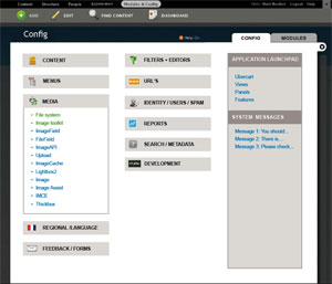
eigentor commentedReworked it: with icons for all eleven sections. Icons vary not only in shape, but also color: should be very easy to find your category now. Also collapsed now, only active category open. But collapsed Wordpress Style (aka on steroids).
As a further means of orientation, system settings are green and sorted to the top. Breaks alphebetical ordering, but might be easier to scan. Maybe it should be different even more in color.
Ordered presumably most-often-used items to the top and also tried to incorporate David Rothsteins idea: to put rather content-editor or side-admin like stuff to the left, and more dev-targeted or say abstract or for drupal-knowledgable people on the right.
Click images for bigger versions.
I guess eleven categories won't be enough. Instead of looking through the top 50 modules we will have to go through the pain to look at the top 300 at least, and best keep categories ready for them. This would mean having clear guidelines for module developers where to put them. This should help to counteract the "free-for-all" concern which is valid. And it is common practice right now: I have seen admin menu bars with up to 12 items on the top level...
Comment #26
eigentor commentedclickable Prototype here: http://auweia.org/test/admin-ia-1/
O.K. admittedly this is the way one should not do it when putting it online. Will do better next time.
But once you clicked through all the pages the images get cached and it is much smoother.
Comment #27
kaakuu commentedThere are approx a dozen or more modules under media. In some situations and under some other heading it may be even more. How does the eye search the list ? Alphabetically ? Datewise ? Those just now installed at topmost ? The lists in the mock-up is not alphabetical but I guess there must be some rhyme or logic I am missing.
Comment #28
eigentor commentedAh, to be honest it is totally random. I did not pay any attention to this yet...
I guess it will be alphabetical for system settings, and alphabetical again for module settings (argh, maybe we need still another concept).
My focus went not inside the boxes yet...
Comment #29
kaakuu commentedThanks. What is inside the boxes ultimately matters.
Ideally it would have been like Cpanel ( x3 skin) - what Cpanel has done long ago in the admin panel is that they just allow to drag and drop stuffs (modules in case of Drupal) under the available headings, so that the Admin user can sort according to his choice and remembering power. In Cpanel they also have a block which remembers the most frequently accessed stuffs - it becomes super easy for the Admin user to carry his daily or weekly chores. If D7 was not in a hurry and not in once-committed-so-must-proceed mode we would probably have this in D7, unless it has already been planned. This is the way things are going and wordpress has already started implementing it I guess.
I wish some sane order will soon develop for what is inside the boxes. As of now Modules are grouped or categorized in a wide variety of ways - in download pages there are different categories, in Admin/permissions pages they are listed in a different order, and in the main Admin page ( the mockup above) they are listed in YET another different order. I find no rhyme which if there I must be missing.
Comment #30
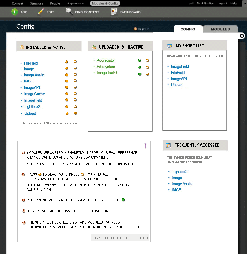
kaakuu commentedExtending little bit on what goes inside the box and avoiding the clutter of dozens of categories,
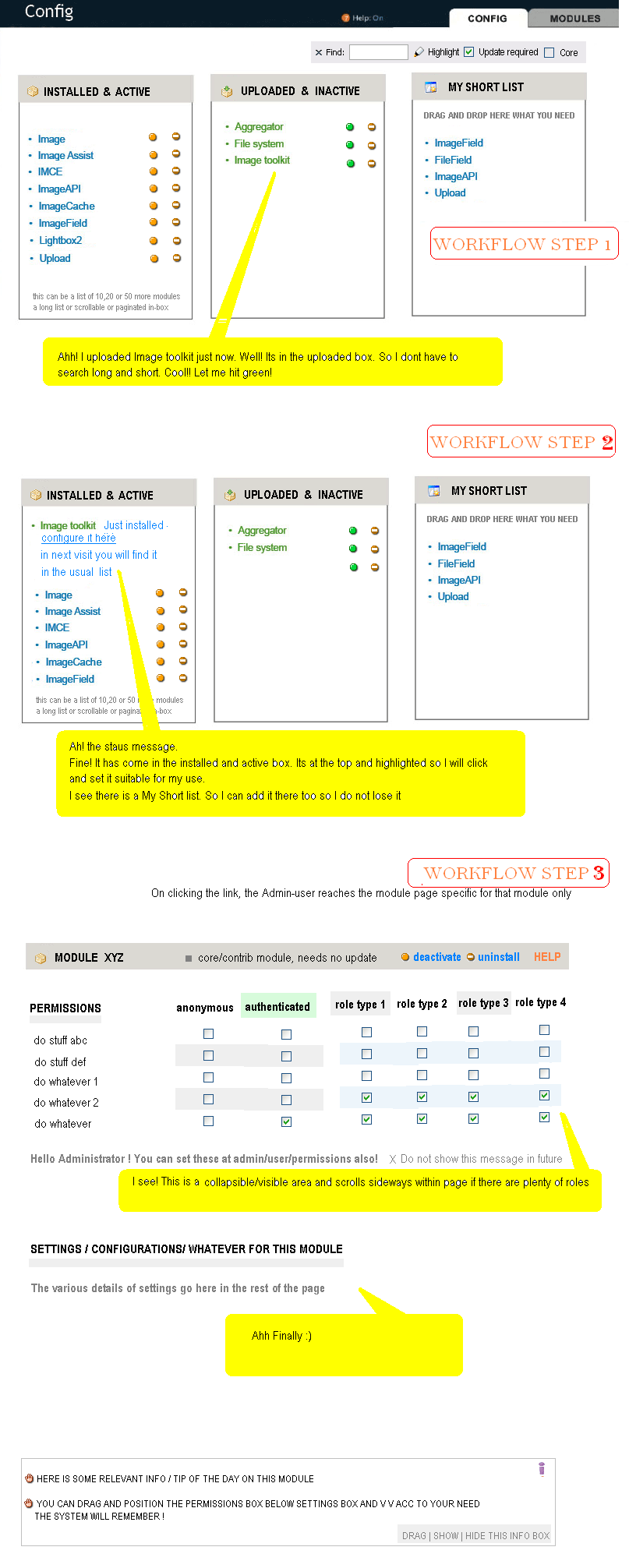
and giving a cleaner, easier to find interface which is more friendly and adaptive to the admin-user and his needs -> please see the mock-up diagram in the attachment and read the info box there.
Comment #31
eigentor commentedKaakuu - this are very interesting aspects and yes, let's be inspired from other systems!
Only thing is this belongs rather another issue: #538904: D8UX: Redesign Modules Page
Still your categorization makes sense, what I like most is to remember the most used and sort them to top, a feature that good old Bill Gate's Operating system does.
Still there are some issues with that also: What we are aiming for now are clever defaults. And once a user memorized a location of a module, I am hesitant to change the order. This would be a means for _really_ long lists that are downright inscannable like the Favorites list of your browser.
What I believe we should aim for to cut down any list to follow the rule of 7, http://www.musanim.com/miller1956/ I mostly find it valid... And if we have more than 8, best subdivide. Would claim the 80% like it. Does not mean there are no exceptions: a client of mine keeps all his documents in one giant alphabetical list and is perfectly happy. Still this is probably rather the exception. Not being dogmatic can help, as we do with the amount of boxes on the config page, that could take some more as I find.
Here Kaakuus Screenshot for easier reference, won't post it on the modules page queue for now because yoroy asked so kindly for it :)
Comment #32
kaakuu commentedHi Thanks
I probably could not grasp clearly what you said though this is a clear statement indeed.
Do you mean "My short list" will become inscannable like the Favorites list of the browser? If that is what concerns us, my answer is NO, modules are after all limited in number and not like the hundreds of webpages that are added to favorit list. Once the user adds that to the Short list there is no problem in his memory-mapping too. An user is going to add atmost 10 or 15 modules to the short list as most modules once set keep on going without further handlling/editing. The system generated most freq list can be set at a default of 5 or something close like Cpanel.
The above two are grossly contraindicatory. Isn't it? Why not rule of 7 to the categories then? Actually with too many categories one has to remember the categories in the mental map AND then the modules again. With simple alpha list the memory work is reduced as well as become logical ( think dictionary, words are not arranged in groups) - there are only 3 categories to work with then - INSTALLED ALREADY, THOSE THAT CAN BE INSTALLED, THOSE I NEED FREQUENTLY.
Any of the box can be hide/shown thus minimizing the severe clutter on this page. Believe me if you can do this it will be rocking and become gold standard for all CMSes.
Comment #33
kaakuu commentedSlight modifications to the above diagram, making all control and configs of modules easy from ONE clean and admin-customizable page, please see attachment
Comment #34
eigentor commentedkaakuu great you really hit this with mockups :)
Well, I was not referring to the short list, this is great and reminds me of the App launcher.
Well what I meant is: A Category like Media can easily have more items than 10 or 12. It gets unscannable. In such a long list the remembering of the last used could help. But I misread you and you just mean the short list remembers. This is just brilliant and we should include it in the app launcher block that is craving for content that makes sense anyway.
The contradiction with rule of 7 or not:
We have too many modules and settings. Basically there are some ways to handle that.
1. The old style drupal: dump everything in Site configuration, which makes it blow up so badly that when you use Admin menu it does not even fit on the page anymore. This has got some advocats, because that is the thing _we_ know and change always hurts the one who loves the old. This methodr it is completely unmanageable for a new user - which, one cannot repeat it often enough, we are targeting by the entire D7UX idea.
2. make few categories, put in lots of stuff: This adresses sequential readers, that like long lists better than many categories.
3. Build few categories but build sub-categories: By this way one could keep to the rule of 7 at the cost of further subfolders that add complexity and clicking.
4. The proposed way, that makes more than 7 top-level catagories and improves scannability by division into two columns, icons that are as different as possible to give them a unique memory slot. What further helps scannability is: you open a section and is has a certain size (the box). You remember the size of the box and next time you click the wrong one that is much shorter, you instantly know that this can't be right.
We had all kinds of discussions of how to order things and there are several modules that work. Drupal has got the special challenge to deal with n elements that cannot be foreseen.
But all our talk is silver: best would be to create interactive Prototypes for the different models and run user test on them. This is the only way to reveal on which side of that 4-sided fence the 80% sit.
I just see I misread you once more: You got one drag-and droppable dashboard box and one that remembers last accessed. Even the better. What I also like is the nifty filtering setting: this takes up oh so little space.
Comment #35
kaakuu commentedHi Thanks.
That's a really good in depth explanation.
Personally I have always found (when the time is short and I need to access something really quick) it easy to find out a module from the Administer > By Module tab which sorts the stuffs alphabetically.
A really simple test is :
assign someone as admin or subadmin of your site who has not installed the stuffs but has been appointed as admin of the site to maintain it. Ask this person to find a module by name - show him the usual page and the By modules (alpha page) . Note the time differences. Usability test results can vary on how those tests are set. Drupal is the only system on earth which is so modular and the only one to have Views, CCK etc with their individual loads of submodules.
What is 'clever' categorization to us or to the test users may or may not be apt to the thousands of other users - so provide them their own "Short list"s "Freq accessed stuffs" etc.
Even as an user who is accustomed to Drupal, there are gross differences to tackle how modules are so very differently listed
in the download page categories (for ex, do I find the same category I downloaded from, in the admin?)
in the permissions page (a long scroll of alpha list)
in the default admin modules page
I am not sure ** if this inequality is being addressed at all **.
Whatever is ultimately done there should be UNIFORMITY and beyond the defaults/core
as much as liberty possible be available to the super admin, instead of writing things in stone, and of course with a prominent 'restore factory settings :)' button!
Comment #36
eigentor commentedHad some Feedback from Mark Boulton and a quick talk with him.
He brought in another point that I was blind to mainly due to Drupal-Blindness.
What he suggests (and I basically follow) is that _all_ access to contrib modules settings go on the modules page, and only system settings remain on this one.
As I am at least 80% on that idea, the next mockup will take that into respect.
This solves one problem: This page will probably not get cluttered beyond reason. And we can go without icons and collapsing. Let's see.
Comment #37
kaakuu commentedHi Eigentor!
The "highlight by core" does that if one needs that in the above mock up.
Adminsitrative-users particularly those who have not downloaded and installed Drupal bit by bit will not always remember what is core and what is contrib - keeping an unified list helps them.
Separate pages will also mean extra clicks, extra to and fro movement, and extra memory-mapping burden.
Extra movements to do Updates also.
In any case, I think the above mock up applies very much to contrib modules settings also on the modules page., where the clutter needs to be avoided more.
If there are two different pages, the "My Short list" (whatever be the name) box is visible in each and it should be a common list where Admin users can drag and drop from both core and contrib, making things easy and 'one-window'. Same goes for the "Frequently done list" also.
Comment #38
kaakuu commentedExtending the thought that anything or all to deal with modules should involve fewer steps, fewer clicks, fewer pages etc, and be intuitive and easy - please see the diagram, which is an addendum to the above diagram (the yellow balloons are what the mockup admin-user thinks)
Comment #39
kaakuu commentedSorry, the corrected diagram
(the dependencies can be shown on hover /tooltip and/or asked to install at the time of install
this saves space and helps a a visual freeflow - if the Plugin manager or module manager is there this will also be taken care of at that level)
Comment #40
yoroy commentedBut… this issue discusses is the configuration tab right? This is starting to look more and more like a concept for the modules page. I don't get it.
(subscribe, will come back to this after reading this more thoroughly and be more constructive…)
Comment #41
kaakuu commentedHi Yoroy, I am somewhat confused if it just about a tab, configuration tab. The issue reads in the beginning as "Configuration page which houses all configuration of Drupal."
Drupal consists of modules only that are configurable and configuration page is about that.
I tried to discuss and show mockups that is the starting page for all configurations.
If it is about Core modules the mockups apply to that in conjunction with Contrib modules in the light of setting up a COMMON "My Short list"(Admin determined) and "Frequent list" (system determined) dragg-droppable boxes.
Comment #42
kaakuu commented@Eigentor - What I understood while following this thread and seeing the mockups already posted by webchick or you does not seem to go with this. Were we proceeding without knowing or have I misunderstood ?
In any case, the mockups apply to both.
@Yoroy, the third diagram was just to explain the context in which things happen/will happen. See the other diagrams, hopefully they have some relevance.
Are core and contribs are separated into "Config" ( for core ) and "Modules" ( for contribs ) ?
If so question is - Structure , People etc already does many of the things of Config
What goes there and what in config ?
How Site admins who are not super admins which belongs to where or they will toggle to and fro to search ?
Comment #43
eigentor commentedKaakuu - well actually that's what I said earlier on: these ideas are good but they mix up modules tab and config tab. It was not clear to me either before the mentioned talk with Mark that we should go with _all_ modules settings on modules tab/page and all config settings on this one.
Yes, my mockups do not go with this and neither webchicks do. That is the miracle of progress :D
what goes in people is not ultimately decided I think, but I'd say all the create user / roles stuff that is residing under user config at the moment. In the end the admin information architecture is evolving. But everything that is not in the excel sheet http://spreadsheets.google.com/pub?key=r3NqKYK4UMfelsw-YQsKxdA&single=tr... will be not under this tab. Actually all contrib modules that are in the excel sheet won't either.
Please read again #538904: D8UX: Redesign Modules Page to seperate things out.
Entering these issues is sometimes hard as it presumes you know about things you have no chance to know :) And still better, come to IRC channel #drupal-usability on freenode if you like, as I see you are really into the subject. We are hanging out there and having a ball :/ Well actually you might not find either bojhan yoroy or me there. But if there is a place for this stuff, this is the best starting point.
If you are daring and endurant, try to read through http://www.d7ux.org/ All the Structure is laid out there in chunks, you see them on the right side under "categories" with the sequential numbers.
Comment #44
kaakuu commentedShort of time today to visit IRC but thanks.
Some quick notes :
#If things have changed should fresh issues be started ? May be no. But are all those who posted here before aware of this?
# Before (or simultaneous with) coming up with the mockup diagrams can you or some one say
What config matters / stuffs goes under the Content tab ?
What config matters / stuffs goes under the Structures tab ?
What config matters / stuffs goes under the Config tab ?
These needs to be clearly evolved and/or defined in text.
If I have understood correctly, what you say is, as of now
The config tab deals with configs of modules, which now happens to be Core ones
The Modules tab deals with configs/settings of modules, which now happens to be Contrib ones.
# So is not the names of these two tabs NON-uniform and confusing, specially to one who has not installed but admins a site OR has installed and forgotten which is which?
Configs is also about Modules as *everything in Drupal is modules*
# If it indeed is meant to be that way a multipage to-and-fro affair how it can be made less confusing?
How to decrease the burden on the memory so that one has not to memorize all the modules as contrib or core to deal with configuration? Providing them on a single page assures one they are all in-one-place and the admin user knows he can quickly find out either alphawise or categorywise.
# What is your opinion on the module workflow diagram, if any ? It may be out of context but one thing is related to another when we want to minimize pages and clutter effectively as well as bring ease of operation in overall config and settings. This workflow actually shows you do not need "Redesign modules page". Configs and modules can be SINGLE page affair with intuitive intelligent workflow, ajax boxes, tooltips etc. Each module has its own config page of course.
Probably this will be difficult at this stage to grasp but hope someone someday looks at this and understands - hence the post :)
A quick look at D7UX site shows the mockups posted here earlier and do not say of the sudden change which is said now, but I can be completely wrong here.
Lastly,
#do we agree on the broad facts that there ought to be "My short list" and "Freq list" boxes ? See diagrams above
#can we make the filters easy and small but with clarity ( diagram above)
Thanks.
Comment #45
eigentor commentedHehe, you really are hard bitten. Thus you can go far in drupal ;) I guess from the name this is finnish?
O.K. I do not want to chase you off because this often happens in the issue queue with people juming in afresh because they are expected to read all that darn stuff which no one ever can do :)
About the list on the left side: you basically have one big list with all the stuff, and are hiding the mess with a scrollbar. This is, according to the four models I tried to describe earlier, the worst of all :), model no. one on steroids :D
I guess 5-10% of users will like this better than a semantic ordering. Someone who is new to drupal and does not know what he is looking for has absolutely no chance. Well, alphabetical sorting is not bad.
But the biggest problem of it is we have already moved in a totally opposite direction. It may even be viable in some situation, but for the process at the present point, at least from my side it is a decided "never in the world".
Addition: have had a look at the mockup you posted to modules page. Yes, this is the direction it goes. Only difference is you put it into three boxes, which I basically like but has the problem: what if someone has 50+ modules? This does not apply to the freshly installed ones.
Still, this brings on a fresh perspective we have not thought about. The workflow you lay out is right on point: that's a way that works very well for the user. But no more commenting from me on that page. Just did not want to spam on the other, but leave the word to the other gays and gals.
The widgets with favorited and last visited: yes, those are nice and we should put them in the place I had the app launcher, as a kind of extra goodies.
But we want to solve one problem: structure the stuff you put in the one box. Best lay it out on the page so that you memorize the place and never have to search for it again. And, divide it into Categories/subgroups that are so descriptive they help even more to find the stuff. You wanted my opinion, here it is.
Concerning the modules page, your mockups and explanations look a lot different, since there they belong ;) I like the workflow you lay out.
Comment #46
kaakuu commentedHe he :)
Thanks. Scrollbar is not written in stone and I also dislike. It can be very nice in-box paginations, that minimizes length as well as adds sortabilty to alpha. So I wrote "this or that or that" in the mockup.
Inbox pagination can be nifty and can handle 50 modules - answer to your other question - it can be two columns also with a slightly wider and longer box , and with use of balloons/tooltips you gain much space.
With the new idea behind config which you say now belongs to system settings
I do not see how "Application Launchpad" can occupy a place here :|
"Best lay it out on the page so that you memorize the place and never have to search for it again. "
This is when you assume that admin visits admin panel daily and plays :) with stuffs. In most cases admin need not visit config so much as visiting Add Content, User Management etc, so the memory actually decays. This is where the "My Short list" comes into play. Why leave it vaguely to memory when you can just add what you need in a short useful list ?
About the widget "Last visited" what I mean is MOST frequently accessed stuffs, and not just last visited.
Comment #47
gábor hojtsyAdding IA tag.
Comment #48
gábor hojtsyGiven that this is just an umbrella issue for a general discussion, it was important to get access to the individual issues in a generic way. Now you can see individual IA related issues under http://drupal.org/project/issues/search/drupal?issue_tags=IA
Comment #49
Bojhan commentedI am going to be somewhat of an prick here, to conclude that this discussion although valuable has provided a mockup that tries to solve many different problems - some of those should be addressed by the Modules page, and not by the configuration page.
So we need to make a clear seperation between what is supposed to live on the configuration page, and what is supposed to be solved in the module enabling, disabling workflow which can be adressed on the module page.
There are two issues where I would like this discussion to move to, and I think most of the proposed solutions are kind of steering towards #538904: D8UX: Redesign Modules Page
And all other discussions regarding the configuration page, on #546956: [meta-issue] Overhaul of Information Architecture. I would love if we could focus on the categories, instead of working up completely new approaches. We have only a few weeks left till code freeze, so ideally we fix the categories and after that are able to rethink certain flows.
Comment #50
yoroy commentedBojhan put into words what I was thinking in #40.
Let's work on the modules page in #538904: D8UX: Redesign Modules Page
Categorize our admin links on configuration page in #546956: [meta-issue] Overhaul of Information Architecture
So, although not how we normally do it, for sanity's sake, I'm marking this a duplicate of the latter.
Comment #51
mcrittenden commentedSubscribe.
Comment #52
eigentor commentedLet's work on this page some more. Though User Testing would have to target it directly, there are some very simple yet effective measures. Let's tackle the following
1. Reorder Category blocks by frequency of usage (and include this order in install profile, if possible. Since the "minimal" is meant to adress developers, who use this page in a completely different way)
2. Create a realistic view of the page, including at least 30+ of the top modules
Our current view of a default is nice, clean and scannable. Yet, alas... Hardly anyone will ever view it that way for longer than a few days. Let's drop in all the stuff, see if it is still scannable, and if not, find solutions. Separation system/contrib? Other Hierarchy?
As for task 1, here is my proposal for the 80% user, Install profile default. I reckon the blocks most in focus are the first three on the left side and the top one on the right. My choice of putting media first may be personal and due to the fact that in the catacombs of drupal there are still people from a 4.7 install that desperately trying to upload their freakin' image.... Still this may be solved with story hopefully getting an imagefield by default in the default install profile. Devs don't worry: the last element gets way more focus than some in the middle on the right side...